/* ===== all pages | head ===== */
/* Custom CSS Added Via Theme Settings */
  <!-- ===== Upcoming Retreats Section ===== -->
<section class="ret-section">
  <div class="ret-inner">

    <div class="ret-header">
      <div>
        <h2 class="ret-heading">Upcoming Retreats</h2>
        <p class="ret-subheading">Join us for a transformative experience in beautiful locations.</p>
      </div>
      <a href="coming-soon.html" class="ret-viewall">View All Retreats <span>&rarr;</span></a>
    </div>

    <div class="ret-grid">

      <article class="ret-card">
        <div class="ret-image">
          <img src="../images/Coastal_cliffs_at_sunset_in_Sussex.jpg" alt="Coastal cliffs at sunset in Sussex" onerror="this.style.display='none'">
          <span class="ret-badge ret-badge-gold">Featured</span>
        </div>
        <div class="ret-body">
          <h3 class="ret-title">3-Day Conscious Living Retreat</h3>
          <p class="ret-location">
            <svg viewBox="0 0 16 16" fill="none" xmlns="http://www.w3.org/2000/svg"><path d="M8 15C8 15 13 10.2 13 6.5C13 3.5 10.8 1.3 8 1.3C5.2 1.3 3 3.5 3 6.5C3 10.2 8 15 8 15Z" stroke="currentColor" stroke-width="1.2" stroke-linejoin="round"/><circle cx="8" cy="6.5" r="2" stroke="currentColor" stroke-width="1.2"/></svg>
            Brighton &amp; Sussex, UK
          </p>
          <div class="ret-meta-row">
            <span>
              <svg viewBox="0 0 16 16" fill="none" xmlns="http://www.w3.org/2000/svg"><rect x="1.5" y="2.8" width="13" height="11.5" rx="1.2" stroke="currentColor" stroke-width="1.1"/><path d="M1.5 6H14.5" stroke="currentColor" stroke-width="1.1"/><path d="M5 1.3V4" stroke="currentColor" stroke-width="1.1" stroke-linecap="round"/><path d="M11 1.3V4" stroke="currentColor" stroke-width="1.1" stroke-linecap="round"/></svg>
              14 &ndash; 16 May 2027
            </span>
            <span>
              <svg viewBox="0 0 16 16" fill="none" xmlns="http://www.w3.org/2000/svg"><circle cx="8" cy="8" r="6.5" stroke="currentColor" stroke-width="1.1"/><path d="M8 4.5V8L10.5 9.8" stroke="currentColor" stroke-width="1.1" stroke-linecap="round" stroke-linejoin="round"/></svg>
              3 Days
            </span>
          </div>
          <p class="ret-tagline">Rest. Reconnect. Realign.</p>
          <div class="ret-footer">
            <span class="ret-price">From &pound;495</span>
            <a href="coming-soon.html" class="ret-btn">View Retreat <span>&rarr;</span></a>
          </div>
        </div>
      </article>

      <article class="ret-card">
        <div class="ret-image">
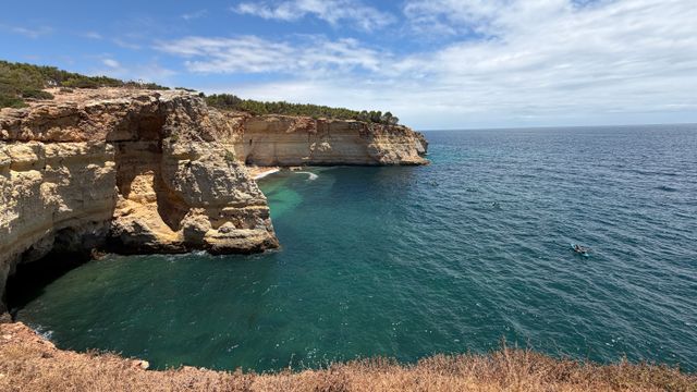
          <img src="../images/Turquoise_sea_and_cliffs_in_the_Algarve.jpg" alt="Turquoise sea and cliffs in the Algarve" onerror="this.style.display='none'">
        </div>
        <div class="ret-body">
          <h3 class="ret-title">7-Day Ayurveda &amp; Inner Balance Retreat</h3>
          <p class="ret-location">
            <svg viewBox="0 0 16 16" fill="none" xmlns="http://www.w3.org/2000/svg"><path d="M8 15C8 15 13 10.2 13 6.5C13 3.5 10.8 1.3 8 1.3C5.2 1.3 3 3.5 3 6.5C3 10.2 8 15 8 15Z" stroke="currentColor" stroke-width="1.2" stroke-linejoin="round"/><circle cx="8" cy="6.5" r="2" stroke="currentColor" stroke-width="1.2"/></svg>
            Algarve, Portugal
          </p>
          <div class="ret-meta-row">
            <span>
              <svg viewBox="0 0 16 16" fill="none" xmlns="http://www.w3.org/2000/svg"><rect x="1.5" y="2.8" width="13" height="11.5" rx="1.2" stroke="currentColor" stroke-width="1.1"/><path d="M1.5 6H14.5" stroke="currentColor" stroke-width="1.1"/><path d="M5 1.3V4" stroke="currentColor" stroke-width="1.1" stroke-linecap="round"/><path d="M11 1.3V4" stroke="currentColor" stroke-width="1.1" stroke-linecap="round"/></svg>
              10 &ndash; 16 September 2027
            </span>
            <span>
              <svg viewBox="0 0 16 16" fill="none" xmlns="http://www.w3.org/2000/svg"><circle cx="8" cy="8" r="6.5" stroke="currentColor" stroke-width="1.1"/><path d="M8 4.5V8L10.5 9.8" stroke="currentColor" stroke-width="1.1" stroke-linecap="round" stroke-linejoin="round"/></svg>
              7 Days
            </span>
          </div>
          <p class="ret-tagline">Nature. Nourishment. New Perspectives.</p>
          <div class="ret-footer">
            <span class="ret-price">From &pound;1,295</span>
            <a href="coming-soon.html" class="ret-btn">View Retreat <span>&rarr;</span></a>
          </div>
        </div>
      </article>

      <article class="ret-card">
        <div class="ret-image">
          <img src="../images/Palm_trees_silhouetted_at_sunset_in_Andalucia.jpg" alt="Palm trees silhouetted at sunset in Andalucia" onerror="this.style.display='none'">
          <span class="ret-badge ret-badge-white">Coming Soon</span>
        </div>
        <div class="ret-body">
          <h3 class="ret-title">Conscious Living Retreat</h3>
          <p class="ret-location">
            <svg viewBox="0 0 16 16" fill="none" xmlns="http://www.w3.org/2000/svg"><path d="M8 15C8 15 13 10.2 13 6.5C13 3.5 10.8 1.3 8 1.3C5.2 1.3 3 3.5 3 6.5C3 10.2 8 15 8 15Z" stroke="currentColor" stroke-width="1.2" stroke-linejoin="round"/><circle cx="8" cy="6.5" r="2" stroke="currentColor" stroke-width="1.2"/></svg>
            Andalucia, Spain
          </p>
          <div class="ret-meta-row">
            <span>
              <svg viewBox="0 0 16 16" fill="none" xmlns="http://www.w3.org/2000/svg"><rect x="1.5" y="2.8" width="13" height="11.5" rx="1.2" stroke="currentColor" stroke-width="1.1"/><path d="M1.5 6H14.5" stroke="currentColor" stroke-width="1.1"/><path d="M5 1.3V4" stroke="currentColor" stroke-width="1.1" stroke-linecap="round"/><path d="M11 1.3V4" stroke="currentColor" stroke-width="1.1" stroke-linecap="round"/></svg>
              Spring 2028
            </span>
            <span>
              <svg viewBox="0 0 16 16" fill="none" xmlns="http://www.w3.org/2000/svg"><circle cx="8" cy="8" r="6.5" stroke="currentColor" stroke-width="1.1"/><path d="M8 4.5V8L10.5 9.8" stroke="currentColor" stroke-width="1.1" stroke-linecap="round" stroke-linejoin="round"/></svg>
              7 Days
            </span>
          </div>
          <p class="ret-tagline">Details coming soon. Join the retreat list to be the first to know.</p>
          <div class="ret-footer ret-footer-solo">
            <a href="coming-soon.html" class="ret-btn">Join the Retreat List <span>&rarr;</span></a>
          </div>
        </div>
      </article>

    </div>
  </div>
</section>

<style>
  .ret-section {
    
  }

  .ret-inner {
    max-width: 1180px;
    margin: 0 auto;
  }

  .ret-header {
    display: flex;
    align-items: flex-end;
    justify-content: space-between;
    gap: 20px;
    margin: 0 0 28px;
  }

  .ret-heading {
    font-family: 'Cormorant Garamond', Georgia, 'Times New Roman', serif;
    font-size: 32px;
    font-weight: bold !important;
    color: #1f2f2a !important;
    margin: 0 0 6px;
  }

  .ret-subheading {
    font-family: 'Montserrat', -apple-system, BlinkMacSystemFont, "Segoe UI", Helvetica, Arial, sans-serif;
    font-size: 14.5px;
    color: #1f2f2a;
    margin: 0;
  }

  .ret-viewall {
    font-family: 'Montserrat', -apple-system, BlinkMacSystemFont, "Segoe UI", Helvetica, Arial, sans-serif;
    font-size: 13px;
    font-weight: 700;
    color: #a47840 !important;
    text-decoration: none;
    white-space: nowrap;
    display: inline-flex;
    align-items: center;
    gap: 5px;
  }

  .ret-viewall span {
    transition: transform 0.2s ease;
  }

  .ret-viewall:hover span {
    transform: translateX(3px);
  }

  .ret-grid {
    display: grid;
    grid-template-columns: repeat(3, 1fr);
    gap: 24px;
  }

  .ret-card {
    background: #ffffff;
    border: 1px solid #e6e2d5;
    border-radius: 8px;
    overflow: hidden;
    display: flex;
    flex-direction: column;
  }

  .ret-image {
    position: relative;
    aspect-ratio: 16 / 10;
    background: #e9e4d6;
  }

  .ret-image img {
    width: 100%;
    height: 100%;
    object-fit: cover;
    display: block;
  }

  .ret-badge {
    position: absolute;
    top: 14px;
    left: 14px;
    font-family: 'Montserrat', -apple-system, BlinkMacSystemFont, "Segoe UI", Helvetica, Arial, sans-serif;
    font-size: 10.5px;
    font-weight: 700;
    letter-spacing: 0.04em;
    text-transform: uppercase;
    padding: 5px 12px;
    border-radius: 4px;
  }

  .ret-badge-gold {
    background: #cba15a;
    color: #2b2210;
  }

  .ret-badge-white {
    background: #ffffff;
    color: #1a1a17;
    border: 1px solid #d8d5c8;
  }

  .ret-body {
    padding: 18px 18px 20px;
    display: flex;
    flex-direction: column;
    flex: 1;
  }

  .ret-title {
    font-family: 'Montserrat', -apple-system, BlinkMacSystemFont, "Segoe UI", Helvetica, Arial, sans-serif;
    font-size: 16px;
    font-weight: 700 !important;
    color: #1a1a17 !important;
    line-height: 1.35;
    margin: 0 0 8px;
  }

  .ret-location {
    display: flex;
    align-items: center;
    gap: 6px;
    font-family: 'Montserrat', -apple-system, BlinkMacSystemFont, "Segoe UI", Helvetica, Arial, sans-serif;
    font-size: 12.5px;
    color: #1a1a17;
    margin: 0 0 8px;
  }

  .ret-location svg {
    width: 13px;
    height: 13px;
    flex: none;
    color: #b98b3e;
  }

  .ret-meta-row {
    display: flex;
    flex-wrap: wrap;
    gap: 16px;
    margin: 0 0 12px;
  }

  .ret-meta-row span {
    display: flex;
    align-items: center;
    gap: 6px;
    font-family: 'Montserrat', -apple-system, BlinkMacSystemFont, "Segoe UI", Helvetica, Arial, sans-serif;
    font-size: 12px;
    color: #1a1a17;
  }

  .ret-meta-row svg {
    width: 13px;
    height: 13px;
    flex: none;
    color: #b98b3e;
  }

  .ret-tagline {
    font-family: 'Montserrat', -apple-system, BlinkMacSystemFont, "Segoe UI", Helvetica, Arial, sans-serif;
    font-size: 13px;
    line-height: 1.5;
    color: #1a1a17;
    margin: 0 0 18px;
    flex: 1;
  }

  .ret-footer {
    display: flex;
    align-items: center;
    justify-content: space-between;
    gap: 12px;
  }

  .ret-footer-solo {
    justify-content: flex-end;
  }

  .ret-footer-solo .ret-btn {
    width: 100%;
    justify-content: center;
  }

  .ret-price {
    font-family: 'Montserrat', -apple-system, BlinkMacSystemFont, "Segoe UI", Helvetica, Arial, sans-serif;
    font-size: 14px;
    font-weight: 700;
    color: #b98b3e;
    white-space: nowrap;
  }

  .ret-btn {
    display: inline-flex;
    align-items: center;
    justify-content: center;
    gap: 7px;
    background: #1f2f2a;
    color: #ffffff !important;
    font-family: 'Montserrat', -apple-system, BlinkMacSystemFont, "Segoe UI", Helvetica, Arial, sans-serif;
    font-size: 12.5px;
    font-weight: 600;
    text-decoration: none;
    padding: 10px 16px;
    border-radius: 5px;
    white-space: nowrap;
    transition: background 0.2s ease;
  }

  .ret-btn span {
    transition: transform 0.2s ease;
  }

  .ret-btn:hover {
    background: #33473f;
  }

  .ret-btn:hover span {
    transform: translateX(3px);
  }

  /* ----- Tablet ----- */
  @media (max-width: 900px) {
    .ret-grid {
      grid-template-columns: 1fr;
      gap: 24px;
    }
  }

  /* ----- Mobile ----- */
  @media (max-width: 560px) {
    .ret-header {
      flex-direction: column;
      align-items: flex-start;
      gap: 10px;
    }
    .ret-heading {
      font-size: 26px;
    }
    .ret-footer {
      flex-direction: column;
      align-items: stretch;
      gap: 10px;
    }
    .ret-footer .ret-btn {
      width: 100%;
      justify-content: center;
    }
  }

/* ===== all pages | head ===== */
#editor-overlay {
    display: none;
    border-color: #2E91FC;
    position: absolute;
    background-color: rgba(46,145,252,0.05);
    border-style: dashed;
    border-width: 3px;
    border-radius: 3px;
    pointer-events: none;
    cursor: pointer;
    z-index: 10000000000;
  }
  .editor-overlay-button {
    color: white;
    background: #2E91FC;
    border-radius: 2px;
    font-size: 13px;
    margin-inline-start: -24px;
    margin-block-start: -12px;
    padding-block: 3px;
    padding-inline: 10px;
    text-transform:uppercase;
    font-weight:bold;
    letter-spacing:1.5px;

    left: 50%;
    top: 50%;
    position: absolute;
  }

/* ===== all pages | head ===== */
body main {
    direction: ltr;
  }
  .slick-list {
    direction: ltr;
  }

/* ===== all pages | head ===== */
/* Font Awesome 4 */
  .fa.fa-twitter{
    font-family:sans-serif;
  }
  .fa.fa-twitter::before{
    content:"𝕏";
    font-size:1.2em;
  }

  /* Font Awesome 5 */
  .fab.fa-twitter{
    font-family:sans-serif;
  }
  .fab.fa-twitter::before{
    content:"𝕏";
    font-size:1.2em;
  }

/* ===== all pages | head ===== */


/* ===== all pages | section-header ===== */
/* Default Header Styles */
  .header {
    
      background-color: #233d32;
    
    font-size: 16px;
  }
  .header a,
  .header a.link-list__link,
  .header a.link-list__link:hover,
  .header a.social-icons__icon,
  .header .user__login a,
  .header .dropdown__item a,
  .header .dropdown__trigger:hover {
    color: #ffffff;
  }
  .header .dropdown__trigger {
    color: #ffffff !important;
  }
  /* Mobile Header Styles */
  @media (max-width: 767px) {
    .header {
      
      font-size: 16px;
    }
    
    .header .hamburger__slices .hamburger__slice {
      
        background-color: #ffffff;
      
    }
    
      .header a.link-list__link, .dropdown__item a, .header__content--mobile {
        text-align: left;
      }
    
    .header--overlay .header__content--mobile  {
      padding-bottom: 20px;
    }
  }
  /* Sticky Styles */

/* ===== all pages | section-header ===== */
@media (min-width: 768px) {
  #block-1786091975344 {
    text-align: left;
  }
}

/* ===== all pages | section-header ===== */
#block-1786091975344 {
    line-height: 1;
  }
  #block-1786091975344 .logo__image {
    display: block;
    width: 270px;
  }
  #block-1786091975344 .logo__text {
    color: ;
  }

/* ===== all pages | section-header ===== */
@media (min-width: 768px) {
  #block-1555988491313 {
    text-align: right;
  }
}

/* ===== all pages | section-header ===== */
@media (min-width: 768px) {
  #block-1786083672896 {
    text-align: left;
  }
}

/* ===== all pages | section-header ===== */
/* Dropdown menu colors for desktop */
  @media (min-width: 768px) {
    #block-1786083672896 .dropdown__menu {
      background-color: #FFFFFF;
    }
    #block-1786083672896 .dropdown__item a {
      color: #595959;
    }
  }
  /* Mobile menu text alignment */
  @media (max-width: 767px) {
    #block-1786083672896 .dropdown__item a {
      text-align: left;
    }
  }

/* ===== all pages | section-header ===== */
@media (min-width: 768px) {
  #block-1602256221872 {
    text-align: right;
  }
}

/* ===== all pages | section-header ===== */
@media (min-width: 768px) {
  #block-1786947737713 {
    text-align: left;
  }
}

/* ===== all pages | section-header ===== */
#block-1786947737713 .btn,
  [data-slick-id="1786947737713"] .block .btn {
    color: #ffffff;
    border-color: #bd934a;
    border-radius: 4px;
    background-color: #bd934a;
  }
  #block-1786947737713 .btn--outline,
  [data-slick-id="1786947737713"] .block .btn--outline {
    background: transparent;
    color: #bd934a;
  }

/* ===== page: about | section-1786092658389 ===== */
#section-1786092658389 {
      background-image: url(../images/about_banner.jpg);
      background-position: center;
    }
  
  #section-1786092658389 .section__overlay {
    position: absolute;
    width: 100%;
    height: 100%;
    left: 0;
    top: 0;
    background-color: ;
  }
  #section-1786092658389 .sizer {
    padding-top: 40px;
    padding-bottom: 40px;
  }
  #section-1786092658389 .container {
    max-width: calc(1260px + 10px + 10px);
    padding-right: 10px;
    padding-left: 10px;
    
  }
  #section-1786092658389 .row {
    
  }
  #section-1786092658389 .container--full {
    width: 100%;
    max-width: calc(100% + 10px + 10px);
  }
  @media (min-width: 768px) {
    
      #section-1786092658389 {
        
      }
    
    #section-1786092658389 .sizer {
      padding-top: 100px;
      padding-bottom: 100px;
    }
    #section-1786092658389 .container {
      max-width: calc(1260px + 40px + 40px);
      padding-right: 40px;
      padding-left: 40px;
    }
    #section-1786092658389 .container--full {
      max-width: calc(100% + 40px + 40px);
    }
  }

/* ===== page: about | section-1786092658389 ===== */
/* flush setting */
  
  
  /* margin settings */
  #block-1786092658389_0, [data-slick-id="1786092658389_0"] {
    margin-top: 0px;
    margin-right: 0px;
    margin-bottom: 0px;
    margin-left: 0px;
  }
  #block-1786092658389_0 .block, [data-slick-id="1786092658389_0"] .block {
    /* border settings */
    border: 4px  black;
    border-radius: 4px;
    

    /* background color */
    
      background-color: ;
    
    /* default padding for mobile */
    
      padding: 20px;
    
    
      padding: 20px;


        padding: 20px;
      
    
    /* mobile padding overrides */
    
    
      padding-top: 0px;
    
    
      padding-right: 0px;
    
    
      padding-bottom: 0px;
    
    
      padding-left: 0px;
    
  }

  @media (min-width: 768px) {
    /* desktop margin settings */
    #block-1786092658389_0, [data-slick-id="1786092658389_0"] {
      margin-top: 0px;
      margin-right: 0px;
      margin-bottom: 0px;
      margin-left: 0px;
    }
    #block-1786092658389_0 .block, [data-slick-id="1786092658389_0"] .block {
      /* default padding for desktop  */
      
        padding: 30px;


          padding: 30px;
        
      
      /* desktop padding overrides */
      
      
        padding-top: 0px;
      
      
        padding-right: 0px;
      
      
        padding-bottom: 0px;
      
      
        padding-left: 0px;
      
    }
  }
  /* mobile text align */
  @media (max-width: 767px) {
    #block-1786092658389_0, [data-slick-id="1786092658389_0"] {
      text-align: left;
    }
  }

/* ===== page: about | section-1786092658389 ===== */

  .mst-section {
    width: 100% !important;
    max-width: 100% !important;
    box-sizing: border-box !important;
    overflow: hidden;

    position: relative;
    /*padding: 44px 32px;*/
  }

  .mst-inner {
    position: relative;
    z-index: 1;
    max-width: 480px;
    margin: 0;
    box-sizing: border-box;
  }

  .mst-eyebrow {
    font-family: 'Montserrat', -apple-system, BlinkMacSystemFont, "Segoe UI", Helvetica, Arial, sans-serif;
    font-size: 12px;
    font-weight: 600;
    letter-spacing: 0.14em;
    text-transform: uppercase;
    color: #b98b3e !important;
    margin: 0 0 14px;
    text-align: left !important;
  }

  .mst-title {
    font-family: 'Cormorant Garamond', Georgia, 'Times New Roman', serif;
    font-size: 32px;
    font-weight: 600 !important;
    line-height: 1.25;
    color: #1c2b26 !important;
    margin: 0 0 18px;
    text-align: left !important;
  }

  .mst-divider {
    display: block;
    width: 56px;
    height: 2px;
    background: #c9974f;
    margin: 0 0 22px;
  }

  .mst-desc {
    font-family: 'Montserrat', -apple-system, BlinkMacSystemFont, "Segoe UI", Helvetica, Arial, sans-serif;
    font-weight: 400;
    font-size: 15px;
    line-height: 1.7;
    color: #55564f !important;
    margin: 0 0 28px;
    text-align: left !important;
  }

  .mst-btn {
    display: inline-flex;
    align-items: center;
    justify-content: center;
    padding: 14px 26px;
    border-radius: 4px;
    background: #16241c;
    color: #f5f1e8 !important;
    font-family: 'Montserrat', -apple-system, BlinkMacSystemFont, "Segoe UI", Helvetica, Arial, sans-serif;
    font-size: 13px;
    font-weight: 600;
    text-decoration: none;
    white-space: nowrap;
  }

  .mst-btn:hover {
    background: #0d1a14;
  }

  .mst-leaf {
    position: absolute;
    right: -10px;
    bottom: -10px;
    width: 170px;
    height: 170px;
    color: #c9974f;
    opacity: 0.16;
    pointer-events: none;
  }

  /* ----- Tablet ----- */
  @media (max-width: 700px) {
    /* the theme's own section wrapper has a background-image set via the
       section's Background Settings in the editor — on mobile that gets
       switched off in favor of a flat colour so it doesn't fight the
       card layout below. */
    #section-1786092658389 {
      background: none !important;
      background-color: #f7f3ec !important;
    }
    .mst-section {
      padding: 20px 28px;
    }
    .mst-title {
      font-size: 28px;
    }
  }

  /* ----- Mobile ----- */
  @media (max-width: 500px) {
    .mst-section {
      padding: 32px 20px;
    }
    .mst-inner {
      max-width: 100%;
    }
    .mst-title {
      font-size: 24px;
    }
    .mst-desc {
      font-size: 13px;
    }
    .mst-btn {
      width: 100%;
    }
    .mst-leaf {
      width: 120px;
      height: 120px;
    }
  }

  /* ----- Small phones ----- */
  @media (max-width: 380px) {
    .mst-title {
      font-size: 21px;
    }
    .mst-leaf {
      width: 90px;
      height: 90px;
    }
  }

/* ===== page: about | section-1786092911854 ===== */
#section-1786092911854 {
      background-image: url(../images/about-bg-2.jpg);
      background-position: center;
    }
  
  #section-1786092911854 .section__overlay {
    position: absolute;
    width: 100%;
    height: 100%;
    left: 0;
    top: 0;
    background-color: ;
  }
  #section-1786092911854 .sizer {
    padding-top: 40px;
    padding-bottom: 40px;
  }
  #section-1786092911854 .container {
    max-width: calc(1260px + 10px + 10px);
    padding-right: 10px;
    padding-left: 10px;
    
  }
  #section-1786092911854 .row {
    
  }
  #section-1786092911854 .container--full {
    width: 100%;
    max-width: calc(100% + 10px + 10px);
  }
  @media (min-width: 768px) {
    
      #section-1786092911854 {
        
      }
    
    #section-1786092911854 .sizer {
      padding-top: 100px;
      padding-bottom: 100px;
    }
    #section-1786092911854 .container {
      max-width: calc(1260px + 40px + 40px);
      padding-right: 40px;
      padding-left: 40px;
    }
    #section-1786092911854 .container--full {
      max-width: calc(100% + 40px + 40px);
    }
  }

/* ===== page: about | section-1786092911854 ===== */
/* flush setting */
  
  
  /* margin settings */
  #block-1786092911854_0, [data-slick-id="1786092911854_0"] {
    margin-top: 0px;
    margin-right: 0px;
    margin-bottom: 0px;
    margin-left: 0px;
  }
  #block-1786092911854_0 .block, [data-slick-id="1786092911854_0"] .block {
    /* border settings */
    border: 4px  black;
    border-radius: 4px;
    

    /* background color */
    
      background-color: ;
    
    /* default padding for mobile */
    
      padding: 20px;
    
    
      padding: 20px;


        padding: 20px;
      
    
    /* mobile padding overrides */
    
    
      padding-top: 0px;
    
    
      padding-right: 0px;
    
    
      padding-bottom: 0px;
    
    
      padding-left: 0px;
    
  }

  @media (min-width: 768px) {
    /* desktop margin settings */
    #block-1786092911854_0, [data-slick-id="1786092911854_0"] {
      margin-top: 0px;
      margin-right: 0px;
      margin-bottom: 0px;
      margin-left: 0px;
    }
    #block-1786092911854_0 .block, [data-slick-id="1786092911854_0"] .block {
      /* default padding for desktop  */
      
        padding: 30px;


          padding: 30px;
        
      
      /* desktop padding overrides */
      
      
        padding-top: 0px;
      
      
        padding-right: 0px;
      
      
        padding-bottom: 0px;
      
      
        padding-left: 0px;
      
    }
  }
  /* mobile text align */
  @media (max-width: 767px) {
    #block-1786092911854_0, [data-slick-id="1786092911854_0"] {
      text-align: left;
    }
  }

/* ===== page: about | section-1786092911854 ===== */
.qtb-section {
    width: 100% !important;
    max-width: 100% !important;
    box-sizing: border-box !important;
    overflow: hidden;

    position: relative;
    padding: 10px 32px;
  }

  .qtb-mandala {
    position: absolute;
    left: -60px;
    top: 50%;
    transform: translateY(-50%);
    width: 320px;
    height: 320px;
    color: #d9ac5c;
    opacity: 0.16;
    pointer-events: none;
    z-index: 0;
  }

  .qtb-media {
    position: absolute;
    right: 0;
    top: 0;
    bottom: 0;
    width: 340px;
    z-index: 0;
  }

  .qtb-media img {
    width: 100%;
    height: 100%;
    object-fit: cover;
    display: block;
  }

  .qtb-media::after {
    content: "";
    position: absolute;
    inset: 0;
    
  }

  .qtb-inner {
    position: relative;
    z-index: 2;
    max-width: 780px;
    margin: 0 auto;
    box-sizing: border-box;
    text-align: center;
  }

  .qtb-mark {
    display: block;
    font-family: 'Cormorant Garamond', Georgia, 'Times New Roman', serif;
    font-size: 40px;
    line-height: 1;
    color: #c9974f !important;
    margin: 0 0 6px;
  }

  .qtb-quote {
    font-family: 'Cormorant Garamond', Georgia, 'Times New Roman', serif !important;
    font-weight: 400;
    font-size: 26px;
    line-height: 1.5;
    color: #f5f1e8 !important;
    margin: 0 0 26px;
  }

  .qtb-tags {
    font-family: 'Montserrat', -apple-system, BlinkMacSystemFont, "Segoe UI", Helvetica, Arial, sans-serif;
    font-weight: 600;
    font-size: 12px;
    letter-spacing: 0.14em;
    text-transform: uppercase;
    color: #c9974f !important;
    margin: 0;
  }

  .qtb-dot {
    color: #6d7a71;
    margin: 0 4px;
  }

  /* ----- Tablet ----- */
  @media (max-width: 900px) {
    .qtb-media {
      width: 240px;
    }
    .qtb-inner {
      max-width: 620px;
    }
    .qtb-quote {
      font-size: 22px;
    }
  }

  /* ----- Mobile ----- */
  @media (max-width: 700px) {
    .qtb-section {
      padding: 40px 24px;
    }
    .qtb-mandala,
    .qtb-media {
      display: none;
    }
    .qtb-quote {
      font-size: 19px;
    }
    .qtb-tags {
      font-size: 11px;
      letter-spacing: 0.1em;
    }
  }

  /* ----- Small phones ----- */
  @media (max-width: 420px) {
    .qtb-section {
      padding: 32px 18px;
    }
    .qtb-mark {
      font-size: 32px;
    }
    .qtb-quote {
      font-size: 16.5px;
      margin-bottom: 20px;
    }
    .qtb-tags {
      font-size: 10px;
      line-height: 1.8;
    }
    .qtb-dot {
      margin: 0 2px;
    }
  }

/* ===== page: about | section-1786093198585 ===== */
#section-1786093198585 .section__overlay {
    position: absolute;
    width: 100%;
    height: 100%;
    left: 0;
    top: 0;
    background-color: #f6f1ee;
  }
  #section-1786093198585 .sizer {
    padding-top: 40px;
    padding-bottom: 40px;
  }
  #section-1786093198585 .container {
    max-width: calc(1260px + 10px + 10px);
    padding-right: 10px;
    padding-left: 10px;
    
  }
  #section-1786093198585 .row {
    
  }
  #section-1786093198585 .container--full {
    width: 100%;
    max-width: calc(100% + 10px + 10px);
  }
  @media (min-width: 768px) {
    
    #section-1786093198585 .sizer {
      padding-top: 100px;
      padding-bottom: 100px;
    }
    #section-1786093198585 .container {
      max-width: calc(1260px + 40px + 40px);
      padding-right: 40px;
      padding-left: 40px;
    }
    #section-1786093198585 .container--full {
      max-width: calc(100% + 40px + 40px);
    }
  }

/* ===== page: about | section-1786093198585 ===== */
/* flush setting */
  
  
  /* margin settings */
  #block-1786093198585_0, [data-slick-id="1786093198585_0"] {
    margin-top: 0px;
    margin-right: 0px;
    margin-bottom: 0px;
    margin-left: 0px;
  }
  #block-1786093198585_0 .block, [data-slick-id="1786093198585_0"] .block {
    /* border settings */
    border: 4px  black;
    border-radius: 4px;
    

    /* background color */
    
      background-color: ;
    
    /* default padding for mobile */
    
      padding: 20px;
    
    
      padding: 20px;


        padding: 20px;
      
    
    /* mobile padding overrides */
    
    
      padding-top: 0px;
    
    
      padding-right: 0px;
    
    
      padding-bottom: 0px;
    
    
      padding-left: 0px;
    
  }

  @media (min-width: 768px) {
    /* desktop margin settings */
    #block-1786093198585_0, [data-slick-id="1786093198585_0"] {
      margin-top: 0px;
      margin-right: 0px;
      margin-bottom: 0px;
      margin-left: 0px;
    }
    #block-1786093198585_0 .block, [data-slick-id="1786093198585_0"] .block {
      /* default padding for desktop  */
      
        padding: 30px;


          padding: 30px;
        
      
      /* desktop padding overrides */
      
      
        padding-top: 0px;
      
      
        padding-right: 0px;
      
      
        padding-bottom: 0px;
      
      
        padding-left: 0px;
      
    }
  }
  /* mobile text align */
  @media (max-width: 767px) {
    #block-1786093198585_0, [data-slick-id="1786093198585_0"] {
      text-align: left;
    }
  }

/* ===== page: about | section-1786093198585 ===== */
.why-section {
    width: 100% !important;
    max-width: 100% !important;
    box-sizing: border-box !important;
    overflow: hidden;

    background: #f7f4ef;
    padding: 48px 32px;
  }

  .why-inner {
    max-width: 1300px;
    margin: 0 auto;
    box-sizing: border-box;
    display: flex;
    align-items: center;
    gap: 40px;
  }

  .why-left {
    flex: 1 1 420px;
    min-width: 0;
    max-width: 460px;
  }

  .why-eyebrow {
    font-family: 'Montserrat', -apple-system, BlinkMacSystemFont, "Segoe UI", Helvetica, Arial, sans-serif;
    font-size: 12px;
    font-weight: 600;
    letter-spacing: 0.12em;
    text-transform: uppercase;
    color: #b98b3e !important;
    margin: 0 0 14px;
    text-align: left !important;
  }

  .why-title {
    font-family: 'Cormorant Garamond', Georgia, 'Times New Roman', serif;
    font-size: 38px;
    font-weight: 600 !important;
    line-height: 1.25;
    color: #1c2b26 !important;
    margin: 0 0 20px;
    text-align: left !important;
    letter-spacing: 1px;
  }

  .why-divider {
    display: block;
    width: 56px;
    height: 2px;
    background: #c9974f;
    margin: 0 0 22px;
  }

  .why-desc {
    font-family: 'Montserrat', -apple-system, BlinkMacSystemFont, "Segoe UI", Helvetica, Arial, sans-serif;
    font-weight: 400;
    font-size: 14px;
    line-height: 1.75;
    color: #000000 !important;
    margin: 0 0 16px;
    text-align: left !important;
  }

  .why-right {
    flex: 1 1 420px;
    min-width: 0;
    display: flex;
    justify-content: center;
  }

  .why-diagram {
    position: relative;
    width: 100%;
    max-width: 420px;
    aspect-ratio: 1 / 1;
  }

  .why-lines {
    position: absolute;
    inset: 0;
    width: 100%;
    height: 100%;
    z-index: 0;
  }

  .why-center {
    position: absolute;
    left: 50%;
    top: 50%;
    transform: translate(-50%, -50%);
    z-index: 2;
    width: 39%;
    aspect-ratio: 1 / 1;
    border-radius: 50%;
    background: radial-gradient(circle at 35% 30%, #1c3128 0%, #0d1a14 100%);
    display: flex;
    flex-direction: column;
    align-items: center;
    justify-content: center;
    text-align: center;
    padding: 8%;
    box-sizing: border-box;
  }

  .why-center-icon {
    width: 26px;
    height: 26px;
    color: #d9ac5c;
    margin: 0 0 8px;
  }

  .why-center-title {
    font-family: 'Montserrat', -apple-system, BlinkMacSystemFont, "Segoe UI", Helvetica, Arial, sans-serif;
    font-size: 13px;
    font-weight: 600;
    letter-spacing: 0.04em;
    text-transform: uppercase;
    color: #f5f1e8 !important;
    margin: 0 0 4px;
  }

  .why-center-desc {
    font-family: 'Montserrat', -apple-system, BlinkMacSystemFont, "Segoe UI", Helvetica, Arial, sans-serif;
    font-size: 10.5px;
    line-height: 1.35;
    color: rgba(245, 241, 232, 0.75) !important;
  }

  .why-node {
    position: absolute;
    z-index: 2;
    width: 130px;
    display: flex;
    flex-direction: column;
    align-items: center;
    text-align: center;
  }

  .why-node-yoga      { left: 50%;    top: 9.2%;  transform: translate(-50%, -50%); }
  .why-node-awareness { left: 88.8%;  top: 37.4%; transform: translate(-50%, -50%); }
  .why-node-balance   { left: 74%;    top: 83%;   transform: translate(-50%, -50%); }
  .why-node-lifestyle { left: 26%;    top: 83%;   transform: translate(-50%, -50%); }
  .why-node-potential { left: 11.2%;  top: 37.4%; transform: translate(-50%, -50%); }

  .why-node-icon {
    display: flex;
    align-items: center;
    justify-content: center;
    width: 52px;
    height: 52px;
    border-radius: 50%;
    background: #fdfcf9;
    border: 2.3px solid rgba(201, 151, 79, 0.5);
    color: #b98b3e;
    flex: none;
    margin: 0 0 10px;
  }

  .why-node-icon svg {
    width: 24px;
    height: 24px;
  }

  .why-node-title {
    font-family: 'Montserrat', -apple-system, BlinkMacSystemFont, "Segoe UI", Helvetica, Arial, sans-serif;
    font-size: 11.5px;
    font-weight: 600;
    letter-spacing: 0.04em;
    text-transform: uppercase;
    color: #1c2b26 !important;
    margin: 0 0 4px;
  }

  .why-node-desc {
    font-family: 'Montserrat', -apple-system, BlinkMacSystemFont, "Segoe UI", Helvetica, Arial, sans-serif;
    font-size: 11px;
    line-height: 1.4;
    color: #000000 !important;
  }

  /* ----- Tablet ----- */
  @media (max-width: 1000px) {
    .why-inner {
      flex-direction: column;
    }
    .why-left {
      max-width: 620px;
      text-align: center;
    }
    .why-eyebrow,
    .why-title,
    .why-desc {
      text-align: center !important;
    }
    .why-divider {
      margin-left: auto;
      margin-right: auto;
    }
    .why-diagram {
      max-width: 380px;
    }
  }

  /* ----- Mobile: collapse the orbit into a simple stacked layout ----- */
  @media (max-width: 640px) {
    .why-section {
      padding: 40px 20px;
    }
    .why-title {
      font-size: 30px;
    }
    .why-lines {
      display: none;
    }
    .why-diagram {
      max-width: 100%;
      aspect-ratio: auto;
      display: flex;
      flex-wrap: wrap;
      justify-content: center;
      gap: 22px 16px;
    }
    .why-center {
      position: static;
      transform: none;
      width: 150px;
      flex: 1 1 100%;
      margin: 0 auto 6px;
    }
    .why-node {
      position: static;
      transform: none;
      width: auto;
      flex: 1 1 42%;
      max-width: 160px;
    }
  }

  /* ----- Small phones ----- */
  @media (max-width: 400px) {
    .why-title {
      font-size: 25px;
    }
    .why-node {
      flex: 1 1 100%;
      max-width: 220px;
    }
  }

/* ===== page: about | section-1786093505009 ===== */
#section-1786093505009 .section__overlay {
    position: absolute;
    width: 100%;
    height: 100%;
    left: 0;
    top: 0;
    background-color: #f2eeea;
  }
  #section-1786093505009 .sizer {
    padding-top: 40px;
    padding-bottom: 40px;
  }
  #section-1786093505009 .container {
    max-width: calc(1260px + 10px + 10px);
    padding-right: 10px;
    padding-left: 10px;
    
  }
  #section-1786093505009 .row {
    
  }
  #section-1786093505009 .container--full {
    width: 100%;
    max-width: calc(100% + 10px + 10px);
  }
  @media (min-width: 768px) {
    
    #section-1786093505009 .sizer {
      padding-top: 100px;
      padding-bottom: 100px;
    }
    #section-1786093505009 .container {
      max-width: calc(1260px + 40px + 40px);
      padding-right: 40px;
      padding-left: 40px;
    }
    #section-1786093505009 .container--full {
      max-width: calc(100% + 40px + 40px);
    }
  }

/* ===== page: about | section-1786093505009 ===== */
/* flush setting */
  
  
  /* margin settings */
  #block-1786093505009_0, [data-slick-id="1786093505009_0"] {
    margin-top: 0px;
    margin-right: 0px;
    margin-bottom: 0px;
    margin-left: 0px;
  }
  #block-1786093505009_0 .block, [data-slick-id="1786093505009_0"] .block {
    /* border settings */
    border: 4px  black;
    border-radius: 4px;
    

    /* background color */
    
      background-color: ;
    
    /* default padding for mobile */
    
      padding: 20px;
    
    
      padding: 20px;


        padding: 20px;
      
    
    /* mobile padding overrides */
    
    
      padding-top: 0px;
    
    
      padding-right: 0px;
    
    
      padding-bottom: 0px;
    
    
      padding-left: 0px;
    
  }

  @media (min-width: 768px) {
    /* desktop margin settings */
    #block-1786093505009_0, [data-slick-id="1786093505009_0"] {
      margin-top: 0px;
      margin-right: 0px;
      margin-bottom: 0px;
      margin-left: 0px;
    }
    #block-1786093505009_0 .block, [data-slick-id="1786093505009_0"] .block {
      /* default padding for desktop  */
      
        padding: 30px;


          padding: 30px;
        
      
      /* desktop padding overrides */
      
      
        padding-top: 0px;
      
      
        padding-right: 0px;
      
      
        padding-bottom: 0px;
      
      
        padding-left: 0px;
      
    }
  }
  /* mobile text align */
  @media (max-width: 767px) {
    #block-1786093505009_0, [data-slick-id="1786093505009_0"] {
      text-align: left;
    }
  }

/* ===== page: about | section-1786093505009 ===== */
.vm-section {
    width: 100% !important;
    max-width: 100% !important;
    box-sizing: border-box !important;
    overflow: hidden;

    background: #f7f4ef;
    padding: 48px 32px;
  }

  .vm-inner {
    max-width: 1300px;
    margin: 0 auto;
    box-sizing: border-box;
    display: grid;
    grid-template-columns: 1fr 1fr;
    gap: 0;
  }

  .vm-col {
    padding: 0 40px;
    min-width: 0;
  }

  .vm-col-vision {
    padding-left: 0;
  }

  .vm-col-mission {
    border-left: 1px solid #e3ddd0;
  }

  .vm-eyebrow {
    font-family: 'Montserrat', -apple-system, BlinkMacSystemFont, "Segoe UI", Helvetica, Arial, sans-serif;
    font-size: 12px;
    font-weight: 600;
    letter-spacing: 0.12em;
    text-transform: uppercase;
    color: #b98b3e !important;
    margin: 0 0 14px;
    text-align: left !important;
  }

  .vm-title {
    font-family: 'Cormorant Garamond', Georgia, 'Times New Roman', serif;
    font-size: 32px;
    font-weight: 600 !important;
    line-height: 1.3;
    color: #1c2b26 !important;
    margin: 0 0 20px;
    text-align: left !important;
  }

  .vm-divider {
    display: block;
    width: 56px;
    height: 2px;
    background: #c9974f;
    margin: 0 0 22px;
  }

  .vm-desc {
    font-family: 'Montserrat', -apple-system, BlinkMacSystemFont, "Segoe UI", Helvetica, Arial, sans-serif;
    font-weight: 400;
    font-size: 13px;
    line-height: 1.75;
    color: #000000 !important;
    margin: 0 0 16px;
    text-align: left !important;
  }

  .vm-desc-strong {
    font-weight: 600;
    color: #1c2b26 !important;
    margin-bottom: 0;
  }

  .vm-icons {
    display: flex;
    gap: 0;
    margin-top: 28px;
  }

  .vm-icon-item {
    flex: 1 1 0;
    min-width: 0;
    padding: 0 16px;
    border-left: 1px solid #e3ddd0;
    text-align: left;
  }

  .vm-icon-item:first-child {
    border-left: none;
    padding-left: 0;
  }

  .vm-icon {
    display: flex;
    align-items: center;
    justify-content: center;
    width: 44px;
    height: 44px;
    border-radius: 50%;
    border: 2.3px solid rgba(201, 151, 79, 0.5);
    color: #b98b3e;
    margin: 0 0 14px;
  }

  .vm-icon svg {
    width: 22px;
    height: 22px;
  }

  .vm-icon-title {
    display: block;
    font-family: 'Montserrat', -apple-system, BlinkMacSystemFont, "Segoe UI", Helvetica, Arial, sans-serif;
    font-size: 11px;
    font-weight: 600;
    letter-spacing: 0.06em;
    text-transform: uppercase;
    color: #1c2b26 !important;
    margin: 0 0 8px;
  }

  .vm-icon-desc {
    display: block;
    font-family: 'Montserrat', -apple-system, BlinkMacSystemFont, "Segoe UI", Helvetica, Arial, sans-serif;
    font-size: 10.5px;
    line-height: 1.5;
    color: #000000 !important;
  }

  /* ----- Tablet ----- */
  @media (max-width: 1000px) {
    .vm-inner {
      grid-template-columns: 1fr;
      row-gap: 40px;
    }
    .vm-col {
      padding: 0;
    }
    .vm-col-mission {
      border-left: none;
      border-top: 1px solid #e3ddd0;
      padding-top: 40px;
    }
    .vm-icons {
      flex-wrap: wrap;
      row-gap: 24px;
    }
    .vm-icon-item {
      flex: 1 1 42%;
    }
    .vm-icon-item:nth-child(3) {
      border-left: 1px solid #e3ddd0;
      padding-left: 16px;
    }
  }

  /* ----- Mobile ----- */
  @media (max-width: 600px) {
    .vm-section {
      padding: 40px 20px;
    }
    .vm-title {
      font-size: 26px;
    }
    .vm-desc {
      font-size: 12.5px;
    }
    .vm-icons {
      flex-direction: column;
      gap: 20px;
    }
    .vm-icon-item {
      flex: none;
      border-left: none !important;
      padding-left: 0 !important;
    }
  }

/* ===== page: about | section-1786704836139 ===== */
#section-1786704836139 .section__overlay {
    position: absolute;
    width: 100%;
    height: 100%;
    left: 0;
    top: 0;
    background-color: #0a211c;
  }
  #section-1786704836139 .sizer {
    padding-top: 40px;
    padding-bottom: 40px;
  }
  #section-1786704836139 .container {
    max-width: calc(1260px + 10px + 10px);
    padding-right: 10px;
    padding-left: 10px;
    
  }
  #section-1786704836139 .row {
    
  }
  #section-1786704836139 .container--full {
    width: 100%;
    max-width: calc(100% + 10px + 10px);
  }
  @media (min-width: 768px) {
    
    #section-1786704836139 .sizer {
      padding-top: 100px;
      padding-bottom: 100px;
    }
    #section-1786704836139 .container {
      max-width: calc(1260px + 40px + 40px);
      padding-right: 40px;
      padding-left: 40px;
    }
    #section-1786704836139 .container--full {
      max-width: calc(100% + 40px + 40px);
    }
  }

/* ===== page: about | section-1786704836139 ===== */
/* flush setting */
  
  
  /* margin settings */
  #block-1786704836139_0, [data-slick-id="1786704836139_0"] {
    margin-top: 0px;
    margin-right: 0px;
    margin-bottom: 0px;
    margin-left: 0px;
  }
  #block-1786704836139_0 .block, [data-slick-id="1786704836139_0"] .block {
    /* border settings */
    border: 4px  black;
    border-radius: 4px;
    

    /* background color */
    
      background-color: ;
    
    /* default padding for mobile */
    
      padding: 20px;
    
    
      padding: 20px;


        padding: 20px;
      
    
    /* mobile padding overrides */
    
    
      padding-top: 0px;
    
    
      padding-right: 0px;
    
    
      padding-bottom: 0px;
    
    
      padding-left: 0px;
    
  }

  @media (min-width: 768px) {
    /* desktop margin settings */
    #block-1786704836139_0, [data-slick-id="1786704836139_0"] {
      margin-top: 0px;
      margin-right: 0px;
      margin-bottom: 0px;
      margin-left: 0px;
    }
    #block-1786704836139_0 .block, [data-slick-id="1786704836139_0"] .block {
      /* default padding for desktop  */
      
        padding: 30px;


          padding: 30px;
        
      
      /* desktop padding overrides */
      
      
        padding-top: 0px;
      
      
        padding-right: 0px;
      
      
        padding-bottom: 0px;
      
      
        padding-left: 0px;
      
    }
  }
  /* mobile text align */
  @media (max-width: 767px) {
    #block-1786704836139_0, [data-slick-id="1786704836139_0"] {
      text-align: left;
    }
  }

/* ===== page: about | section-1786704836139 ===== */
.bts-section {
    width: 100% !important;
    max-width: 100% !important;
    box-sizing: border-box !important;
    overflow: hidden;

    position: relative;
    min-height: 190px;
    background: linear-gradient(150deg, #16241c 0%, #0d1a14 100%);
  }

  .bts-img {
    position: absolute;
    inset: 0;
    width: 100%;
    height: 100%;
    object-fit: cover;
    display: block;
  }

  .bts-overlay {
    position: absolute;
    inset: 0;
    background: linear-gradient(90deg,
      rgba(13, 26, 20, 0.93) 0%,
      rgba(13, 26, 20, 0.8) 26%,
      rgba(13, 26, 20, 0.35) 45%,
      rgba(13, 26, 20, 0) 62%);
  }

  .bts-inner {
    position: relative;
    z-index: 2;
    max-width: 1300px;
    margin: 0 auto;
    box-sizing: border-box;
    padding: 30px 32px;
  }

  .bts-eyebrow {
    font-family: 'Montserrat', -apple-system, BlinkMacSystemFont, "Segoe UI", Helvetica, Arial, sans-serif;
    font-size: 12.5px;
    font-weight: 700;
    letter-spacing: 0.1em;
    text-transform: uppercase;
    color: #d9ac5c !important;
    max-width: 220px;
    line-height: 1.4;
    margin: 0 0 12px;
    text-align: left !important;
  }

  .bts-desc {
    font-family: 'Montserrat', -apple-system, BlinkMacSystemFont, "Segoe UI", Helvetica, Arial, sans-serif;
    font-weight: 400;
    font-size: 12.5px;
    line-height: 1.6;
    color: rgba(245, 241, 232, 0.9) !important;
    max-width: 240px;
    margin: 0;
    text-align: left !important;
  }

  /* ----- Tablet ----- */
  @media (max-width: 900px) {
    .bts-section {
      min-height: 210px;
    }
    .bts-overlay {
      background: linear-gradient(90deg,
        rgba(13, 26, 20, 0.94) 0%,
        rgba(13, 26, 20, 0.85) 38%,
        rgba(13, 26, 20, 0.4) 60%,
        rgba(13, 26, 20, 0) 80%);
    }
    .bts-eyebrow,
    .bts-desc {
      max-width: 280px;
    }
  }

  /* ----- Mobile ----- */
  @media (max-width: 640px) {
    .bts-section {
      min-height: 0;
    }
    .bts-img {
      position: static;
      width: 100%;
      height: 220px;
    }
    .bts-overlay {
      background: linear-gradient(180deg,
        rgba(13, 26, 20, 0) 0%,
        rgba(13, 26, 20, 0.55) 55%,
        rgba(13, 26, 20, 0.95) 100%);
    }
    .bts-inner {
      position: absolute;
      left: 0;
      bottom: 0;
      right: 0;
      padding: 24px 20px;
    }
    .bts-eyebrow,
    .bts-desc {
      max-width: 100%;
    }
    .bts-eyebrow {
      font-size: 11.5px;
    }
    .bts-desc {
      font-size: 12px;
    }
  }

  /* ----- Small phones ----- */
  @media (max-width: 400px) {
    .bts-img {
      height: 260px;
    }
    .bts-inner {
      padding: 20px 16px;
    }
  }

/* ===== page: about | section-1786705489974 ===== */
#section-1786705489974 .section__overlay {
    position: absolute;
    width: 100%;
    height: 100%;
    left: 0;
    top: 0;
    background-color: #f3efea;
  }
  #section-1786705489974 .sizer {
    padding-top: 40px;
    padding-bottom: 40px;
  }
  #section-1786705489974 .container {
    max-width: calc(1260px + 10px + 10px);
    padding-right: 10px;
    padding-left: 10px;
    
  }
  #section-1786705489974 .row {
    
  }
  #section-1786705489974 .container--full {
    width: 100%;
    max-width: calc(100% + 10px + 10px);
  }
  @media (min-width: 768px) {
    
    #section-1786705489974 .sizer {
      padding-top: 100px;
      padding-bottom: 100px;
    }
    #section-1786705489974 .container {
      max-width: calc(1260px + 40px + 40px);
      padding-right: 40px;
      padding-left: 40px;
    }
    #section-1786705489974 .container--full {
      max-width: calc(100% + 40px + 40px);
    }
  }

/* ===== page: about | section-1786705489974 ===== */
/* flush setting */
  
  
  /* margin settings */
  #block-1786705489974_0, [data-slick-id="1786705489974_0"] {
    margin-top: 0px;
    margin-right: 0px;
    margin-bottom: 0px;
    margin-left: 0px;
  }
  #block-1786705489974_0 .block, [data-slick-id="1786705489974_0"] .block {
    /* border settings */
    border: 4px  black;
    border-radius: 4px;
    

    /* background color */
    
      background-color: ;
    
    /* default padding for mobile */
    
      padding: 20px;
    
    
      padding: 20px;


        padding: 20px;
      
    
    /* mobile padding overrides */
    
    
      padding-top: 0px;
    
    
      padding-right: 0px;
    
    
      padding-bottom: 0px;
    
    
      padding-left: 0px;
    
  }

  @media (min-width: 768px) {
    /* desktop margin settings */
    #block-1786705489974_0, [data-slick-id="1786705489974_0"] {
      margin-top: 0px;
      margin-right: 0px;
      margin-bottom: 0px;
      margin-left: 0px;
    }
    #block-1786705489974_0 .block, [data-slick-id="1786705489974_0"] .block {
      /* default padding for desktop  */
      
        padding: 30px;


          padding: 30px;
        
      
      /* desktop padding overrides */
      
      
        padding-top: 0px;
      
      
        padding-right: 0px;
      
      
        padding-bottom: 0px;
      
      
        padding-left: 0px;
      
    }
  }
  /* mobile text align */
  @media (max-width: 767px) {
    #block-1786705489974_0, [data-slick-id="1786705489974_0"] {
      text-align: left;
    }
  }

/* ===== page: about | section-1786705489974 ===== */
.jc-section {
    width: 100% !important;
    max-width: 100% !important;
    box-sizing: border-box !important;
    overflow: hidden;

    position: relative;
    background: linear-gradient(150deg, #16241c 0%, #0d1a14 100%);
    padding: 48px 32px;
  }

  .jc-mandala {
    position: absolute;
    bottom: -50px;
    width: 220px;
    height: 220px;
    color: #d9ac5c;
    opacity: 0.14;
    pointer-events: none;
    z-index: 0;
  }

  .jc-mandala-left {
    left: -50px;
  }

  .jc-mandala-right {
    right: -50px;
  }

  .jc-inner {
    position: relative;
    z-index: 2;
    max-width: 680px;
    margin: 0 auto;
    box-sizing: border-box;
    text-align: center;
  }

  .jc-eyebrow {
    font-family: 'Montserrat', -apple-system, BlinkMacSystemFont, "Segoe UI", Helvetica, Arial, sans-serif;
    font-size: 12px;
    font-weight: 700;
    letter-spacing: 0.14em;
    text-transform: uppercase;
    color: #c9974f !important;
    margin: 0 0 12px;
  }

  .jc-title {
    font-family: 'Cormorant Garamond', Georgia, 'Times New Roman', serif;
    font-size: 30px;
    font-weight: 600 !important;
    line-height: 1.3;
    color: #f5f1e8 !important;
    margin: 0 0 16px;
  }

  .jc-desc {
    font-family: 'Montserrat', -apple-system, BlinkMacSystemFont, "Segoe UI", Helvetica, Arial, sans-serif;
    font-weight: 400;
    font-size: 12.5px;
    line-height: 1.65;
    color: rgba(245, 241, 232, 0.72) !important;
    max-width: 520px;
    margin: 0 auto 28px;
  }

  .jc-actions {
    display: flex;
    align-items: center;
    justify-content: center;
    gap: 14px;
    flex-wrap: wrap;
  }

  .jc-btn {
    display: inline-flex;
    align-items: center;
    gap: 8px;
    padding: 13px 22px;
    border-radius: 4px;
    font-family: 'Montserrat', -apple-system, BlinkMacSystemFont, "Segoe UI", Helvetica, Arial, sans-serif;
    font-size: 13px;
    font-weight: 600;
    text-decoration: none;
    white-space: nowrap;
  }

  .jc-btn svg {
    width: 16px;
    height: 16px;
    flex: none;
  }

  .jc-btn-solid {
    background: #d9ac5c;
    color: #1a1a17 !important;
  }

  .jc-btn-solid:hover {
    background: #c9974f;
  }

  .jc-btn-outline {
    background: transparent;
    color: #f5f1e8 !important;
    border: 1px solid rgba(217, 172, 92, 0.5);
  }

  .jc-btn-outline:hover {
    border-color: #d9ac5c;
  }

  /* ----- Tablet ----- */
  @media (max-width: 900px) {
    .jc-mandala {
      width: 170px;
      height: 170px;
    }
  }

  /* ----- Mobile ----- */
  @media (max-width: 640px) {
    .jc-section {
      padding: 40px 24px;
    }
    .jc-mandala {
      display: none;
    }
    .jc-title {
      font-size: 24px;
    }
    .jc-desc {
      font-size: 12px;
    }
    .jc-actions {
      flex-direction: column;
      align-items: stretch;
    }
    .jc-btn {
      justify-content: center;
    }
  }

  /* ----- Small phones ----- */
  @media (max-width: 400px) {
    .jc-section {
      padding: 32px 18px;
    }
    .jc-title {
      font-size: 21px;
    }
  }

/* ===== page: about | section-1786093562105 ===== */
#section-1786093562105 {
      background-image: url(../images/footer_bg.jpg);
      background-position: center;
    }
  
  #section-1786093562105 .section__overlay {
    position: absolute;
    width: 100%;
    height: 100%;
    left: 0;
    top: 0;
    background-color: ;
  }
  #section-1786093562105 .sizer {
    padding-top: 40px;
    padding-bottom: 40px;
  }
  #section-1786093562105 .container {
    max-width: calc(1260px + 10px + 10px);
    padding-right: 10px;
    padding-left: 10px;
    
  }
  #section-1786093562105 .row {
    
  }
  #section-1786093562105 .container--full {
    width: 100%;
    max-width: calc(100% + 10px + 10px);
  }
  @media (min-width: 768px) {
    
      #section-1786093562105 {
        
      }
    
    #section-1786093562105 .sizer {
      padding-top: 100px;
      padding-bottom: 100px;
    }
    #section-1786093562105 .container {
      max-width: calc(1260px + 40px + 40px);
      padding-right: 40px;
      padding-left: 40px;
    }
    #section-1786093562105 .container--full {
      max-width: calc(100% + 40px + 40px);
    }
  }

/* ===== page: about | section-1786093562105 ===== */
/* flush setting */
  
  
  /* margin settings */
  #block-1786093562105_0, [data-slick-id="1786093562105_0"] {
    margin-top: 0px;
    margin-right: 0px;
    margin-bottom: 0px;
    margin-left: 0px;
  }
  #block-1786093562105_0 .block, [data-slick-id="1786093562105_0"] .block {
    /* border settings */
    border: 4px  black;
    border-radius: 4px;
    

    /* background color */
    
      background-color: ;
    
    /* default padding for mobile */
    
      padding: 20px;
    
    
      padding: 20px;


        padding: 20px;
      
    
    /* mobile padding overrides */
    
    
      padding-top: 0px;
    
    
      padding-right: 0px;
    
    
      padding-bottom: 0px;
    
    
      padding-left: 0px;
    
  }

  @media (min-width: 768px) {
    /* desktop margin settings */
    #block-1786093562105_0, [data-slick-id="1786093562105_0"] {
      margin-top: 0px;
      margin-right: 0px;
      margin-bottom: 0px;
      margin-left: 0px;
    }
    #block-1786093562105_0 .block, [data-slick-id="1786093562105_0"] .block {
      /* default padding for desktop  */
      
        padding: 30px;


          padding: 30px;
        
      
      /* desktop padding overrides */
      
      
        padding-top: 0px;
      
      
        padding-right: 0px;
      
      
        padding-bottom: 0px;
      
      
        padding-left: 0px;
      
    }
  }
  /* mobile text align */
  @media (max-width: 767px) {
    #block-1786093562105_0, [data-slick-id="1786093562105_0"] {
      text-align: left;
    }
  }

/* ===== page: agni | section-1786612062462 ===== */
#section-1786612062462 {
      background-image: url(../images/agni-banner.jpg);
      background-position: center;
    }
  
  #section-1786612062462 .section__overlay {
    position: absolute;
    width: 100%;
    height: 100%;
    left: 0;
    top: 0;
    background-color: ;
  }
  #section-1786612062462 .sizer {
    padding-top: 40px;
    padding-bottom: 40px;
  }
  #section-1786612062462 .container {
    max-width: calc(1260px + 10px + 10px);
    padding-right: 10px;
    padding-left: 10px;
    
  }
  #section-1786612062462 .row {
    
  }
  #section-1786612062462 .container--full {
    width: 100%;
    max-width: calc(100% + 10px + 10px);
  }
  @media (min-width: 768px) {
    
      #section-1786612062462 {
        
      }
    
    #section-1786612062462 .sizer {
      padding-top: 100px;
      padding-bottom: 100px;
    }
    #section-1786612062462 .container {
      max-width: calc(1260px + 40px + 40px);
      padding-right: 40px;
      padding-left: 40px;
    }
    #section-1786612062462 .container--full {
      max-width: calc(100% + 40px + 40px);
    }
  }

/* ===== page: agni | section-1786612062462 ===== */
/* flush setting */
  
  
  /* margin settings */
  #block-1786612062462_0, [data-slick-id="1786612062462_0"] {
    margin-top: 0px;
    margin-right: 0px;
    margin-bottom: 0px;
    margin-left: 0px;
  }
  #block-1786612062462_0 .block, [data-slick-id="1786612062462_0"] .block {
    /* border settings */
    border: 4px  black;
    border-radius: 4px;
    

    /* background color */
    
      background-color: ;
    
    /* default padding for mobile */
    
      padding: 20px;
    
    
      padding: 20px;


        padding: 20px;
      
    
    /* mobile padding overrides */
    
    
      padding-top: 0px;
    
    
      padding-right: 0px;
    
    
      padding-bottom: 0px;
    
    
      padding-left: 0px;
    
  }

  @media (min-width: 768px) {
    /* desktop margin settings */
    #block-1786612062462_0, [data-slick-id="1786612062462_0"] {
      margin-top: 0px;
      margin-right: 0px;
      margin-bottom: 0px;
      margin-left: 0px;
    }
    #block-1786612062462_0 .block, [data-slick-id="1786612062462_0"] .block {
      /* default padding for desktop  */
      
        padding: 30px;


          padding: 30px;
        
      
      /* desktop padding overrides */
      
      
        padding-top: 0px;
      
      
        padding-right: 0px;
      
      
        padding-bottom: 0px;
      
      
        padding-left: 0px;
      
    }
  }
  /* mobile text align */
  @media (max-width: 767px) {
    #block-1786612062462_0, [data-slick-id="1786612062462_0"] {
      text-align: left;
    }
  }

/* ===== page: agni | section-1786612062462 ===== */
@media (min-width: 768px) {

    #section-1786612062462 .sizer {

        padding-top: 25px;

        padding-bottom: 25px;

    }

}

  .agh-section {

    width: 100% !important;

    max-width: 100% !important;

    box-sizing: border-box !important;

    overflow: hidden;


    padding: 44px 32px;

  }


  .agh-inner {

    max-width: 1300px;

    margin: 0 auto;

    box-sizing: border-box;

  }


  .agh-title {

    font-family: 'Cormorant Garamond', Georgia, 'Times New Roman', serif !important;

    font-size: 46px;

    font-weight: 700 !important;

    line-height: 1;

    color: #1c2b26 !important;

    margin: 0 0 6px;

    text-align: left !important;

  }


  .agh-subtitle {

    font-family: 'Montserrat', -apple-system, BlinkMacSystemFont, "Segoe UI", Helvetica, Arial, sans-serif !important;

    font-size: 18px;

    font-weight: 700;

    color: #c9974f !important;

    margin: 0 0 16px;

    text-align: left !important;

  }


  .agh-desc {

    font-family: 'Montserrat', -apple-system, BlinkMacSystemFont, "Segoe UI", Helvetica, Arial, sans-serif !important;

    font-size: 14px;

    line-height: 1.7;

    color: #1c2b26 !important;

    margin: 0 0 26px;

    max-width: 560px;

    text-align: left !important;

  }


  .agh-actions {

    display: flex;

    gap: 12px;

    flex-wrap: wrap;

    margin: 0 0 32px;

  }


  .agh-btn {

    display: inline-flex;

    align-items: center;

    justify-content: center;

    gap: 8px;

    flex: 0 1 auto;

    padding: 13px 20px;

    border-radius: 4px;

    font-family: -apple-system, BlinkMacSystemFont, "Segoe UI", Helvetica, Arial, sans-serif;

    font-size: 13px;

    font-weight: 700;

    text-decoration: none;

    white-space: nowrap;

  }


  .agh-btn svg {

    width: 16px;

    height: 16px;

    flex: none;

  }


  .agh-btn-solid {

    background: #16241c;

    color: #f5f1e8 !important;

  }


  .agh-btn-solid:hover {

    background: #0d1a14;

  }


  .agh-btn-outline {

    background: #fdfcf9;

    color: #1c2b26 !important;

    border: 1px solid #16241b;

  }


  .agh-btn-outline:hover {

    border-color: rgba(31, 47, 42, 0.4);

  }


  .agh-row {

    display: flex;

    flex-wrap: wrap;

    gap: 22px 24px;

  }


  .agh-item {

    display: flex;

    align-items: center;

    gap: 8px;

    flex: 0 1 auto;

  }


  .agh-icon {

    display: flex;

    align-items: center;

    justify-content: center;

    width: 36px;

    height: 36px;

    border-radius: 50%;

    flex: none;

  }


  .agh-icon svg {

    width: 17px;

    height: 17px;

  }


  .agh-icon-orange {

    background: #f6e3d4;

    color: #c4602c;

  }


  .agh-icon-green {

    background: #e6ecdd;

    color: #6d8452;

  }


  .agh-icon-brown {

    background: #ece0d4;

    color: #8a6a45;

  }


  .agh-icon-rose {

    background: #f3e0e3;

    color: #b5657a;

  }


  .agh-item-text {

    font-family: -apple-system, BlinkMacSystemFont, "Segoe UI", Helvetica, Arial, sans-serif;

    font-size: 12.5px;

    font-weight: 700;

    line-height: 1.35;

    color: #262521 !important;

    max-width: 140px;

  }


  /* ----- Tablet ----- */

  @media (max-width: 900px) {

    .agh-section {

      padding: 36px 28px;

    }

    .agh-row {

      gap: 20px;

    }

  }


  /* ----- Mobile ----- */

  @media (max-width: 600px) {

    .agh-section {

      padding: 32px 20px;

    }

    .agh-title {

      font-size: 34px;

    }

    .agh-subtitle {

      font-size: 15px;

    }

    .agh-desc {

      font-size: 13px;

    }

    .agh-actions {

      flex-direction: column;

      align-items: stretch;

    }

    .agh-row {

      flex-direction: column;

      gap: 14px;

    }

    .agh-item-text {

      max-width: none;

    }

  }


  /* ----- Small phones ----- */

  @media (max-width: 420px) {

    #section-1786612062462 {

      background-image: none !important;

      background-color: #e7d1ba !important

    }

    .agh-section {

      padding: 28px 16px;

    }

    .agh-title {

      font-size: 28px;

    }

    .agh-subtitle {

      font-size: 14px;

      margin-bottom: 12px;

    }

    .agh-desc {

      font-size: 12.5px;

      margin-bottom: 20px;

    }

    .agh-icon {

      width: 32px;

      height: 32px;

    }

    .agh-icon svg {

      width: 15px;

      height: 15px;

    }

    .agh-item-text {

      font-size: 11px;

    }

  }

/* ===== page: agni | section-1786616291156 ===== */
#section-1786616291156 .section__overlay {
    position: absolute;
    width: 100%;
    height: 100%;
    left: 0;
    top: 0;
    background-color: #f9f7f3;
  }
  #section-1786616291156 .sizer {
    padding-top: 40px;
    padding-bottom: 40px;
  }
  #section-1786616291156 .container {
    max-width: calc(1260px + 10px + 10px);
    padding-right: 10px;
    padding-left: 10px;
    
  }
  #section-1786616291156 .row {
    
  }
  #section-1786616291156 .container--full {
    width: 100%;
    max-width: calc(100% + 10px + 10px);
  }
  @media (min-width: 768px) {
    
    #section-1786616291156 .sizer {
      padding-top: 100px;
      padding-bottom: 100px;
    }
    #section-1786616291156 .container {
      max-width: calc(1260px + 40px + 40px);
      padding-right: 40px;
      padding-left: 40px;
    }
    #section-1786616291156 .container--full {
      max-width: calc(100% + 40px + 40px);
    }
  }

/* ===== page: agni | section-1786616291156 ===== */
/* flush setting */
  
  
  /* margin settings */
  #block-1786616291156_0, [data-slick-id="1786616291156_0"] {
    margin-top: 0px;
    margin-right: 0px;
    margin-bottom: 0px;
    margin-left: 0px;
  }
  #block-1786616291156_0 .block, [data-slick-id="1786616291156_0"] .block {
    /* border settings */
    border: 4px  black;
    border-radius: 4px;
    

    /* background color */
    
      background-color: ;
    
    /* default padding for mobile */
    
      padding: 20px;
    
    
      padding: 20px;


        padding: 20px;
      
    
    /* mobile padding overrides */
    
    
      padding-top: 0px;
    
    
      padding-right: 0px;
    
    
      padding-bottom: 0px;
    
    
      padding-left: 0px;
    
  }

  @media (min-width: 768px) {
    /* desktop margin settings */
    #block-1786616291156_0, [data-slick-id="1786616291156_0"] {
      margin-top: 0px;
      margin-right: 0px;
      margin-bottom: 0px;
      margin-left: 0px;
    }
    #block-1786616291156_0 .block, [data-slick-id="1786616291156_0"] .block {
      /* default padding for desktop  */
      
        padding: 30px;


          padding: 30px;
        
      
      /* desktop padding overrides */
      
      
        padding-top: 0px;
      
      
        padding-right: 0px;
      
      
        padding-bottom: 0px;
      
      
        padding-left: 0px;
      
    }
  }
  /* mobile text align */
  @media (max-width: 767px) {
    #block-1786616291156_0, [data-slick-id="1786616291156_0"] {
      text-align: left;
    }
  }

/* ===== page: agni | section-1786616291156 ===== */
@media (min-width: 768px) {

    #section-1786616291156 .sizer {

        padding-top: 0px;

        padding-bottom: 0px;

    }

}

  /* ---------- shared safety ---------- */

  .an-section, .wa-section, .ta-section, .sig-section, .hsa-section, .afa-section {

    width: 100% !important;

    max-width: 100% !important;

    box-sizing: border-box !important;

    overflow: hidden;

  }


  /* ---------- Section 1: Nav ---------- */

  .an-section {

    background: #fdfcf9;

    border-bottom: 1px solid rgba(31, 47, 42, 0.1);

    padding: 12px 24px;

  }


  .an-inner {

    max-width: 1300px;

    margin: 0 auto;

    display: flex;

    flex-wrap: wrap;

    gap: 6px;

    scrollbar-width: none;

  }


  .an-inner::-webkit-scrollbar {

    display: none;

  }


  .an-tab {

    display: inline-flex;

    align-items: center;

    gap: 6px;

    padding: 8px 12px;

    border-radius: 6px;

    font-family: 'Montserrat', -apple-system, BlinkMacSystemFont, "Segoe UI", Helvetica, Arial, sans-serif !important;

    font-size: 12px;

    font-weight: 600 !important;

    color: #000000 !important;

    text-decoration: none;

    white-space: nowrap;

  }


  .an-tab svg {

    width: 15px;

    height: 15px;

    flex: none;

  }


  .an-tab:hover {

    background: rgba(31, 47, 42, 0.05);

  }


  .an-tab-active {

    color: #b98b3e !important;

    background: rgba(185, 139, 62, 0.1);

  }


  /* ---------- Section 2: What is Agni + Agni in Ayurveda ---------- */

  .wa-section {

    background: #f7f3ec;

    padding: 40px 32px;

  }


  .wa-inner {

    max-width: 1300px;

    margin: 0 auto;

    display: flex;

    flex-wrap: wrap;

    gap: 40px;

  }


  .wa-left {

    flex: 1 1 320px;

    max-width: 340px;

    min-width: 0;

  }


  .wa-right {

    flex: 2 1 600px;

    min-width: 0;

  }


  .wa-eyebrow {

    font-family: 'Cormorant Garamond', Georgia, 'Times New Roman', serif !important;

    font-size: 26px;

    font-weight: 700;

    color: #1c2b26 !important;

    margin: 0 0 14px;

    text-align: left !important;

  }


  .wa-eyebrow-center {

    text-align: center !important;

    margin: 0 0 28px;

  }


  .wa-desc {

    font-family: -apple-system, BlinkMacSystemFont, "Segoe UI", Helvetica, Arial, sans-serif;

    font-size: 13px;

    line-height: 1.7;

    color: #1c2b26 !important;

    margin: 0 0 20px;

    text-align: left !important;

  }


  .wa-quote {

    position: relative;

    background: #f1e3d3;

    border-radius: 8px;

    padding: 20px 22px;

  }


  .wa-quote-mark {

    display: block;

    font-family: Georgia, 'Playfair Display', 'Times New Roman', serif;

    font-size: 26px;

    line-height: 1;

    color: #c9974f !important;

    margin: 0 0 6px;

  }


  .wa-quote-mark-end {

    text-align: right;

    margin: 6px 0 0;

  }


  .wa-quote-text {

    font-family: 'Montserrat', -apple-system, BlinkMacSystemFont, "Segoe UI", Helvetica, Arial, sans-serif !important;

    font-size: 13px;

    line-height: 1.6;

    color: #3a3b35 !important;

    margin: 0 0 8px;

    text-align: left !important;

  }


  .wa-quote-source {

    font-family: 'Montserrat', -apple-system, BlinkMacSystemFont, "Segoe UI", Helvetica, Arial, sans-serif !important;

    font-size: 11.5px;

    color: #3a3b35 !important;

    margin: 0;

    text-align: left !important;

  }


  .was-row {

    display: flex;

    align-items: flex-start;

    justify-content: center;

    flex-wrap: wrap;

    gap: 8px;

  }


  .was-step {

    display: flex;

    flex-direction: column;

    align-items: center;

    text-align: center;

    width: 130px;

    flex: none;

  }


  .was-icon {

    display: flex;

    align-items: center;

    justify-content: center;

    width: 56px;

    height: 56px;

    border-radius: 50%;

    flex: none;

    margin-bottom: 10px;

  }


  .was-icon svg {

    width: 26px;

    height: 26px;

  }


  .was-icon-orange {

    background: #f6e3d4;

    color: #c47a2c;

  }


  .was-icon-purple {

    background: #e8e0ec;

    color: #7a5a9c;

  }


  .was-icon-blue {

    background: #dde8ec;

    color: #3f7f9c;

  }


  .was-icon-green {

    background: #e6ecdd;

    color: #6d8452;

  }


  .was-icon-brown {

    background: #ece0d4;

    color: #8a6a45;

  }


  .was-title {

    font-family: 'Montserrat', -apple-system, BlinkMacSystemFont, "Segoe UI", Helvetica, Arial, sans-serif !important;

    font-size: 12.5px;

    font-weight: 700;

    color: #1c2b26 !important;

    margin: 0 0 6px;

  }


  .was-desc {

    font-family: 'Montserrat', -apple-system, BlinkMacSystemFont, "Segoe UI", Helvetica, Arial, sans-serif !important;

    font-size: 11px;

    line-height: 1.45;

    color: #000000 !important;

  }


  .was-arrow {

    width: 26px;

    height: 12px;

    color: #c9974f;

    flex: none;

    margin-top: 22px;

    opacity: 0.85;

  }


  /* ---------- Section 3: Types of Agni ---------- */

  .ta-section {

    background: #fdfcf9;

    padding: 44px 32px;

  }


  .ta-inner {

    max-width: 1300px;

    margin: 0 auto;

  }


  .ta-eyebrow {

    font-family: 'Cormorant Garamond', Georgia, 'Times New Roman', serif !important;

    font-size: 25px;

    font-weight: 700 !important;

    color: #1c2b26 !important;

    text-align: center !important;

    margin: 0 0 28px;

  }


  .ta-grid {

    display: grid;

    grid-template-columns: repeat(6, 1fr);

    gap: 14px;

  }


  .ta-card {

    background: #f7f3ec;

    border-radius: 8px;

    padding: 20px 16px;

    box-sizing: border-box;

    min-width: 0;

  }


  .ta-icon {

    display: flex;

    align-items: center;

    justify-content: center;

    width: 44px;

    height: 44px;

    border-radius: 50%;

    margin: 0 0 14px;

  }


  .ta-icon svg {

    width: 20px;

    height: 20px;

  }


  .ta-icon-orange {

    background: #f6e3d4;

    color: #c47a2c;

  }


  .ta-icon-purple {

    background: #e8e0ec;

    color: #7a5a9c;

  }


  .ta-icon-green {

    background: #e6ecdd;

    color: #6d8452;

  }


  .ta-icon-blue {

    background: #dde8ec;

    color: #3f7f9c;

  }


  .ta-icon-brown {

    background: #ece0d4;

    color: #8a6a45;

  }


  .ta-title {

    font-family: 'Montserrat', -apple-system, BlinkMacSystemFont, "Segoe UI", Helvetica, Arial, sans-serif !important;

    font-size: 13px;

    font-weight: 700 !important;

    color: #1c2b26 !important;

    margin: 0 0 8px;

    text-align: left !important;

  }


  .ta-desc {

    font-family: 'Montserrat', -apple-system, BlinkMacSystemFont, "Segoe UI", Helvetica, Arial, sans-serif !important;

    font-size: 12px;

    line-height: 1.5;

    color: #1c2b26 !important;

    margin: 0;

    text-align: left !important;

  }


  .ta-callout {

    position: relative;

    grid-column: 6 / 7;

    grid-row: 1 / 3;

    background: linear-gradient(160deg, #16241c 0%, #0d1a14 100%);

    border-radius: 8px;

    padding: 26px 22px;

    overflow: hidden;

    display: flex;

    flex-direction: column;

    justify-content: center;

  }


  .ta-callout-leaf {

    position: absolute;

    right: -10px;

    bottom: -10px;

    width: 90px;

    height: 90px;

    color: #d9ac5c;

    opacity: 0.2;

  }


  .ta-callout-icon {

    position: relative;

    color: #d9ac5c;

    margin: 0 0 14px;

  }


  .ta-callout-icon svg {

    width: 26px;

    height: 26px;

  }


  .ta-callout-title {

    position: relative;

    font-family: 'Cormorant Garamond', Georgia, 'Times New Roman', serif !important;

    font-size: 18px;

    font-weight: 700 !important;

    color: #f5f1e8 !important;

    margin: 0 0 10px;

    text-align: left !important;

    letter-spacing:  0.5px;

  }


  .ta-callout-desc {

    position: relative;

    font-family: 'Montserrat', -apple-system, BlinkMacSystemFont, "Segoe UI", Helvetica, Arial, sans-serif !important;

    font-size: 12px;

    line-height: 1.6;

    color: #f5f1e8 !important;

    margin: 0;

    text-align: left !important;

  }


  /* ---------- Section 4: Signs of Agni ---------- */

  .sig-section {

    background: #f7f3ec;

    padding: 44px 32px;

  }


  .sig-inner {

    max-width: 1300px;

    margin: 0 auto;

  }


  .sig-eyebrow {

    font-family: 'Cormorant Garamond', Georgia, 'Times New Roman', serif !important;

    font-size: 25px;

    font-weight: 700 !important;

    color: #1c2b26 !important;

    text-align: center !important;

    margin: 0 0 0 0px;

  }


  .sig-banner {

    display: flex;

    align-items: stretch;

    border-radius: 12px;

    overflow: hidden;

    background: linear-gradient(135deg, #f6ecdf 0%, #f1e3d3 100%);

    min-height: 320px;

  }


  .sig-media {

    flex: 0 0 240px;

    min-width: 0;

    background: linear-gradient(150deg, #3a2f26 0%, #1c1712 100%);

  }


  .sig-media img {

    width: 100%;

    height: 100%;

    object-fit: cover;

    display: block;

  }


  .sig-content {

    flex: 1;

    display: flex;

    align-items: center;

    justify-content: center;

    gap: 30px;

    padding: 30px 24px;

    flex-wrap: wrap;

  }


  .sig-col {

    flex: 1 1 220px;

    max-width: 280px;

    min-width: 0;

  }


  .sig-col-title {

    font-family: 'Montserrat', -apple-system, BlinkMacSystemFont, "Segoe UI", Helvetica, Arial, sans-serif !important;

    font-size: 12.5px;

    font-weight: 700 !important;

    margin: 0 0 0px;

    text-align: left !important;

    line-height: 1.4;

    padding: 0 0 10px 0;

  }


  .sig-col-title-good {

    color: #4f7a4a !important;

  }


  .sig-col-title-bad {

    color: #b5602c !important;

  }


  .sig-list {

    list-style: none;

    margin: 0;

    padding: 0;

    display: flex;

    flex-direction: column;

    gap: 10px;

  }


  .sig-list li {

    display: flex;

    align-items: flex-start;

    gap: 8px;

    font-family: -apple-system, BlinkMacSystemFont, "Segoe UI", Helvetica, Arial, sans-serif;

    font-size: 11.5px;

    line-height: 1.45;

    color: #000000 !important;

    text-align: left !important;

  }


  .sig-icon {

    flex: none;

    width: 16px;

    height: 16px;

    display: flex;

    align-items: center;

    justify-content: center;

    margin-top: 1px;

  }


  .sig-icon svg {

    width: 16px;

    height: 16px;

  }


  .sig-icon-good {

    color: #5f8a52;

  }


  .sig-icon-bad {

    color: #c47a3c;

  }


  .sig-center {

    flex: 0 0 auto;

    display: flex;

    align-items: center;

    justify-content: center;

    width: 70px;

    height: 70px;

    border-radius: 50%;

    border: 2.5px dashed #c9974f;

    color: #b98b3e;

  }


  .sig-center-icon svg {

    width: 28px;

    height: 28px;

  }


  /* ---------- Section 5: How to Strengthen Agni ---------- */

  .hsa-section {

    background: #fdfcf9;

    padding: 44px 32px;

  }


  .hsa-inner {

    max-width: 1300px;

    margin: 0 auto;

  }


  .hsa-eyebrow {

    font-family: 'Cormorant Garamond', Georgia, 'Times New Roman', serif !important;

    font-size: 25px;

    font-weight: 700 !important;

    color: #1c2b26 !important;

    text-align: center !important;

    margin: 0 0 28px;

  }


  .hsa-row {

    display: flex;

    flex-wrap: wrap;

    justify-content: center;

    gap: 24px 16px;

  }


  .hsa-item {

    flex: 1 1 120px;

    max-width: 150px;

    text-align: center;

  }


  .hsa-icon {

    display: flex;

    align-items: center;

    justify-content: center;

    width: 52px;

    height: 52px;

    border-radius: 50%;

    border: 1.3px solid #c9974f;

    color: #b98b3e;

    margin: 0 auto 12px;

  }


  .hsa-icon svg {

    width: 22px;

    height: 22px;

  }


  .hsa-title {

    font-family: -apple-system, BlinkMacSystemFont, "Segoe UI", Helvetica, Arial, sans-serif;

    font-size: 12px;

    font-weight: 700;

    line-height: 1.35;

    color: #1c2b26 !important;

    margin: 0 0 6px;

  }


  .hsa-desc {

    font-family: 'Montserrat', -apple-system, BlinkMacSystemFont, "Segoe UI", Helvetica, Arial, sans-serif !important;

    font-size: 11px;

    line-height: 1.45;

    color: #1c2b26 !important;

    margin: 0;

  }


  /* ---------- Section 6: FAQ ---------- */

  .afa-section {

    background: #f7f3ec;

    padding: 44px 32px;

  }


  .afa-inner {

    max-width: 1300px;

    margin: 0 auto;

  }


  .afa-eyebrow {

    font-family: 'Cormorant Garamond', Georgia, 'Times New Roman', serif !important;

    font-size: 25px;

    font-weight: 700 !important;

    color: #1c2b26 !important;

    text-align: left !important;

    margin: 0 0 28px;

  }


  .afa-row {

    display: grid;

    grid-template-columns: 1fr 340px;

    gap: 24px;

  }


  .afa-list {

    display: flex;

    flex-direction: column;

    gap: 10px;

  }


  .afa-item {

    background: #fdfcf9;

    border: 1px solid rgba(31, 47, 42, 0.1);

    border-radius: 6px;

    overflow: hidden;

  }


  .afa-q {

    width: 100%;

    display: flex;

    align-items: center;

    justify-content: space-between;

    gap: 10px;

    background: transparent;

    border: none;

    cursor: pointer;

    padding: 14px 18px;

    text-align: left;

    font-family: -apple-system, BlinkMacSystemFont, "Segoe UI", Helvetica, Arial, sans-serif;

    font-size: 13px;

    font-weight: 600;

    color: #262521;

  }


  .afa-chevron {

    width: 15px;

    height: 15px;

    flex: none;

    color: #b98b3e;

    transition: transform 0.2s ease;

  }


  .afa-item.afa-open .afa-chevron {

    transform: rotate(180deg);

  }


  .afa-a {

    max-height: 0;

    overflow: hidden;

    margin: 0;

    padding: 0 18px;

    /*font-family: -apple-system, BlinkMacSystemFont, "Segoe UI", Helvetica, Arial, sans-serif;*/

    font-size: 13px;

    line-height: 1.6;

    color: #6c6c64 !important;

    transition: max-height 0.25s ease, padding 0.25s ease;

  }


  .afa-item.afa-open .afa-a {

    max-height: 200px;

    padding: 0 18px 16px;

  }


  .afa-viewall {

    display: inline-flex;

    align-items: center;

    gap: 4px;

    margin: 14px 0 0;

    font-family: -apple-system, BlinkMacSystemFont, "Segoe UI", Helvetica, Arial, sans-serif;

    font-size: 12.5px;

    font-weight: 700;

    color: #1c2b26 !important;

    text-decoration: none;

    grid-column: 1 / 2;

  }


  .afa-viewall:hover {

    color: #b98b3e !important;

  }


  .afa-cta {

    position: relative;

    grid-column: 2 / 3;

    grid-row: 1 / 3;

    border-radius: 8px;

    overflow: hidden;

    background: linear-gradient(150deg, #3a2f26 0%, #1c1712 100%);

    min-height: 260px;

  }


  .afa-cta img {

    position: absolute;

    inset: 0;

    width: 100%;

    height: 100%;

    object-fit: cover;

  }


  .afa-cta-overlay {

    position: relative;

    z-index: 1;

    height: 100%;

    box-sizing: border-box;

    padding: 26px 22px;

    display: flex;

    flex-direction: column;

    justify-content: flex-end;

    background: linear-gradient(0deg, rgba(9,18,13,0.92) 0%, rgba(9,18,13,0.55) 55%, rgba(9,18,13,0.15) 100%);

  }


  .afa-cta-title {

    font-family: Georgia, 'Playfair Display', 'Times New Roman', serif;

    font-size: 19px;

    font-weight: 700;

    line-height: 1.3;

    color: #f5f1e8 !important;

    margin: 0 0 10px;

    text-align: left !important;

  }


  .afa-cta-desc {

    font-family: -apple-system, BlinkMacSystemFont, "Segoe UI", Helvetica, Arial, sans-serif;

    font-size: 12px;

    line-height: 1.55;

    color: rgba(245, 241, 232, 0.82) !important;

    margin: 0 0 18px;

    text-align: left !important;

  }


  .afa-cta-btn {

    display: inline-flex;

    align-items: center;

    gap: 8px;

    align-self: flex-start;

    padding: 11px 18px;

    border-radius: 4px;

    background: #16241c;

    color: #f5f1e8 !important;

    font-family: -apple-system, BlinkMacSystemFont, "Segoe UI", Helvetica, Arial, sans-serif;

    font-size: 12.5px;

    font-weight: 700;

    text-decoration: none;

    white-space: nowrap;

  }


  .afa-cta-btn svg {

    width: 15px;

    height: 15px;

  }


  .afa-cta-btn:hover {

    background: #0d1a14;

  }


  /* ----- Tablet ----- */

  @media (max-width: 1100px) {

    .ta-grid {

      grid-template-columns: repeat(3, 1fr);

    }

    .ta-callout {

      grid-column: 1 / 4;

      grid-row: auto;

    }

  }


  @media (max-width: 900px) {

    .wa-inner {

      flex-direction: column;

    }

    .wa-left {

      max-width: 100%;

    }

    .sig-banner {

      flex-direction: column;

    }

    .sig-media {

      flex: none;

      width: 100%;

      height: 160px;

    }

    .afa-row {

      grid-template-columns: 1fr;

    }

    .afa-cta {

      grid-column: 1 / 2;

      grid-row: auto;

      min-height: 220px;

    }

    .afa-viewall {

      grid-column: 1 / 2;

    }

  }


  /* ----- Mobile ----- */

  @media (max-width: 600px) {

    .an-section {

      padding: 10px 16px;

    }

    .an-inner {

      flex-wrap: nowrap;

      overflow-x: auto;

      -webkit-overflow-scrolling: touch;

    }

    .an-tab {

      font-size: 11px;

      padding: 7px 10px;

    }

    .wa-section, .ta-section, .sig-section, .hsa-section, .afa-section {

      padding: 32px 20px;

    }

    .wa-inner {

      gap: 32px;

    }

    .wa-eyebrow {

      font-size: 17px;

    }

    .wa-quote {

      padding: 16px 18px;

    }

    .ta-eyebrow, .sig-eyebrow, .hsa-eyebrow {

      font-size: 19px;

      margin-bottom: 22px;

    }

    .afa-eyebrow {

      font-size: 19px;

      margin-bottom: 22px;

    }

    .ta-grid {

      grid-template-columns: repeat(2, 1fr);

    }

    .ta-callout {

      grid-column: 1 / 3;

    }

    .ta-card {

      padding: 16px 14px;

    }

    .was-row {

      flex-direction: column;

    }

    .was-arrow {

      transform: rotate(90deg);

      margin-top: 0;

    }

    .was-step {

      width: 100%;

    }

    .sig-media {

      display: none;

    }

    .sig-content {

      flex-direction: column;

      gap: 20px;

      padding: 24px 18px;

    }

    .sig-col {

      max-width: 100%;

    }

    .hsa-row {

      gap: 22px 20px;

    }

    .hsa-item {

      flex: 1 1 42%;

      max-width: 160px;

    }

    .afa-q {

      padding: 12px 14px;

      font-size: 12.5px;

    }

    .afa-cta, .afa-cta {

      min-height: 230px;

    }

    .afa-cta-title {

      font-size: 18px;

    }

  }


  /* ----- Small phones ----- */

  @media (max-width: 420px) {

    .an-tab {

      font-size: 10.5px;

      padding: 6px 9px;

      gap: 5px;

    }

    .an-tab svg {

      width: 13px;

      height: 13px;

    }

    .wa-section, .ta-section, .sig-section, .hsa-section, .afa-section {

      padding: 26px 16px;

    }

    .wa-eyebrow, .ta-eyebrow, .sig-eyebrow, .hsa-eyebrow, .afa-eyebrow {

      font-size: 17px;

    }

    .wa-desc {

      font-size: 12.5px;

    }

    .wa-quote-text {

      font-size: 12px;

    }

    .ta-grid {

      grid-template-columns: 1fr;

    }

    .ta-callout {

      grid-column: 1 / 2;

    }

    .was-icon {

      width: 48px;

      height: 48px;

    }

    .was-icon svg {

      width: 22px;

      height: 22px;

    }

    .hsa-row {

      gap: 18px 14px;

    }

    .hsa-item {

      flex: 1 1 100%;

      max-width: 220px;

    }

    .afa-cta, .afa-cta {

      min-height: 200px;

    }

    .afa-cta-overlay {

      padding: 20px 18px;

    }

    .afa-cta-title {

      font-size: 17px;

    }

    .afa-cta-desc {

      font-size: 11.5px;

    }

    .afa-cta-btn {

      width: 100%;

      justify-content: center;

    }

  }

/* ===== page: agni | section-1786616860695 ===== */
#section-1786616860695 .section__overlay {
    position: absolute;
    width: 100%;
    height: 100%;
    left: 0;
    top: 0;
    background-color: #f9f7f3;
  }
  #section-1786616860695 .sizer {
    padding-top: 40px;
    padding-bottom: 40px;
  }
  #section-1786616860695 .container {
    max-width: calc(1260px + 10px + 10px);
    padding-right: 10px;
    padding-left: 10px;
    
  }
  #section-1786616860695 .row {
    
  }
  #section-1786616860695 .container--full {
    width: 100%;
    max-width: calc(100% + 10px + 10px);
  }
  @media (min-width: 768px) {
    
    #section-1786616860695 .sizer {
      padding-top: 100px;
      padding-bottom: 100px;
    }
    #section-1786616860695 .container {
      max-width: calc(1260px + 40px + 40px);
      padding-right: 40px;
      padding-left: 40px;
    }
    #section-1786616860695 .container--full {
      max-width: calc(100% + 40px + 40px);
    }
  }

/* ===== page: agni | section-1786616860695 ===== */
/* flush setting */
  
  
  /* margin settings */
  #block-1786616860695_0, [data-slick-id="1786616860695_0"] {
    margin-top: 0px;
    margin-right: 0px;
    margin-bottom: 0px;
    margin-left: 0px;
  }
  #block-1786616860695_0 .block, [data-slick-id="1786616860695_0"] .block {
    /* border settings */
    border: 4px  black;
    border-radius: 4px;
    

    /* background color */
    
      background-color: ;
    
    /* default padding for mobile */
    
      padding: 20px;
    
    
      padding: 20px;


        padding: 20px;
      
    
    /* mobile padding overrides */
    
    
      padding-top: 0px;
    
    
      padding-right: 0px;
    
    
      padding-bottom: 0px;
    
    
      padding-left: 0px;
    
  }

  @media (min-width: 768px) {
    /* desktop margin settings */
    #block-1786616860695_0, [data-slick-id="1786616860695_0"] {
      margin-top: 0px;
      margin-right: 0px;
      margin-bottom: 0px;
      margin-left: 0px;
    }
    #block-1786616860695_0 .block, [data-slick-id="1786616860695_0"] .block {
      /* default padding for desktop  */
      
        padding: 30px;


          padding: 30px;
        
      
      /* desktop padding overrides */
      
      
        padding-top: 0px;
      
      
        padding-right: 0px;
      
      
        padding-bottom: 0px;
      
      
        padding-left: 0px;
      
    }
  }
  /* mobile text align */
  @media (max-width: 767px) {
    #block-1786616860695_0, [data-slick-id="1786616860695_0"] {
      text-align: left;
    }
  }

/* ===== page: agni | section-1786616860695 ===== */
@media (min-width: 768px) {

    #section-1786616860695 .sizer {

        padding-top: 0px;

        padding-bottom: 0px;

    }

}

  :where(.page-agni) .agni-emr-section {

    width: 100% !important;

    max-width: 100% !important;

    box-sizing: border-box !important;

    overflow: hidden;


    background: #f7f3ec;

    padding: 30px 24px;

  }


  :where(.page-agni) .agni-emr-inner {

    max-width: 1300px;

    margin: 0 auto;

    box-sizing: border-box;

  }


  :where(.page-agni) .agni-emr-head {

    text-align: center;

    margin: 0 0 20px;

  }


  :where(.page-agni) .agni-emr-title {

    font-family: 'Cormorant Garamond', Georgia, 'Times New Roman', serif !important;

    font-size: 25px;

    font-weight: 700 !important;

    color: #1c2b26 !important;

    margin: 0 0 8px;

  }


  :where(.page-agni) .agni-emr-title-dot {

    display: inline-block;

    width: 6px;

    height: 6px;

    border-radius: 50%;

    background: #c9974f;

  }


  :where(.page-agni) .agni-emr-carousel {

    position: relative;

    display: flex;

    align-items: center;

    gap: 10px;

  }


  :where(.page-agni) .agni-emr-nav {

    flex: none;

    display: flex;

    align-items: center;

    justify-content: center;

    width: 34px;

    height: 34px;

    border-radius: 50%;

    border: 1px solid rgba(31, 47, 42, 0.16);

    background: #fdfcf9;

    color: #1c2b26;

    cursor: pointer;

  }


  :where(.page-agni) .agni-emr-nav svg {

    width: 16px;

    height: 16px;

  }


  :where(.page-agni) .agni-emr-nav:hover {

    border-color: rgba(31, 47, 42, 0.35);

  }


  :where(.page-agni) .agni-emr-track {

    flex: 1;

    min-width: 0;

    overflow-x: auto;

    scroll-behavior: smooth;

    -webkit-overflow-scrolling: touch;

  }


  :where(.page-agni) .agni-emr-track::-webkit-scrollbar {

    display: none;

  }


  :where(.page-agni) .agni-emr-row {

    display: flex;

    gap: 14px;

    width: max-content;

  }


  :where(.page-agni) .agni-emr-card {

    display: block;

    flex: none;

    width: 150px;

    background: #fdfcf9;

    border: 1px solid rgba(31, 47, 42, 0.1);

    border-radius: 8px;

    overflow: hidden;

    text-decoration: none;

  }


  :where(.page-agni) .agni-emr-media {

    width: 100%;

    aspect-ratio: 1 / 1;

    background: linear-gradient(150deg, #3a2f26 0%, #1c1712 100%);

  }


  :where(.page-agni) .agni-emr-media img {

    width: 100%;

    height: 100%;

    object-fit: cover;

    display: block;

  }


  :where(.page-agni) .agni-emr-card-title {

    display: block;

    padding: 10px 12px;

    font-size: 12px;

    font-weight: 700 !important;

    line-height: 1.35;

    color: #1c2b26 !important;

    text-align: left !important;

  }


  /* ----- Mobile ----- */

  @media (max-width: 600px) {

    :where(.page-agni) .agni-emr-section {

      padding: 26px 16px;

    }

    :where(.page-agni) .agni-emr-title {

      font-size: 18px;

    }

    :where(.page-agni) .agni-emr-nav {

      width: 30px;

      height: 30px;

    }

    :where(.page-agni) .agni-emr-card {

      width: 130px;

    }

  }

/* ===== page: agni | section-1786617088376 ===== */
#section-1786617088376 .section__overlay {
    position: absolute;
    width: 100%;
    height: 100%;
    left: 0;
    top: 0;
    background-color: #16241b;
  }
  #section-1786617088376 .sizer {
    padding-top: 40px;
    padding-bottom: 40px;
  }
  #section-1786617088376 .container {
    max-width: calc(1260px + 10px + 10px);
    padding-right: 10px;
    padding-left: 10px;
    
  }
  #section-1786617088376 .row {
    
  }
  #section-1786617088376 .container--full {
    width: 100%;
    max-width: calc(100% + 10px + 10px);
  }
  @media (min-width: 768px) {
    
    #section-1786617088376 .sizer {
      padding-top: 100px;
      padding-bottom: 100px;
    }
    #section-1786617088376 .container {
      max-width: calc(1260px + 40px + 40px);
      padding-right: 40px;
      padding-left: 40px;
    }
    #section-1786617088376 .container--full {
      max-width: calc(100% + 40px + 40px);
    }
  }

/* ===== page: agni | section-1786617088376 ===== */
/* flush setting */
  
  
  /* margin settings */
  #block-1786617088376_0, [data-slick-id="1786617088376_0"] {
    margin-top: 0px;
    margin-right: 0px;
    margin-bottom: 0px;
    margin-left: 0px;
  }
  #block-1786617088376_0 .block, [data-slick-id="1786617088376_0"] .block {
    /* border settings */
    border: 4px  black;
    border-radius: 4px;
    

    /* background color */
    
      background-color: ;
    
    /* default padding for mobile */
    
      padding: 20px;
    
    
      padding: 20px;


        padding: 20px;
      
    
    /* mobile padding overrides */
    
    
      padding-top: 0px;
    
    
      padding-right: 0px;
    
    
      padding-bottom: 0px;
    
    
      padding-left: 0px;
    
  }

  @media (min-width: 768px) {
    /* desktop margin settings */
    #block-1786617088376_0, [data-slick-id="1786617088376_0"] {
      margin-top: 0px;
      margin-right: 0px;
      margin-bottom: 0px;
      margin-left: 0px;
    }
    #block-1786617088376_0 .block, [data-slick-id="1786617088376_0"] .block {
      /* default padding for desktop  */
      
        padding: 30px;


          padding: 30px;
        
      
      /* desktop padding overrides */
      
      
        padding-top: 0px;
      
      
        padding-right: 0px;
      
      
        padding-bottom: 0px;
      
      
        padding-left: 0px;
      
    }
  }
  /* mobile text align */
  @media (max-width: 767px) {
    #block-1786617088376_0, [data-slick-id="1786617088376_0"] {
      text-align: left;
    }
  }

/* ===== page: agni | section-1786617088376 ===== */
.awa-section {

    width: 100% !important;

    max-width: 100% !important;

    box-sizing: border-box !important;

    overflow: hidden;


    position: relative;

    background: linear-gradient(150deg, #16241c 0%, #0d1a14 100%);

    min-height: 110px;

  }


  .awa-media {

    position: absolute;

    left: 0;

    top: 0;

    bottom: 0;

    width: 300px;

    z-index: 0;

    overflow: hidden;

    /* Safety ceiling: even if some intermediate viewport width causes

       .awa-inner text to wrap more than expected and stretch this

       section taller than intended, the photo strip itself can never

       balloon past this height. */

    max-height: 220px;

  }


  .awa-media img {

    position: absolute;

    inset: 0;

    width: 100%;

    height: 100%;

    object-fit: cover;

    display: block;

  }


  .awa-media::after {

    content: "";

    position: absolute;

    inset: 0;

    background: linear-gradient(90deg, rgba(13, 26, 20, 0) 30%, #0d1a14 92%);

  }


  .awa-inner {

    position: relative;

    z-index: 2;

    max-width: 1300px;

    margin: 0 auto;

    box-sizing: border-box;

    display: flex;

    align-items: center;

    justify-content: space-between;

    flex-wrap: wrap;

    gap: 24px;

    padding: 20px 32px 20px 320px;

    min-height: 110px;

  }


  .awa-text {

    flex: 1 1 440px;

    min-width: 0;

  }


  .awa-title {

    font-family: Georgia, 'Playfair Display', 'Times New Roman', serif;

    font-size: 19px;

    font-weight: 700;

    line-height: 1.3;

    color: #f5f1e8 !important;

    margin: 0 0 6px;

    text-align: left !important;

  }


  .awa-desc {

    font-family: -apple-system, BlinkMacSystemFont, "Segoe UI", Helvetica, Arial, sans-serif;

    font-size: 12.5px;

    line-height: 1.55;

    color: rgba(245, 241, 232, 0.72) !important;

    margin: 0;

    max-width: 480px;

    text-align: left !important;

  }


  .awa-btn {

    flex: none;

    display: inline-flex;

    align-items: center;

    gap: 8px;

    padding: 13px 22px;

    border-radius: 4px;

    background: #d9ac5c;

    color: #1a1a17 !important;

    font-family: -apple-system, BlinkMacSystemFont, "Segoe UI", Helvetica, Arial, sans-serif;

    font-size: 13px;

    font-weight: 700;

    text-decoration: none;

    white-space: nowrap;

  }


  .awa-btn svg {

    width: 16px;

    height: 16px;

    flex: none;

  }


  .awa-btn:hover {

    background: #c9974f;

  }


  /* ----- Tablet ----- */

  @media (max-width: 900px) {

    .awa-media {

      width: 220px;

    }

    .awa-inner {

      padding-left: 250px;

    }

  }


  /* ----- Mobile -----

     Matches the theme's own theme breakpoint (@media (min-width: 768px)

     appears throughout the site's injected CSS) rather than an

     arbitrary 700px, so this rule reliably fires on real mobile

     viewports instead of leaving a 700-767px gap where the desktop

     side-by-side layout (with its 320px text padding) was still

     active and made the text wrap onto many lines, stretching the

     absolutely-positioned photo tall along with it. */

  @media (max-width: 767px) {

    .awa-media {

      position: static;

      width: 100%;

      height: 150px;

    }

    .awa-media::after {

      background: linear-gradient(0deg, #0d1a14 5%, rgba(13, 26, 20, 0) 60%);

    }

    .awa-inner {

      flex-direction: column;

      align-items: flex-start;

      padding: 22px 20px 26px;

      min-height: 0;

    }

    /* .awa-text's flex-basis of 440px applies to the main axis, which

       flips to vertical once .awa-inner becomes flex-direction:column

       above — without this reset it was forcing the text block to a

       minimum HEIGHT of 440px instead of a width, which is what was

       stretching the whole banner tall on mobile. */

    .awa-text {

      flex: 1 1 auto;

      width: 100%;

    }

    .awa-title {

      font-size: 17px;

    }

    .awa-btn {

      width: 100%;

      justify-content: center;

    }

  }


  /* ----- Small phones ----- */

  @media (max-width: 420px) {

    .awa-media {

      height: 130px;

    }

    .awa-title {

      font-size: 16px;

    }

    .awa-desc {

      font-size: 12px;

    }

  }

/* ===== page: agni | section-1786617255443 ===== */
#section-1786617255443 .section__overlay {
    position: absolute;
    width: 100%;
    height: 100%;
    left: 0;
    top: 0;
    background-color: #16241b;
  }
  #section-1786617255443 .sizer {
    padding-top: 40px;
    padding-bottom: 40px;
  }
  #section-1786617255443 .container {
    max-width: calc(1260px + 10px + 10px);
    padding-right: 10px;
    padding-left: 10px;
    
  }
  #section-1786617255443 .row {
    
  }
  #section-1786617255443 .container--full {
    width: 100%;
    max-width: calc(100% + 10px + 10px);
  }
  @media (min-width: 768px) {
    
    #section-1786617255443 .sizer {
      padding-top: 100px;
      padding-bottom: 100px;
    }
    #section-1786617255443 .container {
      max-width: calc(1260px + 40px + 40px);
      padding-right: 40px;
      padding-left: 40px;
    }
    #section-1786617255443 .container--full {
      max-width: calc(100% + 40px + 40px);
    }
  }

/* ===== page: agni | section-1786617255443 ===== */
/* flush setting */
  
  
  /* margin settings */
  #block-1786617255443_0, [data-slick-id="1786617255443_0"] {
    margin-top: 0px;
    margin-right: 0px;
    margin-bottom: 0px;
    margin-left: 0px;
  }
  #block-1786617255443_0 .block, [data-slick-id="1786617255443_0"] .block {
    /* border settings */
    border: 4px  black;
    border-radius: 4px;
    

    /* background color */
    
      background-color: ;
    
    /* default padding for mobile */
    
      padding: 20px;
    
    
      padding: 20px;


        padding: 20px;
      
    
    /* mobile padding overrides */
    
    
      padding-top: 0px;
    
    
      padding-right: 0px;
    
    
      padding-bottom: 0px;
    
    
      padding-left: 0px;
    
  }

  @media (min-width: 768px) {
    /* desktop margin settings */
    #block-1786617255443_0, [data-slick-id="1786617255443_0"] {
      margin-top: 0px;
      margin-right: 0px;
      margin-bottom: 0px;
      margin-left: 0px;
    }
    #block-1786617255443_0 .block, [data-slick-id="1786617255443_0"] .block {
      /* default padding for desktop  */
      
        padding: 30px;


          padding: 30px;
        
      
      /* desktop padding overrides */
      
      
        padding-top: 0px;
      
      
        padding-right: 0px;
      
      
        padding-bottom: 0px;
      
      
        padding-left: 0px;
      
    }
  }
  /* mobile text align */
  @media (max-width: 767px) {
    #block-1786617255443_0, [data-slick-id="1786617255443_0"] {
      text-align: left;
    }
  }

/* ===== page: ama | section-1786607385599 ===== */
#section-1786607385599 {
      background-image: url(../images/ama-banner.jpg);
      background-position: center;
    }
  
  #section-1786607385599 .section__overlay {
    position: absolute;
    width: 100%;
    height: 100%;
    left: 0;
    top: 0;
    background-color: ;
  }
  #section-1786607385599 .sizer {
    padding-top: 40px;
    padding-bottom: 40px;
  }
  #section-1786607385599 .container {
    max-width: calc(1260px + 10px + 10px);
    padding-right: 10px;
    padding-left: 10px;
    
  }
  #section-1786607385599 .row {
    
  }
  #section-1786607385599 .container--full {
    width: 100%;
    max-width: calc(100% + 10px + 10px);
  }
  @media (min-width: 768px) {
    
      #section-1786607385599 {
        
      }
    
    #section-1786607385599 .sizer {
      padding-top: 100px;
      padding-bottom: 100px;
    }
    #section-1786607385599 .container {
      max-width: calc(1260px + 40px + 40px);
      padding-right: 40px;
      padding-left: 40px;
    }
    #section-1786607385599 .container--full {
      max-width: calc(100% + 40px + 40px);
    }
  }

/* ===== page: ama | section-1786607385599 ===== */
/* flush setting */
  
  
  /* margin settings */
  #block-1786607385599_0, [data-slick-id="1786607385599_0"] {
    margin-top: 0px;
    margin-right: 0px;
    margin-bottom: 0px;
    margin-left: 0px;
  }
  #block-1786607385599_0 .block, [data-slick-id="1786607385599_0"] .block {
    /* border settings */
    border: 4px  black;
    border-radius: 4px;
    

    /* background color */
    
      background-color: ;
    
    /* default padding for mobile */
    
      padding: 20px;
    
    
      padding: 20px;


        padding: 20px;
      
    
    /* mobile padding overrides */
    
    
      padding-top: 0px;
    
    
      padding-right: 0px;
    
    
      padding-bottom: 0px;
    
    
      padding-left: 0px;
    
  }

  @media (min-width: 768px) {
    /* desktop margin settings */
    #block-1786607385599_0, [data-slick-id="1786607385599_0"] {
      margin-top: 0px;
      margin-right: 0px;
      margin-bottom: 0px;
      margin-left: 0px;
    }
    #block-1786607385599_0 .block, [data-slick-id="1786607385599_0"] .block {
      /* default padding for desktop  */
      
        padding: 30px;


          padding: 30px;
        
      
      /* desktop padding overrides */
      
      
        padding-top: 0px;
      
      
        padding-right: 0px;
      
      
        padding-bottom: 0px;
      
      
        padding-left: 0px;
      
    }
  }
  /* mobile text align */
  @media (max-width: 767px) {
    #block-1786607385599_0, [data-slick-id="1786607385599_0"] {
      text-align: left;
    }
  }

/* ===== page: ama | section-1786607385599 ===== */
@media (min-width: 768px) {

    #section-1786607385599 .sizer {

        padding-top: 25px;

        padding-bottom: 25px;

    }

}

  .aoi-section {

    width: 100% !important;

    max-width: 100% !important;

    box-sizing: border-box !important;

    overflow: hidden;


    padding: 40px 32px;

  }


  .aoi-inner {

    max-width: 1300px;

    margin: 0 auto;

    box-sizing: border-box;

  }


  .aoi-title {

    font-size: 46px;

    font-weight: 700 !important;

    line-height: 1;

    color: #1c2b26 !important;

    margin: 0 0 6px;

    text-align: left !important;

  }


  .aoi-subtitle {

    font-family: 'Montserrat', -apple-system, BlinkMacSystemFont, "Segoe UI", Helvetica, Arial, sans-serif !important;

    font-size: 18px;

    font-weight: 700 !important;

    color: #c9974f !important;

    margin: 0 0 16px;

    text-align: left !important;

  }


  .aoi-desc {

    font-family: 'Montserrat', -apple-system, BlinkMacSystemFont, "Segoe UI", Helvetica, Arial, sans-serif !important;

    font-size: 14px;

    line-height: 1.7;

    color: #1c2b26 !important;

    margin: 0 0 26px;

    max-width: 560px;

    text-align: left !important;

  }


  .aoi-actions {

    display: flex;

    gap: 12px;

    flex-wrap: wrap;

    margin: 0 0 32px;

  }


  .aoi-btn {

    display: inline-flex;

    align-items: center;

    justify-content: center;

    gap: 8px;

    flex: 0 1 auto;

    padding: 13px 20px;

    border-radius: 4px;

    font-family: -apple-system, BlinkMacSystemFont, "Segoe UI", Helvetica, Arial, sans-serif;

    font-size: 13px;

    font-weight: 700;

    text-decoration: none;

    white-space: nowrap;

  }


  .aoi-btn svg {

    width: 16px;

    height: 16px;

    flex: none;

  }


  .aoi-btn-solid {

    background: #16241c;

    color: #f5f1e8 !important;

  }


  .aoi-btn-solid:hover {

    background: #0d1a14;

  }


  .aoi-btn-outline {

    background: #fdfcf9;

    color: #1c2b26 !important;

    border: 1px solid #17241b;

  }


  .aoi-btn-outline:hover {

    border-color: rgba(31, 47, 42, 0.4);

  }


  .aoi-row {

    display: flex;

    flex-wrap: wrap;

    gap: 22px 24px;

  }


  .aoi-item {

    display: flex;

    align-items: center;

    gap: 8px;

    flex: 0 1 auto;

  }


  .aoi-icon {

    display: flex;

    align-items: center;

    justify-content: center;

    width: 26px;

    height: 26px;

    border-radius: 50%;

    border: 1.3px solid #c9974f;

    color: #b98b3e;

    flex: none;

  }


  .aoi-icon svg {

    width: 13px;

    height: 13px;

  }


  .aoi-item-text {

    font-family: 'Montserrat', -apple-system, BlinkMacSystemFont, "Segoe UI", Helvetica, Arial, sans-serif !important;

    font-size: 11.5px;

    font-weight: 600;

    line-height: 1.35;

    color: #262521 !important;

    max-width: 130px;

  }


  /* ----- Tablet ----- */

  @media (max-width: 900px) {

    .aoi-section {

      padding: 36px 28px;

    }

    .aoi-row {

      gap: 20px;

    }

  }


  /* ----- Mobile ----- */

  @media (max-width: 600px) {

    .aoi-section {

      padding: 32px 20px;

    }

    .aoi-title {

      font-size: 34px;

    }

    .aoi-subtitle {

      font-size: 15px;

    }

    .aoi-desc {

      font-size: 13px;

    }

    .aoi-actions {

      flex-direction: column;

      align-items: stretch;

    }

    .aoi-row {

      flex-direction: column;

      gap: 14px;

    }

    .aoi-item-text {

      max-width: none;

    }

  }


  /* ----- Small phones ----- */

  @media (max-width: 420px) {

    #section-1786607385599 {

      background-image: none !important;

      background-color: #e7d1ba !important;

    }

    .aoi-section {

      padding: 28px 16px;

    }

    .aoi-title {

      font-size: 28px;

    }

    .aoi-subtitle {

      font-size: 14px;

      margin-bottom: 12px;

    }

    .aoi-desc {

      font-size: 12.5px;

      margin-bottom: 20px;

    }

    .aoi-icon {

      width: 24px;

      height: 24px;

    }

    .aoi-icon svg {

      width: 12px;

      height: 12px;

    }

    .aoi-item-text {

      font-size: 11px;

    }

  }

/* ===== page: ama | section-1786608485983 ===== */
#section-1786608485983 .section__overlay {
    position: absolute;
    width: 100%;
    height: 100%;
    left: 0;
    top: 0;
    background-color: #fcfaf8;
  }
  #section-1786608485983 .sizer {
    padding-top: 40px;
    padding-bottom: 40px;
  }
  #section-1786608485983 .container {
    max-width: calc(1260px + 10px + 10px);
    padding-right: 10px;
    padding-left: 10px;
    
  }
  #section-1786608485983 .row {
    
  }
  #section-1786608485983 .container--full {
    width: 100%;
    max-width: calc(100% + 10px + 10px);
  }
  @media (min-width: 768px) {
    
    #section-1786608485983 .sizer {
      padding-top: 100px;
      padding-bottom: 100px;
    }
    #section-1786608485983 .container {
      max-width: calc(1260px + 40px + 40px);
      padding-right: 40px;
      padding-left: 40px;
    }
    #section-1786608485983 .container--full {
      max-width: calc(100% + 40px + 40px);
    }
  }

/* ===== page: ama | section-1786608485983 ===== */
/* flush setting */
  
  
  /* margin settings */
  #block-1786608485983_0, [data-slick-id="1786608485983_0"] {
    margin-top: 0px;
    margin-right: 0px;
    margin-bottom: 0px;
    margin-left: 0px;
  }
  #block-1786608485983_0 .block, [data-slick-id="1786608485983_0"] .block {
    /* border settings */
    border: 4px  black;
    border-radius: 4px;
    

    /* background color */
    
      background-color: ;
    
    /* default padding for mobile */
    
      padding: 20px;
    
    
      padding: 20px;


        padding: 20px;
      
    
    /* mobile padding overrides */
    
    
      padding-top: 0px;
    
    
      padding-right: 0px;
    
    
      padding-bottom: 0px;
    
    
      padding-left: 0px;
    
  }

  @media (min-width: 768px) {
    /* desktop margin settings */
    #block-1786608485983_0, [data-slick-id="1786608485983_0"] {
      margin-top: 0px;
      margin-right: 0px;
      margin-bottom: 0px;
      margin-left: 0px;
    }
    #block-1786608485983_0 .block, [data-slick-id="1786608485983_0"] .block {
      /* default padding for desktop  */
      
        padding: 30px;


          padding: 30px;
        
      
      /* desktop padding overrides */
      
      
        padding-top: 0px;
      
      
        padding-right: 0px;
      
      
        padding-bottom: 0px;
      
      
        padding-left: 0px;
      
    }
  }
  /* mobile text align */
  @media (max-width: 767px) {
    #block-1786608485983_0, [data-slick-id="1786608485983_0"] {
      text-align: left;
    }
  }

/* ===== page: ama | section-1786608485983 ===== */
/* ---------- shared safety ---------- */

  .nav-section, .wia-section, .toa-section, .eff-section, .rem-section, .amf-section {

    width: 100% !important;

    max-width: 100% !important;

    box-sizing: border-box !important;

    overflow: hidden;

  }


  /* ---------- Section 1: Nav ---------- */

  .nav-section {

    background: #fdfcf9;

    border-bottom: 1px solid rgba(31, 47, 42, 0.1);

    padding: 12px 24px;

  }


  .nav-inner {

    max-width: 1300px;

    margin: 0 auto;

    display: flex;

    flex-wrap: wrap;

    gap: 6px;

    scrollbar-width: none;

  }


  .nav-inner::-webkit-scrollbar {

    display: none;

  }


  .nav-tab {

    display: inline-flex;

    align-items: center;

    gap: 6px;

    padding: 8px 12px;

    border-radius: 6px;

    font-family: 'Montserrat', -apple-system, BlinkMacSystemFont, "Segoe UI", Helvetica, Arial, sans-serif !important;

    font-size: 12px;

    font-weight: 600;

    color: #000000 !important;

    text-decoration: none;

    white-space: nowrap;

  }


  .nav-tab svg {

    width: 15px;

    height: 15px;

    flex: none;

  }


  .nav-tab:hover {

    background: rgba(31, 47, 42, 0.05);

  }


  .nav-tab-active {

    color: #b98b3e !important;

    background: rgba(185, 139, 62, 0.1);

  }


  /* ---------- Section 2: What is Ama + How Ama Forms ---------- */

  .wia-section {

    background: #f7f3ec;

    padding: 40px 32px;

  }


  .wia-inner {

    max-width: 1300px;

    margin: 0 auto;

    display: flex;

    flex-wrap: wrap;

    gap: 40px;

  }


  .wia-left {

    flex: 1 1 320px;

    max-width: 340px;

    min-width: 0;

  }


  .wia-right {

    flex: 2 1 600px;

    min-width: 0;

  }


  .wia-eyebrow {

    font-family: 'Cormorant Garamond', Georgia, 'Times New Roman', serif !important;

    font-size: 25px;

    font-weight: 700 !important;

    color: #1c2b26 !important;

    margin: 0 0 14px;

    text-align: left !important;

  }


  .wia-eyebrow-center {

    text-align: center !important;

    margin: 0 0 28px;

  }


  .wia-desc {

    font-family: 'Montserrat', -apple-system, BlinkMacSystemFont, "Segoe UI", Helvetica, Arial, sans-serif !important;

    font-size: 13px;

    line-height: 1.7;

    color: #55564f !important;

    margin: 0 0 20px;

    text-align: left !important;

  }


  .wia-quote {

    position: relative;

    background: #f1e3d3;

    border-radius: 8px;

    padding: 20px 22px;

  }


  .wia-quote-mark {

    display: block;

    font-family: Georgia, 'Playfair Display', 'Times New Roman', serif;

    font-size: 26px;

    line-height: 1;

    color: #c9974f !important;

    margin: 0 0 6px;

  }


  .wia-quote-mark-end {

    text-align: right;

    margin: 6px 0 0;

  }


  .wia-quote-text {

    font-family: 'Montserrat', -apple-system, BlinkMacSystemFont, "Segoe UI", Helvetica, Arial, sans-serif !important;

    font-size: 13px;

    line-height: 1.6;

    color: #3a3b35 !important;

    margin: 0 0 8px;

    text-align: left !important;

  }


  .wia-quote-source {

    font-family: 'Montserrat', -apple-system, BlinkMacSystemFont, "Segoe UI", Helvetica, Arial, sans-serif !important;

    font-size: 11.5px;

    color: #6c6c64 !important;

    margin: 0;

    text-align: left !important;

  }


  .haf-row {

    display: flex;

    align-items: flex-start;

    justify-content: center;

    flex-wrap: wrap;

    gap: 8px;

  }


  .haf-step {

    display: flex;

    flex-direction: column;

    align-items: center;

    text-align: center;

    width: 130px;

    flex: none;

  }


  .haf-icon {

    display: flex;

    align-items: center;

    justify-content: center;

    width: 56px;

    height: 56px;

    border-radius: 50%;

    flex: none;

    margin-bottom: 10px;

  }


  .haf-icon svg {

    width: 26px;

    height: 26px;

  }


  .haf-icon-orange {

    background: #f6e3d4;

    color: #c47a2c;

  }


  .haf-icon-brown {

    background: #ece0d4;

    color: #8a6a45;

  }


  .haf-icon-green {

    background: #e6ecdd;

    color: #6d8452;

  }


  .haf-icon-dark {

    background: #e4e2dc;

    color: #4a4a44;

  }


  .haf-title {

    font-family: 'Montserrat', -apple-system, BlinkMacSystemFont, "Segoe UI", Helvetica, Arial, sans-serif !important;

    font-size: 12.5px;

    font-weight: 700 !important;

    color: #1c2b26 !important;

    margin: 0 0 6px;

  }


  .haf-desc {

    font-family: 'Montserrat', -apple-system, BlinkMacSystemFont, "Segoe UI", Helvetica, Arial, sans-serif !important;

    font-size: 11px;

    line-height: 1.45;

    color: #1c2b26 !important;

  }


  .haf-arrow {

    width: 26px;

    height: 12px;

    color: #c9974f;

    flex: none;

    margin-top: 22px;

    opacity: 0.85;

  }


  /* ---------- Section 3: Types of Ama ---------- */

  .toa-section {

    background: #fdfcf9;

    padding: 44px 32px;

  }


  .toa-inner {

    max-width: 1300px;

    margin: 0 auto;

  }


  .toa-eyebrow {

    font-family: 'Cormorant Garamond', Georgia, 'Times New Roman', serif !important;

    font-size: 25px;

    font-weight: 700 !important;

    color: #1c2b26 !important;

    text-align: center !important;

    margin: 0 0 28px;

  }


  .toa-grid {

    display: grid;

    grid-template-columns: repeat(6, 1fr);

    gap: 14px;

  }


  .toa-card {

    background: #f7f3ec;

    border-radius: 8px;

    padding: 20px 16px;

    box-sizing: border-box;

    min-width: 0;

  }


  .toa-icon {

    display: flex;

    align-items: center;

    justify-content: center;

    width: 44px;

    height: 44px;

    border-radius: 50%;

    margin: 0 0 14px;

  }


  .toa-icon svg {

    width: 20px;

    height: 20px;

  }


  .toa-icon-brown {

    background: #ece0d4;

    color: #8a6a45;

  }


  .toa-icon-blue {

    background: #dde8ec;

    color: #3f7f9c;

  }


  .toa-icon-green {

    background: #e6ecdd;

    color: #6d8452;

  }


  .toa-icon-teal {

    background: #dcece8;

    color: #3f8f88;

  }


  .toa-title {

    font-family: 'Montserrat', -apple-system, BlinkMacSystemFont, "Segoe UI", Helvetica, Arial, sans-serif !important;

    font-size: 13px;

    font-weight: 700 !important;

    color: #1c2b26 !important;

    margin: 0 0 8px;

    text-align: left !important;

  }


  .toa-desc {

    font-family: 'Montserrat', -apple-system, BlinkMacSystemFont, "Segoe UI", Helvetica, Arial, sans-serif !important;

    font-size: 11px;

    line-height: 1.5;

    color: #1c2b26 !important;

    margin: 0 0 14px;

    text-align: left !important;

  }


  .toa-tags {

    font-family: 'Montserrat', -apple-system, BlinkMacSystemFont, "Segoe UI", Helvetica, Arial, sans-serif !important;

    font-size: 10.5px;

    line-height: 1.5;

    color: #1c2b26 !important;

    margin: 0;

    text-align: left !important;

    font-weight: bold;

  }


  .toa-callout {

    position: relative;

    grid-column: 6 / 7;

    grid-row: 1 / 3;

    background: linear-gradient(160deg, #16241c 0%, #0d1a14 100%);

    border-radius: 8px;

    padding: 26px 22px;

    overflow: hidden;

    display: flex;

    flex-direction: column;

    justify-content: center;

  }


  .toa-callout-leaf {

    position: absolute;

    right: -10px;

    bottom: -10px;

    width: 90px;

    height: 90px;

    color: #d9ac5c;

    opacity: 0.2;

  }


  .toa-callout-icon {

    position: relative;

    color: #d9ac5c;

    margin: 0 0 14px;

  }


  .toa-callout-icon svg {

    width: 26px;

    height: 26px;

  }


  .toa-callout-title {

    position: relative;

    font-family: 'Cormorant Garamond', Georgia, 'Times New Roman', serif !important;

    font-size: 18px;

    font-weight: 700 !important;

    color: #f5f1e8 !important;

    margin: 0 0 10px;

    text-align: left !important;

  }


  .toa-callout-desc {

    position: relative;

    font-family: 'Montserrat', -apple-system, BlinkMacSystemFont, "Segoe UI", Helvetica, Arial, sans-serif !important;

    font-size: 12px;

    line-height: 1.6;

    color: #f5f1e8 !important;

    margin: 0;

    text-align: left !important;

  }


  /* ---------- Section 4: Effects ---------- */

  .eff-section {

    background: #f7f3ec;

    padding: 44px 32px;

  }


  .eff-inner {

    max-width: 1300px;

    margin: 0 auto;

  }


  .eff-eyebrow {

    font-family: 'Cormorant Garamond', Georgia, 'Times New Roman', serif !important;

    font-size: 25px;

    font-weight: 700 !important;

    color: #1c2b26 !important;

    text-align: center !important;

    margin: 0 0 28px;

  }


  .eff-row {

    display: grid;

    grid-template-columns: 1fr 340px;

    gap: 24px;

    align-items: stretch;

  }


  .eff-content {

    background: #fdfcf9;

    border-radius: 8px;

    padding: 24px;

    box-sizing: border-box;

  }


  .eff-grid {

    display: grid;

    grid-template-columns: repeat(4, 1fr);

    row-gap: 22px;

  }


  .eff-item {

    text-align: center;

    padding: 0 10px;

  }


  .eff-icon {

    display: flex;

    align-items: center;

    justify-content: center;

    width: 42px;

    height: 42px;

    border-radius: 50%;

    margin: 0 auto 10px;

  }


  .eff-icon svg {

    width: 20px;

    height: 20px;

  }


  .eff-icon-red {

    background: #f6e3d4;

    color: #c4602c;

  }


  .eff-icon-green {

    background: #e6ecdd;

    color: #6d8452;

  }


  .eff-icon-teal {

    background: #dcece8;

    color: #3f8f88;

  }


  .eff-title {

    display: block;

    font-size: 12px;

    font-weight: 700 !important;

    color: #1c2b26 !important;

    margin: 0 0 6px;

  }


  .eff-desc {

    display: block;

    font-size: 11px;

    line-height: 1.45;

    color: #1c2b26 !important;

  }


  .eff-card {

    position: relative;

    border-radius: 8px;

    overflow: hidden;

    background: linear-gradient(150deg, #3a2f26 0%, #1c1712 100%);

    min-height: 300px;

  }


  .eff-card img {

    position: absolute;

    inset: 0;

    width: 100%;

    height: 100%;

    object-fit: cover;

  }


  .eff-card-overlay {

    position: relative;

    z-index: 1;

    height: 100%;

    box-sizing: border-box;

    padding: 26px 22px;

    display: flex;

    flex-direction: column;

    justify-content: flex-end;

    background: linear-gradient(0deg, rgba(9,18,13,0.9) 0%, rgba(9,18,13,0.5) 55%, rgba(9,18,13,0.15) 100%);

  }


  .eff-card-title {

    font-family: 'Cormorant Garamond', Georgia, 'Times New Roman', serif !important;

    font-size: 20px;

    font-weight: 700 !important;

    line-height: 1.25;

    color: #f5f1e8 !important;

    margin: 0 0 10px;

    text-align: left !important;

  }


  .eff-card-desc {

    font-family: 'Montserrat', -apple-system, BlinkMacSystemFont, "Segoe UI", Helvetica, Arial, sans-serif !important;

    font-size: 12px;

    line-height: 1.55;

    color: rgba(245, 241, 232, 0.82) !important;

    margin: 0 0 18px;

    text-align: left !important;

  }


  .eff-card-btn {

    display: inline-flex;

    align-items: center;

    gap: 8px;

    align-self: flex-start;

    padding: 11px 18px;

    border-radius: 4px;

    background: #fdfcf9;

    color: #1c2b26 !important;

    font-family: 'Montserrat', -apple-system, BlinkMacSystemFont, "Segoe UI", Helvetica, Arial, sans-serif !important;

    font-size: 12.5px;

    font-weight: 700;

    text-decoration: none;

    white-space: nowrap;

  }


  .eff-card-btn svg {

    width: 15px;

    height: 15px;

  }


  .eff-card-btn:hover {

    background: #e9e5da;

  }


  /* ---------- Section 5: How to Remove Ama ---------- */

  .rem-section {

    background: #fdfcf9;

    padding: 44px 32px;

  }


  .rem-inner {

    max-width: 1300px;

    margin: 0 auto;

  }


  .rem-eyebrow {

    font-family: 'Cormorant Garamond', Georgia, 'Times New Roman', serif !important;

    font-size: 25px;

    font-weight: 700 !important;

    color: #1c2b26 !important;

    text-align: center !important;

    margin: 0 0 28px;

  }


  .rem-row {

    display: grid;

    grid-template-columns: 1fr 300px;

    gap: 24px;

    align-items: stretch;

  }


  .rem-grid {

    display: grid;

    grid-template-columns: repeat(3, 1fr);

    gap: 14px;

  }


  .rem-card {

    background: #f7f3ec;

    border-radius: 8px;

    padding: 20px 16px;

    box-sizing: border-box;

    min-width: 0;

  }


  .rem-icon {

    display: flex;

    align-items: center;

    justify-content: center;

    width: 40px;

    height: 40px;

    border-radius: 50%;

    margin: 0 0 12px;

  }


  .rem-icon svg {

    width: 18px;

    height: 18px;

  }


  .rem-icon-orange {

    background: #f6e3d4;

    color: #c47a2c;

  }


  .rem-icon-brown {

    background: #ece0d4;

    color: #8a6a45;

  }


  .rem-icon-green {

    background: #e6ecdd;

    color: #6d8452;

  }


  .rem-icon-blue {

    background: #dde8ec;

    color: #3f7f9c;

  }


  .rem-icon-teal {

    background: #dcece8;

    color: #3f8f88;

  }


  .rem-title {

    font-family: 'Montserrat', -apple-system, BlinkMacSystemFont, "Segoe UI", Helvetica, Arial, sans-serif !important;

    font-size: 13px;

    font-weight: 700 !important;

    color: #1c2b26 !important;

    margin: 0 0 6px;

    text-align: left !important;

  }


  .rem-desc {

    font-family: 'Montserrat', -apple-system, BlinkMacSystemFont, "Segoe UI", Helvetica, Arial, sans-serif !important;

    font-size: 11px;

    line-height: 1.5;

    color: #1c2b26 !important;

    margin: 0;

    text-align: left !important;

  }


  .rem-check {

    position: relative;

    background: #f1e3d3;

    border-radius: 8px;

    padding: 22px;

    box-sizing: border-box;

    overflow: hidden;

  }


  .rem-check-leaf {

    position: absolute;

    right: -10px;

    top: -10px;

    width: 80px;

    height: 80px;

    color: #b9a173;

    opacity: 0.35;

  }


  .rem-check-eyebrow {

    position: relative;

    font-family: 'Cormorant Garamond', Georgia, 'Times New Roman', serif !important;

    font-size: 15px;

    font-weight: 700 !important;

    color: #1c2b26 !important;

    margin: 0 0 14px;

    text-align: left !important;

  }


  .rem-check-list {

    position: relative;

    list-style: none;

    margin: 0 0 16px;

    padding: 0;

  }


  .rem-check-list li {

    display: flex;

    align-items: center;

    gap: 9px;

    font-size: 12px;

    color: #3a3b35 !important;

    margin: 0 0 10px;

  }


  .rem-check-icon {

    display: flex;

    align-items: center;

    justify-content: center;

    width: 17px;

    height: 17px;

    flex: none;

    color: #7a8a6f;

  }


  .rem-check-icon svg {

    width: 15px;

    height: 15px;

  }


  .rem-check-note {

    position: relative;

    font-size: 11px;

    font-weight: 600;

    color: #8a6a3f !important;

    margin: 0;

    text-align: left !important;

  }


  /* ---------- Section 6: FAQ ---------- */

  .amf-section {

    background: #f7f3ec;

    padding: 44px 32px;

  }


  .amf-inner {

    max-width: 1300px;

    margin: 0 auto;

  }


  .amf-eyebrow {

    font-family: 'Cormorant Garamond', Georgia, 'Times New Roman', serif !important;

    font-size: 25px;

    font-weight: 700 !important;

    color: #1c2b26 !important;

    text-align: center !important;

    margin: 0 0 28px;

  }


  .amf-row {

    display: grid;

    grid-template-columns: 1fr 340px;

    gap: 24px;

  }


  .amf-list {

    display: flex;

    flex-direction: column;

    gap: 10px;

  }


  .amf-item {

    background: #fdfcf9;

    border: 1px solid rgba(31, 47, 42, 0.1);

    border-radius: 6px;

    overflow: hidden;

  }


  .amf-q {

    width: 100%;

    display: flex;

    align-items: center;

    justify-content: space-between;

    gap: 10px;

    background: transparent;

    border: none;

    cursor: pointer;

    padding: 14px 18px;

    text-align: left;

    font-size: 13px;

    font-weight: 600 !important;

    color: #262521;

  }


  .amf-chevron {

    width: 15px;

    height: 15px;

    flex: none;

    color: #b98b3e;

    transition: transform 0.2s ease;

  }


  .amf-item.amf-open .amf-chevron {

    transform: rotate(180deg);

  }


  .amf-a {

    max-height: 0;

    overflow: hidden;

    margin: 0;

    padding: 0 18px;

    font-size: 13px;

    line-height: 1.6;

    color: #6c6c64 !important;

    transition: max-height 0.25s ease, padding 0.25s ease;

  }


  .amf-item.amf-open .amf-a {

    max-height: 200px;

    padding: 0 18px 16px;

  }


  .amf-viewall {

    display: inline-flex;

    align-items: center;

    gap: 4px;

    margin: 14px 0 0;

    font-family: 'Montserrat', -apple-system, BlinkMacSystemFont, "Segoe UI", Helvetica, Arial, sans-serif !important;

    font-size: 12.5px;

    font-weight: 700;

    color: #1c2b26 !important;

    text-decoration: none;

    grid-column: 1 / 2;

  }


  .amf-viewall:hover {

    color: #b98b3e !important;

  }


  .amf-cta {

    position: relative;

    grid-column: 2 / 3;

    grid-row: 1 / 3;

    border-radius: 8px;

    overflow: hidden;

    background: linear-gradient(150deg, #3a2f26 0%, #1c1712 100%);

    min-height: 260px;

  }


  .amf-cta img {

    position: absolute;

    inset: 0;

    width: 100%;

    height: 100%;

    object-fit: cover;

  }


  .amf-cta-overlay {

    position: relative;

    z-index: 1;

    height: 100%;

    box-sizing: border-box;

    padding: 26px 22px;

    display: flex;

    flex-direction: column;

    justify-content: flex-end;

    background: linear-gradient(0deg, rgba(9,18,13,0.92) 0%, rgba(9,18,13,0.55) 55%, rgba(9,18,13,0.15) 100%);

  }


  .amf-cta-title {

    font-size: 19px;

    font-weight: 700 !important;

    color: #f5f1e8 !important;

    margin: 0 0 10px;

    text-align: left !important;

  }


  .amf-cta-desc {

    font-size: 12px;

    line-height: 1.55;

    color: rgba(245, 241, 232, 0.82) !important;

    margin: 0 0 18px;

    text-align: left !important;

  }


  .amf-cta-btn {

    display: inline-flex;

    align-items: center;

    gap: 8px;

    align-self: flex-start;

    padding: 11px 18px;

    border-radius: 4px;

    background: #16241c;

    color: #f5f1e8 !important;

    font-family: 'Montserrat', -apple-system, BlinkMacSystemFont, "Segoe UI", Helvetica, Arial, sans-serif !important;

    font-size: 12.5px;

    font-weight: 700;

    text-decoration: none;

    white-space: nowrap;

  }


  .amf-cta-btn svg {

    width: 15px;

    height: 15px;

  }


  .amf-cta-btn:hover {

    background: #0d1a14;

  }


  /* ----- Tablet ----- */

  @media (max-width: 1100px) {

    .toa-grid {

      grid-template-columns: repeat(3, 1fr);

    }

    .toa-callout {

      grid-column: 1 / 4;

      grid-row: auto;

    }

    .eff-grid {

      grid-template-columns: repeat(2, 1fr);

    }

    .rem-grid {

      grid-template-columns: repeat(2, 1fr);

    }

  }


  @media (max-width: 900px) {

    .wia-inner {

      flex-direction: column;

    }

    .wia-left {

      max-width: 100%;

    }

    .eff-row {

      grid-template-columns: 1fr;

    }

    .rem-row {

      grid-template-columns: 1fr;

    }

    .amf-row {

      grid-template-columns: 1fr;

    }

    .amf-cta {

      grid-column: 1 / 2;

      grid-row: auto;

      min-height: 220px;

    }

    .amf-viewall {

      grid-column: 1 / 2;

    }

  }


  /* ----- Mobile ----- */

  @media (max-width: 600px) {

    .nav-section {

      padding: 10px 16px;

    }

    .nav-inner {

      flex-wrap: nowrap;

      overflow-x: auto;

      -webkit-overflow-scrolling: touch;

    }

    .nav-tab {

      font-size: 11px;

      padding: 7px 10px;

    }

    .wia-section, .toa-section, .eff-section, .rem-section, .amf-section {

      padding: 32px 20px;

    }

    .wia-inner {

      gap: 32px;

    }

    .wia-eyebrow {

      font-size: 17px;

    }

    .wia-quote {

      padding: 16px 18px;

    }

    .toa-eyebrow, .eff-eyebrow, .rem-eyebrow, .amf-eyebrow {

      font-size: 19px;

      margin-bottom: 22px;

    }

    .toa-grid {

      grid-template-columns: repeat(2, 1fr);

    }

    .toa-callout {

      grid-column: 1 / 3;

    }

    .toa-card, .rem-card {

      padding: 16px 14px;

    }

    .toa-callout, .rem-check {

      padding: 20px 18px;

    }

    .eff-grid {

      grid-template-columns: 1fr;

    }

    .eff-content {

      padding: 18px;

    }

    .eff-card, .amf-cta {

      min-height: 230px;

    }

    .eff-card-title, .amf-cta-title {

      font-size: 18px;

    }

    .rem-grid {

      grid-template-columns: 1fr;

    }

    .rem-row {

      gap: 18px;

    }

    .amf-row {

      gap: 18px;

    }

    .amf-q {

      padding: 12px 14px;

      font-size: 12.5px;

    }

    .haf-row {

      flex-direction: column;

    }

    .haf-arrow {

      transform: rotate(90deg);

      margin-top: 0;

    }

    .haf-step {

      width: 100%;

    }

  }


  /* ----- Small phones ----- */

  @media (max-width: 420px) {

    .nav-tab {

      font-size: 10.5px;

      padding: 6px 9px;

      gap: 5px;

    }

    .nav-tab svg {

      width: 13px;

      height: 13px;

    }

    .wia-section, .toa-section, .eff-section, .rem-section, .amf-section {

      padding: 26px 16px;

    }

    .wia-eyebrow, .toa-eyebrow, .eff-eyebrow, .rem-eyebrow, .amf-eyebrow {

      font-size: 17px;

    }

    .wia-desc {

      font-size: 12.5px;

    }

    .wia-quote-text {

      font-size: 12px;

    }

    .toa-grid {

      grid-template-columns: 1fr;

    }

    .toa-callout {

      grid-column: 1 / 2;

    }

    .haf-icon {

      width: 48px;

      height: 48px;

    }

    .haf-icon svg {

      width: 22px;

      height: 22px;

    }

    .eff-card, .amf-cta {

      min-height: 200px;

    }

    .eff-card-overlay, .amf-cta-overlay {

      padding: 20px 18px;

    }

    .eff-card-title, .amf-cta-title {

      font-size: 17px;

    }

    .eff-card-desc, .amf-cta-desc {

      font-size: 11.5px;

    }

    .eff-card-btn, .amf-cta-btn {

      width: 100%;

      justify-content: center;

    }

    .rem-check-list li {

      font-size: 11.5px;

    }

  }

/* ===== page: ama | section-1786610156472 ===== */
#section-1786610156472 .section__overlay {
    position: absolute;
    width: 100%;
    height: 100%;
    left: 0;
    top: 0;
    background-color: #fcfaf8;
  }
  #section-1786610156472 .sizer {
    padding-top: 40px;
    padding-bottom: 40px;
  }
  #section-1786610156472 .container {
    max-width: calc(1260px + 10px + 10px);
    padding-right: 10px;
    padding-left: 10px;
    
  }
  #section-1786610156472 .row {
    
  }
  #section-1786610156472 .container--full {
    width: 100%;
    max-width: calc(100% + 10px + 10px);
  }
  @media (min-width: 768px) {
    
    #section-1786610156472 .sizer {
      padding-top: 100px;
      padding-bottom: 100px;
    }
    #section-1786610156472 .container {
      max-width: calc(1260px + 40px + 40px);
      padding-right: 40px;
      padding-left: 40px;
    }
    #section-1786610156472 .container--full {
      max-width: calc(100% + 40px + 40px);
    }
  }

/* ===== page: ama | section-1786610156472 ===== */
/* flush setting */
  
  
  /* margin settings */
  #block-1786610156472_0, [data-slick-id="1786610156472_0"] {
    margin-top: 0px;
    margin-right: 0px;
    margin-bottom: 0px;
    margin-left: 0px;
  }
  #block-1786610156472_0 .block, [data-slick-id="1786610156472_0"] .block {
    /* border settings */
    border: 4px  black;
    border-radius: 4px;
    

    /* background color */
    
      background-color: ;
    
    /* default padding for mobile */
    
      padding: 20px;
    
    
      padding: 20px;


        padding: 20px;
      
    
    /* mobile padding overrides */
    
    
      padding-top: 0px;
    
    
      padding-right: 0px;
    
    
      padding-bottom: 0px;
    
    
      padding-left: 0px;
    
  }

  @media (min-width: 768px) {
    /* desktop margin settings */
    #block-1786610156472_0, [data-slick-id="1786610156472_0"] {
      margin-top: 0px;
      margin-right: 0px;
      margin-bottom: 0px;
      margin-left: 0px;
    }
    #block-1786610156472_0 .block, [data-slick-id="1786610156472_0"] .block {
      /* default padding for desktop  */
      
        padding: 30px;


          padding: 30px;
        
      
      /* desktop padding overrides */
      
      
        padding-top: 0px;
      
      
        padding-right: 0px;
      
      
        padding-bottom: 0px;
      
      
        padding-left: 0px;
      
    }
  }
  /* mobile text align */
  @media (max-width: 767px) {
    #block-1786610156472_0, [data-slick-id="1786610156472_0"] {
      text-align: left;
    }
  }

/* ===== page: ama | section-1786610156472 ===== */
@media (min-width: 768px) {

    #section-1786610156472 .sizer {

        padding-top: 0px;

        padding-bottom: 0px;

    }

}

  .ama-emr-section {

    width: 100% !important;

    max-width: 100% !important;

    box-sizing: border-box !important;

    overflow: hidden;


    background: #f7f3ec;

    padding: 30px 24px;

  }


  .ama-emr-inner {

    max-width: 1300px;

    margin: 0 auto;

    box-sizing: border-box;

  }


  .ama-emr-head {

    text-align: center;

    margin: 0 0 20px;

  }


  .ama-emr-title {

    font-family: 'Cormorant Garamond', Georgia, 'Times New Roman', serif !important;

    font-size: 20px;

    font-weight: 700 !important;

    color: #1c2b26 !important;

    margin: 0 0 8px;

  }


  .ama-emr-title-dot {

    display: inline-block;

    width: 6px;

    height: 6px;

    border-radius: 50%;

    background: #c9974f;

  }


  .ama-emr-carousel {

    position: relative;

    display: flex;

    align-items: center;

    gap: 10px;

  }


  .ama-emr-nav {

    flex: none;

    display: flex;

    align-items: center;

    justify-content: center;

    width: 34px;

    height: 34px;

    border-radius: 50%;

    border: 1px solid rgba(31, 47, 42, 0.16);

    background: #fdfcf9;

    color: #1c2b26;

    cursor: pointer;

  }


  .ama-emr-nav svg {

    width: 16px;

    height: 16px;

  }


  .ama-emr-nav:hover {

    border-color: rgba(31, 47, 42, 0.35);

  }


  .ama-emr-track {

    flex: 1;

    min-width: 0;

    overflow-x: auto;

    scroll-behavior: smooth;

    -webkit-overflow-scrolling: touch;

  }


  .ama-emr-track::-webkit-scrollbar {

    display: none;

  }


  .ama-emr-row {

    display: flex;

    gap: 14px;

    width: max-content;

  }


  .ama-emr-card {

    display: block;

    flex: none;

    width: 150px;

    background: #fdfcf9;

    border: 1px solid rgba(31, 47, 42, 0.1);

    border-radius: 8px;

    overflow: hidden;

    text-decoration: none;

  }


  .ama-emr-media {

    width: 100%;

    aspect-ratio: 1 / 1;

    background: linear-gradient(150deg, #3a2f26 0%, #1c1712 100%);

  }


  .ama-emr-media img {

    width: 100%;

    height: 100%;

    object-fit: cover;

    display: block;

  }


  .ama-emr-card-title {

    display: block;

    padding: 10px 12px;

    font-size: 12px;

    font-weight: 700 !important;

    line-height: 1.35;

    color: #1c2b26 !important;

    text-align: left !important;

  }


  /* ----- Mobile ----- */

  @media (max-width: 600px) {

    .ama-emr-section {

      padding: 26px 16px;

    }

    .ama-emr-title {

      font-size: 18px;

    }

    .ama-emr-nav {

      width: 30px;

      height: 30px;

    }

    .ama-emr-card {

      width: 130px;

    }

  }

/* ===== page: ama | section-1786610485345 ===== */
#section-1786610485345 .section__overlay {
    position: absolute;
    width: 100%;
    height: 100%;
    left: 0;
    top: 0;
    background-color: #031f16;
  }
  #section-1786610485345 .sizer {
    padding-top: 40px;
    padding-bottom: 40px;
  }
  #section-1786610485345 .container {
    max-width: calc(1260px + 10px + 10px);
    padding-right: 10px;
    padding-left: 10px;
    
  }
  #section-1786610485345 .row {
    
  }
  #section-1786610485345 .container--full {
    width: 100%;
    max-width: calc(100% + 10px + 10px);
  }
  @media (min-width: 768px) {
    
    #section-1786610485345 .sizer {
      padding-top: 100px;
      padding-bottom: 100px;
    }
    #section-1786610485345 .container {
      max-width: calc(1260px + 40px + 40px);
      padding-right: 40px;
      padding-left: 40px;
    }
    #section-1786610485345 .container--full {
      max-width: calc(100% + 40px + 40px);
    }
  }

/* ===== page: ama | section-1786610485345 ===== */
/* flush setting */
  
  
  /* margin settings */
  #block-1786610485345_0, [data-slick-id="1786610485345_0"] {
    margin-top: 0px;
    margin-right: 0px;
    margin-bottom: 0px;
    margin-left: 0px;
  }
  #block-1786610485345_0 .block, [data-slick-id="1786610485345_0"] .block {
    /* border settings */
    border: 4px  black;
    border-radius: 4px;
    

    /* background color */
    
      background-color: ;
    
    /* default padding for mobile */
    
      padding: 20px;
    
    
      padding: 20px;


        padding: 20px;
      
    
    /* mobile padding overrides */
    
    
      padding-top: 0px;
    
    
      padding-right: 0px;
    
    
      padding-bottom: 0px;
    
    
      padding-left: 0px;
    
  }

  @media (min-width: 768px) {
    /* desktop margin settings */
    #block-1786610485345_0, [data-slick-id="1786610485345_0"] {
      margin-top: 0px;
      margin-right: 0px;
      margin-bottom: 0px;
      margin-left: 0px;
    }
    #block-1786610485345_0 .block, [data-slick-id="1786610485345_0"] .block {
      /* default padding for desktop  */
      
        padding: 30px;


          padding: 30px;
        
      
      /* desktop padding overrides */
      
      
        padding-top: 0px;
      
      
        padding-right: 0px;
      
      
        padding-bottom: 0px;
      
      
        padding-left: 0px;
      
    }
  }
  /* mobile text align */
  @media (max-width: 767px) {
    #block-1786610485345_0, [data-slick-id="1786610485345_0"] {
      text-align: left;
    }
  }

/* ===== page: ama | section-1786610485345 ===== */
@media (min-width: 768px) {

    #section-1786610485345 .sizer {

        padding-top: 0px;

        padding-bottom: 0px;

    }

}

  .rab-section {

    width: 100% !important;

    max-width: 100% !important;

    box-sizing: border-box !important;

    overflow: hidden;


    position: relative;

    background: linear-gradient(150deg, #16241c 0%, #0d1a14 100%);

    min-height: 120px;

  }


  .rab-media {

    position: absolute;

    left: 0;

    top: 0;

    bottom: 0;

    width: 320px;

    z-index: 0;

  }


  .rab-media img {

    width: 100%;

    height: 100%;

    object-fit: cover;

    display: block;

  }


  .rab-media::after {

    content: "";

    position: absolute;

    inset: 0;

    background: linear-gradient(90deg, rgba(13, 26, 20, 0) 35%, #0d1a14 92%);

  }


  .rab-mandala {

    position: absolute;

    top: 50%;

    transform: translateY(-50%);

    width: 140px;

    height: 140px;

    color: #d9ac5c;

    opacity: 0.16;

    pointer-events: none;

    z-index: 1;

  }


  .rab-mandala-left {

    left: -50px;

  }


  .rab-mandala-right {

    right: -50px;

  }


  .rab-inner {

    position: relative;

    z-index: 2;

    max-width: 1300px;

    margin: 0 auto;

    box-sizing: border-box;

    display: flex;

    align-items: center;

    justify-content: space-between;

    flex-wrap: wrap;

    gap: 24px;

    padding: 22px 32px 22px 350px;

  }


  .rab-text {

    flex: 1 1 460px;

    min-width: 0;

  }


  .rab-title {

    font-family: 'Cormorant Garamond', Georgia, 'Times New Roman', serif !important;

    font-size: 21px;

    font-weight: 700 !important;

    line-height: 1.35;

    color: #f5f1e8 !important;

    margin: 0 0 8px;

    text-align: left !important;

  }


  .rab-desc {

    font-family: 'Montserrat', -apple-system, BlinkMacSystemFont, "Segoe UI", Helvetica, Arial, sans-serif !important;

    font-size: 12.5px;

    line-height: 1.55;

    color: #f5f1e8 !important;

    margin: 0;

    max-width: 480px;

    text-align: left !important;

  }


  .rab-btn {

    flex: none;

    display: inline-flex;

    align-items: center;

    gap: 8px;

    padding: 14px 24px;

    border-radius: 4px;

    background: #d9ac5c;

    color: #1a1a17 !important;

    font-family: 'Montserrat', -apple-system, BlinkMacSystemFont, "Segoe UI", Helvetica, Arial, sans-serif !important;

    font-size: 13px;

    font-weight: 700 !important;

    text-decoration: none;

    white-space: nowrap;

  }


  .rab-btn svg {

    width: 16px;

    height: 16px;

    flex: none;

  }


  .rab-btn:hover {

    background: #c9974f;

  }


  /* ----- Tablet ----- */

  @media (max-width: 900px) {

    .rab-media {

      width: 220px;

    }

    .rab-inner {

      padding-left: 250px;

    }

  }


  /* ----- Mobile ----- */

  @media (max-width: 700px) {

    .rab-media {

      position: static;

      width: 100%;

      height: 160px;

    }

    .rab-media::after {

      background: linear-gradient(0deg, #0d1a14 5%, rgba(13, 26, 20, 0) 60%);

    }

    .rab-mandala {

      display: none;

    }

    .rab-inner {

      flex-direction: column;

      align-items: flex-start;

      padding: 24px 20px 28px;

    }

    .rab-title {

      font-size: 17px;

    }

    .rab-btn {

      width: 100%;

      justify-content: center;

    }

  }

/* ===== page: ama | section-1786610579897 ===== */
#section-1786610579897 .section__overlay {
    position: absolute;
    width: 100%;
    height: 100%;
    left: 0;
    top: 0;
    background-color: #031f16;
  }
  #section-1786610579897 .sizer {
    padding-top: 40px;
    padding-bottom: 40px;
  }
  #section-1786610579897 .container {
    max-width: calc(1260px + 10px + 10px);
    padding-right: 10px;
    padding-left: 10px;
    
  }
  #section-1786610579897 .row {
    
  }
  #section-1786610579897 .container--full {
    width: 100%;
    max-width: calc(100% + 10px + 10px);
  }
  @media (min-width: 768px) {
    
    #section-1786610579897 .sizer {
      padding-top: 100px;
      padding-bottom: 100px;
    }
    #section-1786610579897 .container {
      max-width: calc(1260px + 40px + 40px);
      padding-right: 40px;
      padding-left: 40px;
    }
    #section-1786610579897 .container--full {
      max-width: calc(100% + 40px + 40px);
    }
  }

/* ===== page: ama | section-1786610579897 ===== */
/* flush setting */
  
  
  /* margin settings */
  #block-1786610579897_0, [data-slick-id="1786610579897_0"] {
    margin-top: 0px;
    margin-right: 0px;
    margin-bottom: 0px;
    margin-left: 0px;
  }
  #block-1786610579897_0 .block, [data-slick-id="1786610579897_0"] .block {
    /* border settings */
    border: 4px  black;
    border-radius: 4px;
    

    /* background color */
    
      background-color: ;
    
    /* default padding for mobile */
    
      padding: 20px;
    
    
      padding: 20px;


        padding: 20px;
      
    
    /* mobile padding overrides */
    
    
      padding-top: 0px;
    
    
      padding-right: 0px;
    
    
      padding-bottom: 0px;
    
    
      padding-left: 0px;
    
  }

  @media (min-width: 768px) {
    /* desktop margin settings */
    #block-1786610579897_0, [data-slick-id="1786610579897_0"] {
      margin-top: 0px;
      margin-right: 0px;
      margin-bottom: 0px;
      margin-left: 0px;
    }
    #block-1786610579897_0 .block, [data-slick-id="1786610579897_0"] .block {
      /* default padding for desktop  */
      
        padding: 30px;


          padding: 30px;
        
      
      /* desktop padding overrides */
      
      
        padding-top: 0px;
      
      
        padding-right: 0px;
      
      
        padding-bottom: 0px;
      
      
        padding-left: 0px;
      
    }
  }
  /* mobile text align */
  @media (max-width: 767px) {
    #block-1786610579897_0, [data-slick-id="1786610579897_0"] {
      text-align: left;
    }
  }

/* ===== page: ayurveda | section-1786427325946 ===== */
#section-1786427325946 {
      background-image: url(../images/ayurveda-banner.jpg);
      background-position: center;
    }
  
  #section-1786427325946 .section__overlay {
    position: absolute;
    width: 100%;
    height: 100%;
    left: 0;
    top: 0;
    background-color: ;
  }
  #section-1786427325946 .sizer {
    padding-top: 40px;
    padding-bottom: 40px;
  }
  #section-1786427325946 .container {
    max-width: calc(1260px + 10px + 10px);
    padding-right: 10px;
    padding-left: 10px;
    
  }
  #section-1786427325946 .row {
    
  }
  #section-1786427325946 .container--full {
    width: 100%;
    max-width: calc(100% + 10px + 10px);
  }
  @media (min-width: 768px) {
    
      #section-1786427325946 {
        
      }
    
    #section-1786427325946 .sizer {
      padding-top: 100px;
      padding-bottom: 100px;
    }
    #section-1786427325946 .container {
      max-width: calc(1260px + 40px + 40px);
      padding-right: 40px;
      padding-left: 40px;
    }
    #section-1786427325946 .container--full {
      max-width: calc(100% + 40px + 40px);
    }
  }

/* ===== page: ayurveda | section-1786427325946 ===== */
/* flush setting */
  
  
  /* margin settings */
  #block-1786427325946_0, [data-slick-id="1786427325946_0"] {
    margin-top: 0px;
    margin-right: 0px;
    margin-bottom: 0px;
    margin-left: 0px;
  }
  #block-1786427325946_0 .block, [data-slick-id="1786427325946_0"] .block {
    /* border settings */
    border: 4px  black;
    border-radius: 4px;
    

    /* background color */
    
      background-color: ;
    
    /* default padding for mobile */
    
      padding: 20px;
    
    
      padding: 20px;


        padding: 20px;
      
    
    /* mobile padding overrides */
    
    
      padding-top: 0px;
    
    
      padding-right: 0px;
    
    
      padding-bottom: 0px;
    
    
      padding-left: 0px;
    
  }

  @media (min-width: 768px) {
    /* desktop margin settings */
    #block-1786427325946_0, [data-slick-id="1786427325946_0"] {
      margin-top: 0px;
      margin-right: 0px;
      margin-bottom: 0px;
      margin-left: 0px;
    }
    #block-1786427325946_0 .block, [data-slick-id="1786427325946_0"] .block {
      /* default padding for desktop  */
      
        padding: 30px;


          padding: 30px;
        
      
      /* desktop padding overrides */
      
      
        padding-top: 0px;
      
      
        padding-right: 0px;
      
      
        padding-bottom: 0px;
      
      
        padding-left: 0px;
      
    }
  }
  /* mobile text align */
  @media (max-width: 767px) {
    #block-1786427325946_0, [data-slick-id="1786427325946_0"] {
      text-align: left;
    }
  }

/* ===== page: ayurveda | section-1786427325946 ===== */
.ayh-section {
    width: 100% !important;
    max-width: 100% !important;
    box-sizing: border-box !important;
    overflow: hidden;


    padding: 48px 40px;
  }

  .ayh-inner {
    max-width: 480px;
    margin: 0;
    box-sizing: border-box;
    text-align: left;
  }

  .ayh-breadcrumb {
    display: flex;
    align-items: center;
    gap: 6px;
    margin: 0 0 16px;
    font-family: -apple-system, BlinkMacSystemFont, "Segoe UI", Helvetica, Arial, sans-serif;
    font-size: 12.5px;
    font-weight: 600;
  }

  .ayh-breadcrumb-link {
    color: #c9974f !important;
    text-decoration: none;
  }

  .ayh-breadcrumb-link:hover {
    color: #b98b3e !important;
    text-decoration: underline;
  }

  .ayh-breadcrumb-sep {
    color: #c9974f !important;
    opacity: 0.6;
  }

  .ayh-breadcrumb-current {
    color: #c9974f !important;
  }

  .ayh-title {
    font-family: Georgia, 'Playfair Display', 'Times New Roman', serif;
    font-size: 44px;
    font-weight: 700 !important;
    line-height: 1.1;
    color: #1c2b26 !important;
    margin: 0 0 8px;
    text-align: left !important;
  }

  .ayh-subtitle {
    font-family: Georgia, 'Playfair Display', 'Times New Roman', serif;
    font-size: 19px;
    font-style: italic;
    font-weight: bold !important;
    color: #c9974f !important;
    margin: 0 0 18px;
    text-align: left !important;
  }

  .ayh-divider {
    display: flex;
    align-items: center;
    gap: 8px;
    margin: 0 0 20px;
  }

  .ayh-line {
    width: 56px;
    height: 1.5px;
    background: #c9974f;
  }

  .ayh-dot {
    width: 6px;
    height: 6px;
    border-radius: 50%;
    background: #c9974f;
    flex: none;
  }

  .ayh-desc {
    font-family: -apple-system, BlinkMacSystemFont, "Segoe UI", Helvetica, Arial, sans-serif;
    font-size: 15px;
    line-height: 1.7;
    color: #000000 !important;
    margin: 0 0 28px;
    text-align: left !important;
  }

  .ayh-actions {
    display: flex;
    gap: 12px;
    flex-wrap: wrap;
  }

  .ayh-btn {
    display: inline-flex;
    align-items: center;
    justify-content: center;
    gap: 9px;
    flex: 1 1 0;
    min-width: 180px;
    padding: 14px 20px;
    border-radius: 4px;
    font-family: -apple-system, BlinkMacSystemFont, "Segoe UI", Helvetica, Arial, sans-serif;
    font-size: 13.5px;
    font-weight: 700;
    text-decoration: none;
    white-space: normal;
    text-align: center;
    box-sizing: border-box;
  }

  .ayh-btn svg {
    width: 17px;
    height: 17px;
    flex: none;
  }

  .ayh-btn-solid {
    background: #16241c;
    color: #f5f1e8 !important;
  }

  .ayh-btn-solid:hover {
    background: #0d1a14;
  }

  .ayh-btn-outline {
    background: #fdfcf9;
    color: #1c2b26 !important;
    border: 1px solid rgba(31, 47, 42, 0.2);
  }

  .ayh-btn-outline:hover {
    border-color: rgba(31, 47, 42, 0.4);
  }

  /* ----- Tablet ----- */
  @media (max-width: 640px) {
    .ayh-section {
      padding: 40px 24px;
    }
    .ayh-title {
      font-size: 36px;
    }
    .ayh-subtitle {
      font-size: 17px;
    }
  }

  /* ----- Mobile ----- */
  @media (max-width: 480px) {
    #section-1786427325946 {
      background-image: none !important;
      backround-color: #e7d1ba !important;
    }
    .ayh-section {
      padding: 32px 20px;
    }
    .ayh-inner {
      max-width: 100%;
    }
    .ayh-breadcrumb {
      font-size: 11.5px;
    }
    .ayh-title {
      font-size: 30px;
    }
    .ayh-subtitle {
      font-size: 15px;
    }
    .ayh-desc {
      font-size: 13.5px;
    }
    .ayh-actions {
      flex-direction: column;
      align-items: stretch;
    }
    .ayh-btn {
      min-width: 0;
    }
  }

/* ===== page: ayurveda | section-1786600071039 ===== */
#section-1786600071039 .section__overlay {
    position: absolute;
    width: 100%;
    height: 100%;
    left: 0;
    top: 0;
    background-color: #fbfaf6;
  }
  #section-1786600071039 .sizer {
    padding-top: 40px;
    padding-bottom: 40px;
  }
  #section-1786600071039 .container {
    max-width: calc(1260px + 10px + 10px);
    padding-right: 10px;
    padding-left: 10px;
    
  }
  #section-1786600071039 .row {
    
  }
  #section-1786600071039 .container--full {
    width: 100%;
    max-width: calc(100% + 10px + 10px);
  }
  @media (min-width: 768px) {
    
    #section-1786600071039 .sizer {
      padding-top: 100px;
      padding-bottom: 100px;
    }
    #section-1786600071039 .container {
      max-width: calc(1260px + 40px + 40px);
      padding-right: 40px;
      padding-left: 40px;
    }
    #section-1786600071039 .container--full {
      max-width: calc(100% + 40px + 40px);
    }
  }

/* ===== page: ayurveda | section-1786600071039 ===== */
/* flush setting */
  
  
  /* margin settings */
  #block-1786600071039_0, [data-slick-id="1786600071039_0"] {
    margin-top: 0px;
    margin-right: 0px;
    margin-bottom: 0px;
    margin-left: 0px;
  }
  #block-1786600071039_0 .block, [data-slick-id="1786600071039_0"] .block {
    /* border settings */
    border: 4px  black;
    border-radius: 4px;
    

    /* background color */
    
      background-color: ;
    
    /* default padding for mobile */
    
      padding: 20px;
    
    
      padding: 20px;


        padding: 20px;
      
    
    /* mobile padding overrides */
    
    
      padding-top: 0px;
    
    
      padding-right: 0px;
    
    
      padding-bottom: 0px;
    
    
      padding-left: 0px;
    
  }

  @media (min-width: 768px) {
    /* desktop margin settings */
    #block-1786600071039_0, [data-slick-id="1786600071039_0"] {
      margin-top: 0px;
      margin-right: 0px;
      margin-bottom: 0px;
      margin-left: 0px;
    }
    #block-1786600071039_0 .block, [data-slick-id="1786600071039_0"] .block {
      /* default padding for desktop  */
      
        padding: 30px;


          padding: 30px;
        
      
      /* desktop padding overrides */
      
      
        padding-top: 0px;
      
      
        padding-right: 0px;
      
      
        padding-bottom: 0px;
      
      
        padding-left: 0px;
      
    }
  }
  /* mobile text align */
  @media (max-width: 767px) {
    #block-1786600071039_0, [data-slick-id="1786600071039_0"] {
      text-align: left;
    }
  }

/* ===== page: ayurveda | section-1786600071039 ===== */
#section-1786600071039 .sizer {
    padding-top: 0px;
    padding-bottom: 0px;
}
@media (min-width: 768px) {
    #section-1786600071039 .sizer {
        padding-top: 0px;
        padding-bottom: 0px;
    }
}

  .byj-section {
    width: 100% !important;
    max-width: 100% !important;
    box-sizing: border-box !important;
    overflow: visible;
    left: 0;
    right: 0;
    padding: 48px 24px;
  }

  .byj-card {
    max-width: 1200px;
    margin: 0 auto;
    box-sizing: border-box;
    background: #fdfcf9;
    border-radius: 16px;
    box-shadow: 0 20px 45px rgba(31, 47, 42, 0.14);
    padding: 40px 40px 44px;
    position: relative;
    z-index: 2;
  }

  .byj-head {
    text-align: center;
    margin: 0 0 32px;
  }

  .byj-title {
    display: flex;
    align-items: center;
    justify-content: center;
    gap: 10px;
    font-family: Georgia, 'Playfair Display', 'Times New Roman', serif;
    font-size: 26px;
    font-weight: 700 !important;
    color: #1c2b26 !important;
    margin: 0 0 10px;
  }

  .byj-title-icon {
    width: 22px;
    height: 22px;
    color: #7a8a5a;
    flex: none;
  }

  .byj-sub {
    /*font-family: -apple-system, BlinkMacSystemFont, "Segoe UI", Helvetica, Arial, sans-serif;*/
    font-size: 13.5px;
    color: #000000 !important;
    margin: 0;
  }

  .byj-grid {
    display: grid;
    grid-template-columns: repeat(4, 1fr);
    gap: 18px;
  }

  .byj-item {
    box-sizing: border-box;
    border-radius: 10px;
    border: 1px solid transparent;
    padding: 22px 20px 24px;
    min-width: 0;
  }

  .byj-item-green {
    background: #eef3e9;
    border-color: #d9e5cc;
  }

  .byj-item-teal {
    background: #e8f2f1;
    border-color: #cde3e0;
  }

  .byj-item-purple {
    background: #efeaf7;
    border-color: #ddd3ef;
  }

  .byj-item-orange {
    background: #faf0e5;
    border-color: #f0dcc0;
  }

  .byj-icon {
    display: flex;
    align-items: center;
    justify-content: center;
    width: 44px;
    height: 44px;
    border-radius: 50%;
    background: #fdfcf9;
    margin: 0 0 16px;
  }

  .byj-icon svg {
    width: 20px;
    height: 20px;
  }

  .byj-item-green .byj-icon {
    color: #6d8452;
    border: 1px solid #cbdab8;
  }

  .byj-item-teal .byj-icon {
    color: #3f8f88;
    border: 1px solid #bcdedb;
  }

  .byj-item-purple .byj-icon {
    color: #6a53a8;
    border: 1px solid #d2c3ec;
  }

  .byj-item-orange .byj-icon {
    color: #c47a2c;
    border: 1px solid #eecd9e;
  }

  .byj-item-title {
    font-family: -apple-system, BlinkMacSystemFont, "Segoe UI", Helvetica, Arial, sans-serif;
    font-size: 14.5px;
    font-weight: 700 !important;
    color: #071b14 !important;
    margin: 0 0 10px;
    text-align: left !important;
    letter-spacing: 0.5px;
  }

  .byj-item-desc {
    /*font-family: -apple-system, BlinkMacSystemFont, "Segoe UI", Helvetica, Arial, sans-serif;*/
    font-size: 12.5px;
    line-height: 1.55;
    color: #071b14 !important;
    margin: 0 0 18px;
    text-align: left !important;
  }

  .byj-link {
    font-family: -apple-system, BlinkMacSystemFont, "Segoe UI", Helvetica, Arial, sans-serif;
    font-size: 12.5px;
    font-weight: 700;
    text-decoration: none;
  }

  .byj-item-green .byj-link {
    color: #6d8452 !important;
  }

  .byj-item-teal .byj-link {
    color: #3f8f88 !important;
  }

  .byj-item-purple .byj-link {
    color: #6a53a8 !important;
  }

  .byj-item-orange .byj-link {
    color: #c47a2c !important;
  }

  /* ----- Tablet ----- */
  @media (max-width: 900px) {
    .byj-card {
      padding: 32px 28px 36px;
    }
    .byj-grid {
      grid-template-columns: repeat(2, 1fr);
      row-gap: 18px;
    }
  }

  /* ----- Mobile ----- */
  @media (max-width: 600px) {
    .byj-section {
      position: static;
      margin-top: 0;
      padding: 36px 16px;
    }
    .byj-card {
      border-radius: 12px;
      padding: 28px 20px 30px;
    }
    .byj-title {
      font-size: 21px;
    }
    .byj-grid {
      grid-template-columns: 1fr;
      gap: 14px;
    }
    .byj-item {
      text-align: center;
    }
    .byj-icon {
      margin: 0 auto 16px;
    }
    .byj-item-title, .byj-item-desc {
      text-align: center !important;
    }
  }

/* ===== page: ayurveda | section-1786601557262 ===== */
#section-1786601557262 .section__overlay {
    position: absolute;
    width: 100%;
    height: 100%;
    left: 0;
    top: 0;
    background-color: #fbfaf6;
  }
  #section-1786601557262 .sizer {
    padding-top: 40px;
    padding-bottom: 40px;
  }
  #section-1786601557262 .container {
    max-width: calc(1260px + 10px + 10px);
    padding-right: 10px;
    padding-left: 10px;
    
  }
  #section-1786601557262 .row {
    
  }
  #section-1786601557262 .container--full {
    width: 100%;
    max-width: calc(100% + 10px + 10px);
  }
  @media (min-width: 768px) {
    
    #section-1786601557262 .sizer {
      padding-top: 100px;
      padding-bottom: 100px;
    }
    #section-1786601557262 .container {
      max-width: calc(1260px + 40px + 40px);
      padding-right: 40px;
      padding-left: 40px;
    }
    #section-1786601557262 .container--full {
      max-width: calc(100% + 40px + 40px);
    }
  }

/* ===== page: ayurveda | section-1786601557262 ===== */
/* flush setting */
  
  
  /* margin settings */
  #block-1786601557262_0, [data-slick-id="1786601557262_0"] {
    margin-top: 0px;
    margin-right: 0px;
    margin-bottom: 0px;
    margin-left: 0px;
  }
  #block-1786601557262_0 .block, [data-slick-id="1786601557262_0"] .block {
    /* border settings */
    border: 4px  black;
    border-radius: 4px;
    

    /* background color */
    
      background-color: ;
    
    /* default padding for mobile */
    
      padding: 20px;
    
    
      padding: 20px;


        padding: 20px;
      
    
    /* mobile padding overrides */
    
    
      padding-top: 0px;
    
    
      padding-right: 0px;
    
    
      padding-bottom: 0px;
    
    
      padding-left: 0px;
    
  }

  @media (min-width: 768px) {
    /* desktop margin settings */
    #block-1786601557262_0, [data-slick-id="1786601557262_0"] {
      margin-top: 0px;
      margin-right: 0px;
      margin-bottom: 0px;
      margin-left: 0px;
    }
    #block-1786601557262_0 .block, [data-slick-id="1786601557262_0"] .block {
      /* default padding for desktop  */
      
        padding: 30px;


          padding: 30px;
        
      
      /* desktop padding overrides */
      
      
        padding-top: 0px;
      
      
        padding-right: 0px;
      
      
        padding-bottom: 0px;
      
      
        padding-left: 0px;
      
    }
  }
  /* mobile text align */
  @media (max-width: 767px) {
    #block-1786601557262_0, [data-slick-id="1786601557262_0"] {
      text-align: left;
    }
  }

/* ===== page: ayurveda | section-1786601557262 ===== */
@media (min-width: 768px) {
    #section-1786601557262 .sizer {
        padding-top: 0px;
        padding-bottom: 0px;
    }
}
#section-1786601557262 .sizer {
    padding-top: 0px;
    padding-bottom: 0px;
}
  .bat-section {
    width: 100% !important;
    max-width: 100% !important;
    box-sizing: border-box !important;
    overflow: hidden;

    background: #f7f3ec;
    padding: 44px 32px;
  }

  .bat-inner {
    max-width: 1300px;
    margin: 0 auto;
    box-sizing: border-box;
  }

  .bat-header {
    display: flex;
    align-items: center;
    justify-content: space-between;
    flex-wrap: wrap;
    gap: 16px;
    margin: 0 0 20px;
  }

  .bat-title {
    font-family: Georgia, 'Playfair Display', 'Times New Roman', serif;
    font-size: 24px;
    font-weight: 700 !important;
    color: #1c2b26 !important;
    margin: 0;
    text-align: left !important;
  }

  .bat-search {
    position: relative;
    flex: 0 1 280px;
    min-width: 220px;
  }

  .bat-search svg {
    position: absolute;
    top: 50%;
    left: 13px;
    transform: translateY(-50%);
    width: 16px;
    height: 16px;
    color: #9a9a90;
    pointer-events: none;
  }

  .bat-search-input {
    width: 100%;
    box-sizing: border-box;
    padding: 10px 14px 10px 36px;
    border-radius: 6px;
    border: 1px solid rgba(31, 47, 42, 0.16);
    background: #fdfcf9;
    font-family: -apple-system, BlinkMacSystemFont, "Segoe UI", Helvetica, Arial, sans-serif;
    font-size: 13px;
    color: #1c2b26;
  }

  .bat-search-input:focus {
    outline: none;
    border-color: #b98b3e;
  }

  .bat-tabs {
    display: flex;
    flex-wrap: wrap;
    gap: 8px;
    margin: 0 0 28px;
  }

  .bat-tab {
    font-family: -apple-system, BlinkMacSystemFont, "Segoe UI", Helvetica, Arial, sans-serif;
    font-size: 12.5px;
    font-weight: 600;
    color: #3a3b35;
    background: #fdfcf9;
    border: 1px solid rgba(31, 47, 42, 0.14);
    border-radius: 20px;
    padding: 8px 16px;
    cursor: pointer;
  }

  .bat-tab:hover {
    border-color: rgba(31, 47, 42, 0.3);
  }

  .bat-tab-active {
    background: #1f2f2a !important;
    border-color: #1f2f2a !important;
    color: #f5f1e8 !important;
  }

  .bat-grid {
    display: grid;
    grid-template-columns: repeat(6, 1fr);
    gap: 18px;
  }

  .bat-card {
    background: #fdfcf9;
    border: 1px solid rgba(31, 47, 42, 0.08);
    border-radius: 8px;
    overflow: hidden;
    box-sizing: border-box;
    padding: 0 0 16px;
    min-width: 0;
  }

  .bat-media {
    position: relative;
    aspect-ratio: 4 / 3;
    background: linear-gradient(150deg, #3a2f26 0%, #1c1712 100%);
    margin: 0 0 12px;
  }

  .bat-media img {
    width: 100%;
    height: 100%;
    object-fit: cover;
    display: block;
  }

  .bat-badge {
    position: absolute;
    top: 8px;
    left: 8px;
    z-index: 1;
    display: flex;
    align-items: center;
    justify-content: center;
    width: 24px;
    height: 24px;
    border-radius: 6px;
    font-family: -apple-system, BlinkMacSystemFont, "Segoe UI", Helvetica, Arial, sans-serif;
    font-size: 11px;
    font-weight: 700;
    color: #f5f1e8;
  }

  .bat-badge-green {
    background: #2f4a30;
  }

  .bat-badge-dark {
    background: #1a1a17;
  }

  .bat-badge-gold {
    background: #b98b3e;
  }

  .bat-badge-dosha {
    background: #fdfcf9;
    color: #1f2f2a;
  }

  .bat-badge-dosha svg {
    width: 14px;
    height: 14px;
  }

  .bat-card-title {
    font-family: -apple-system, BlinkMacSystemFont, "Segoe UI", Helvetica, Arial, sans-serif;
    font-size: 13.5px;
    font-weight: 700 !important;
    color: #1c2b26 !important;
    margin: 0 14px 6px;
    text-align: left !important;
  }

  .bat-card-desc {
    font-family: -apple-system, BlinkMacSystemFont, "Segoe UI", Helvetica, Arial, sans-serif;
    font-size: 12px;
    line-height: 1.5;
    color: #1c2b26 !important;
    margin: 0 14px 12px;
    text-align: left !important;
  }

  .bat-link {
    display: inline-flex;
    align-items: center;
    gap: 4px;
    margin: 0 14px;
    /*font-family: -apple-system, BlinkMacSystemFont, "Segoe UI", Helvetica, Arial, sans-serif;*/
    font-size: 12px;
    font-weight: 700;
    color: #1c2b26 !important;
    text-decoration: none;
  }

  .bat-link:hover {
    color: #96702f !important;
  }

  .bat-empty {
    font-family: -apple-system, BlinkMacSystemFont, "Segoe UI", Helvetica, Arial, sans-serif;
    font-size: 13px;
    color: #6c6c64 !important;
    text-align: center !important;
    padding: 40px 0;
    margin: 0;
  }

  /* ----- Large tablet ----- */
  @media (max-width: 1100px) {
    .bat-grid {
      grid-template-columns: repeat(4, 1fr);
      row-gap: 24px;
    }
  }

  /* ----- Tablet ----- */
  @media (max-width: 800px) {
    .bat-grid {
      grid-template-columns: repeat(3, 1fr);
    }
    .bat-search {
      flex: 1 1 100%;
    }
  }

  /* ----- Mobile ----- */
  @media (max-width: 600px) {
    .bat-section {
      padding: 20px 20px;
    }
    .bat-title {
      font-size: 20px;
    }
    .bat-grid {
      grid-template-columns: repeat(2, 1fr);
      gap: 14px;
      row-gap: 22px;
    }
    .bat-tabs {
      flex-wrap: nowrap;
      overflow-x: auto;
      -webkit-overflow-scrolling: touch;
      margin: 0 0 24px;
      padding-bottom: 4px;
    }
    .bat-tab {
      flex: none;
      white-space: nowrap;
    }
  }

  /* ----- Small phones ----- */
  @media (max-width: 420px) {
    .bat-grid {
      grid-template-columns: 1fr;
    }
  }

/* ===== page: ayurveda | section-1786603644668 ===== */
#section-1786603644668 .section__overlay {
    position: absolute;
    width: 100%;
    height: 100%;
    left: 0;
    top: 0;
    background-color: #fbfaf6;
  }
  #section-1786603644668 .sizer {
    padding-top: 40px;
    padding-bottom: 40px;
  }
  #section-1786603644668 .container {
    max-width: calc(1260px + 10px + 10px);
    padding-right: 10px;
    padding-left: 10px;
    
  }
  #section-1786603644668 .row {
    
  }
  #section-1786603644668 .container--full {
    width: 100%;
    max-width: calc(100% + 10px + 10px);
  }
  @media (min-width: 768px) {
    
    #section-1786603644668 .sizer {
      padding-top: 100px;
      padding-bottom: 100px;
    }
    #section-1786603644668 .container {
      max-width: calc(1260px + 40px + 40px);
      padding-right: 40px;
      padding-left: 40px;
    }
    #section-1786603644668 .container--full {
      max-width: calc(100% + 40px + 40px);
    }
  }

/* ===== page: ayurveda | section-1786603644668 ===== */
/* flush setting */
  
  
  /* margin settings */
  #block-1786603644668_0, [data-slick-id="1786603644668_0"] {
    margin-top: 0px;
    margin-right: 0px;
    margin-bottom: 0px;
    margin-left: 0px;
  }
  #block-1786603644668_0 .block, [data-slick-id="1786603644668_0"] .block {
    /* border settings */
    border: 4px  black;
    border-radius: 4px;
    

    /* background color */
    
      background-color: ;
    
    /* default padding for mobile */
    
      padding: 20px;
    
    
      padding: 20px;


        padding: 20px;
      
    
    /* mobile padding overrides */
    
    
      padding-top: 0px;
    
    
      padding-right: 0px;
    
    
      padding-bottom: 0px;
    
    
      padding-left: 0px;
    
  }

  @media (min-width: 768px) {
    /* desktop margin settings */
    #block-1786603644668_0, [data-slick-id="1786603644668_0"] {
      margin-top: 0px;
      margin-right: 0px;
      margin-bottom: 0px;
      margin-left: 0px;
    }
    #block-1786603644668_0 .block, [data-slick-id="1786603644668_0"] .block {
      /* default padding for desktop  */
      
        padding: 30px;


          padding: 30px;
        
      
      /* desktop padding overrides */
      
      
        padding-top: 0px;
      
      
        padding-right: 0px;
      
      
        padding-bottom: 0px;
      
      
        padding-left: 0px;
      
    }
  }
  /* mobile text align */
  @media (max-width: 767px) {
    #block-1786603644668_0, [data-slick-id="1786603644668_0"] {
      text-align: left;
    }
  }

/* ===== page: ayurveda | section-1786603644668 ===== */
:where(.page-ayurveda) .sizer {
        padding-top: 0px !important;
        padding-bottom: 0px !important;
    }

  .wmt-section {
    width: 100% !important;
    max-width: 100% !important;
    box-sizing: border-box !important;
    overflow: hidden;

    background-color: #1b3a27;
    padding: 34px 32px;
  }

  .wmt-inner {
    max-width: 1300px;
    margin: 0 auto;
    box-sizing: border-box;
    display: flex;
    align-items: center;
    gap: 32px;
  }

  .wmt-left {
    flex: 0 0 220px;
    display: flex;
    flex-direction: column;
    gap: 16px;
    padding-right: 28px;
    border-right: 1px solid rgba(217, 172, 92, 0.25);
  }

  .wmt-title {
    font-family: Georgia, 'Playfair Display', 'Times New Roman', serif;
    font-size: 18px;
    font-weight: 700 !important;
    line-height: 1.35;
    color: #d9ac5c !important;
    margin: 0;
    text-align: left !important;
  }

  .wmt-btn {
    display: inline-flex;
    align-items: center;
    justify-content: center;
    align-self: flex-start;
    padding: 11px 20px;
    border-radius: 4px;
    background: #d9ac5c;
    color: #1a1a17 !important;
    font-family: -apple-system, BlinkMacSystemFont, "Segoe UI", Helvetica, Arial, sans-serif;
    font-size: 12.5px;
    font-weight: 700;
    text-decoration: none;
    white-space: nowrap;
  }

  .wmt-btn:hover {
    background: #c9974f;
  }

  .wmt-row {
    flex: 1;
    display: flex;
    min-width: 0;
  }

  .wmt-item {
    flex: 1;
    min-width: 0;
    box-sizing: border-box;
    padding: 0 18px;
    border-right: 1px solid rgba(217, 172, 92, 0.25);
    text-align: left;
  }

  .wmt-item:last-child {
    border-right: none;
  }

  .wmt-icon {
    display: flex;
    align-items: center;
    justify-content: center;
    width: 30px;
    height: 30px;
    color: #d9ac5c;
    margin: 0 0 12px;
  }

  .wmt-icon svg {
    width: 24px;
    height: 24px;
  }

  .wmt-item-title {
    font-family: 'Montserrat', -apple-system, BlinkMacSystemFont, "Segoe UI", Helvetica, Arial, sans-serif !important;
    font-size: 13px;
    font-weight: 700;
    color: #f5f1e8 !important;
    margin: 0 0 6px;
    text-align: left !important;
  }

  .wmt-item-desc {
    font-family: -apple-system, BlinkMacSystemFont, "Segoe UI", Helvetica, Arial, sans-serif;
    font-size: 11px;
    line-height: 1.5;
    color: #ffffff !important;
    margin: 0;
    text-align: left !important;
  }

  /* ----- Large tablet ----- */
  @media (max-width: 1100px) {
    .wmt-inner {
      flex-wrap: wrap;
    }
    .wmt-left {
      flex: 1 1 100%;
      border-right: none;
      border-bottom: 1px solid rgba(217, 172, 92, 0.25);
      padding-right: 0;
      padding-bottom: 24px;
      flex-direction: row;
      align-items: center;
      justify-content: space-between;
    }
    .wmt-row {
      flex: 1 1 100%;
      flex-wrap: wrap;
      padding-top: 24px;
    }
    .wmt-item {
      flex: 1 1 33.33%;
      margin-bottom: 20px;
    }
    .wmt-item:nth-child(3n) {
      border-right: none;
    }
  }

  /* ----- Tablet ----- */
  @media (max-width: 700px) {
    .wmt-left {
      flex-direction: column;
      align-items: flex-start;
      gap: 14px;
    }
    .wmt-item {
      flex: 1 1 50%;
    }
    .wmt-item:nth-child(3n) {
      border-right: 1px solid rgba(217, 172, 92, 0.25);
    }
    .wmt-item:nth-child(2n) {
      border-right: none;
    }
  }

  /* ----- Mobile ----- */
  @media (max-width: 500px) {
    .wmt-section {
      padding: 30px 20px;
    }
    .wmt-item {
      flex: 1 1 100%;
      border-right: none !important;
      padding: 0;
      border-bottom: 1px solid rgba(217, 172, 92, 0.2);
      padding-bottom: 16px;
    }
    .wmt-item:last-child {
      border-bottom: none;
      padding-bottom: 0;
    }
  }

/* ===== page: ayurveda | section-1786603915795 ===== */
#section-1786603915795 .section__overlay {
    position: absolute;
    width: 100%;
    height: 100%;
    left: 0;
    top: 0;
    background-color: #fbfaf6;
  }
  #section-1786603915795 .sizer {
    padding-top: 40px;
    padding-bottom: 40px;
  }
  #section-1786603915795 .container {
    max-width: calc(1260px + 10px + 10px);
    padding-right: 10px;
    padding-left: 10px;
    
  }
  #section-1786603915795 .row {
    
  }
  #section-1786603915795 .container--full {
    width: 100%;
    max-width: calc(100% + 10px + 10px);
  }
  @media (min-width: 768px) {
    
    #section-1786603915795 .sizer {
      padding-top: 100px;
      padding-bottom: 100px;
    }
    #section-1786603915795 .container {
      max-width: calc(1260px + 40px + 40px);
      padding-right: 40px;
      padding-left: 40px;
    }
    #section-1786603915795 .container--full {
      max-width: calc(100% + 40px + 40px);
    }
  }

/* ===== page: ayurveda | section-1786603915795 ===== */
/* flush setting */
  
  
  /* margin settings */
  #block-1786603915795_0, [data-slick-id="1786603915795_0"] {
    margin-top: 0px;
    margin-right: 0px;
    margin-bottom: 0px;
    margin-left: 0px;
  }
  #block-1786603915795_0 .block, [data-slick-id="1786603915795_0"] .block {
    /* border settings */
    border: 4px  black;
    border-radius: 4px;
    

    /* background color */
    
      background-color: ;
    
    /* default padding for mobile */
    
      padding: 20px;
    
    
      padding: 20px;


        padding: 20px;
      
    
    /* mobile padding overrides */
    
    
      padding-top: 0px;
    
    
      padding-right: 0px;
    
    
      padding-bottom: 0px;
    
    
      padding-left: 0px;
    
  }

  @media (min-width: 768px) {
    /* desktop margin settings */
    #block-1786603915795_0, [data-slick-id="1786603915795_0"] {
      margin-top: 0px;
      margin-right: 0px;
      margin-bottom: 0px;
      margin-left: 0px;
    }
    #block-1786603915795_0 .block, [data-slick-id="1786603915795_0"] .block {
      /* default padding for desktop  */
      
        padding: 30px;


          padding: 30px;
        
      
      /* desktop padding overrides */
      
      
        padding-top: 0px;
      
      
        padding-right: 0px;
      
      
        padding-bottom: 0px;
      
      
        padding-left: 0px;
      
    }
  }
  /* mobile text align */
  @media (max-width: 767px) {
    #block-1786603915795_0, [data-slick-id="1786603915795_0"] {
      text-align: left;
    }
  }

/* ===== page: ayurveda | section-1786603915795 ===== */
.faq-section {
    width: 100% !important;
    max-width: 100% !important;
    box-sizing: border-box !important;
    overflow: hidden;

    background: #f7f3ec;
    padding: 40px 32px;
  }

  .faq-inner {
    max-width: 1300px;
    margin: 0 auto;
    box-sizing: border-box;
    display: grid;
    grid-template-columns: 200px 1fr;
    gap: 40px;
    align-items: start;
  }

  .faq-side {
    text-align: center;
  }

  .faq-side-img {
    width: 100%;
    aspect-ratio: 1 / 1;
    border-radius: 8px;
    overflow: hidden;
    margin: 0 0 18px;
    background: linear-gradient(150deg, #3a2f26 0%, #1c1712 100%);
  }

  .faq-side-img img {
    width: 100%;
    height: 100%;
    object-fit: cover;
    display: block;
  }

  .faq-side-title {
    font-family: Georgia, 'Playfair Display', 'Times New Roman', serif;
    font-size: 17px;
    font-weight: 700 !important;
    color: #1c2b26 !important;
    margin: 0 0 8px;
  }

  .faq-side-desc {
    font-family: -apple-system, BlinkMacSystemFont, "Segoe UI", Helvetica, Arial, sans-serif;
    font-size: 12px;
    line-height: 1.5;
    color: #1c2b26 !important;
    margin: 0 0 18px;
  }

  .faq-side-btn {
    display: inline-flex;
    align-items: center;
    justify-content: center;
    padding: 11px 18px;
    border-radius: 4px;
    background: #16241c;
    color: #f5f1e8 !important;
    font-family: -apple-system, BlinkMacSystemFont, "Segoe UI", Helvetica, Arial, sans-serif;
    font-size: 12.5px;
    font-weight: 700;
    text-decoration: none;
    white-space: nowrap;
  }

  .faq-side-btn:hover {
    background: #0d1a14;
  }

  .faq-content {
    min-width: 0;
  }

  .faq-head {
    position: relative;
    display: flex;
    align-items: center;
    justify-content: center;
    margin: 0 0 20px;
  }

  .faq-head-center {
    text-align: center;
  }

  .faq-title {
    font-family: Georgia, 'Playfair Display', 'Times New Roman', serif;
    font-size: 24px;
    font-weight: 700 !important;
    color: #1c2b26 !important;
    margin: 0 0 8px;
    letter-spacing: 0.5px;
  }

  .faq-title-dot {
    display: inline-block;
    width: 6px;
    height: 6px;
    border-radius: 50%;
    background: #c9974f;
  }

  .faq-viewall {
    position: absolute;
    right: 0;
    top: 6px;
    display: inline-flex;
    align-items: center;
    gap: 4px;
    font-family: -apple-system, BlinkMacSystemFont, "Segoe UI", Helvetica, Arial, sans-serif;
    font-size: 12.5px;
    font-weight: 700;
    color: #1c2b26 !important;
    text-decoration: none;
    white-space: nowrap;
  }

  .faq-viewall:hover {
    color: #b98b3e !important;
  }

  .faq-search {
    position: relative;
    max-width: 480px;
    margin: 0 auto 26px;
  }

  .faq-search-input {
    width: 100%;
    box-sizing: border-box;
    padding: 12px 40px 12px 16px;
    border-radius: 6px;
    border: 1px solid rgba(31, 47, 42, 0.16);
    background: #fdfcf9;
    font-family: -apple-system, BlinkMacSystemFont, "Segoe UI", Helvetica, Arial, sans-serif;
    font-size: 13px;
    color: #1c2b26;
  }

  .faq-search-input:focus {
    outline: none;
    border-color: #b98b3e;
  }

  .faq-search svg {
    position: absolute;
    top: 50%;
    right: 14px;
    transform: translateY(-50%);
    width: 16px;
    height: 16px;
    color: #9a9a90;
    pointer-events: none;
  }

  .faq-grid {
    display: flex;
    gap: 20px;
    align-items: flex-start;
  }

  .faq-col {
    flex: 1;
    min-width: 0;
    display: flex;
    flex-direction: column;
    gap: 10px;
  }

  .faq-item {
    background: #fdfcf9;
    border: 1px solid rgba(31, 47, 42, 0.1);
    border-radius: 6px;
    overflow: hidden;
  }

  .faq-q {
    width: 100%;
    display: flex;
    align-items: center;
    justify-content: space-between;
    gap: 10px;
    background: transparent;
    border: none;
    cursor: pointer;
    padding: 13px 16px;
    text-align: left;
    font-family: -apple-system, BlinkMacSystemFont, "Segoe UI", Helvetica, Arial, sans-serif;
    font-size: 12.5px;
    font-weight: 600;
    color: #262521;
  }

  .faq-chevron {
    width: 15px;
    height: 15px;
    flex: none;
    color: #b98b3e;
    transition: transform 0.2s ease;
  }

  .faq-item.faq-open .faq-chevron {
    transform: rotate(180deg);
  }

  .faq-a {
    max-height: 0;
    overflow: hidden;
    margin: 0;
    padding: 0 16px;
    font-family: -apple-system, BlinkMacSystemFont, "Segoe UI", Helvetica, Arial, sans-serif;
    font-size: 12px;
    line-height: 1.6;
    color: #6c6c64 !important;
    transition: max-height 0.25s ease, padding 0.25s ease;
  }

  .faq-item.faq-open .faq-a {
    max-height: 200px;
    padding: 0 16px 16px;
  }

  .faq-empty {
    font-family: -apple-system, BlinkMacSystemFont, "Segoe UI", Helvetica, Arial, sans-serif;
    font-size: 13px;
    color: #6c6c64 !important;
    text-align: center !important;
    padding: 30px 0 0;
    margin: 0;
  }

  /* ----- Tablet ----- */
  @media (max-width: 900px) {
    .faq-inner {
      grid-template-columns: 1fr;
    }
    .faq-side {
      display: flex;
      align-items: center;
      gap: 20px;
      text-align: left;
      max-width: 520px;
      margin: 0 auto;
    }
    .faq-side-img {
      width: 100px;
      flex: none;
      margin: 0;
    }
    .faq-side-btn {
      align-self: flex-start;
    }
  }

  /* ----- Mobile ----- */
  @media (max-width: 600px) {
    .faq-section {
      padding: 32px 20px;
    }
    .faq-title {
      font-size: 20px;
    }
    .faq-head {
      flex-direction: column;
      gap: 12px;
    }
    .faq-viewall {
      position: static;
    }
    .faq-side {
      flex-direction: column;
      text-align: center;
    }
    .faq-side-img {
      width: 100%;
      max-width: 160px;
    }
    .faq-side-btn {
      align-self: center;
    }
    .faq-grid {
      flex-direction: column;
    }
  }

/* ===== page: ayurveda | section-1786606326145 ===== */
#section-1786606326145 .section__overlay {
    position: absolute;
    width: 100%;
    height: 100%;
    left: 0;
    top: 0;
    background-color: #fbfaf6;
  }
  #section-1786606326145 .sizer {
    padding-top: 40px;
    padding-bottom: 40px;
  }
  #section-1786606326145 .container {
    max-width: calc(1260px + 10px + 10px);
    padding-right: 10px;
    padding-left: 10px;
    
  }
  #section-1786606326145 .row {
    
  }
  #section-1786606326145 .container--full {
    width: 100%;
    max-width: calc(100% + 10px + 10px);
  }
  @media (min-width: 768px) {
    
    #section-1786606326145 .sizer {
      padding-top: 100px;
      padding-bottom: 100px;
    }
    #section-1786606326145 .container {
      max-width: calc(1260px + 40px + 40px);
      padding-right: 40px;
      padding-left: 40px;
    }
    #section-1786606326145 .container--full {
      max-width: calc(100% + 40px + 40px);
    }
  }

/* ===== page: ayurveda | section-1786606326145 ===== */
/* flush setting */
  
  
  /* margin settings */
  #block-1786606326145_0, [data-slick-id="1786606326145_0"] {
    margin-top: 0px;
    margin-right: 0px;
    margin-bottom: 0px;
    margin-left: 0px;
  }
  #block-1786606326145_0 .block, [data-slick-id="1786606326145_0"] .block {
    /* border settings */
    border: 4px  black;
    border-radius: 4px;
    

    /* background color */
    
      background-color: ;
    
    /* default padding for mobile */
    
      padding: 20px;
    
    
      padding: 20px;


        padding: 20px;
      
    
    /* mobile padding overrides */
    
    
      padding-top: 0px;
    
    
      padding-right: 0px;
    
    
      padding-bottom: 0px;
    
    
      padding-left: 0px;
    
  }

  @media (min-width: 768px) {
    /* desktop margin settings */
    #block-1786606326145_0, [data-slick-id="1786606326145_0"] {
      margin-top: 0px;
      margin-right: 0px;
      margin-bottom: 0px;
      margin-left: 0px;
    }
    #block-1786606326145_0 .block, [data-slick-id="1786606326145_0"] .block {
      /* default padding for desktop  */
      
        padding: 30px;


          padding: 30px;
        
      
      /* desktop padding overrides */
      
      
        padding-top: 0px;
      
      
        padding-right: 0px;
      
      
        padding-bottom: 0px;
      
      
        padding-left: 0px;
      
    }
  }
  /* mobile text align */
  @media (max-width: 767px) {
    #block-1786606326145_0, [data-slick-id="1786606326145_0"] {
      text-align: left;
    }
  }

/* ===== page: ayurveda | section-1786606326145 ===== */
@media (min-width: 768px) {
    #section-1786606326145 .sizer {
        padding-top: 0px;
        padding-bottom: 0px;
    }
}
  .sc-section {
    width: 100% !important;
    max-width: 100% !important;
    box-sizing: border-box !important;
    overflow: hidden;

    position: relative;
    background: #f1ece1;
    padding: 22px 32px;
  }

  .sc-branch {
    position: absolute;
    top: 50%;
    transform: translateY(-50%);
    width: 90px;
    height: 90px;
    color: #c9974f;
    opacity: 0.45;
    pointer-events: none;
  }

  .sc-branch-left {
    left: 24px;
  }

  .sc-branch-right {
    right: 24px;
    transform: translateY(-50%) scaleX(-1);
  }

  .sc-inner {
    max-width: 1200px;
    margin: 0 auto;
    box-sizing: border-box;
    display: flex;
    align-items: center;
    justify-content: space-between;
    flex-wrap: wrap;
    gap: 24px;
    position: relative;
    z-index: 1;
    padding: 0 90px;
  }

  .sc-left {
    display: flex;
    align-items: center;
    gap: 16px;
    flex: 1 1 320px;
    min-width: 0;
  }

  .sc-icon {
    display: flex;
    align-items: center;
    justify-content: center;
    width: 42px;
    height: 42px;
    flex: none;
    border-radius: 6px;
    background: #b98b3e;
    color: #fdfcf9;
  }

  .sc-icon svg {
    width: 20px;
    height: 20px;
  }

  .sc-title {
    font-family: Georgia, 'Cormorant Garamond', Georgia, 'Times New Roman', serif !important;
    font-size: 18px;
    font-weight: 700 !important;
    color: #1c2b26 !important;
    margin: 0 0 4px;
    text-align: left !important;
  }

  .sc-desc {
    /*font-family: -apple-system, BlinkMacSystemFont, "Segoe UI", Helvetica, Arial, sans-serif;*/
    font-size: 12px;
    line-height: 1.5;
    color: #1c2b26 !important;
    margin: 0;
    text-align: left !important;
  }

  .sc-right {
    flex: 1 1 380px;
    min-width: 0;
  }

  .sc-form {
    display: flex;
    gap: 10px;
  }

  .sc-input {
    flex: 1;
    min-width: 0;
    box-sizing: border-box;
    padding: 12px 16px;
    border-radius: 4px;
    border: 1px solid rgba(31, 47, 42, 0.18);
    background: #fdfcf9;
    font-family: -apple-system, BlinkMacSystemFont, "Segoe UI", Helvetica, Arial, sans-serif;
    font-size: 13px;
    color: #1c2b26;
  }

  .sc-input::placeholder {
    color: #9a9a90;
  }

  .sc-input:focus {
    outline: none;
    border-color: #b98b3e;
  }

  .sc-btn {
    flex: none;
    padding: 12px 22px;
    border-radius: 4px;
    border: none;
    background: #16241c;
    color: #f5f1e8 !important;
    font-family: -apple-system, BlinkMacSystemFont, "Segoe UI", Helvetica, Arial, sans-serif;
    font-size: 13px;
    font-weight: 700;
    cursor: pointer;
    white-space: nowrap;
  }

  .sc-btn:hover {
    background: #0d1a14;
  }

  .sc-privacy {
    /*font-family: -apple-system, BlinkMacSystemFont, "Segoe UI", Helvetica, Arial, sans-serif;*/
    font-size: 11px;
    color: #1c2b26 !important;
    margin: 8px 0 0;
    text-align: left !important;
  }

  /* ----- Tablet ----- */
  @media (max-width: 900px) {
    .sc-branch {
      display: none;
    }
    .sc-inner {
      padding: 0;
      justify-content: center;
    }
    .sc-left, .sc-right {
      flex: 1 1 100%;
    }
  }

  /* ----- Mobile ----- */
  @media (max-width: 560px) {
    .sc-section {
      padding: 24px 20px;
    }
    .sc-left {
      text-align: center;
      flex-direction: column;
      gap: 10px;
    }
    .sc-text {
      text-align: center;
    }
    .sc-title, .sc-desc, .sc-privacy {
      text-align: center !important;
    }
    .sc-form {
      flex-direction: column;
    }
    .sc-btn {
      width: 100%;
    }
  }

/* ===== page: ayurveda | section-1786606529733 ===== */
#section-1786606529733 .section__overlay {
    position: absolute;
    width: 100%;
    height: 100%;
    left: 0;
    top: 0;
    background-color: #132d1e;
  }
  #section-1786606529733 .sizer {
    padding-top: 40px;
    padding-bottom: 40px;
  }
  #section-1786606529733 .container {
    max-width: calc(1260px + 10px + 10px);
    padding-right: 10px;
    padding-left: 10px;
    
  }
  #section-1786606529733 .row {
    
  }
  #section-1786606529733 .container--full {
    width: 100%;
    max-width: calc(100% + 10px + 10px);
  }
  @media (min-width: 768px) {
    
    #section-1786606529733 .sizer {
      padding-top: 100px;
      padding-bottom: 100px;
    }
    #section-1786606529733 .container {
      max-width: calc(1260px + 40px + 40px);
      padding-right: 40px;
      padding-left: 40px;
    }
    #section-1786606529733 .container--full {
      max-width: calc(100% + 40px + 40px);
    }
  }

/* ===== page: ayurveda | section-1786606529733 ===== */
/* flush setting */
  
  
  /* margin settings */
  #block-1786606529733_0, [data-slick-id="1786606529733_0"] {
    margin-top: 0px;
    margin-right: 0px;
    margin-bottom: 0px;
    margin-left: 0px;
  }
  #block-1786606529733_0 .block, [data-slick-id="1786606529733_0"] .block {
    /* border settings */
    border: 4px  black;
    border-radius: 4px;
    

    /* background color */
    
      background-color: ;
    
    /* default padding for mobile */
    
      padding: 20px;
    
    
      padding: 20px;


        padding: 20px;
      
    
    /* mobile padding overrides */
    
    
      padding-top: 0px;
    
    
      padding-right: 0px;
    
    
      padding-bottom: 0px;
    
    
      padding-left: 0px;
    
  }

  @media (min-width: 768px) {
    /* desktop margin settings */
    #block-1786606529733_0, [data-slick-id="1786606529733_0"] {
      margin-top: 0px;
      margin-right: 0px;
      margin-bottom: 0px;
      margin-left: 0px;
    }
    #block-1786606529733_0 .block, [data-slick-id="1786606529733_0"] .block {
      /* default padding for desktop  */
      
        padding: 30px;


          padding: 30px;
        
      
      /* desktop padding overrides */
      
      
        padding-top: 0px;
      
      
        padding-right: 0px;
      
      
        padding-bottom: 0px;
      
      
        padding-left: 0px;
      
    }
  }
  /* mobile text align */
  @media (max-width: 767px) {
    #block-1786606529733_0, [data-slick-id="1786606529733_0"] {
      text-align: left;
    }
  }

/* ===== page: ayurveda | section-1786606529733 ===== */
@media (min-width: 768px) {
    #section-1786606529733 .sizer {
        padding-top: 0px;
        padding-bottom: 0px;
    }
}
  .rtc-section {
    width: 100% !important;
    max-width: 100% !important;
    box-sizing: border-box !important;
    overflow: hidden;

    position: relative;
    background: linear-gradient(150deg, #16241c 0%, #0d1a14 100%);
    padding: 26px 32px;
  }

  .rtc-mandala {
    position: absolute;
    top: 50%;
    transform: translateY(-50%);
    width: 180px;
    height: 180px;
    color: #d9ac5c;
    opacity: 0.18;
    pointer-events: none;
  }

  .rtc-mandala-left {
    left: -60px;
  }

  .rtc-mandala-right {
    right: -60px;
  }

  .rtc-inner {
    max-width: 1300px;
    margin: 0 auto;
    box-sizing: border-box;
    display: flex;
    align-items: center;
    justify-content: space-between;
    flex-wrap: wrap;
    gap: 24px;
    position: relative;
    z-index: 1;
  }

  .rtc-left {
    display: flex;
    align-items: center;
    gap: 18px;
    flex: 1 1 420px;
    min-width: 0;
  }

  .rtc-icon {
    display: flex;
    align-items: center;
    justify-content: center;
    width: 52px;
    height: 52px;
    flex: none;
    border-radius: 50%;
    border: 1.3px solid #d9ac5c;
    color: #d9ac5c;
  }

  .rtc-icon svg {
    width: 24px;
    height: 24px;
  }

  .rtc-title {
    font-family: 'Cormorant Garamond', Georgia, 'Times New Roman', serif !important;
    font-size: 19px;
    font-weight: 700 !important;
    color: #f5f1e8 !important;
    margin: 0 0 6px;
    text-align: left !important;
  }

  .rtc-desc {
    font-family: -apple-system, BlinkMacSystemFont, "Segoe UI", Helvetica, Arial, sans-serif;
    font-size: 12.5px;
    line-height: 1.55;
    color: #f5f1e8 !important;
    margin: 0;
    text-align: left !important;
  }

  .rtc-btn {
    flex: none;
    display: inline-flex;
    align-items: center;
    justify-content: center;
    padding: 15px 26px;
    border-radius: 4px;
    background: #d9ac5c;
    color: #1a1a17 !important;
    font-family: -apple-system, BlinkMacSystemFont, "Segoe UI", Helvetica, Arial, sans-serif;
    font-size: 13.5px;
    font-weight: 700;
    text-decoration: none;
    white-space: nowrap;
  }

  .rtc-btn:hover {
    background: #c9974f;
  }

  /* ----- Tablet ----- */
  @media (max-width: 800px) {
    .rtc-mandala {
      display: none;
    }
    .rtc-inner {
      justify-content: center;
      text-align: center;
    }
    .rtc-left {
      flex-direction: column;
      text-align: center;
      flex: 1 1 100%;
    }
    .rtc-title, .rtc-desc {
      text-align: center !important;
    }
    .rtc-btn {
      width: 100%;
    }
  }

  /* ----- Mobile ----- */
  @media (max-width: 500px) {
    .rtc-section {
      padding: 28px 20px;
    }
    .rtc-title {
      font-size: 17px;
    }
  }

/* ===== page: ayurveda | section-1786606637575 ===== */
#section-1786606637575 .section__overlay {
    position: absolute;
    width: 100%;
    height: 100%;
    left: 0;
    top: 0;
    background-color: #223c2f;
  }
  #section-1786606637575 .sizer {
    padding-top: 40px;
    padding-bottom: 40px;
  }
  #section-1786606637575 .container {
    max-width: calc(1260px + 10px + 10px);
    padding-right: 10px;
    padding-left: 10px;
    
  }
  #section-1786606637575 .row {
    
  }
  #section-1786606637575 .container--full {
    width: 100%;
    max-width: calc(100% + 10px + 10px);
  }
  @media (min-width: 768px) {
    
    #section-1786606637575 .sizer {
      padding-top: 100px;
      padding-bottom: 100px;
    }
    #section-1786606637575 .container {
      max-width: calc(1260px + 40px + 40px);
      padding-right: 40px;
      padding-left: 40px;
    }
    #section-1786606637575 .container--full {
      max-width: calc(100% + 40px + 40px);
    }
  }

/* ===== page: ayurveda | section-1786606637575 ===== */
/* flush setting */
  
  
  /* margin settings */
  #block-1786606637575_0, [data-slick-id="1786606637575_0"] {
    margin-top: 0px;
    margin-right: 0px;
    margin-bottom: 0px;
    margin-left: 0px;
  }
  #block-1786606637575_0 .block, [data-slick-id="1786606637575_0"] .block {
    /* border settings */
    border: 4px  black;
    border-radius: 4px;
    

    /* background color */
    
      background-color: ;
    
    /* default padding for mobile */
    
      padding: 20px;
    
    
      padding: 20px;


        padding: 20px;
      
    
    /* mobile padding overrides */
    
    
      padding-top: 0px;
    
    
      padding-right: 0px;
    
    
      padding-bottom: 0px;
    
    
      padding-left: 0px;
    
  }

  @media (min-width: 768px) {
    /* desktop margin settings */
    #block-1786606637575_0, [data-slick-id="1786606637575_0"] {
      margin-top: 0px;
      margin-right: 0px;
      margin-bottom: 0px;
      margin-left: 0px;
    }
    #block-1786606637575_0 .block, [data-slick-id="1786606637575_0"] .block {
      /* default padding for desktop  */
      
        padding: 30px;


          padding: 30px;
        
      
      /* desktop padding overrides */
      
      
        padding-top: 0px;
      
      
        padding-right: 0px;
      
      
        padding-bottom: 0px;
      
      
        padding-left: 0px;
      
    }
  }
  /* mobile text align */
  @media (max-width: 767px) {
    #block-1786606637575_0, [data-slick-id="1786606637575_0"] {
      text-align: left;
    }
  }

/* ===== page: ayurveda-consultation | section-1788172025578 ===== */
#section-1788172025578 {
      background-image: url(../images/ayurveda-consultation-banner.jpg);
      background-position: center;
    }
  
  #section-1788172025578 .section__overlay {
    position: absolute;
    width: 100%;
    height: 100%;
    left: 0;
    top: 0;
    background-color: ;
  }
  #section-1788172025578 .sizer {
    padding-top: 40px;
    padding-bottom: 40px;
  }
  #section-1788172025578 .container {
    max-width: calc(1260px + 10px + 10px);
    padding-right: 10px;
    padding-left: 10px;
    
  }
  #section-1788172025578 .row {
    
  }
  #section-1788172025578 .container--full {
    width: 100%;
    max-width: calc(100% + 10px + 10px);
  }
  @media (min-width: 768px) {
    
      #section-1788172025578 {
        
      }
    
    #section-1788172025578 .sizer {
      padding-top: 100px;
      padding-bottom: 100px;
    }
    #section-1788172025578 .container {
      max-width: calc(1260px + 40px + 40px);
      padding-right: 40px;
      padding-left: 40px;
    }
    #section-1788172025578 .container--full {
      max-width: calc(100% + 40px + 40px);
    }
  }

/* ===== page: ayurveda-consultation | section-1788172025578 ===== */
/* flush setting */
  
  
  /* margin settings */
  #block-1788172025578_0, [data-slick-id="1788172025578_0"] {
    margin-top: 0px;
    margin-right: 0px;
    margin-bottom: 0px;
    margin-left: 0px;
  }
  #block-1788172025578_0 .block, [data-slick-id="1788172025578_0"] .block {
    /* border settings */
    border: 4px  black;
    border-radius: 4px;
    

    /* background color */
    
      background-color: ;
    
    /* default padding for mobile */
    
      padding: 20px;
    
    
      padding: 20px;


        padding: 20px;
      
    
    /* mobile padding overrides */
    
    
      padding-top: 0px;
    
    
      padding-right: 0px;
    
    
      padding-bottom: 0px;
    
    
      padding-left: 0px;
    
  }

  @media (min-width: 768px) {
    /* desktop margin settings */
    #block-1788172025578_0, [data-slick-id="1788172025578_0"] {
      margin-top: 0px;
      margin-right: 0px;
      margin-bottom: 0px;
      margin-left: 0px;
    }
    #block-1788172025578_0 .block, [data-slick-id="1788172025578_0"] .block {
      /* default padding for desktop  */
      
        padding: 30px;


          padding: 30px;
        
      
      /* desktop padding overrides */
      
      
        padding-top: 0px;
      
      
        padding-right: 0px;
      
      
        padding-bottom: 0px;
      
      
        padding-left: 0px;
      
    }
  }
  /* mobile text align */
  @media (max-width: 767px) {
    #block-1788172025578_0, [data-slick-id="1788172025578_0"] {
      text-align: left;
    }
  }

/* ===== page: ayurveda-consultation | section-1788172025578 ===== */
.ayc-section {

    width: 100% !important;

    max-width: 100% !important;

    box-sizing: border-box !important;

    overflow: hidden;


    position: relative;

    /*padding: 44px 40px;*/

  }


  .ayc-bg {

    position: absolute;

    inset: 0;

  }


  .ayc-bg img {

    position: absolute;

    inset: 0;

    width: 100%;

    height: 100%;

    object-fit: cover;

    display: block;

  }


  .ayc-overlay {

    position: absolute;

    inset: 0;

  }


  .ayc-inner {

    position: relative;

    z-index: 2;

    max-width: 1300px;

    margin: 0 auto;

    box-sizing: border-box;

  }


  .ayc-breadcrumb {

    display: flex;

    align-items: center;

    gap: 7px;

    margin: 0 0 24px;

    font-family: 'Montserrat', -apple-system, BlinkMacSystemFont, "Segoe UI", Helvetica, Arial, sans-serif;

    font-size: 12.5px;

    font-weight: 500;

  }


  .ayc-breadcrumb-link {

    color: #767769 !important;

    text-decoration: none;

  }


  .ayc-breadcrumb-link:hover {

    color: #b98b3e !important;

  }


  .ayc-breadcrumb-sep {

    color: #a8a99c;

  }


  .ayc-breadcrumb-current {

    color: #b98b3e !important;

  }


  .ayc-content {

    max-width: 460px;

  }


  .ayc-eyebrow {

    font-family: 'Montserrat', -apple-system, BlinkMacSystemFont, "Segoe UI", Helvetica, Arial, sans-serif;

    font-weight: 700;

    font-size: 12px;

    letter-spacing: 0.12em;

    text-transform: uppercase;

    color: #b98b3e !important;

    margin: 0 0 14px;

    text-align: left !important;

  }


  .ayc-title {

    font-family: 'Cormorant Garamond', Georgia, 'Times New Roman', serif;

    font-weight: 600 !important;

    font-size: 42px;

    line-height: 1.18;

    color: #1c2b26 !important;

    margin: 0;

    text-align: left !important;

  }


  .ayc-divider {

    display: flex;

    align-items: center;

    gap: 12px;

    margin: 20px 0;

  }


  .ayc-divider-line {

    flex: 1 1 auto;

    height: 1px;

    max-width: 48px;

    background: rgba(185, 139, 62, 0.4);

  }


  .ayc-divider svg {

    width: 20px;

    height: 20px;

    flex: none;

    color: #b98b3e;

  }


  .ayc-desc {

    font-family: 'Montserrat', -apple-system, BlinkMacSystemFont, "Segoe UI", Helvetica, Arial, sans-serif;

    font-weight: 400;

    font-size: 14px;

    line-height: 1.75;

    color: #1c2b26 !important;

    margin: 0 0 28px;

    text-align: left !important;

  }


  .ayc-actions {

    display: flex;

    gap: 12px;

    flex-wrap: wrap;

  }


  .ayc-btn {

    display: inline-flex;

    align-items: center;

    justify-content: center;

    gap: 8px;

    padding: 13px 18px;

    border-radius: 4px;

    font-family: 'Montserrat', -apple-system, BlinkMacSystemFont, "Segoe UI", Helvetica, Arial, sans-serif;

    font-size: 13px;

    font-weight: 600;

    text-decoration: none;

    white-space: nowrap;

    box-sizing: border-box;

  }


  .ayc-btn svg {

    width: 15px;

    height: 15px;

    flex: none;

  }


  .ayc-btn-solid {

    background: #16241c;

    color: #f5f1e8 !important;

  }


  .ayc-btn-solid:hover {

    background: #0d1a14;

  }


  .ayc-btn-outline {

    background: #fdfcf9;

    color: #1c2b26 !important;

    border: 1px solid rgba(28, 43, 38, 0.2);

  }


  .ayc-btn-outline:hover {

    border-color: rgba(28, 43, 38, 0.4);

  }


  /* ----- Tablet ----- */

  @media (max-width: 900px) {

    .ayc-section {

      padding: 32px 24px;

    }

    .ayc-overlay {

      background: linear-gradient(180deg, #fdfcf9 0%, #fdfcf9 44%, rgba(253, 252, 249, 0.84) 60%, rgba(253, 252, 249, 0.25) 82%, rgba(253, 252, 249, 0.03) 100%);

    }

    .ayc-title {

      font-size: 34px;

    }

  }


  /* ----- Mobile ----- */

  @media (max-width: 560px) {

    #section-1788172025578 {

      background-image:none;

    }

    .ayc-section {

      padding: 28px 20px;

    }

    .ayc-content {

      max-width: 100%;

    }

    .ayc-title {

      font-size: 27px;

    }

    .ayc-desc {

      font-size: 13px;

    }

    .ayc-actions {

      flex-direction: column;

      align-items: stretch;

    }

    .ayc-btn {

      justify-content: center;

    }

  }

/* ===== page: ayurveda-consultation | section-1788178854087 ===== */
#section-1788178854087 .section__overlay {
    position: absolute;
    width: 100%;
    height: 100%;
    left: 0;
    top: 0;
    background-color: #f4efed;
  }
  #section-1788178854087 .sizer {
    padding-top: 40px;
    padding-bottom: 40px;
  }
  #section-1788178854087 .container {
    max-width: calc(1260px + 10px + 10px);
    padding-right: 10px;
    padding-left: 10px;
    
  }
  #section-1788178854087 .row {
    
  }
  #section-1788178854087 .container--full {
    width: 100%;
    max-width: calc(100% + 10px + 10px);
  }
  @media (min-width: 768px) {
    
    #section-1788178854087 .sizer {
      padding-top: 100px;
      padding-bottom: 100px;
    }
    #section-1788178854087 .container {
      max-width: calc(1260px + 40px + 40px);
      padding-right: 40px;
      padding-left: 40px;
    }
    #section-1788178854087 .container--full {
      max-width: calc(100% + 40px + 40px);
    }
  }

/* ===== page: ayurveda-consultation | section-1788178854087 ===== */
/* flush setting */
  
  
  /* margin settings */
  #block-1788178854087_0, [data-slick-id="1788178854087_0"] {
    margin-top: 0px;
    margin-right: 0px;
    margin-bottom: 0px;
    margin-left: 0px;
  }
  #block-1788178854087_0 .block, [data-slick-id="1788178854087_0"] .block {
    /* border settings */
    border: 4px  black;
    border-radius: 4px;
    

    /* background color */
    
      background-color: ;
    
    /* default padding for mobile */
    
      padding: 20px;
    
    
      padding: 20px;


        padding: 20px;
      
    
    /* mobile padding overrides */
    
    
      padding-top: 0px;
    
    
      padding-right: 0px;
    
    
      padding-bottom: 0px;
    
    
      padding-left: 0px;
    
  }

  @media (min-width: 768px) {
    /* desktop margin settings */
    #block-1788178854087_0, [data-slick-id="1788178854087_0"] {
      margin-top: 0px;
      margin-right: 0px;
      margin-bottom: 0px;
      margin-left: 0px;
    }
    #block-1788178854087_0 .block, [data-slick-id="1788178854087_0"] .block {
      /* default padding for desktop  */
      
        padding: 30px;


          padding: 30px;
        
      
      /* desktop padding overrides */
      
      
        padding-top: 0px;
      
      
        padding-right: 0px;
      
      
        padding-bottom: 0px;
      
      
        padding-left: 0px;
      
    }
  }
  /* mobile text align */
  @media (max-width: 767px) {
    #block-1788178854087_0, [data-slick-id="1788178854087_0"] {
      text-align: left;
    }
  }

/* ===== page: ayurveda-consultation | section-1788178854087 ===== */
.taa-section {

    width: 100% !important;

    max-width: 100% !important;

    box-sizing: border-box !important;

    overflow: hidden;


    position: relative;

    padding: 56px 40px;

  }


  .taa-decor {

    position: absolute;

    top: -60px;

    left: -60px;

    width: 320px;

    height: 320px;

    opacity: 0.12;

    pointer-events: none;

  }


  .taa-decor svg {

    width: 100%;

    height: 100%;

  }


  .taa-inner {

    position: relative;

    z-index: 2;

    max-width: 900px;

    margin: 0 auto;

    box-sizing: border-box;

    text-align: center;

  }


  .taa-eyebrow {

    display: inline-flex;

    align-items: center;

    gap: 7px;

    font-family: 'Montserrat', -apple-system, BlinkMacSystemFont, "Segoe UI", Helvetica, Arial, sans-serif;

    font-weight: 700;

    font-size: 12px;

    letter-spacing: 0.12em;

    text-transform: uppercase;

    color: #b98b3e !important;

    margin: 0 0 14px;

  }


  .taa-eyebrow svg {

    width: 15px;

    height: 15px;

    flex: none;

  }


  .taa-title {

    font-family: 'Cormorant Garamond', Georgia, 'Times New Roman', serif;

    font-weight: bold !important;

    font-size: 34px;

    color: #1c2b26 !important;

    margin: 0 0 18px;

  }


  .taa-desc {

    font-family: 'Montserrat', -apple-system, BlinkMacSystemFont, "Segoe UI", Helvetica, Arial, sans-serif;

    font-weight: 400;

    font-size: 13.5px;

    line-height: 1.75;

    color: #1c2b26 !important;

    margin: 0 0 48px;

    max-width: 760px;

    margin-left: auto;

    margin-right: auto;

  }


  .taa-grid {

    display: flex;

    align-items: flex-start;

  }


  .taa-item {

    flex: 1 1 0;

    min-width: 0;

    padding: 0 18px;

    position: relative;

  }


  .taa-item + .taa-item::before {

    content: '';

    position: absolute;

    left: 0;

    top: 4px;

    bottom: 4px;

    width: 1px;

    background: rgba(28, 43, 38, 0.12);

  }


  .taa-icon {

    width: 44px;

    height: 44px;

    margin: 0 auto 16px;

    color: #b98b3e;

  }


  .taa-icon svg {

    width: 100%;

    height: 100%;

  }


  .taa-item-title {

    font-family: 'Cormorant Garamond', Georgia, 'Times New Roman', serif;

    font-weight: 600 !important;

    font-size: 16px;

    color: #1c2b26 !important;

    margin: 0 0 8px;

  }


  .taa-item-desc {

    font-family: 'Montserrat', -apple-system, BlinkMacSystemFont, "Segoe UI", Helvetica, Arial, sans-serif;

    font-weight: 400;

    font-size: 11.5px;

    line-height: 1.6;

    color: #1c2b26 !important;

    margin: 0;

  }


  /* ----- Tablet ----- */

  @media (max-width: 900px) {

    .taa-section {

      padding: 44px 24px;

    }

    .taa-title {

      font-size: 28px;

    }

    .taa-grid {

      flex-wrap: wrap;

      row-gap: 32px;

    }

    .taa-item {

      flex: 1 1 45%;

    }

    .taa-item + .taa-item::before {

      display: none;

    }

  }


  /* ----- Mobile ----- */

  @media (max-width: 560px) {

    .taa-section {

      padding: 36px 20px;

    }

    .taa-title {

      font-size: 24px;

    }

    .taa-desc {

      font-size: 13px;

      margin-bottom: 36px;

    }

    .taa-grid {

      flex-direction: column;

      row-gap: 28px;

    }

    .taa-item {

      flex: none;

      padding: 0;

    }

  }

/* ===== page: ayurveda-consultation | section-1788179033588 ===== */
#section-1788179033588 .section__overlay {
    position: absolute;
    width: 100%;
    height: 100%;
    left: 0;
    top: 0;
    background-color: #e8e9e2;
  }
  #section-1788179033588 .sizer {
    padding-top: 40px;
    padding-bottom: 40px;
  }
  #section-1788179033588 .container {
    max-width: calc(1260px + 10px + 10px);
    padding-right: 10px;
    padding-left: 10px;
    
  }
  #section-1788179033588 .row {
    
  }
  #section-1788179033588 .container--full {
    width: 100%;
    max-width: calc(100% + 10px + 10px);
  }
  @media (min-width: 768px) {
    
    #section-1788179033588 .sizer {
      padding-top: 100px;
      padding-bottom: 100px;
    }
    #section-1788179033588 .container {
      max-width: calc(1260px + 40px + 40px);
      padding-right: 40px;
      padding-left: 40px;
    }
    #section-1788179033588 .container--full {
      max-width: calc(100% + 40px + 40px);
    }
  }

/* ===== page: ayurveda-consultation | section-1788179033588 ===== */
/* flush setting */
  
  
  /* margin settings */
  #block-1788179033588_0, [data-slick-id="1788179033588_0"] {
    margin-top: 0px;
    margin-right: 0px;
    margin-bottom: 0px;
    margin-left: 0px;
  }
  #block-1788179033588_0 .block, [data-slick-id="1788179033588_0"] .block {
    /* border settings */
    border: 4px  black;
    border-radius: 4px;
    

    /* background color */
    
      background-color: ;
    
    /* default padding for mobile */
    
      padding: 20px;
    
    
      padding: 20px;


        padding: 20px;
      
    
    /* mobile padding overrides */
    
    
      padding-top: 0px;
    
    
      padding-right: 0px;
    
    
      padding-bottom: 0px;
    
    
      padding-left: 0px;
    
  }

  @media (min-width: 768px) {
    /* desktop margin settings */
    #block-1788179033588_0, [data-slick-id="1788179033588_0"] {
      margin-top: 0px;
      margin-right: 0px;
      margin-bottom: 0px;
      margin-left: 0px;
    }
    #block-1788179033588_0 .block, [data-slick-id="1788179033588_0"] .block {
      /* default padding for desktop  */
      
        padding: 30px;


          padding: 30px;
        
      
      /* desktop padding overrides */
      
      
        padding-top: 0px;
      
      
        padding-right: 0px;
      
      
        padding-bottom: 0px;
      
      
        padding-left: 0px;
      
    }
  }
  /* mobile text align */
  @media (max-width: 767px) {
    #block-1788179033588_0, [data-slick-id="1788179033588_0"] {
      text-align: left;
    }
  }

/* ===== page: ayurveda-consultation | section-1788179033588 ===== */
.cpc-section {

    width: 100% !important;

    max-width: 100% !important;

    box-sizing: border-box !important;

    overflow: hidden;


    /*padding: 56px 40px;*/

  }


  .cpc-inner {

    max-width: 1200px;

    margin: 0 auto;

    box-sizing: border-box;

    display: flex;

    align-items: center;

    gap: 60px;

  }


  .cpc-media {

    flex: 1 1 46%;

    min-width: 0;

    border-radius: 10px;

    overflow: hidden;

    aspect-ratio: 4 / 3;

  }


  .cpc-media img {

    width: 100%;

    height: 100%;

    object-fit: cover;

    display: block;

  }


  .cpc-content {

    flex: 1 1 54%;

    min-width: 0;

  }


  .cpc-eyebrow {

    font-family: 'Montserrat', -apple-system, BlinkMacSystemFont, "Segoe UI", Helvetica, Arial, sans-serif;

    font-weight: 700;

    font-size: 12px;

    letter-spacing: 0.12em;

    text-transform: uppercase;

    color: #b98b3e !important;

    margin: 0 0 12px;

    text-align: left !important;

  }


  .cpc-title {

    font-family: 'Cormorant Garamond', Georgia, 'Times New Roman', serif;

    font-weight: bold !important;

    font-size: 30px;

    line-height: 1.25;

    color: #1c2b26 !important;

    margin: 0 0 32px;

    text-align: left !important;

  }


  .cpc-list {

    display: flex;

    flex-direction: column;

    gap: 24px;

  }


  .cpc-item {

    display: flex;

    align-items: flex-start;

    gap: 16px;

  }


  .cpc-icon {

    flex: none;

    width: 44px;

    height: 44px;

    border-radius: 50%;

    background: #f7f3ec;

    color: #b98b3e;

    display: flex;

    align-items: center;

    justify-content: center;

  }


  .cpc-icon svg {

    width: 21px;

    height: 21px;

  }


  .cpc-item-title {

    font-family: 'Montserrat', -apple-system, BlinkMacSystemFont, "Segoe UI", Helvetica, Arial, sans-serif !important;

    font-weight: 600 !important;

    font-size: 16px;

    color: #1c2b26 !important;

    margin: 0 0 6px;

    text-align: left !important;

  }


  .cpc-item-desc {

    font-family: 'Montserrat', -apple-system, BlinkMacSystemFont, "Segoe UI", Helvetica, Arial, sans-serif;

    font-weight: 400;

    font-size: 12.5px;

    line-height: 1.65;

    color: #1c2b26 !important;

    margin: 0;

    text-align: left !important;

  }


  /* ----- Tablet ----- */

  @media (max-width: 900px) {

    .cpc-section {

      padding: 44px 24px;

    }

    .cpc-inner {

      flex-direction: column;

      gap: 32px;

    }

    .cpc-media {

      width: 100%;

      flex: none;

    }

    .cpc-content {

      width: 100%;

      flex: none;

    }

  }


  /* ----- Mobile ----- */

  @media (max-width: 560px) {

    .cpc-section {

      padding: 36px 20px;

    }

    .cpc-title {

      font-size: 24px;

      margin-bottom: 24px;

    }

    .cpc-list {

      gap: 20px;

    }

  }

/* ===== page: ayurveda-consultation | section-1788179398047 ===== */
#section-1788179398047 .section__overlay {
    position: absolute;
    width: 100%;
    height: 100%;
    left: 0;
    top: 0;
    background-color: #f4f0ed;
  }
  #section-1788179398047 .sizer {
    padding-top: 40px;
    padding-bottom: 40px;
  }
  #section-1788179398047 .container {
    max-width: calc(1260px + 10px + 10px);
    padding-right: 10px;
    padding-left: 10px;
    
  }
  #section-1788179398047 .row {
    
  }
  #section-1788179398047 .container--full {
    width: 100%;
    max-width: calc(100% + 10px + 10px);
  }
  @media (min-width: 768px) {
    
    #section-1788179398047 .sizer {
      padding-top: 100px;
      padding-bottom: 100px;
    }
    #section-1788179398047 .container {
      max-width: calc(1260px + 40px + 40px);
      padding-right: 40px;
      padding-left: 40px;
    }
    #section-1788179398047 .container--full {
      max-width: calc(100% + 40px + 40px);
    }
  }

/* ===== page: ayurveda-consultation | section-1788179398047 ===== */
/* flush setting */
  
  
  /* margin settings */
  #block-1788179398047_0, [data-slick-id="1788179398047_0"] {
    margin-top: 0px;
    margin-right: 0px;
    margin-bottom: 0px;
    margin-left: 0px;
  }
  #block-1788179398047_0 .block, [data-slick-id="1788179398047_0"] .block {
    /* border settings */
    border: 4px  black;
    border-radius: 4px;
    

    /* background color */
    
      background-color: ;
    
    /* default padding for mobile */
    
      padding: 20px;
    
    
      padding: 20px;


        padding: 20px;
      
    
    /* mobile padding overrides */
    
    
      padding-top: 0px;
    
    
      padding-right: 0px;
    
    
      padding-bottom: 0px;
    
    
      padding-left: 0px;
    
  }

  @media (min-width: 768px) {
    /* desktop margin settings */
    #block-1788179398047_0, [data-slick-id="1788179398047_0"] {
      margin-top: 0px;
      margin-right: 0px;
      margin-bottom: 0px;
      margin-left: 0px;
    }
    #block-1788179398047_0 .block, [data-slick-id="1788179398047_0"] .block {
      /* default padding for desktop  */
      
        padding: 30px;


          padding: 30px;
        
      
      /* desktop padding overrides */
      
      
        padding-top: 0px;
      
      
        padding-right: 0px;
      
      
        padding-bottom: 0px;
      
      
        padding-left: 0px;
      
    }
  }
  /* mobile text align */
  @media (max-width: 767px) {
    #block-1788179398047_0, [data-slick-id="1788179398047_0"] {
      text-align: left;
    }
  }

/* ===== page: ayurveda-consultation | section-1788179398047 ===== */
.wac-section {

    width: 100% !important;

    max-width: 100% !important;

    box-sizing: border-box !important;

    overflow: hidden;


    position: relative;


    /*padding: 48px 40px;*/

  }


  .wac-decor {

    position: absolute;

    top: -60px;

    right: -60px;

    width: 320px;

    height: 320px;

    opacity: 0.12;

    pointer-events: none;

  }


  .wac-decor svg {

    width: 100%;

    height: 100%;

  }


  .wac-inner {

    position: relative;

    z-index: 2;

    max-width: 1200px;

    margin: 0 auto;

    box-sizing: border-box;

    text-align: center;

  }


  .wac-eyebrow {

    font-family: 'Montserrat', -apple-system, BlinkMacSystemFont, "Segoe UI", Helvetica, Arial, sans-serif;

    font-weight: 700;

    font-size: 12px;

    letter-spacing: 0.12em;

    text-transform: uppercase;

    color: #b98b3e !important;

    margin: 0 0 12px;

  }


  .wac-title {

    font-family: 'Cormorant Garamond', Georgia, 'Times New Roman', serif;

    font-weight: 600 !important;

    font-size: 30px;

    color: #1c2b26 !important;

    margin: 0 0 40px;

  }


  .wac-grid {

    display: flex;

    align-items: flex-start;

  }


  .wac-item {

    flex: 1 1 0;

    min-width: 0;

    padding: 0 18px;

    position: relative;

  }


  .wac-item + .wac-item::before {

    content: '';

    position: absolute;

    left: 0;

    top: 4px;

    bottom: 4px;

    width: 1px;

    background: rgba(28, 43, 38, 0.12);

  }


  .wac-icon {

    width: 40px;

    height: 40px;

    margin: 0 auto 16px;

    color: #b98b3e;

  }


  .wac-icon svg {

    width: 100%;

    height: 100%;

  }


  .wac-item-title {

    font-family: 'Montserrat', -apple-system, BlinkMacSystemFont, "Segoe UI", Helvetica, Arial, sans-serif;

    font-weight: 700 !important;

    font-size: 14px;

    color: #1c2b26 !important;

    margin: 0 0 8px;

  }


  .wac-item-desc {

    font-family: 'Montserrat', -apple-system, BlinkMacSystemFont, "Segoe UI", Helvetica, Arial, sans-serif;

    font-weight: 400;

    font-size: 11.5px;

    line-height: 1.6;

    color: #1c2b26 !important;

    margin: 0;

  }


  /* ----- Tablet ----- */

  @media (max-width: 900px) {

    .wac-section {

      padding: 40px 24px;

    }

    .wac-title {

      font-size: 25px;

    }

    .wac-grid {

      flex-wrap: wrap;

      row-gap: 32px;

    }

    .wac-item {

      flex: 1 1 45%;

    }

    .wac-item + .wac-item::before {

      display: none;

    }

  }


  /* ----- Mobile ----- */

  @media (max-width: 560px) {

    .wac-section {

      padding: 32px 20px;

    }

    .wac-title {

      font-size: 22px;

      margin-bottom: 28px;

    }

    .wac-grid {

      flex-direction: column;

      row-gap: 28px;

    }

    .wac-item {

      flex: none;

      padding: 0;

    }

  }

/* ===== page: ayurveda-consultation | section-1788179764937 ===== */
#section-1788179764937 .section__overlay {
    position: absolute;
    width: 100%;
    height: 100%;
    left: 0;
    top: 0;
    background-color: #0d221c;
  }
  #section-1788179764937 .sizer {
    padding-top: 40px;
    padding-bottom: 40px;
  }
  #section-1788179764937 .container {
    max-width: calc(1260px + 10px + 10px);
    padding-right: 10px;
    padding-left: 10px;
    
  }
  #section-1788179764937 .row {
    
  }
  #section-1788179764937 .container--full {
    width: 100%;
    max-width: calc(100% + 10px + 10px);
  }
  @media (min-width: 768px) {
    
    #section-1788179764937 .sizer {
      padding-top: 100px;
      padding-bottom: 100px;
    }
    #section-1788179764937 .container {
      max-width: calc(1260px + 40px + 40px);
      padding-right: 40px;
      padding-left: 40px;
    }
    #section-1788179764937 .container--full {
      max-width: calc(100% + 40px + 40px);
    }
  }

/* ===== page: ayurveda-consultation | section-1788179764937 ===== */
/* flush setting */
  
  
  /* margin settings */
  #block-1788179764937_0, [data-slick-id="1788179764937_0"] {
    margin-top: 0px;
    margin-right: 0px;
    margin-bottom: 0px;
    margin-left: 0px;
  }
  #block-1788179764937_0 .block, [data-slick-id="1788179764937_0"] .block {
    /* border settings */
    border: 4px  black;
    border-radius: 4px;
    

    /* background color */
    
      background-color: ;
    
    /* default padding for mobile */
    
      padding: 20px;
    
    
      padding: 20px;


        padding: 20px;
      
    
    /* mobile padding overrides */
    
    
      padding-top: 0px;
    
    
      padding-right: 0px;
    
    
      padding-bottom: 0px;
    
    
      padding-left: 0px;
    
  }

  @media (min-width: 768px) {
    /* desktop margin settings */
    #block-1788179764937_0, [data-slick-id="1788179764937_0"] {
      margin-top: 0px;
      margin-right: 0px;
      margin-bottom: 0px;
      margin-left: 0px;
    }
    #block-1788179764937_0 .block, [data-slick-id="1788179764937_0"] .block {
      /* default padding for desktop  */
      
        padding: 30px;


          padding: 30px;
        
      
      /* desktop padding overrides */
      
      
        padding-top: 0px;
      
      
        padding-right: 0px;
      
      
        padding-bottom: 0px;
      
      
        padding-left: 0px;
      
    }
  }
  /* mobile text align */
  @media (max-width: 767px) {
    #block-1788179764937_0, [data-slick-id="1788179764937_0"] {
      text-align: left;
    }
  }

/* ===== page: ayurveda-consultation | section-1788179764937 ===== */
.byj2-section {

    width: 100% !important;

    max-width: 100% !important;

    box-sizing: border-box !important;

    overflow: hidden;


    /*padding: 20px 40px;*/

  }


  .byj2-inner {

    max-width: 1300px;

    margin: 0 auto;

    box-sizing: border-box;

    display: flex;

    align-items: center;

    justify-content: space-between;

    flex-wrap: wrap;

    gap: 20px;

  }


  .byj2-left {

    display: flex;

    align-items: center;

    gap: 16px;

    flex: 1 1 380px;

    min-width: 0;

  }


  .byj2-icon {

    flex: none;

    width: 40px;

    height: 40px;

    color: #b98b3e;

  }


  .byj2-icon svg {

    width: 100%;

    height: 100%;

  }


  .byj2-text {

    min-width: 0;

  }


  .byj2-title {

    font-family: 'Cormorant Garamond', Georgia, 'Times New Roman', serif;

    font-weight: 600 !important;

    font-size: 23px;

    line-height: 1.3;

    color: #f5f1e8 !important;

    margin: 0 0 6px;

    text-align: left !important;

  }


  .byj2-desc {

    font-family: 'Montserrat', -apple-system, BlinkMacSystemFont, "Segoe UI", Helvetica, Arial, sans-serif;

    font-weight: 400;

    font-size: 13px;

    line-height: 1.55;

    color: rgba(245, 241, 232, 0.72) !important;

    margin: 0;

    text-align: left !important;

  }


  .byj2-actions {

    display: flex;

    gap: 12px;

    flex: none;

  }


  .byj2-btn {

    display: inline-flex;

    align-items: center;

    justify-content: center;

    gap: 8px;

    padding: 13px 20px;

    border-radius: 4px;

    font-family: 'Montserrat', -apple-system, BlinkMacSystemFont, "Segoe UI", Helvetica, Arial, sans-serif;

    font-size: 13px;

    font-weight: 600;

    text-decoration: none;

    white-space: nowrap;

    box-sizing: border-box;

  }


  .byj2-btn svg {

    width: 15px;

    height: 15px;

    flex: none;

  }


  .byj2-btn-solid {

    background: #d9ac5c;

    color: #1a1a17 !important;

  }


  .byj2-btn-solid:hover {

    background: #c9974f;

  }


  .byj2-btn-outline {

    background: transparent;

    color: #f5f1e8 !important;

    border: 1px solid rgba(217, 172, 92, 0.5);

  }


  .byj2-btn-outline:hover {

    border-color: #d9ac5c;

  }


  /* ----- Tablet ----- */

  @media (max-width: 900px) {

    .byj2-inner {

      justify-content: center;

      text-align: center;

    }

    .byj2-left {

      flex: 1 1 100%;

      justify-content: center;

      text-align: center;

    }

    .byj2-title,

    .byj2-desc {

      text-align: center !important;

    }

    .byj2-actions {

      flex: 1 1 100%;

      justify-content: center;

    }

  }


  /* ----- Mobile ----- */

  @media (max-width: 560px) {

    .byj2-section {

      padding: 28px 20px;

    }

    .byj2-left {

      flex-direction: column;

      gap: 12px;

    }

    .byj2-title {

      font-size: 19px;

    }

    .byj2-desc {

      font-size: 12.5px;

    }

    .byj2-actions {

      flex-direction: column;

      align-items: stretch;

      width: 100%;

    }

    .byj2-btn {

      justify-content: center;

    }

  }

/* ===== page: ayurveda-consultation | section-1788179862422 ===== */
#section-1788179862422 {
      background-image: url(../images/footer_bg.jpg);
      background-position: center;
    }
  
  #section-1788179862422 .section__overlay {
    position: absolute;
    width: 100%;
    height: 100%;
    left: 0;
    top: 0;
    background-color: ;
  }
  #section-1788179862422 .sizer {
    padding-top: 40px;
    padding-bottom: 40px;
  }
  #section-1788179862422 .container {
    max-width: calc(1260px + 10px + 10px);
    padding-right: 10px;
    padding-left: 10px;
    
  }
  #section-1788179862422 .row {
    
  }
  #section-1788179862422 .container--full {
    width: 100%;
    max-width: calc(100% + 10px + 10px);
  }
  @media (min-width: 768px) {
    
      #section-1788179862422 {
        
      }
    
    #section-1788179862422 .sizer {
      padding-top: 100px;
      padding-bottom: 100px;
    }
    #section-1788179862422 .container {
      max-width: calc(1260px + 40px + 40px);
      padding-right: 40px;
      padding-left: 40px;
    }
    #section-1788179862422 .container--full {
      max-width: calc(100% + 40px + 40px);
    }
  }

/* ===== page: ayurveda-consultation | section-1788179862422 ===== */
/* flush setting */
  
  
  /* margin settings */
  #block-1788179862422_0, [data-slick-id="1788179862422_0"] {
    margin-top: 0px;
    margin-right: 0px;
    margin-bottom: 0px;
    margin-left: 0px;
  }
  #block-1788179862422_0 .block, [data-slick-id="1788179862422_0"] .block {
    /* border settings */
    border: 4px  black;
    border-radius: 4px;
    

    /* background color */
    
      background-color: ;
    
    /* default padding for mobile */
    
      padding: 20px;
    
    
      padding: 20px;


        padding: 20px;
      
    
    /* mobile padding overrides */
    
    
      padding-top: 0px;
    
    
      padding-right: 0px;
    
    
      padding-bottom: 0px;
    
    
      padding-left: 0px;
    
  }

  @media (min-width: 768px) {
    /* desktop margin settings */
    #block-1788179862422_0, [data-slick-id="1788179862422_0"] {
      margin-top: 0px;
      margin-right: 0px;
      margin-bottom: 0px;
      margin-left: 0px;
    }
    #block-1788179862422_0 .block, [data-slick-id="1788179862422_0"] .block {
      /* default padding for desktop  */
      
        padding: 30px;


          padding: 30px;
        
      
      /* desktop padding overrides */
      
      
        padding-top: 0px;
      
      
        padding-right: 0px;
      
      
        padding-bottom: 0px;
      
      
        padding-left: 0px;
      
    }
  }
  /* mobile text align */
  @media (max-width: 767px) {
    #block-1788179862422_0, [data-slick-id="1788179862422_0"] {
      text-align: left;
    }
  }

/* ===== page: balance | section-1786100356243 ===== */
#section-1786100356243 {
      background-image: url(../images/balance-banner.jpg);
      background-position: center;
    }
  
  #section-1786100356243 .section__overlay {
    position: absolute;
    width: 100%;
    height: 100%;
    left: 0;
    top: 0;
    background-color: ;
  }
  #section-1786100356243 .sizer {
    padding-top: 40px;
    padding-bottom: 40px;
  }
  #section-1786100356243 .container {
    max-width: calc(1260px + 10px + 10px);
    padding-right: 10px;
    padding-left: 10px;
    
  }
  #section-1786100356243 .row {
    
  }
  #section-1786100356243 .container--full {
    width: 100%;
    max-width: calc(100% + 10px + 10px);
  }
  @media (min-width: 768px) {
    
      #section-1786100356243 {
        
      }
    
    #section-1786100356243 .sizer {
      padding-top: 100px;
      padding-bottom: 100px;
    }
    #section-1786100356243 .container {
      max-width: calc(1260px + 40px + 40px);
      padding-right: 40px;
      padding-left: 40px;
    }
    #section-1786100356243 .container--full {
      max-width: calc(100% + 40px + 40px);
    }
  }

/* ===== page: balance | section-1786100356243 ===== */
/* flush setting */
  
  
  /* margin settings */
  #block-1786100356243_0, [data-slick-id="1786100356243_0"] {
    margin-top: 0px;
    margin-right: 0px;
    margin-bottom: 0px;
    margin-left: 0px;
  }
  #block-1786100356243_0 .block, [data-slick-id="1786100356243_0"] .block {
    /* border settings */
    border: 4px  black;
    border-radius: 4px;
    

    /* background color */
    
      background-color: ;
    
    /* default padding for mobile */
    
      padding: 20px;
    
    
      padding: 20px;


        padding: 20px;
      
    
    /* mobile padding overrides */
    
    
      padding-top: 0px;
    
    
      padding-right: 0px;
    
    
      padding-bottom: 0px;
    
    
      padding-left: 0px;
    
  }

  @media (min-width: 768px) {
    /* desktop margin settings */
    #block-1786100356243_0, [data-slick-id="1786100356243_0"] {
      margin-top: 0px;
      margin-right: 0px;
      margin-bottom: 0px;
      margin-left: 0px;
    }
    #block-1786100356243_0 .block, [data-slick-id="1786100356243_0"] .block {
      /* default padding for desktop  */
      
        padding: 30px;


          padding: 30px;
        
      
      /* desktop padding overrides */
      
      
        padding-top: 0px;
      
      
        padding-right: 0px;
      
      
        padding-bottom: 0px;
      
      
        padding-left: 0px;
      
    }
  }
  /* mobile text align */
  @media (max-width: 767px) {
    #block-1786100356243_0, [data-slick-id="1786100356243_0"] {
      text-align: left;
    }
  }

/* ===== page: balance | section-1786100356243 ===== */
@media (min-width: 768px) {

    #section-1786100356243 .sizer {

        padding-top: 25px;

        padding-bottom: 25px;

    }

}

  .ab-section {

    width: 100% !important;

    max-width: 100% !important;

    box-sizing: border-box !important;

    overflow: hidden;


    display: flex !important;

    align-items: stretch;

  }


  .ab-left {

    flex: 0 0 38%;

    max-width: 38%;

    box-sizing: border-box;

    /*padding: 64px 48px;*/

    display: flex;

    flex-direction: column;

    justify-content: center;

  }


  .ab-eyebrow {

    font-size: 12px;

    font-weight: 600 !important;

    letter-spacing: 0.16em;

    text-transform: uppercase;

    color: #b98b3e !important;

    margin: 0 0 16px;

    text-align: left !important;

  }


  .ab-title {

    font-size: 36px;

    font-weight: 600 !important;

    line-height: 1.25;

    color: #182420 !important;

    margin: 0 0 20px;

    text-align: left !important;

  }


  .ab-divider {

    display: flex;

    align-items: center;

    margin: 0 0 22px;

  }


  .ab-line {

    width: 46px;

    height: 2px;

    background: #b98b3e;

  }


  .ab-desc {

    font-size: 15px;

    line-height: 1.75;

    color: #182420 !important;

    margin: 0 0 30px;

    text-align: left !important;

  }


  .ab-actions {

    display: flex;

    gap: 5px;

    flex-wrap: wrap;

  }


  .ab-btn {

    display: inline-flex;

    align-items: center;

    gap: 8px;

    padding: 13px 18px;

    border-radius: 4px;

    font-family: 'Montserrat', -apple-system, BlinkMacSystemFont, "Segoe UI", Helvetica, Arial, sans-serif !important;

    font-size: 13.5px;

    font-weight: 600 !important;

    text-decoration: none;

    white-space: nowrap;

  }


  .ab-btn svg {

    width: 18px;

    height: 18px;

    flex: none;

  }


  .ab-btn-solid {

    background: #16241c;

    color: #f5f1e8 !important;

  }


  .ab-btn-solid:hover {

    background: #0d1a14;

  }


  .ab-btn-outline {

    background: transparent;

    color: #182420 !important;

    border: 1px solid rgba(24, 36, 32, 0.35);

  }


  .ab-btn-outline:hover {

    border-color: #182420;

    background: rgba(24, 36, 32, 0.05);

  }


  .ab-right {

    flex: 1 1 62%;

    position: relative;

    min-height: 420px;

    overflow: hidden;

  }


  .ab-photo {

    width: 100%;

    height: 100%;

    object-fit: cover;

    display: block;

  }


  .ab-quote {

    position: absolute;

    top: 50%;

    right: 0px;

    transform: translateY(-50%);

    width: 180px;

    box-sizing: border-box;

    background: #16241c;

    border-radius: 8px;

    padding: 15px 15px 15px;

    text-align: center;

  }


  .ab-quote-mark {

    display: block;

    font-family: Georgia, 'Playfair Display', 'Times New Roman', serif;

    font-size: 40px;

    line-height: 1;

    color: #b98b3e !important;

    margin: 0 0 10px;

  }


  .ab-quote-text {

    font-size: 15px;

    line-height: 1.6;

    color: #f5f1e8 !important;

    margin: 0 0 16px;

  }


  .ab-quote-dot {

    display: block;

    width: 6px;

    height: 6px;

    border-radius: 50%;

    background: #b98b3e;

    margin: 0 auto;

  }


  /* ----- Tablet ----- */

  @media (max-width: 900px) {

    .ab-section {

      flex-direction: column;

    }

    .ab-left {

      flex: none;

      max-width: 100%;

      padding: 48px 40px;

    }

    .ab-right {

      min-height: 420px;

    }

    .ab-title {

      font-size: 32px;

    }

  }


  /* ----- Mobile ----- */

  @media (max-width: 600px) {

    .ab-left {

      padding: 40px 24px;

    }

    .ab-title {

      font-size: 26px;

      margin-bottom: 16px;

    }

    .ab-desc {

      font-size: 14px;

      margin-bottom: 26px;

    }

    .ab-eyebrow {

      font-size: 11px;

      margin-bottom: 14px;

    }

    .ab-actions {

      flex-direction: column;

      align-items: stretch;

    }

    .ab-btn {

      justify-content: center;

      white-space: normal;

    }

    .ab-right {

      min-height: 320px;

    }

    .ab-quote {

      right: 20px;

      left: 20px;

      width: auto;

      padding: 24px 20px 22px;

    }

    .ab-quote-mark {

      font-size: 34px;

    }

    .ab-quote-text {

      font-size: 14px;

    }

  }


  /* ----- Small phones ----- */

  @media (max-width: 420px) {

    #section-1786100356243 {

      background-image:none !important;

      background-color: #f6f1ed !important;

    }

    .ab-left {

      padding: 32px 20px;

    }

    .ab-title {

      font-size: 22px;

    }

    .ab-right {

      min-height: 260px;

    }

  }

/* ===== page: balance | section-1786100530085 ===== */
#section-1786100530085 .section__overlay {
    position: absolute;
    width: 100%;
    height: 100%;
    left: 0;
    top: 0;
    background-color: #f9f6f1;
  }
  #section-1786100530085 .sizer {
    padding-top: 40px;
    padding-bottom: 40px;
  }
  #section-1786100530085 .container {
    max-width: calc(1260px + 10px + 10px);
    padding-right: 10px;
    padding-left: 10px;
    
  }
  #section-1786100530085 .row {
    
  }
  #section-1786100530085 .container--full {
    width: 100%;
    max-width: calc(100% + 10px + 10px);
  }
  @media (min-width: 768px) {
    
    #section-1786100530085 .sizer {
      padding-top: 100px;
      padding-bottom: 100px;
    }
    #section-1786100530085 .container {
      max-width: calc(1260px + 40px + 40px);
      padding-right: 40px;
      padding-left: 40px;
    }
    #section-1786100530085 .container--full {
      max-width: calc(100% + 40px + 40px);
    }
  }

/* ===== page: balance | section-1786100530085 ===== */
/* flush setting */
  
  
  /* margin settings */
  #block-1786100530085_0, [data-slick-id="1786100530085_0"] {
    margin-top: 0px;
    margin-right: 0px;
    margin-bottom: 0px;
    margin-left: 0px;
  }
  #block-1786100530085_0 .block, [data-slick-id="1786100530085_0"] .block {
    /* border settings */
    border: 4px  black;
    border-radius: 4px;
    

    /* background color */
    
      background-color: ;
    
    /* default padding for mobile */
    
      padding: 20px;
    
    
      padding: 20px;


        padding: 20px;
      
    
    /* mobile padding overrides */
    
    
      padding-top: 0px;
    
    
      padding-right: 0px;
    
    
      padding-bottom: 0px;
    
    
      padding-left: 0px;
    
  }

  @media (min-width: 768px) {
    /* desktop margin settings */
    #block-1786100530085_0, [data-slick-id="1786100530085_0"] {
      margin-top: 0px;
      margin-right: 0px;
      margin-bottom: 0px;
      margin-left: 0px;
    }
    #block-1786100530085_0 .block, [data-slick-id="1786100530085_0"] .block {
      /* default padding for desktop  */
      
        padding: 30px;


          padding: 30px;
        
      
      /* desktop padding overrides */
      
      
        padding-top: 0px;
      
      
        padding-right: 0px;
      
      
        padding-bottom: 0px;
      
      
        padding-left: 0px;
      
    }
  }
  /* mobile text align */
  @media (max-width: 767px) {
    #block-1786100530085_0, [data-slick-id="1786100530085_0"] {
      text-align: left;
    }
  }

/* ===== page: balance | section-1786100530085 ===== */
@media (min-width: 768px) {

    #section-1786100530085 .sizer {

        padding-top: 25px;

        padding-bottom: 25px;

    }

}

  .fsb-section {

    width: 100% !important;

    max-width: 100% !important;

    box-sizing: border-box !important;

    overflow: hidden;


    /*padding: 26px 40px;*/

  }


  .fsb-inner {

    max-width: 100%;

    margin: 0 auto;

    display: flex;

    flex-wrap: wrap;

    align-items: center;

    justify-content: center;

    gap: 20px;

  }


  .fsb-item {

    display: flex;

    align-items: center;

    gap: 14px;

    flex: 1 1 220px;

    min-width: 0;

  }


  .fsb-icon {

    display: flex;

    align-items: center;

    justify-content: center;

    width: 52px;

    height: 52px;

    border-radius: 50%;

    border: 1.3px solid #c9974f;

    color: #c9974f;

    flex: none;

  }


  .fsb-icon svg {

    width: 24px;

    height: 24px;

  }


  .fsb-text {

    display: flex;

    flex-direction: column;

    gap: 3px;

    text-align: left !important;

    min-width: 0;

  }


  .fsb-title {

    font-size: 14.5px;

    font-weight: 600 !important;

    color: #1f2f2a !important;

    text-align: left !important;

  }


  .fsb-desc {

    font-size: 12.5px;

    line-height: 1.4;

    color: #1f2f2a !important;

    text-align: left !important;

  }


  .fsb-divider {

    width: 1px;

    height: 48px;

    background: rgba(31, 47, 42, 0.14);

    flex: none;

  }


  /* ----- Tablet ----- */

  @media (max-width: 900px) {

    .fsb-divider {

      display: none;

    }

    .fsb-item {

      flex: 1 1 45%;

    }

  }


  /* ----- Mobile ----- */

  @media (max-width: 560px) {

    .fsb-section {

      padding: 24px 20px;

    }

    .fsb-item {

      flex: 1 1 100%;

    }

  }

/* ===== page: balance | section-1786100653463 ===== */
#section-1786100653463 .section__overlay {
    position: absolute;
    width: 100%;
    height: 100%;
    left: 0;
    top: 0;
    background-color: #fcfaf6;
  }
  #section-1786100653463 .sizer {
    padding-top: 40px;
    padding-bottom: 40px;
  }
  #section-1786100653463 .container {
    max-width: calc(1260px + 10px + 10px);
    padding-right: 10px;
    padding-left: 10px;
    
  }
  #section-1786100653463 .row {
    
  }
  #section-1786100653463 .container--full {
    width: 100%;
    max-width: calc(100% + 10px + 10px);
  }
  @media (min-width: 768px) {
    
    #section-1786100653463 .sizer {
      padding-top: 100px;
      padding-bottom: 100px;
    }
    #section-1786100653463 .container {
      max-width: calc(1260px + 40px + 40px);
      padding-right: 40px;
      padding-left: 40px;
    }
    #section-1786100653463 .container--full {
      max-width: calc(100% + 40px + 40px);
    }
  }

/* ===== page: balance | section-1786100653463 ===== */
/* flush setting */
  
  
  /* margin settings */
  #block-1786100653463_0, [data-slick-id="1786100653463_0"] {
    margin-top: 0px;
    margin-right: 0px;
    margin-bottom: 0px;
    margin-left: 0px;
  }
  #block-1786100653463_0 .block, [data-slick-id="1786100653463_0"] .block {
    /* border settings */
    border: 4px  black;
    border-radius: 4px;
    

    /* background color */
    
      background-color: ;
    
    /* default padding for mobile */
    
      padding: 20px;
    
    
      padding: 20px;


        padding: 20px;
      
    
    /* mobile padding overrides */
    
    
      padding-top: 0px;
    
    
      padding-right: 0px;
    
    
      padding-bottom: 0px;
    
    
      padding-left: 0px;
    
  }

  @media (min-width: 768px) {
    /* desktop margin settings */
    #block-1786100653463_0, [data-slick-id="1786100653463_0"] {
      margin-top: 0px;
      margin-right: 0px;
      margin-bottom: 0px;
      margin-left: 0px;
    }
    #block-1786100653463_0 .block, [data-slick-id="1786100653463_0"] .block {
      /* default padding for desktop  */
      
        padding: 30px;


          padding: 30px;
        
      
      /* desktop padding overrides */
      
      
        padding-top: 0px;
      
      
        padding-right: 0px;
      
      
        padding-bottom: 0px;
      
      
        padding-left: 0px;
      
    }
  }
  /* mobile text align */
  @media (max-width: 767px) {
    #block-1786100653463_0, [data-slick-id="1786100653463_0"] {
      text-align: left;
    }
  }

/* ===== page: balance | section-1786100653463 ===== */
@media (min-width: 768px) {

    #section-1786100653463 .sizer {

        padding-top: 25px;

        padding-bottom: 25px;

    }

}

  .bal2-section {

    width: 100% !important;

    max-width: 100% !important;

    box-sizing: border-box !important;

    overflow: hidden;


    padding: 0px 40px;

  }


  .bal2-inner {

    max-width: 1300px;

    margin: 0 auto;

    box-sizing: border-box;

    display: flex;

    flex-wrap: wrap;

    gap: 48px;

  }


  .bal2-left {

    flex: 1 1 300px;

    max-width: 340px;

    min-width: 0;

    box-sizing: border-box;

    border-right: 1px solid rgba(31, 47, 42, 0.12);

    padding-right: 40px;

    display: flex;

    flex-direction: column;

  }


  .bal2-right {

    flex: 2 1 560px;

    min-width: 0;

    box-sizing: border-box;

  }


  .bal2-eyebrow {

    font-size: 11.5px;

    font-weight: 600 !important;

    letter-spacing: 0.12em;

    text-transform: uppercase;

    color: #b98b3e !important;

    margin: 0 0 12px;

    text-align: left !important;

  }


  .bal2-eyebrow-center {

    text-align: center !important;

    margin: 0 0 28px;

  }


  .bal2-title {

    font-size: 27px;

    font-weight: 600 !important;

    line-height: 1.3;

    color: #1c2b26 !important;

    margin: 0 0 16px;

    text-align: left !important;

  }


  .bal2-desc {

    font-size: 14px;

    line-height: 1.7;

    color: #1c2b26 !important;

    margin: 0 0 16px;

    text-align: left !important;

  }


  .bal2-callout {

    display: flex;

    align-items: center;

    gap: 12px;

    background: #f1e3d3;

    border-radius: 8px;

    padding: 16px 18px;

    margin-top: auto;

  }


  .bal2-callout-icon {

    display: flex;

    align-items: center;

    justify-content: center;

    width: 22px;

    height: 22px;

    flex: none;

    color: #b98b3e;

  }


  .bal2-callout-icon svg {

    width: 20px;

    height: 20px;

  }


  .bal2-callout-text {

    font-size: 13px;

    line-height: 1.5;

    color: #3a3b35 !important;

    margin: 0;

    text-align: left !important;

  }


  .bal2-callout-wide {

    justify-content: center;

    margin-top: 32px;

  }


  .bal2-callout-wide .bal2-callout-text {

    text-align: center !important;

    flex: none;

  }


  .bal2-steps {

    display: flex;

    flex-wrap: wrap;

    align-items: flex-start;

    justify-content: center;

    row-gap: 26px;

    gap: 1px;

  }


  .bal2-step {

    display: flex;

    flex-direction: column;

    align-items: center;

    text-align: center;

    width: 108px;

    flex: none;

  }


  .bal2-icon {

    display: flex;

    align-items: center;

    justify-content: center;

    width: 58px;

    height: 58px;

    border-radius: 50%;

    border: 1.3px solid #c9974f;

    background: #f7f3ec;

    color: #b98b3e;

    flex: none;

    margin-bottom: 10px;

  }


  .bal2-icon svg {

    width: 26px;

    height: 26px;

  }


  .bal2-step-title {

    font-size: 13.5px;

    font-weight: 600 !important;

    color: #1c2b26 !important;

    margin: 0 0 6px;

  }


  .bal2-step-desc {

    font-size: 11px;

    line-height: 1.5;

    color: #1c2b26 !important;

  }


  .bal2-arrow {

    width: 26px;

    height: 12px;

    color: #c9974f;

    flex: none;

    margin-top: 22px;

    opacity: 0.85;

  }


  /* ----- Tablet ----- */

  @media (max-width: 1000px) {

    .bal2-left {

      max-width: 100%;

      flex: 1 1 100%;

      border-right: none;

      border-bottom: 1px solid rgba(31, 47, 42, 0.12);

      padding-right: 0;

      padding-bottom: 32px;

    }

    .bal2-callout {

      margin-top: 20px;

    }

  }


  /* ----- Mobile ----- */

  @media (max-width: 720px) {

    .bal2-arrow {

      display: none;

    }

    .bal2-step {

      width: 30%;

    }

  }


  @media (max-width: 600px) {

    .bal2-section {

      padding: 36px 20px;

    }

    .bal2-title {

      font-size: 22px;

    }

    .bal2-step {

      width: 44%;

    }

    .bal2-icon {

      width: 50px;

      height: 50px;

    }

    .bal2-icon svg {

      width: 22px;

      height: 22px;

    }

  }


  /* ----- Small phones ----- */

  @media (max-width: 420px) {

    .bal2-section {

      padding: 30px 16px;

    }

    .bal2-step {

      width: 47%;

    }

    .bal2-callout {

      flex-direction: column;

      text-align: center;

    }

    .bal2-callout-text {

      text-align: center !important;

    }

    .bal2-callout-wide {

      flex-direction: row;

      flex-wrap: wrap;

    }

  }

/* ===== page: balance | section-1786100787823 ===== */
#section-1786100787823 .section__overlay {
    position: absolute;
    width: 100%;
    height: 100%;
    left: 0;
    top: 0;
    background-color: #fcfaf6;
  }
  #section-1786100787823 .sizer {
    padding-top: 40px;
    padding-bottom: 40px;
  }
  #section-1786100787823 .container {
    max-width: calc(1260px + 10px + 10px);
    padding-right: 10px;
    padding-left: 10px;
    
  }
  #section-1786100787823 .row {
    
  }
  #section-1786100787823 .container--full {
    width: 100%;
    max-width: calc(100% + 10px + 10px);
  }
  @media (min-width: 768px) {
    
    #section-1786100787823 .sizer {
      padding-top: 100px;
      padding-bottom: 100px;
    }
    #section-1786100787823 .container {
      max-width: calc(1260px + 40px + 40px);
      padding-right: 40px;
      padding-left: 40px;
    }
    #section-1786100787823 .container--full {
      max-width: calc(100% + 40px + 40px);
    }
  }

/* ===== page: balance | section-1786100787823 ===== */
/* flush setting */
  
  
  /* margin settings */
  #block-1786100787823_0, [data-slick-id="1786100787823_0"] {
    margin-top: 0px;
    margin-right: 0px;
    margin-bottom: 0px;
    margin-left: 0px;
  }
  #block-1786100787823_0 .block, [data-slick-id="1786100787823_0"] .block {
    /* border settings */
    border: 4px  black;
    border-radius: 4px;
    

    /* background color */
    
      background-color: ;
    
    /* default padding for mobile */
    
      padding: 20px;
    
    
      padding: 20px;


        padding: 20px;
      
    
    /* mobile padding overrides */
    
    
      padding-top: 0px;
    
    
      padding-right: 0px;
    
    
      padding-bottom: 0px;
    
    
      padding-left: 0px;
    
  }

  @media (min-width: 768px) {
    /* desktop margin settings */
    #block-1786100787823_0, [data-slick-id="1786100787823_0"] {
      margin-top: 0px;
      margin-right: 0px;
      margin-bottom: 0px;
      margin-left: 0px;
    }
    #block-1786100787823_0 .block, [data-slick-id="1786100787823_0"] .block {
      /* default padding for desktop  */
      
        padding: 30px;


          padding: 30px;
        
      
      /* desktop padding overrides */
      
      
        padding-top: 0px;
      
      
        padding-right: 0px;
      
      
        padding-bottom: 0px;
      
      
        padding-left: 0px;
      
    }
  }
  /* mobile text align */
  @media (max-width: 767px) {
    #block-1786100787823_0, [data-slick-id="1786100787823_0"] {
      text-align: left;
    }
  }

/* ===== page: balance | section-1786100787823 ===== */
@media (min-width: 768px) {

    #section-1786100787823 .sizer {

        padding-top: 25px;

        padding-bottom: 25px;

    }

}

  .ub-section {

    width: 100% !important;

    max-width: 100% !important;

    box-sizing: border-box !important;

    overflow: hidden;


    background: #f7f3ec;

    padding: 40px 32px;

  }


  .ub-inner {

    max-width: 100%;

    margin: 0 auto;

    display: flex;

    flex-wrap: wrap;

    align-items: stretch;

    gap: 28px;

  }


  .ub-video {

    position: relative;

    display: block;

    flex: 1 1 320px;

    min-width: 0;

    border-radius: 6px;

    overflow: hidden;

    background: linear-gradient(150deg, #3a2f26 0%, #1c1712 100%);

    text-decoration: none;

  }


  .ub-video img {

    width: 100%;

    height: 100%;

    object-fit: cover;

    display: block;

    min-height: 220px;

  }


  .ub-play {

    position: absolute;

    top: 50%;

    left: 50%;

    transform: translate(-50%, -50%);

    width: 52px;

    height: 52px;

    border-radius: 50%;

    background: rgba(255, 255, 255, 0.92);

    display: flex;

    align-items: center;

    justify-content: center;

    color: #1f2f2a;

  }


  .ub-play svg {

    width: 20px;

    height: 20px;

    margin-left: 3px;

  }


  .ub-copy {

    flex: 1 1 260px;

    min-width: 0;

    max-width: 340px;

    display: flex;

    flex-direction: column;

    justify-content: center;

    text-align: left !important;

  }


  .ub-eyebrow,

  .ub-signs-eyebrow {

    font-size: 11px;

    font-weight: 600 !important;

    letter-spacing: 0.14em;

    text-transform: uppercase;

    color: #b98b3e !important;

    margin: 0 0 12px;

    text-align: left !important;

  }


  .ub-title {

    font-size: 25px;

    font-weight: 600 !important;

    line-height: 1.3;

    color: #1c2b26 !important;

    margin: 0 0 14px;

    text-align: left !important;

  }


  .ub-desc {

    font-size: 13.5px;

    line-height: 1.7;

    color: #1c2b26 !important;

    margin: 0 0 22px;

    text-align: left !important;

  }


  .ub-btn {

    display: inline-flex;

    align-items: center;

    justify-content: center;

    padding: 13px 20px;

    border-radius: 4px;

    background: #16241c;

    color: #f5f1e8 !important;

    font-family: 'Montserrat', -apple-system, BlinkMacSystemFont, "Segoe UI", Helvetica, Arial, sans-serif !important;

    font-size: 13px;

    font-weight: 600 !important;

    text-decoration: none;

    white-space: nowrap;

    align-self: flex-start;

  }


  .ub-btn:hover {

    background: #0d1a14;

  }


  .ub-signs {

    position: relative;

    flex: 1 1 260px;

    min-width: 0;

    max-width: 320px;

    box-sizing: border-box;

    background: #efe9db;

    border: 1px solid rgba(31, 47, 42, 0.1);

    border-radius: 6px;

    padding: 22px 22px 26px;

    overflow: hidden;

  }


  .ub-signs-eyebrow {

    margin: 0 0 14px;

  }


  .ub-signs-list {

    list-style: none;

    margin: 0;

    padding: 0;

    position: relative;

    z-index: 1;

  }


  .ub-signs-list li {

    display: flex;

    align-items: center;

    gap: 9px;

    font-size: 13px;

    color: #3a3b35 !important;

    margin: 0 0 11px;

    padding: 0;

    line-height: 1.3;

    font-weight: 500 !important;

  }


  .ub-signs-list li:last-child {

    margin-bottom: 0;

  }


  .ub-check {

    display: flex;

    align-items: center;

    justify-content: center;

    width: 18px;

    height: 18px;

    flex: none;

    color: #7a8a6f;

  }


  .ub-check svg {

    width: 16px;

    height: 16px;

  }


  .ub-leaf {

    position: absolute;

    right: -10px;

    bottom: -6px;

    width: 90px;

    height: 90px;

    color: #b9a173;

    opacity: 0.5;

    z-index: 0;

  }


  /* ----- Tablet ----- */

  @media (max-width: 900px) {

    .ub-inner {

      justify-content: center;

    }

    .ub-video,

    .ub-copy,

    .ub-signs {

      flex: 1 1 100%;

      max-width: 560px;

    }

    .ub-copy {

      text-align: center !important;

      align-items: center;

    }

    .ub-eyebrow,

    .ub-title,

    .ub-desc {

      text-align: center !important;

    }

    .ub-btn {

      align-self: center;

    }

  }


  /* ----- Mobile ----- */

  @media (max-width: 600px) {

    .ub-section {

      padding: 32px 20px;

    }

    .ub-title {

      font-size: 21px;

    }

    .ub-video img {

      min-height: 200px;

    }

  }

/* ===== page: balance | section-1786100898320 ===== */
#section-1786100898320 .section__overlay {
    position: absolute;
    width: 100%;
    height: 100%;
    left: 0;
    top: 0;
    background-color: #fcfaf6;
  }
  #section-1786100898320 .sizer {
    padding-top: 40px;
    padding-bottom: 40px;
  }
  #section-1786100898320 .container {
    max-width: calc(1260px + 10px + 10px);
    padding-right: 10px;
    padding-left: 10px;
    
  }
  #section-1786100898320 .row {
    
  }
  #section-1786100898320 .container--full {
    width: 100%;
    max-width: calc(100% + 10px + 10px);
  }
  @media (min-width: 768px) {
    
    #section-1786100898320 .sizer {
      padding-top: 100px;
      padding-bottom: 100px;
    }
    #section-1786100898320 .container {
      max-width: calc(1260px + 40px + 40px);
      padding-right: 40px;
      padding-left: 40px;
    }
    #section-1786100898320 .container--full {
      max-width: calc(100% + 40px + 40px);
    }
  }

/* ===== page: balance | section-1786100898320 ===== */
/* flush setting */
  
  
  /* margin settings */
  #block-1786100898320_0, [data-slick-id="1786100898320_0"] {
    margin-top: 0px;
    margin-right: 0px;
    margin-bottom: 0px;
    margin-left: 0px;
  }
  #block-1786100898320_0 .block, [data-slick-id="1786100898320_0"] .block {
    /* border settings */
    border: 4px  black;
    border-radius: 4px;
    

    /* background color */
    
      background-color: ;
    
    /* default padding for mobile */
    
      padding: 20px;
    
    
      padding: 20px;


        padding: 20px;
      
    
    /* mobile padding overrides */
    
    
      padding-top: 0px;
    
    
      padding-right: 0px;
    
    
      padding-bottom: 0px;
    
    
      padding-left: 0px;
    
  }

  @media (min-width: 768px) {
    /* desktop margin settings */
    #block-1786100898320_0, [data-slick-id="1786100898320_0"] {
      margin-top: 0px;
      margin-right: 0px;
      margin-bottom: 0px;
      margin-left: 0px;
    }
    #block-1786100898320_0 .block, [data-slick-id="1786100898320_0"] .block {
      /* default padding for desktop  */
      
        padding: 30px;


          padding: 30px;
        
      
      /* desktop padding overrides */
      
      
        padding-top: 0px;
      
      
        padding-right: 0px;
      
      
        padding-bottom: 0px;
      
      
        padding-left: 0px;
      
    }
  }
  /* mobile text align */
  @media (max-width: 767px) {
    #block-1786100898320_0, [data-slick-id="1786100898320_0"] {
      text-align: left;
    }
  }

/* ===== page: balance | section-1786100898320 ===== */
@media (min-width: 768px) {

    #section-1786100898320 .sizer {

        padding-top: 0px;

        padding-bottom: 0px;

    }

}

  /* Base Overrides */

  .kj-wrap * {

    box-sizing: border-box !important;

  }


  .kj-wrap {

    width: 100% !important;

    /*max-width: 1140px !important;*/

    margin: 0 auto !important;

    /*padding: 20px 10px !important;*/

    font-family: -apple-system, BlinkMacSystemFont, "Segoe UI", Roboto, sans-serif !important;

    color: #1c2b26 !important;

  }


  .kj-section-title {

    font-size: 11px !important;

    font-weight: 800 !important;

    letter-spacing: 0.12em !important;

    text-transform: uppercase !important;

    color: #2c3a35 !important;

    text-align: center !important;

    margin-bottom: 24px !important;

  }


  /* Block Cards Wrapper */

  .kj-block {

    background: #ffffff !important;

    border-radius: 12px !important;

    padding: 30px 24px !important;

    border: 1px solid #eae5db !important;

    box-shadow: 0 4px 15px rgba(0,0,0,0.02) !important;

    margin-bottom: 30px !important;

  }


  /* 1. ROADMAP ROW */

  .kj-roadmap-block {

    margin-bottom: 30px !important;

  }


  .kj-steps-row {

    display: grid !important;

    grid-template-columns: repeat(4, 1fr) !important;

    gap: 20px !important;

  }


  .kj-step {

    min-width: 0 !important;

  }


  .kj-step-num-row {

    display: flex !important;

    align-items: center !important;

    gap: 8px !important;

    margin-bottom: 12px !important;

  }


  .kj-num {

    width: 32px !important;

    height: 32px !important;

    border-radius: 50% !important;

    background: #16241c !important;

    color: #ffffff !important;

    font-weight: 700 !important;

    font-size: 13px !important;

    display: flex !important;

    align-items: center !important;

    justify-content: center !important;

    flex-shrink: 0 !important;

  }


  .kj-line {

    flex: 1 1 0 !important;

    height: 0 !important;

    border-top: 2px dashed #c9974f !important;

  }


  .kj-step-first .kj-line-before,

  .kj-step-last .kj-line-after {

    border-top-color: transparent !important;

  }


  .kj-step-content {

    text-align: center !important;

  }


  .kj-title {

    font-size: 15px !important;

    font-weight: 700 !important;

    margin: 0 0 6px 0 !important;

    color: #16241c !important;

    text-align: center !important;

    font-family: 'Montserrat', -apple-system, BlinkMacSystemFont, "Segoe UI", Helvetica, Arial, sans-serif !important;

  }


  .kj-desc {

    font-size: 12px !important;

    line-height: 1.45 !important;

    color: #16241c !important;

    margin: 0 !important;

    text-align: center !important;

  }


  /* 2. DAILY PRACTICES (FULL ROW GRID) */

  .kj-row-practices {

    margin-bottom: 30px !important;

  }


  .kj-practices-grid {

    display: flex !important;

    flex-wrap: wrap !important;

    gap: 16px !important;

  }


  .kj-practice-card {

    flex: 1 1 calc(25% - 16px) !important;

    min-width: 230px !important;

    background: #ffffff !important;

    border-radius: 10px !important;

    padding: 14px !important;

    border: 1px solid #eae5db !important;

    display: flex !important;

    align-items: flex-start !important;

    gap: 12px !important;

    box-shadow: 0 2px 8px rgba(0,0,0,0.02) !important;

  }


  .kj-img-box {

    width: 52px !important;

    height: 52px !important;

    border-radius: 8px !important;

    background: #2a221b !important;

    flex-shrink: 0 !important;

    overflow: hidden !important;

  }


  .kj-img-box img {

    width: 100% !important;

    height: 100% !important;

    object-fit: cover !important;

    margin:0;

  }


  .kj-card-text {

    text-align: left !important;

  }


  .kj-card-text h5 {

    font-size: 13.5px !important;

    font-weight: 700 !important;

    margin: 0 0 4px 0 !important;

    color: #16241c !important;

    text-align: left !important;

    font-family: 'Montserrat', -apple-system, BlinkMacSystemFont, "Segoe UI", Helvetica, Arial, sans-serif !important;

  }


  .kj-card-text p {

    font-size: 11.5px !important;

    line-height: 1.35 !important;

    color: #16241c !important;

    margin: 0 !important;

    text-align: left !important;

  }


  /* 3. EXPLORE & GO DEEPER (FULL ROW - SPLIT) */

  .kj-explore-split {

    display: flex !important;

    flex-wrap: wrap !important;

    gap: 30px !important;

    align-items: center !important;

  }


  .kj-explore-links {

    flex: 1 1 500px !important;

  }


  .kj-link {

    display: flex !important;

    align-items: center !important;

    padding: 10px 0 !important;

    border-bottom: 1px solid #eee7dd !important;

    text-decoration: none !important;

    gap: 12px !important;

  }


  .kj-link:last-child {

    border-bottom: none !important;

  }


  .kj-link:hover {

    opacity: 0.8 !important;

  }


  .kj-link-icon {

    width: 32px !important;

    height: 32px !important;

    border-radius: 50% !important;

    border: 1px solid #c9974f !important;

    color: #c9974f !important;

    display: flex !important;

    align-items: center !important;

    justify-content: center !important;

    flex-shrink: 0 !important;

  }


  .kj-link-icon svg {

    width: 16px !important;

    height: 16px !important;

  }


  .kj-link-info {

    flex-grow: 1 !important;

    display: flex !important;

    flex-direction: column !important;

    text-align: left !important;

  }


  .kj-link-info strong {

    font-size: 13px !important;

    color: #16241c !important;

  }


  .kj-link-info small {

    font-size: 11px !important;

    color: #767769 !important;

  }


  .kj-arrow {

    color: #c9974f !important;

    font-size: 18px !important;

  }


  .kj-cta-box {

    flex: 1 1 300px !important;

    background: #122018 !important;

    border-radius: 10px !important;

    padding: 24px !important;

    text-align: center !important;

    display: flex !important;

    flex-direction: column !important;

    align-items: center !important;

  }


  .kj-cta-icon {

    color: #d9ac5c !important;

    margin-bottom: 10px !important;

  }


  .kj-cta-icon svg {

    width: 28px !important;

    height: 28px !important;

  }


  .kj-cta-msg {

    font-family: 'Cormorant Garamond', Georgia, 'Times New Roman', serif !important;

    color: #f5f1e8 !important;

    font-size: 19px !important;

    line-height: 1.45 !important;

    margin: 0 0 18px 0 !important;

  }


  .kj-cta-button {

    display: block !important;

    width: 100% !important;

    padding: 12px !important;

    background: #d9ac5c !important;

    color: #122018 !important;

    font-weight: 700 !important;

    font-size: 12.5px !important;

    border-radius: 6px !important;

    text-decoration: none !important;

    font-family: 'Montserrat', -apple-system, BlinkMacSystemFont, "Segoe UI", Helvetica, Arial, sans-serif !important;

  }


  /* RESPONSIVE BREAKPOINTS */

  @media (max-width: 992px) {

    .kj-practice-card {

      flex: 1 1 calc(50% - 16px) !important;

    }

  }


  @media (max-width: 600px) {

    .kj-steps-row {

      grid-template-columns: 1fr !important;

      gap: 24px !important;

    }

    .kj-line {

      display: none !important;

    }

    .kj-practice-card {

      flex: 1 1 100% !important;

    }

    .kj-explore-split {

      flex-direction: column !important;

    }

    .kj-explore-links, .kj-cta-box {

      width: 100% !important;

    }

  }

/* ===== page: balance | section-1786101026238 ===== */
#section-1786101026238 .section__overlay {
    position: absolute;
    width: 100%;
    height: 100%;
    left: 0;
    top: 0;
    background-color: #f8f6f1;
  }
  #section-1786101026238 .sizer {
    padding-top: 40px;
    padding-bottom: 40px;
  }
  #section-1786101026238 .container {
    max-width: calc(1260px + 10px + 10px);
    padding-right: 10px;
    padding-left: 10px;
    
  }
  #section-1786101026238 .row {
    
  }
  #section-1786101026238 .container--full {
    width: 100%;
    max-width: calc(100% + 10px + 10px);
  }
  @media (min-width: 768px) {
    
    #section-1786101026238 .sizer {
      padding-top: 100px;
      padding-bottom: 100px;
    }
    #section-1786101026238 .container {
      max-width: calc(1260px + 40px + 40px);
      padding-right: 40px;
      padding-left: 40px;
    }
    #section-1786101026238 .container--full {
      max-width: calc(100% + 40px + 40px);
    }
  }

/* ===== page: balance | section-1786101026238 ===== */
/* flush setting */
  
  
  /* margin settings */
  #block-1786101026238_0, [data-slick-id="1786101026238_0"] {
    margin-top: 0px;
    margin-right: 0px;
    margin-bottom: 0px;
    margin-left: 0px;
  }
  #block-1786101026238_0 .block, [data-slick-id="1786101026238_0"] .block {
    /* border settings */
    border: 4px  black;
    border-radius: 4px;
    

    /* background color */
    
      background-color: ;
    
    /* default padding for mobile */
    
      padding: 20px;
    
    
      padding: 20px;


        padding: 20px;
      
    
    /* mobile padding overrides */
    
    
      padding-top: 0px;
    
    
      padding-right: 0px;
    
    
      padding-bottom: 0px;
    
    
      padding-left: 0px;
    
  }

  @media (min-width: 768px) {
    /* desktop margin settings */
    #block-1786101026238_0, [data-slick-id="1786101026238_0"] {
      margin-top: 0px;
      margin-right: 0px;
      margin-bottom: 0px;
      margin-left: 0px;
    }
    #block-1786101026238_0 .block, [data-slick-id="1786101026238_0"] .block {
      /* default padding for desktop  */
      
        padding: 30px;


          padding: 30px;
        
      
      /* desktop padding overrides */
      
      
        padding-top: 0px;
      
      
        padding-right: 0px;
      
      
        padding-bottom: 0px;
      
      
        padding-left: 0px;
      
    }
  }
  /* mobile text align */
  @media (max-width: 767px) {
    #block-1786101026238_0, [data-slick-id="1786101026238_0"] {
      text-align: left;
    }
  }

/* ===== page: balance | section-1786101026238 ===== */
@media (min-width: 768px) {

    #section-1786101026238 .sizer {

        padding-top: 0px;

        padding-bottom: 0px;

    }

}

  .hbi-section {

    width: 100% !important;

    max-width: 100% !important;

    box-sizing: border-box !important;

    overflow: hidden;


    padding: 28px 40px;

    position: relative;

  }


  .hbi-inner {

    max-width: 100%;

    margin: 0 auto;

    position: relative;

    z-index: 1;

    box-sizing: border-box;

  }


  .hbi-eyebrow {

    font-size: 11px;

    font-weight: 600 !important;

    letter-spacing: 0.14em;

    text-transform: uppercase;

    color: #b98b3e !important;

    text-align: center !important;

    margin: 0 0 22px;

  }


  .hbi-row {

    display: grid;

    grid-template-columns: 1fr auto 1fr auto 1fr auto 1fr auto 1fr;

    align-items: center;

    gap: 10px;

    width: 100%;

    box-sizing: border-box;

  }


  .hbi-item {

    display: flex;

    align-items: center;

    gap: 12px;

    min-width: 0;

    height: 100%;

  }


  .hbi-icon {

    display: flex;

    align-items: center;

    justify-content: center;

    width: 48px;

    height: 48px;

    border-radius: 50%;

    border: 1.3px solid #c9974f;

    color: #b98b3e;

    flex: none;

  }


  .hbi-icon svg {

    width: 22px;

    height: 22px;

  }


  .hbi-text {

    display: flex;

    flex-direction: column;

    gap: 3px;

    text-align: left !important;

    min-width: 0;

  }


  .hbi-title {

    font-family: -apple-system, BlinkMacSystemFont, "Segoe UI", Helvetica, Arial, sans-serif;

    font-size: 13.5px;

    font-weight: 700;

    color: #1c2b26 !important;

    text-align: left !important;

  }


  .hbi-desc {

    font-size: 11.5px;

    line-height: 1.4;

    color: #1c2b26 !important;

    text-align: left !important;

  }


  .hbi-arrow {

    width: 20px;

    height: 12px;

    color: #c9974f;

    flex: none;

    opacity: 0.75;

  }


  /* ----- Tablet ----- */

  @media (max-width: 900px) {

    .hbi-row {

      grid-template-columns: repeat(2, 1fr);

      row-gap: 20px;

    }

    .hbi-arrow {

      display: none;

    }

  }


  /* ----- Mobile ----- */

  @media (max-width: 560px) {

    .hbi-section {

      padding: 26px 20px;

    }

    .hbi-row {

      grid-template-columns: 1fr;

    }

  }

/* ===== page: balance | section-1786101111517 ===== */
#section-1786101111517 {
      background-image: url(../images/footer_bg.jpg);
      background-position: center;
    }
  
  #section-1786101111517 .section__overlay {
    position: absolute;
    width: 100%;
    height: 100%;
    left: 0;
    top: 0;
    background-color: ;
  }
  #section-1786101111517 .sizer {
    padding-top: 40px;
    padding-bottom: 40px;
  }
  #section-1786101111517 .container {
    max-width: calc(1260px + 10px + 10px);
    padding-right: 10px;
    padding-left: 10px;
    
  }
  #section-1786101111517 .row {
    
  }
  #section-1786101111517 .container--full {
    width: 100%;
    max-width: calc(100% + 10px + 10px);
  }
  @media (min-width: 768px) {
    
      #section-1786101111517 {
        
      }
    
    #section-1786101111517 .sizer {
      padding-top: 100px;
      padding-bottom: 100px;
    }
    #section-1786101111517 .container {
      max-width: calc(1260px + 40px + 40px);
      padding-right: 40px;
      padding-left: 40px;
    }
    #section-1786101111517 .container--full {
      max-width: calc(100% + 40px + 40px);
    }
  }

/* ===== page: balance | section-1786101111517 ===== */
/* flush setting */
  
  
  /* margin settings */
  #block-1786101111517_0, [data-slick-id="1786101111517_0"] {
    margin-top: 0px;
    margin-right: 0px;
    margin-bottom: 0px;
    margin-left: 0px;
  }
  #block-1786101111517_0 .block, [data-slick-id="1786101111517_0"] .block {
    /* border settings */
    border: 4px  black;
    border-radius: 4px;
    

    /* background color */
    
      background-color: ;
    
    /* default padding for mobile */
    
      padding: 20px;
    
    
      padding: 20px;


        padding: 20px;
      
    
    /* mobile padding overrides */
    
    
      padding-top: 0px;
    
    
      padding-right: 0px;
    
    
      padding-bottom: 0px;
    
    
      padding-left: 0px;
    
  }

  @media (min-width: 768px) {
    /* desktop margin settings */
    #block-1786101111517_0, [data-slick-id="1786101111517_0"] {
      margin-top: 0px;
      margin-right: 0px;
      margin-bottom: 0px;
      margin-left: 0px;
    }
    #block-1786101111517_0 .block, [data-slick-id="1786101111517_0"] .block {
      /* default padding for desktop  */
      
        padding: 30px;


          padding: 30px;
        
      
      /* desktop padding overrides */
      
      
        padding-top: 0px;
      
      
        padding-right: 0px;
      
      
        padding-bottom: 0px;
      
      
        padding-left: 0px;
      
    }
  }
  /* mobile text align */
  @media (max-width: 767px) {
    #block-1786101111517_0, [data-slick-id="1786101111517_0"] {
      text-align: left;
    }
  }

/* ===== page: book-consultation | section-1790330527738 ===== */
#section-1790330527738 .section__overlay {
    position: absolute;
    width: 100%;
    height: 100%;
    left: 0;
    top: 0;
    background-color: ;
  }
  #section-1790330527738 .sizer {
    padding-top: 40px;
    padding-bottom: 40px;
  }
  #section-1790330527738 .container {
    max-width: calc(1260px + 10px + 10px);
    padding-right: 10px;
    padding-left: 10px;
    
  }
  #section-1790330527738 .row {
    
  }
  #section-1790330527738 .container--full {
    width: 100%;
    max-width: calc(100% + 10px + 10px);
  }
  @media (min-width: 768px) {
    
    #section-1790330527738 .sizer {
      padding-top: 100px;
      padding-bottom: 100px;
    }
    #section-1790330527738 .container {
      max-width: calc(1260px + 40px + 40px);
      padding-right: 40px;
      padding-left: 40px;
    }
    #section-1790330527738 .container--full {
      max-width: calc(100% + 40px + 40px);
    }
  }

/* ===== page: book-consultation | section-1790330527738 ===== */
/* flush setting */
  
  
  /* margin settings */
  #block-1790330527738_0, [data-slick-id="1790330527738_0"] {
    margin-top: 0px;
    margin-right: 0px;
    margin-bottom: 0px;
    margin-left: 0px;
  }
  #block-1790330527738_0 .block, [data-slick-id="1790330527738_0"] .block {
    /* border settings */
    border: 4px  black;
    border-radius: 4px;
    

    /* background color */
    
      background-color: ;
    
    /* default padding for mobile */
    
      padding: 20px;
    
    
      padding: 20px;


        padding: 20px;
      
    
    /* mobile padding overrides */
    
    
      padding-top: 0px;
    
    
      padding-right: 0px;
    
    
      padding-bottom: 0px;
    
    
      padding-left: 0px;
    
  }

  @media (min-width: 768px) {
    /* desktop margin settings */
    #block-1790330527738_0, [data-slick-id="1790330527738_0"] {
      margin-top: 0px;
      margin-right: 0px;
      margin-bottom: 0px;
      margin-left: 0px;
    }
    #block-1790330527738_0 .block, [data-slick-id="1790330527738_0"] .block {
      /* default padding for desktop  */
      
        padding: 30px;


          padding: 30px;
        
      
      /* desktop padding overrides */
      
      
        padding-top: 0px;
      
      
        padding-right: 0px;
      
      
        padding-bottom: 0px;
      
      
        padding-left: 0px;
      
    }
  }
  /* mobile text align */
  @media (max-width: 767px) {
    #block-1790330527738_0, [data-slick-id="1790330527738_0"] {
      text-align: left;
    }
  }

/* ===== page: book-consultation | section-1790330527738 ===== */
.bc-page {

    background: #fbf8f0;

  }


  .bc-container {

    max-width: 1100px;

    margin: 0 auto;

    padding: 0 24px;

  }


  /* ----- Typography ----- */

  .bc-eyebrow {

    font-family: 'Montserrat', -apple-system, BlinkMacSystemFont, "Segoe UI", Helvetica, Arial, sans-serif;

    font-size: 12px;

    font-weight: 600;

    letter-spacing: 0.14em;

    text-transform: uppercase;

    color: #d9ac5c;

    margin: 0 0 14px;

  }


  .bc-title {

    font-family: 'Cormorant Garamond', Georgia, 'Times New Roman', serif;

    font-weight: 400;

    font-size: 44px;

    line-height: 1.15;

    color: #f5f1e8;

    margin: 0 0 18px;

  }


  .bc-lead {

    font-family: 'Montserrat', -apple-system, BlinkMacSystemFont, "Segoe UI", Helvetica, Arial, sans-serif;

    font-size: 15px;

    line-height: 1.7;

    color: rgba(245, 241, 232, 0.85);

    margin: 0 0 22px;

    max-width: 620px;

  }


  .bc-h2 {

    font-family: 'Cormorant Garamond', Georgia, 'Times New Roman', serif;

    font-weight: 400;

    font-size: 32px;

    line-height: 1.2;

    color: #1f2f2a;

    text-align: center;

    margin: 0 0 8px;

  }


  .bc-sub {

    font-family: 'Montserrat', -apple-system, BlinkMacSystemFont, "Segoe UI", Helvetica, Arial, sans-serif;

    font-size: 14px;

    color: #6c7066;

    text-align: center;

    margin: 0 0 32px;

  }


  .bc-h3 {

    font-family: 'Cormorant Garamond', Georgia, 'Times New Roman', serif;

    font-weight: 500;

    font-size: 19px;

    line-height: 1.3;

    color: #1f2f2a;

    margin: 0 0 8px;

  }


  .bc-p {

    font-family: 'Montserrat', -apple-system, BlinkMacSystemFont, "Segoe UI", Helvetica, Arial, sans-serif;

    font-size: 13px;

    line-height: 1.7;

    color: #4a4a44;

    margin: 0;

  }


  /* ----- Buttons ----- */

  .bc-btn {

    display: inline-flex;

    align-items: center;

    justify-content: center;

    gap: 8px;

    font-family: 'Montserrat', -apple-system, BlinkMacSystemFont, "Segoe UI", Helvetica, Arial, sans-serif;

    font-size: 14px;

    font-weight: 600;

    text-decoration: none;

    padding: 14px 26px;

    border-radius: 6px;

    white-space: nowrap;

    transition: background 0.2s ease;

  }


  .bc-btn svg {

    width: 17px;

    height: 17px;

    flex: none;

  }


  .bc-btn-gold {

    background: #c99a49;

    color: #1a1a17 !important;

  }


  .bc-btn-gold:hover {

    background: #d9ac5c;

  }


  .bc-btn-dark {

    background: #1f2f2a;

    color: #ffffff !important;

  }


  .bc-btn-dark:hover {

    background: #33473f;

  }


  /* ----- Hero ----- */

  .bc-hero {

    background: linear-gradient(150deg, #16241c 0%, #0d1a14 100%);

    padding: 72px 0 64px;

  }


  .bc-chips {

    display: flex;

    flex-wrap: wrap;

    gap: 10px;

    margin: 0 0 30px;

  }


  .bc-chip {

    font-family: 'Montserrat', -apple-system, BlinkMacSystemFont, "Segoe UI", Helvetica, Arial, sans-serif;

    font-size: 12px;

    font-weight: 500;

    color: #f5f1e8;

    border: 1px solid rgba(217, 172, 92, 0.5);

    border-radius: 999px;

    padding: 7px 14px;

  }


  /* ----- Blocks ----- */

  .bc-block {

    padding: 56px 0;

  }


  .bc-block-tint {

    background: #f3eee3;

    margin: 0 -24px;

    padding: 56px 24px;

    border-radius: 12px;

  }


  .bc-grid-4 {

    display: grid;

    grid-template-columns: repeat(4, 1fr);

    gap: 18px;

  }


  .bc-card {

    background: #ffffff;

    border: 1px solid #e6e2d5;

    border-radius: 10px;

    padding: 24px 20px;

  }


  .bc-icon {

    width: 40px;

    height: 40px;

    color: #b98b3e;

    margin: 0 0 14px;

  }


  .bc-icon svg {

    width: 100%;

    height: 100%;

  }


  /* ----- Steps ----- */

  .bc-steps {

    display: grid;

    grid-template-columns: repeat(3, 1fr);

    gap: 28px;

  }


  .bc-step {

    text-align: center;

  }


  .bc-step-num {

    display: inline-flex;

    align-items: center;

    justify-content: center;

    width: 38px;

    height: 38px;

    border-radius: 50%;

    background: #16241c;

    color: #d9ac5c;

    font-family: 'Montserrat', -apple-system, BlinkMacSystemFont, "Segoe UI", Helvetica, Arial, sans-serif;

    font-size: 14px;

    font-weight: 600;

    margin: 0 0 14px;

  }


  /* ----- Booking embed ----- */

  .bc-embed {

    max-width: 860px;

    margin: 0 auto;

    background: #ffffff;

    border: 1px solid #e6e2d5;

    border-radius: 12px;

    padding: 20px;

    min-height: 320px;

    display: flex;

    align-items: center;

    justify-content: center;

  }


  .bc-embed-placeholder {

    text-align: center;

    padding: 30px 16px;

  }


  .bc-embed-title {

    font-family: 'Cormorant Garamond', Georgia, 'Times New Roman', serif;

    font-size: 22px;

    font-weight: 500;

    color: #1f2f2a;

    margin: 0 0 8px;

  }


  .bc-embed-text {

    font-family: 'Montserrat', -apple-system, BlinkMacSystemFont, "Segoe UI", Helvetica, Arial, sans-serif;

    font-size: 13px;

    color: #6c7066;

    margin: 0 0 20px;

  }


  /* ----- FAQ ----- */

  .bc-faq {

    max-width: 780px;

    margin: 28px auto 0;

    display: flex;

    flex-direction: column;

    gap: 10px;

  }


  .bc-faq-item {

    background: #ffffff;

    border: 1px solid #e6e2d5;

    border-radius: 6px;

  }


  .bc-faq-item summary {

    list-style: none;

    display: flex;

    align-items: center;

    justify-content: space-between;

    gap: 12px;

    padding: 16px 18px;

    cursor: pointer;

    font-family: 'Montserrat', -apple-system, BlinkMacSystemFont, "Segoe UI", Helvetica, Arial, sans-serif;

    font-size: 14px;

    font-weight: 600;

    color: #1f2f2a;

  }


  .bc-faq-item summary::-webkit-details-marker {

    display: none;

  }


  .bc-faq-icon {

    position: relative;

    width: 13px;

    height: 13px;

    flex: none;

  }


  .bc-faq-icon::before,

  .bc-faq-icon::after {

    content: "";

    position: absolute;

    background: #b98b3e;

    transition: opacity 0.2s ease;

  }


  .bc-faq-icon::before {

    top: 50%;

    left: 0;

    width: 100%;

    height: 1.6px;

    transform: translateY(-50%);

  }


  .bc-faq-icon::after {

    left: 50%;

    top: 0;

    width: 1.6px;

    height: 100%;

    transform: translateX(-50%);

  }


  .bc-faq-item[open] .bc-faq-icon::after {

    opacity: 0;

  }


  .bc-faq-answer {

    font-family: 'Montserrat', -apple-system, BlinkMacSystemFont, "Segoe UI", Helvetica, Arial, sans-serif;

    font-size: 13px;

    line-height: 1.7;

    color: #55564f;

    margin: 0;

    padding: 0 18px 18px;

  }


  /* ----- Closing ----- */

  .bc-close {

    background: linear-gradient(150deg, #16241c 0%, #0d1a14 100%);

    padding: 48px 0;

  }


  .bc-close-inner {

    display: flex;

    align-items: center;

    justify-content: space-between;

    gap: 24px;

    flex-wrap: wrap;

  }


  .bc-close-quote {

    font-family: 'Cormorant Garamond', Georgia, 'Times New Roman', serif;

    font-style: italic;

    font-weight: 500;

    font-size: 24px;

    line-height: 1.35;

    color: #f5f1e8;

    margin: 0;

    max-width: 560px;

  }


  /* ----- Tablet ----- */

  @media (max-width: 900px) {

    .bc-title {

      font-size: 36px;

    }

    .bc-grid-4 {

      grid-template-columns: repeat(2, 1fr);

    }

    .bc-steps {

      grid-template-columns: 1fr;

      gap: 24px;

    }

  }


  /* ----- Mobile ----- */

  @media (max-width: 560px) {

    .bc-hero {

      padding: 48px 0 44px;

    }

    .bc-title {

      font-size: 30px;

    }

    .bc-lead {

      font-size: 14px;

    }

    .bc-h2 {

      font-size: 26px;

    }

    .bc-block {

      padding: 40px 0;

    }

    .bc-block-tint {

      padding: 40px 20px;

      margin: 0 -24px;

      border-radius: 0;

    }

    .bc-grid-4 {

      grid-template-columns: 1fr;

    }

    .bc-btn {

      width: 100%;

    }

    .bc-close-inner {

      flex-direction: column;

      align-items: stretch;

      text-align: center;

    }

    .bc-close-quote {

      font-size: 21px;

    }

  }

/* ===== page: book-consultation | section-1790331570219 ===== */
#section-1790331570219 {
      background-image: url(../images/footer_bg.jpg);
      background-position: center;
    }
  
  #section-1790331570219 .section__overlay {
    position: absolute;
    width: 100%;
    height: 100%;
    left: 0;
    top: 0;
    background-color: ;
  }
  #section-1790331570219 .sizer {
    padding-top: 40px;
    padding-bottom: 40px;
  }
  #section-1790331570219 .container {
    max-width: calc(1260px + 10px + 10px);
    padding-right: 10px;
    padding-left: 10px;
    
  }
  #section-1790331570219 .row {
    
  }
  #section-1790331570219 .container--full {
    width: 100%;
    max-width: calc(100% + 10px + 10px);
  }
  @media (min-width: 768px) {
    
      #section-1790331570219 {
        
      }
    
    #section-1790331570219 .sizer {
      padding-top: 100px;
      padding-bottom: 100px;
    }
    #section-1790331570219 .container {
      max-width: calc(1260px + 40px + 40px);
      padding-right: 40px;
      padding-left: 40px;
    }
    #section-1790331570219 .container--full {
      max-width: calc(100% + 40px + 40px);
    }
  }

/* ===== page: book-consultation | section-1790331570219 ===== */
/* flush setting */
  
  
  /* margin settings */
  #block-1790331570219_0, [data-slick-id="1790331570219_0"] {
    margin-top: 0px;
    margin-right: 0px;
    margin-bottom: 0px;
    margin-left: 0px;
  }
  #block-1790331570219_0 .block, [data-slick-id="1790331570219_0"] .block {
    /* border settings */
    border: 4px  black;
    border-radius: 4px;
    

    /* background color */
    
      background-color: ;
    
    /* default padding for mobile */
    
      padding: 20px;
    
    
      padding: 20px;


        padding: 20px;
      
    
    /* mobile padding overrides */
    
    
      padding-top: 0px;
    
    
      padding-right: 0px;
    
    
      padding-bottom: 0px;
    
    
      padding-left: 0px;
    
  }

  @media (min-width: 768px) {
    /* desktop margin settings */
    #block-1790331570219_0, [data-slick-id="1790331570219_0"] {
      margin-top: 0px;
      margin-right: 0px;
      margin-bottom: 0px;
      margin-left: 0px;
    }
    #block-1790331570219_0 .block, [data-slick-id="1790331570219_0"] .block {
      /* default padding for desktop  */
      
        padding: 30px;


          padding: 30px;
        
      
      /* desktop padding overrides */
      
      
        padding-top: 0px;
      
      
        padding-right: 0px;
      
      
        padding-bottom: 0px;
      
      
        padding-left: 0px;
      
    }
  }
  /* mobile text align */
  @media (max-width: 767px) {
    #block-1790331570219_0, [data-slick-id="1790331570219_0"] {
      text-align: left;
    }
  }

/* ===== page: coming-soon | section-1787057389618 ===== */
#section-1787057389618 .section__overlay {
    position: absolute;
    width: 100%;
    height: 100%;
    left: 0;
    top: 0;
    background-color: ;
  }
  #section-1787057389618 .sizer {
    padding-top: 40px;
    padding-bottom: 40px;
  }
  #section-1787057389618 .container {
    max-width: calc(1260px + 10px + 10px);
    padding-right: 10px;
    padding-left: 10px;
    
  }
  #section-1787057389618 .row {
    
  }
  #section-1787057389618 .container--full {
    width: 100%;
    max-width: calc(100% + 10px + 10px);
  }
  @media (min-width: 768px) {
    
    #section-1787057389618 .sizer {
      padding-top: 100px;
      padding-bottom: 100px;
    }
    #section-1787057389618 .container {
      max-width: calc(1260px + 40px + 40px);
      padding-right: 40px;
      padding-left: 40px;
    }
    #section-1787057389618 .container--full {
      max-width: calc(100% + 40px + 40px);
    }
  }

/* ===== page: coming-soon | section-1787057389618 ===== */
/* flush setting */
  
  
  /* margin settings */
  #block-1787057389618_0, [data-slick-id="1787057389618_0"] {
    margin-top: 0px;
    margin-right: 0px;
    margin-bottom: 0px;
    margin-left: 0px;
  }
  #block-1787057389618_0 .block, [data-slick-id="1787057389618_0"] .block {
    /* border settings */
    border: 4px  black;
    border-radius: 4px;
    

    /* background color */
    
      background-color: ;
    
    /* default padding for mobile */
    
      padding: 20px;
    
    
      padding: 20px;


        padding: 20px;
      
    
    /* mobile padding overrides */
    
    
      padding-top: 0px;
    
    
      padding-right: 0px;
    
    
      padding-bottom: 0px;
    
    
      padding-left: 0px;
    
  }

  @media (min-width: 768px) {
    /* desktop margin settings */
    #block-1787057389618_0, [data-slick-id="1787057389618_0"] {
      margin-top: 0px;
      margin-right: 0px;
      margin-bottom: 0px;
      margin-left: 0px;
    }
    #block-1787057389618_0 .block, [data-slick-id="1787057389618_0"] .block {
      /* default padding for desktop  */
      
        padding: 30px;


          padding: 30px;
        
      
      /* desktop padding overrides */
      
      
        padding-top: 0px;
      
      
        padding-right: 0px;
      
      
        padding-bottom: 0px;
      
      
        padding-left: 0px;
      
    }
  }
  /* mobile text align */
  @media (max-width: 767px) {
    #block-1787057389618_0, [data-slick-id="1787057389618_0"] {
      text-align: left;
    }
  }

/* ===== page: coming-soon | section-1787057389618 ===== */
.cs-section {

    width: 100% !important;

    max-width: 100% !important;

    box-sizing: border-box !important;

    overflow: hidden;


    background: linear-gradient(150deg, #fdfcf9 0%, #f2ede2 100%);

    min-height: 100vh;

    display: flex;

    align-items: center;

    justify-content: center;

    padding: 64px 32px;

  }


  .cs-inner {

    max-width: 620px;

    margin: 0 auto;

    box-sizing: border-box;

    text-align: center;

  }


  .cs-icon {

    width: 56px;

    height: 56px;

    margin: 0 auto 24px;

    color: #b98b3e;

  }


  .cs-icon svg {

    width: 100%;

    height: 100%;

  }


  .cs-eyebrow {

    font-family: 'Montserrat', -apple-system, BlinkMacSystemFont, "Segoe UI", Helvetica, Arial, sans-serif;

    font-weight: 600;

    font-size: 12px;

    letter-spacing: 0.16em;

    text-transform: uppercase;

    color: #b98b3e !important;

    margin: 0 0 18px;

  }


  .cs-title {

    font-family: 'Cormorant Garamond', Georgia, 'Times New Roman', serif;

    font-weight: 500;

    font-size: 42px;

    line-height: 1.25;

    color: #1c2b26 !important;

    margin: 0 0 24px;

  }


  .cs-divider {

    display: flex;

    align-items: center;

    justify-content: center;

    gap: 10px;

    margin: 0 0 24px;

  }


  .cs-line {

    width: 44px;

    height: 1.5px;

    background: #b98b3e;

    opacity: 0.7;

  }


  .cs-dot {

    width: 6px;

    height: 6px;

    border-radius: 50%;

    background: #b98b3e;

    flex: none;

  }


  .cs-desc {

    font-family: 'Montserrat', -apple-system, BlinkMacSystemFont, "Segoe UI", Helvetica, Arial, sans-serif;

    font-weight: 400;

    font-size: 15px;

    line-height: 1.75;

    color: #55564f !important;

    margin: 0 0 40px;

  }


  .cs-back {

    display: inline-block;

    font-family: 'Montserrat', -apple-system, BlinkMacSystemFont, "Segoe UI", Helvetica, Arial, sans-serif;

    font-weight: 500;

    font-size: 13px;

    color: rgba(28, 43, 38, 0.55) !important;

    text-decoration: none;

    margin-top: 4px;

  }


  .cs-back:hover {

    color: #b98b3e !important;

  }


  /* ----- Tablet ----- */

  @media (max-width: 700px) {

    .cs-title {

      font-size: 34px;

    }

  }


  /* ----- Mobile ----- */

  @media (max-width: 480px) {

    .cs-section {

      padding: 48px 20px;

    }

    .cs-title {

      font-size: 27px;

    }

    .cs-desc {

      font-size: 13.5px;

      margin-bottom: 28px;

    }

  }

/* ===== page: coming-soon | section-1787057423944 ===== */
#section-1787057423944 {
      background-image: url(../images/footer_bg.jpg);
      background-position: center;
    }
  
  #section-1787057423944 .section__overlay {
    position: absolute;
    width: 100%;
    height: 100%;
    left: 0;
    top: 0;
    background-color: ;
  }
  #section-1787057423944 .sizer {
    padding-top: 40px;
    padding-bottom: 40px;
  }
  #section-1787057423944 .container {
    max-width: calc(1260px + 10px + 10px);
    padding-right: 10px;
    padding-left: 10px;
    
  }
  #section-1787057423944 .row {
    
  }
  #section-1787057423944 .container--full {
    width: 100%;
    max-width: calc(100% + 10px + 10px);
  }
  @media (min-width: 768px) {
    
      #section-1787057423944 {
        
      }
    
    #section-1787057423944 .sizer {
      padding-top: 100px;
      padding-bottom: 100px;
    }
    #section-1787057423944 .container {
      max-width: calc(1260px + 40px + 40px);
      padding-right: 40px;
      padding-left: 40px;
    }
    #section-1787057423944 .container--full {
      max-width: calc(100% + 40px + 40px);
    }
  }

/* ===== page: coming-soon | section-1787057423944 ===== */
/* flush setting */
  
  
  /* margin settings */
  #block-1787057423944_0, [data-slick-id="1787057423944_0"] {
    margin-top: 0px;
    margin-right: 0px;
    margin-bottom: 0px;
    margin-left: 0px;
  }
  #block-1787057423944_0 .block, [data-slick-id="1787057423944_0"] .block {
    /* border settings */
    border: 4px  black;
    border-radius: 4px;
    

    /* background color */
    
      background-color: ;
    
    /* default padding for mobile */
    
      padding: 20px;
    
    
      padding: 20px;


        padding: 20px;
      
    
    /* mobile padding overrides */
    
    
      padding-top: 0px;
    
    
      padding-right: 0px;
    
    
      padding-bottom: 0px;
    
    
      padding-left: 0px;
    
  }

  @media (min-width: 768px) {
    /* desktop margin settings */
    #block-1787057423944_0, [data-slick-id="1787057423944_0"] {
      margin-top: 0px;
      margin-right: 0px;
      margin-bottom: 0px;
      margin-left: 0px;
    }
    #block-1787057423944_0 .block, [data-slick-id="1787057423944_0"] .block {
      /* default padding for desktop  */
      
        padding: 30px;


          padding: 30px;
        
      
      /* desktop padding overrides */
      
      
        padding-top: 0px;
      
      
        padding-right: 0px;
      
      
        padding-bottom: 0px;
      
      
        padding-left: 0px;
      
    }
  }
  /* mobile text align */
  @media (max-width: 767px) {
    #block-1787057423944_0, [data-slick-id="1787057423944_0"] {
      text-align: left;
    }
  }

/* ===== page: conscious-living-mentoring | section-1788421677862 ===== */
#section-1788421677862 {
      background-image: url(../images/conscious-living-banner.jpg);
      background-position: center;
    }
  
  #section-1788421677862 .section__overlay {
    position: absolute;
    width: 100%;
    height: 100%;
    left: 0;
    top: 0;
    background-color: ;
  }
  #section-1788421677862 .sizer {
    padding-top: 40px;
    padding-bottom: 40px;
  }
  #section-1788421677862 .container {
    max-width: calc(1260px + 10px + 10px);
    padding-right: 10px;
    padding-left: 10px;
    
  }
  #section-1788421677862 .row {
    
  }
  #section-1788421677862 .container--full {
    width: 100%;
    max-width: calc(100% + 10px + 10px);
  }
  @media (min-width: 768px) {
    
      #section-1788421677862 {
        
      }
    
    #section-1788421677862 .sizer {
      padding-top: 100px;
      padding-bottom: 100px;
    }
    #section-1788421677862 .container {
      max-width: calc(1260px + 40px + 40px);
      padding-right: 40px;
      padding-left: 40px;
    }
    #section-1788421677862 .container--full {
      max-width: calc(100% + 40px + 40px);
    }
  }

/* ===== page: conscious-living-mentoring | section-1788421677862 ===== */
/* flush setting */
  
  
  /* margin settings */
  #block-1788421677862_0, [data-slick-id="1788421677862_0"] {
    margin-top: 0px;
    margin-right: 0px;
    margin-bottom: 0px;
    margin-left: 0px;
  }
  #block-1788421677862_0 .block, [data-slick-id="1788421677862_0"] .block {
    /* border settings */
    border: 4px  black;
    border-radius: 4px;
    

    /* background color */
    
      background-color: ;
    
    /* default padding for mobile */
    
      padding: 20px;
    
    
      padding: 20px;


        padding: 20px;
      
    
    /* mobile padding overrides */
    
    
      padding-top: 0px;
    
    
      padding-right: 0px;
    
    
      padding-bottom: 0px;
    
    
      padding-left: 0px;
    
  }

  @media (min-width: 768px) {
    /* desktop margin settings */
    #block-1788421677862_0, [data-slick-id="1788421677862_0"] {
      margin-top: 0px;
      margin-right: 0px;
      margin-bottom: 0px;
      margin-left: 0px;
    }
    #block-1788421677862_0 .block, [data-slick-id="1788421677862_0"] .block {
      /* default padding for desktop  */
      
        padding: 30px;


          padding: 30px;
        
      
      /* desktop padding overrides */
      
      
        padding-top: 0px;
      
      
        padding-right: 0px;
      
      
        padding-bottom: 0px;
      
      
        padding-left: 0px;
      
    }
  }
  /* mobile text align */
  @media (max-width: 767px) {
    #block-1788421677862_0, [data-slick-id="1788421677862_0"] {
      text-align: left;
    }
  }

/* ===== page: conscious-living-mentoring | section-1788421677862 ===== */
.clm-section {

    width: 100% !important;

    max-width: 100% !important;

    box-sizing: border-box !important;

    overflow: hidden;


    position: relative;

    min-height: 460px;

    display: flex;

    align-items: center;

  }


  .clm-bg {

    position: absolute;

    inset: 0;

    z-index: 0;

  }


  .clm-bg img {

    width: 100%;

    height: 100%;

    object-fit: cover;

    object-position: 78% center;

    display: block;

  }


  .clm-overlay {

    position: absolute;

    inset: 0;

    z-index: 1;


  }


  .clm-inner {

    position: relative;

    z-index: 2;

    max-width: 1300px;

    margin: 0 auto;

    width: 100%;

    box-sizing: border-box;


  }


  .clm-eyebrow {

    font-weight: 600 !important;

    font-size: 12px;

    letter-spacing: 0.14em;

    text-transform: uppercase;

    color: #d9ac5c !important;

    margin: 0 0 16px;

    text-align: left !important;

  }


  .clm-title {

    font-weight: 600 !important;

    font-size: 44px;

    line-height: 1.15;

    color: #fdfcf9 !important;

    margin: 0 0 22px;

    max-width: 620px;

    text-align: left !important;

  }


  .clm-desc {

    font-family: 'Montserrat', -apple-system, BlinkMacSystemFont, "Segoe UI", Helvetica, Arial, sans-serif;

    font-weight: 400;

    font-size: 13.5px;

    line-height: 1.7;

    color: #fdfcf9 !important;

    margin: 0 0 30px;

    max-width: 480px;

    text-align: left !important;

  }


  .clm-actions {

    display: flex;

    gap: 12px;

    flex-wrap: wrap;

    margin-bottom: 30px;

  }


  .clm-btn {

    display: inline-flex;

    align-items: center;

    gap: 8px;

    justify-content: center;

    padding: 14px 22px;

    border-radius: 4px;

    font-family: 'Montserrat', -apple-system, BlinkMacSystemFont, "Segoe UI", Helvetica, Arial, sans-serif !important;

    font-size: 13px;

    font-weight: 600 !important;

    text-decoration: none;

    white-space: nowrap;

    box-sizing: border-box;

  }


  .clm-btn-solid {

    background: #d9ac5c;

    color: #1a1a17 !important;

  }


  .clm-btn-solid:hover {

    background: #c9974f;

  }


  .clm-btn-outline {

    background: transparent;

    color: #fdfcf9 !important;

    border: 1px solid rgba(253, 252, 249, 0.4);

  }


  .clm-btn-outline:hover {

    border-color: rgba(253, 252, 249, 0.7);

  }


  .clm-features {

    display: flex;

    align-items: center;

    flex-wrap: wrap;

    gap: 22px;

  }


  .clm-feature {

    display: flex;

    align-items: center;

    gap: 7px;

  }


  .clm-feature svg {

    width: 16px;

    height: 16px;

    flex: none;

    color: #d9ac5c;

  }


  .clm-feature span {

    font-family: 'Montserrat', -apple-system, BlinkMacSystemFont, "Segoe UI", Helvetica, Arial, sans-serif;

    font-weight: 500 !important;

    font-size: 12px;

    color: #fdfcf9 !important;

  }


  /* ----- Tablet ----- */

  @media (max-width: 900px) {

    .clm-section {

      min-height: 0;

    }

    .clm-overlay {

      background: linear-gradient(180deg, rgba(13, 16, 12, 0.55) 0%, rgba(13, 16, 12, 0.85) 60%, rgba(13, 16, 12, 0.92) 100%);

    }

    .clm-inner {

      padding: 200px 24px 40px;

    }

    .clm-title {

      font-size: 34px;

      max-width: 100%;

    }

    .clm-desc {

      max-width: 100%;

    }

  }


  /* ----- Mobile ----- */

  @media (max-width: 560px) {

    #section-1788421677862 {

      background-image:none;

      background-color:#000000;

    }

    .clm-inner {

      padding: 170px 20px 32px;

    }

    .clm-title {

      font-size: 27px;

    }

    .clm-actions {

      flex-direction: column;

      align-items: stretch;

    }

    .clm-btn {

      justify-content: center;

    }

    .clm-features {

      flex-direction: column;

      align-items: flex-start;

      gap: 12px;

    }

  }

/* ===== page: conscious-living-mentoring | section-1788422658073 ===== */
#section-1788422658073 .section__overlay {
    position: absolute;
    width: 100%;
    height: 100%;
    left: 0;
    top: 0;
    background-color: #f9f7f1;
  }
  #section-1788422658073 .sizer {
    padding-top: 40px;
    padding-bottom: 40px;
  }
  #section-1788422658073 .container {
    max-width: calc(1260px + 10px + 10px);
    padding-right: 10px;
    padding-left: 10px;
    
  }
  #section-1788422658073 .row {
    
  }
  #section-1788422658073 .container--full {
    width: 100%;
    max-width: calc(100% + 10px + 10px);
  }
  @media (min-width: 768px) {
    
    #section-1788422658073 .sizer {
      padding-top: 100px;
      padding-bottom: 100px;
    }
    #section-1788422658073 .container {
      max-width: calc(1260px + 40px + 40px);
      padding-right: 40px;
      padding-left: 40px;
    }
    #section-1788422658073 .container--full {
      max-width: calc(100% + 40px + 40px);
    }
  }

/* ===== page: conscious-living-mentoring | section-1788422658073 ===== */
/* flush setting */
  
  
  /* margin settings */
  #block-1788422658073_0, [data-slick-id="1788422658073_0"] {
    margin-top: 0px;
    margin-right: 0px;
    margin-bottom: 0px;
    margin-left: 0px;
  }
  #block-1788422658073_0 .block, [data-slick-id="1788422658073_0"] .block {
    /* border settings */
    border: 4px  black;
    border-radius: 4px;
    

    /* background color */
    
      background-color: ;
    
    /* default padding for mobile */
    
      padding: 20px;
    
    
      padding: 20px;


        padding: 20px;
      
    
    /* mobile padding overrides */
    
    
      padding-top: 0px;
    
    
      padding-right: 0px;
    
    
      padding-bottom: 0px;
    
    
      padding-left: 0px;
    
  }

  @media (min-width: 768px) {
    /* desktop margin settings */
    #block-1788422658073_0, [data-slick-id="1788422658073_0"] {
      margin-top: 0px;
      margin-right: 0px;
      margin-bottom: 0px;
      margin-left: 0px;
    }
    #block-1788422658073_0 .block, [data-slick-id="1788422658073_0"] .block {
      /* default padding for desktop  */
      
        padding: 30px;


          padding: 30px;
        
      
      /* desktop padding overrides */
      
      
        padding-top: 0px;
      
      
        padding-right: 0px;
      
      
        padding-bottom: 0px;
      
      
        padding-left: 0px;
      
    }
  }
  /* mobile text align */
  @media (max-width: 767px) {
    #block-1788422658073_0, [data-slick-id="1788422658073_0"] {
      text-align: left;
    }
  }

/* ===== page: conscious-living-mentoring | section-1788422658073 ===== */
.clr-section {

    width: 100% !important;

    max-width: 100% !important;

    box-sizing: border-box !important;

    overflow: hidden;


  }


  .clr-inner {

    max-width: 1200px;

    margin: 0 auto;

    box-sizing: border-box;

    display: flex;

    align-items: center;

    gap: 56px;

  }


  .clr-text {

    flex: 1 1 42%;

    min-width: 0;

  }


  .clr-lead {

    font-family: 'Cormorant Garamond', Georgia, 'Times New Roman', serif !important;

    font-weight: 500 !important;

    font-size: 18px;

    color: #55564f !important;

    margin: 0 0 4px;

    text-align: left !important;

  }


  .clr-title {

    font-family: 'Cormorant Garamond', Georgia, 'Times New Roman', serif;

    font-weight: 500 !important;

    font-size: 29px;

    line-height: 1.28;

    color: #1c2b26 !important;

    margin: 0 0 22px;

    text-align: left !important;

  }


  .clr-list {

    margin: 0 0 20px;

  }


  .clr-list p {

    font-weight: 400;

    font-size: 13.5px;

    line-height: 1.8;

    color: #1c2b26 !important;

    margin: 0;

    text-align: left !important;

  }


  .clr-highlight {

    font-weight: 600 !important;

    font-size: 18px;

    line-height: 1.4;

    color: #b98b3e !important;

    margin: 0 0 20px;

    text-align: left !important;

  }


  .clr-divider {

    width: 46px;

    height: 2px;

    background: #b98b3e;

    margin: 0 0 20px;

  }


  .clr-closing {

    font-weight: 500 !important;

    font-size: 13.5px;

    line-height: 1.7;

    color: #1c2b26 !important;

    margin: 0;

    text-align: left !important;

  }


  .clr-photo {

    flex: 1 1 58%;

    min-width: 0;

    aspect-ratio: 16 / 10;

    border-radius: 10px;

    overflow: hidden;

    background: linear-gradient(150deg, #3a2f26 0%, #1c1712 100%);

  }


  .clr-photo img {

    width: 100%;

    height: 100%;

    object-fit: cover;

    display: block;

  }


  /* ----- Tablet ----- */

  @media (max-width: 900px) {

    .clr-section {

      padding: 44px 24px;

    }

    .clr-inner {

      flex-direction: column-reverse;

      gap: 32px;

    }

    .clr-photo {

      width: 100%;

    }

  }


  /* ----- Mobile ----- */

  @media (max-width: 560px) {

    .clr-section {

      padding: 36px 20px;

    }

    .clr-title {

      font-size: 24px;

    }

    .clr-highlight {

      font-size: 16px;

    }

  }

/* ===== page: conscious-living-mentoring | section-1788422971783 ===== */
#section-1788422971783 .section__overlay {
    position: absolute;
    width: 100%;
    height: 100%;
    left: 0;
    top: 0;
    background-color: #f4f0e9;
  }
  #section-1788422971783 .sizer {
    padding-top: 40px;
    padding-bottom: 40px;
  }
  #section-1788422971783 .container {
    max-width: calc(1260px + 10px + 10px);
    padding-right: 10px;
    padding-left: 10px;
    
  }
  #section-1788422971783 .row {
    
  }
  #section-1788422971783 .container--full {
    width: 100%;
    max-width: calc(100% + 10px + 10px);
  }
  @media (min-width: 768px) {
    
    #section-1788422971783 .sizer {
      padding-top: 100px;
      padding-bottom: 100px;
    }
    #section-1788422971783 .container {
      max-width: calc(1260px + 40px + 40px);
      padding-right: 40px;
      padding-left: 40px;
    }
    #section-1788422971783 .container--full {
      max-width: calc(100% + 40px + 40px);
    }
  }

/* ===== page: conscious-living-mentoring | section-1788422971783 ===== */
/* flush setting */
  
  
  /* margin settings */
  #block-1788422971783_0, [data-slick-id="1788422971783_0"] {
    margin-top: 0px;
    margin-right: 0px;
    margin-bottom: 0px;
    margin-left: 0px;
  }
  #block-1788422971783_0 .block, [data-slick-id="1788422971783_0"] .block {
    /* border settings */
    border: 4px  black;
    border-radius: 4px;
    

    /* background color */
    
      background-color: ;
    
    /* default padding for mobile */
    
      padding: 20px;
    
    
      padding: 20px;


        padding: 20px;
      
    
    /* mobile padding overrides */
    
    
      padding-top: 0px;
    
    
      padding-right: 0px;
    
    
      padding-bottom: 0px;
    
    
      padding-left: 0px;
    
  }

  @media (min-width: 768px) {
    /* desktop margin settings */
    #block-1788422971783_0, [data-slick-id="1788422971783_0"] {
      margin-top: 0px;
      margin-right: 0px;
      margin-bottom: 0px;
      margin-left: 0px;
    }
    #block-1788422971783_0 .block, [data-slick-id="1788422971783_0"] .block {
      /* default padding for desktop  */
      
        padding: 30px;


          padding: 30px;
        
      
      /* desktop padding overrides */
      
      
        padding-top: 0px;
      
      
        padding-right: 0px;
      
      
        padding-bottom: 0px;
      
      
        padding-left: 0px;
      
    }
  }
  /* mobile text align */
  @media (max-width: 767px) {
    #block-1788422971783_0, [data-slick-id="1788422971783_0"] {
      text-align: left;
    }
  }

/* ===== page: conscious-living-mentoring | section-1788422971783 ===== */
.clp-section {

    width: 100% !important;

    max-width: 100% !important;

    box-sizing: border-box !important;

    overflow: hidden;


  }


  .clp-inner {

    max-width: 1300px;

    margin: 0 auto;

    box-sizing: border-box;

    display: flex;

    align-items: center;

    gap: 48px;

  }


  .clp-text {

    flex: 1 1 30%;

    min-width: 0;

  }


  .clp-title {

    font-weight: 600 !important;

    font-size: 24px;

    line-height: 1.3;

    color: #1c2b26 !important;

    margin: 0 0 12px;

    text-align: left !important;

  }


  .clp-desc {

    font-weight: 400;

    font-size: 12.5px;

    line-height: 1.7;

    color: #1c2b26 !important;

    margin: 0;

    text-align: left !important;

  }


  .clp-steps {

    flex: 1 1 70%;

    min-width: 0;

    display: flex;

    align-items: flex-start;

    justify-content: space-between;

  }


  .clp-step {

    flex: 1 1 0;

    min-width: 0;

    text-align: center;

  }


  .clp-icon {

    width: 62px;

    height: 62px;

    margin: 0 auto 12px;

    border-radius: 50%;

    border: 1px solid rgba(185, 139, 62, 0.5);

    color: #b98b3e;

    display: flex;

    align-items: center;

    justify-content: center;

  }


  .clp-icon svg {

    width: 30px;

    height: 30px;

  }


  .clp-label {

    font-weight: 600 !important;

    font-size: 11px;

    letter-spacing: 0.06em;

    text-transform: uppercase;

    color: #1c2b26 !important;

    margin: 0;

  }


  .clp-arrow {

    flex: none;

    width: 26px;

    padding-top: 27px;

  }


  .clp-arrow svg {

    width: 100%;

    height: auto;

  }


  /* ----- Tablet ----- */

  @media (max-width: 1000px) {

    .clp-section {

      padding: 36px 24px;

    }

    .clp-inner {

      flex-direction: column;

      align-items: flex-start;

      gap: 32px;

    }

    .clp-text {

      max-width: 100%;

    }

    .clp-steps {

      width: 100%;

      flex-wrap: wrap;

      row-gap: 28px;

    }

    .clp-arrow {

      display: none;

    }

    .clp-step {

      flex: 1 1 30%;

    }

  }


  /* ----- Mobile ----- */

  @media (max-width: 560px) {

    .clp-section {

      padding: 28px 18px;

    }

    .clp-title {

      font-size: 21px;

    }

    .clp-step {

      flex: 1 1 45%;

    }

    .clp-icon {

      width: 52px;

      height: 52px;

    }

    .clp-icon svg {

      width: 25px;

      height: 25px;

    }

  }

/* ===== page: conscious-living-mentoring | section-1788423134347 ===== */
#section-1788423134347 .section__overlay {
    position: absolute;
    width: 100%;
    height: 100%;
    left: 0;
    top: 0;
    background-color: #f9f6f1;
  }
  #section-1788423134347 .sizer {
    padding-top: 40px;
    padding-bottom: 40px;
  }
  #section-1788423134347 .container {
    max-width: calc(1260px + 10px + 10px);
    padding-right: 10px;
    padding-left: 10px;
    
  }
  #section-1788423134347 .row {
    
  }
  #section-1788423134347 .container--full {
    width: 100%;
    max-width: calc(100% + 10px + 10px);
  }
  @media (min-width: 768px) {
    
    #section-1788423134347 .sizer {
      padding-top: 100px;
      padding-bottom: 100px;
    }
    #section-1788423134347 .container {
      max-width: calc(1260px + 40px + 40px);
      padding-right: 40px;
      padding-left: 40px;
    }
    #section-1788423134347 .container--full {
      max-width: calc(100% + 40px + 40px);
    }
  }

/* ===== page: conscious-living-mentoring | section-1788423134347 ===== */
/* flush setting */
  
  
  /* margin settings */
  #block-1788423134347_0, [data-slick-id="1788423134347_0"] {
    margin-top: 0px;
    margin-right: 0px;
    margin-bottom: 0px;
    margin-left: 0px;
  }
  #block-1788423134347_0 .block, [data-slick-id="1788423134347_0"] .block {
    /* border settings */
    border: 4px  black;
    border-radius: 4px;
    

    /* background color */
    
      background-color: ;
    
    /* default padding for mobile */
    
      padding: 20px;
    
    
      padding: 20px;


        padding: 20px;
      
    
    /* mobile padding overrides */
    
    
      padding-top: 0px;
    
    
      padding-right: 0px;
    
    
      padding-bottom: 0px;
    
    
      padding-left: 0px;
    
  }

  @media (min-width: 768px) {
    /* desktop margin settings */
    #block-1788423134347_0, [data-slick-id="1788423134347_0"] {
      margin-top: 0px;
      margin-right: 0px;
      margin-bottom: 0px;
      margin-left: 0px;
    }
    #block-1788423134347_0 .block, [data-slick-id="1788423134347_0"] .block {
      /* default padding for desktop  */
      
        padding: 30px;


          padding: 30px;
        
      
      /* desktop padding overrides */
      
      
        padding-top: 0px;
      
      
        padding-right: 0px;
      
      
        padding-bottom: 0px;
      
      
        padding-left: 0px;
      
    }
  }
  /* mobile text align */
  @media (max-width: 767px) {
    #block-1788423134347_0, [data-slick-id="1788423134347_0"] {
      text-align: left;
    }
  }

/* ===== page: conscious-living-mentoring | section-1788423134347 ===== */
.clf-section {

    width: 100% !important;

    max-width: 100% !important;

    box-sizing: border-box !important;

    overflow: hidden;


  }


  .clf-inner {

    max-width: 1300px;

    margin: 0 auto;

    box-sizing: border-box;

    display: flex;

    align-items: center;

    gap: 32px;

  }


  .clf-col {

    min-width: 0;

  }


  .clf-col-left {

    flex: 1 1 30%;

  }


  .clf-col-mid {

    flex: 1 1 28%;

  }


  .clf-eyebrow {

    font-weight: 600 !important;

    font-size: 11.5px;

    letter-spacing: 0.1em;

    text-transform: uppercase;

    color: #b98b3e !important;

    margin: 0 0 12px;

    text-align: left !important;

  }


  .clf-title {

    font-weight: 600 !important;

    font-size: 25px;

    line-height: 1.25;

    color: #1c2b26 !important;

    margin: 0 0 16px;

    text-align: left !important;

  }


  .clf-desc {

    font-weight: 400;

    font-size: 12px;

    line-height: 1.65;

    color: #1c2b26 !important;

    margin: 0 0 18px;

    text-align: left !important;

  }


  .clf-subhead {

    font-weight: 600 !important;

    font-size: 12px;

    color: #b98b3e !important;

    margin: 0 0 12px;

    text-align: left !important;

  }


  .clf-list {

    display: flex;

    flex-direction: column;

    gap: 9px;

  }


  .clf-item {

    display: flex;

    align-items: center;

    gap: 8px;

  }


  .clf-item svg {

    flex: none;

    width: 16px;

    height: 16px;

    color: #b98b3e;

  }


  .clf-item span {

    font-weight: 500 !important;

    font-size: 12.5px;

    color: #55564f !important;

  }


  .clf-divider {

    flex: none;

    width: 24px;

    align-self: stretch;

    display: flex;

    justify-content: center;

  }


  .clf-divider svg {

    height: 100%;

    width: auto;

  }


  .clf-instead {

    font-weight: 500;

    font-size: 12.5px;

    color: #1c2b26 !important;

    margin: 0 0 10px;

    text-align: left !important;

  }


  .clf-question {

    font-weight: 600 !important;

    font-size: 25px;

    line-height: 1.3;

    color: #1c2b26 !important;

    margin: 0 0 18px;

    text-align: left !important;

  }


  .clf-photo {

    flex: 1 1 34%;

    min-width: 0;

    align-self: stretch;

    aspect-ratio: 4 / 3;

    border-radius: 10px;

    overflow: hidden;

    background: linear-gradient(150deg, #3a2f26 0%, #1c1712 100%);

  }


  .clf-photo img {

    width: 100%;

    height: 100%;

    object-fit: cover;

    display: block;

  }


  /* ----- Tablet ----- */

  @media (max-width: 1000px) {

    .clf-section {

      padding: 40px 24px;

    }

    .clf-inner {

      flex-direction: column;

      align-items: stretch;

      gap: 28px;

    }

    .clf-col-left,

    .clf-col-mid {

      flex: none;

      width: 100%;

    }

    .clf-divider {

      display: none;

    }

    .clf-photo {

      width: 100%;

      aspect-ratio: 16 / 9;

    }

  }


  /* ----- Mobile ----- */

  @media (max-width: 560px) {

    .clf-section {

      padding: 32px 18px;

    }

    .clf-title,

    .clf-question {

      font-size: 21px;

    }

  }

/* ===== page: conscious-living-mentoring | section-1788429155928 ===== */
#section-1788429155928 .section__overlay {
    position: absolute;
    width: 100%;
    height: 100%;
    left: 0;
    top: 0;
    background-color: #f9f6f1;
  }
  #section-1788429155928 .sizer {
    padding-top: 40px;
    padding-bottom: 40px;
  }
  #section-1788429155928 .container {
    max-width: calc(1260px + 10px + 10px);
    padding-right: 10px;
    padding-left: 10px;
    
  }
  #section-1788429155928 .row {
    
  }
  #section-1788429155928 .container--full {
    width: 100%;
    max-width: calc(100% + 10px + 10px);
  }
  @media (min-width: 768px) {
    
    #section-1788429155928 .sizer {
      padding-top: 100px;
      padding-bottom: 100px;
    }
    #section-1788429155928 .container {
      max-width: calc(1260px + 40px + 40px);
      padding-right: 40px;
      padding-left: 40px;
    }
    #section-1788429155928 .container--full {
      max-width: calc(100% + 40px + 40px);
    }
  }

/* ===== page: conscious-living-mentoring | section-1788429155928 ===== */
/* flush setting */
  
  
  /* margin settings */
  #block-1788429155928_0, [data-slick-id="1788429155928_0"] {
    margin-top: 0px;
    margin-right: 0px;
    margin-bottom: 0px;
    margin-left: 0px;
  }
  #block-1788429155928_0 .block, [data-slick-id="1788429155928_0"] .block {
    /* border settings */
    border: 4px  black;
    border-radius: 4px;
    

    /* background color */
    
      background-color: ;
    
    /* default padding for mobile */
    
      padding: 20px;
    
    
      padding: 20px;


        padding: 20px;
      
    
    /* mobile padding overrides */
    
    
      padding-top: 0px;
    
    
      padding-right: 0px;
    
    
      padding-bottom: 0px;
    
    
      padding-left: 0px;
    
  }

  @media (min-width: 768px) {
    /* desktop margin settings */
    #block-1788429155928_0, [data-slick-id="1788429155928_0"] {
      margin-top: 0px;
      margin-right: 0px;
      margin-bottom: 0px;
      margin-left: 0px;
    }
    #block-1788429155928_0 .block, [data-slick-id="1788429155928_0"] .block {
      /* default padding for desktop  */
      
        padding: 30px;


          padding: 30px;
        
      
      /* desktop padding overrides */
      
      
        padding-top: 0px;
      
      
        padding-right: 0px;
      
      
        padding-bottom: 0px;
      
      
        padding-left: 0px;
      
    }
  }
  /* mobile text align */
  @media (max-width: 767px) {
    #block-1788429155928_0, [data-slick-id="1788429155928_0"] {
      text-align: left;
    }
  }

/* ===== page: conscious-living-mentoring | section-1788429155928 ===== */
.clw-section {

    width: 100% !important;

    max-width: 100% !important;

    box-sizing: border-box !important;

    overflow: hidden;


  }


  .clw-inner {

    max-width: 1300px;

    margin: 0 auto;

    box-sizing: border-box;

  }


  .clw-card {

    border: 1px solid rgba(28, 43, 38, 0.14);

    border-radius: 14px;

    overflow: hidden;

  }


  .clw-head {

    text-align: center;

    padding: 32px 24px 26px;

  }


  .clw-eyebrow {

    font-weight: 600 !important;

    font-size: 11.5px;

    letter-spacing: 0.12em;

    text-transform: uppercase;

    color: #b98b3e !important;

    margin: 0 0 8px;

  }


  .clw-title {

    font-weight: 600 !important;

    font-size: 26px;

    color: #1c2b26 !important;

    margin: 0;

  }


  .clw-grid {

    display: grid;

    grid-template-columns: repeat(6, 1fr);

    gap: 14px;

    padding: 0 24px 28px;

  }


  .clw-item {

    text-align: center;

    padding: 24px 14px;

    background: #fdfcf9;

    border: 1px solid rgba(28, 43, 38, 0.1);

    border-radius: 10px;

  }


  .clw-icon {

    width: 52px;

    height: 52px;

    margin: 0 auto 14px;

    border-radius: 50%;

    border: 1px solid rgba(185, 139, 62, 0.5);

    color: #b98b3e;

    display: flex;

    align-items: center;

    justify-content: center;

  }


  .clw-icon svg {

    width: 24px;

    height: 24px;

  }


  .clw-item-title {

    font-family: 'Montserrat', -apple-system, BlinkMacSystemFont, "Segoe UI", Helvetica, Arial, sans-serif !important;

    font-weight: 600 !important;

    font-size: 12px;

    letter-spacing: 0.05em;

    text-transform: uppercase;

    color: #1c2b26 !important;

    margin: 0 0 8px;

  }


  .clw-item-desc {

    font-family: 'Montserrat', -apple-system, BlinkMacSystemFont, "Segoe UI", Helvetica, Arial, sans-serif;

    font-weight: 400;

    font-size: 11.5px;

    line-height: 1.5;

    color: #1c2b26 !important;

    margin: 0;

  }


  .clw-banner {

    display: flex;

    align-items: center;

    justify-content: center;

    gap: 10px;

    background: #16241c;

    padding: 18px 20px;

  }


  .clw-banner svg {

    width: 20px;

    height: 20px;

    color: #d9ac5c;

    flex: none;

  }


  .clw-banner span {

    font-weight: 700 !important;

    font-size: 12.5px;

    letter-spacing: 0.1em;

    text-transform: uppercase;

    color: #fdfcf9 !important;

  }


  /* ----- Tablet ----- */

  @media (max-width: 900px) {

    .clw-section {

      padding: 36px 20px;

    }

    .clw-title {

      font-size: 22px;

    }

    .clw-grid {

      grid-template-columns: repeat(3, 1fr);

      padding: 0 20px 24px;

    }

  }


  /* ----- Mobile ----- */

  @media (max-width: 560px) {

    .clw-section {

      padding: 28px 14px;

    }

    .clw-head {

      padding: 24px 18px 18px;

    }

    .clw-title {

      font-size: 19px;

    }

    .clw-grid {

      grid-template-columns: repeat(2, 1fr);

      gap: 12px;

      padding: 0 14px 22px;

    }

    .clw-item {

      padding: 20px 12px;

    }

    .clw-banner {

      flex-direction: column;

      gap: 6px;

      text-align: center;

      padding: 16px;

    }

  }

/* ===== page: conscious-living-mentoring | section-1788429381958 ===== */
#section-1788429381958 .section__overlay {
    position: absolute;
    width: 100%;
    height: 100%;
    left: 0;
    top: 0;
    background-color: #f9f6f1;
  }
  #section-1788429381958 .sizer {
    padding-top: 40px;
    padding-bottom: 40px;
  }
  #section-1788429381958 .container {
    max-width: calc(1260px + 10px + 10px);
    padding-right: 10px;
    padding-left: 10px;
    
  }
  #section-1788429381958 .row {
    
  }
  #section-1788429381958 .container--full {
    width: 100%;
    max-width: calc(100% + 10px + 10px);
  }
  @media (min-width: 768px) {
    
    #section-1788429381958 .sizer {
      padding-top: 100px;
      padding-bottom: 100px;
    }
    #section-1788429381958 .container {
      max-width: calc(1260px + 40px + 40px);
      padding-right: 40px;
      padding-left: 40px;
    }
    #section-1788429381958 .container--full {
      max-width: calc(100% + 40px + 40px);
    }
  }

/* ===== page: conscious-living-mentoring | section-1788429381958 ===== */
/* flush setting */
  
  
  /* margin settings */
  #block-1788429381958_0, [data-slick-id="1788429381958_0"] {
    margin-top: 0px;
    margin-right: 0px;
    margin-bottom: 0px;
    margin-left: 0px;
  }
  #block-1788429381958_0 .block, [data-slick-id="1788429381958_0"] .block {
    /* border settings */
    border: 4px  black;
    border-radius: 4px;
    

    /* background color */
    
      background-color: ;
    
    /* default padding for mobile */
    
      padding: 20px;
    
    
      padding: 20px;


        padding: 20px;
      
    
    /* mobile padding overrides */
    
    
      padding-top: 0px;
    
    
      padding-right: 0px;
    
    
      padding-bottom: 0px;
    
    
      padding-left: 0px;
    
  }

  @media (min-width: 768px) {
    /* desktop margin settings */
    #block-1788429381958_0, [data-slick-id="1788429381958_0"] {
      margin-top: 0px;
      margin-right: 0px;
      margin-bottom: 0px;
      margin-left: 0px;
    }
    #block-1788429381958_0 .block, [data-slick-id="1788429381958_0"] .block {
      /* default padding for desktop  */
      
        padding: 30px;


          padding: 30px;
        
      
      /* desktop padding overrides */
      
      
        padding-top: 0px;
      
      
        padding-right: 0px;
      
      
        padding-bottom: 0px;
      
      
        padding-left: 0px;
      
    }
  }
  /* mobile text align */
  @media (max-width: 767px) {
    #block-1788429381958_0, [data-slick-id="1788429381958_0"] {
      text-align: left;
    }
  }

/* ===== page: conscious-living-mentoring | section-1788429381958 ===== */
.cli-section {

    width: 100% !important;

    max-width: 100% !important;

    box-sizing: border-box !important;

    overflow: hidden;


  }


  .cli-inner {

    max-width: 1200px;

    margin: 0 auto;

    box-sizing: border-box;

    display: flex;

    align-items: center;

    gap: 48px;

  }


  .cli-video {

    flex: 1 1 56%;

    min-width: 0;

  }


  .cli-video-frame {

    position: relative;

    aspect-ratio: 16 / 9;

    border-radius: 10px;

    overflow: hidden;

    background: linear-gradient(150deg, #3a2f26 0%, #1c1712 100%);

  }


  .cli-video-frame img {

    position: absolute;

    inset: 0;

    width: 100%;

    height: 100%;

    object-fit: cover;

    display: block;

  }


  .cli-play {

    position: absolute;

    top: 50%;

    left: 50%;

    transform: translate(-50%, -50%);

    width: 64px;

    height: 64px;

    border-radius: 50%;

    background: rgba(13, 16, 12, 0.5);

    border: 2px solid #fdfcf9;

    display: flex;

    align-items: center;

    justify-content: center;

    color: #fdfcf9;

    z-index: 2;

  }


  .cli-play svg {

    width: 22px;

    height: 22px;

    margin-left: 3px;

  }


  .cli-play:hover {

    background: rgba(13, 16, 12, 0.7);

  }


  .cli-controls {

    position: absolute;

    left: 0;

    right: 0;

    bottom: 0;

    z-index: 2;

    display: flex;

    align-items: center;

    justify-content: space-between;

    gap: 10px;

    padding: 10px 12px;

    background: linear-gradient(0deg, rgba(0, 0, 0, 0.75) 0%, rgba(0, 0, 0, 0) 100%);

  }


  .cli-controls-left,

  .cli-controls-right {

    display: flex;

    align-items: center;

    gap: 4px;

  }


  .cli-ctrl-btn {

    display: flex;

    align-items: center;

    justify-content: center;

    width: 26px;

    height: 26px;

    background: none;

    border: none;

    padding: 0;

    color: #fdfcf9;

    cursor: pointer;

    opacity: 0.9;

  }


  .cli-ctrl-btn:hover {

    opacity: 1;

  }


  .cli-ctrl-btn svg {

    width: 16px;

    height: 16px;

  }


  .cli-time {

    font-family: 'Montserrat', -apple-system, BlinkMacSystemFont, "Segoe UI", Helvetica, Arial, sans-serif;

    font-weight: 500;

    font-size: 11px;

    color: #fdfcf9 !important;

    margin-left: 4px;

  }


  .cli-content {

    flex: 1 1 44%;

    min-width: 0;

  }


  .cli-eyebrow {

    font-weight: 600 !important;

    font-size: 12px;

    letter-spacing: 0.1em;

    text-transform: uppercase;

    color: #b98b3e !important;

    margin: 0 0 14px;

    text-align: left !important;

  }


  .cli-title {

    font-weight: 600 !important;

    font-size: 26px;

    line-height: 1.28;

    color: #1c2b26 !important;

    margin: 0 0 16px;

    text-align: left !important;

  }


  .cli-desc {

    font-weight: 400;

    font-size: 13px;

    line-height: 1.7;

    color: #1c2b26 !important;

    margin: 0 0 26px;

    text-align: left !important;

  }


  .cli-btn {

    display: inline-flex;

    align-items: center;

    justify-content: center;

    padding: 14px 24px;

    border-radius: 4px;

    background: #b98b3e;

    color: #ffffff !important;

    font-family: 'Montserrat', -apple-system, BlinkMacSystemFont, "Segoe UI", Helvetica, Arial, sans-serif !important;

    font-size: 13px;

    font-weight: 600 !important;

    text-decoration: none;

  }


  .cli-btn:hover {

    background: #a97d33;

  }


  /* ----- Tablet ----- */

  @media (max-width: 900px) {

    .cli-section {

      padding: 36px 24px;

    }

    .cli-inner {

      flex-direction: column;

      gap: 32px;

    }

    .cli-title {

      font-size: 23px;

    }

  }


  /* ----- Mobile ----- */

  @media (max-width: 560px) {

    .cli-section {

      padding: 28px 18px;

    }

    .cli-title {

      font-size: 21px;

    }

    .cli-play {

      width: 52px;

      height: 52px;

    }

    .cli-play svg {

      width: 18px;

      height: 18px;

    }

    .cli-controls {

      padding: 8px 10px;

    }

    .cli-controls-right .cli-ctrl-btn:nth-child(1) {

      display: none;

    }

    .cli-btn {

      width: 100%;

      text-align: center;

    }

  }

/* ===== page: conscious-living-mentoring | section-1788430040014 ===== */
#section-1788430040014 .section__overlay {
    position: absolute;
    width: 100%;
    height: 100%;
    left: 0;
    top: 0;
    background-color: #f9f6f1;
  }
  #section-1788430040014 .sizer {
    padding-top: 40px;
    padding-bottom: 40px;
  }
  #section-1788430040014 .container {
    max-width: calc(1260px + 10px + 10px);
    padding-right: 10px;
    padding-left: 10px;
    
  }
  #section-1788430040014 .row {
    
  }
  #section-1788430040014 .container--full {
    width: 100%;
    max-width: calc(100% + 10px + 10px);
  }
  @media (min-width: 768px) {
    
    #section-1788430040014 .sizer {
      padding-top: 100px;
      padding-bottom: 100px;
    }
    #section-1788430040014 .container {
      max-width: calc(1260px + 40px + 40px);
      padding-right: 40px;
      padding-left: 40px;
    }
    #section-1788430040014 .container--full {
      max-width: calc(100% + 40px + 40px);
    }
  }

/* ===== page: conscious-living-mentoring | section-1788430040014 ===== */
/* flush setting */
  
  
  /* margin settings */
  #block-1788430040014_0, [data-slick-id="1788430040014_0"] {
    margin-top: 0px;
    margin-right: 0px;
    margin-bottom: 0px;
    margin-left: 0px;
  }
  #block-1788430040014_0 .block, [data-slick-id="1788430040014_0"] .block {
    /* border settings */
    border: 4px  black;
    border-radius: 4px;
    

    /* background color */
    
      background-color: ;
    
    /* default padding for mobile */
    
      padding: 20px;
    
    
      padding: 20px;


        padding: 20px;
      
    
    /* mobile padding overrides */
    
    
      padding-top: 0px;
    
    
      padding-right: 0px;
    
    
      padding-bottom: 0px;
    
    
      padding-left: 0px;
    
  }

  @media (min-width: 768px) {
    /* desktop margin settings */
    #block-1788430040014_0, [data-slick-id="1788430040014_0"] {
      margin-top: 0px;
      margin-right: 0px;
      margin-bottom: 0px;
      margin-left: 0px;
    }
    #block-1788430040014_0 .block, [data-slick-id="1788430040014_0"] .block {
      /* default padding for desktop  */
      
        padding: 30px;


          padding: 30px;
        
      
      /* desktop padding overrides */
      
      
        padding-top: 0px;
      
      
        padding-right: 0px;
      
      
        padding-bottom: 0px;
      
      
        padding-left: 0px;
      
    }
  }
  /* mobile text align */
  @media (max-width: 767px) {
    #block-1788430040014_0, [data-slick-id="1788430040014_0"] {
      text-align: left;
    }
  }

/* ===== page: conscious-living-mentoring | section-1788430040014 ===== */
.clj-section {

    width: 100% !important;

    max-width: 100% !important;

    box-sizing: border-box !important;

    overflow: hidden;


  }


  .clj-inner {

    max-width: 1300px;

    margin: 0 auto;

    box-sizing: border-box;

  }


  .clj-head {

    text-align: center;

    margin-bottom: 32px;

  }


  .clj-eyebrow {

    font-weight: 600 !important;

    font-size: 11.5px;

    letter-spacing: 0.14em;

    text-transform: uppercase;

    color: #b98b3e !important;

    margin: 0 0 10px;

  }


  .clj-title {

    font-weight: 600 !important;

    font-size: 27px;

    color: #1c2b26 !important;

    margin: 0;

  }


  .clj-steps {

    position: relative;

    display: flex;

    gap: 14px;

  }


  .clj-steps::before {

    content: "";

    position: absolute;

    top: 15px;

    left: 15px;

    right: 15px;

    height: 0;

    border-top: 1px dashed rgba(185, 139, 62, 0.5);

    z-index: 0;

  }


  .clj-step {

    position: relative;

    flex: 1 1 0;

    min-width: 0;

    display: flex;

    flex-direction: column;

  }


  .clj-num {

    position: relative;

    z-index: 1;

    flex: none;

    width: 30px;

    height: 30px;

    margin: 0 auto 14px;

    border-radius: 50%;

    background: #16241c;

    color: #d9ac5c;

    display: flex;

    align-items: center;

    justify-content: center;

    font-weight: 700 !important;

    font-size: 11px;

  }


  .clj-card {

    flex: 1 1 auto;

    background: #fdfcf9;

    border: 1px solid rgba(28, 43, 38, 0.1);

    border-radius: 10px;

    padding: 20px 16px;

    box-sizing: border-box;

  }


  .clj-icon {

    width: 26px;

    height: 26px;

    margin-bottom: 12px;

    color: #b98b3e;

  }


  .clj-icon svg {

    width: 100%;

    height: 100%;

  }


  .clj-card-title {

    font-weight: 600 !important;

    font-size: 12.5px;

    color: #1c2b26 !important;

    margin: 0 0 8px;

    text-align: left !important;

  }


  .clj-card-desc {

    font-weight: 400;

    font-size: 11px;

    line-height: 1.55;

    color: #1c2b26 !important;

    margin: 0;

    text-align: left !important;

  }


  /* ----- Tablet ----- */

  @media (max-width: 1000px) {

    .clj-section {

      padding: 36px 24px;

    }

    .clj-title {

      font-size: 22px;

    }

    .clj-steps {

      flex-wrap: wrap;

      row-gap: 32px;

    }

    .clj-steps::before {

      display: none;

    }

    .clj-step {

      flex: 1 1 30%;

      padding-top: 15px;

    }

    .clj-num {

      position: absolute;

      top: 15px;

      left: 50%;

      transform: translate(-50%, -50%);

      margin: 0;

    }

    .clj-card {

      padding-top: 26px;

    }

  }


  /* ----- Mobile ----- */

  @media (max-width: 560px) {

    .clj-section {

      padding: 28px 18px;

    }

    .clj-title {

      font-size: 19px;

    }

    .clj-steps {

      row-gap: 32px;

    }

    .clj-step {

      flex: 1 1 100%;

      padding-top: 15px;

    }

    .clj-num {

      position: absolute;

      top: 15px;

      left: 50%;

      transform: translate(-50%, -50%);

      margin: 0;

    }

    .clj-card {

      display: flex;

      align-items: flex-start;

      gap: 14px;

      padding-top: 26px;

    }

    .clj-icon {

      flex: none;

      margin-bottom: 0;

      margin-top: 2px;

    }

  }

/* ===== page: conscious-living-mentoring | section-1788430328217 ===== */
#section-1788430328217 .section__overlay {
    position: absolute;
    width: 100%;
    height: 100%;
    left: 0;
    top: 0;
    background-color: #f9f6f1;
  }
  #section-1788430328217 .sizer {
    padding-top: 40px;
    padding-bottom: 40px;
  }
  #section-1788430328217 .container {
    max-width: calc(1260px + 10px + 10px);
    padding-right: 10px;
    padding-left: 10px;
    
  }
  #section-1788430328217 .row {
    
  }
  #section-1788430328217 .container--full {
    width: 100%;
    max-width: calc(100% + 10px + 10px);
  }
  @media (min-width: 768px) {
    
    #section-1788430328217 .sizer {
      padding-top: 100px;
      padding-bottom: 100px;
    }
    #section-1788430328217 .container {
      max-width: calc(1260px + 40px + 40px);
      padding-right: 40px;
      padding-left: 40px;
    }
    #section-1788430328217 .container--full {
      max-width: calc(100% + 40px + 40px);
    }
  }

/* ===== page: conscious-living-mentoring | section-1788430328217 ===== */
/* flush setting */
  
  
  /* margin settings */
  #block-1788430328217_0, [data-slick-id="1788430328217_0"] {
    margin-top: 0px;
    margin-right: 0px;
    margin-bottom: 0px;
    margin-left: 0px;
  }
  #block-1788430328217_0 .block, [data-slick-id="1788430328217_0"] .block {
    /* border settings */
    border: 4px  black;
    border-radius: 4px;
    

    /* background color */
    
      background-color: ;
    
    /* default padding for mobile */
    
      padding: 20px;
    
    
      padding: 20px;


        padding: 20px;
      
    
    /* mobile padding overrides */
    
    
      padding-top: 0px;
    
    
      padding-right: 0px;
    
    
      padding-bottom: 0px;
    
    
      padding-left: 0px;
    
  }

  @media (min-width: 768px) {
    /* desktop margin settings */
    #block-1788430328217_0, [data-slick-id="1788430328217_0"] {
      margin-top: 0px;
      margin-right: 0px;
      margin-bottom: 0px;
      margin-left: 0px;
    }
    #block-1788430328217_0 .block, [data-slick-id="1788430328217_0"] .block {
      /* default padding for desktop  */
      
        padding: 30px;


          padding: 30px;
        
      
      /* desktop padding overrides */
      
      
        padding-top: 0px;
      
      
        padding-right: 0px;
      
      
        padding-bottom: 0px;
      
      
        padding-left: 0px;
      
    }
  }
  /* mobile text align */
  @media (max-width: 767px) {
    #block-1788430328217_0, [data-slick-id="1788430328217_0"] {
      text-align: left;
    }
  }

/* ===== page: conscious-living-mentoring | section-1788430328217 ===== */
.clt-section {

    width: 100% !important;

    max-width: 100% !important;

    box-sizing: border-box !important;

    overflow: hidden;


  }


  .clt-inner {

    max-width: 1300px;

    margin: 0 auto;

    box-sizing: border-box;

  }


  .clt-title {

    font-weight: 700;

    font-size: 13px;

    letter-spacing: 0.1em;

    text-transform: uppercase;

    color: #b98b3e !important;

    text-align: center;

    margin: 0 0 22px;

  }


  .clt-grid {

    display: grid;

    grid-template-columns: repeat(6, 1fr);

    gap: 12px;

    margin-bottom: 18px;

  }


  .clt-card {

    background: #fdfcf9;

    border: 1px solid rgba(28, 43, 38, 0.12);

    border-radius: 8px;

    padding: 16px 14px;

  }


  .clt-head {

    display: flex;

    align-items: center;

    gap: 8px;

    margin-bottom: 8px;

  }


  .clt-icon {

    flex: none;

    width: 22px;

    height: 22px;

    color: #b98b3e;

  }


  .clt-icon svg {

    width: 100%;

    height: 100%;

  }


  .clt-card-title {

    font-weight: 600 !important;

    font-size: 12.5px;

    color: #1c2b26 !important;

    margin: 0;

    text-align: left !important;

  }


  .clt-card-desc {

    font-weight: 400;

    font-size: 11px;

    line-height: 1.5;

    color: #1c2b26 !important;

    margin: 0;

    text-align: left !important;

  }


  .clt-footer {

    font-weight: 400;

    font-size: 12px;

    color: #1c2b26 !important;

    text-align: center;

    margin: 0;

  }


  /* ----- Tablet ----- */

  @media (max-width: 900px) {

    .clt-section {

      padding: 32px 24px;

    }

    .clt-grid {

      grid-template-columns: repeat(3, 1fr);

      gap: 14px;

      margin-bottom: 22px;

    }

  }


  /* ----- Mobile ----- */

  @media (max-width: 560px) {

    .clt-section {

      padding: 28px 18px;

    }

    .clt-title {

      font-size: 12px;

    }

    .clt-grid {

      grid-template-columns: repeat(2, 1fr);

      gap: 12px;

    }

    .clt-footer {

      font-size: 11.5px;

    }

  }


  @media (max-width: 380px) {

    .clt-grid {

      grid-template-columns: 1fr;

    }

  }

/* ===== page: conscious-living-mentoring | section-1788430395326 ===== */
#section-1788430395326 {
      background-image: url(../images/footer_bg.jpg);
      background-position: center;
    }
  
  #section-1788430395326 .section__overlay {
    position: absolute;
    width: 100%;
    height: 100%;
    left: 0;
    top: 0;
    background-color: ;
  }
  #section-1788430395326 .sizer {
    padding-top: 40px;
    padding-bottom: 40px;
  }
  #section-1788430395326 .container {
    max-width: calc(1260px + 10px + 10px);
    padding-right: 10px;
    padding-left: 10px;
    
  }
  #section-1788430395326 .row {
    
  }
  #section-1788430395326 .container--full {
    width: 100%;
    max-width: calc(100% + 10px + 10px);
  }
  @media (min-width: 768px) {
    
      #section-1788430395326 {
        
      }
    
    #section-1788430395326 .sizer {
      padding-top: 100px;
      padding-bottom: 100px;
    }
    #section-1788430395326 .container {
      max-width: calc(1260px + 40px + 40px);
      padding-right: 40px;
      padding-left: 40px;
    }
    #section-1788430395326 .container--full {
      max-width: calc(100% + 40px + 40px);
    }
  }

/* ===== page: conscious-living-mentoring | section-1788430395326 ===== */
/* flush setting */
  
  
  /* margin settings */
  #block-1788430395326_0, [data-slick-id="1788430395326_0"] {
    margin-top: 0px;
    margin-right: 0px;
    margin-bottom: 0px;
    margin-left: 0px;
  }
  #block-1788430395326_0 .block, [data-slick-id="1788430395326_0"] .block {
    /* border settings */
    border: 4px  black;
    border-radius: 4px;
    

    /* background color */
    
      background-color: ;
    
    /* default padding for mobile */
    
      padding: 20px;
    
    
      padding: 20px;


        padding: 20px;
      
    
    /* mobile padding overrides */
    
    
      padding-top: 0px;
    
    
      padding-right: 0px;
    
    
      padding-bottom: 0px;
    
    
      padding-left: 0px;
    
  }

  @media (min-width: 768px) {
    /* desktop margin settings */
    #block-1788430395326_0, [data-slick-id="1788430395326_0"] {
      margin-top: 0px;
      margin-right: 0px;
      margin-bottom: 0px;
      margin-left: 0px;
    }
    #block-1788430395326_0 .block, [data-slick-id="1788430395326_0"] .block {
      /* default padding for desktop  */
      
        padding: 30px;


          padding: 30px;
        
      
      /* desktop padding overrides */
      
      
        padding-top: 0px;
      
      
        padding-right: 0px;
      
      
        padding-bottom: 0px;
      
      
        padding-left: 0px;
      
    }
  }
  /* mobile text align */
  @media (max-width: 767px) {
    #block-1788430395326_0, [data-slick-id="1788430395326_0"] {
      text-align: left;
    }
  }

/* ===== page: contact | section-1787204182366 ===== */
#section-1787204182366 .section__overlay {
    position: absolute;
    width: 100%;
    height: 100%;
    left: 0;
    top: 0;
    background-color: ;
  }
  #section-1787204182366 .sizer {
    padding-top: 40px;
    padding-bottom: 40px;
  }
  #section-1787204182366 .container {
    max-width: calc(1260px + 10px + 10px);
    padding-right: 10px;
    padding-left: 10px;
    
  }
  #section-1787204182366 .row {
    
  }
  #section-1787204182366 .container--full {
    width: 100%;
    max-width: calc(100% + 10px + 10px);
  }
  @media (min-width: 768px) {
    
    #section-1787204182366 .sizer {
      padding-top: 100px;
      padding-bottom: 100px;
    }
    #section-1787204182366 .container {
      max-width: calc(1260px + 40px + 40px);
      padding-right: 40px;
      padding-left: 40px;
    }
    #section-1787204182366 .container--full {
      max-width: calc(100% + 40px + 40px);
    }
  }

/* ===== page: contact | section-1787204182366 ===== */
/* flush setting */
  
  
  /* margin settings */
  #block-1787204182366_0, [data-slick-id="1787204182366_0"] {
    margin-top: 0px;
    margin-right: 0px;
    margin-bottom: 0px;
    margin-left: 0px;
  }
  #block-1787204182366_0 .block, [data-slick-id="1787204182366_0"] .block {
    /* border settings */
    border: 4px  black;
    border-radius: 4px;
    

    /* background color */
    
      background-color: ;
    
    /* default padding for mobile */
    
      padding: 20px;
    
    
      padding: 20px;


        padding: 20px;
      
    
    /* mobile padding overrides */
    
    
      padding-top: 0px;
    
    
      padding-right: 0px;
    
    
      padding-bottom: 0px;
    
    
      padding-left: 0px;
    
  }

  @media (min-width: 768px) {
    /* desktop margin settings */
    #block-1787204182366_0, [data-slick-id="1787204182366_0"] {
      margin-top: 0px;
      margin-right: 0px;
      margin-bottom: 0px;
      margin-left: 0px;
    }
    #block-1787204182366_0 .block, [data-slick-id="1787204182366_0"] .block {
      /* default padding for desktop  */
      
        padding: 30px;


          padding: 30px;
        
      
      /* desktop padding overrides */
      
      
        padding-top: 0px;
      
      
        padding-right: 0px;
      
      
        padding-bottom: 0px;
      
      
        padding-left: 0px;
      
    }
  }
  /* mobile text align */
  @media (max-width: 767px) {
    #block-1787204182366_0, [data-slick-id="1787204182366_0"] {
      text-align: left;
    }
  }

/* ===== page: contact | section-1787204182366 ===== */
.ct-section {

    width: 100% !important;

    max-width: 100% !important;

    box-sizing: border-box !important;

    overflow: hidden;


    background: #fdfcf9;

    padding: 56px 40px;

  }


  .ct-inner {

    max-width: 900px;

    margin: 0 auto;

    box-sizing: border-box;

    text-align: center;

  }


  .ct-eyebrow {

    font-family: 'Montserrat', -apple-system, BlinkMacSystemFont, "Segoe UI", Helvetica, Arial, sans-serif;

    font-weight: 700;

    font-size: 12px;

    letter-spacing: 0.14em;

    text-transform: uppercase;

    color: #b98b3e !important;

    margin: 0 0 12px;

  }


  .ct-title {

    font-family: 'Cormorant Garamond', Georgia, 'Times New Roman', serif;

    font-weight: 500;

    font-size: 32px;

    color: #1c2b26 !important;

    margin: 0 0 14px;

  }


  .ct-desc {

    font-family: 'Montserrat', -apple-system, BlinkMacSystemFont, "Segoe UI", Helvetica, Arial, sans-serif;

    font-weight: 400;

    font-size: 14px;

    line-height: 1.7;

    color: #55564f !important;

    margin: 0 0 40px;

    max-width: 480px;

    margin-left: auto;

    margin-right: auto;

  }


  .ct-grid {

    display: flex;

    gap: 20px;

  }


  .ct-card {

    flex: 1 1 0;

    min-width: 0;

    background: #f7f3ec;

    border-radius: 10px;

    padding: 32px 24px;

    text-decoration: none;

    display: flex;

    flex-direction: column;

    align-items: center;

  }


  .ct-icon {

    width: 40px;

    height: 40px;

    color: #b98b3e;

    margin-bottom: 16px;

  }


  .ct-icon svg {

    width: 100%;

    height: 100%;

  }


  .ct-card-title {

    font-family: 'Cormorant Garamond', Georgia, 'Times New Roman', serif;

    font-weight: 600;

    font-size: 18px;

    color: #1c2b26 !important;

    margin: 0 0 8px;

  }


  .ct-card-text {

    font-family: 'Montserrat', -apple-system, BlinkMacSystemFont, "Segoe UI", Helvetica, Arial, sans-serif;

    font-weight: 500;

    font-size: 13px;

    color: #55564f !important;

    margin: 0;

    word-break: break-word;

  }


  .ct-card:hover {

    background: #f2ede2;

  }


  .ct-social-row {

    display: flex;

    gap: 10px;

  }


  .ct-social-link {

    width: 38px;

    height: 38px;

    border-radius: 50%;

    background: #fdfcf9;

    border: 1px solid rgba(28, 43, 38, 0.12);

    display: flex;

    align-items: center;

    justify-content: center;

    color: #1c2b26;

    text-decoration: none;

  }


  .ct-social-link svg {

    width: 18px;

    height: 18px;

  }


  .ct-social-link:hover {

    background: #b98b3e;

    border-color: #b98b3e;

    color: #fdfcf9;

  }


  /* ----- Tablet ----- */

  @media (max-width: 700px) {

    .ct-section {

      padding: 44px 24px;

    }

    .ct-grid {

      flex-direction: column;

    }

  }


  /* ----- Mobile ----- */

  @media (max-width: 480px) {

    .ct-section {

      padding: 36px 20px;

    }

    .ct-title {

      font-size: 26px;

    }

    .ct-desc {

      font-size: 13px;

    }

  }

/* ===== page: contact | section-1787204182366 ===== */
/* flush setting */
  
  
  /* margin settings */
  #block-1787204222615, [data-slick-id="1787204222615"] {
    margin-top: 0px;
    margin-right: 0px;
    margin-bottom: 0px;
    margin-left: 0px;
  }
  #block-1787204222615 .block, [data-slick-id="1787204222615"] .block {
    /* border settings */
    border: 4px  black;
    border-radius: 4px;
    

    /* background color */
    
    /* default padding for mobile */
    
    
      padding: 20px;


        padding: 20px;
      
    
    /* mobile padding overrides */
    
    
      padding-top: 0px;
    
    
      padding-right: 0px;
    
    
      padding-bottom: 0px;
    
    
      padding-left: 0px;
    
  }

  @media (min-width: 768px) {
    /* desktop margin settings */
    #block-1787204222615, [data-slick-id="1787204222615"] {
      margin-top: 0px;
      margin-right: 0px;
      margin-bottom: 0px;
      margin-left: 0px;
    }
    #block-1787204222615 .block, [data-slick-id="1787204222615"] .block {
      /* default padding for desktop  */


          padding: 30px;
        
      
      /* desktop padding overrides */
      
      
        padding-top: 0px;
      
      
        padding-right: 0px;
      
      
        padding-bottom: 0px;
      
      
        padding-left: 0px;
      
    }
  }
  /* mobile text align */
  @media (max-width: 767px) {
    #block-1787204222615, [data-slick-id="1787204222615"] {
      text-align: center;
    }
  }

/* ===== page: contact | section-1787204182366 ===== */
#block-1787204222615 .form-btn {
    border-color: #bd934a;
    border-radius: 4px;
    background: #bd934a;
    color: #ffffff;
  }
  #block-1787204222615 .btn--outline {
    color: #bd934a;
    background: transparent;
  }
  #block-1787204222615 .disclaimer-text {
    font-size: 16px;
    margin-top: 1.25rem;
    margin-bottom: 0;
    color: #888;
  }

/* ===== page: contact | section-1787204507662 ===== */
#section-1787204507662 {
      background-image: url(../images/footer_bg.jpg);
      background-position: center;
    }
  
  #section-1787204507662 .section__overlay {
    position: absolute;
    width: 100%;
    height: 100%;
    left: 0;
    top: 0;
    background-color: ;
  }
  #section-1787204507662 .sizer {
    padding-top: 40px;
    padding-bottom: 40px;
  }
  #section-1787204507662 .container {
    max-width: calc(1260px + 10px + 10px);
    padding-right: 10px;
    padding-left: 10px;
    
  }
  #section-1787204507662 .row {
    
  }
  #section-1787204507662 .container--full {
    width: 100%;
    max-width: calc(100% + 10px + 10px);
  }
  @media (min-width: 768px) {
    
      #section-1787204507662 {
        
      }
    
    #section-1787204507662 .sizer {
      padding-top: 100px;
      padding-bottom: 100px;
    }
    #section-1787204507662 .container {
      max-width: calc(1260px + 40px + 40px);
      padding-right: 40px;
      padding-left: 40px;
    }
    #section-1787204507662 .container--full {
      max-width: calc(100% + 40px + 40px);
    }
  }

/* ===== page: contact | section-1787204507662 ===== */
/* flush setting */
  
  
  /* margin settings */
  #block-1787204507662_0, [data-slick-id="1787204507662_0"] {
    margin-top: 0px;
    margin-right: 0px;
    margin-bottom: 0px;
    margin-left: 0px;
  }
  #block-1787204507662_0 .block, [data-slick-id="1787204507662_0"] .block {
    /* border settings */
    border: 4px  black;
    border-radius: 4px;
    

    /* background color */
    
      background-color: ;
    
    /* default padding for mobile */
    
      padding: 20px;
    
    
      padding: 20px;


        padding: 20px;
      
    
    /* mobile padding overrides */
    
    
      padding-top: 0px;
    
    
      padding-right: 0px;
    
    
      padding-bottom: 0px;
    
    
      padding-left: 0px;
    
  }

  @media (min-width: 768px) {
    /* desktop margin settings */
    #block-1787204507662_0, [data-slick-id="1787204507662_0"] {
      margin-top: 0px;
      margin-right: 0px;
      margin-bottom: 0px;
      margin-left: 0px;
    }
    #block-1787204507662_0 .block, [data-slick-id="1787204507662_0"] .block {
      /* default padding for desktop  */
      
        padding: 30px;


          padding: 30px;
        
      
      /* desktop padding overrides */
      
      
        padding-top: 0px;
      
      
        padding-right: 0px;
      
      
        padding-bottom: 0px;
      
      
        padding-left: 0px;
      
    }
  }
  /* mobile text align */
  @media (max-width: 767px) {
    #block-1787204507662_0, [data-slick-id="1787204507662_0"] {
      text-align: left;
    }
  }

/* ===== page: daily-routine | section-1786626066236 ===== */
#section-1786626066236 {
      background-image: url(../images/daily-routine-banner.jpg);
      background-position: center;
    }
  
  #section-1786626066236 .section__overlay {
    position: absolute;
    width: 100%;
    height: 100%;
    left: 0;
    top: 0;
    background-color: ;
  }
  #section-1786626066236 .sizer {
    padding-top: 40px;
    padding-bottom: 40px;
  }
  #section-1786626066236 .container {
    max-width: calc(1260px + 10px + 10px);
    padding-right: 10px;
    padding-left: 10px;
    
  }
  #section-1786626066236 .row {
    
  }
  #section-1786626066236 .container--full {
    width: 100%;
    max-width: calc(100% + 10px + 10px);
  }
  @media (min-width: 768px) {
    
      #section-1786626066236 {
        
      }
    
    #section-1786626066236 .sizer {
      padding-top: 100px;
      padding-bottom: 100px;
    }
    #section-1786626066236 .container {
      max-width: calc(1260px + 40px + 40px);
      padding-right: 40px;
      padding-left: 40px;
    }
    #section-1786626066236 .container--full {
      max-width: calc(100% + 40px + 40px);
    }
  }

/* ===== page: daily-routine | section-1786626066236 ===== */
/* flush setting */
  
  
  /* margin settings */
  #block-1786626066236_0, [data-slick-id="1786626066236_0"] {
    margin-top: 0px;
    margin-right: 0px;
    margin-bottom: 0px;
    margin-left: 0px;
  }
  #block-1786626066236_0 .block, [data-slick-id="1786626066236_0"] .block {
    /* border settings */
    border: 4px  black;
    border-radius: 4px;
    

    /* background color */
    
      background-color: ;
    
    /* default padding for mobile */
    
      padding: 20px;
    
    
      padding: 20px;


        padding: 20px;
      
    
    /* mobile padding overrides */
    
    
      padding-top: 0px;
    
    
      padding-right: 0px;
    
    
      padding-bottom: 0px;
    
    
      padding-left: 0px;
    
  }

  @media (min-width: 768px) {
    /* desktop margin settings */
    #block-1786626066236_0, [data-slick-id="1786626066236_0"] {
      margin-top: 0px;
      margin-right: 0px;
      margin-bottom: 0px;
      margin-left: 0px;
    }
    #block-1786626066236_0 .block, [data-slick-id="1786626066236_0"] .block {
      /* default padding for desktop  */
      
        padding: 30px;


          padding: 30px;
        
      
      /* desktop padding overrides */
      
      
        padding-top: 0px;
      
      
        padding-right: 0px;
      
      
        padding-bottom: 0px;
      
      
        padding-left: 0px;
      
    }
  }
  /* mobile text align */
  @media (max-width: 767px) {
    #block-1786626066236_0, [data-slick-id="1786626066236_0"] {
      text-align: left;
    }
  }

/* ===== page: daily-routine | section-1786626066236 ===== */
@media (min-width: 768px) {

    #section-1786626066236 .sizer {

        padding-top: 0px;

        padding-bottom: 0px;

    }

}

  .drt-section {

    width: 100% !important;

    max-width: 100% !important;

    box-sizing: border-box !important;

    overflow: hidden;


    /*padding: 44px 32px;*/

  }


  .drt-inner {

    max-width: 1300px;

    margin: 0 auto;

    box-sizing: border-box;

  }


  .drt-top {

    display: flex;

    align-items: stretch;

    gap: 24px;

    margin: 0 0 40px;

    min-height: 380px;

  }


  .drt-content {

    flex: 1 1 460px;

    min-width: 0;

    display: flex;

    flex-direction: column;

    justify-content: center;

    padding: 10px 0;

  }


  .drt-title {

    font-size: 44px;

    font-weight: 700 !important;

    line-height: 1;

    color: #1c2b26 !important;

    margin: 0 0 8px;

    text-align: left !important;

  }


  .drt-subtitle {

    font-family: Georgia, 'Playfair Display', 'Times New Roman', serif;

    font-size: 17px;

    font-weight: 700;

    color: #c9974f !important;

    margin: 0 0 16px;

    text-align: left !important;

  }


  .drt-desc {

    font-family: 'Montserrat', -apple-system, BlinkMacSystemFont, "Segoe UI", Helvetica, Arial, sans-serif !important;

    font-size: 13.5px;

    line-height: 1.7;

    color: #1c2b26 !important;

    margin: 0 0 26px;

    max-width: 480px;

    text-align: left !important;

  }


  .drt-actions {

    display: flex;

    gap: 12px;

    flex-wrap: wrap;

  }


  .drt-btn {

    display: inline-flex;

    align-items: center;

    justify-content: center;

    gap: 8px;

    flex: 0 1 auto;

    padding: 13px 20px;

    border-radius: 4px;

    font-family: 'Montserrat', -apple-system, BlinkMacSystemFont, "Segoe UI", Helvetica, Arial, sans-serif !important;

    font-size: 13px;

    font-weight: 700 !important;

    text-decoration: none;

    white-space: nowrap;

  }


  .drt-btn svg {

    width: 16px;

    height: 16px;

    flex: none;

  }


  .drt-btn-solid {

    background: #16241c;

    color: #f5f1e8 !important;

  }


  .drt-btn-solid:hover {

    background: #0d1a14;

  }


  .drt-btn-outline {

    background: #fdfcf9;

    color: #1c2b26 !important;

    border: 1px solid rgba(31, 47, 42, 0.2);

  }


  .drt-btn-outline:hover {

    border-color: rgba(31, 47, 42, 0.4);

  }


  .drt-media {

    position: relative;

    flex: 1 1 480px;

    min-width: 0;

    border-radius: 10px;

    overflow: hidden;

  }


  .drt-media img {

    position: absolute;

    inset: 0;

    width: 100%;

    height: 100%;

    object-fit: cover;

    display: block;

  }


  .drt-media::after {

    content: "";

    position: absolute;

    inset: 0;


    pointer-events: none;

  }


  .drt-mandala {

    position: absolute;

    top: -30px;

    right: -30px;

    width: 160px;

    height: 160px;

    color: #d9ac5c;

    opacity: 0.3;

    pointer-events: none;

  }


  .drt-card {

    position: absolute;

    top: 20px;

    right: 20px;

    z-index: 2;

    width: 220px;

    box-sizing: border-box;

    background: rgba(18, 30, 24, 0.88);

    border: 1px solid rgba(217, 172, 92, 0.45);

    border-radius: 8px;

    padding: 16px 18px;

  }


  .drt-card-item {

    display: flex;

    align-items: center;

    gap: 9px;

    margin: 0 0 13px;

  }


  .drt-card-item:last-child {

    margin-bottom: 0;

  }


  .drt-card-icon {

    display: flex;

    align-items: center;

    justify-content: center;

    flex: none;

    width: 16px;

    height: 16px;

    color: #d9ac5c;

  }


  .drt-card-icon svg {

    width: 15px;

    height: 15px;

  }


  .drt-card-text {

    font-size: 11.5px;

    font-weight: 600 !important;

    line-height: 1.3;

    color: #f5f1e8 !important;

  }


  .drt-row {

    position: relative;

    z-index: 3;

    display: flex;

    flex-wrap: wrap;

    justify-content: center;

    gap: 14px 12px;

    background: #fdfcf9;

    border: 1px solid rgba(31, 47, 42, 0.1);

    border-radius: 10px;

    padding: 22px 20px;

  }


  .drt-item {

    display: flex;

    align-items: center;

    gap: 10px;

    flex: 0 1 auto;

    background: #f7f3ec;

    border-radius: 8px;

    padding: 10px 14px;

  }


  .drt-item-icon {

    display: flex;

    align-items: center;

    justify-content: center;

    flex: none;

    width: 26px;

    height: 26px;

    color: #b98b3e;

  }


  .drt-item-icon svg {

    width: 24px;

    height: 24px;

  }


  .drt-item-text {

    font-size: 11.5px;

    font-weight: 700 !important;

    line-height: 1.35;

    color: #262521 !important;

  }


  /* ----- Tablet ----- */

  @media (max-width: 1000px) {

    .drt-card {

      width: 190px;

      padding: 13px 15px;

    }

    .drt-card-text {

      font-size: 10.5px;

    }

    .drt-row {

      gap: 20px 16px;

    }

  }


  /* ----- Stacked layout -----

     .drt-media's flex-basis of 480px applies to the main axis, which

     flips to vertical once .drt-top becomes flex-direction:column

     here — reset to auto so it doesn't force a 480px minimum HEIGHT.


     The image itself switches from position:absolute (needed on

     desktop so it can reliably fill a flex-stretched height) to a

     normal static block with an explicit pixel height. That lets

     object-fit:cover clip the photo on its own, without depending on

     .drt-media having overflow:hidden — which means .drt-card can

     become a normal static block straight after it in the flow and

     simply sit below the photo, instead of both fighting to occupy

     the same fixed-height, clipped box. */

  @media (max-width: 860px) {

    /* the theme's own section wrapper has a background-image set via the

       section's Background Settings in the editor — on mobile that

       gets switched off in favor of a flat colour. */

    #section-1786626066236 {

      background-image: none !important;

      background-color: #fdfcf9 !important;

    }

    .drt-top {

      flex-direction: column;

      min-height: 0;

    }

    .drt-content {

      padding: 0;

    }

    .drt-media {

      flex: 1 1 auto;

      overflow: visible;

    }

    .drt-media img {

      position: static;

      width: 100%;

      height: 320px;

      border-radius: 10px;

    }

    .drt-media::after {

      display: none;

    }

    .drt-card {

      position: static;

      width: 100%;

      margin-top: 12px;

    }

    .drt-mandala {

      display: none;

    }

  }


  /* ----- Mobile ----- */

  @media (max-width: 600px) {

    .drt-section {

      padding: 32px 20px;

    }

    .drt-top {

      margin-bottom: 30px;

    }

    .drt-title {

      font-size: 32px;

    }

    .drt-subtitle {

      font-size: 14px;

    }

    .drt-desc {

      font-size: 13px;

    }

    .drt-actions {

      flex-direction: column;

      align-items: stretch;

    }

    .drt-media img {

      height: 260px;

    }

    .drt-row {

      justify-content: flex-start;

      gap: 20px 24px;

    }

    .drt-item {

      flex: 1 1 42%;

    }

  }


  /* ----- Small phones ----- */

  @media (max-width: 420px) {

    .drt-title {

      font-size: 27px;

    }

    .drt-subtitle {

      font-size: 13px;

      margin-bottom: 12px;

    }

    .drt-desc {

      font-size: 12.5px;

      margin-bottom: 20px;

    }

    .drt-media img {

      height: 220px;

    }

    .drt-card-item {

      margin-bottom: 10px;

    }

    .drt-row {

      gap: 16px 18px;

    }

    .drt-item {

      flex: 1 1 100%;

    }

    .drt-item-icon {

      width: 22px;

      height: 22px;

    }

    .drt-item-icon svg {

      width: 20px;

      height: 20px;

    }

    .drt-item-text {

      font-size: 11px;

    }

  }

/* ===== page: daily-routine | section-1786697775199 ===== */
#section-1786697775199 .section__overlay {
    position: absolute;
    width: 100%;
    height: 100%;
    left: 0;
    top: 0;
    background-color: #faf7f4;
  }
  #section-1786697775199 .sizer {
    padding-top: 40px;
    padding-bottom: 40px;
  }
  #section-1786697775199 .container {
    max-width: calc(1260px + 10px + 10px);
    padding-right: 10px;
    padding-left: 10px;
    
  }
  #section-1786697775199 .row {
    
  }
  #section-1786697775199 .container--full {
    width: 100%;
    max-width: calc(100% + 10px + 10px);
  }
  @media (min-width: 768px) {
    
    #section-1786697775199 .sizer {
      padding-top: 100px;
      padding-bottom: 100px;
    }
    #section-1786697775199 .container {
      max-width: calc(1260px + 40px + 40px);
      padding-right: 40px;
      padding-left: 40px;
    }
    #section-1786697775199 .container--full {
      max-width: calc(100% + 40px + 40px);
    }
  }

/* ===== page: daily-routine | section-1786697775199 ===== */
/* flush setting */
  
  
  /* margin settings */
  #block-1786697775199_0, [data-slick-id="1786697775199_0"] {
    margin-top: 0px;
    margin-right: 0px;
    margin-bottom: 0px;
    margin-left: 0px;
  }
  #block-1786697775199_0 .block, [data-slick-id="1786697775199_0"] .block {
    /* border settings */
    border: 4px  black;
    border-radius: 4px;
    

    /* background color */
    
      background-color: ;
    
    /* default padding for mobile */
    
      padding: 20px;
    
    
      padding: 20px;


        padding: 20px;
      
    
    /* mobile padding overrides */
    
    
      padding-top: 0px;
    
    
      padding-right: 0px;
    
    
      padding-bottom: 0px;
    
    
      padding-left: 0px;
    
  }

  @media (min-width: 768px) {
    /* desktop margin settings */
    #block-1786697775199_0, [data-slick-id="1786697775199_0"] {
      margin-top: 0px;
      margin-right: 0px;
      margin-bottom: 0px;
      margin-left: 0px;
    }
    #block-1786697775199_0 .block, [data-slick-id="1786697775199_0"] .block {
      /* default padding for desktop  */
      
        padding: 30px;


          padding: 30px;
        
      
      /* desktop padding overrides */
      
      
        padding-top: 0px;
      
      
        padding-right: 0px;
      
      
        padding-bottom: 0px;
      
      
        padding-left: 0px;
      
    }
  }
  /* mobile text align */
  @media (max-width: 767px) {
    #block-1786697775199_0, [data-slick-id="1786697775199_0"] {
      text-align: left;
    }
  }

/* ===== page: daily-routine | section-1786697775199 ===== */
@media (min-width: 768px) {

    #section-1786697775199 .sizer {

        padding-top: 0px;

        padding-bottom: 0px;

    }

}

  /* ---------- shared safety ---------- */

  .drc-section, .wid-section, .kp-section, .ben-section, .dfaq-section {

    width: 100% !important;

    max-width: 100% !important;

    box-sizing: border-box !important;

    overflow: hidden;

  }


  /* ---------- Section 1: Nav ---------- */

  .drc-section {

    background: #fdfcf9;

    border-bottom: 1px solid rgba(31, 47, 42, 0.1);

    padding: 12px 24px;

  }


  .drc-inner {

    max-width: 1300px;

    margin: 0 auto;

    display: flex;

    flex-wrap: wrap;

    gap: 6px;

    scrollbar-width: none;

  }


  .drc-inner::-webkit-scrollbar {

    display: none;

  }


  .drc-tab {

    display: inline-flex;

    align-items: center;

    gap: 6px;

    padding: 8px 12px;

    border-radius: 6px;

    font-family: 'Montserrat', -apple-system, BlinkMacSystemFont, "Segoe UI", Helvetica, Arial, sans-serif !important;

    font-size: 12px;

    font-weight: 600 !important;

    color: #000000 !important;

    text-decoration: none;

    white-space: nowrap;

  }


  .drc-tab svg {

    width: 15px;

    height: 15px;

    flex: none;

  }


  .drc-tab:hover {

    background: rgba(31, 47, 42, 0.05);

  }


  .drc-tab-active {

    color: #b98b3e !important;

    background: rgba(185, 139, 62, 0.1);

  }


  /* ---------- Section 2: What is Dinacharya + Timeline ---------- */

  .wid-section {

    background: #f7f3ec;

    padding: 40px 32px;

  }


  .wid-inner {

    max-width: 1300px;

    margin: 0 auto;

    display: flex;

    flex-wrap: wrap;

    gap: 40px;

  }


  .wid-left {

    flex: 1 1 300px;

    max-width: 320px;

    min-width: 0;

  }


  .wid-right {

    flex: 2 1 620px;

    min-width: 0;

  }


  .wid-eyebrow {

    font-family: 'Cormorant Garamond', Georgia, 'Times New Roman', serif !important;

    font-size: 25px;

    font-weight: 700 !important;

    color: #1c2b26 !important;

    margin: 0 0 14px;

    text-align: left !important;

  }


  .wid-eyebrow-center {

    text-align: center !important;

    margin: 0 0 30px;

  }


  .wid-desc {

    font-size: 12.5px;

    line-height: 1.7;

    color: #1c2b26 !important;

    margin: 0 0 16px;

    text-align: left !important;

  }


  .wid-quote {

    position: relative;

    background: #f1e3d3;

    border-radius: 8px;

    padding: 20px 22px;

    margin-top: 6px;

  }


  .wid-quote-mark {

    display: block;

    font-family: Georgia, 'Playfair Display', 'Times New Roman', serif;

    font-size: 26px;

    line-height: 1;

    color: #c9974f !important;

    margin: 0 0 6px;

  }


  .wid-quote-mark-end {

    text-align: right;

    margin: 6px 0 0;

  }


  .wid-quote-text {

    font-family: Georgia, 'Playfair Display', 'Times New Roman', serif;

    font-style: italic;

    font-size: 13px;

    line-height: 1.6;

    color: #3a3b35 !important;

    margin: 0 0 8px;

    text-align: left !important;

  }


  .wid-quote-source {

    font-family: -apple-system, BlinkMacSystemFont, "Segoe UI", Helvetica, Arial, sans-serif;

    font-size: 11.5px;

    color: #6c6c64 !important;

    margin: 0;

    text-align: left !important;

  }


  .tl-wrap {

    position: relative;

    padding-top: 30px;

  }


  .tl-path {

    position: absolute;

    top: 0;

    left: 0;

    width: 100%;

    height: 90px;

    color: #d9ac5c;

  }


  .tl-sun {

    position: absolute;

    top: -6px;

    left: 50%;

    transform: translateX(-50%);

    display: flex;

    color: #c9974f;

  }


  .tl-sun svg {

    width: 22px;

    height: 22px;

  }


  .tl-row {

    position: relative;

    display: flex;

    align-items: flex-start;

    justify-content: space-between;

    gap: 6px;

    padding-top: 26px;

  }


  .tl-step {

    display: flex;

    flex-direction: column;

    align-items: center;

    text-align: center;

    flex: 1 1 0;

    min-width: 0;

  }


  .tl-off-0 { margin-top: 0; }

  .tl-off-1 { margin-top: -14px; }

  .tl-off-2 { margin-top: -22px; }

  .tl-off-3 { margin-top: -26px; }


  .tl-icon {

    display: flex;

    align-items: center;

    justify-content: center;

    width: 50px;

    height: 50px;

    border-radius: 50%;

    background: #fdfcf9;

    border: 1px solid rgba(201, 151, 79, 0.4);

    color: #b98b3e;

    flex: none;

    margin-bottom: 10px;

  }


  .tl-icon svg {

    width: 22px;

    height: 22px;

  }


  .tl-time {

    font-size: 10px;

    font-weight: 700 !important;

    color: #b98b3e !important;

    margin: 0 0 4px;

  }


  .tl-title {

    font-size: 11.5px;

    font-weight: 700 !important;

    color: #1c2b26 !important;

    margin: 0 0 4px;

  }


  .tl-desc {

    font-size: 9.5px;

    line-height: 1.4;

    color: #1c2b26 !important;

  }


  .tl-legend {

    display: flex;

    flex-wrap: wrap;

    justify-content: center;

    gap: 10px 26px;

    margin-top: 30px;

    padding-top: 20px;

    border-top: 1px solid rgba(31, 47, 42, 0.1);

  }


  .tl-legend-item {

    display: inline-flex;

    align-items: center;

    gap: 6px;

    font-size: 11px;

    font-weight: 600 !important;

    color: #3a3b35 !important;

  }


  .tl-legend-item svg {

    width: 15px;

    height: 15px;

    color: #b98b3e;

    flex: none;

  }


  /* ---------- Section 3: Key Practices ---------- */

  .kp-section {

    background: #fdfcf9;

    padding: 44px 32px;

  }


  .kp-inner {

    max-width: 1300px;

    margin: 0 auto;

  }


  .kp-eyebrow {

    font-family: 'Cormorant Garamond', Georgia, 'Times New Roman', serif !important;

    font-size: 25px;

    font-weight: 700 !important;

    color: #1c2b26 !important;

    text-align: left !important;

    margin: 0 0 24px;

  }


  .kp-grid {

    display: grid;

    grid-template-columns: repeat(4, 1fr) 280px;

    grid-auto-rows: minmax(0, 1fr);

    gap: 14px;

  }


  .kp-card {

    background: #f7f3ec;

    border-radius: 8px;

    padding: 20px 16px;

    box-sizing: border-box;

    min-width: 0;

  }


  .kp-icon {

    display: flex;

    align-items: center;

    justify-content: center;

    width: 34px;

    height: 34px;

    color: #b98b3e;

    margin: 0 0 12px;

  }


  .kp-icon svg {

    width: 26px;

    height: 26px;

  }


  .kp-title {

    font-size: 12.5px;

    font-family: 'Montserrat', -apple-system, BlinkMacSystemFont, "Segoe UI", Helvetica, Arial, sans-serif !important;

    font-weight: 700 !important;

    color: #1c2b26 !important;

    margin: 0 0 6px;

    text-align: left !important;

  }


  .kp-desc {

    font-family: 'Montserrat', -apple-system, BlinkMacSystemFont, "Segoe UI", Helvetica, Arial, sans-serif !important;

    font-size: 11px;

    line-height: 1.5;

    color: #1c2b26 !important;

    margin: 0;

    text-align: left !important;

  }


  .kp-callout {

    position: relative;

    grid-column: 5 / 6;

    grid-row: 1 / 3;

    border-radius: 8px;

    overflow: hidden;

    background: linear-gradient(150deg, #3a2f26 0%, #1c1712 100%);

    min-height: 260px;

  }


  .kp-callout img {

    position: absolute;

    inset: 0;

    width: 100%;

    height: 100%;

    object-fit: cover;

  }


  .kp-callout-overlay {

    position: relative;

    z-index: 1;

    height: 100%;

    box-sizing: border-box;

    padding: 24px 22px;

    display: flex;

    flex-direction: column;

    justify-content: flex-end;

    background: linear-gradient(0deg, rgba(9,18,13,0.92) 0%, rgba(9,18,13,0.55) 55%, rgba(9,18,13,0.15) 100%);

  }


  .kp-callout-title {

    font-family: 'Cormorant Garamond', Georgia, 'Times New Roman', serif !important;

    font-size: 25px;

    font-weight: 700 !important;

    line-height: 1.3;

    color: #f5f1e8 !important;

    margin: 0 0 10px;

    text-align: left !important;

  }


  .kp-callout-desc {

    font-family: 'Montserrat', -apple-system, BlinkMacSystemFont, "Segoe UI", Helvetica, Arial, sans-serif !important;    font-size: 12px;

    line-height: 1.55;

    color: #f5f1e8 !important;

    margin: 0 0 18px;

    text-align: left !important;

  }


  .kp-callout-btn {

    display: inline-flex;

    align-items: center;

    gap: 8px;

    align-self: flex-start;

    padding: 11px 18px;

    border-radius: 4px;

    background: #d9ac5c;

    color: #1a1a17 !important;

    font-family: 'Montserrat', -apple-system, BlinkMacSystemFont, "Segoe UI", Helvetica, Arial, sans-serif !important;

    font-size: 12.5px;

    font-weight: 700 !important;

    text-decoration: none;

    white-space: nowrap;

  }


  .kp-callout-btn svg {

    width: 15px;

    height: 15px;

  }


  .kp-callout-btn:hover {

    background: #c9974f;

  }


  /* ---------- Section 4: Benefits row ---------- */

  .ben-section {

    background: #f7f3ec;

    padding: 40px 32px;

  }


  .ben-inner {

    max-width: 1300px;

    margin: 0 auto;

  }


  .ben-eyebrow {

    font-family: 'Cormorant Garamond', Georgia, 'Times New Roman', serif !important;

    font-size: 25px;

    font-weight: 700 !important;

    color: #1c2b26 !important;

    text-align: left !important;

    margin: 0 0 26px;

  }


  .ben-row {

    display: flex;

    flex-wrap: wrap;

    justify-content: space-between;

    gap: 20px 16px;

  }


  .ben-item {

    display: flex;

    flex-direction: column;

    align-items: center;

    text-align: center;

    flex: 1 1 110px;

    max-width: 140px;

  }


  .ben-icon {

    display: flex;

    align-items: center;

    justify-content: center;

    width: 30px;

    height: 30px;

    color: #b98b3e;

    margin: 0 0 10px;

  }


  .ben-icon svg {

    width: 26px;

    height: 26px;

  }


  .ben-text {

    font-family: 'Montserrat', -apple-system, BlinkMacSystemFont, "Segoe UI", Helvetica, Arial, sans-serif !important;

    font-size: 11.5px;

    font-weight: 700 !important;

    line-height: 1.4;

    color: #262521 !important;

  }


  /* ---------- Section 5: FAQ + Wisdom + CTA ---------- */

  .dfaq-section {

    background: #fdfcf9;

    padding: 44px 32px;

  }


  .dfaq-inner {

    max-width: 1300px;

    margin: 0 auto;

  }


  .dfaq-eyebrow {

    font-family: 'Cormorant Garamond', Georgia, 'Times New Roman', serif !important;

    font-size: 25px;

    font-weight: 700 !important;

    color: #1c2b26 !important;

    text-align: left !important;

    margin: 0 0 26px;

  }


  .dfaq-row {

    display: grid;

    grid-template-columns: 1.3fr 1fr 1fr;

    gap: 20px;

    align-items: stretch;

  }


  .dfaq-list-wrap {

    min-width: 0;

  }


  .dfaq-list {

    display: flex;

    flex-direction: column;

    gap: 10px;

  }


  .dfaq-item {

    background: #f7f3ec;

    border: 1px solid rgba(31, 47, 42, 0.08);

    border-radius: 6px;

    overflow: hidden;

  }


  .dfaq-q {

    width: 100%;

    display: flex;

    align-items: center;

    justify-content: space-between;

    gap: 10px;

    background: transparent;

    border: none;

    cursor: pointer;

    padding: 13px 16px;

    text-align: left;

    font-size: 12.5px;

    font-weight: 600;

    color: #262521;

  }


  .dfaq-chevron {

    width: 15px;

    height: 15px;

    flex: none;

    color: #b98b3e;

    transition: transform 0.2s ease;

  }


  .dfaq-item.dfaq-open .dfaq-chevron {

    transform: rotate(180deg);

  }


  .dfaq-a {

    max-height: 0;

    overflow: hidden;

    margin: 0;

    padding: 0 16px;

    font-size: 13px;

    line-height: 1.6;

    color: #262521 !important;

    transition: max-height 0.25s ease, padding 0.25s ease;

  }


  .dfaq-item.dfaq-open .dfaq-a {

    max-height: 200px;

    padding: 0 16px 16px;

  }


  .dfaq-viewall {

    display: inline-flex;

    align-items: center;

    gap: 4px;

    margin: 14px 0 0;

    font-family: -apple-system, BlinkMacSystemFont, "Segoe UI", Helvetica, Arial, sans-serif;

    font-size: 12.5px;

    font-weight: 700;

    color: #1c2b26 !important;

    text-decoration: none;

  }


  .dfaq-viewall:hover {

    color: #b98b3e !important;

  }


  .dfaq-wisdom {

    position: relative;

    background: #f1e3d3;

    border-radius: 8px;

    padding: 26px 24px;

    overflow: hidden;

    box-sizing: border-box;

  }


  .dfaq-wisdom-leaf {

    position: absolute;

    right: -10px;

    bottom: -10px;

    width: 90px;

    height: 90px;

    color: #b9a173;

    opacity: 0.3;

  }


  .dfaq-wisdom-title {

    position: relative;

    font-size: 25px;

    font-weight: 700 !important;

    color: #1c2b26 !important;

    margin: 0 0 12px;

    text-align: left !important;

  }


  .dfaq-wisdom-text {

    position: relative;

    font-size: 13px;

    line-height: 1.6;

    color: #1c2b26 !important;

    margin: 0 0 10px;

    text-align: left !important;

  }


  .dfaq-wisdom-source {

    position: relative;

    font-size: 12px;

    color: #1c2b26 !important;

    margin: 0 0 20px;

    text-align: left !important;

  }


  .dfaq-wisdom-icon {

    position: relative;

    display: block;

    color: #b98b3e;

  }


  .dfaq-wisdom-icon svg {

    width: 26px;

    height: 26px;

  }


  .dfaq-cta {

    position: relative;

    background: linear-gradient(160deg, #16241c 0%, #0d1a14 100%);

    border-radius: 8px;

    padding: 26px 24px;

    overflow: hidden;

    box-sizing: border-box;

    display: flex;

    flex-direction: column;

    justify-content: center;

  }


  .dfaq-cta-leaf {

    position: absolute;

    right: -10px;

    bottom: -10px;

    width: 100px;

    height: 100px;

    color: #d9ac5c;

    opacity: 0.18;

  }


  .dfaq-cta-title {

    position: relative;

    font-family: 'Cormorant Garamond', Georgia, 'Times New Roman', serif !important;

    font-size: 25px;

    font-weight: 700 !important;

    line-height: 1.3;

    color: #f5f1e8 !important;

    margin: 0 0 10px;

    text-align: left !important;

  }


  .dfaq-cta-desc {

    position: relative;

    font-size: 13px;

    line-height: 1.55;

    color: #f5f1e8 !important;

    margin: 0 0 18px;

    text-align: left !important;

  }


  .dfaq-cta-btn {

    position: relative;

    display: inline-flex;

    align-items: center;

    gap: 8px;

    align-self: flex-start;

    padding: 12px 18px;

    border-radius: 4px;

    background: #d9ac5c;

    color: #1a1a17 !important;

    font-family: 'Montserrat', -apple-system, BlinkMacSystemFont, "Segoe UI", Helvetica, Arial, sans-serif !important;

    font-size: 12px;

    font-weight: 700 !important;

    text-decoration: none;

    white-space: nowrap;

  }


  .dfaq-cta-btn svg {

    width: 15px;

    height: 15px;

  }


  .dfaq-cta-btn:hover {

    background: #c9974f;

  }


  /* ----- Large tablet ----- */

  @media (max-width: 1150px) {

    .kp-grid {

      grid-template-columns: repeat(3, 1fr);

      grid-auto-rows: auto;

    }

    .kp-callout {

      grid-column: 1 / 4;

      grid-row: auto;

      min-height: 220px;

    }

    .dfaq-row {

      grid-template-columns: 1fr;

    }

  }


  /* ----- Tablet ----- */

  @media (max-width: 900px) {

    .wid-inner {

      flex-direction: column;

    }

    .wid-left {

      max-width: 100%;

    }

    .tl-path, .tl-sun {

      display: none;

    }

    .tl-wrap {

      padding-top: 0;

    }

    .tl-row {

      flex-wrap: wrap;

      justify-content: flex-start;

      padding-top: 0;

    }

    .tl-step {

      flex: 1 1 30%;

      max-width: none;

    }

    .tl-off-0, .tl-off-1, .tl-off-2, .tl-off-3 {

      margin-top: 0;

    }

    .kp-grid {

      grid-template-columns: repeat(2, 1fr);

    }

    .kp-callout {

      grid-column: 1 / 3;

    }

  }


  /* ----- Mobile ----- */

  @media (max-width: 600px) {

    .drc-section {

      padding: 10px 16px;

    }

    .drc-inner {

      flex-wrap: nowrap;

      overflow-x: auto;

      -webkit-overflow-scrolling: touch;

    }

    .drc-tab {

      font-size: 11px;

      padding: 7px 10px;

    }

    .wid-section, .kp-section, .ben-section, .dfaq-section {

      padding: 32px 20px;

    }

    .wid-eyebrow, .kp-eyebrow, .ben-eyebrow, .dfaq-eyebrow {

      font-size: 19px;

    }

    .tl-step {

      flex: 1 1 45%;

    }

    .kp-grid {

      grid-template-columns: 1fr;

    }

    .kp-callout {

      grid-column: 1 / 2;

      min-height: 200px;

    }

    .ben-row {

      justify-content: flex-start;

    }

    .ben-item {

      flex: 1 1 42%;

    }

  }


  /* ----- Small phones ----- */

  @media (max-width: 420px) {

    .drc-tab {

      font-size: 10.5px;

      padding: 6px 9px;

      gap: 5px;

    }

    .drc-tab svg {

      width: 13px;

      height: 13px;

    }

    .wid-section, .kp-section, .ben-section, .dfaq-section {

      padding: 26px 16px;

    }

    .wid-eyebrow, .kp-eyebrow, .ben-eyebrow, .dfaq-eyebrow {

      font-size: 17px;

    }

    .tl-step {

      flex: 1 1 100%;

    }

    .ben-item {

      flex: 1 1 100%;

      max-width: none;

    }

    .dfaq-cta-btn {

      width: 100%;

      justify-content: center;

    }

  }

/* ===== page: daily-routine | section-1786698094104 ===== */
#section-1786698094104 .section__overlay {
    position: absolute;
    width: 100%;
    height: 100%;
    left: 0;
    top: 0;
    background-color: #faf7f4;
  }
  #section-1786698094104 .sizer {
    padding-top: 40px;
    padding-bottom: 40px;
  }
  #section-1786698094104 .container {
    max-width: calc(1260px + 10px + 10px);
    padding-right: 10px;
    padding-left: 10px;
    
  }
  #section-1786698094104 .row {
    
  }
  #section-1786698094104 .container--full {
    width: 100%;
    max-width: calc(100% + 10px + 10px);
  }
  @media (min-width: 768px) {
    
    #section-1786698094104 .sizer {
      padding-top: 100px;
      padding-bottom: 100px;
    }
    #section-1786698094104 .container {
      max-width: calc(1260px + 40px + 40px);
      padding-right: 40px;
      padding-left: 40px;
    }
    #section-1786698094104 .container--full {
      max-width: calc(100% + 40px + 40px);
    }
  }

/* ===== page: daily-routine | section-1786698094104 ===== */
/* flush setting */
  
  
  /* margin settings */
  #block-1786698094104_0, [data-slick-id="1786698094104_0"] {
    margin-top: 0px;
    margin-right: 0px;
    margin-bottom: 0px;
    margin-left: 0px;
  }
  #block-1786698094104_0 .block, [data-slick-id="1786698094104_0"] .block {
    /* border settings */
    border: 4px  black;
    border-radius: 4px;
    

    /* background color */
    
      background-color: ;
    
    /* default padding for mobile */
    
      padding: 20px;
    
    
      padding: 20px;


        padding: 20px;
      
    
    /* mobile padding overrides */
    
    
      padding-top: 0px;
    
    
      padding-right: 0px;
    
    
      padding-bottom: 0px;
    
    
      padding-left: 0px;
    
  }

  @media (min-width: 768px) {
    /* desktop margin settings */
    #block-1786698094104_0, [data-slick-id="1786698094104_0"] {
      margin-top: 0px;
      margin-right: 0px;
      margin-bottom: 0px;
      margin-left: 0px;
    }
    #block-1786698094104_0 .block, [data-slick-id="1786698094104_0"] .block {
      /* default padding for desktop  */
      
        padding: 30px;


          padding: 30px;
        
      
      /* desktop padding overrides */
      
      
        padding-top: 0px;
      
      
        padding-right: 0px;
      
      
        padding-bottom: 0px;
      
      
        padding-left: 0px;
      
    }
  }
  /* mobile text align */
  @media (max-width: 767px) {
    #block-1786698094104_0, [data-slick-id="1786698094104_0"] {
      text-align: left;
    }
  }

/* ===== page: daily-routine | section-1786698094104 ===== */
@media (min-width: 768px) {

    #section-1786698094104 .sizer {

        padding-top: 0px;

        padding-bottom: 0px;

    }

}

  :where(.page-daily-routine) .agni-emr-section {

    width: 100% !important;

    max-width: 100% !important;

    box-sizing: border-box !important;

    overflow: hidden;


    background: #f7f3ec;

    padding: 30px 24px;

  }


  :where(.page-daily-routine) .agni-emr-inner {

    max-width: 1300px;

    margin: 0 auto;

    box-sizing: border-box;

  }


  :where(.page-daily-routine) .agni-emr-head {

    text-align: center;

    margin: 0 0 20px;

  }


  :where(.page-daily-routine) .agni-emr-title {

    font-family: 'Cormorant Garamond', Georgia, 'Times New Roman', serif !important;

    font-size: 25px;

    font-weight: 700 !important;

    color: #1c2b26 !important;

    margin: 0 0 8px;

  }


  :where(.page-daily-routine) .agni-emr-title-dot {

    display: inline-block;

    width: 6px;

    height: 6px;

    border-radius: 50%;

    background: #c9974f;

  }


  :where(.page-daily-routine) .agni-emr-carousel {

    position: relative;

    display: flex;

    align-items: center;

    gap: 10px;

  }


  :where(.page-daily-routine) .agni-emr-nav {

    flex: none;

    display: flex;

    align-items: center;

    justify-content: center;

    width: 34px;

    height: 34px;

    border-radius: 50%;

    border: 1px solid rgba(31, 47, 42, 0.16);

    background: #fdfcf9;

    color: #1c2b26;

    cursor: pointer;

  }


  :where(.page-daily-routine) .agni-emr-nav svg {

    width: 16px;

    height: 16px;

  }


  :where(.page-daily-routine) .agni-emr-nav:hover {

    border-color: rgba(31, 47, 42, 0.35);

  }


  :where(.page-daily-routine) .agni-emr-track {

    flex: 1;

    min-width: 0;

    overflow-x: auto;

    scroll-behavior: smooth;

    -webkit-overflow-scrolling: touch;

  }


  :where(.page-daily-routine) .agni-emr-track::-webkit-scrollbar {

    display: none;

  }


  :where(.page-daily-routine) .agni-emr-row {

    display: flex;

    gap: 14px;

    width: max-content;

  }


  :where(.page-daily-routine) .agni-emr-card {

    display: block;

    flex: none;

    width: 150px;

    background: #fdfcf9;

    border: 1px solid rgba(31, 47, 42, 0.1);

    border-radius: 8px;

    overflow: hidden;

    text-decoration: none;

  }


  :where(.page-daily-routine) .agni-emr-media {

    width: 100%;

    aspect-ratio: 1 / 1;

    background: linear-gradient(150deg, #3a2f26 0%, #1c1712 100%);

  }


  :where(.page-daily-routine) .agni-emr-media img {

    width: 100%;

    height: 100%;

    object-fit: cover;

    display: block;

  }


  :where(.page-daily-routine) .agni-emr-card-title {

    display: block;

    padding: 10px 12px;

    font-size: 12px;

    font-weight: 700 !important;

    line-height: 1.35;

    color: #1c2b26 !important;

    text-align: left !important;

  }


  /* ----- Mobile ----- */

  @media (max-width: 600px) {

    :where(.page-daily-routine) .agni-emr-section {

      padding: 26px 16px;

    }

    :where(.page-daily-routine) .agni-emr-title {

      font-size: 18px;

    }

    :where(.page-daily-routine) .agni-emr-nav {

      width: 30px;

      height: 30px;

    }

    :where(.page-daily-routine) .agni-emr-card {

      width: 130px;

    }

  }

/* ===== page: daily-routine | section-1786698250265 ===== */
#section-1786698250265 .section__overlay {
    position: absolute;
    width: 100%;
    height: 100%;
    left: 0;
    top: 0;
    background-color: #011d16;
  }
  #section-1786698250265 .sizer {
    padding-top: 40px;
    padding-bottom: 40px;
  }
  #section-1786698250265 .container {
    max-width: calc(1260px + 10px + 10px);
    padding-right: 10px;
    padding-left: 10px;
    
  }
  #section-1786698250265 .row {
    
  }
  #section-1786698250265 .container--full {
    width: 100%;
    max-width: calc(100% + 10px + 10px);
  }
  @media (min-width: 768px) {
    
    #section-1786698250265 .sizer {
      padding-top: 100px;
      padding-bottom: 100px;
    }
    #section-1786698250265 .container {
      max-width: calc(1260px + 40px + 40px);
      padding-right: 40px;
      padding-left: 40px;
    }
    #section-1786698250265 .container--full {
      max-width: calc(100% + 40px + 40px);
    }
  }

/* ===== page: daily-routine | section-1786698250265 ===== */
/* flush setting */
  
  
  /* margin settings */
  #block-1786698250265_0, [data-slick-id="1786698250265_0"] {
    margin-top: 0px;
    margin-right: 0px;
    margin-bottom: 0px;
    margin-left: 0px;
  }
  #block-1786698250265_0 .block, [data-slick-id="1786698250265_0"] .block {
    /* border settings */
    border: 4px  black;
    border-radius: 4px;
    

    /* background color */
    
      background-color: ;
    
    /* default padding for mobile */
    
      padding: 20px;
    
    
      padding: 20px;


        padding: 20px;
      
    
    /* mobile padding overrides */
    
    
      padding-top: 0px;
    
    
      padding-right: 0px;
    
    
      padding-bottom: 0px;
    
    
      padding-left: 0px;
    
  }

  @media (min-width: 768px) {
    /* desktop margin settings */
    #block-1786698250265_0, [data-slick-id="1786698250265_0"] {
      margin-top: 0px;
      margin-right: 0px;
      margin-bottom: 0px;
      margin-left: 0px;
    }
    #block-1786698250265_0 .block, [data-slick-id="1786698250265_0"] .block {
      /* default padding for desktop  */
      
        padding: 30px;


          padding: 30px;
        
      
      /* desktop padding overrides */
      
      
        padding-top: 0px;
      
      
        padding-right: 0px;
      
      
        padding-bottom: 0px;
      
      
        padding-left: 0px;
      
    }
  }
  /* mobile text align */
  @media (max-width: 767px) {
    #block-1786698250265_0, [data-slick-id="1786698250265_0"] {
      text-align: left;
    }
  }

/* ===== page: daily-routine | section-1786698250265 ===== */
@media (min-width: 768px) {

    #section-1786698250265 .sizer {

        padding-top: 0px;

        padding-bottom: 0px;

    }

}


  .daily-routine-byj-section {

    width: 100% !important;

    max-width: 100% !important;

    box-sizing: border-box !important;

    overflow: hidden;


    position: relative;

    background: linear-gradient(150deg, #16241c 0%, #0d1a14 100%);

    min-height: 110px;

  }


  .daily-routine-byj-media {

    position: absolute;

    left: 0;

    top: 0;

    bottom: 0;

    width: 300px;

    z-index: 0;

  }


  .daily-routine-byj-media img {

    width: 100%;

    height: 100%;

    object-fit: cover;

    display: block;

  }


  .daily-routine-byj-media::after {

    content: "";

    position: absolute;

    inset: 0;

    background: linear-gradient(90deg, rgba(13, 26, 20, 0) 30%, #0d1a14 92%);

  }


  .daily-routine-byj-inner {

    position: relative;

    z-index: 2;

    max-width: 1300px;

    margin: 0 auto;

    box-sizing: border-box;

    display: flex;

    align-items: center;

    justify-content: space-between;

    flex-wrap: wrap;

    gap: 24px;

    padding: 20px 32px 20px 320px;

    min-height: 110px;

  }


  .daily-routine-byj-text {

    flex: 1 1 440px;

    min-width: 0;

  }


  .daily-routine-byj-title {

    font-family: 'Cormorant Garamond', Georgia, 'Times New Roman', serif !important;

    font-size: 24px;

    font-weight: 700 !important;

    line-height: 1.3;

    color: #f5f1e8 !important;

    margin: 0 0 6px;

    text-align: left !important;

  }


  .daily-routine-byj-desc {

    font-size: 12.5px;

    line-height: 1.55;

    color: #f5f1e8 !important;

    margin: 0;

    max-width: 480px;

    text-align: left !important;

  }


  .daily-routine-byj-btn {

    flex: none;

    display: inline-flex;

    align-items: center;

    gap: 8px;

    padding: 13px 22px;

    border-radius: 4px;

    background: #d9ac5c;

    color: #1a1a17 !important;

    font-family: 'Montserrat', -apple-system, BlinkMacSystemFont, "Segoe UI", Helvetica, Arial, sans-serif !important;

    font-size: 13px;

    font-weight: 700 !important;

    text-decoration: none;

    white-space: nowrap;

  }


  .daily-routine-byj-btn svg {

    width: 16px;

    height: 16px;

    flex: none;

  }


  .daily-routine-byj-btn:hover {

    background: #c9974f;

  }


  /* ----- Tablet ----- */

  @media (max-width: 900px) {

    .daily-routine-byj-media {

      width: 220px;

    }

    .daily-routine-byj-inner {

      padding-left: 250px;

    }

  }


  /* ----- Mobile ----- */

  @media (max-width: 700px) {

    .daily-routine-byj-media {

      position: static;

      width: 100%;

      height: 150px;

    }

    .daily-routine-byj-media::after {

      background: linear-gradient(0deg, #0d1a14 5%, rgba(13, 26, 20, 0) 60%);

    }

    .daily-routine-byj-inner {

      flex-direction: column;

      align-items: flex-start;

      padding: 22px 20px 26px;

      min-height: 0;

    }

    .daily-routine-byj-title {

      font-size: 17px;

    }

    .daily-routine-byj-btn {

      width: 100%;

      justify-content: center;

    }

  }


  /* ----- Small phones ----- */

  @media (max-width: 420px) {

    .daily-routine-byj-media {

      height: 130px;

    }

    .daily-routine-byj-title {

      font-size: 16px;

    }

    .daily-routine-byj-desc {

      font-size: 12px;

    }

  }

/* ===== page: daily-routine | section-1786698366871 ===== */
#section-1786698366871 .section__overlay {
    position: absolute;
    width: 100%;
    height: 100%;
    left: 0;
    top: 0;
    background-color: #011d16;
  }
  #section-1786698366871 .sizer {
    padding-top: 40px;
    padding-bottom: 40px;
  }
  #section-1786698366871 .container {
    max-width: calc(1260px + 10px + 10px);
    padding-right: 10px;
    padding-left: 10px;
    
  }
  #section-1786698366871 .row {
    
  }
  #section-1786698366871 .container--full {
    width: 100%;
    max-width: calc(100% + 10px + 10px);
  }
  @media (min-width: 768px) {
    
    #section-1786698366871 .sizer {
      padding-top: 100px;
      padding-bottom: 100px;
    }
    #section-1786698366871 .container {
      max-width: calc(1260px + 40px + 40px);
      padding-right: 40px;
      padding-left: 40px;
    }
    #section-1786698366871 .container--full {
      max-width: calc(100% + 40px + 40px);
    }
  }

/* ===== page: daily-routine | section-1786698366871 ===== */
/* flush setting */
  
  
  /* margin settings */
  #block-1786698366871_0, [data-slick-id="1786698366871_0"] {
    margin-top: 0px;
    margin-right: 0px;
    margin-bottom: 0px;
    margin-left: 0px;
  }
  #block-1786698366871_0 .block, [data-slick-id="1786698366871_0"] .block {
    /* border settings */
    border: 4px  black;
    border-radius: 4px;
    

    /* background color */
    
      background-color: ;
    
    /* default padding for mobile */
    
      padding: 20px;
    
    
      padding: 20px;


        padding: 20px;
      
    
    /* mobile padding overrides */
    
    
      padding-top: 0px;
    
    
      padding-right: 0px;
    
    
      padding-bottom: 0px;
    
    
      padding-left: 0px;
    
  }

  @media (min-width: 768px) {
    /* desktop margin settings */
    #block-1786698366871_0, [data-slick-id="1786698366871_0"] {
      margin-top: 0px;
      margin-right: 0px;
      margin-bottom: 0px;
      margin-left: 0px;
    }
    #block-1786698366871_0 .block, [data-slick-id="1786698366871_0"] .block {
      /* default padding for desktop  */
      
        padding: 30px;


          padding: 30px;
        
      
      /* desktop padding overrides */
      
      
        padding-top: 0px;
      
      
        padding-right: 0px;
      
      
        padding-bottom: 0px;
      
      
        padding-left: 0px;
      
    }
  }
  /* mobile text align */
  @media (max-width: 767px) {
    #block-1786698366871_0, [data-slick-id="1786698366871_0"] {
      text-align: left;
    }
  }

/* ===== page: food-and-nutrition | section-1787121754271 ===== */
#section-1787121754271 {
      background-image: url(../images/food-and-nutrition-banner.jpg);
      background-position: center;
    }
  
  #section-1787121754271 .section__overlay {
    position: absolute;
    width: 100%;
    height: 100%;
    left: 0;
    top: 0;
    background-color: ;
  }
  #section-1787121754271 .sizer {
    padding-top: 40px;
    padding-bottom: 40px;
  }
  #section-1787121754271 .container {
    max-width: calc(1260px + 10px + 10px);
    padding-right: 10px;
    padding-left: 10px;
    
  }
  #section-1787121754271 .row {
    
  }
  #section-1787121754271 .container--full {
    width: 100%;
    max-width: calc(100% + 10px + 10px);
  }
  @media (min-width: 768px) {
    
      #section-1787121754271 {
        
      }
    
    #section-1787121754271 .sizer {
      padding-top: 100px;
      padding-bottom: 100px;
    }
    #section-1787121754271 .container {
      max-width: calc(1260px + 40px + 40px);
      padding-right: 40px;
      padding-left: 40px;
    }
    #section-1787121754271 .container--full {
      max-width: calc(100% + 40px + 40px);
    }
  }

/* ===== page: food-and-nutrition | section-1787121754271 ===== */
/* flush setting */
  
  
  /* margin settings */
  #block-1787121754271_0, [data-slick-id="1787121754271_0"] {
    margin-top: 0px;
    margin-right: 0px;
    margin-bottom: 0px;
    margin-left: 0px;
  }
  #block-1787121754271_0 .block, [data-slick-id="1787121754271_0"] .block {
    /* border settings */
    border: 4px  black;
    border-radius: 4px;
    

    /* background color */
    
      background-color: ;
    
    /* default padding for mobile */
    
      padding: 20px;
    
    
      padding: 20px;


        padding: 20px;
      
    
    /* mobile padding overrides */
    
    
      padding-top: 0px;
    
    
      padding-right: 0px;
    
    
      padding-bottom: 0px;
    
    
      padding-left: 0px;
    
  }

  @media (min-width: 768px) {
    /* desktop margin settings */
    #block-1787121754271_0, [data-slick-id="1787121754271_0"] {
      margin-top: 0px;
      margin-right: 0px;
      margin-bottom: 0px;
      margin-left: 0px;
    }
    #block-1787121754271_0 .block, [data-slick-id="1787121754271_0"] .block {
      /* default padding for desktop  */
      
        padding: 30px;


          padding: 30px;
        
      
      /* desktop padding overrides */
      
      
        padding-top: 0px;
      
      
        padding-right: 0px;
      
      
        padding-bottom: 0px;
      
      
        padding-left: 0px;
      
    }
  }
  /* mobile text align */
  @media (max-width: 767px) {
    #block-1787121754271_0, [data-slick-id="1787121754271_0"] {
      text-align: left;
    }
  }

/* ===== page: food-and-nutrition | section-1787121754271 ===== */
.fn-section {

    width: 100% !important;

    max-width: 100% !important;

    box-sizing: border-box !important;

    overflow: hidden;


    position: relative;

    padding: 25px 25px 25px;

  }


  .fn-inner {

    position: relative;

    z-index: 2;

    max-width: 1300px;

    margin: 0 auto;

    box-sizing: border-box;

  }


  .fn-breadcrumb {

    display: flex;

    align-items: center;

    gap: 7px;

    margin: 0 0 20px;

    font-family: 'Montserrat', -apple-system, BlinkMacSystemFont, "Segoe UI", Helvetica, Arial, sans-serif;

    font-size: 12.5px;

    font-weight: 500;

  }


  .fn-breadcrumb-link {

    display: inline-flex;

    align-items: center;

    color: #767769 !important;

    text-decoration: none;

  }


  .fn-breadcrumb-link svg {

    width: 15px;

    height: 15px;

  }


  .fn-breadcrumb-link:hover {

    color: #b98b3e !important;

  }


  .fn-breadcrumb-sep {

    color: #a8a99c;

  }


  .fn-breadcrumb-current {

    color: #b98b3e !important;

  }


  .fn-content {

    max-width: 560px;

  }


  .fn-title {

    font-family: 'Cormorant Garamond', Georgia, 'Times New Roman', serif;

    font-weight: 700 !important;

    font-size: 46px;

    line-height: 1.1;

    color: #1c2b26 !important;

    margin: 0 0 8px;

    text-align: left !important;

  }


  .fn-subtitle {

    font-weight: 500;

    font-size: 20px;

    color: #b98b3e !important;

    margin: 0 0 18px;

    text-align: left !important;

  }


  .fn-desc {

    font-family: 'Montserrat', -apple-system, BlinkMacSystemFont, "Segoe UI", Helvetica, Arial, sans-serif;

    font-weight: 400;

    font-size: 14px;

    line-height: 1.7;

    color: #1c2b26 !important;

    margin: 0 0 28px;

    text-align: left !important;

  }


  .fn-actions {

    display: flex;

    gap: 12px;

    flex-wrap: wrap;

  }


  .fn-btn {

    display: inline-flex;

    align-items: center;

    justify-content: center;

    gap: 8px;

    padding: 14px 20px;

    border-radius: 4px;

    font-family: 'Montserrat', -apple-system, BlinkMacSystemFont, "Segoe UI", Helvetica, Arial, sans-serif;

    font-size: 13.5px;

    font-weight: 600 !important;

    text-decoration: none;

    white-space: nowrap;

    box-sizing: border-box;

  }


  .fn-btn svg {

    width: 15px;

    height: 15px;

    flex: none;

  }


  .fn-btn-solid {

    background: #16241c;

    color: #f5f1e8 !important;

  }


  .fn-btn-solid:hover {

    background: #0d1a14;

  }


  .fn-btn-outline {

    background: #fdfcf9;

    color: #1c2b26 !important;

    border: 1px solid rgba(28, 43, 38, 0.2);

  }


  .fn-btn-outline:hover {

    border-color: rgba(28, 43, 38, 0.4);

  }


  .fn-quote {

    position: absolute;

    top: 0;

    right: 0;

    width: 220px;

    box-sizing: border-box;

    background: #12211a;

    border-radius: 8px;

    padding: 24px 22px 20px;

  }


  .fn-quote-mark {

    display: block;

    font-family: Georgia, 'Playfair Display', 'Times New Roman', serif;

    font-size: 32px;

    line-height: 1;

    color: #d9ac5c !important;

  }


  .fn-quote-mark-open {

    margin: 0 0 4px;

  }


  .fn-quote-mark-close {

    text-align: right;

    margin: 6px 0 0;

  }


  .fn-quote-text {

    font-family: 'Cormorant Garamond', Georgia, 'Times New Roman', serif !important;

    font-size: 15px;

    line-height: 1.55;

    color: #f5f1e8 !important;

    margin: 0 0 10px;

    text-align: left !important;

  }


  .fn-quote-attr {

    font-family: 'Montserrat', -apple-system, BlinkMacSystemFont, "Segoe UI", Helvetica, Arial, sans-serif;

    font-weight: 500;

    font-size: 11.5px;

    color: #f5f1e8 !important;

    margin: 0;

    text-align: left !important;

  }


  .fn-features {

    position: relative;

    z-index: 2;

    max-width: 1300px;

    margin: 32px auto 0;

    box-sizing: border-box;

    display: flex;

    justify-content: space-between;

    gap: 16px;

    background: #f7f3ec;

    border-radius: 8px;

    padding: 24px 32px;

  }


  .fn-feature {

    display: flex;

    align-items: center;

    gap: 10px;

    flex: 1 1 0;

    min-width: 0;

  }


  .fn-feature-icon {

    flex: none;

    width: 28px;

    height: 28px;

    color: #b98b3e;

  }


  .fn-feature-icon svg {

    width: 100%;

    height: 100%;

  }


  .fn-feature-label {

    font-family: 'Montserrat', -apple-system, BlinkMacSystemFont, "Segoe UI", Helvetica, Arial, sans-serif;

    font-weight: 600 !important;

    font-size: 11.5px;

    line-height: 1.4;

    color: #1c2b26 !important;

    margin: 0;

    text-align: left !important;

  }


  /* ----- Large tablet ----- */

  @media (max-width: 1100px) {

    .fn-quote {

      position: static;

      width: 100%;

      max-width: 420px;

      margin: 24px 0 0;

    }

  }


  /* ----- Tablet ----- */

  @media (max-width: 900px) {

    .fn-section {

      padding: 32px 24px 28px;

    }

    .fn-title {

      font-size: 36px;

    }

    .fn-subtitle {

      font-size: 17px;

    }

    .fn-features {

      flex-wrap: wrap;

      row-gap: 20px;

    }

    .fn-feature {

      flex: 1 1 45%;

    }

  }


  /* ----- Mobile ----- */

  @media (max-width: 560px) {

    #section-1787121754271 {

      background-image:none !important;

      background-color: #fbf7f2 !important;

    }

    .fn-section {

      padding: 28px 20px 24px;

    }

    .fn-content {

      max-width: 100%;

    }

    .fn-title {

      font-size: 28px;

    }

    .fn-subtitle {

      font-size: 15px;

    }

    .fn-desc {

      font-size: 13px;

    }

    .fn-actions {

      flex-direction: column;

      align-items: stretch;

    }

    .fn-btn {

      justify-content: center;

    }

    .fn-quote {

      max-width: 100%;

    }

    .fn-features {

      flex-direction: column;

      row-gap: 16px;

    }

    .fn-feature {

      flex: none;

    }

  }

/* ===== page: food-and-nutrition | section-1787123186360 ===== */
#section-1787123186360 .section__overlay {
    position: absolute;
    width: 100%;
    height: 100%;
    left: 0;
    top: 0;
    background-color: #fbf8f3;
  }
  #section-1787123186360 .sizer {
    padding-top: 40px;
    padding-bottom: 40px;
  }
  #section-1787123186360 .container {
    max-width: calc(1260px + 10px + 10px);
    padding-right: 10px;
    padding-left: 10px;
    
  }
  #section-1787123186360 .row {
    
  }
  #section-1787123186360 .container--full {
    width: 100%;
    max-width: calc(100% + 10px + 10px);
  }
  @media (min-width: 768px) {
    
    #section-1787123186360 .sizer {
      padding-top: 100px;
      padding-bottom: 100px;
    }
    #section-1787123186360 .container {
      max-width: calc(1260px + 40px + 40px);
      padding-right: 40px;
      padding-left: 40px;
    }
    #section-1787123186360 .container--full {
      max-width: calc(100% + 40px + 40px);
    }
  }

/* ===== page: food-and-nutrition | section-1787123186360 ===== */
/* flush setting */
  
  
  /* margin settings */
  #block-1787123186360_0, [data-slick-id="1787123186360_0"] {
    margin-top: 0px;
    margin-right: 0px;
    margin-bottom: 0px;
    margin-left: 0px;
  }
  #block-1787123186360_0 .block, [data-slick-id="1787123186360_0"] .block {
    /* border settings */
    border: 4px  black;
    border-radius: 4px;
    

    /* background color */
    
      background-color: ;
    
    /* default padding for mobile */
    
      padding: 20px;
    
    
      padding: 20px;


        padding: 20px;
      
    
    /* mobile padding overrides */
    
    
      padding-top: 0px;
    
    
      padding-right: 0px;
    
    
      padding-bottom: 0px;
    
    
      padding-left: 0px;
    
  }

  @media (min-width: 768px) {
    /* desktop margin settings */
    #block-1787123186360_0, [data-slick-id="1787123186360_0"] {
      margin-top: 0px;
      margin-right: 0px;
      margin-bottom: 0px;
      margin-left: 0px;
    }
    #block-1787123186360_0 .block, [data-slick-id="1787123186360_0"] .block {
      /* default padding for desktop  */
      
        padding: 30px;


          padding: 30px;
        
      
      /* desktop padding overrides */
      
      
        padding-top: 0px;
      
      
        padding-right: 0px;
      
      
        padding-bottom: 0px;
      
      
        padding-left: 0px;
      
    }
  }
  /* mobile text align */
  @media (max-width: 767px) {
    #block-1787123186360_0, [data-slick-id="1787123186360_0"] {
      text-align: left;
    }
  }

/* ===== page: food-and-nutrition | section-1787123186360 ===== */
.afd-page {

    width: 100% !important;

    max-width: 100% !important;

    box-sizing: border-box !important;

    overflow: hidden;


    background: #fdfcf9;

  }


  .afd-page * {

    box-sizing: border-box;

  }


  .afd-page [id^="afd-section-"] {

    scroll-margin-top: 24px;

  }


  .afd-inner {

    max-width: 1300px;

    margin: 0 auto;

    padding: 0 32px 56px;

  }


  /* ----- Tabs ----- */

  .afd-tabs {

    display: flex;

    align-items: center;

    gap: 4px;

    overflow-x: auto;

    -webkit-overflow-scrolling: touch;

    border-bottom: 1px solid rgba(28, 43, 38, 0.1);

    padding: 0 32px;

    margin-bottom: 32px;

    scrollbar-width: thin;

  }


  .afd-tab {

    display: inline-flex;

    align-items: center;

    gap: 6px;

    flex: none;

    padding: 16px 14px;

    font-family: 'Montserrat', -apple-system, BlinkMacSystemFont, "Segoe UI", Helvetica, Arial, sans-serif;

    font-weight: 600 !important;

    font-size: 13px;

    color: #000000 !important;

    text-decoration: none;

    white-space: nowrap;

    border-bottom: 2px solid transparent;

  }


  .afd-tab svg {

    width: 16px;

    height: 16px;

    flex: none;

  }


  .afd-tab-active {

    color: #b98b3e !important;

    border-bottom-color: #b98b3e;

  }


  .afd-tab:hover:not(.afd-tab-active) {

    color: #1c2b26 !important;

  }


  /* ----- Shared ----- */

  .afd-heading {

    font-family: 'Cormorant Garamond', Georgia, 'Times New Roman', serif;

    font-weight: bold !important;

    font-size: 26px;

    color: #1c2b26 !important;

    margin: 0 0 14px;

    text-align: left !important;

  }


  .afd-para {

    font-family: 'Montserrat', -apple-system, BlinkMacSystemFont, "Segoe UI", Helvetica, Arial, sans-serif;

    font-weight: 400;

    font-size: 13.5px;

    line-height: 1.7;

    color: #1c2b26 !important;

    margin: 0 0 20px;

    text-align: left !important;

  }


  .afd-section-title {

    font-family: 'Cormorant Garamond', Georgia, 'Times New Roman', serif;

    font-weight: bold !important;

    font-size: 26px;

    color: #1c2b26 !important;

    text-align: center;

    margin: 0 0 24px;

  }


  .afd-card-heading {

    font-family: 'Cormorant Garamond', Georgia, 'Times New Roman', serif;

    font-weight: bold !important;

    font-size: 21px;

    color: #1c2b26 !important;

    text-align: center;

    margin: 0 0 6px;

  }


  .afd-card-subheading {

    font-family: 'Montserrat', -apple-system, BlinkMacSystemFont, "Segoe UI", Helvetica, Arial, sans-serif;

    font-weight: 400;

    font-size: 12.5px;

    color: #000000 !important;

    text-align: center;

    margin: 0 0 22px;

  }


  .afd-row {

    display: flex;

    gap: 24px;

    margin-bottom: 40px;

  }


  /* ----- Overview + Quote ----- */

  .afd-row-overview {

    align-items: stretch;

  }


  .afd-overview-text {

    flex: 1 1 30%;

    min-width: 0;

  }


  .afd-quote {

    background: #f5e9e4;

    border-left: 3px solid #b98b3e;

    border-radius: 4px;

    padding: 18px 20px;

  }


  .afd-quote-mark {

    display: block;

    font-family: Georgia, 'Playfair Display', 'Times New Roman', serif;

    font-size: 28px;

    line-height: 1;

    color: #b98b3e !important;

    margin: 0 0 4px;

  }


  .afd-quote-text {

    font-family: 'Cormorant Garamond', Georgia, 'Times New Roman', serif !important;

    font-size: 19px;

    line-height: 1.5;

    color: #1c2b26 !important;

    margin: 0 0 6px;

    text-align: left !important;

  }


  .afd-quote-attr {

    font-family: 'Montserrat', -apple-system, BlinkMacSystemFont, "Segoe UI", Helvetica, Arial, sans-serif;

    font-weight: 500;

    font-size: 12px;

    color: #1c2b26 !important;

    margin: 0;

    text-align: left !important;

  }


  /* ----- Core Principles ----- */

  .afd-principles-card {

    flex: 1 1 70%;

    min-width: 0;

    background: #f7f3ec;

    border-radius: 8px;

    padding: 28px 24px;

  }


  .afd-principles-row {

    display: flex;

    gap: 16px;

  }


  .afd-principle {

    flex: 1 1 0;

    min-width: 0;

    text-align: center;

  }


  .afd-principle-icon {

    width: 34px;

    height: 34px;

    color: #b98b3e;

    margin: 0 auto 10px;

  }


  .afd-principle-icon svg {

    width: 100%;

    height: 100%;

  }


  .afd-principle-title {

    font-family: 'Montserrat', -apple-system, BlinkMacSystemFont, "Segoe UI", Helvetica, Arial, sans-serif !important;

    font-weight: 700 !important;

    font-size: 12px;

    color: #1c2b26 !important;

    margin: 0 0 6px;

  }


  .afd-principle-desc {

    font-weight: 400;

    font-size: 12px;

    line-height: 1.5;

    color: #1c2b26 !important;

    margin: 0;

  }


  /* ----- Dosha Cards ----- */

  .afd-dosha-grid {

    display: flex;

    gap: 20px;

    margin-bottom: 40px;

  }


  .afd-dosha-card {

    flex: 1 1 0;

    min-width: 0;

    border-radius: 8px;

    padding: 22px;

    display: flex;

    flex-direction: column;

  }


  .afd-dosha-vata {

    background: #f2ede2;

  }


  .afd-dosha-pitta {

    background: #fbeee2;

  }


  .afd-dosha-kapha {

    background: #e8f0f2;

  }


  .afd-dosha-icon {

    width: 30px;

    height: 30px;

    margin-bottom: 10px;

  }


  .afd-dosha-vata .afd-dosha-icon { color: #7a9e6e; }

  .afd-dosha-pitta .afd-dosha-icon { color: #d9622b; }

  .afd-dosha-kapha .afd-dosha-icon { color: #4a8fa8; }


  .afd-dosha-icon svg {

    width: 100%;

    height: 100%;

  }


  .afd-dosha-title {

    font-family: 'Cormorant Garamond', Georgia, 'Times New Roman', serif;

    font-weight: 600 !important;

    font-size: 19px;

    margin: 0 0 4px;

    text-align: left !important;

  }


  .afd-dosha-vata .afd-dosha-title { color: #4d6b41 !important; }

  .afd-dosha-pitta .afd-dosha-title { color: #b8481a !important; }

  .afd-dosha-kapha .afd-dosha-title { color: #2c6d84 !important; }


  .afd-dosha-subtitle {

    font-weight: 400;

    font-size: 12px;

    color: #000000 !important;

    margin: 0 0 16px;

    text-align: left !important;

  }


  .afd-dosha-label {

    font-weight: 700 !important;

    font-size: 12px;

    color: #1c2b26 !important;

    margin: 0 0 4px;

    text-align: left !important;

  }


  .afd-dosha-text {

    font-weight: 400;

    font-size: 12px;

    line-height: 1.6;

    color: #000000 !important;

    margin: 0 0 14px;

    text-align: left !important;

  }


  .afd-dosha-media {

    margin-top: auto;

    /*padding-top: 10px;*/

    border-radius: 6px;

    overflow: hidden;

    aspect-ratio: 16 / 10;

    background: linear-gradient(150deg, #3a2f26 0%, #1c1712 100%);

  }


  .afd-dosha-media img {

    width: 100%;

    height: 100%;

    object-fit: cover;

    display: block;

    border-radius: 6px;

  }


  /* ----- Six Tastes + Agni ----- */

  .afd-row-taste-agni {

    align-items: stretch;

  }


  .afd-tastes-card {

    flex: 1 1 55%;

    min-width: 0;

    background: #f7f3ec;

    border-radius: 8px;

    padding: 26px 24px;

  }


  .afd-tastes-row {

    display: flex;

    gap: 14px;

  }


  .afd-taste {

    flex: 1 1 0;

    min-width: 0;

    text-align: center;

  }


  .afd-taste-icon {

    width: 28px;

    height: 28px;

    color: #b98b3e;

    margin: 0 auto 8px;

  }


  .afd-taste-icon svg {

    width: 100%;

    height: 100%;

  }


  .afd-taste-name {

    font-family: 'Montserrat', -apple-system, BlinkMacSystemFont, "Segoe UI", Helvetica, Arial, sans-serif;

    font-weight: 700 !important;

    font-size: 12.5px;

    color: #1c2b26 !important;

    margin: 0;

  }


  .afd-taste-sanskrit {

    font-family: 'Montserrat', -apple-system, BlinkMacSystemFont, "Segoe UI", Helvetica, Arial, sans-serif;

    font-weight: 700 !important;

    font-size: 12.5px;

    color: #1c2b26 !important;

    margin: 0 0 6px;

  }


  .afd-taste-desc {

    font-family: 'Montserrat', -apple-system, BlinkMacSystemFont, "Segoe UI", Helvetica, Arial, sans-serif;

    font-weight: 400;

    font-size: 10.5px;

    line-height: 1.4;

    color: #1c2b26 !important;

    margin: 0;

  }


  .afd-agni-card {

    position: relative;

    flex: 1 1 45%;

    min-width: 0;

    border-radius: 8px;

    overflow: hidden;

    padding: 26px 24px;

    display: flex;

    flex-direction: column;

    justify-content: center;

  }


  .afd-agni-bg {

    position: absolute;

    inset: 0;

  }


  .afd-agni-bg img {

    position: absolute;

    inset: 0;

    width: 100%;

    height: 100%;

    object-fit: cover;

    display: block;

  }


  .afd-agni-overlay {

    position: absolute;

    inset: 0;

    background: linear-gradient(150deg, rgba(22, 36, 28, 0.94) 0%, rgba(13, 26, 20, 0.94) 100%);

  }


  .afd-agni-content {

    position: relative;

    z-index: 2;

  }


  .afd-agni-head {

    display: flex;

    align-items: center;

    gap: 10px;

    margin-bottom: 10px;

  }


  .afd-agni-icon {

    width: 26px;

    height: 26px;

    color: #d9ac5c;

    flex: none;

  }


  .afd-agni-icon svg {

    width: 100%;

    height: 100%;

  }


  .afd-agni-title {

    font-family: 'Cormorant Garamond', Georgia, 'Times New Roman', serif;

    font-weight: bold !important;

    font-size: 21px;

    color: #f5f1e8 !important;

    margin: 0;

    text-align: left !important;

  }


  .afd-agni-desc {

    font-family: 'Montserrat', -apple-system, BlinkMacSystemFont, "Segoe UI", Helvetica, Arial, sans-serif;

    font-weight: 400;

    font-size: 12.5px;

    line-height: 1.6;

    color: #f5f1e8 !important;

    margin: 0 0 16px;

    text-align: left !important;

  }


  .afd-agni-list {

    list-style: none;

    margin: 0;

    padding: 0;

    display: flex;

    flex-direction: column;

    gap: 9px;

  }


  .afd-agni-list li {

    position: relative;

    padding-left: 22px;

    font-family: 'Montserrat', -apple-system, BlinkMacSystemFont, "Segoe UI", Helvetica, Arial, sans-serif;

    font-weight: 500 !important;

    font-size: 12.5px;

    color: #f5f1e8 !important;

    text-align: left;

  }


  .afd-agni-list li::before {

    content: '';

    position: absolute;

    left: 0;

    top: 4px;

    width: 14px;

    height: 14px;

    border: 1.4px solid #d9ac5c;

    border-radius: 50%;

  }


  .afd-agni-list li::after {

    content: '';

    position: absolute;

    left: 4px;

    top: 8px;

    width: 6px;

    height: 6px;

    background: #d9ac5c;

    border-radius: 50%;

  }


  /* ----- Daily Guide + Combinations ----- */

  .afd-row-guide-combo {

    align-items: stretch;

  }


  .afd-guide-card {

    position: relative;

    flex: 1 1 32%;

    min-width: 0;

    border-radius: 8px;

    overflow: hidden;

    padding: 26px 22px;

    display: flex;

    flex-direction: column;

    justify-content: flex-end;

    min-height: 340px;

  }


  .afd-guide-bg {

    position: absolute;

    inset: 0;

  }


  .afd-guide-bg img {

    position: absolute;

    inset: 0;

    width: 100%;

    height: 100%;

    object-fit: cover;

    display: block;

  }


  .afd-guide-overlay {

    position: absolute;

    inset: 0;

    background: linear-gradient(0deg, rgba(247, 243, 236, 0.98) 0%, rgba(247, 243, 236, 0.7) 45%, rgba(247, 243, 236, 0) 75%);

  }


  .afd-guide-content {

    position: relative;

    z-index: 2;

  }


  .afd-guide-title {

    font-family: 'Cormorant Garamond', Georgia, 'Times New Roman', serif;

    font-weight: bold !important;

    font-size: 20px;

    color: #000000 !important;

    margin: 0 0 12px;

    text-align: left !important;

  }


  .afd-guide-list {

    list-style: none;

    margin: 0;

    padding: 0;

    display: flex;

    flex-direction: column;

    gap: 8px;

  }


  .afd-guide-list li {

    position: relative;

    padding-left: 22px;

    font-family: 'Montserrat', -apple-system, BlinkMacSystemFont, "Segoe UI", Helvetica, Arial, sans-serif;

    font-weight: bold;

    font-size: 12px;

    color: #000000 !important;

    text-align: left;

  }


  .afd-guide-list li::before {

    content: '';

    position: absolute;

    left: 0;

    top: 4px;

    width: 13px;

    height: 13px;

    border: 1.3px solid #b98b3e;

    border-radius: 50%;

  }


  .afd-combo-card {

    flex: 1 1 68%;

    min-width: 0;

    background: #f2ede2;

    border-radius: 8px;

    padding: 26px 24px;

  }


  .afd-combo-heading {

    text-align: left !important;

    font-size: 17px;

    margin-bottom: 14px;

  }


  .afd-combo-avoid-heading {

    margin-top: 22px;

  }


  .afd-combo-row {

    display: flex;

    gap: 14px;

  }


  .afd-combo-row-avoid {

    background: rgba(255, 255, 255, 0.4);

    border-radius: 6px;

    padding: 14px;

    margin: 0 -14px;

  }


  .afd-combo-item {

    flex: 1 1 0;

    min-width: 0;

  }


  .afd-combo-icon {

    width: 24px;

    height: 24px;

    color: #b98b3e;

    margin-bottom: 8px;

  }


  .afd-combo-icon svg {

    width: 100%;

    height: 100%;

  }


  .afd-combo-title {

    font-family: 'Montserrat', -apple-system, BlinkMacSystemFont, "Segoe UI", Helvetica, Arial, sans-serif;

    font-weight: 700;

    font-size: 12px;

    color: #1c2b26 !important;

    margin: 0 0 4px;

    text-align: left !important;

  }


  .afd-combo-desc {

    font-family: 'Montserrat', -apple-system, BlinkMacSystemFont, "Segoe UI", Helvetica, Arial, sans-serif;

    font-weight: 400;

    font-size: 11px;

    line-height: 1.4;

    color: #1c2b26 !important;

    margin: 0;

    text-align: left !important;

  }


  /* ----- Helpful Tip Banner ----- */

  .afd-tip-banner {

    display: flex;

    align-items: center;

    gap: 20px;

    background: #f7f3ec;

    border-radius: 8px;

    padding: 20px 24px;

    margin-bottom: 40px;

  }


  .afd-tip-icon {

    flex: none;

    width: 40px;

    height: 40px;

    color: #b98b3e;

  }


  .afd-tip-icon svg {

    width: 100%;

    height: 100%;

  }


  .afd-tip-text {

    flex: 1 1 320px;

    min-width: 0;

  }


  .afd-tip-title {

    font-family: 'Montserrat', -apple-system, BlinkMacSystemFont, "Segoe UI", Helvetica, Arial, sans-serif !important;

    font-weight: 700 !important;

    font-size: 14px;

    color: #1c2b26 !important;

    margin: 0 0 4px;

    text-align: left !important;

  }


  .afd-tip-desc {

    font-family: 'Montserrat', -apple-system, BlinkMacSystemFont, "Segoe UI", Helvetica, Arial, sans-serif;

    font-weight: 400;

    font-size: 12.5px;

    line-height: 1.55;

    color: #1c2b26 !important;

    margin: 0;

    text-align: left !important;

  }


  .afd-tip-media {

    flex: 1 1 260px;

    min-width: 0;

    max-width: 340px;

    height: 70px;

    border-radius: 6px;

    overflow: hidden;

    background: linear-gradient(150deg, #3a2f26 0%, #1c1712 100%);

  }


  .afd-tip-media img {

    width: 100%;

    height: 100%;

    object-fit: cover;

    display: block;

  }


  /* ----- Bottom row: FAQ / CTA / Explore ----- */

  .afd-row-bottom {

    align-items: stretch;

    margin-bottom: 0;

  }


  .afd-faq {

    flex: 1 1 34%;

    min-width: 0;

  }


  .afd-faq .afd-card-heading {

    text-align: left !important;

    margin-bottom: 16px;

  }


  .afd-faq-list {

    display: flex;

    flex-direction: column;

    gap: 10px;

    margin-bottom: 14px;

  }


  .afd-faq-item {

    border: 1px solid rgba(28, 43, 38, 0.12);

    border-radius: 6px;

    overflow: hidden;

    background: #fdfcf9;

  }


  .afd-faq-question {

    width: 100%;

    display: flex;

    align-items: center;

    justify-content: space-between;

    gap: 10px;

    padding: 12px 14px;

    background: none;

    border: none;

    cursor: pointer;

    font-family: 'Montserrat', -apple-system, BlinkMacSystemFont, "Segoe UI", Helvetica, Arial, sans-serif;

    font-weight: 600 !important;

    font-size: 12.5px;

    color: #1c2b26;

    text-align: left;

  }


  .afd-faq-chevron {

    width: 15px;

    height: 15px;

    flex: none;

    color: #b98b3e;

    transition: transform 0.2s ease;

  }


  .afd-faq-item.is-open .afd-faq-chevron {

    transform: rotate(180deg);

  }


  .afd-faq-answer {

    max-height: 0;

    overflow: hidden;

    transition: max-height 0.25s ease;

  }


  .afd-faq-item.is-open .afd-faq-answer {

    max-height: 200px;

  }


  .afd-faq-answer p {

    margin: 0;

    padding: 0 14px 14px;

    font-weight: 400;

    font-size: 13px;

    line-height: 1.6;

    color: #1c2b26;

    text-align: left;

  }


  .afd-faq-viewall {

    display: inline-flex;

    align-items: center;

    gap: 6px;

    font-family: 'Montserrat', -apple-system, BlinkMacSystemFont, "Segoe UI", Helvetica, Arial, sans-serif;

    font-weight: 600 !important;

    font-size: 12.5px;

    color: #1c2b26 !important;

    text-decoration: none;

  }


  .afd-faq-viewall:hover {

    color: #96702f !important;

  }


  .afd-cta-card {

    position: relative;

    flex: 1 1 32%;

    min-width: 0;

    border-radius: 8px;

    overflow: hidden;

    padding: 24px 22px;

    display: flex;

    flex-direction: column;

    justify-content: flex-end;

    min-height: 320px;

  }


  .afd-cta-bg {

    position: absolute;

    inset: 0;

  }


  .afd-cta-bg img {

    position: absolute;

    inset: 0;

    width: 100%;

    height: 100%;

    object-fit: cover;

    display: block;

  }


  .afd-cta-overlay {

    position: absolute;

    inset: 0;

    background: linear-gradient(0deg, rgba(13, 26, 20, 0.88) 0%, rgba(13, 26, 20, 0.55) 55%, rgba(13, 26, 20, 0.25) 100%);

  }


  .afd-cta-content {

    position: relative;

    z-index: 2;

  }


  .afd-cta-title {

    font-weight: bold !important;

    font-size: 21px;

    color: #f5f1e8 !important;

    margin: 0 0 8px;

    text-align: left !important;

  }


  .afd-cta-desc {

    font-family: 'Montserrat', -apple-system, BlinkMacSystemFont, "Segoe UI", Helvetica, Arial, sans-serif;

    font-weight: 400;

    font-size: 12.5px;

    line-height: 1.55;

    color: #f5f1e8 !important;

    margin: 0 0 18px;

    text-align: left !important;

  }


  .afd-cta-btn {

    display: inline-flex;

    align-items: center;

    justify-content: center;

    gap: 8px;

    padding: 12px 18px;

    border-radius: 4px;

    background: #16241c;

    color: #f5f1e8 !important;

    font-family: 'Montserrat', -apple-system, BlinkMacSystemFont, "Segoe UI", Helvetica, Arial, sans-serif;

    font-size: 12.5px;

    font-weight: 600 !important;

    text-decoration: none;

    white-space: nowrap;

  }


  .afd-cta-btn svg {

    width: 15px;

    height: 15px;

    flex: none;

  }


  .afd-cta-btn:hover {

    background: #0d1a14;

  }


  .afd-explore {

    flex: 1 1 34%;

    min-width: 0;

  }


  .afd-explore .afd-card-heading {

    text-align: left !important;

    margin-bottom: 16px;

  }


  .afd-explore-scroller {

    display: grid;

    grid-template-columns: repeat(4, 1fr);

    gap: 10px;

  }


  .afd-explore-card {

    position: relative;

    display: block;

    aspect-ratio: 1 / 1;

    border-radius: 6px;

    overflow: hidden;

    background: linear-gradient(150deg, #3a2f26 0%, #1c1712 100%);

    text-decoration: none;

  }


  .afd-explore-card img {

    width: 100%;

    height: 100%;

    object-fit: cover;

    display: block;

  }


  .afd-explore-card::after {

    content: '';

    position: absolute;

    inset: 0;

    background: linear-gradient(0deg, rgba(13, 26, 20, 0.85) 0%, rgba(13, 26, 20, 0.1) 60%);

  }


  .afd-explore-label {

    position: absolute;

    left: 8px;

    right: 8px;

    bottom: 8px;

    z-index: 2;

    font-family: 'Montserrat', -apple-system, BlinkMacSystemFont, "Segoe UI", Helvetica, Arial, sans-serif;

    font-weight: 600 !important;

    font-size: 10.5px;

    line-height: 1.3;

    color: #f5f1e8 !important;

  }


  /* ----- Tablet ----- */

  @media (max-width: 1024px) {

    .afd-inner {

      padding: 0 24px 48px;

    }

    .afd-row-overview,

    .afd-row-taste-agni,

    .afd-row-guide-combo {

      flex-direction: column;

    }

    .afd-dosha-grid {

      flex-wrap: wrap;

    }

    .afd-dosha-card {

      flex: 1 1 45%;

      min-width: 260px;

    }

    .afd-row-bottom {

      flex-wrap: wrap;

    }

    .afd-faq,

    .afd-cta-card,

    .afd-explore {

      flex: 1 1 100%;

    }

  }


  /* ----- Mobile ----- */

  @media (max-width: 700px) {

    .afd-inner {

      padding: 0 16px 40px;

    }

    .afd-tabs {

      padding: 0 16px;

    }

    .afd-heading,

    .afd-section-title {

      font-size: 22px;

    }

    .afd-principles-row {

      flex-wrap: wrap;

      row-gap: 20px;

    }

    .afd-principle {

      flex: 1 1 45%;

      min-width: 130px;

    }

    .afd-dosha-grid {

      flex-direction: column;

    }

    .afd-dosha-card {

      flex: none;

      min-width: 0;

    }

    .afd-tastes-row {

      flex-wrap: wrap;

      row-gap: 18px;

    }

    .afd-taste {

      flex: 1 1 30%;

      min-width: 80px;

    }

    .afd-combo-row,

    .afd-combo-row-avoid {

      flex-wrap: wrap;

      row-gap: 16px;

    }

    .afd-combo-item {

      flex: 1 1 45%;

      min-width: 140px;

    }

    .afd-tip-banner {

      flex-wrap: wrap;

    }

    .afd-tip-media {

      flex: 1 1 100%;

      max-width: 100%;

    }

    .afd-explore-scroller {

      grid-template-columns: repeat(2, 1fr);

    }

  }

/* ===== page: food-and-nutrition | section-1787126862812 ===== */
#section-1787126862812 .section__overlay {
    position: absolute;
    width: 100%;
    height: 100%;
    left: 0;
    top: 0;
    background-color: #fbf8f3;
  }
  #section-1787126862812 .sizer {
    padding-top: 40px;
    padding-bottom: 40px;
  }
  #section-1787126862812 .container {
    max-width: calc(1260px + 10px + 10px);
    padding-right: 10px;
    padding-left: 10px;
    
  }
  #section-1787126862812 .row {
    
  }
  #section-1787126862812 .container--full {
    width: 100%;
    max-width: calc(100% + 10px + 10px);
  }
  @media (min-width: 768px) {
    
    #section-1787126862812 .sizer {
      padding-top: 100px;
      padding-bottom: 100px;
    }
    #section-1787126862812 .container {
      max-width: calc(1260px + 40px + 40px);
      padding-right: 40px;
      padding-left: 40px;
    }
    #section-1787126862812 .container--full {
      max-width: calc(100% + 40px + 40px);
    }
  }

/* ===== page: food-and-nutrition | section-1787126862812 ===== */
/* flush setting */
  
  
  /* margin settings */
  #block-1787126862812_0, [data-slick-id="1787126862812_0"] {
    margin-top: 0px;
    margin-right: 0px;
    margin-bottom: 0px;
    margin-left: 0px;
  }
  #block-1787126862812_0 .block, [data-slick-id="1787126862812_0"] .block {
    /* border settings */
    border: 4px  black;
    border-radius: 4px;
    

    /* background color */
    
      background-color: ;
    
    /* default padding for mobile */
    
      padding: 20px;
    
    
      padding: 20px;


        padding: 20px;
      
    
    /* mobile padding overrides */
    
    
      padding-top: 0px;
    
    
      padding-right: 0px;
    
    
      padding-bottom: 0px;
    
    
      padding-left: 0px;
    
  }

  @media (min-width: 768px) {
    /* desktop margin settings */
    #block-1787126862812_0, [data-slick-id="1787126862812_0"] {
      margin-top: 0px;
      margin-right: 0px;
      margin-bottom: 0px;
      margin-left: 0px;
    }
    #block-1787126862812_0 .block, [data-slick-id="1787126862812_0"] .block {
      /* default padding for desktop  */
      
        padding: 30px;


          padding: 30px;
        
      
      /* desktop padding overrides */
      
      
        padding-top: 0px;
      
      
        padding-right: 0px;
      
      
        padding-bottom: 0px;
      
      
        padding-left: 0px;
      
    }
  }
  /* mobile text align */
  @media (max-width: 767px) {
    #block-1787126862812_0, [data-slick-id="1787126862812_0"] {
      text-align: left;
    }
  }

/* ===== page: food-and-nutrition | section-1787126862812 ===== */
.nb-section {

    width: 100% !important;

    max-width: 100% !important;

    box-sizing: border-box !important;

    overflow: hidden;


    position: relative;

    background: linear-gradient(150deg, #16241c 0%, #0d1a14 100%);

    padding: 20px 40px;

  }


  .nb-media {

    position: absolute;

    top: 0;

    left: 0;

    bottom: 0;

    width: 260px;

  }


  .nb-media img {

    position: absolute;

    inset: 0;

    width: 100%;

    height: 100%;

    object-fit: cover;

    display: block;

  }


  .nb-overlay {

    position: absolute;

    inset: 0;

    background: linear-gradient(90deg, rgba(13, 26, 20, 0.15) 0%, rgba(13, 26, 20, 0.55) 45%, #0d1a14 75%);

  }


  .nb-inner {

    position: relative;

    z-index: 2;

    max-width: 1300px;

    margin: 0 auto;

    box-sizing: border-box;

    display: flex;

    align-items: center;

    justify-content: space-between;

    flex-wrap: wrap;

    gap: 20px;

    padding-left: 220px;

  }


  .nb-text {

    flex: 1 1 400px;

    min-width: 0;

    padding-left: 15px;

  }


  .nb-title {

    font-family: 'Cormorant Garamond', Georgia, 'Times New Roman', serif;

    font-weight: bold !important;

    font-size: 24px;

    line-height: 1.3;

    color: #f5f1e8 !important;

    margin: 0 0 6px;

    text-align: left !important;

  }


  .nb-desc {

    font-family: 'Montserrat', -apple-system, BlinkMacSystemFont, "Segoe UI", Helvetica, Arial, sans-serif;

    font-weight: 400;

    font-size: 13px;

    line-height: 1.55;

    color: #f5f1e8 !important;

    margin: 0;

    text-align: left !important;

  }


  .nb-btn {

    display: inline-flex;

    align-items: center;

    justify-content: center;

    gap: 8px;

    flex: none;

    padding: 13px 22px;

    border-radius: 4px;

    background: #d9ac5c;

    color: #1a1a17 !important;

    font-family: 'Montserrat', -apple-system, BlinkMacSystemFont, "Segoe UI", Helvetica, Arial, sans-serif !important;

    font-size: 13.5px;

    font-weight: 600 !important;

    text-decoration: none;

    white-space: nowrap;

    box-sizing: border-box;

  }


  .nb-btn svg {

    width: 15px;

    height: 15px;

    flex: none;

  }


  .nb-btn:hover {

    background: #c9974f;

  }


  /* ----- Tablet ----- */

  @media (max-width: 900px) {

    .nb-media {

      width: 100%;

    }

    .nb-overlay {

      background: linear-gradient(180deg, rgba(13, 26, 20, 0.2) 0%, rgba(13, 26, 20, 0.6) 40%, #0d1a14 70%);

    }

    .nb-inner {

      padding-left: 0;

      justify-content: center;

      text-align: center;

    }

    .nb-text {

      flex: 1 1 100%;

      text-align: center;

      padding-left: 15px;

    }

    .nb-title,

    .nb-desc {

      text-align: center !important;

    }

  }


  /* ----- Mobile ----- */

  @media (max-width: 560px) {

    .nb-section {

      padding: 24px 20px;

    }

    .nb-title {

      font-size: 20px;

    }

    .nb-desc {

      font-size: 12.5px;

    }

    .nb-inner {

      flex-direction: column;

      align-items: stretch;

    }

    .nb-btn {

      justify-content: center;

    }

  }

/* ===== page: food-and-nutrition | section-1787126900713 ===== */
#section-1787126900713 {
      background-image: url(../images/footer_bg.jpg);
      background-position: center;
    }
  
  #section-1787126900713 .section__overlay {
    position: absolute;
    width: 100%;
    height: 100%;
    left: 0;
    top: 0;
    background-color: ;
  }
  #section-1787126900713 .sizer {
    padding-top: 40px;
    padding-bottom: 40px;
  }
  #section-1787126900713 .container {
    max-width: calc(1260px + 10px + 10px);
    padding-right: 10px;
    padding-left: 10px;
    
  }
  #section-1787126900713 .row {
    
  }
  #section-1787126900713 .container--full {
    width: 100%;
    max-width: calc(100% + 10px + 10px);
  }
  @media (min-width: 768px) {
    
      #section-1787126900713 {
        
      }
    
    #section-1787126900713 .sizer {
      padding-top: 100px;
      padding-bottom: 100px;
    }
    #section-1787126900713 .container {
      max-width: calc(1260px + 40px + 40px);
      padding-right: 40px;
      padding-left: 40px;
    }
    #section-1787126900713 .container--full {
      max-width: calc(100% + 40px + 40px);
    }
  }

/* ===== page: food-and-nutrition | section-1787126900713 ===== */
/* flush setting */
  
  
  /* margin settings */
  #block-1787126900713_0, [data-slick-id="1787126900713_0"] {
    margin-top: 0px;
    margin-right: 0px;
    margin-bottom: 0px;
    margin-left: 0px;
  }
  #block-1787126900713_0 .block, [data-slick-id="1787126900713_0"] .block {
    /* border settings */
    border: 4px  black;
    border-radius: 4px;
    

    /* background color */
    
      background-color: ;
    
    /* default padding for mobile */
    
      padding: 20px;
    
    
      padding: 20px;


        padding: 20px;
      
    
    /* mobile padding overrides */
    
    
      padding-top: 0px;
    
    
      padding-right: 0px;
    
    
      padding-bottom: 0px;
    
    
      padding-left: 0px;
    
  }

  @media (min-width: 768px) {
    /* desktop margin settings */
    #block-1787126900713_0, [data-slick-id="1787126900713_0"] {
      margin-top: 0px;
      margin-right: 0px;
      margin-bottom: 0px;
      margin-left: 0px;
    }
    #block-1787126900713_0 .block, [data-slick-id="1787126900713_0"] .block {
      /* default padding for desktop  */
      
        padding: 30px;


          padding: 30px;
        
      
      /* desktop padding overrides */
      
      
        padding-top: 0px;
      
      
        padding-right: 0px;
      
      
        padding-bottom: 0px;
      
      
        padding-left: 0px;
      
    }
  }
  /* mobile text align */
  @media (max-width: 767px) {
    #block-1787126900713_0, [data-slick-id="1787126900713_0"] {
      text-align: left;
    }
  }

/* ===== page: history-of-ayurveda | section-1787129209121 ===== */
#section-1787129209121 {
      background-image: url(../images/history-banner.jpg);
      background-position: center;
    }
  
  #section-1787129209121 .section__overlay {
    position: absolute;
    width: 100%;
    height: 100%;
    left: 0;
    top: 0;
    background-color: ;
  }
  #section-1787129209121 .sizer {
    padding-top: 40px;
    padding-bottom: 40px;
  }
  #section-1787129209121 .container {
    max-width: calc(1260px + 10px + 10px);
    padding-right: 10px;
    padding-left: 10px;
    
  }
  #section-1787129209121 .row {
    
  }
  #section-1787129209121 .container--full {
    width: 100%;
    max-width: calc(100% + 10px + 10px);
  }
  @media (min-width: 768px) {
    
      #section-1787129209121 {
        
      }
    
    #section-1787129209121 .sizer {
      padding-top: 100px;
      padding-bottom: 100px;
    }
    #section-1787129209121 .container {
      max-width: calc(1260px + 40px + 40px);
      padding-right: 40px;
      padding-left: 40px;
    }
    #section-1787129209121 .container--full {
      max-width: calc(100% + 40px + 40px);
    }
  }

/* ===== page: history-of-ayurveda | section-1787129209121 ===== */
/* flush setting */
  
  
  /* margin settings */
  #block-1787129209121_0, [data-slick-id="1787129209121_0"] {
    margin-top: 0px;
    margin-right: 0px;
    margin-bottom: 0px;
    margin-left: 0px;
  }
  #block-1787129209121_0 .block, [data-slick-id="1787129209121_0"] .block {
    /* border settings */
    border: 4px  black;
    border-radius: 4px;
    

    /* background color */
    
      background-color: ;
    
    /* default padding for mobile */
    
      padding: 20px;
    
    
      padding: 20px;


        padding: 20px;
      
    
    /* mobile padding overrides */
    
    
      padding-top: 0px;
    
    
      padding-right: 0px;
    
    
      padding-bottom: 0px;
    
    
      padding-left: 0px;
    
  }

  @media (min-width: 768px) {
    /* desktop margin settings */
    #block-1787129209121_0, [data-slick-id="1787129209121_0"] {
      margin-top: 0px;
      margin-right: 0px;
      margin-bottom: 0px;
      margin-left: 0px;
    }
    #block-1787129209121_0 .block, [data-slick-id="1787129209121_0"] .block {
      /* default padding for desktop  */
      
        padding: 30px;


          padding: 30px;
        
      
      /* desktop padding overrides */
      
      
        padding-top: 0px;
      
      
        padding-right: 0px;
      
      
        padding-bottom: 0px;
      
      
        padding-left: 0px;
      
    }
  }
  /* mobile text align */
  @media (max-width: 767px) {
    #block-1787129209121_0, [data-slick-id="1787129209121_0"] {
      text-align: left;
    }
  }

/* ===== page: history-of-ayurveda | section-1787129209121 ===== */
.hoa-section {

    width: 100% !important;

    max-width: 100% !important;

    box-sizing: border-box !important;

    overflow: hidden;


    position: relative;

    /*padding: 36px 40px;*/

  }


  .hoa-inner {

    position: relative;

    z-index: 2;

    max-width: 1300px;

    margin: 0 auto;

    box-sizing: border-box;

  }


  .hoa-breadcrumb {

    display: flex;

    align-items: center;

    gap: 7px;

    margin: 0 0 22px;

    font-family: 'Montserrat', -apple-system, BlinkMacSystemFont, "Segoe UI", Helvetica, Arial, sans-serif;

    font-size: 12.5px;

    font-weight: 500;

  }


  .hoa-breadcrumb-link {

    display: inline-flex;

    align-items: center;

    gap: 5px;

    color: #767769 !important;

    text-decoration: none;

  }


  .hoa-breadcrumb-link svg {

    width: 14px;

    height: 14px;

  }


  .hoa-breadcrumb-link:hover {

    color: #b98b3e !important;

  }


  .hoa-breadcrumb-sep {

    color: #a8a99c;

  }


  .hoa-breadcrumb-current {

    color: #b98b3e !important;

  }


  .hoa-content {

    max-width: 540px;

  }


  .hoa-title {

    font-family: 'Cormorant Garamond', Georgia, 'Times New Roman', serif;

    font-weight: 700 !important;

    font-size: 46px;

    line-height: 1.1;

    color: #1c2b26 !important;

    margin: 0 0 8px;

    text-align: left !important;

  }


  .hoa-subtitle {

    font-family: 'Cormorant Garamond', Georgia, 'Times New Roman', serif;

    font-weight: 600;

    font-size: 21px;

    color: #b98b3e !important;

    margin: 0 0 18px;

    text-align: left !important;

  }


  .hoa-desc {

    font-family: 'Montserrat', -apple-system, BlinkMacSystemFont, "Segoe UI", Helvetica, Arial, sans-serif;

    font-weight: 400;

    font-size: 14px;

    line-height: 1.7;

    color: #1c2b26 !important;

    margin: 0 0 28px;

    text-align: left !important;

  }


  .hoa-actions {

    display: flex;

    gap: 12px;

    flex-wrap: wrap;

  }


  .hoa-btn {

    display: inline-flex;

    align-items: center;

    justify-content: center;

    gap: 8px;

    padding: 14px 20px;

    border-radius: 4px;

    font-family: 'Montserrat', -apple-system, BlinkMacSystemFont, "Segoe UI", Helvetica, Arial, sans-serif;

    font-size: 13.5px;

    font-weight: 600;

    text-decoration: none;

    white-space: nowrap;

    box-sizing: border-box;

  }


  .hoa-btn svg {

    width: 15px;

    height: 15px;

    flex: none;

  }


  .hoa-btn-solid {

    background: #16241c;

    color: #f5f1e8 !important;

  }


  .hoa-btn-solid:hover {

    background: #0d1a14;

  }


  .hoa-btn-outline {

    background: transparent;

    color: #1c2b26 !important;

    border: 1px solid #17241b;

  }


  .hoa-btn-outline:hover {

    border-color: rgba(28, 43, 38, 0.5);

  }


  .hoa-features {

    position: relative;

    z-index: 2;

    max-width: 1300px;

    margin: 36px auto 0;

    box-sizing: border-box;

    display: flex;

    justify-content: space-between;

    gap: 16px;

    background: #f7f3ec;

    border-radius: 8px;

    padding: 24px 32px;

  }


  .hoa-feature {

    display: flex;

    align-items: center;

    gap: 10px;

    flex: 1 1 0;

    min-width: 0;

  }


  .hoa-feature-icon {

    flex: none;

    width: 40px;

    height: 40px;

    border: 1px solid rgba(185, 139, 62, 0.4);

    border-radius: 50%;

    display: flex;

    align-items: center;

    justify-content: center;

    color: #b98b3e;

  }


  .hoa-feature-icon svg {

    width: 20px;

    height: 20px;

  }


  .hoa-feature-label {

    font-weight: 600;

    font-size: 12px;

    line-height: 1.4;

    color: #1c2b26 !important;

    margin: 0;

    text-align: left !important;

  }


  /* ----- Tablet ----- */

  @media (max-width: 900px) {

    .hoa-section {

      padding: 28px 24px;

    }

    .hoa-title {

      font-size: 36px;

    }

    .hoa-subtitle {

      font-size: 18px;

    }

    .hoa-features {

      flex-wrap: wrap;

      row-gap: 20px;

    }

    .hoa-feature {

      flex: 1 1 45%;

    }

  }


  /* ----- Mobile ----- */

  @media (max-width: 560px) {

    #section-1787129209121 {

      background-image: none !important;

      background-color: #f9f5f0 !important; 

    }

    .hoa-section {

      padding: 24px 20px;

    }

    .hoa-content {

      max-width: 100%;

    }

    .hoa-title {

      font-size: 28px;

    }

    .hoa-subtitle {

      font-size: 16px;

    }

    .hoa-desc {

      font-size: 13px;

    }

    .hoa-actions {

      flex-direction: column;

      align-items: stretch;

    }

    .hoa-btn {

      justify-content: center;

    }

    .hoa-features {

      flex-direction: column;

      row-gap: 16px;

    }

    .hoa-feature {

      flex: none;

    }

  }

/* ===== page: history-of-ayurveda | section-1787134261241 ===== */
#section-1787134261241 .section__overlay {
    position: absolute;
    width: 100%;
    height: 100%;
    left: 0;
    top: 0;
    background-color: #fcfaf7;
  }
  #section-1787134261241 .sizer {
    padding-top: 40px;
    padding-bottom: 40px;
  }
  #section-1787134261241 .container {
    max-width: calc(1260px + 10px + 10px);
    padding-right: 10px;
    padding-left: 10px;
    
  }
  #section-1787134261241 .row {
    
  }
  #section-1787134261241 .container--full {
    width: 100%;
    max-width: calc(100% + 10px + 10px);
  }
  @media (min-width: 768px) {
    
    #section-1787134261241 .sizer {
      padding-top: 100px;
      padding-bottom: 100px;
    }
    #section-1787134261241 .container {
      max-width: calc(1260px + 40px + 40px);
      padding-right: 40px;
      padding-left: 40px;
    }
    #section-1787134261241 .container--full {
      max-width: calc(100% + 40px + 40px);
    }
  }

/* ===== page: history-of-ayurveda | section-1787134261241 ===== */
/* flush setting */
  
  
  /* margin settings */
  #block-1787134261241_0, [data-slick-id="1787134261241_0"] {
    margin-top: 0px;
    margin-right: 0px;
    margin-bottom: 0px;
    margin-left: 0px;
  }
  #block-1787134261241_0 .block, [data-slick-id="1787134261241_0"] .block {
    /* border settings */
    border: 4px  black;
    border-radius: 4px;
    

    /* background color */
    
      background-color: ;
    
    /* default padding for mobile */
    
      padding: 20px;
    
    
      padding: 20px;


        padding: 20px;
      
    
    /* mobile padding overrides */
    
    
      padding-top: 0px;
    
    
      padding-right: 0px;
    
    
      padding-bottom: 0px;
    
    
      padding-left: 0px;
    
  }

  @media (min-width: 768px) {
    /* desktop margin settings */
    #block-1787134261241_0, [data-slick-id="1787134261241_0"] {
      margin-top: 0px;
      margin-right: 0px;
      margin-bottom: 0px;
      margin-left: 0px;
    }
    #block-1787134261241_0 .block, [data-slick-id="1787134261241_0"] .block {
      /* default padding for desktop  */
      
        padding: 30px;


          padding: 30px;
        
      
      /* desktop padding overrides */
      
      
        padding-top: 0px;
      
      
        padding-right: 0px;
      
      
        padding-bottom: 0px;
      
      
        padding-left: 0px;
      
    }
  }
  /* mobile text align */
  @media (max-width: 767px) {
    #block-1787134261241_0, [data-slick-id="1787134261241_0"] {
      text-align: left;
    }
  }

/* ===== page: history-of-ayurveda | section-1787134261241 ===== */
.aoh-page {

    width: 100% !important;

    max-width: 100% !important;

    box-sizing: border-box !important;

    overflow: hidden;


    background: #fdfcf9;

  }


  .aoh-page * {

    box-sizing: border-box;

  }


  .aoh-inner {

    max-width: 1300px;

    margin: 0 auto;

    /*padding: 0 32px 56px;*/

  }


  /* ----- Tabs ----- */

  .aoh-tabs {

    display: flex;

    align-items: center;

    justify-content: center;

    gap: 8px;

    overflow-x: auto;

    -webkit-overflow-scrolling: touch;

    border-bottom: 1px solid rgba(28, 43, 38, 0.1);

    padding: 0 32px;

    margin-bottom: 32px;

    position: relative;

    z-index: 5;

  }


  .aoh-tab {

    flex: none;

    padding: 16px 14px;

    font-family: 'Montserrat', -apple-system, BlinkMacSystemFont, "Segoe UI", Helvetica, Arial, sans-serif;

    font-weight: 600;

    font-size: 13px;

    color: #000000 !important;

    text-decoration: none;

    white-space: nowrap;

    border-bottom: 2px solid transparent;

    cursor: pointer;

  }


  .aoh-tab-active {

    color: #b98b3e !important;

    border-bottom-color: #b98b3e;

  }


  .aoh-tab:hover:not(.aoh-tab-active) {

    color: #1c2b26 !important;

  }


  /* Anchor targets: keep content clear of the sticky tab bar when jumped to */

  #aoh-overview, #aoh-ancient-origins, #aoh-classical-era, #aoh-medieval-period, #aoh-modern-revival, #aoh-global-spread {

    scroll-margin-top: 24px;

  }


  .aoh-anchor {

    display: block;

    height: 4px;

  }


  /* ----- Shared headings ----- */

  .aoh-heading {

    font-family: 'Cormorant Garamond', Georgia, 'Times New Roman', serif;

    font-weight: bold !important;

    font-size: 26px;

    color: #1c2b26 !important;

    margin: 0 0 14px;

    text-align: left !important;

    letter-spacing: 0.5px;

  }


  .aoh-para {

    font-family: 'Montserrat', -apple-system, BlinkMacSystemFont, "Segoe UI", Helvetica, Arial, sans-serif;

    font-weight: 400;

    font-size: 13.5px;

    line-height: 1.75;

    color: #1c2b26 !important;

    margin: 0 0 16px;

    text-align: left !important;

  }


  .aoh-section-title {

    font-family: 'Cormorant Garamond', Georgia, 'Times New Roman', serif;

    font-weight: 600 !important;

    font-size: 26px;

    color: #1c2b26 !important;

    text-align: center;

    margin: 44px 0 32px;

    letter-spacing: 0.5px;

  }


  .aoh-row {

    display: flex;

    gap: 32px;

  }


  /* ----- Origins ----- */

  .aoh-row-origins {

    align-items: stretch;

  }


  .aoh-origins-text {

    flex: 1 1 44%;

    min-width: 0;

    display: flex;

    flex-direction: column;

  }


  .aoh-origins-media {

    flex: 1 1 56%;

    min-width: 0;

    border-radius: 8px;

    overflow: hidden;

    min-height: 260px;

    background: linear-gradient(150deg, #3a2f26 0%, #1c1712 100%);

  }


  .aoh-origins-media img {

    width: 100%;

    height: 100%;

    object-fit: cover;

    display: block;

  }


  .aoh-quote {

    position: relative;

    margin-top: auto;

    background: #f5e9e4;

    border-radius: 6px;

    padding: 18px 40px;

  }


  .aoh-quote-mark {

    position: absolute;

    font-family: Georgia, 'Playfair Display', 'Times New Roman', serif;

    font-size: 30px;

    line-height: 1;

    color: #d9ac5c !important;

    opacity: 0.7;

  }


  .aoh-quote-mark-open {

    top: 14px;

    left: 14px;

  }


  .aoh-quote-mark-close {

    bottom: 8px;

    right: 14px;

  }


  .aoh-quote-text {

    font-family: 'Montserrat', -apple-system, BlinkMacSystemFont, "Segoe UI", Helvetica, Arial, sans-serif !important;

    font-size: 13.5px;

    line-height: 1.55;

    color: #1c2b26 !important;

    margin: 0 0 6px;

    text-align: left !important;

  }


  .aoh-quote-attr {

    font-family: 'Montserrat', -apple-system, BlinkMacSystemFont, "Segoe UI", Helvetica, Arial, sans-serif;

    font-weight: 500;

    font-size: 11.5px;

    color: #1c2b26 !important;

    margin: 0;

    text-align: left !important;

  }


  /* ----- Timeline ----- */

  .aoh-timeline {

    display: flex;

    align-items: flex-start;

    margin-bottom: 44px;

  }


  .aoh-tl-step {

    flex: 1 1 0;

    min-width: 0;

    text-align: center;

    padding: 0 8px;

  }


  .aoh-tl-arrow {

    flex: 1 1 20px;

    min-width: 16px;

    max-width: 40px;

    height: 1px;

    border-top: 1.5px dashed #b98b3e;

    opacity: 0.6;

    margin-top: 26px;

  }


  .aoh-tl-circle {

    width: 52px;

    height: 52px;

    border: 2.5px solid #b98b3e;

    border-radius: 50%;

    display: flex;

    align-items: center;

    justify-content: center;

    color: #b98b3e;

    margin: 0 auto 12px;

  }


  .aoh-tl-circle svg {

    width: 24px;

    height: 24px;

  }


  .aoh-tl-title {

    font-family: 'Montserrat', -apple-system, BlinkMacSystemFont, "Segoe UI", Helvetica, Arial, sans-serif !important;

    font-weight: bold  !important;

    font-size: 13px;

    color: #1c2b26 !important;

    margin: 0 0 2px;

  }


  .aoh-tl-date {

    font-family: 'Montserrat', -apple-system, BlinkMacSystemFont, "Segoe UI", Helvetica, Arial, sans-serif;

    font-weight: 500;

    font-size: 10.5px;

    color: #1c2b26 !important;

    margin: 0 0 8px;

  }


  .aoh-tl-desc {

    font-family: 'Montserrat', -apple-system, BlinkMacSystemFont, "Segoe UI", Helvetica, Arial, sans-serif;

    font-weight: 400;

    font-size: 11px;

    line-height: 1.5;

    color: #1c2b26 !important;

    margin: 0;

  }


  /* ----- Living Tradition ----- */

  .aoh-living {

    display: flex;

    align-items: center;

    gap: 28px;

    background: #ece7da;

    border-radius: 8px;

    padding: 26px 30px;

    margin-bottom: 44px;

  }


  .aoh-living-icon {

    flex: none;

    width: 56px;

    height: 56px;

    color: #4d6b41;

  }


  .aoh-living-icon svg {

    width: 100%;

    height: 100%;

  }


  .aoh-living-text {

    flex: 1 1 320px;

    min-width: 0;

  }


  .aoh-living-title {

    font-family: 'Cormorant Garamond', Georgia, 'Times New Roman', serif;

    font-weight: 600 !important;

    font-size: 19px;

    color: #1c2b26 !important;

    margin: 0 0 6px;

    text-align: left !important;

  }


  .aoh-living-desc {

    font-family: 'Montserrat', -apple-system, BlinkMacSystemFont, "Segoe UI", Helvetica, Arial, sans-serif;

    font-weight: 400;

    font-size: 12.5px;

    line-height: 1.6;

    color: #1c2b26 !important;

    margin: 0;

    text-align: left !important;

  }


  .aoh-stats {

    flex: none;

    display: flex;

    gap: 28px;

  }


  .aoh-stat {

    text-align: center;

  }


  .aoh-stat-num {

    font-family: 'Cormorant Garamond', Georgia, 'Times New Roman', serif;

    font-weight: 700;

    font-size: 26px;

    color: #1c2b26 !important;

    margin: 0 0 4px;

  }


  .aoh-stat-icon {

    width: 26px;

    height: 26px;

    color: #1c2b26;

    margin: 0 auto 6px;

  }


  .aoh-stat-icon svg {

    width: 100%;

    height: 100%;

  }


  .aoh-stat-label {

    font-family: 'Montserrat', -apple-system, BlinkMacSystemFont, "Segoe UI", Helvetica, Arial, sans-serif;

    font-weight: 500;

    font-size: 10.5px;

    color: #1c2b26 !important;

    margin: 0;

    white-space: nowrap;

  }


  /* ----- FAQ + CTA ----- */

  .aoh-row-bottom {

    align-items: stretch;

  }


  .aoh-faq {

    flex: 1 1 62%;

    min-width: 0;

    display: flex;

    flex-direction: column;

    gap: 10px;

  }


  .aoh-faq-item {

    border: 1px solid rgba(28, 43, 38, 0.12);

    border-radius: 6px;

    overflow: hidden;

    background: #fdfcf9;

  }


  .aoh-faq-question {

    width: 100%;

    display: flex;

    align-items: center;

    justify-content: space-between;

    gap: 10px;

    padding: 14px 16px;

    background: none;

    border: none;

    cursor: pointer;

    font-family: 'Montserrat', -apple-system, BlinkMacSystemFont, "Segoe UI", Helvetica, Arial, sans-serif;

    font-weight: 600;

    font-size: 13px;

    color: #1c2b26;

    text-align: left;

  }


  .aoh-faq-chevron {

    width: 16px;

    height: 16px;

    flex: none;

    color: #b98b3e;

    transition: transform 0.2s ease;

  }


  .aoh-faq-item.is-open .aoh-faq-chevron {

    transform: rotate(180deg);

  }


  .aoh-faq-answer {

    max-height: 0;

    overflow: hidden;

    transition: max-height 0.25s ease;

  }


  .aoh-faq-item.is-open .aoh-faq-answer {

    max-height: 200px;

  }


  .aoh-faq-answer p {

    margin: 0;

    padding: 0 16px 16px;

    font-family: 'Montserrat', -apple-system, BlinkMacSystemFont, "Segoe UI", Helvetica, Arial, sans-serif;

    font-weight: 400;

    font-size: 12.5px;

    line-height: 1.6;

    color: #55564f;

    text-align: left;

  }


  .aoh-faq-viewall {

    display: inline-flex;

    align-items: center;

    gap: 6px;

    margin-top: 4px;

    font-family: 'Montserrat', -apple-system, BlinkMacSystemFont, "Segoe UI", Helvetica, Arial, sans-serif;

    font-weight: 600;

    font-size: 12.5px;

    color: #b98b3e !important;

    text-decoration: none;

  }


  .aoh-faq-viewall:hover {

    color: #96702f !important;

  }


  .aoh-cta {

    flex: 1 1 38%;

    min-width: 0;

    background: #f5e9e4;

    border-radius: 8px;

    padding: 28px 26px;

  }


  .aoh-cta-art {

    width: 100px;

    height: 84px;

    color: #b98b3e;

    margin: 0 0 16px;

  }


  .aoh-cta-art svg {

    width: 100%;

    height: 100%;

  }


  .aoh-cta-title {

    font-family: 'Cormorant Garamond', Georgia, 'Times New Roman', serif;

    font-weight: 600 !important;

    font-size: 21px;

    line-height: 1.25;

    color: #1c2b26 !important;

    margin: 0 0 10px;

    text-align: left !important;

  }


  .aoh-cta-desc {

    font-family: 'Montserrat', -apple-system, BlinkMacSystemFont, "Segoe UI", Helvetica, Arial, sans-serif;

    font-weight: 400;

    font-size: 12.5px;

    line-height: 1.6;

    color: #1c2b26 !important;

    margin: 0 0 20px;

    text-align: left !important;

  }


  .aoh-cta-btn {

    display: inline-flex;

    align-items: center;

    justify-content: center;

    gap: 8px;

    padding: 13px 20px;

    border-radius: 4px;

    background: #16241c;

    color: #f5f1e8 !important;

    font-family: 'Montserrat', -apple-system, BlinkMacSystemFont, "Segoe UI", Helvetica, Arial, sans-serif;

    font-size: 13px;

    font-weight: 600;

    text-decoration: none;

    white-space: nowrap;

  }


  .aoh-cta-btn svg {

    width: 15px;

    height: 15px;

    flex: none;

  }


  .aoh-cta-btn:hover {

    background: #0d1a14;

  }


  /* ----- Tablet ----- */

  @media (max-width: 1024px) {

    .aoh-inner {

      padding: 0 24px 48px;

    }

    .aoh-row-origins {

      flex-direction: column;

    }

    .aoh-origins-media {

      min-height: 220px;

    }

    .aoh-timeline {

      flex-wrap: wrap;

      row-gap: 24px;

    }

    .aoh-tl-step {

      flex: 1 1 30%;

      min-width: 150px;

    }

    .aoh-tl-arrow {

      display: none;

    }

    .aoh-living {

      flex-wrap: wrap;

    }

    .aoh-stats {

      flex: 1 1 100%;

      justify-content: space-between;

    }

    .aoh-row-bottom {

      flex-direction: column;

    }

  }


  /* ----- Mobile ----- */

  @media (max-width: 700px) {

    .aoh-inner {

      padding: 0 16px 40px;

    }

    .aoh-tabs {

      padding: 0 16px;

      justify-content: flex-start;

    }

    .aoh-heading, .aoh-section-title {

      font-size: 22px;

    }

    .aoh-tl-step {

      flex: 1 1 45%;

      min-width: 130px;

    }

    .aoh-quote {

      padding: 18px 24px;

    }

    .aoh-stats {

      flex-wrap: wrap;

      gap: 18px;

      justify-content: flex-start;

    }

    .aoh-stat {

      flex: 1 1 40%;

    }

  }

/* ===== page: history-of-ayurveda | section-1787134804785 ===== */
#section-1787134804785 .section__overlay {
    position: absolute;
    width: 100%;
    height: 100%;
    left: 0;
    top: 0;
    background-color: #fcfaf7;
  }
  #section-1787134804785 .sizer {
    padding-top: 40px;
    padding-bottom: 40px;
  }
  #section-1787134804785 .container {
    max-width: calc(1260px + 10px + 10px);
    padding-right: 10px;
    padding-left: 10px;
    
  }
  #section-1787134804785 .row {
    
  }
  #section-1787134804785 .container--full {
    width: 100%;
    max-width: calc(100% + 10px + 10px);
  }
  @media (min-width: 768px) {
    
    #section-1787134804785 .sizer {
      padding-top: 100px;
      padding-bottom: 100px;
    }
    #section-1787134804785 .container {
      max-width: calc(1260px + 40px + 40px);
      padding-right: 40px;
      padding-left: 40px;
    }
    #section-1787134804785 .container--full {
      max-width: calc(100% + 40px + 40px);
    }
  }

/* ===== page: history-of-ayurveda | section-1787134804785 ===== */
/* flush setting */
  
  
  /* margin settings */
  #block-1787134804785_0, [data-slick-id="1787134804785_0"] {
    margin-top: 0px;
    margin-right: 0px;
    margin-bottom: 0px;
    margin-left: 0px;
  }
  #block-1787134804785_0 .block, [data-slick-id="1787134804785_0"] .block {
    /* border settings */
    border: 4px  black;
    border-radius: 4px;
    

    /* background color */
    
      background-color: ;
    
    /* default padding for mobile */
    
      padding: 20px;
    
    
      padding: 20px;


        padding: 20px;
      
    
    /* mobile padding overrides */
    
    
      padding-top: 0px;
    
    
      padding-right: 0px;
    
    
      padding-bottom: 0px;
    
    
      padding-left: 0px;
    
  }

  @media (min-width: 768px) {
    /* desktop margin settings */
    #block-1787134804785_0, [data-slick-id="1787134804785_0"] {
      margin-top: 0px;
      margin-right: 0px;
      margin-bottom: 0px;
      margin-left: 0px;
    }
    #block-1787134804785_0 .block, [data-slick-id="1787134804785_0"] .block {
      /* default padding for desktop  */
      
        padding: 30px;


          padding: 30px;
        
      
      /* desktop padding overrides */
      
      
        padding-top: 0px;
      
      
        padding-right: 0px;
      
      
        padding-bottom: 0px;
      
      
        padding-left: 0px;
      
    }
  }
  /* mobile text align */
  @media (max-width: 767px) {
    #block-1787134804785_0, [data-slick-id="1787134804785_0"] {
      text-align: left;
    }
  }

/* ===== page: history-of-ayurveda | section-1787134804785 ===== */
@media (min-width: 768px) {

    :where(.page-history-of-ayurveda) #section-1786610156472 .sizer {

        padding-top: 0px;

        padding-bottom: 0px;

    }

}

  .emr-section {

    width: 100% !important;

    max-width: 100% !important;

    box-sizing: border-box !important;

    overflow: hidden;


    background: #f7f3ec;

    padding: 30px 24px;

  }


  .emr-inner {

    max-width: 1300px;

    margin: 0 auto;

    box-sizing: border-box;

  }


  .emr-head {

    text-align: center;

    margin: 0 0 20px;

  }


  .emr-title {

    font-family: 'Cormorant Garamond', Georgia, 'Times New Roman', serif !important;

    font-size: 20px;

    font-weight: 700 !important;

    color: #1c2b26 !important;

    margin: 0 0 8px;

  }


  .emr-title-dot {

    display: inline-block;

    width: 6px;

    height: 6px;

    border-radius: 50%;

    background: #c9974f;

  }


  .emr-carousel {

    position: relative;

    display: flex;

    align-items: center;

    gap: 10px;

  }


  .emr-nav {

    flex: none;

    display: flex;

    align-items: center;

    justify-content: center;

    width: 34px;

    height: 34px;

    border-radius: 50%;

    border: 1px solid rgba(31, 47, 42, 0.16);

    background: #fdfcf9;

    color: #1c2b26;

    cursor: pointer;

  }


  .emr-nav svg {

    width: 16px;

    height: 16px;

  }


  .emr-nav:hover {

    border-color: rgba(31, 47, 42, 0.35);

  }


  .emr-track {

    flex: 1;

    min-width: 0;

    overflow-x: auto;

    scroll-behavior: smooth;

    -webkit-overflow-scrolling: touch;

  }


  .emr-track::-webkit-scrollbar {

    display: none;

  }


  .emr-row {

    display: flex;

    gap: 14px;

    width: max-content;

  }


  .emr-card {

    display: block;

    flex: none;

    width: 150px;

    background: #fdfcf9;

    border: 1px solid rgba(31, 47, 42, 0.1);

    border-radius: 8px;

    overflow: hidden;

    text-decoration: none;

  }


  .emr-media {

    width: 100%;

    aspect-ratio: 1 / 1;

    background: linear-gradient(150deg, #3a2f26 0%, #1c1712 100%);

  }


  .emr-media img {

    width: 100%;

    height: 100%;

    object-fit: cover;

    display: block;

  }


  .emr-card-title {

    display: block;

    padding: 10px 12px;

    font-family: -apple-system, BlinkMacSystemFont, "Segoe UI", Helvetica, Arial, sans-serif;

    font-size: 12px;

    font-weight: 700;

    line-height: 1.35;

    color: #1c2b26 !important;

    text-align: left !important;

  }


  /* ----- Mobile ----- */

  @media (max-width: 600px) {

    .emr-section {

      padding: 26px 16px;

    }

    .emr-title {

      font-size: 18px;

    }

    .emr-nav {

      width: 30px;

      height: 30px;

    }

    .emr-card {

      width: 130px;

    }

  }

/* ===== page: history-of-ayurveda | section-1787135066526 ===== */
#section-1787135066526 .section__overlay {
    position: absolute;
    width: 100%;
    height: 100%;
    left: 0;
    top: 0;
    background-color: #fcfaf7;
  }
  #section-1787135066526 .sizer {
    padding-top: 40px;
    padding-bottom: 40px;
  }
  #section-1787135066526 .container {
    max-width: calc(1260px + 10px + 10px);
    padding-right: 10px;
    padding-left: 10px;
    
  }
  #section-1787135066526 .row {
    
  }
  #section-1787135066526 .container--full {
    width: 100%;
    max-width: calc(100% + 10px + 10px);
  }
  @media (min-width: 768px) {
    
    #section-1787135066526 .sizer {
      padding-top: 100px;
      padding-bottom: 100px;
    }
    #section-1787135066526 .container {
      max-width: calc(1260px + 40px + 40px);
      padding-right: 40px;
      padding-left: 40px;
    }
    #section-1787135066526 .container--full {
      max-width: calc(100% + 40px + 40px);
    }
  }

/* ===== page: history-of-ayurveda | section-1787135066526 ===== */
/* flush setting */
  
  
  /* margin settings */
  #block-1787135066526_0, [data-slick-id="1787135066526_0"] {
    margin-top: 0px;
    margin-right: 0px;
    margin-bottom: 0px;
    margin-left: 0px;
  }
  #block-1787135066526_0 .block, [data-slick-id="1787135066526_0"] .block {
    /* border settings */
    border: 4px  black;
    border-radius: 4px;
    

    /* background color */
    
      background-color: ;
    
    /* default padding for mobile */
    
      padding: 20px;
    
    
      padding: 20px;


        padding: 20px;
      
    
    /* mobile padding overrides */
    
    
      padding-top: 0px;
    
    
      padding-right: 0px;
    
    
      padding-bottom: 0px;
    
    
      padding-left: 0px;
    
  }

  @media (min-width: 768px) {
    /* desktop margin settings */
    #block-1787135066526_0, [data-slick-id="1787135066526_0"] {
      margin-top: 0px;
      margin-right: 0px;
      margin-bottom: 0px;
      margin-left: 0px;
    }
    #block-1787135066526_0 .block, [data-slick-id="1787135066526_0"] .block {
      /* default padding for desktop  */
      
        padding: 30px;


          padding: 30px;
        
      
      /* desktop padding overrides */
      
      
        padding-top: 0px;
      
      
        padding-right: 0px;
      
      
        padding-bottom: 0px;
      
      
        padding-left: 0px;
      
    }
  }
  /* mobile text align */
  @media (max-width: 767px) {
    #block-1787135066526_0, [data-slick-id="1787135066526_0"] {
      text-align: left;
    }
  }

/* ===== page: history-of-ayurveda | section-1787135066526 ===== */
.rte-section {

    width: 100% !important;

    max-width: 100% !important;

    box-sizing: border-box !important;

    overflow: hidden;


    position: relative;

    background: linear-gradient(150deg, #16241c 0%, #0d1a14 100%);

    padding: 20px 40px;

  }


  .rte-media {

    position: absolute;

    top: 0;

    left: 0;

    bottom: 0;

    width: 220px;

  }


  .rte-media img {

    position: absolute;

    inset: 0;

    width: 100%;

    height: 100%;

    object-fit: cover;

    display: block;

  }


  .rte-overlay {

    position: absolute;

    inset: 0;

    background: linear-gradient(90deg, rgba(13, 26, 20, 0.1) 0%, rgba(13, 26, 20, 0.5) 42%, #0d1a14 70%);

  }


  .rte-inner {

    position: relative;

    z-index: 2;

    max-width: 1300px;

    margin: 0 auto;

    box-sizing: border-box;

    display: flex;

    align-items: center;

    justify-content: space-between;

    flex-wrap: wrap;

    gap: 20px;

    padding-left: 190px;

  }


  .rte-text {

    flex: 1 1 420px;

    min-width: 0;

  }


  .rte-title {

    font-family: 'Cormorant Garamond', Georgia, 'Times New Roman', serif;

    font-weight: 600 !important;

    font-size: 23px;

    line-height: 1.3;

    color: #f5f1e8 !important;

    margin: 0 0 6px;

    text-align: left !important;

  }


  .rte-desc {

    font-family: 'Montserrat', -apple-system, BlinkMacSystemFont, "Segoe UI", Helvetica, Arial, sans-serif;

    font-weight: 400;

    font-size: 13px;

    line-height: 1.55;

    color: #f5f1e8 !important;

    margin: 0;

    text-align: left !important;

  }


  .rte-btn {

    display: inline-flex;

    align-items: center;

    justify-content: center;

    gap: 8px;

    flex: none;

    padding: 13px 22px;

    border-radius: 4px;

    background: #d9ac5c;

    color: #1a1a17 !important;

    font-family: 'Montserrat', -apple-system, BlinkMacSystemFont, "Segoe UI", Helvetica, Arial, sans-serif;

    font-size: 13.5px;

    font-weight: 600;

    text-decoration: none;

    white-space: nowrap;

    box-sizing: border-box;

  }


  .rte-btn svg {

    width: 15px;

    height: 15px;

    flex: none;

  }


  .rte-btn:hover {

    background: #c9974f;

  }


  /* ----- Tablet ----- */

  @media (max-width: 900px) {

    .rte-media {

      width: 100%;

    }

    .rte-overlay {

      background: linear-gradient(180deg, rgba(13, 26, 20, 0.15) 0%, rgba(13, 26, 20, 0.55) 38%, #0d1a14 68%);

    }

    .rte-inner {

      padding-left: 0;

      justify-content: center;

      text-align: center;

    }

    .rte-text {

      flex: 1 1 100%;

      text-align: center;

    }

    .rte-title, .rte-desc {

      text-align: center !important;

    }

  }


  /* ----- Mobile ----- */

  @media (max-width: 560px) {

    .rte-section {

      padding: 24px 20px;

    }

    .rte-title {

      font-size: 19px;

    }

    .rte-desc {

      font-size: 12.5px;

    }

    .rte-inner {

      flex-direction: column;

      align-items: stretch;

    }

    .rte-btn {

      justify-content: center;

    }

  }

/* ===== page: history-of-ayurveda | section-1787135116343 ===== */
#section-1787135116343 {
      background-image: url(../images/footer_bg.jpg);
      background-position: center;
    }
  
  #section-1787135116343 .section__overlay {
    position: absolute;
    width: 100%;
    height: 100%;
    left: 0;
    top: 0;
    background-color: ;
  }
  #section-1787135116343 .sizer {
    padding-top: 40px;
    padding-bottom: 40px;
  }
  #section-1787135116343 .container {
    max-width: calc(1260px + 10px + 10px);
    padding-right: 10px;
    padding-left: 10px;
    
  }
  #section-1787135116343 .row {
    
  }
  #section-1787135116343 .container--full {
    width: 100%;
    max-width: calc(100% + 10px + 10px);
  }
  @media (min-width: 768px) {
    
      #section-1787135116343 {
        
      }
    
    #section-1787135116343 .sizer {
      padding-top: 100px;
      padding-bottom: 100px;
    }
    #section-1787135116343 .container {
      max-width: calc(1260px + 40px + 40px);
      padding-right: 40px;
      padding-left: 40px;
    }
    #section-1787135116343 .container--full {
      max-width: calc(100% + 40px + 40px);
    }
  }

/* ===== page: history-of-ayurveda | section-1787135116343 ===== */
/* flush setting */
  
  
  /* margin settings */
  #block-1787135116343_0, [data-slick-id="1787135116343_0"] {
    margin-top: 0px;
    margin-right: 0px;
    margin-bottom: 0px;
    margin-left: 0px;
  }
  #block-1787135116343_0 .block, [data-slick-id="1787135116343_0"] .block {
    /* border settings */
    border: 4px  black;
    border-radius: 4px;
    

    /* background color */
    
      background-color: ;
    
    /* default padding for mobile */
    
      padding: 20px;
    
    
      padding: 20px;


        padding: 20px;
      
    
    /* mobile padding overrides */
    
    
      padding-top: 0px;
    
    
      padding-right: 0px;
    
    
      padding-bottom: 0px;
    
    
      padding-left: 0px;
    
  }

  @media (min-width: 768px) {
    /* desktop margin settings */
    #block-1787135116343_0, [data-slick-id="1787135116343_0"] {
      margin-top: 0px;
      margin-right: 0px;
      margin-bottom: 0px;
      margin-left: 0px;
    }
    #block-1787135116343_0 .block, [data-slick-id="1787135116343_0"] .block {
      /* default padding for desktop  */
      
        padding: 30px;


          padding: 30px;
        
      
      /* desktop padding overrides */
      
      
        padding-top: 0px;
      
      
        padding-right: 0px;
      
      
        padding-bottom: 0px;
      
      
        padding-left: 0px;
      
    }
  }
  /* mobile text align */
  @media (max-width: 767px) {
    #block-1787135116343_0, [data-slick-id="1787135116343_0"] {
      text-align: left;
    }
  }

/* ===== page: human-potential | section-1786101522861 ===== */
#section-1786101522861 {
      background-image: url(../images/human_potential_banner.jpg);
      background-position: center;
    }
  
  #section-1786101522861 .section__overlay {
    position: absolute;
    width: 100%;
    height: 100%;
    left: 0;
    top: 0;
    background-color: ;
  }
  #section-1786101522861 .sizer {
    padding-top: 40px;
    padding-bottom: 40px;
  }
  #section-1786101522861 .container {
    max-width: calc(1260px + 10px + 10px);
    padding-right: 10px;
    padding-left: 10px;
    
  }
  #section-1786101522861 .row {
    
  }
  #section-1786101522861 .container--full {
    width: 100%;
    max-width: calc(100% + 10px + 10px);
  }
  @media (min-width: 768px) {
    
      #section-1786101522861 {
        
      }
    
    #section-1786101522861 .sizer {
      padding-top: 100px;
      padding-bottom: 100px;
    }
    #section-1786101522861 .container {
      max-width: calc(1260px + 40px + 40px);
      padding-right: 40px;
      padding-left: 40px;
    }
    #section-1786101522861 .container--full {
      max-width: calc(100% + 40px + 40px);
    }
  }

/* ===== page: human-potential | section-1786101522861 ===== */
/* flush setting */
  
  
  /* margin settings */
  #block-1786101522861_0, [data-slick-id="1786101522861_0"] {
    margin-top: 0px;
    margin-right: 0px;
    margin-bottom: 0px;
    margin-left: 0px;
  }
  #block-1786101522861_0 .block, [data-slick-id="1786101522861_0"] .block {
    /* border settings */
    border: 4px  black;
    border-radius: 4px;
    

    /* background color */
    
      background-color: ;
    
    /* default padding for mobile */
    
      padding: 20px;
    
    
      padding: 20px;


        padding: 20px;
      
    
    /* mobile padding overrides */
    
    
      padding-top: 0px;
    
    
      padding-right: 0px;
    
    
      padding-bottom: 0px;
    
    
      padding-left: 0px;
    
  }

  @media (min-width: 768px) {
    /* desktop margin settings */
    #block-1786101522861_0, [data-slick-id="1786101522861_0"] {
      margin-top: 0px;
      margin-right: 0px;
      margin-bottom: 0px;
      margin-left: 0px;
    }
    #block-1786101522861_0 .block, [data-slick-id="1786101522861_0"] .block {
      /* default padding for desktop  */
      
        padding: 30px;


          padding: 30px;
        
      
      /* desktop padding overrides */
      
      
        padding-top: 0px;
      
      
        padding-right: 0px;
      
      
        padding-bottom: 0px;
      
      
        padding-left: 0px;
      
    }
  }
  /* mobile text align */
  @media (max-width: 767px) {
    #block-1786101522861_0, [data-slick-id="1786101522861_0"] {
      text-align: left;
    }
  }

/* ===== page: human-potential | section-1786101522861 ===== */
@media (min-width: 768px) {
    #section-1786101522861 .sizer {
        padding-top: 25px;
        padding-bottom: 25px;
    }
}
  .hpe-section {
    width: 100% !important;
    max-width: 100% !important;
    box-sizing: border-box !important;
    overflow: hidden;

    position: relative;
    min-height: 460px;
    display: flex !important;
    align-items: center;
  }

  .hpe-bg {
    position: absolute;
    inset: 0;
    overflow: hidden;
  }

  .hpe-bg img {
    position: absolute;
    inset: 0;
    width: 100%;
    height: 100%;
    object-fit: cover;
    display: block;
  }

  .hpe-overlay {
    position: absolute;
    inset: 0;
  }

  .hpe-inner {
    position: relative;
    z-index: 2;
    max-width: 540px;
    box-sizing: border-box;
    padding: 64px 48px;
  }

  .hpe-eyebrow {
    font-size: 12px;
    font-weight: 600 !important;
    letter-spacing: 0.16em;
    text-transform: uppercase;
    color: #d9ac5c !important;
    margin: 0 0 16px;
    text-align: left !important;
  }

  .hpe-title {
    font-size: 36px;
    font-weight: 600 !important;
    line-height: 1.25;
    color: #f5f1e8 !important;
    margin: 0 0 20px;
    text-align: left !important;
  }

  .hpe-divider {
    display: flex;
    align-items: center;
    margin: 0 0 20px;
  }

  .hpe-line {
    width: 44px;
    height: 2px;
    background: #d9ac5c;
  }

  .hpe-desc {
    font-size: 14.5px;
    line-height: 1.75;
    color: #f5f1e8 !important;
    margin: 0 0 28px;
    text-align: left !important;
  }

  .hpe-actions {
    display: flex;
    gap: 12px;
    flex-wrap: wrap;
  }

  .hpe-btn {
    display: inline-flex;
    align-items: center;
    justify-content: center;
    gap: 8px;
    flex: 1 1 0;
    min-width: 0;
    padding: 13px 16px;
    border-radius: 4px;
    font-family: 'Montserrat', -apple-system, BlinkMacSystemFont, "Segoe UI", Helvetica, Arial, sans-serif !important;
    font-size: 13px;
    font-weight: 600 !important;
    text-decoration: none;
    white-space: normal;
    text-align: center;
  }

  .hpe-btn svg {
    width: 16px;
    height: 16px;
    flex: none;
  }

  .hpe-btn-solid {
    background: #d9ac5c;
    color: #1a1a17 !important;
  }

  .hpe-btn-solid:hover {
    background: #c9974f;
  }

  .hpe-btn-outline {
    background: transparent;
    color: #f5f1e8 !important;
    border: 1px solid rgba(245, 241, 232, 0.5);
  }

  .hpe-btn-outline:hover {
    border-color: #f5f1e8;
    background: rgba(245, 241, 232, 0.08);
  }

  .hpe-quote {
    position: absolute;
    z-index: 2;
    top: 50%;
    right: 0px;
    transform: translateY(-50%);
    width: 190px;
    box-sizing: border-box;
    background: #12211a;
    border-radius: 8px;
    padding: 15px 15px 15px;
    text-align: center;
  }

  .hpe-quote-mark {
    display: block;
    font-family: Georgia, 'Playfair Display', 'Times New Roman', serif;
    font-size: 38px;
    line-height: 1;
    color: #d9ac5c !important;
    margin: 0 0 8px;
  }

  .hpe-quote-text {
    font-family: 'Cormorant Garamond', Georgia, 'Times New Roman', serif !important;
    font-size: 14px;
    line-height: 1.6;
    color: #f5f1e8 !important;
    margin: 0 0 14px;
  }

  .hpe-quote-dot {
    display: block;
    width: 6px;
    height: 6px;
    border-radius: 50%;
    background: #d9ac5c;
    margin: 0 auto;
  }

  /* ----- Tablet ----- */
  @media (max-width: 900px) {
    /* the theme's own section wrapper has a background-image set via the
       section's Background Settings in the editor — on mobile that
       gets switched off in favor of a flat colour matching the hero's
       dark theme, since the photo/overlay treatment below no longer
       needs to blend with it. */
    #section-1786101522861 {
      background-image: none !important;
      background-color: #0d1a14 !important;
    }
    /* .hpe-quote goes from position:absolute (out of the flex flow)
       to position:static below, joining .hpe-inner as a normal flex
       item — without flex-direction:column here, .hpe-section's
       default row direction squeezes them into two narrow side-by-
       side columns instead of stacking. */
    .hpe-section {
      min-height: 0;
      flex-direction: column;
      align-items: stretch;
    }
    .hpe-inner {
      max-width: 100%;
      padding: 56px 32px 40px;
    }
    /* Quote moves onto its own row below the hero text instead of
       overlaying the photo on the right. */
    .hpe-quote {
      position: static;
      transform: none;
      width: auto;
      max-width: 400px;
      margin: 0 32px 40px;
    }
    .hpe-title {
      font-size: 30px;
    }
    /* Buttons stack as two lines instead of sitting side by side. */
    .hpe-actions {
      flex-direction: column;
      align-items: stretch;
    }
    .hpe-btn {
      flex: none;
      justify-content: center;
    }
  }

  /* ----- Mobile ----- */
  @media (max-width: 600px) {
    .hpe-inner {
      padding: 44px 24px 32px;
    }
    .hpe-title {
      font-size: 25px;
    }
    .hpe-desc {
      font-size: 13.5px;
      margin-bottom: 24px;
    }
    .hpe-eyebrow {
      font-size: 11px;
    }
    .hpe-quote {
      margin: 0 24px 32px;
    }
  }

/* ===== page: human-potential | section-1786101664551 ===== */
#section-1786101664551 .section__overlay {
    position: absolute;
    width: 100%;
    height: 100%;
    left: 0;
    top: 0;
    background-color: #faf5f1;
  }
  #section-1786101664551 .sizer {
    padding-top: 40px;
    padding-bottom: 40px;
  }
  #section-1786101664551 .container {
    max-width: calc(1260px + 10px + 10px);
    padding-right: 10px;
    padding-left: 10px;
    
  }
  #section-1786101664551 .row {
    
  }
  #section-1786101664551 .container--full {
    width: 100%;
    max-width: calc(100% + 10px + 10px);
  }
  @media (min-width: 768px) {
    
    #section-1786101664551 .sizer {
      padding-top: 100px;
      padding-bottom: 100px;
    }
    #section-1786101664551 .container {
      max-width: calc(1260px + 40px + 40px);
      padding-right: 40px;
      padding-left: 40px;
    }
    #section-1786101664551 .container--full {
      max-width: calc(100% + 40px + 40px);
    }
  }

/* ===== page: human-potential | section-1786101664551 ===== */
/* flush setting */
  
  
  /* margin settings */
  #block-1786101664551_0, [data-slick-id="1786101664551_0"] {
    margin-top: 0px;
    margin-right: 0px;
    margin-bottom: 0px;
    margin-left: 0px;
  }
  #block-1786101664551_0 .block, [data-slick-id="1786101664551_0"] .block {
    /* border settings */
    border: 4px  black;
    border-radius: 4px;
    

    /* background color */
    
      background-color: ;
    
    /* default padding for mobile */
    
      padding: 20px;
    
    
      padding: 20px;


        padding: 20px;
      
    
    /* mobile padding overrides */
    
    
      padding-top: 0px;
    
    
      padding-right: 0px;
    
    
      padding-bottom: 0px;
    
    
      padding-left: 0px;
    
  }

  @media (min-width: 768px) {
    /* desktop margin settings */
    #block-1786101664551_0, [data-slick-id="1786101664551_0"] {
      margin-top: 0px;
      margin-right: 0px;
      margin-bottom: 0px;
      margin-left: 0px;
    }
    #block-1786101664551_0 .block, [data-slick-id="1786101664551_0"] .block {
      /* default padding for desktop  */
      
        padding: 30px;


          padding: 30px;
        
      
      /* desktop padding overrides */
      
      
        padding-top: 0px;
      
      
        padding-right: 0px;
      
      
        padding-bottom: 0px;
      
      
        padding-left: 0px;
      
    }
  }
  /* mobile text align */
  @media (max-width: 767px) {
    #block-1786101664551_0, [data-slick-id="1786101664551_0"] {
      text-align: left;
    }
  }

/* ===== page: human-potential | section-1786101664551 ===== */
@media (min-width: 768px) {
    #section-1786101664551 .sizer {
        padding-top: 25px;
        padding-bottom: 25px;
    }
}
  .fsd-section {
    width: 100% !important;
    max-width: 100% !important;
    box-sizing: border-box !important;
    overflow: hidden;
    
    /*padding: 22px 28px;*/
  }

  .fsd-inner {
    max-width: 100%;
    margin: 0 auto;
    display: flex;
    flex-wrap: wrap;
    align-items: center;
    justify-content: center;
    gap: 10px;
  }

  .fsd-item {
    display: flex;
    align-items: center;
    gap: 10px;
    flex: 1 1 178px;
    max-width: 178px;
    min-width: 0;
  }

  .fsd-icon {
    display: flex;
    align-items: center;
    justify-content: center;
    width: 42px;
    height: 42px;
    border-radius: 50%;
    border: 1.3px solid #c9974f;
    color: #c9974f;
    flex: none;
  }

  .fsd-icon svg {
    width: 18px;
    height: 18px;
  }

  .fsd-text {
    display: flex;
    flex-direction: column;
    gap: 2px;
    text-align: left !important;
    min-width: 0;
  }

  .fsd-title {
    font-size: 12px;
    font-weight: 600 !important;
    color: #1f2f2a !important;
    text-align: left !important;
  }

  .fsd-desc {
    font-size: 10.5px;
    line-height: 1.35;
    color: #1f2f2a !important;
    text-align: left !important;
  }

  .fsd-divider {
    width: 1px;
    height: 40px;
    background: rgba(31, 47, 42, 0.14);
    flex: none;
  }

  /* ----- Tablet ----- */
  @media (max-width: 900px) {
    .fsd-divider {
      display: none;
    }
    .fsd-item {
      flex: 1 1 45%;
      max-width: none;
    }
  }

  /* ----- Mobile ----- */
  @media (max-width: 560px) {
    .fsd-section {
      padding: 20px 20px;
    }
    .fsd-item {
      flex: 1 1 100%;
    }
  }

/* ===== page: human-potential | section-1786101771895 ===== */
#section-1786101771895 .section__overlay {
    position: absolute;
    width: 100%;
    height: 100%;
    left: 0;
    top: 0;
    background-color: #faf5f1;
  }
  #section-1786101771895 .sizer {
    padding-top: 40px;
    padding-bottom: 40px;
  }
  #section-1786101771895 .container {
    max-width: calc(1260px + 10px + 10px);
    padding-right: 10px;
    padding-left: 10px;
    
  }
  #section-1786101771895 .row {
    
  }
  #section-1786101771895 .container--full {
    width: 100%;
    max-width: calc(100% + 10px + 10px);
  }
  @media (min-width: 768px) {
    
    #section-1786101771895 .sizer {
      padding-top: 100px;
      padding-bottom: 100px;
    }
    #section-1786101771895 .container {
      max-width: calc(1260px + 40px + 40px);
      padding-right: 40px;
      padding-left: 40px;
    }
    #section-1786101771895 .container--full {
      max-width: calc(100% + 40px + 40px);
    }
  }

/* ===== page: human-potential | section-1786101771895 ===== */
/* flush setting */
  
  
  /* margin settings */
  #block-1786101771895_0, [data-slick-id="1786101771895_0"] {
    margin-top: 0px;
    margin-right: 0px;
    margin-bottom: 0px;
    margin-left: 0px;
  }
  #block-1786101771895_0 .block, [data-slick-id="1786101771895_0"] .block {
    /* border settings */
    border: 4px  black;
    border-radius: 4px;
    

    /* background color */
    
      background-color: ;
    
    /* default padding for mobile */
    
      padding: 20px;
    
    
      padding: 20px;


        padding: 20px;
      
    
    /* mobile padding overrides */
    
    
      padding-top: 0px;
    
    
      padding-right: 0px;
    
    
      padding-bottom: 0px;
    
    
      padding-left: 0px;
    
  }

  @media (min-width: 768px) {
    /* desktop margin settings */
    #block-1786101771895_0, [data-slick-id="1786101771895_0"] {
      margin-top: 0px;
      margin-right: 0px;
      margin-bottom: 0px;
      margin-left: 0px;
    }
    #block-1786101771895_0 .block, [data-slick-id="1786101771895_0"] .block {
      /* default padding for desktop  */
      
        padding: 30px;


          padding: 30px;
        
      
      /* desktop padding overrides */
      
      
        padding-top: 0px;
      
      
        padding-right: 0px;
      
      
        padding-bottom: 0px;
      
      
        padding-left: 0px;
      
    }
  }
  /* mobile text align */
  @media (max-width: 767px) {
    #block-1786101771895_0, [data-slick-id="1786101771895_0"] {
      text-align: left;
    }
  }

/* ===== page: human-potential | section-1786101771895 ===== */
@media (min-width: 768px) {
    #section-1786101771895 .sizer {
        padding-top: 25px;
        padding-bottom: 25px;
    }
}
  .hpp-section {
    width: 100% !important;
    max-width: 100% !important;
    box-sizing: border-box !important;
    overflow: hidden;

    background: #f7f3ec;
    padding: 0px 40px;
  }

  .hpp-inner {
    max-width: 1300px;
    margin: 0 auto;
    box-sizing: border-box;
    display: flex;
    flex-wrap: wrap;
    gap: 48px;
  }

  .hpp-left {
    flex: 1 1 300px;
    max-width: 320px;
    min-width: 0;
    box-sizing: border-box;
    border-right: 1px solid rgba(31, 47, 42, 0.12);
    padding-right: 40px;
    display: flex;
    flex-direction: column;
  }

  .hpp-right {
    flex: 3 1 690px;
    min-width: 0;
    box-sizing: border-box;
  }

  .hpp-eyebrow {
    font-size: 11.5px;
    font-weight: 600 !important;
    letter-spacing: 0.12em;
    text-transform: uppercase;
    color: #b98b3e !important;
    margin: 0 0 12px;
    text-align: left !important;
  }

  .hpp-eyebrow-center {
    text-align: center !important;
    margin: 0 0 28px;
  }

  .hpp-title {
    font-size: 26px;
    font-weight: 600 !important;
    line-height: 1.3;
    color: #1c2b26 !important;
    margin: 0 0 16px;
    text-align: left !important;
  }

  .hpp-desc {
    font-size: 13.5px;
    line-height: 1.7;
    color: #1c2b26 !important;
    margin: 0 0 16px;
    text-align: left !important;
  }

  .hpp-callout {
    display: flex;
    align-items: center;
    gap: 12px;
    background: #f1e3d3;
    border-radius: 8px;
    padding: 16px 18px;
    margin-top: auto;
  }

  .hpp-callout-icon {
    display: flex;
    align-items: center;
    justify-content: center;
    width: 22px;
    height: 22px;
    flex: none;
    color: #b98b3e;
  }

  .hpp-callout-icon svg {
    width: 20px;
    height: 20px;
  }

  .hpp-callout-text {
    font-size: 12.5px;
    line-height: 1.5;
    color: #3a3b35 !important;
    margin: 0;
    text-align: left !important;
  }

  .hpp-callout-wide {
    justify-content: center;
    margin-top: 32px;
  }

  .hpp-callout-wide .hpp-callout-text {
    text-align: center !important;
    flex: none;
  }

  .hpp-steps {
    display: flex;
    flex-direction: column;
    align-items: center;
  }

  .hpp-row-1 {
    display: grid;
    grid-template-columns: 1fr auto 1fr auto 1fr auto 1fr;
    align-items: start;
    gap: 6px;
    width: 100%;
    max-width: 620px;
  }

  .hpp-row-2 {
    display: grid;
    grid-template-columns: 1fr auto 1fr;
    align-items: start;
    gap: 6px;
    width: 100%;
    max-width: 320px;
  }

  /* Centered down-arrow connector between the two rows */
  .hpp-row-connector {
    display: flex;
    justify-content: center;
    width: 100%;
    margin: 18px 0 22px;
  }

  .hpp-arrow-down {
    width: 14px;
    height: 22px;
    color: #c9974f;
    opacity: 0.85;
  }

  .hpp-step {
    display: flex;
    flex-direction: column;
    align-items: center;
    text-align: center;
    min-width: 0;
    max-width: 130px;
    margin: 0 auto;
  }

  .hpp-icon {
    display: flex;
    align-items: center;
    justify-content: center;
    width: 56px;
    height: 56px;
    border-radius: 50%;
    background: #12211a;
    color: #d9ac5c;
    flex: none;
    margin-bottom: 10px;
  }

  .hpp-icon svg {
    width: 24px;
    height: 24px;
  }

  .hpp-step-title {
    font-size: 12px;
    font-weight: 600 !important;
    line-height: 1.35;
    color: #1c2b26 !important;
    margin: 0 0 6px;
  }

  .hpp-step-desc {
    font-size: 10.5px;
    line-height: 1.45;
    color: #1c2b26 !important;
  }

  .hpp-arrow {
    width: 20px;
    height: 12px;
    color: #c9974f;
    flex: none;
    margin-top: 22px;
    opacity: 0.85;
  }

  /* ----- Tablet ----- */
  @media (max-width: 1100px) {
    .hpp-left {
      max-width: 100%;
      flex: 1 1 100%;
      border-right: none;
      border-bottom: 1px solid rgba(31, 47, 42, 0.12);
      padding-right: 0;
      padding-bottom: 32px;
    }
    .hpp-callout {
      margin-top: 20px;
    }
  }

  /* ----- Mobile ----- */
  @media (max-width: 760px) {
    .hpp-arrow {
      display: none;
    }
    .hpp-row-1 {
      grid-template-columns: repeat(2, 1fr);
      max-width: 360px;
      row-gap: 24px;
    }
    .hpp-row-2 {
      grid-template-columns: repeat(2, 1fr);
      max-width: 360px;
    }
    .hpp-step {
      max-width: none;
    }
  }

  @media (max-width: 600px) {
    .hpp-section {
      padding: 36px 20px;
    }
    .hpp-title {
      font-size: 22px;
    }
    .hpp-icon {
      width: 48px;
      height: 48px;
    }
    .hpp-icon svg {
      width: 20px;
      height: 20px;
    }
  }

  /* ----- Small phones ----- */
  @media (max-width: 420px) {
    .hpp-section {
      padding: 30px 16px;
    }
    .hpp-callout {
      flex-direction: column;
      text-align: center;
    }
    .hpp-callout-text {
      text-align: center !important;
    }
    .hpp-callout-wide {
      flex-direction: row;
      flex-wrap: wrap;
    }
  }

/* ===== page: human-potential | section-1786101909055 ===== */
#section-1786101909055 .section__overlay {
    position: absolute;
    width: 100%;
    height: 100%;
    left: 0;
    top: 0;
    background-color: #faf5f1;
  }
  #section-1786101909055 .sizer {
    padding-top: 40px;
    padding-bottom: 40px;
  }
  #section-1786101909055 .container {
    max-width: calc(1260px + 10px + 10px);
    padding-right: 10px;
    padding-left: 10px;
    
  }
  #section-1786101909055 .row {
    
  }
  #section-1786101909055 .container--full {
    width: 100%;
    max-width: calc(100% + 10px + 10px);
  }
  @media (min-width: 768px) {
    
    #section-1786101909055 .sizer {
      padding-top: 100px;
      padding-bottom: 100px;
    }
    #section-1786101909055 .container {
      max-width: calc(1260px + 40px + 40px);
      padding-right: 40px;
      padding-left: 40px;
    }
    #section-1786101909055 .container--full {
      max-width: calc(100% + 40px + 40px);
    }
  }

/* ===== page: human-potential | section-1786101909055 ===== */
/* flush setting */
  
  
  /* margin settings */
  #block-1786101909055_0, [data-slick-id="1786101909055_0"] {
    margin-top: 0px;
    margin-right: 0px;
    margin-bottom: 0px;
    margin-left: 0px;
  }
  #block-1786101909055_0 .block, [data-slick-id="1786101909055_0"] .block {
    /* border settings */
    border: 4px  black;
    border-radius: 4px;
    

    /* background color */
    
      background-color: ;
    
    /* default padding for mobile */
    
      padding: 20px;
    
    
      padding: 20px;


        padding: 20px;
      
    
    /* mobile padding overrides */
    
    
      padding-top: 0px;
    
    
      padding-right: 0px;
    
    
      padding-bottom: 0px;
    
    
      padding-left: 0px;
    
  }

  @media (min-width: 768px) {
    /* desktop margin settings */
    #block-1786101909055_0, [data-slick-id="1786101909055_0"] {
      margin-top: 0px;
      margin-right: 0px;
      margin-bottom: 0px;
      margin-left: 0px;
    }
    #block-1786101909055_0 .block, [data-slick-id="1786101909055_0"] .block {
      /* default padding for desktop  */
      
        padding: 30px;


          padding: 30px;
        
      
      /* desktop padding overrides */
      
      
        padding-top: 0px;
      
      
        padding-right: 0px;
      
      
        padding-bottom: 0px;
      
      
        padding-left: 0px;
      
    }
  }
  /* mobile text align */
  @media (max-width: 767px) {
    #block-1786101909055_0, [data-slick-id="1786101909055_0"] {
      text-align: left;
    }
  }

/* ===== page: human-potential | section-1786101909055 ===== */
@media (min-width: 768px) {
    #section-1786101909055 .sizer {
        padding-top: 25px;
        padding-bottom: 25px;
    }
}
  .hpv-section {
    width: 100% !important;
    max-width: 100% !important;
    box-sizing: border-box !important;
    overflow: hidden;

    background: #f7f3ec;
    padding: 40px 32px;
  }

  .hpv-inner {
    max-width: 100%;
    margin: 0 auto;
    display: flex;
    flex-wrap: wrap;
    align-items: stretch;
    gap: 28px;
  }

  .hpv-video {
    position: relative;
    display: block;
    flex: 1 1 320px;
    min-width: 0;
    border-radius: 6px;
    overflow: hidden;
    background: linear-gradient(150deg, #3a2f26 0%, #1c1712 100%);
    text-decoration: none;
  }

  .hpv-video img {
    width: 100%;
    height: 100%;
    object-fit: cover;
    display: block;
    min-height: 220px;
  }

  .hpv-play {
    position: absolute;
    top: 50%;
    left: 50%;
    transform: translate(-50%, -50%);
    width: 52px;
    height: 52px;
    border-radius: 50%;
    background: rgba(255, 255, 255, 0.92);
    display: flex;
    align-items: center;
    justify-content: center;
    color: #1f2f2a;
  }

  .hpv-play svg {
    width: 20px;
    height: 20px;
    margin-left: 3px;
  }

  .hpv-copy {
    flex: 1 1 260px;
    min-width: 0;
    max-width: 340px;
    display: flex;
    flex-direction: column;
    justify-content: center;
    text-align: left !important;
  }

  .hpv-eyebrow,
  .hpv-signs-eyebrow {
    font-size: 11px;
    font-weight: 600 !important;
    letter-spacing: 0.14em;
    text-transform: uppercase;
    color: #b98b3e !important;
    margin: 0 0 12px;
    text-align: left !important;
  }

  .hpv-title {
    font-size: 25px;
    font-weight: 700 !important;
    line-height: 1.3;
    color: #1c2b26 !important;
    margin: 0 0 14px;
    text-align: left !important;
  }

  .hpv-desc {
    font-size: 13.5px;
    line-height: 1.7;
    color: #1c2b26 !important;
    margin: 0 0 22px;
    text-align: left !important;
  }

  .hpv-btn {
    display: inline-flex;
    align-items: center;
    justify-content: center;
    padding: 13px 20px;
    border-radius: 4px;
    background: #16241c;
    color: #f5f1e8 !important;
    font-family: 'Montserrat', -apple-system, BlinkMacSystemFont, "Segoe UI", Helvetica, Arial, sans-serif !important;
    font-size: 13px;
    font-weight: 700;
    text-decoration: none;
    white-space: nowrap;
    align-self: flex-start;
  }

  .hpv-btn:hover {
    background: #0d1a14;
  }

  .hpv-signs {
    position: relative;
    flex: 1 1 260px;
    min-width: 0;
    max-width: 320px;
    box-sizing: border-box;
    background: #efe9db;
    border: 1px solid rgba(31, 47, 42, 0.1);
    border-radius: 6px;
    padding: 22px 22px 26px;
    overflow: hidden;
  }

  .hpv-signs-eyebrow {
    margin: 0 0 14px;
  }

  .hpv-signs-list {
    list-style: none;
    margin: 0;
    padding: 0;
    position: relative;
    z-index: 1;
  }

  .hpv-signs-list li {
    display: flex;
    align-items: center;
    gap: 9px;
    font-size: 13px;
    font-weight: 500 !important;
    color: #3a3b35 !important;
    margin: 0 0 11px;
    padding: 0;
    line-height: 1.3;
  }

  .hpv-signs-list li:last-child {
    margin-bottom: 0;
  }

  .hpv-check {
    display: flex;
    align-items: center;
    justify-content: center;
    width: 18px;
    height: 18px;
    flex: none;
    color: #7a8a6f;
  }

  .hpv-check svg {
    width: 16px;
    height: 16px;
  }

  .hpv-leaf {
    position: absolute;
    right: -10px;
    bottom: -6px;
    width: 90px;
    height: 90px;
    color: #b9a173;
    opacity: 0.5;
    z-index: 0;
  }

  /* ----- Tablet ----- */
  @media (max-width: 900px) {
    .hpv-inner {
      justify-content: center;
    }
    .hpv-video,
    .hpv-copy,
    .hpv-signs {
      flex: 1 1 100%;
      max-width: 560px;
    }
    .hpv-copy {
      text-align: center !important;
      align-items: center;
    }
    .hpv-eyebrow,
    .hpv-title,
    .hpv-desc {
      text-align: center !important;
    }
    .hpv-btn {
      align-self: center;
    }
  }

  /* ----- Mobile ----- */
  @media (max-width: 600px) {
    .hpv-section {
      padding: 32px 20px;
    }
    .hpv-title {
      font-size: 21px;
    }
    .hpv-video img {
      min-height: 200px;
    }
  }

/* ===== page: human-potential | section-1786101983230 ===== */
#section-1786101983230 .section__overlay {
    position: absolute;
    width: 100%;
    height: 100%;
    left: 0;
    top: 0;
    background-color: #faf5f1;
  }
  #section-1786101983230 .sizer {
    padding-top: 40px;
    padding-bottom: 40px;
  }
  #section-1786101983230 .container {
    max-width: calc(1260px + 10px + 10px);
    padding-right: 10px;
    padding-left: 10px;
    
  }
  #section-1786101983230 .row {
    
  }
  #section-1786101983230 .container--full {
    width: 100%;
    max-width: calc(100% + 10px + 10px);
  }
  @media (min-width: 768px) {
    
    #section-1786101983230 .sizer {
      padding-top: 100px;
      padding-bottom: 100px;
    }
    #section-1786101983230 .container {
      max-width: calc(1260px + 40px + 40px);
      padding-right: 40px;
      padding-left: 40px;
    }
    #section-1786101983230 .container--full {
      max-width: calc(100% + 40px + 40px);
    }
  }

/* ===== page: human-potential | section-1786101983230 ===== */
/* flush setting */
  
  
  /* margin settings */
  #block-1786101983230_0, [data-slick-id="1786101983230_0"] {
    margin-top: 0px;
    margin-right: 0px;
    margin-bottom: 0px;
    margin-left: 0px;
  }
  #block-1786101983230_0 .block, [data-slick-id="1786101983230_0"] .block {
    /* border settings */
    border: 4px  black;
    border-radius: 4px;
    

    /* background color */
    
      background-color: ;
    
    /* default padding for mobile */
    
      padding: 20px;
    
    
      padding: 20px;


        padding: 20px;
      
    
    /* mobile padding overrides */
    
    
      padding-top: 0px;
    
    
      padding-right: 0px;
    
    
      padding-bottom: 0px;
    
    
      padding-left: 0px;
    
  }

  @media (min-width: 768px) {
    /* desktop margin settings */
    #block-1786101983230_0, [data-slick-id="1786101983230_0"] {
      margin-top: 0px;
      margin-right: 0px;
      margin-bottom: 0px;
      margin-left: 0px;
    }
    #block-1786101983230_0 .block, [data-slick-id="1786101983230_0"] .block {
      /* default padding for desktop  */
      
        padding: 30px;


          padding: 30px;
        
      
      /* desktop padding overrides */
      
      
        padding-top: 0px;
      
      
        padding-right: 0px;
      
      
        padding-bottom: 0px;
      
      
        padding-left: 0px;
      
    }
  }
  /* mobile text align */
  @media (max-width: 767px) {
    #block-1786101983230_0, [data-slick-id="1786101983230_0"] {
      text-align: left;
    }
  }

/* ===== page: human-potential | section-1786101983230 ===== */
@media (min-width: 768px) {
    #section-1786101983230 .sizer {
        padding-top: 25px;
        padding-bottom: 25px;
    }
     #section-1786101983230 .container {
        max-width: calc(1260px + 40px + 40px);
        padding-right: 0px;
        padding-left: 0px;
    }
}
  .dpp-section {
    width: 100% !important;
    max-width: 100% !important;
    box-sizing: border-box !important;
    overflow: hidden;

    background: #f7f3ec;
    padding: 44px 32px;
  }

  .dpp-inner {
    max-width: 100%;
    margin: 0 auto;
    box-sizing: border-box;
  }

  .dpp-eyebrow {
    font-size: 11px;
    font-weight: 600 !important;
    letter-spacing: 0.14em;
    text-transform: uppercase;
    color: #1f2f2a !important;
    text-align: center !important;
    margin: 0 0 22px;
  }

  .dpp-eyebrow-2 {
    margin: 40px 0 22px;
  }

  .dpp-grid {
    display: grid;
    grid-template-columns: repeat(8, 1fr);
    gap: 12px;
  }

  .dpp-card {
    background: #efece3;
    border: 1px solid rgba(31, 47, 42, 0.1);
    border-radius: 6px;
    padding: 10px;
    box-sizing: border-box;
    min-width: 0;
  }

  .dpp-img {
    width: 100%;
    aspect-ratio: 1 / 1;
    border-radius: 4px;
    overflow: hidden;
    margin: 0 0 10px;
    background: linear-gradient(150deg, #3a2f26 0%, #1c1712 100%);
  }

  .dpp-img img {
    width: 100%;
    height: 100%;
    object-fit: cover;
    display: block;
    margin: 0;
  }

  .dpp-title {
    font-size: 12px;
    font-weight: 600 !important;
    color: #1f2f2a !important;
    margin: 0 0 6px;
    text-align: left !important;
  }

  .dpp-desc {
    font-size: 11px;
    line-height: 1.45;
    color: #1f2f2a !important;
    margin: 0;
    text-align: left !important;
  }

  .dpp-row {
    display: grid;
    grid-template-columns: 1fr auto;
    align-items: stretch;
    gap: 24px;
  }

  .dpp-items {
    display: flex;
    flex-wrap: wrap;
    align-items: flex-start;
    gap: 14px;
    min-width: 0;
    margin-top:55px;
  }

  .dpp-item {
    display: flex;
    align-items: flex-start;
    gap: 10px;
    flex: 1 1 150px;
    max-width: 165px;
    min-width: 0;
  }

  .dpp-icon {
    display: flex;
    align-items: center;
    justify-content: center;
    width: 38px;
    height: 38px;
    border-radius: 50%;
    border: 1.3px solid #c9974f;
    color: #b98b3e;
    flex: none;
  }

  .dpp-icon svg {
    width: 18px;
    height: 18px;
  }

  .dpp-text {
    display: flex;
    flex-direction: column;
    gap: 3px;
    text-align: left !important;
    min-width: 0;
  }

  .dpp-item-title {
    font-size: 12.5px;
    font-weight: 600 !important;
    color: #1c2b26 !important;
    text-align: left !important;
  }

  .dpp-item-desc {
    font-size: 11px;
    line-height: 1.4;
    color: #1c2b26 !important;
    text-align: left !important;
  }

  .dpp-cta {
    box-sizing: border-box;
    width: 230px;
    background: linear-gradient(160deg, #16241c 0%, #0d1a14 100%);
    border-radius: 8px;
    padding: 20px 20px;
    display: flex;
    flex-direction: column;
    align-items: flex-start;
    justify-content: center;
    gap: 10px;
  }

  .dpp-cta-icon {
    color: #d9ac5c;
  }

  .dpp-cta-icon svg {
    width: 24px;
    height: 24px;
  }

  .dpp-cta-text {
    font-family: 'Cormorant Garamond', Georgia, 'Times New Roman', serif !important;
    font-size: 20px;
    font-weight: 600 !important;
    line-height: 1.35;
    color: #f5f1e8 !important;
    margin: 0;
    text-align: left !important;
  }

  .dpp-cta-btn {
    display: inline-flex;
    align-items: center;
    padding: 11px 18px;
    border-radius: 4px;
    background: #d9ac5c;
    color: #1a1a17 !important;
    font-family: 'Montserrat', -apple-system, BlinkMacSystemFont, "Segoe UI", Helvetica, Arial, sans-serif !important;
    font-size: 12.5px;
    font-weight: 600 !important;
    text-decoration: none;
    white-space: nowrap;
    margin-top: 4px;
  }

  .dpp-cta-btn:hover {
    background: #c9974f;
  }

  /* ----- Tablet ----- */
  @media (max-width: 1000px) {
    .dpp-grid {
      grid-template-columns: repeat(4, 1fr);
    }
    .dpp-row {
      grid-template-columns: 1fr;
    }
    .dpp-items {
      justify-content: center;
    }
    .dpp-cta {
      width: 100%;
      align-items: flex-start;
    }
  }

  /* ----- Mobile ----- */
  @media (max-width: 640px) {
    .dpp-section {
      padding: 36px 20px;
    }
    .dpp-grid {
      grid-template-columns: repeat(2, 1fr);
      gap: 14px;
    }
    .dpp-title {
      font-size: 13px;
    }
    .dpp-desc {
      font-size: 11.5px;
    }
    .dpp-item {
      flex: 1 1 100%;
      max-width: 320px;
    }
    .dpp-eyebrow-2 {
      margin-top: 32px;
    }
  }

/* ===== page: human-potential | section-1786102199726 ===== */
#section-1786102199726 .section__overlay {
    position: absolute;
    width: 100%;
    height: 100%;
    left: 0;
    top: 0;
    background-color: #f5f2eb;
  }
  #section-1786102199726 .sizer {
    padding-top: 40px;
    padding-bottom: 40px;
  }
  #section-1786102199726 .container {
    max-width: calc(1260px + 10px + 10px);
    padding-right: 10px;
    padding-left: 10px;
    
  }
  #section-1786102199726 .row {
    
  }
  #section-1786102199726 .container--full {
    width: 100%;
    max-width: calc(100% + 10px + 10px);
  }
  @media (min-width: 768px) {
    
    #section-1786102199726 .sizer {
      padding-top: 100px;
      padding-bottom: 100px;
    }
    #section-1786102199726 .container {
      max-width: calc(1260px + 40px + 40px);
      padding-right: 40px;
      padding-left: 40px;
    }
    #section-1786102199726 .container--full {
      max-width: calc(100% + 40px + 40px);
    }
  }

/* ===== page: human-potential | section-1786102199726 ===== */
/* flush setting */
  
  
  /* margin settings */
  #block-1786102199726_0, [data-slick-id="1786102199726_0"] {
    margin-top: 0px;
    margin-right: 0px;
    margin-bottom: 0px;
    margin-left: 0px;
  }
  #block-1786102199726_0 .block, [data-slick-id="1786102199726_0"] .block {
    /* border settings */
    border: 4px  black;
    border-radius: 4px;
    

    /* background color */
    
      background-color: ;
    
    /* default padding for mobile */
    
      padding: 20px;
    
    
      padding: 20px;


        padding: 20px;
      
    
    /* mobile padding overrides */
    
    
      padding-top: 0px;
    
    
      padding-right: 0px;
    
    
      padding-bottom: 0px;
    
    
      padding-left: 0px;
    
  }

  @media (min-width: 768px) {
    /* desktop margin settings */
    #block-1786102199726_0, [data-slick-id="1786102199726_0"] {
      margin-top: 0px;
      margin-right: 0px;
      margin-bottom: 0px;
      margin-left: 0px;
    }
    #block-1786102199726_0 .block, [data-slick-id="1786102199726_0"] .block {
      /* default padding for desktop  */
      
        padding: 30px;


          padding: 30px;
        
      
      /* desktop padding overrides */
      
      
        padding-top: 0px;
      
      
        padding-right: 0px;
      
      
        padding-bottom: 0px;
      
      
        padding-left: 0px;
      
    }
  }
  /* mobile text align */
  @media (max-width: 767px) {
    #block-1786102199726_0, [data-slick-id="1786102199726_0"] {
      text-align: left;
    }
  }

/* ===== page: human-potential | section-1786102199726 ===== */
@media (min-width: 768px) {
    #section-1786102199726 .sizer {
        padding-top: 0px;
        padding-bottom: 0px;
    }
}
  .jhp-section {
    width: 100% !important;
    max-width: 100% !important;
    box-sizing: border-box !important;
    overflow: hidden;
   
    padding: 20px 28px;
  }

  .jhp-inner {
    max-width: 100%;
    margin: 0 auto;
    box-sizing: border-box;
  }

  .jhp-eyebrow {
    font-size: 11px;
    font-weight: 600 !important;
    letter-spacing: 0.14em;
    text-transform: uppercase;
    color: #1f2f2a !important;
    text-align: center !important;
    margin: 0 0 16px;
  }

  .jhp-row {
    display: flex;
    flex-wrap: wrap;
    align-items: center;
    justify-content: center;
    gap: 8px;
  }

  .jhp-item {
    display: flex;
    align-items: center;
    gap: 10px;
    flex: none;
  }

  .jhp-icon {
    display: flex;
    align-items: center;
    justify-content: center;
    width: 44px;
    height: 44px;
    border-radius: 50%;
    border: 1.3px solid #c9974f;
    color: #b98b3e;
    flex: none;
  }

  .jhp-icon svg {
    width: 20px;
    height: 20px;
  }

  .jhp-text {
    display: flex;
    flex-direction: column;
    gap: 1px;
    text-align: left !important;
    white-space: nowrap;
  }

  .jhp-title {
    font-size: 12.5px;
    font-weight: 600 !important;
    color: #1c2b26 !important;
    text-align: left !important;
  }

  .jhp-desc {
    font-size: 11px;
    line-height: 1.4;
    color: #1c2b26 !important;
    text-align: left !important;
  }

  .jhp-arrow {
    width: 30px;
    height: 12px;
    color: #c9974f;
    flex: none;
    opacity: 0.85;
  }

  /* ----- Tablet ----- */
  @media (max-width: 1000px) {
    .jhp-row {
      row-gap: 20px;
    }
    .jhp-arrow {
      display: none;
    }
    .jhp-item {
      flex: 1 1 45%;
      justify-content: center;
    }
    .jhp-text {
      white-space: normal;
    }
  }

  /* ----- Mobile ----- */
  @media (max-width: 640px) {
    .jhp-section {
      padding: 22px 20px;
    }
    .jhp-item {
      flex: 1 1 100%;
      justify-content: flex-start;
      max-width: 320px;
    }
    .jhp-row {
      flex-direction: column;
      align-items: center;
    }
  }

/* ===== page: human-potential | section-1786102286019 ===== */
#section-1786102286019 {
      background-image: url(../images/footer_bg.jpg);
      background-position: center;
    }
  
  #section-1786102286019 .section__overlay {
    position: absolute;
    width: 100%;
    height: 100%;
    left: 0;
    top: 0;
    background-color: ;
  }
  #section-1786102286019 .sizer {
    padding-top: 40px;
    padding-bottom: 40px;
  }
  #section-1786102286019 .container {
    max-width: calc(1260px + 10px + 10px);
    padding-right: 10px;
    padding-left: 10px;
    
  }
  #section-1786102286019 .row {
    
  }
  #section-1786102286019 .container--full {
    width: 100%;
    max-width: calc(100% + 10px + 10px);
  }
  @media (min-width: 768px) {
    
      #section-1786102286019 {
        
      }
    
    #section-1786102286019 .sizer {
      padding-top: 100px;
      padding-bottom: 100px;
    }
    #section-1786102286019 .container {
      max-width: calc(1260px + 40px + 40px);
      padding-right: 40px;
      padding-left: 40px;
    }
    #section-1786102286019 .container--full {
      max-width: calc(100% + 40px + 40px);
    }
  }

/* ===== page: human-potential | section-1786102286019 ===== */
/* flush setting */
  
  
  /* margin settings */
  #block-1786102286019_0, [data-slick-id="1786102286019_0"] {
    margin-top: 0px;
    margin-right: 0px;
    margin-bottom: 0px;
    margin-left: 0px;
  }
  #block-1786102286019_0 .block, [data-slick-id="1786102286019_0"] .block {
    /* border settings */
    border: 4px  black;
    border-radius: 4px;
    

    /* background color */
    
      background-color: ;
    
    /* default padding for mobile */
    
      padding: 20px;
    
    
      padding: 20px;


        padding: 20px;
      
    
    /* mobile padding overrides */
    
    
      padding-top: 0px;
    
    
      padding-right: 0px;
    
    
      padding-bottom: 0px;
    
    
      padding-left: 0px;
    
  }

  @media (min-width: 768px) {
    /* desktop margin settings */
    #block-1786102286019_0, [data-slick-id="1786102286019_0"] {
      margin-top: 0px;
      margin-right: 0px;
      margin-bottom: 0px;
      margin-left: 0px;
    }
    #block-1786102286019_0 .block, [data-slick-id="1786102286019_0"] .block {
      /* default padding for desktop  */
      
        padding: 30px;


          padding: 30px;
        
      
      /* desktop padding overrides */
      
      
        padding-top: 0px;
      
      
        padding-right: 0px;
      
      
        padding-bottom: 0px;
      
      
        padding-left: 0px;
      
    }
  }
  /* mobile text align */
  @media (max-width: 767px) {
    #block-1786102286019_0, [data-slick-id="1786102286019_0"] {
      text-align: left;
    }
  }

/* ===== page: index | section-1786089450661 ===== */
#section-1786089450661 {
      background-image: url(../images/home-banner.jpg);
      background-position: center;
    }
  
  #section-1786089450661 .section__overlay {
    position: absolute;
    width: 100%;
    height: 100%;
    left: 0;
    top: 0;
    background-color: ;
  }
  #section-1786089450661 .sizer {
    padding-top: 40px;
    padding-bottom: 40px;
  }
  #section-1786089450661 .container {
    max-width: calc(1260px + 10px + 10px);
    padding-right: 10px;
    padding-left: 10px;
    
  }
  #section-1786089450661 .row {
    
  }
  #section-1786089450661 .container--full {
    width: 100%;
    max-width: calc(100% + 10px + 10px);
  }
  @media (min-width: 768px) {
    
      #section-1786089450661 {
        
      }
    
    #section-1786089450661 .sizer {
      padding-top: 100px;
      padding-bottom: 100px;
    }
    #section-1786089450661 .container {
      max-width: calc(1260px + 40px + 40px);
      padding-right: 40px;
      padding-left: 40px;
    }
    #section-1786089450661 .container--full {
      max-width: calc(100% + 40px + 40px);
    }
  }

/* ===== page: index | section-1786089450661 ===== */
/* flush setting */
  
  
  /* margin settings */
  #block-1786089450661_0, [data-slick-id="1786089450661_0"] {
    margin-top: 0px;
    margin-right: 0px;
    margin-bottom: 0px;
    margin-left: 0px;
  }
  #block-1786089450661_0 .block, [data-slick-id="1786089450661_0"] .block {
    /* border settings */
    border: 4px  black;
    border-radius: 4px;
    

    /* background color */
    
      background-color: ;
    
    /* default padding for mobile */
    
      padding: 20px;
    
    
      padding: 20px;


        padding: 20px;
      
    
    /* mobile padding overrides */
    
    
      padding-top: 0px;
    
    
      padding-right: 0px;
    
    
      padding-bottom: 0px;
    
    
      padding-left: 0px;
    
  }

  @media (min-width: 768px) {
    /* desktop margin settings */
    #block-1786089450661_0, [data-slick-id="1786089450661_0"] {
      margin-top: 0px;
      margin-right: 0px;
      margin-bottom: 0px;
      margin-left: 0px;
    }
    #block-1786089450661_0 .block, [data-slick-id="1786089450661_0"] .block {
      /* default padding for desktop  */
      
        padding: 30px;


          padding: 30px;
        
      
      /* desktop padding overrides */
      
      
        padding-top: 0px;
      
      
        padding-right: 0px;
      
      
        padding-bottom: 0px;
      
      
        padding-left: 0px;
      
    }
  }
  /* mobile text align */
  @media (max-width: 767px) {
    #block-1786089450661_0, [data-slick-id="1786089450661_0"] {
      text-align: left;
    }
  }

/* ===== page: index | section-1786089450661 ===== */
.icv-hero {
    background: transparent;
    /*padding: 88px 24px;*/
  }
  #section-1786089450661 .sizer {
    padding-top: 40px;
    padding-bottom: 40px;
  }
  
  .icv-hero-inner {
    max-width: 640px;
    margin: 0;
    text-align: left;
  }

  .icv-hero-eyebrow {
    font-family: 'Montserrat', -apple-system, BlinkMacSystemFont, "Segoe UI", Helvetica, Arial, sans-serif;
    font-size: 13px;
    font-weight: 600;
    letter-spacing: 0.16em;
    text-transform: uppercase;
    color: #b98b3e;
    margin: 0 0 14px;
  }

  .icv-hero-title {
    font-family: 'Cormorant Garamond', Georgia, 'Times New Roman', serif;
    font-size: 56px;
    font-weight: 600 !important;
    line-height: 1.08;
    color: #123128 !important;
    margin: 0 0 20px;
  }

  .icv-hero-subtitle {
    font-family: 'Montserrat', -apple-system, BlinkMacSystemFont, "Segoe UI", Helvetica, Arial, sans-serif;
    font-size: 19px;
    color: #333330;
    margin: 0 0 28px;
    font-weight: 500;
  }

  .icv-hero-divider {
    display: flex;
    align-items: center;
    justify-content: flex-start;
    gap: 14px;
    margin: 0 0 28px;
  }

  .icv-hero-line {
    width: 72px;
    height: 1px;
    background: #cbb27b;
  }

  .icv-hero-lotus {
    width: 26px;
    height: 26px;
    color: #b98b3e;
    flex: none;
  }

  .icv-hero-desc {
    font-family: 'Montserrat', -apple-system, BlinkMacSystemFont, "Segoe UI", Helvetica, Arial, sans-serif;
    font-size: 15px;
    line-height: 1.7;
    color: #13322a !important;
    max-width: 520px;
    margin: 0 0 36px;
  }

  .icv-hero-actions {
    display: flex;
    align-items: center;
    justify-content: flex-start;
    gap: 16px;
    flex-wrap: wrap;
  }

  .icv-btn {
    display: inline-flex;
    align-items: center;
    gap: 9px;
    padding: 14px 26px;
    font-family: 'Montserrat', -apple-system, BlinkMacSystemFont, "Segoe UI", Helvetica, Arial, sans-serif;
    font-size: 14.5px;
    font-weight: 600;
    text-decoration: none;
    border-radius: 6px;
    transition: background 0.2s ease, color 0.2s ease, border-color 0.2s ease;
  }

  .icv-btn svg {
    width: 17px;
    height: 17px;
  }

  .icv-btn-solid {
    background: #123128;
    color: #f5f1e8;
    border: 1px solid #123128;
  }

  .icv-btn-solid:hover {
    background: #0a221d;
  }

  .icv-btn-outline {
    background: transparent;
    color: #123128;
    border: 1px solid #0a2722;
  }

  .icv-btn-outline:hover {
    border-color: #123128;
  }

  /* ----- Tablet ----- */
  @media (max-width: 900px) {
    .icv-hero {
      padding: 72px 24px;
    }
    .icv-hero-inner {
      max-width: 100%;
    }
    .icv-hero-title {
      font-size: 46px;
    }
    .icv-hero-subtitle {
      font-size: 17px;
      margin: 0 0 24px;
    }
    .icv-hero-desc {
      font-size: 15.5px;
      max-width: 100%;
      margin: 0 0 32px;
    }
    .icv-hero-line {
      width: 56px;
    }
  }

  /* ----- Mobile ----- */
  @media (max-width: 560px) {
    .icv-hero {
      padding: 64px 20px;
      padding-bottom:0px;
    }
    .icv-hero-title {
      font-size: 38px;
    }
    .icv-hero-subtitle {
      font-size: 16px;
    }
    .icv-hero-desc {
      font-size: 15px;
      margin: 0 0 28px;
    }
    .icv-hero-divider {
      margin: 0 0 24px;
    }
    .icv-hero-line {
      width: 40px;
    }
    .icv-hero-lotus {
      width: 22px;
      height: 22px;
    }
    .icv-hero-actions {
      flex-direction: column;
      width: 100%;
    }
    .icv-btn {
      width: 100%;
      justify-content: center;
    }
  }

  /* ----- Small phones ----- */
  @media (max-width: 380px) {
    .icv-hero {
      padding: 48px 16px;
    }
    .icv-hero-title {
      font-size: 30px;
    }
    .icv-hero-subtitle {
      font-size: 14.5px;
    }
    .icv-hero-desc {
      font-size: 14px;
      line-height: 1.6;
    }
    .icv-btn {
      padding: 12px 20px;
      font-size: 14px;
    }
  }
  @media (max-width: 560px) {
    #section-1786089450661 {
      background-image: none !important;
      background-color: #e7d1ba !important;
    }
  .background-image--1785146606765 {
    background-image: none !important;
  }
}

/* ===== page: index | section-1786089636085 ===== */
#section-1786089636085 .section__overlay {
    position: absolute;
    width: 100%;
    height: 100%;
    left: 0;
    top: 0;
    background-color: #f8f5ef;
  }
  #section-1786089636085 .sizer {
    padding-top: 40px;
    padding-bottom: 40px;
  }
  #section-1786089636085 .container {
    max-width: calc(1260px + 10px + 10px);
    padding-right: 10px;
    padding-left: 10px;
    
  }
  #section-1786089636085 .row {
    
  }
  #section-1786089636085 .container--full {
    width: 100%;
    max-width: calc(100% + 10px + 10px);
  }
  @media (min-width: 768px) {
    
    #section-1786089636085 .sizer {
      padding-top: 100px;
      padding-bottom: 100px;
    }
    #section-1786089636085 .container {
      max-width: calc(1260px + 40px + 40px);
      padding-right: 40px;
      padding-left: 40px;
    }
    #section-1786089636085 .container--full {
      max-width: calc(100% + 40px + 40px);
    }
  }

/* ===== page: index | section-1786089636085 ===== */
/* flush setting */
  
  
  /* margin settings */
  #block-1786089636085_0, [data-slick-id="1786089636085_0"] {
    margin-top: 0px;
    margin-right: 0px;
    margin-bottom: 0px;
    margin-left: 0px;
  }
  #block-1786089636085_0 .block, [data-slick-id="1786089636085_0"] .block {
    /* border settings */
    border: 4px  black;
    border-radius: 4px;
    

    /* background color */
    
      background-color: ;
    
    /* default padding for mobile */
    
      padding: 20px;
    
    
      padding: 20px;


        padding: 20px;
      
    
    /* mobile padding overrides */
    
    
      padding-top: 0px;
    
    
      padding-right: 0px;
    
    
      padding-bottom: 0px;
    
    
      padding-left: 0px;
    
  }

  @media (min-width: 768px) {
    /* desktop margin settings */
    #block-1786089636085_0, [data-slick-id="1786089636085_0"] {
      margin-top: 0px;
      margin-right: 0px;
      margin-bottom: 0px;
      margin-left: 0px;
    }
    #block-1786089636085_0 .block, [data-slick-id="1786089636085_0"] .block {
      /* default padding for desktop  */
      
        padding: 30px;


          padding: 30px;
        
      
      /* desktop padding overrides */
      
      
        padding-top: 0px;
      
      
        padding-right: 0px;
      
      
        padding-bottom: 0px;
      
      
        padding-left: 0px;
      
    }
  }
  /* mobile text align */
  @media (max-width: 767px) {
    #block-1786089636085_0, [data-slick-id="1786089636085_0"] {
      text-align: left;
    }
  }

/* ===== page: index | section-1786089636085 ===== */
@media (min-width: 768px) {
    #section-1786089636085 .sizer {
        padding-top: 25px;
        padding-bottom: 25px;
    }
}
:where(.page-index) a {color:#000000;}
:where(.page-index) a:hover {color:#b98e47;}
  .phil-section {
   /* padding: 72px 24px;*/
  }

  .phil-inner {
    max-width: 1180px;
    margin: 0 auto;
    text-align: center;
  }

  .phil-heading {
    font-family: 'Cormorant Garamond', Georgia, 'Times New Roman', serif;
    font-size: 32px;
    font-weight: 600 !important;
    color: #1f2f2a !important;
    margin: 0 0 10px;
    letter-spacing: 0.01em;
  }

  .phil-subheading {
    font-family: 'Montserrat', -apple-system, BlinkMacSystemFont, "Segoe UI", Helvetica, Arial, sans-serif;
    font-weight: 400;
    font-size: 15px;
    color: #262f28 !important;
    margin: 0 0 22px;
  }

  .phil-divider {
    display: flex;
    align-items: center;
    justify-content: center;
    margin: 0 0 48px;
  }

  .phil-divider::before, .phil-divider::after {
    content: "";
    width: 64px;
    height: 1px;
    background: #cbb27b;
  }

  .phil-diamond {
    width: 7px;
    height: 7px;
    background: #b98b3e;
    transform: rotate(45deg);
    margin: 0 14px;
  }

  .phil-grid {
    display: grid;
    grid-template-columns: repeat(6, 1fr);
    column-gap: 0;
  }

  .phil-item {
    padding: 0 20px;
    border-left: 1px solid #e3ddd0;
  }

  .phil-item:first-child {
    border-left: none;
  }

  .phil-icon {
    width: 92px;
    height: 92px;
    margin: 0 auto 18px;
    color: #ac7931;
  }

  .phil-icon svg {
    width: 100%;
    height: 100%;
  }

  .phil-title {
    font-family: 'Cormorant Garamond', Georgia, 'Times New Roman', serif;
    font-size: 19px;
    font-weight: 500;
    color: #1f2f2a !important;
    margin: 0 0 10px;
  }

  .phil-title a {
    font-family: 'Cormorant Garamond', Georgia, 'Times New Roman', serif;
    color: #000000 !important;
    font-weight: 500 !important;
  }

  .phil-desc {
    font-family: 'Montserrat', -apple-system, BlinkMacSystemFont, "Segoe UI", Helvetica, Arial, sans-serif;
    font-weight: 400;
    font-size: 13.5px;
    line-height: 1.5;
    color: #000000 !important;
    margin: 0;
  }

  /* ----- Tablet ----- */
  @media (max-width: 900px) {
    .phil-section {
      padding: 56px 24px;
    }
    .phil-grid {
      grid-template-columns: repeat(3, 1fr);
      row-gap: 40px;
    }
    .phil-item:nth-child(4) {
      border-left: none;
    }
  }

  /* ----- Mobile ----- */
  @media (max-width: 560px) {
    .phil-section {
      padding: 48px 20px;
    }
    .phil-heading {
      font-size: 26px;
    }
    .phil-subheading {
      font-size: 14px;
      margin: 0 0 18px;
    }
    .phil-divider {
      margin: 0 0 32px;
    }
    .phil-divider::before, .phil-divider::after {
      width: 40px;
    }
    .phil-grid {
      grid-template-columns: repeat(2, 1fr);
      row-gap: 32px;
      column-gap: 0;
    }
    .phil-item {
      padding: 0 12px;
      border-left: none;
    }
    .phil-item:nth-child(even) {
      border-left: 1px solid #e3ddd0;
    }
    .phil-icon {
      width: 56px;
      height: 56px;
      margin: 0 auto 14px;
    }
    .phil-title {
      font-size: 15px;
    }
    .phil-desc {
      font-size: 13px;
    }
  }

  /* ----- Small phones ----- */
  @media (max-width: 380px) {
    .phil-grid {
      grid-template-columns: 1fr;
      row-gap: 28px;
    }
    .phil-item {
      border-left: none !important;
      padding: 0 8px;
    }
  }

  /* (homepage-only header padding removed: the header is now the same height on every page) */

/* ===== page: index | section-1786089900245 ===== */
#section-1786089900245 .section__overlay {
    position: absolute;
    width: 100%;
    height: 100%;
    left: 0;
    top: 0;
    background-color: #ecece4;
  }
  #section-1786089900245 .sizer {
    padding-top: 40px;
    padding-bottom: 40px;
  }
  #section-1786089900245 .container {
    max-width: calc(1260px + 10px + 10px);
    padding-right: 10px;
    padding-left: 10px;
    
  }
  #section-1786089900245 .row {
    
  }
  #section-1786089900245 .container--full {
    width: 100%;
    max-width: calc(100% + 10px + 10px);
  }
  @media (min-width: 768px) {
    
    #section-1786089900245 .sizer {
      padding-top: 100px;
      padding-bottom: 100px;
    }
    #section-1786089900245 .container {
      max-width: calc(1260px + 40px + 40px);
      padding-right: 40px;
      padding-left: 40px;
    }
    #section-1786089900245 .container--full {
      max-width: calc(100% + 40px + 40px);
    }
  }

/* ===== page: index | section-1786089900245 ===== */
/* flush setting */
  
  
  /* margin settings */
  #block-1786089900245_0, [data-slick-id="1786089900245_0"] {
    margin-top: 0px;
    margin-right: 0px;
    margin-bottom: 0px;
    margin-left: 0px;
  }
  #block-1786089900245_0 .block, [data-slick-id="1786089900245_0"] .block {
    /* border settings */
    border: 4px  black;
    border-radius: 4px;
    

    /* background color */
    
      background-color: ;
    
    /* default padding for mobile */
    
      padding: 20px;
    
    
      padding: 20px;


        padding: 20px;
      
    
    /* mobile padding overrides */
    
    
      padding-top: 0px;
    
    
      padding-right: 0px;
    
    
      padding-bottom: 0px;
    
    
      padding-left: 0px;
    
  }

  @media (min-width: 768px) {
    /* desktop margin settings */
    #block-1786089900245_0, [data-slick-id="1786089900245_0"] {
      margin-top: 0px;
      margin-right: 0px;
      margin-bottom: 0px;
      margin-left: 0px;
    }
    #block-1786089900245_0 .block, [data-slick-id="1786089900245_0"] .block {
      /* default padding for desktop  */
      
        padding: 30px;


          padding: 30px;
        
      
      /* desktop padding overrides */
      
      
        padding-top: 0px;
      
      
        padding-right: 0px;
      
      
        padding-bottom: 0px;
      
      
        padding-left: 0px;
      
    }
  }
  /* mobile text align */
  @media (max-width: 767px) {
    #block-1786089900245_0, [data-slick-id="1786089900245_0"] {
      text-align: left;
    }
  }

/* ===== page: index | section-1786089900245 ===== */
.svc-section {
    width: 100% !important;
    max-width: 100% !important;
    box-sizing: border-box !important;
    overflow: hidden;
  }

  .svc-inner {
    max-width: 100%;
    margin: 0 auto;
  }

  .svc-heading {
    font-family: 'Cormorant Garamond', Georgia, 'Times New Roman', serif;
    font-size: 30px;
    font-weight: bold !important;
    color: #1f2f2a !important;
    text-align: center;
    margin: 0 0 8px;
  }

  .svc-subheading {
    font-family: 'Montserrat', -apple-system, BlinkMacSystemFont, "Segoe UI", Helvetica, Arial, sans-serif;
    font-size: 15px;
    color: #000000 !important;
    text-align: center;
    margin: 0 0 14px;
  }

  .svc-divider {
    display: flex;
    justify-content: center;
    margin: 0 0 36px;
  }

  .svc-diamond {
    width: 7px;
    height: 7px;
    background: #b98b3e;
    transform: rotate(45deg);
  }

  .svc-grid {
    display: flex;
    flex-wrap: wrap;
    justify-content: center;
    gap: 16px;
  }

  .svc-card {
    background: #fbfaf5;
    border-radius: 10px;
    overflow: hidden;
    border: 1px solid #e3e5d9;
    display: flex;
    flex-direction: column;
    flex: 0 1 calc((100% - 64px) / 5);
    min-width: 190px;
  }

  .svc-image {
    aspect-ratio: 4 / 5;
    background-size: cover;
    background-position: center;
  }

  .svc-image img {
    width: 100%;
    height: 100%;
    object-fit: cover;
    display: block;
  }

  .svc-image-6, .svc-image-7 {
    background: linear-gradient(150deg, #3a2f26 0%, #1c1712 100%);
  }

  .svc-body {
    padding: 14px 14px 16px;
    text-align: center;
  }

  .svc-head {
    display: flex;
    align-items: center;
    justify-content: center;
    gap: 8px;
    margin-bottom: 8px;
  }

  .svc-icon {
    width: 28px;
    height: 28px;
    color: #b98b3e;
    flex: none;
  }

  .svc-icon svg {
    width: 100%;
    height: 100%;
  }

  .svc-title {
    font-family: 'Cormorant Garamond', Georgia, 'Times New Roman', serif;
    font-size: 17px;
    text-align: center;
    font-weight: bold !important;
    color: #000000 !important;
    margin: 0;
    line-height: 1.3;
  }

  .svc-desc {
    font-family: 'Montserrat', -apple-system, BlinkMacSystemFont, "Segoe UI", Helvetica, Arial, sans-serif;
    font-size: 12px;
    line-height: 1.5;
    color: #000000 !important;
    margin: 0 0 10px;
  }

  .svc-link {
    font-family: 'Montserrat', -apple-system, BlinkMacSystemFont, "Segoe UI", Helvetica, Arial, sans-serif;
    font-size: 11px;
    font-weight: 600;
    color: #c59c5b !important;
    text-decoration: none;
    display: inline-flex;
    align-items: center;
    gap: 4px;
  }

  .svc-link span {
    transition: transform 0.2s ease;
  }

  .svc-link:hover span {
    transform: translateX(3px);
  }

  /* ----- Large tablet ----- */
  @media (max-width: 1100px) {
    .svc-grid {
      row-gap: 18px;
    }
    .svc-card {
      flex-basis: calc((100% - 32px) / 3);
    }
  }

  /* ----- Tablet ----- */
  @media (max-width: 900px) {
    .svc-section {
      padding: 56px 20px;
    }
    .svc-grid {
      gap: 16px;
    }
    .svc-card {
      flex-basis: calc((100% - 16px) / 2);
    }
  }

  /* ----- Mobile ----- */
  @media (max-width: 560px) {
    .svc-section {
      padding: 48px 16px;
    }
    .svc-heading {
      font-size: 24px;
    }
    .svc-subheading {
      font-size: 14px;
    }
    .svc-grid {
      gap: 16px;
    }
    .svc-card {
      flex-basis: 100%;
    }
    .svc-image {
      aspect-ratio: 16 / 9;
    }
    .svc-body {
      padding: 14px 14px 16px;
    }
    .svc-icon {
      width: 28px;
      height: 28px;
    }
    .svc-title {
      font-size: 15px;
    }
    .svc-desc {
      font-size: 12.5px;
      margin: 0 0 10px;
    }
  }

/* ===== page: index | section-1786090173652 ===== */
#section-1786090173652 .section__overlay {
    position: absolute;
    width: 100%;
    height: 100%;
    left: 0;
    top: 0;
    background-color: #233c30;
  }
  #section-1786090173652 .sizer {
    padding-top: 40px;
    padding-bottom: 40px;
  }
  #section-1786090173652 .container {
    max-width: calc(1260px + 10px + 10px);
    padding-right: 10px;
    padding-left: 10px;
    
  }
  #section-1786090173652 .row {
    
  }
  #section-1786090173652 .container--full {
    width: 100%;
    max-width: calc(100% + 10px + 10px);
  }
  @media (min-width: 768px) {
    
    #section-1786090173652 .sizer {
      padding-top: 100px;
      padding-bottom: 100px;
    }
    #section-1786090173652 .container {
      max-width: calc(1260px + 40px + 40px);
      padding-right: 40px;
      padding-left: 40px;
    }
    #section-1786090173652 .container--full {
      max-width: calc(100% + 40px + 40px);
    }
  }

/* ===== page: index | section-1786090173652 ===== */
/* flush setting */
  
  
  /* margin settings */
  #block-1786090173652_0, [data-slick-id="1786090173652_0"] {
    margin-top: 0px;
    margin-right: 0px;
    margin-bottom: 0px;
    margin-left: 0px;
  }
  #block-1786090173652_0 .block, [data-slick-id="1786090173652_0"] .block {
    /* border settings */
    border: 4px  black;
    border-radius: 4px;
    

    /* background color */
    
      background-color: ;
    
    /* default padding for mobile */
    
      padding: 20px;
    
    
      padding: 20px;


        padding: 20px;
      
    
    /* mobile padding overrides */
    
    
      padding-top: 0px;
    
    
      padding-right: 0px;
    
    
      padding-bottom: 0px;
    
    
      padding-left: 0px;
    
  }

  @media (min-width: 768px) {
    /* desktop margin settings */
    #block-1786090173652_0, [data-slick-id="1786090173652_0"] {
      margin-top: 0px;
      margin-right: 0px;
      margin-bottom: 0px;
      margin-left: 0px;
    }
    #block-1786090173652_0 .block, [data-slick-id="1786090173652_0"] .block {
      /* default padding for desktop  */
      
        padding: 30px;


          padding: 30px;
        
      
      /* desktop padding overrides */
      
      
        padding-top: 0px;
      
      
        padding-right: 0px;
      
      
        padding-bottom: 0px;
      
      
        padding-left: 0px;
      
    }
  }
  /* mobile text align */
  @media (max-width: 767px) {
    #block-1786090173652_0, [data-slick-id="1786090173652_0"] {
      text-align: left;
    }
  }

/* ===== page: index | section-1786090173652 ===== */
.jt-section {
    /*background: #0d2119;*/
    padding: 56px 24px;
  }

  .jt-inner {
    max-width: 1200px;
    margin: 0 auto;
  }

  .jt-heading {
    font-family: 'Cormorant Garamond', Georgia, 'Times New Roman', serif;
    font-size: 26px;
    font-weight: 400;
    color: #f5f1e8 !important;
    text-align: center;
    margin: 0 0 40px;
  }

  .jt-row {
    display: flex;
    align-items: flex-start;
    justify-content: center;
    gap: 6px;
  }

  .jt-step {
    display: flex;
    flex-direction: column;
    align-items: center;
    text-align: center;
    width: 160px;
    flex: none;
  }

  .jt-circle {
    width: 64px;
    height: 64px;
    border: 1.5px solid #b98b3e;
    border-radius: 50%;
    display: flex;
    align-items: center;
    justify-content: center;
    color: #cd9e49;
    margin-bottom: 14px;
    flex: none;
  }

  .jt-circle svg {
    width: 30px;
    height: 30px;
  }

  .jt-title {
    font-family: 'Montserrat', -apple-system, BlinkMacSystemFont, "Segoe UI", Helvetica, Arial, sans-serif !important;
    font-size: 13px;
    font-weight: 500;
    color: #e0d3bc !important;
    margin: 0 0 6px;
  }

  .jt-desc {
    font-family: 'Montserrat', -apple-system, BlinkMacSystemFont, "Segoe UI", Helvetica, Arial, sans-serif;
    font-size: 12px;
    line-height: 1.5;
    color: #e0d3bc !important;
    margin: 0;
  }

  .jt-arrow {
    display: flex;
    align-items: center;
    flex: 1 1 20px;
    min-width: 20px;
    max-width: 60px;
    height: 64px;
  }

  .jt-arrow-line {
    flex: 1;
    height: 0;
    border-top: 1.5px dashed #b98b3e;
    opacity: 0.7;
  }

  .jt-arrow-head {
    width: 0;
    height: 0;
    border-top: 4px solid transparent;
    border-bottom: 4px solid transparent;
    border-left: 6px solid #b98b3e;
    opacity: 0.7;
    flex: none;
  }

  @media (max-width: 900px) {
    .jt-row {
      flex-direction: column;
      align-items: center;
      gap: 14px;
    }

    .jt-step {
      width: 240px;
    }

    .jt-arrow {
      flex-direction: column;
      align-items: center;
      justify-content: center;
      width: 0;
      height: 44px;
      max-width: none;
      min-width: 0;
      flex: none;
    }

    .jt-arrow-line {
      width: 0;
      height: 100%;
      flex: 1 1 auto;
      border-top: none;
      border-left: 1.5px dashed #b98b3e;
    }

    .jt-arrow-head {
      width: 0;
      height: 0;
      border-left: 4px solid transparent;
      border-right: 4px solid transparent;
      border-bottom: none;
      border-top: 6px solid #b98b3e;
      flex: none;
      margin-top: -1px;
    }
  }

/* ===== page: index | section-1786090382564 ===== */
#section-1786090382564 .section__overlay {
    position: absolute;
    width: 100%;
    height: 100%;
    left: 0;
    top: 0;
    background-color: #f8f4ee;
  }
  #section-1786090382564 .sizer {
    padding-top: 40px;
    padding-bottom: 40px;
  }
  #section-1786090382564 .container {
    max-width: calc(1260px + 10px + 10px);
    padding-right: 10px;
    padding-left: 10px;
    
  }
  #section-1786090382564 .row {
    
  }
  #section-1786090382564 .container--full {
    width: 100%;
    max-width: calc(100% + 10px + 10px);
  }
  @media (min-width: 768px) {
    
    #section-1786090382564 .sizer {
      padding-top: 100px;
      padding-bottom: 100px;
    }
    #section-1786090382564 .container {
      max-width: calc(1260px + 40px + 40px);
      padding-right: 40px;
      padding-left: 40px;
    }
    #section-1786090382564 .container--full {
      max-width: calc(100% + 40px + 40px);
    }
  }

/* ===== page: index | section-1786090382564 ===== */
/* flush setting */
  
  
  /* margin settings */
  #block-1786090382564_0, [data-slick-id="1786090382564_0"] {
    margin-top: 0px;
    margin-right: 0px;
    margin-bottom: 0px;
    margin-left: 0px;
  }
  #block-1786090382564_0 .block, [data-slick-id="1786090382564_0"] .block {
    /* border settings */
    border: 4px  black;
    border-radius: 4px;
    

    /* background color */
    
      background-color: ;
    
    /* default padding for mobile */
    
      padding: 20px;
    
    
      padding: 20px;


        padding: 20px;
      
    
    /* mobile padding overrides */
    
    
      padding-top: 0px;
    
    
      padding-right: 0px;
    
    
      padding-bottom: 0px;
    
    
      padding-left: 0px;
    
  }

  @media (min-width: 768px) {
    /* desktop margin settings */
    #block-1786090382564_0, [data-slick-id="1786090382564_0"] {
      margin-top: 0px;
      margin-right: 0px;
      margin-bottom: 0px;
      margin-left: 0px;
    }
    #block-1786090382564_0 .block, [data-slick-id="1786090382564_0"] .block {
      /* default padding for desktop  */
      
        padding: 30px;


          padding: 30px;
        
      
      /* desktop padding overrides */
      
      
        padding-top: 0px;
      
      
        padding-right: 0px;
      
      
        padding-bottom: 0px;
      
      
        padding-left: 0px;
      
    }
  }
  /* mobile text align */
  @media (max-width: 767px) {
    #block-1786090382564_0, [data-slick-id="1786090382564_0"] {
      text-align: left;
    }
  }

/* ===== page: index | section-1786090382564 ===== */
#section-1786090382564 .sizer {
    padding-top: 0px !important;
    padding-bottom: 0px !important;
  }
  .qt-section {
    padding: 24px 24px;
    border-radius: 10px;
  }

  .qt-inner {
    margin: 0 auto;
  }

  .qt-card {
    position: relative;
    overflow: hidden;
    background: #f3eee3;
    border: 1px solid #eee5d6;
    border-radius: 10px;
    padding: 40px 32px 32px;
    text-align: center;
  }

  .qt-motif {
    position: absolute;
    color: #b98b3e;
    opacity: 0.18;
    pointer-events: none;
  }

  .qt-motif-tl {
    top: -8px;
    left: -8px;
    width: 130px;
    height: 130px;
  }

  .qt-motif-br {
    bottom: -20px;
    right: -10px;
    width: 190px;
    height: 150px;
  }

  .qt-mark {
    display: block;
    font-family: 'Cormorant Garamond', Georgia, 'Times New Roman', serif;
    font-size: 46px;
    line-height: 1;
    color: #b98b3e;
    margin-bottom: 4px;
  }

  .qt-text {
    position: relative;
    font-family: 'Cormorant Garamond', Georgia, 'Times New Roman', serif !important;
    font-weight: 500;
    font-size: 26px;
    line-height: 1.55;
    color: #2b2b26;
    margin: 0 0 16px;
  }

  .qt-cite {
    position: relative;
    font-family: 'Montserrat', -apple-system, BlinkMacSystemFont, "Segoe UI", Helvetica, Arial, sans-serif;
    font-size: 13px;
    font-weight: 500;
    letter-spacing: 0.02em;
    color: #4a4a44;
    margin: 0;
  }

  @media (max-width: 600px) {
    .qt-text {
      font-size: 17px;
    }
    .qt-card {
      padding: 32px 20px 26px;
    }
  }

/* ===== page: index | section-1786090528285 ===== */
#section-1786090528285 {
      background-image: url(../images/banner_bottom_bg.png);
      background-position: center;
    }
  
  #section-1786090528285 .section__overlay {
    position: absolute;
    width: 100%;
    height: 100%;
    left: 0;
    top: 0;
    background-color: ;
  }
  #section-1786090528285 .sizer {
    padding-top: 40px;
    padding-bottom: 40px;
  }
  #section-1786090528285 .container {
    max-width: calc(1260px + 10px + 10px);
    padding-right: 10px;
    padding-left: 10px;
    
  }
  #section-1786090528285 .row {
    
  }
  #section-1786090528285 .container--full {
    width: 100%;
    max-width: calc(100% + 10px + 10px);
  }
  @media (min-width: 768px) {
    
      #section-1786090528285 {
        
      }
    
    #section-1786090528285 .sizer {
      padding-top: 100px;
      padding-bottom: 100px;
    }
    #section-1786090528285 .container {
      max-width: calc(1260px + 40px + 40px);
      padding-right: 40px;
      padding-left: 40px;
    }
    #section-1786090528285 .container--full {
      max-width: calc(100% + 40px + 40px);
    }
  }

/* ===== page: index | section-1786090528285 ===== */
/* flush setting */
  
  
  /* margin settings */
  #block-1786090528285_0, [data-slick-id="1786090528285_0"] {
    margin-top: 0px;
    margin-right: 0px;
    margin-bottom: 0px;
    margin-left: 0px;
  }
  #block-1786090528285_0 .block, [data-slick-id="1786090528285_0"] .block {
    /* border settings */
    border: 4px  black;
    border-radius: 4px;
    

    /* background color */
    
      background-color: ;
    
    /* default padding for mobile */
    
      padding: 20px;
    
    
      padding: 20px;


        padding: 20px;
      
    
    /* mobile padding overrides */
    
    
      padding-top: 0px;
    
    
      padding-right: 0px;
    
    
      padding-bottom: 0px;
    
    
      padding-left: 0px;
    
  }

  @media (min-width: 768px) {
    /* desktop margin settings */
    #block-1786090528285_0, [data-slick-id="1786090528285_0"] {
      margin-top: 0px;
      margin-right: 0px;
      margin-bottom: 0px;
      margin-left: 0px;
    }
    #block-1786090528285_0 .block, [data-slick-id="1786090528285_0"] .block {
      /* default padding for desktop  */
      
        padding: 30px;


          padding: 30px;
        
      
      /* desktop padding overrides */
      
      
        padding-top: 0px;
      
      
        padding-right: 0px;
      
      
        padding-bottom: 0px;
      
      
        padding-left: 0px;
      
    }
  }
  /* mobile text align */
  @media (max-width: 767px) {
    #block-1786090528285_0, [data-slick-id="1786090528285_0"] {
      text-align: left;
    }
  }

/* ===== page: index | section-1786090528285 ===== */
.tst-section {
    /*padding: 56px 24px;*/
  }
  #section-1786090528285 .sizer {
    padding-top: 0px !important;
    padding-bottom: 0px !important;
  }
  .tst-inner {
    max-width: 1180px;
    margin: 0 auto;
  }

  .tst-heading {
    font-family: 'Cormorant Garamond', Georgia, 'Times New Roman', serif;
    font-size: 30px;
    font-weight: bold !important;
    color: #1f2f2a !important;
    text-align: center;
    margin: 0 0 12px;
  }

  .tst-divider {
    display: flex;
    justify-content: center;
    margin: 0 0 36px;
  }

  .tst-diamond {
    width: 7px;
    height: 7px;
    background: #b98b3e;
    transform: rotate(45deg);
  }

  .tst-grid {
    display: grid;
    grid-template-columns: repeat(3, 1fr);
    gap: 20px;
  }

  .tst-card {
    background: #fdfcf8;
    border: 1px solid #e6e0d1;
    border-radius: 10px;
    padding: 20px;
    display: flex;
    align-items: flex-start;
    gap: 14px;
  }

  .tst-avatar {
    position: relative;
    width: 52px;
    height: 52px;
    border-radius: 50%;
    flex: none;
    overflow: hidden;
    display: flex;
    align-items: center;
    justify-content: center;
  }

  .tst-initials {
    font-family: 'Montserrat', -apple-system, BlinkMacSystemFont, "Segoe UI", Helvetica, Arial, sans-serif;
    font-size: 14px;
    font-weight: 600;
    color: #ffffff;
  }

  .tst-avatar img {
    position: absolute;
    inset: 0;
    width: 100%;
    height: 100%;
    object-fit: cover;
  }

  .tst-stars {
    display: flex;
    gap: 3px;
    margin-bottom: 10px;
  }

  .tst-stars svg {
    width: 15px;
    height: 15px;
    color: #d9a441;
  }

  .tst-quote {
    font-family: 'Montserrat', -apple-system, BlinkMacSystemFont, "Segoe UI", Helvetica, Arial, sans-serif;
    font-size: 13.5px;
    line-height: 1.55;
    color: #4a4a44;
    margin: 0 0 14px;
    text-align:left !important;
  }

  .tst-name {
    font-family: 'Montserrat', -apple-system, BlinkMacSystemFont, "Segoe UI", Helvetica, Arial, sans-serif;
    font-size: 13px;
    font-weight: 600;
    color: #1f2f2a;
    margin: 0;
    text-align: left !important;
  }

  .tst-cta {
    display: flex;
    justify-content: center;
    margin-top: 32px;
  }

  .tst-btn {
    display: inline-flex;
    align-items: center;
    gap: 8px;
    padding: 12px 24px;
    border: 1px solid #cbb27b;
    border-radius: 6px;
    background: transparent;
    color: #a97d2f;
    font-family: 'Montserrat', -apple-system, BlinkMacSystemFont, "Segoe UI", Helvetica, Arial, sans-serif;
    font-size: 13.5px;
    font-weight: 600;
    text-decoration: none;
    transition: background 0.2s ease, border-color 0.2s ease;
  }

  .tst-btn:hover {
    background: #f1e6cf;
    border-color: #b98b3e;
  }

  .tst-btn span {
    transition: transform 0.2s ease;
  }

  .tst-btn:hover span {
    transform: translateX(3px);
  }

  @media (max-width: 900px) {
    .tst-grid {
      grid-template-columns: 1fr;
    }
  }

/* ===== page: index | section-1786950527103 ===== */
#section-1786950527103 .section__overlay {
    position: absolute;
    width: 100%;
    height: 100%;
    left: 0;
    top: 0;
    background-color: #f7f5ef;
  }
  #section-1786950527103 .sizer {
    padding-top: 40px;
    padding-bottom: 40px;
  }
  #section-1786950527103 .container {
    max-width: calc(1260px + 10px + 10px);
    padding-right: 10px;
    padding-left: 10px;
    
  }
  #section-1786950527103 .row {
    
  }
  #section-1786950527103 .container--full {
    width: 100%;
    max-width: calc(100% + 10px + 10px);
  }
  @media (min-width: 768px) {
    
    #section-1786950527103 .sizer {
      padding-top: 100px;
      padding-bottom: 100px;
    }
    #section-1786950527103 .container {
      max-width: calc(1260px + 40px + 40px);
      padding-right: 40px;
      padding-left: 40px;
    }
    #section-1786950527103 .container--full {
      max-width: calc(100% + 40px + 40px);
    }
  }

/* ===== page: index | section-1786950527103 ===== */
/* flush setting */
  
  
  /* margin settings */
  #block-1786950527103_0, [data-slick-id="1786950527103_0"] {
    margin-top: 0px;
    margin-right: 0px;
    margin-bottom: 0px;
    margin-left: 0px;
  }
  #block-1786950527103_0 .block, [data-slick-id="1786950527103_0"] .block {
    /* border settings */
    border: 4px  black;
    border-radius: 4px;
    

    /* background color */
    
      background-color: ;
    
    /* default padding for mobile */
    
      padding: 20px;
    
    
      padding: 20px;


        padding: 20px;
      
    
    /* mobile padding overrides */
    
    
      padding-top: 0px;
    
    
      padding-right: 0px;
    
    
      padding-bottom: 0px;
    
    
      padding-left: 0px;
    
  }

  @media (min-width: 768px) {
    /* desktop margin settings */
    #block-1786950527103_0, [data-slick-id="1786950527103_0"] {
      margin-top: 0px;
      margin-right: 0px;
      margin-bottom: 0px;
      margin-left: 0px;
    }
    #block-1786950527103_0 .block, [data-slick-id="1786950527103_0"] .block {
      /* default padding for desktop  */
      
        padding: 30px;


          padding: 30px;
        
      
      /* desktop padding overrides */
      
      
        padding-top: 0px;
      
      
        padding-right: 0px;
      
      
        padding-bottom: 0px;
      
      
        padding-left: 0px;
      
    }
  }
  /* mobile text align */
  @media (max-width: 767px) {
    #block-1786950527103_0, [data-slick-id="1786950527103_0"] {
      text-align: left;
    }
  }

/* ===== page: index | section-1786950527103 ===== */
.ch-section {
    width: 100% !important;
    max-width: 100% !important;
    box-sizing: border-box !important;
    overflow: hidden;

    background: #f7f4ef;
    padding: 20px 20px;
  }

  .ch-inner {
    max-width: 1300px;
    margin: 0 auto;
    box-sizing: border-box;
  }

  .ch-heading {
    font-family: 'Cormorant Garamond', Georgia, 'Times New Roman', serif;
    font-size: 28px;
    font-weight: bold !important;
    color: #1c2b26 !important;
    text-align: center;
    margin: 0 0 8px;
  }

  .ch-subheading {
    font-family: 'Montserrat', -apple-system, BlinkMacSystemFont, "Segoe UI", Helvetica, Arial, sans-serif;
    font-weight: 400;
    font-size: 14px;
    color: #1c2b26 !important;
    text-align: center;
    margin: 0 0 28px;
  }

  .ch-grid {
    display: grid;
    grid-template-columns: repeat(4, 1fr);
    gap: 18px;
  }

  .ch-card {
    background: #fdfcf9;
    border: 1px solid rgba(31, 47, 42, 0.1);
    border-radius: 8px;
    overflow: hidden;
    min-width: 0;
  }

  .ch-media {
    position: relative;
    aspect-ratio: 4 / 3;
    background: linear-gradient(150deg, #3a2f26 0%, #1c1712 100%);
  }

  .ch-media img {
    width: 100%;
    height: 100%;
    object-fit: cover;
    display: block;
  }

  .ch-play {
    position: absolute;
    left: 50%;
    top: 50%;
    transform: translate(-50%, -50%);
    display: flex;
    align-items: center;
    justify-content: center;
    width: 42px;
    height: 42px;
    border-radius: 50%;
    background: rgba(253, 252, 249, 0.92);
    color: #1c2b26;
    pointer-events: none;
  }

  .ch-play svg {
    width: 18px;
    height: 18px;
  }

  .ch-body {
    padding: 14px 16px 16px;
  }

  .ch-label {
    display: block;
    font-family: 'Montserrat', -apple-system, BlinkMacSystemFont, "Segoe UI", Helvetica, Arial, sans-serif;
    font-weight: 600;
    font-size: 10px;
    letter-spacing: 0.1em;
    text-transform: uppercase;
    color: #2b4436 !important;
    margin: 0 0 6px;
  }

  .ch-title {
    font-family: 'Montserrat', -apple-system, BlinkMacSystemFont, "Segoe UI", Helvetica, Arial, sans-serif !important;
    font-weight: 500;
    font-size: 13px;
    line-height: 1.35;
    color: #000000 !important;
    margin: 0 0 10px;
    text-align: left !important;
  }

  .ch-link {
    display: inline-flex;
    align-items: center;
    gap: 4px;
    font-family: 'Montserrat', -apple-system, BlinkMacSystemFont, "Segoe UI", Helvetica, Arial, sans-serif;
    font-weight: 600;
    font-size: 12px;
    color: #b98b3e !important;
    text-decoration: none;
  }

  .ch-link:hover {
    color: #96702f !important;
  }

  .ch-arrow {
    transition: transform 0.2s ease;
  }

  .ch-link:hover .ch-arrow {
    transform: translateX(2px);
  }

  /* ----- Tablet ----- */
  @media (max-width: 900px) {
    .ch-grid {
      grid-template-columns: repeat(2, 1fr);
      row-gap: 20px;
    }
  }

  /* ----- Mobile ----- */
  @media (max-width: 600px) {
    .ch-section {
      padding: 32px 20px;
    }
    .ch-heading {
      font-size: 23px;
    }
    .ch-subheading {
      font-size: 12.5px;
      margin-bottom: 22px;
    }
  }

  /* ----- Small phones ----- */
  @media (max-width: 420px) {
    .ch-grid {
      grid-template-columns: 1fr;
    }
    .ch-heading {
      font-size: 20px;
    }
  }

/* ===== page: index | section-1786951315325 ===== */
#section-1786951315325 .section__overlay {
    position: absolute;
    width: 100%;
    height: 100%;
    left: 0;
    top: 0;
    background-color: #f7f5ef;
  }
  #section-1786951315325 .sizer {
    padding-top: 40px;
    padding-bottom: 40px;
  }
  #section-1786951315325 .container {
    max-width: calc(1260px + 10px + 10px);
    padding-right: 10px;
    padding-left: 10px;
    
  }
  #section-1786951315325 .row {
    
  }
  #section-1786951315325 .container--full {
    width: 100%;
    max-width: calc(100% + 10px + 10px);
  }
  @media (min-width: 768px) {
    
    #section-1786951315325 .sizer {
      padding-top: 100px;
      padding-bottom: 100px;
    }
    #section-1786951315325 .container {
      max-width: calc(1260px + 40px + 40px);
      padding-right: 40px;
      padding-left: 40px;
    }
    #section-1786951315325 .container--full {
      max-width: calc(100% + 40px + 40px);
    }
  }

/* ===== page: index | section-1786951315325 ===== */
/* flush setting */
  
  
  /* margin settings */
  #block-1786951315325_0, [data-slick-id="1786951315325_0"] {
    margin-top: 0px;
    margin-right: 0px;
    margin-bottom: 0px;
    margin-left: 0px;
  }
  #block-1786951315325_0 .block, [data-slick-id="1786951315325_0"] .block {
    /* border settings */
    border: 4px  black;
    border-radius: 4px;
    

    /* background color */
    
      background-color: ;
    
    /* default padding for mobile */
    
      padding: 20px;
    
    
      padding: 20px;


        padding: 20px;
      
    
    /* mobile padding overrides */
    
    
      padding-top: 0px;
    
    
      padding-right: 0px;
    
    
      padding-bottom: 0px;
    
    
      padding-left: 0px;
    
  }

  @media (min-width: 768px) {
    /* desktop margin settings */
    #block-1786951315325_0, [data-slick-id="1786951315325_0"] {
      margin-top: 0px;
      margin-right: 0px;
      margin-bottom: 0px;
      margin-left: 0px;
    }
    #block-1786951315325_0 .block, [data-slick-id="1786951315325_0"] .block {
      /* default padding for desktop  */
      
        padding: 30px;


          padding: 30px;
        
      
      /* desktop padding overrides */
      
      
        padding-top: 0px;
      
      
        padding-right: 0px;
      
      
        padding-bottom: 0px;
      
      
        padding-left: 0px;
      
    }
  }
  /* mobile text align */
  @media (max-width: 767px) {
    #block-1786951315325_0, [data-slick-id="1786951315325_0"] {
      text-align: left;
    }
  }

/* ===== page: index | section-1786951315325 ===== */
.nl-section {
    width: 100% !important;
    max-width: 100% !important;
    box-sizing: border-box !important;
    overflow: hidden;

    background: linear-gradient(150deg, #16241c 0%, #0d1a14 100%);
    padding: 22px 32px;
  }

  .nl-inner {
    max-width: 1300px;
    margin: 0 auto;
    box-sizing: border-box;
    display: flex;
    align-items: center;
    justify-content: space-between;
    flex-wrap: wrap;
    gap: 20px;
  }

  .nl-text {
    flex: 1 1 380px;
    min-width: 0;
  }

  .nl-title {
    font-family: 'Cormorant Garamond', Georgia, 'Times New Roman', serif;
    font-size: 19px;
    font-weight: 400;
    line-height: 1.3;
    color: #f5f1e8 !important;
    margin: 0 0 5px;
    text-align: left !important;
  }

  .nl-desc {
    font-family: 'Montserrat', -apple-system, BlinkMacSystemFont, "Segoe UI", Helvetica, Arial, sans-serif;
    font-weight: 400;
    font-size: 12px;
    line-height: 1.5;
    color: rgba(245, 241, 232, 0.68) !important;
    margin: 0;
    max-width: 460px;
    text-align: left !important;
  }

  .nl-form {
    display: flex;
    align-items: center;
    gap: 8px;
    flex: 1 1 400px;
    max-width: 460px;
  }

  .nl-input {
    flex: 1;
    min-width: 0;
    padding: 12px 16px;
    border-radius: 4px;
    border: none;
    background: #fdfcf9;
    color: #1c2b26;
    font-family: 'Montserrat', -apple-system, BlinkMacSystemFont, "Segoe UI", Helvetica, Arial, sans-serif;
    font-size: 13px;
    box-sizing: border-box;
  }

  .nl-input::placeholder {
    color: #9a9a90;
  }

  .nl-input:focus {
    outline: 2px solid #d9ac5c;
    outline-offset: 1px;
  }

  .nl-btn {
    display: inline-flex;
    align-items: center;
    justify-content: center;
    gap: 7px;
    flex: none;
    padding: 12px 20px;
    border-radius: 4px;
    border: none;
    background: #d9ac5c;
    color: #1a1a17 !important;
    font-family: 'Montserrat', -apple-system, BlinkMacSystemFont, "Segoe UI", Helvetica, Arial, sans-serif;
    font-size: 13px;
    font-weight: 600;
    white-space: nowrap;
    cursor: pointer;
  }

  .nl-btn svg {
    width: 15px;
    height: 15px;
    flex: none;
  }

  .nl-btn:hover {
    background: #c9974f;
  }

  /* ----- Tablet ----- */
  @media (max-width: 900px) {
    .nl-inner {
      justify-content: center;
      text-align: center;
    }
    .nl-text {
      flex: 1 1 100%;
      text-align: center;
    }
    .nl-title, .nl-desc {
      text-align: center !important;
    }
    .nl-desc {
      max-width: 100%;
      margin: 0 auto;
    }
    .nl-form {
      flex: 1 1 100%;
      max-width: 480px;
      margin: 0 auto;
    }
  }

  /* ----- Mobile ----- */
  @media (max-width: 560px) {
    .nl-section {
      padding: 26px 20px;
    }
    .nl-title {
      font-size: 18px;
    }
    .nl-desc {
      font-size: 12px;
    }
    .nl-form {
      flex-direction: column;
      align-items: stretch;
    }
    .nl-btn {
      justify-content: center;
    }
  }

/* ===== page: index | section-1786091389041 ===== */
#section-1786091389041 {
      background-image: url(../images/footer_bg.jpg);
      background-position: center;
    }
  
  #section-1786091389041 .section__overlay {
    position: absolute;
    width: 100%;
    height: 100%;
    left: 0;
    top: 0;
    background-color: ;
  }
  #section-1786091389041 .sizer {
    padding-top: 40px;
    padding-bottom: 40px;
  }
  #section-1786091389041 .container {
    max-width: calc(1260px + 10px + 10px);
    padding-right: 10px;
    padding-left: 10px;
    
  }
  #section-1786091389041 .row {
    
  }
  #section-1786091389041 .container--full {
    width: 100%;
    max-width: calc(100% + 10px + 10px);
  }
  @media (min-width: 768px) {
    
      #section-1786091389041 {
        
      }
    
    #section-1786091389041 .sizer {
      padding-top: 100px;
      padding-bottom: 100px;
    }
    #section-1786091389041 .container {
      max-width: calc(1260px + 40px + 40px);
      padding-right: 40px;
      padding-left: 40px;
    }
    #section-1786091389041 .container--full {
      max-width: calc(100% + 40px + 40px);
    }
  }

/* ===== page: index | section-1786091389041 ===== */
/* flush setting */
  
  
  /* margin settings */
  #block-1786091389041_0, [data-slick-id="1786091389041_0"] {
    margin-top: 0px;
    margin-right: 0px;
    margin-bottom: 0px;
    margin-left: 0px;
  }
  #block-1786091389041_0 .block, [data-slick-id="1786091389041_0"] .block {
    /* border settings */
    border: 4px  black;
    border-radius: 4px;
    

    /* background color */
    
      background-color: ;
    
    /* default padding for mobile */
    
      padding: 20px;
    
    
      padding: 20px;


        padding: 20px;
      
    
    /* mobile padding overrides */
    
    
      padding-top: 0px;
    
    
      padding-right: 0px;
    
    
      padding-bottom: 0px;
    
    
      padding-left: 0px;
    
  }

  @media (min-width: 768px) {
    /* desktop margin settings */
    #block-1786091389041_0, [data-slick-id="1786091389041_0"] {
      margin-top: 0px;
      margin-right: 0px;
      margin-bottom: 0px;
      margin-left: 0px;
    }
    #block-1786091389041_0 .block, [data-slick-id="1786091389041_0"] .block {
      /* default padding for desktop  */
      
        padding: 30px;


          padding: 30px;
        
      
      /* desktop padding overrides */
      
      
        padding-top: 0px;
      
      
        padding-right: 0px;
      
      
        padding-bottom: 0px;
      
      
        padding-left: 0px;
      
    }
  }
  /* mobile text align */
  @media (max-width: 767px) {
    #block-1786091389041_0, [data-slick-id="1786091389041_0"] {
      text-align: left;
    }
  }

/* ===== page: lifestyle | section-1786102619752 ===== */
#section-1786102619752 {
      background-image: url(../images/lifestyle-banner.jpg);
      background-position: center;
    }
  
  #section-1786102619752 .section__overlay {
    position: absolute;
    width: 100%;
    height: 100%;
    left: 0;
    top: 0;
    background-color: ;
  }
  #section-1786102619752 .sizer {
    padding-top: 40px;
    padding-bottom: 40px;
  }
  #section-1786102619752 .container {
    max-width: calc(1260px + 10px + 10px);
    padding-right: 10px;
    padding-left: 10px;
    
  }
  #section-1786102619752 .row {
    
  }
  #section-1786102619752 .container--full {
    width: 100%;
    max-width: calc(100% + 10px + 10px);
  }
  @media (min-width: 768px) {
    
      #section-1786102619752 {
        
      }
    
    #section-1786102619752 .sizer {
      padding-top: 100px;
      padding-bottom: 100px;
    }
    #section-1786102619752 .container {
      max-width: calc(1260px + 40px + 40px);
      padding-right: 40px;
      padding-left: 40px;
    }
    #section-1786102619752 .container--full {
      max-width: calc(100% + 40px + 40px);
    }
  }

/* ===== page: lifestyle | section-1786102619752 ===== */
/* flush setting */
  
  
  /* margin settings */
  #block-1786102619752_0, [data-slick-id="1786102619752_0"] {
    margin-top: 0px;
    margin-right: 0px;
    margin-bottom: 0px;
    margin-left: 0px;
  }
  #block-1786102619752_0 .block, [data-slick-id="1786102619752_0"] .block {
    /* border settings */
    border: 4px  black;
    border-radius: 4px;
    

    /* background color */
    
      background-color: ;
    
    /* default padding for mobile */
    
      padding: 20px;
    
    
      padding: 20px;


        padding: 20px;
      
    
    /* mobile padding overrides */
    
    
      padding-top: 0px;
    
    
      padding-right: 0px;
    
    
      padding-bottom: 0px;
    
    
      padding-left: 0px;
    
  }

  @media (min-width: 768px) {
    /* desktop margin settings */
    #block-1786102619752_0, [data-slick-id="1786102619752_0"] {
      margin-top: 0px;
      margin-right: 0px;
      margin-bottom: 0px;
      margin-left: 0px;
    }
    #block-1786102619752_0 .block, [data-slick-id="1786102619752_0"] .block {
      /* default padding for desktop  */
      
        padding: 30px;


          padding: 30px;
        
      
      /* desktop padding overrides */
      
      
        padding-top: 0px;
      
      
        padding-right: 0px;
      
      
        padding-bottom: 0px;
      
      
        padding-left: 0px;
      
    }
  }
  /* mobile text align */
  @media (max-width: 767px) {
    #block-1786102619752_0, [data-slick-id="1786102619752_0"] {
      text-align: left;
    }
  }

/* ===== page: lifestyle | section-1786102619752 ===== */
@media (min-width: 768px) {

    #section-1786102619752 .sizer {

        padding-top: 25px;

        padding-bottom: 25px;

    }

}

  .lha-section {

    width: 100% !important;

    max-width: 100% !important;

    box-sizing: border-box !important;

    overflow: hidden;


    display: flex !important;

    align-items: stretch;

  }


  .lha-left {

    flex: 0 0 41%;

    max-width: 41%;

    box-sizing: border-box;

    padding: 56px 48px;

    display: flex;

    flex-direction: column;

    justify-content: center;

    min-width: 0;

  }


  .lha-eyebrow {

    font-size: 12px;

    font-weight: 700 !important;

    letter-spacing: 0.16em;

    text-transform: uppercase;

    color: #b98b3e !important;

    margin: 0 0 14px;

    text-align: left !important;

  }


  .lha-title {

    font-size: 32px;

    font-weight: 700 !important;

    line-height: 1.25;

    color: #182420 !important;

    margin: 0 0 18px;

    text-align: left !important;

  }


  .lha-divider {

    display: flex;

    align-items: center;

    gap: 8px;

    margin: 0 0 18px;

  }


  .lha-line {

    width: 40px;

    height: 2px;

    background: #b98b3e;

  }


  .lha-arrow {

    width: 15px;

    height: 12px;

    color: #b98b3e;

    flex: none;

  }


  .lha-lead {

    font-size: 15.5px;

    font-weight: 600 !important;

    line-height: 1.5;

    color: #2c2d28 !important;

    margin: 0 0 16px;

    text-align: left !important;

  }


  .lha-desc {

    font-size: 13.5px;

    line-height: 1.75;

    color: #2c2d28 !important;

    margin: 0 0 26px;

    text-align: left !important;

  }


  .lha-actions {

    display: flex;

    gap: 10px;

    flex-wrap: wrap;

  }


  .lha-btn {

    display: inline-flex;

    align-items: center;

    justify-content: center;

    gap: 8px;

    flex: 1 1 0;

    min-width: 0;

    padding: 13px 14px;

    border-radius: 4px;

    font-family: 'Montserrat', -apple-system, BlinkMacSystemFont, "Segoe UI", Helvetica, Arial, sans-serif !important;

    font-size: 13px;

    font-weight: 700 !important;

    text-decoration: none;

    white-space: normal;

    text-align: center;

  }


  .lha-btn svg {

    width: 16px;

    height: 16px;

    flex: none;

  }


  .lha-btn-solid {

    background: #16241c;

    color: #f5f1e8 !important;

  }


  .lha-btn-solid:hover {

    background: #0d1a14;

  }


  .lha-btn-outline {

    background: transparent;

    color: #182420 !important;

    border: 1px solid rgba(24, 36, 32, 0.35);

  }


  .lha-btn-outline:hover {

    border-color: #182420;

    background: rgba(24, 36, 32, 0.05);

  }


  .lha-right {

    flex: 1 1 62%;

    position: relative;

    min-height: 420px;

    overflow: hidden;

  }


  .lha-photo {

    width: 100%;

    height: 100%;

    object-fit: cover;

    display: block;

  }


  .lha-quote {

    position: absolute;

    top: 50%;

    right: 0px;

    transform: translateY(-50%);

    width: 180px;

    box-sizing: border-box;

    background: #16241c;

    border-radius: 8px;

    padding: 15px 15px 15px;

    text-align: center;

  }


  .lha-quote-mark {

    display: block;

    font-family: Georgia, 'Playfair Display', 'Times New Roman', serif;

    font-size: 38px;

    line-height: 1;

    color: #b98b3e !important;

    margin: 0 0 8px;

  }


  .lha-quote-text {

    font-family: 'Cormorant Garamond', Georgia, 'Times New Roman', serif !important;

    font-size: 17px;

    line-height: 1.6;

    color: #f5f1e8 !important;

    margin: 0 0 14px;

  }


  .lha-quote-dot {

    display: block;

    width: 6px;

    height: 6px;

    border-radius: 50%;

    background: #b98b3e;

    margin: 0 auto;

  }


  /* ----- Tablet ----- */

  @media (max-width: 900px) {

    .lha-section {

      flex-direction: column;

    }

    .lha-left {

      flex: none;

      max-width: 100%;

      padding: 48px 40px;

    }

    .lha-right {

      min-height: 420px;

    }

    .lha-title {

      font-size: 30px;

    }

  }


  /* ----- Mobile ----- */

  @media (max-width: 600px) {

    .lha-left {

      padding: 40px 24px;

    }

    .lha-title {

      font-size: 25px;

    }

    .lha-lead {

      font-size: 14.5px;

    }

    .lha-desc {

      font-size: 13px;

      margin-bottom: 22px;

    }

    .lha-eyebrow {

      font-size: 11px;

    }

    .lha-actions {

      flex-direction: column;

      align-items: stretch;

    }

    .lha-btn {

      flex: none;

      justify-content: center;

      white-space: normal;

    }

    .lha-right {

      min-height: 320px;

    }

    .lha-quote {

      right: 20px;

      left: 20px;

      width: auto;

      padding: 22px 20px 20px;

    }

    .lha-quote-mark {

      font-size: 32px;

    }

    .lha-quote-text {

      font-size: 13.5px;

    }

  }


  /* ----- Small phones ----- */

  @media (max-width: 420px) {

    #section-1786102619752 {

      background-image: none !important;

      background-color: #e7d1ba !important;

    }

    .lha-left {

      padding: 32px 20px;

    }

    .lha-title {

      font-size: 22px;

    }

    .lha-right {

      min-height: 260px;

    }

  }

/* ===== page: lifestyle | section-1786102824870 ===== */
#section-1786102824870 .section__overlay {
    position: absolute;
    width: 100%;
    height: 100%;
    left: 0;
    top: 0;
    background-color: #f8f3ed;
  }
  #section-1786102824870 .sizer {
    padding-top: 40px;
    padding-bottom: 40px;
  }
  #section-1786102824870 .container {
    max-width: calc(1260px + 10px + 10px);
    padding-right: 10px;
    padding-left: 10px;
    
  }
  #section-1786102824870 .row {
    
  }
  #section-1786102824870 .container--full {
    width: 100%;
    max-width: calc(100% + 10px + 10px);
  }
  @media (min-width: 768px) {
    
    #section-1786102824870 .sizer {
      padding-top: 100px;
      padding-bottom: 100px;
    }
    #section-1786102824870 .container {
      max-width: calc(1260px + 40px + 40px);
      padding-right: 40px;
      padding-left: 40px;
    }
    #section-1786102824870 .container--full {
      max-width: calc(100% + 40px + 40px);
    }
  }

/* ===== page: lifestyle | section-1786102824870 ===== */
/* flush setting */
  
  
  /* margin settings */
  #block-1786102824870_0, [data-slick-id="1786102824870_0"] {
    margin-top: 0px;
    margin-right: 0px;
    margin-bottom: 0px;
    margin-left: 0px;
  }
  #block-1786102824870_0 .block, [data-slick-id="1786102824870_0"] .block {
    /* border settings */
    border: 4px  black;
    border-radius: 4px;
    

    /* background color */
    
      background-color: ;
    
    /* default padding for mobile */
    
      padding: 20px;
    
    
      padding: 20px;


        padding: 20px;
      
    
    /* mobile padding overrides */
    
    
      padding-top: 0px;
    
    
      padding-right: 0px;
    
    
      padding-bottom: 0px;
    
    
      padding-left: 0px;
    
  }

  @media (min-width: 768px) {
    /* desktop margin settings */
    #block-1786102824870_0, [data-slick-id="1786102824870_0"] {
      margin-top: 0px;
      margin-right: 0px;
      margin-bottom: 0px;
      margin-left: 0px;
    }
    #block-1786102824870_0 .block, [data-slick-id="1786102824870_0"] .block {
      /* default padding for desktop  */
      
        padding: 30px;


          padding: 30px;
        
      
      /* desktop padding overrides */
      
      
        padding-top: 0px;
      
      
        padding-right: 0px;
      
      
        padding-bottom: 0px;
      
      
        padding-left: 0px;
      
    }
  }
  /* mobile text align */
  @media (max-width: 767px) {
    #block-1786102824870_0, [data-slick-id="1786102824870_0"] {
      text-align: left;
    }
  }

/* ===== page: lifestyle | section-1786102824870 ===== */
@media (min-width: 768px) {

    #section-1786102824870 .sizer {

        padding-top: 25px;

        padding-bottom: 25px;

    }

}

  .fsc-section {

    width: 100% !important;

    max-width: 100% !important;

    box-sizing: border-box !important;

    overflow: hidden;


    padding: 0px 32px;

  }


  .fsc-inner {

    max-width: 100%;

    margin: 0 auto;

    display: flex;

    flex-wrap: wrap;

    align-items: center;

    justify-content: center;

    gap: 12px;

  }


  .fsc-item {

    display: flex;

    align-items: center;

    gap: 12px;

    flex: 1 1 205px;

    max-width: 205px;

    min-width: 0;

  }


  .fsc-icon {

    display: flex;

    align-items: center;

    justify-content: center;

    width: 46px;

    height: 46px;

    border-radius: 50%;

    border: 1.3px solid #c9974f;

    color: #c9974f;

    flex: none;

  }


  .fsc-icon svg {

    width: 20px;

    height: 20px;

  }


  .fsc-text {

    display: flex;

    flex-direction: column;

    gap: 3px;

    text-align: left !important;

    min-width: 0;

  }


  .fsc-title {

    font-size: 13px;

    font-weight: 700 !important;

    color: #1f2f2a !important;

    text-align: left !important;

  }


  .fsc-desc {

    font-size: 11px;

    line-height: 1.4;

    color: #1f2f2a !important;

    text-align: left !important;

  }


  .fsc-divider {

    width: 1px;

    height: 44px;

    background: rgba(31, 47, 42, 0.14);

    flex: none;

  }


  /* ----- Tablet ----- */

  @media (max-width: 900px) {

    .fsc-divider {

      display: none;

    }

    .fsc-item {

      flex: 1 1 45%;

      max-width: none;

    }

  }


  /* ----- Mobile ----- */

  @media (max-width: 560px) {

    .fsc-section {

      padding: 22px 20px;

    }

    .fsc-item {

      flex: 1 1 100%;

    }

  }

/* ===== page: lifestyle | section-1786102913630 ===== */
#section-1786102913630 .section__overlay {
    position: absolute;
    width: 100%;
    height: 100%;
    left: 0;
    top: 0;
    background-color: #fbf8f4;
  }
  #section-1786102913630 .sizer {
    padding-top: 40px;
    padding-bottom: 40px;
  }
  #section-1786102913630 .container {
    max-width: calc(1260px + 10px + 10px);
    padding-right: 10px;
    padding-left: 10px;
    
  }
  #section-1786102913630 .row {
    
  }
  #section-1786102913630 .container--full {
    width: 100%;
    max-width: calc(100% + 10px + 10px);
  }
  @media (min-width: 768px) {
    
    #section-1786102913630 .sizer {
      padding-top: 100px;
      padding-bottom: 100px;
    }
    #section-1786102913630 .container {
      max-width: calc(1260px + 40px + 40px);
      padding-right: 40px;
      padding-left: 40px;
    }
    #section-1786102913630 .container--full {
      max-width: calc(100% + 40px + 40px);
    }
  }

/* ===== page: lifestyle | section-1786102913630 ===== */
/* flush setting */
  
  
  /* margin settings */
  #block-1786102913630_0, [data-slick-id="1786102913630_0"] {
    margin-top: 0px;
    margin-right: 0px;
    margin-bottom: 0px;
    margin-left: 0px;
  }
  #block-1786102913630_0 .block, [data-slick-id="1786102913630_0"] .block {
    /* border settings */
    border: 4px  black;
    border-radius: 4px;
    

    /* background color */
    
      background-color: ;
    
    /* default padding for mobile */
    
      padding: 20px;
    
    
      padding: 20px;


        padding: 20px;
      
    
    /* mobile padding overrides */
    
    
      padding-top: 0px;
    
    
      padding-right: 0px;
    
    
      padding-bottom: 0px;
    
    
      padding-left: 0px;
    
  }

  @media (min-width: 768px) {
    /* desktop margin settings */
    #block-1786102913630_0, [data-slick-id="1786102913630_0"] {
      margin-top: 0px;
      margin-right: 0px;
      margin-bottom: 0px;
      margin-left: 0px;
    }
    #block-1786102913630_0 .block, [data-slick-id="1786102913630_0"] .block {
      /* default padding for desktop  */
      
        padding: 30px;


          padding: 30px;
        
      
      /* desktop padding overrides */
      
      
        padding-top: 0px;
      
      
        padding-right: 0px;
      
      
        padding-bottom: 0px;
      
      
        padding-left: 0px;
      
    }
  }
  /* mobile text align */
  @media (max-width: 767px) {
    #block-1786102913630_0, [data-slick-id="1786102913630_0"] {
      text-align: left;
    }
  }

/* ===== page: lifestyle | section-1786102913630 ===== */
@media (min-width: 768px) {

    #section-1786102913630 .sizer {

        padding-top: 25px;

        padding-bottom: 25px;

    }

}

  .pol-section {

    width: 100% !important;

    max-width: 100% !important;

    box-sizing: border-box !important;

    overflow: hidden;


    background: #f7f3ec;

    padding: 48px 40px;

  }


  .pol-inner {

    max-width: 1300px;

    margin: 0 auto;

    box-sizing: border-box;

    display: flex;

    flex-wrap: wrap;

    gap: 48px;

  }


  .pol-left {

    flex: 1 1 300px;

    max-width: 340px;

    min-width: 0;

    box-sizing: border-box;

    border-right: 1px solid rgba(31, 47, 42, 0.12);

    padding-right: 40px;

    display: flex;

    flex-direction: column;

  }


  .pol-right {

    flex: 2 1 640px;

    min-width: 0;

    box-sizing: border-box;

  }


  .pol-eyebrow {

    font-size: 11.5px;

    font-weight: 700 !important;

    letter-spacing: 0.12em;

    text-transform: uppercase;

    color: #b98b3e !important;

    margin: 0 0 12px;

    text-align: left !important;

  }


  .pol-eyebrow-center {

    text-align: center !important;

    margin: 0 0 28px;

  }


  .pol-title {

    font-size: 27px;

    font-weight: 700 !important;

    line-height: 1.3;

    color: #1c2b26 !important;

    margin: 0 0 16px;

    text-align: left !important;

  }


  .pol-desc {

    font-size: 14px;

    line-height: 1.7;

    color: #1c2b26 !important;

    margin: 0 0 16px;

    text-align: left !important;

  }


  .pol-callout {

    display: flex;

    align-items: center;

    gap: 12px;

    background: #f1e3d3;

    border-radius: 8px;

    padding: 16px 18px;

    margin-top: auto;

  }


  .pol-callout-icon {

    display: flex;

    align-items: center;

    justify-content: center;

    width: 22px;

    height: 22px;

    flex: none;

    color: #b98b3e;

  }


  .pol-callout-icon svg {

    width: 20px;

    height: 20px;

  }


  .pol-callout-text {

    font-size: 13px;

    line-height: 1.5;

    color: #1c2b26 !important;

    margin: 0;

    text-align: left !important;

  }


  .pol-callout-wide {

    justify-content: center;

    margin-top: 32px;

  }


  .pol-callout-wide .pol-callout-text {

    text-align: center !important;

    flex: none;

  }


  .pol-steps {

    display: flex;

    flex-direction: column;

    align-items: center;

  }


  .pol-row {

    display: flex;

    flex-wrap: wrap;

    align-items: flex-start;

    justify-content: center;

    row-gap: 26px;

    gap: 8px;

  }


  /* Centered down-arrow connector between the two rows */

  .pol-row-connector {

    display: flex;

    justify-content: center;

    width: 100%;

    margin: 18px 0 22px;

  }


  .pol-arrow-down {

    width: 14px;

    height: 22px;

    color: #c9974f;

    opacity: 0.85;

  }


  .pol-step {

    display: flex;

    flex-direction: column;

    align-items: center;

    text-align: center;

    width: 108px;

    flex: none;

  }


  .pol-icon {

    display: flex;

    align-items: center;

    justify-content: center;

    width: 58px;

    height: 58px;

    border-radius: 50%;

    border: 1.3px solid #c9974f;

    background: #f7f3ec;

    color: #b98b3e;

    flex: none;

    margin-bottom: 10px;

  }


  .pol-icon svg {

    width: 26px;

    height: 26px;

  }


  .pol-step-title {

    font-size: 12.5px;

    font-weight: 700 !important;

    line-height: 1.35;

    color: #1c2b26 !important;

    margin: 0 0 6px;

  }


  .pol-step-desc {

    font-size: 11px;

    line-height: 1.5;

    color: #1c2b26 !important;

  }


  .pol-arrow {

    width: 26px;

    height: 12px;

    color: #c9974f;

    flex: none;

    margin-top: 22px;

    opacity: 0.85;

  }


  /* ----- Tablet ----- */

  @media (max-width: 1000px) {

    .pol-left {

      max-width: 100%;

      flex: 1 1 100%;

      border-right: none;

      border-bottom: 1px solid rgba(31, 47, 42, 0.12);

      padding-right: 0;

      padding-bottom: 32px;

    }

    .pol-callout {

      margin-top: 20px;

    }

  }


  /* ----- Mobile ----- */

  @media (max-width: 720px) {

    .pol-arrow {

      display: none;

    }

    .pol-step {

      width: 30%;

    }

  }


  @media (max-width: 600px) {

    .pol-section {

      padding: 36px 20px;

    }

    .pol-title {

      font-size: 22px;

    }

    .pol-step {

      width: 44%;

    }

    .pol-icon {

      width: 50px;

      height: 50px;

    }

    .pol-icon svg {

      width: 22px;

      height: 22px;

    }

  }


  /* ----- Small phones ----- */

  @media (max-width: 420px) {

    .pol-section {

      padding: 30px 16px;

    }

    .pol-step {

      width: 47%;

    }

    .pol-callout {

      flex-direction: column;

      text-align: center;

    }

    .pol-callout-text {

      text-align: center !important;

    }

    .pol-callout-wide {

      flex-direction: row;

      flex-wrap: wrap;

    }

  }

/* ===== page: lifestyle | section-1786103003079 ===== */
#section-1786103003079 .section__overlay {
    position: absolute;
    width: 100%;
    height: 100%;
    left: 0;
    top: 0;
    background-color: #fbf8f4;
  }
  #section-1786103003079 .sizer {
    padding-top: 40px;
    padding-bottom: 40px;
  }
  #section-1786103003079 .container {
    max-width: calc(1260px + 10px + 10px);
    padding-right: 10px;
    padding-left: 10px;
    
  }
  #section-1786103003079 .row {
    
  }
  #section-1786103003079 .container--full {
    width: 100%;
    max-width: calc(100% + 10px + 10px);
  }
  @media (min-width: 768px) {
    
    #section-1786103003079 .sizer {
      padding-top: 100px;
      padding-bottom: 100px;
    }
    #section-1786103003079 .container {
      max-width: calc(1260px + 40px + 40px);
      padding-right: 40px;
      padding-left: 40px;
    }
    #section-1786103003079 .container--full {
      max-width: calc(100% + 40px + 40px);
    }
  }

/* ===== page: lifestyle | section-1786103003079 ===== */
/* flush setting */
  
  
  /* margin settings */
  #block-1786103003079_0, [data-slick-id="1786103003079_0"] {
    margin-top: 0px;
    margin-right: 0px;
    margin-bottom: 0px;
    margin-left: 0px;
  }
  #block-1786103003079_0 .block, [data-slick-id="1786103003079_0"] .block {
    /* border settings */
    border: 4px  black;
    border-radius: 4px;
    

    /* background color */
    
      background-color: ;
    
    /* default padding for mobile */
    
      padding: 20px;
    
    
      padding: 20px;


        padding: 20px;
      
    
    /* mobile padding overrides */
    
    
      padding-top: 0px;
    
    
      padding-right: 0px;
    
    
      padding-bottom: 0px;
    
    
      padding-left: 0px;
    
  }

  @media (min-width: 768px) {
    /* desktop margin settings */
    #block-1786103003079_0, [data-slick-id="1786103003079_0"] {
      margin-top: 0px;
      margin-right: 0px;
      margin-bottom: 0px;
      margin-left: 0px;
    }
    #block-1786103003079_0 .block, [data-slick-id="1786103003079_0"] .block {
      /* default padding for desktop  */
      
        padding: 30px;


          padding: 30px;
        
      
      /* desktop padding overrides */
      
      
        padding-top: 0px;
      
      
        padding-right: 0px;
      
      
        padding-bottom: 0px;
      
      
        padding-left: 0px;
      
    }
  }
  /* mobile text align */
  @media (max-width: 767px) {
    #block-1786103003079_0, [data-slick-id="1786103003079_0"] {
      text-align: left;
    }
  }

/* ===== page: lifestyle | section-1786103003079 ===== */
@media (min-width: 768px) {

    #section-1786103003079 .sizer {

        padding-top: 25px;

        padding-bottom: 25px;

    }

}

  .lvi-section {

    width: 100% !important;

    max-width: 100% !important;

    box-sizing: border-box !important;

    overflow: hidden;


    background: #f7f3ec;

    padding: 40px 32px;

  }


  .lvi-inner {

    max-width: 100%;

    margin: 0 auto;

    display: flex;

    flex-wrap: wrap;

    align-items: center;

    gap: 40px;

  }


  .lvi-video {

    position: relative;

    display: block;

    flex: 1 1 380px;

    min-width: 0;

    max-width: 460px;

    aspect-ratio: 16 / 10;

    border-radius: 6px;

    overflow: hidden;

    background: linear-gradient(150deg, #3a2f26 0%, #1c1712 100%);

    text-decoration: none;

  }


  .lvi-video img {

    width: 100%;

    height: 100%;

    object-fit: cover;

    display: block;

  }


  .lvi-play {

    position: absolute;

    top: 50%;

    left: 50%;

    transform: translate(-50%, -50%);

    width: 56px;

    height: 56px;

    border-radius: 50%;

    background: rgba(255, 255, 255, 0.92);

    display: flex;

    align-items: center;

    justify-content: center;

    color: #1f2f2a;

  }


  .lvi-play svg {

    width: 21px;

    height: 21px;

    margin-left: 3px;

  }


  .lvi-copy {

    flex: 1 1 320px;

    min-width: 0;

    max-width: 480px;

    text-align: left !important;

  }


  .lvi-eyebrow {

    font-size: 11.5px;

    font-weight: 700 !important;

    letter-spacing: 0.14em;

    text-transform: uppercase;

    color: #b98b3e !important;

    margin: 0 0 14px;

    text-align: left !important;

  }


  .lvi-title {

    font-family: 'Cormorant Garamond', Georgia, 'Times New Roman', serif !important;

    font-size: 26px;

    font-weight: 700 !important;

    line-height: 1.35;

    color: #1c2b26 !important;

    margin: 0 0 16px;

    text-align: left !important;

  }


  .lvi-desc {

    font-size: 14.5px;

    line-height: 1.75;

    color: #1c2b26 !important;

    margin: 0 0 26px;

    text-align: left !important;

  }


  .lvi-btn {

    display: inline-flex;

    align-items: center;

    padding: 14px 22px;

    border-radius: 4px;

    background: #16241c;

    color: #f5f1e8 !important;

    font-family: 'Montserrat', -apple-system, BlinkMacSystemFont, "Segoe UI", Helvetica, Arial, sans-serif !important;

    font-size: 13.5px;

    font-weight: 700 !important;

    text-decoration: none;

    white-space: normal;

  }


  .lvi-btn:hover {

    background: #0d1a14;

  }


  /* ----- Tablet ----- */

  @media (max-width: 900px) {

    .lvi-inner {

      justify-content: center;

    }

    .lvi-video,

    .lvi-copy {

      flex: 1 1 100%;

      max-width: 560px;

    }

    .lvi-copy {

      text-align: center !important;

    }

    .lvi-eyebrow,

    .lvi-title,

    .lvi-desc {

      text-align: center !important;

    }

    .lvi-btn {

      margin: 0 auto;

    }

  }


  /* ----- Mobile ----- */

  @media (max-width: 600px) {

    .lvi-section {

      padding: 32px 20px;

    }

    .lvi-title {

      font-size: 22px;

    }

    .lvi-desc {

      font-size: 13.5px;

    }

  }

/* ===== page: lifestyle | section-1786103096192 ===== */
#section-1786103096192 .section__overlay {
    position: absolute;
    width: 100%;
    height: 100%;
    left: 0;
    top: 0;
    background-color: #fbf8f4;
  }
  #section-1786103096192 .sizer {
    padding-top: 40px;
    padding-bottom: 40px;
  }
  #section-1786103096192 .container {
    max-width: calc(1260px + 10px + 10px);
    padding-right: 10px;
    padding-left: 10px;
    
  }
  #section-1786103096192 .row {
    
  }
  #section-1786103096192 .container--full {
    width: 100%;
    max-width: calc(100% + 10px + 10px);
  }
  @media (min-width: 768px) {
    
    #section-1786103096192 .sizer {
      padding-top: 100px;
      padding-bottom: 100px;
    }
    #section-1786103096192 .container {
      max-width: calc(1260px + 40px + 40px);
      padding-right: 40px;
      padding-left: 40px;
    }
    #section-1786103096192 .container--full {
      max-width: calc(100% + 40px + 40px);
    }
  }

/* ===== page: lifestyle | section-1786103096192 ===== */
/* flush setting */
  
  
  /* margin settings */
  #block-1786103096192_0, [data-slick-id="1786103096192_0"] {
    margin-top: 0px;
    margin-right: 0px;
    margin-bottom: 0px;
    margin-left: 0px;
  }
  #block-1786103096192_0 .block, [data-slick-id="1786103096192_0"] .block {
    /* border settings */
    border: 4px  black;
    border-radius: 4px;
    

    /* background color */
    
      background-color: ;
    
    /* default padding for mobile */
    
      padding: 20px;
    
    
      padding: 20px;


        padding: 20px;
      
    
    /* mobile padding overrides */
    
    
      padding-top: 0px;
    
    
      padding-right: 0px;
    
    
      padding-bottom: 0px;
    
    
      padding-left: 0px;
    
  }

  @media (min-width: 768px) {
    /* desktop margin settings */
    #block-1786103096192_0, [data-slick-id="1786103096192_0"] {
      margin-top: 0px;
      margin-right: 0px;
      margin-bottom: 0px;
      margin-left: 0px;
    }
    #block-1786103096192_0 .block, [data-slick-id="1786103096192_0"] .block {
      /* default padding for desktop  */
      
        padding: 30px;


          padding: 30px;
        
      
      /* desktop padding overrides */
      
      
        padding-top: 0px;
      
      
        padding-right: 0px;
      
      
        padding-bottom: 0px;
      
      
        padding-left: 0px;
      
    }
  }
  /* mobile text align */
  @media (max-width: 767px) {
    #block-1786103096192_0, [data-slick-id="1786103096192_0"] {
      text-align: left;
    }
  }

/* ===== page: lifestyle | section-1786103096192 ===== */
@media (min-width: 768px) {

    #section-1786103096192 .sizer {

        padding-top: 25px;

        padding-bottom: 25px;

    }

}

  .lia-section {

    width: 100% !important;

    max-width: 100% !important;

    box-sizing: border-box !important;

    overflow: hidden;


    background: #f7f3ec;

    padding: 32px 32px 40px;

  }


  .lia-inner {

    width: 100%;

    max-width: 100%;

    margin: 0 auto;

    box-sizing: border-box;

  }


  .lia-eyebrow {

    font-size: 11px;

    font-weight: 700 !important;

    letter-spacing: 0.12em;

    text-transform: uppercase;

    color: #1f2f2a !important;

    text-align: center !important;

    margin: 0 0 20px;

  }


  .lia-grid {

    display: flex;

    flex-wrap: wrap;

    justify-content: center;

    gap: 16px;

  }


  .lia-card {

    flex: 1 1 150px;

    max-width: 175px;

    min-width: 0;

    box-sizing: border-box;

  }


  .lia-img {

    width: 100%;

    aspect-ratio: 4 / 3;

    border-radius: 8px;

    overflow: hidden;

    background: linear-gradient(150deg, #3a2f26 0%, #1c1712 100%);

  }


  .lia-img img {

    width: 100%;

    height: 100%;

    object-fit: cover;

    display: block;

    margin: 0;

  }


  .lia-head {

    display: flex;

    align-items: center;

    gap: 8px;

    margin: 10px 0 8px 0;

  }


  .lia-icon {

    display: flex;

    align-items: center;

    justify-content: center;

    width: 32px;

    height: 32px;

    border-radius: 50%;

    background: #fdfcf9;

    border: 1.3px solid #c9974f;

    color: #b98b3e;

    box-shadow: 0 2px 5px rgba(31, 47, 42, 0.12);

    flex: none;

  }


  .lia-icon svg {

    width: 15px;

    height: 15px;

  }


  .lia-title {

    font-size: 13px;

    font-weight: 700 !important;

    color: #1c2b26 !important;

    margin: 0;

    text-align: left !important;

    line-height: 1.3;

    font-family: 'Montserrat', -apple-system, BlinkMacSystemFont, "Segoe UI", Helvetica, Arial, sans-serif !important;

  }


  .lia-desc {

    font-size: 11.5px;

    line-height: 1.55;

    color: #1c2b26 !important;

    margin: 0;

    text-align: left !important;

  }


  /* ----- Tablet ----- */

  @media (max-width: 900px) {

    .lia-card {

      flex: 1 1 30%;

      max-width: none;

    }

  }


  /* ----- Mobile ----- */

  @media (max-width: 640px) {

    .lia-section {

      padding: 28px 20px 32px;

    }

    .lia-card {

      flex: 1 1 45%;

    }

  }


  /* ----- Small phones ----- */

  @media (max-width: 420px) {

    .lia-card {

      flex: 1 1 100%;

      max-width: 320px;

    }

  }

/* ===== page: lifestyle | section-1786103163661 ===== */
#section-1786103163661 .section__overlay {
    position: absolute;
    width: 100%;
    height: 100%;
    left: 0;
    top: 0;
    background-color: #fbf8f4;
  }
  #section-1786103163661 .sizer {
    padding-top: 40px;
    padding-bottom: 40px;
  }
  #section-1786103163661 .container {
    max-width: calc(1260px + 10px + 10px);
    padding-right: 10px;
    padding-left: 10px;
    
  }
  #section-1786103163661 .row {
    
  }
  #section-1786103163661 .container--full {
    width: 100%;
    max-width: calc(100% + 10px + 10px);
  }
  @media (min-width: 768px) {
    
    #section-1786103163661 .sizer {
      padding-top: 100px;
      padding-bottom: 100px;
    }
    #section-1786103163661 .container {
      max-width: calc(1260px + 40px + 40px);
      padding-right: 40px;
      padding-left: 40px;
    }
    #section-1786103163661 .container--full {
      max-width: calc(100% + 40px + 40px);
    }
  }

/* ===== page: lifestyle | section-1786103163661 ===== */
/* flush setting */
  
  
  /* margin settings */
  #block-1786103163661_0, [data-slick-id="1786103163661_0"] {
    margin-top: 0px;
    margin-right: 0px;
    margin-bottom: 0px;
    margin-left: 0px;
  }
  #block-1786103163661_0 .block, [data-slick-id="1786103163661_0"] .block {
    /* border settings */
    border: 4px  black;
    border-radius: 4px;
    

    /* background color */
    
      background-color: ;
    
    /* default padding for mobile */
    
      padding: 20px;
    
    
      padding: 20px;


        padding: 20px;
      
    
    /* mobile padding overrides */
    
    
      padding-top: 0px;
    
    
      padding-right: 0px;
    
    
      padding-bottom: 0px;
    
    
      padding-left: 0px;
    
  }

  @media (min-width: 768px) {
    /* desktop margin settings */
    #block-1786103163661_0, [data-slick-id="1786103163661_0"] {
      margin-top: 0px;
      margin-right: 0px;
      margin-bottom: 0px;
      margin-left: 0px;
    }
    #block-1786103163661_0 .block, [data-slick-id="1786103163661_0"] .block {
      /* default padding for desktop  */
      
        padding: 30px;


          padding: 30px;
        
      
      /* desktop padding overrides */
      
      
        padding-top: 0px;
      
      
        padding-right: 0px;
      
      
        padding-bottom: 0px;
      
      
        padding-left: 0px;
      
    }
  }
  /* mobile text align */
  @media (max-width: 767px) {
    #block-1786103163661_0, [data-slick-id="1786103163661_0"] {
      text-align: left;
    }
  }

/* ===== page: lifestyle | section-1786103163661 ===== */
@media (min-width: 768px) {

    #section-1786103163661 .sizer {

        padding-top: 25px;

        padding-bottom: 25px;

    }

}

  .par-section {

    width: 100% !important;

    max-width: 100% !important;

    box-sizing: border-box !important;

    overflow: hidden;


    background: #f7f3ec;

    padding: 24px 32px;

  }


  .par-inner {

    max-width: 100%;

    margin: 0 auto;

    box-sizing: border-box;

  }


  .par-eyebrow {

    font-size: 10.5px;

    font-weight: 700 !important;

    letter-spacing: 0.12em;

    text-transform: uppercase;

    color: #1c2b26 !important;

    text-align: center !important;

    margin: 0 0 18px;

  }


  .par-row {

    display: grid;

    grid-template-columns: 1fr auto;

    align-items: stretch;

    gap: 24px;

  }


  .par-items {

    display: grid;

    grid-template-columns: repeat(3, 1fr);

    align-items: start;

    gap: 18px 14px;

    min-width: 0;

  }


  .par-item {

    display: flex;

    align-items: flex-start;

    gap: 10px;

    min-width: 0;

    max-width: none;

  }


  .par-icon {

    display: flex;

    align-items: center;

    justify-content: center;

    width: 38px;

    height: 38px;

    border-radius: 50%;

    border: 1.3px solid #c9974f;

    color: #b98b3e;

    flex: none;

  }


  .par-icon svg {

    width: 18px;

    height: 18px;

  }


  .par-text {

    display: flex;

    flex-direction: column;

    gap: 3px;

    text-align: left !important;

    min-width: 0;

  }


  .par-title {

    font-size: 12.5px;

    font-weight: 700 !important;

    color: #1c2b26 !important;

    text-align: left !important;

  }


  .par-desc {

    font-size: 12px;

    line-height: 1.4;

    color: #1c2b26 !important;

    text-align: left !important;

  }


  .par-cta {

    box-sizing: border-box;

    width: 230px;

    background: linear-gradient(160deg, #16241c 0%, #0d1a14 100%);

    border-radius: 8px;

    padding: 20px 20px;

    display: flex;

    flex-direction: column;

    align-items: flex-start;

    justify-content: center;

    gap: 10px;

  }


  .par-cta-icon {

    color: #d9ac5c;

  }


  .par-cta-icon svg {

    width: 24px;

    height: 24px;

  }


  .par-cta-text {

    font-family: 'Cormorant Garamond', Georgia, 'Times New Roman', serif !important;

    font-size: 20px;

    font-weight: 700 !important;

    line-height: 1.35;

    color: #f5f1e8 !important;

    margin: 0;

    text-align: left !important;

  }


  .par-cta-btn {

    display: inline-flex;

    align-items: center;

    padding: 11px 18px;

    border-radius: 4px;

    background: #d9ac5c;

    color: #1a1a17 !important;

    font-family: 'Montserrat', -apple-system, BlinkMacSystemFont, "Segoe UI", Helvetica, Arial, sans-serif !important;

    font-size: 12.5px;

    font-weight: 700 !important;

    text-decoration: none;

    white-space: nowrap;

    margin-top: 4px;

  }


  .par-cta-btn:hover {

    background: #c9974f;

  }


  /* ----- Tablet ----- */

  @media (max-width: 1000px) {

    .par-row {

      grid-template-columns: 1fr;

    }

    .par-cta {

      width: 100%;

      align-items: flex-start;

    }

  }


  /* ----- Mobile ----- */

  @media (max-width: 640px) {

    .par-section {

      padding: 22px 20px;

    }

    .par-items {

      grid-template-columns: repeat(2, 1fr);

    }

  }


  /* ----- Small phones ----- */

  @media (max-width: 420px) {

    .par-items {

      grid-template-columns: 1fr;

    }

  }

/* ===== page: lifestyle | section-1786103240181 ===== */
#section-1786103240181 .section__overlay {
    position: absolute;
    width: 100%;
    height: 100%;
    left: 0;
    top: 0;
    background-color: #f5f0e8;
  }
  #section-1786103240181 .sizer {
    padding-top: 40px;
    padding-bottom: 40px;
  }
  #section-1786103240181 .container {
    max-width: calc(1260px + 10px + 10px);
    padding-right: 10px;
    padding-left: 10px;
    
  }
  #section-1786103240181 .row {
    
  }
  #section-1786103240181 .container--full {
    width: 100%;
    max-width: calc(100% + 10px + 10px);
  }
  @media (min-width: 768px) {
    
    #section-1786103240181 .sizer {
      padding-top: 100px;
      padding-bottom: 100px;
    }
    #section-1786103240181 .container {
      max-width: calc(1260px + 40px + 40px);
      padding-right: 40px;
      padding-left: 40px;
    }
    #section-1786103240181 .container--full {
      max-width: calc(100% + 40px + 40px);
    }
  }

/* ===== page: lifestyle | section-1786103240181 ===== */
/* flush setting */
  
  
  /* margin settings */
  #block-1786103240181_0, [data-slick-id="1786103240181_0"] {
    margin-top: 0px;
    margin-right: 0px;
    margin-bottom: 0px;
    margin-left: 0px;
  }
  #block-1786103240181_0 .block, [data-slick-id="1786103240181_0"] .block {
    /* border settings */
    border: 4px  black;
    border-radius: 4px;
    

    /* background color */
    
      background-color: ;
    
    /* default padding for mobile */
    
      padding: 20px;
    
    
      padding: 20px;


        padding: 20px;
      
    
    /* mobile padding overrides */
    
    
      padding-top: 0px;
    
    
      padding-right: 0px;
    
    
      padding-bottom: 0px;
    
    
      padding-left: 0px;
    
  }

  @media (min-width: 768px) {
    /* desktop margin settings */
    #block-1786103240181_0, [data-slick-id="1786103240181_0"] {
      margin-top: 0px;
      margin-right: 0px;
      margin-bottom: 0px;
      margin-left: 0px;
    }
    #block-1786103240181_0 .block, [data-slick-id="1786103240181_0"] .block {
      /* default padding for desktop  */
      
        padding: 30px;


          padding: 30px;
        
      
      /* desktop padding overrides */
      
      
        padding-top: 0px;
      
      
        padding-right: 0px;
      
      
        padding-bottom: 0px;
      
      
        padding-left: 0px;
      
    }
  }
  /* mobile text align */
  @media (max-width: 767px) {
    #block-1786103240181_0, [data-slick-id="1786103240181_0"] {
      text-align: left;
    }
  }

/* ===== page: lifestyle | section-1786103240181 ===== */
@media (min-width: 768px) {

    #section-1786103240181 .sizer {

        padding-top: 25px;

        padding-bottom: 25px;

    }

}

  .tlj-section {

    width: 100% !important;

    max-width: 100% !important;

    box-sizing: border-box !important;

    overflow: hidden;


    padding: 26px 32px;

  }


  .tlj-inner {

    max-width: 100%;

    margin: 0 auto;

    box-sizing: border-box;

  }


  .tlj-header {

    display: flex;

    flex-wrap: wrap;

    align-items: baseline;

    justify-content: center;

    gap: 12px;

    margin: 0 0 18px;

    text-align: center;

  }


  .tlj-eyebrow {

    font-family: -apple-system, BlinkMacSystemFont, "Segoe UI", Helvetica, Arial, sans-serif;

    font-size: 11px;

    font-weight: 700;

    letter-spacing: 0.12em;

    text-transform: uppercase;

    color: #b98b3e !important;

    text-align: center !important;

  }


  .tlj-tagline {

    font-size: 13.5px;

    color: #5c5d54 !important;

    text-align: center !important;

  }


  .tlj-tagline strong {

    color: #1c2b26 !important;

    font-weight: 700;

  }


  .tlj-row {

    display: flex;

    flex-wrap: wrap;

    align-items: flex-start;

    justify-content: center;

    row-gap: 26px;

    gap: 10px;

  }


  .tlj-step {

    display: flex;

    flex-direction: column;

    align-items: center;

    text-align: center;

    width: 140px;

    flex: none;

  }


  .tlj-icon {

    display: flex;

    align-items: center;

    justify-content: center;

    width: 60px;

    height: 60px;

    border-radius: 50%;

    border: 1.3px solid #c9974f;

    background: #f7f3ec;

    color: #b98b3e;

    flex: none;

    margin-bottom: 12px;

  }


  .tlj-icon svg {

    width: 26px;

    height: 26px;

  }


  .tlj-title {

    font-size: 13.5px;

    font-weight: 700 !important;

    color: #1c2b26 !important;

    margin: 0 0 6px;

  }


  .tlj-desc {

    font-size: 11.5px;

    line-height: 1.5;

    color: #1c2b26 !important;

  }


  .tlj-arrow {

    width: 28px;

    height: 12px;

    color: #c9974f;

    flex: none;

    margin-top: 30px;

    opacity: 0.85;

  }


  /* ----- Tablet ----- */

  @media (max-width: 900px) {

    .tlj-header {

      justify-content: center;

      text-align: center;

    }

    .tlj-arrow {

      display: none;

    }

    .tlj-step {

      width: 30%;

    }

  }


  /* ----- Mobile ----- */

  @media (max-width: 640px) {

    .tlj-section {

      padding: 24px 20px;

    }

    .tlj-step {

      width: 45%;

    }

  }


  /* ----- Small phones ----- */

  @media (max-width: 420px) {

    .tlj-step {

      width: 100%;

    }

  }

/* ===== page: lifestyle | section-1787032737748 ===== */
#section-1787032737748 .section__overlay {
    position: absolute;
    width: 100%;
    height: 100%;
    left: 0;
    top: 0;
    background-color: #f5f0e9;
  }
  #section-1787032737748 .sizer {
    padding-top: 40px;
    padding-bottom: 40px;
  }
  #section-1787032737748 .container {
    max-width: calc(1260px + 10px + 10px);
    padding-right: 10px;
    padding-left: 10px;
    
  }
  #section-1787032737748 .row {
    
  }
  #section-1787032737748 .container--full {
    width: 100%;
    max-width: calc(100% + 10px + 10px);
  }
  @media (min-width: 768px) {
    
    #section-1787032737748 .sizer {
      padding-top: 100px;
      padding-bottom: 100px;
    }
    #section-1787032737748 .container {
      max-width: calc(1260px + 40px + 40px);
      padding-right: 40px;
      padding-left: 40px;
    }
    #section-1787032737748 .container--full {
      max-width: calc(100% + 40px + 40px);
    }
  }

/* ===== page: lifestyle | section-1787032737748 ===== */
/* flush setting */
  
  
  /* margin settings */
  #block-1787032737748_0, [data-slick-id="1787032737748_0"] {
    margin-top: 0px;
    margin-right: 0px;
    margin-bottom: 0px;
    margin-left: 0px;
  }
  #block-1787032737748_0 .block, [data-slick-id="1787032737748_0"] .block {
    /* border settings */
    border: 4px  black;
    border-radius: 4px;
    

    /* background color */
    
      background-color: ;
    
    /* default padding for mobile */
    
      padding: 20px;
    
    
      padding: 20px;


        padding: 20px;
      
    
    /* mobile padding overrides */
    
    
      padding-top: 0px;
    
    
      padding-right: 0px;
    
    
      padding-bottom: 0px;
    
    
      padding-left: 0px;
    
  }

  @media (min-width: 768px) {
    /* desktop margin settings */
    #block-1787032737748_0, [data-slick-id="1787032737748_0"] {
      margin-top: 0px;
      margin-right: 0px;
      margin-bottom: 0px;
      margin-left: 0px;
    }
    #block-1787032737748_0 .block, [data-slick-id="1787032737748_0"] .block {
      /* default padding for desktop  */
      
        padding: 30px;


          padding: 30px;
        
      
      /* desktop padding overrides */
      
      
        padding-top: 0px;
      
      
        padding-right: 0px;
      
      
        padding-bottom: 0px;
      
      
        padding-left: 0px;
      
    }
  }
  /* mobile text align */
  @media (max-width: 767px) {
    #block-1787032737748_0, [data-slick-id="1787032737748_0"] {
      text-align: left;
    }
  }

/* ===== page: lifestyle | section-1787032737748 ===== */
.pbn-section {

    width: 100% !important;

    max-width: 100% !important;

    box-sizing: border-box !important;

    overflow: hidden;


    background: linear-gradient(150deg, #16241c 0%, #0d1a14 100%);

    padding: 22px 40px;

  }


  .pbn-inner {

    max-width: 1300px;

    margin: 0 auto;

    box-sizing: border-box;

    display: flex;

    align-items: center;

    justify-content: space-between;

    flex-wrap: wrap;

    gap: 24px;

  }


  .pbn-text {

    display: flex;

    align-items: center;

    gap: 18px;

    flex: 1 1 380px;

    min-width: 0;

  }


  .pbn-icon {

    flex: none;

    width: 40px;

    height: 40px;

    color: #d9ac5c;

  }


  .pbn-icon svg {

    width: 100%;

    height: 100%;

  }


  .pbn-copy {

    min-width: 0;

  }


  .pbn-title {

    font-family: 'Cormorant Garamond', Georgia, 'Times New Roman', serif;

    font-weight: bold !important;

    font-size: 19px;

    line-height: 1.3;

    color: #f5f1e8 !important;

    margin: 0 0 4px;

    text-align: left !important;

  }


  .pbn-desc {

    font-family: 'Montserrat', -apple-system, BlinkMacSystemFont, "Segoe UI", Helvetica, Arial, sans-serif;

    font-weight: 400;

    font-size: 13px;

    line-height: 1.5;

    color: #f5f1e8 !important;

    margin: 0;

    text-align: left !important;

  }


  .pbn-actions {

    display: flex;

    align-items: center;

    gap: 12px;

    flex: none;

  }


  .pbn-btn {

    display: inline-flex;

    align-items: center;

    justify-content: center;

    padding: 13px 22px;

    border-radius: 4px;

    font-family: 'Montserrat', -apple-system, BlinkMacSystemFont, "Segoe UI", Helvetica, Arial, sans-serif;

    font-weight: 600 !important;

    font-size: 13px;

    text-decoration: none;

    white-space: nowrap;

    box-sizing: border-box;

  }


  .pbn-btn-solid {

    background: #d9ac5c;

    color: #1a1a17 !important;

  }


  .pbn-btn-solid:hover {

    background: #c9974f;

  }


  .pbn-btn-outline {

    background: transparent;

    color: #f5f1e8 !important;

    border: 1px solid rgba(245, 241, 232, 0.35);

  }


  .pbn-btn-outline:hover {

    border-color: rgba(245, 241, 232, 0.7);

    background: rgba(245, 241, 232, 0.06);

  }


  /* ----- Tablet ----- */

  @media (max-width: 900px) {

    .pbn-inner {

      justify-content: center;

      text-align: center;

    }

    .pbn-text {

      flex: 1 1 100%;

      justify-content: center;

      text-align: center;

    }

    .pbn-title,

    .pbn-desc {

      text-align: center !important;

    }

    .pbn-actions {

      flex: 1 1 100%;

      justify-content: center;

    }

  }


  /* ----- Mobile ----- */

  @media (max-width: 560px) {

    .pbn-section {

      padding: 28px 20px;

    }

    .pbn-text {

      flex-direction: column;

      gap: 10px;

    }

    .pbn-title {

      font-size: 18px;

    }

    .pbn-desc {

      font-size: 12.5px;

    }

    .pbn-actions {

      flex-direction: column;

      align-items: stretch;

      width: 100%;

    }

    .pbn-btn {

      width: 100%;

    }

  }

/* ===== page: lifestyle | section-1786103316519 ===== */
#section-1786103316519 {
      background-image: url(../images/footer_bg.jpg);
      background-position: center;
    }
  
  #section-1786103316519 .section__overlay {
    position: absolute;
    width: 100%;
    height: 100%;
    left: 0;
    top: 0;
    background-color: ;
  }
  #section-1786103316519 .sizer {
    padding-top: 40px;
    padding-bottom: 40px;
  }
  #section-1786103316519 .container {
    max-width: calc(1260px + 10px + 10px);
    padding-right: 10px;
    padding-left: 10px;
    
  }
  #section-1786103316519 .row {
    
  }
  #section-1786103316519 .container--full {
    width: 100%;
    max-width: calc(100% + 10px + 10px);
  }
  @media (min-width: 768px) {
    
      #section-1786103316519 {
        
      }
    
    #section-1786103316519 .sizer {
      padding-top: 100px;
      padding-bottom: 100px;
    }
    #section-1786103316519 .container {
      max-width: calc(1260px + 40px + 40px);
      padding-right: 40px;
      padding-left: 40px;
    }
    #section-1786103316519 .container--full {
      max-width: calc(100% + 40px + 40px);
    }
  }

/* ===== page: lifestyle | section-1786103316519 ===== */
/* flush setting */
  
  
  /* margin settings */
  #block-1786103316519_0, [data-slick-id="1786103316519_0"] {
    margin-top: 0px;
    margin-right: 0px;
    margin-bottom: 0px;
    margin-left: 0px;
  }
  #block-1786103316519_0 .block, [data-slick-id="1786103316519_0"] .block {
    /* border settings */
    border: 4px  black;
    border-radius: 4px;
    

    /* background color */
    
      background-color: ;
    
    /* default padding for mobile */
    
      padding: 20px;
    
    
      padding: 20px;


        padding: 20px;
      
    
    /* mobile padding overrides */
    
    
      padding-top: 0px;
    
    
      padding-right: 0px;
    
    
      padding-bottom: 0px;
    
    
      padding-left: 0px;
    
  }

  @media (min-width: 768px) {
    /* desktop margin settings */
    #block-1786103316519_0, [data-slick-id="1786103316519_0"] {
      margin-top: 0px;
      margin-right: 0px;
      margin-bottom: 0px;
      margin-left: 0px;
    }
    #block-1786103316519_0 .block, [data-slick-id="1786103316519_0"] .block {
      /* default padding for desktop  */
      
        padding: 30px;


          padding: 30px;
        
      
      /* desktop padding overrides */
      
      
        padding-top: 0px;
      
      
        padding-right: 0px;
      
      
        padding-bottom: 0px;
      
      
        padding-left: 0px;
      
    }
  }
  /* mobile text align */
  @media (max-width: 767px) {
    #block-1786103316519_0, [data-slick-id="1786103316519_0"] {
      text-align: left;
    }
  }

/* ===== page: marma-treatment | section-1787115442022 ===== */
#section-1787115442022 {
      background-image: url(../images/marma-treatment-banner.jpg);
      background-position: center;
    }
  
  #section-1787115442022 .section__overlay {
    position: absolute;
    width: 100%;
    height: 100%;
    left: 0;
    top: 0;
    background-color: ;
  }
  #section-1787115442022 .sizer {
    padding-top: 40px;
    padding-bottom: 40px;
  }
  #section-1787115442022 .container {
    max-width: calc(1260px + 10px + 10px);
    padding-right: 10px;
    padding-left: 10px;
    
  }
  #section-1787115442022 .row {
    
  }
  #section-1787115442022 .container--full {
    width: 100%;
    max-width: calc(100% + 10px + 10px);
  }
  @media (min-width: 768px) {
    
      #section-1787115442022 {
        
      }
    
    #section-1787115442022 .sizer {
      padding-top: 100px;
      padding-bottom: 100px;
    }
    #section-1787115442022 .container {
      max-width: calc(1260px + 40px + 40px);
      padding-right: 40px;
      padding-left: 40px;
    }
    #section-1787115442022 .container--full {
      max-width: calc(100% + 40px + 40px);
    }
  }

/* ===== page: marma-treatment | section-1787115442022 ===== */
/* flush setting */
  
  
  /* margin settings */
  #block-1787115442022_0, [data-slick-id="1787115442022_0"] {
    margin-top: 0px;
    margin-right: 0px;
    margin-bottom: 0px;
    margin-left: 0px;
  }
  #block-1787115442022_0 .block, [data-slick-id="1787115442022_0"] .block {
    /* border settings */
    border: 4px  black;
    border-radius: 4px;
    

    /* background color */
    
      background-color: ;
    
    /* default padding for mobile */
    
      padding: 20px;
    
    
      padding: 20px;


        padding: 20px;
      
    
    /* mobile padding overrides */
    
    
      padding-top: 0px;
    
    
      padding-right: 0px;
    
    
      padding-bottom: 0px;
    
    
      padding-left: 0px;
    
  }

  @media (min-width: 768px) {
    /* desktop margin settings */
    #block-1787115442022_0, [data-slick-id="1787115442022_0"] {
      margin-top: 0px;
      margin-right: 0px;
      margin-bottom: 0px;
      margin-left: 0px;
    }
    #block-1787115442022_0 .block, [data-slick-id="1787115442022_0"] .block {
      /* default padding for desktop  */
      
        padding: 30px;


          padding: 30px;
        
      
      /* desktop padding overrides */
      
      
        padding-top: 0px;
      
      
        padding-right: 0px;
      
      
        padding-bottom: 0px;
      
      
        padding-left: 0px;
      
    }
  }
  /* mobile text align */
  @media (max-width: 767px) {
    #block-1787115442022_0, [data-slick-id="1787115442022_0"] {
      text-align: left;
    }
  }

/* ===== page: marma-treatment | section-1787115442022 ===== */
.mth-section {
    width: 100% !important;
    max-width: 100% !important;
    box-sizing: border-box !important;
    overflow: hidden;

    padding: 25px 25px;
  }

  .mth-inner {
    max-width: 520px;
    box-sizing: border-box;
  }

  .mth-eyebrow {
    font-family: 'Montserrat', -apple-system, BlinkMacSystemFont, "Segoe UI", Helvetica, Arial, sans-serif;
    font-weight: 700;
    font-size: 12px;
    letter-spacing: 0.14em;
    text-transform: uppercase;
    color: #b98b3e !important;
    margin: 0 0 12px;
    text-align: left !important;
  }

  .mth-title {
    font-family: 'Cormorant Garamond', Georgia, 'Times New Roman', serif;
    font-weight: 700 !important;
    font-size: 48px;
    line-height: 1.15;
    color: #1c2b26 !important;
    margin: 0 0 20px;
    text-align: left !important;
  }

  .mth-subtitle {
    font-family: 'Cormorant Garamond', Georgia, 'Times New Roman', serif;
    font-weight: bold !important;
    font-size: 24px;
    line-height: 1.35;
    color: #1c2b26 !important;
    margin: 0 0 14px;
    text-align: left !important;
  }

  .mth-desc {
    font-family: 'Montserrat', -apple-system, BlinkMacSystemFont, "Segoe UI", Helvetica, Arial, sans-serif;
    font-weight: 400;
    font-size: 15px;
    line-height: 1.7;
    color: #1c2b26 !important;
    margin: 0 0 28px;
    max-width: 420px;
    text-align: left !important;
  }

  .mth-actions {
    display: flex;
    gap: 12px;
    flex-wrap: wrap;
    margin: 0 0 18px;
  }

  .mth-btn {
    display: inline-flex;
    align-items: center;
    justify-content: center;
    gap: 8px;
    padding: 14px 22px;
    border-radius: 4px;
    font-family: 'Montserrat', -apple-system, BlinkMacSystemFont, "Segoe UI", Helvetica, Arial, sans-serif;
    font-size: 13.5px;
    font-weight: 600;
    text-decoration: none;
    white-space: nowrap;
    box-sizing: border-box;
  }

  .mth-btn svg {
    width: 16px;
    height: 16px;
    flex: none;
  }

  .mth-btn-solid {
    background: #16241c;
    color: #f5f1e8 !important;
  }

  .mth-btn-solid:hover {
    background: #0d1a14;
  }

  .mth-btn-outline {
    background: transparent;
    color: #1c2b26 !important;
    border: 1px solid rgba(28, 43, 38, 0.3);
  }

  .mth-btn-outline:hover {
    border-color: rgba(28, 43, 38, 0.55);
    background: rgba(28, 43, 38, 0.05);
  }

  .mth-note {
    display: flex;
    align-items: center;
    gap: 6px;
    font-family: 'Montserrat', -apple-system, BlinkMacSystemFont, "Segoe UI", Helvetica, Arial, sans-serif;
    font-weight: 500;
    font-size: 12.5px;
    color: #000000 !important;
    margin: 0;
    text-align: left !important;
  }

  .mth-note svg {
    width: 13px;
    height: 13px;
    flex: none;
  }

  /* ----- Tablet ----- */
  @media (max-width: 900px) {
    .mth-section {
      padding: 48px 32px;
    }
    .mth-title {
      font-size: 38px;
    }
    .mth-subtitle {
      font-size: 20px;
    }
  }

  /* ----- Mobile ----- */
  @media (max-width: 560px) {
    #section-1787115442022 {
      background-image: none !important;
      background-color: #f7f2ef !important;
    }
    .mth-section {
      padding: 40px 20px;
    }
    .mth-inner {
      max-width: 100%;
    }
    .mth-eyebrow {
      font-size: 11px;
    }
    .mth-title {
      font-size: 30px;
    }
    .mth-subtitle {
      font-size: 17px;
    }
    .mth-desc {
      font-size: 13.5px;
      max-width: 100%;
    }
    .mth-actions {
      flex-direction: column;
      align-items: stretch;
    }
    .mth-btn {
      justify-content: center;
    }
  }

/* ===== page: marma-treatment | section-1787115907347 ===== */
#section-1787115907347 .section__overlay {
    position: absolute;
    width: 100%;
    height: 100%;
    left: 0;
    top: 0;
    background-color: #f7f3ef;
  }
  #section-1787115907347 .sizer {
    padding-top: 40px;
    padding-bottom: 40px;
  }
  #section-1787115907347 .container {
    max-width: calc(1260px + 10px + 10px);
    padding-right: 10px;
    padding-left: 10px;
    
  }
  #section-1787115907347 .row {
    
  }
  #section-1787115907347 .container--full {
    width: 100%;
    max-width: calc(100% + 10px + 10px);
  }
  @media (min-width: 768px) {
    
    #section-1787115907347 .sizer {
      padding-top: 100px;
      padding-bottom: 100px;
    }
    #section-1787115907347 .container {
      max-width: calc(1260px + 40px + 40px);
      padding-right: 40px;
      padding-left: 40px;
    }
    #section-1787115907347 .container--full {
      max-width: calc(100% + 40px + 40px);
    }
  }

/* ===== page: marma-treatment | section-1787115907347 ===== */
/* flush setting */
  
  
  /* margin settings */
  #block-1787115907347_0, [data-slick-id="1787115907347_0"] {
    margin-top: 0px;
    margin-right: 0px;
    margin-bottom: 0px;
    margin-left: 0px;
  }
  #block-1787115907347_0 .block, [data-slick-id="1787115907347_0"] .block {
    /* border settings */
    border: 4px  black;
    border-radius: 4px;
    

    /* background color */
    
      background-color: ;
    
    /* default padding for mobile */
    
      padding: 20px;
    
    
      padding: 20px;


        padding: 20px;
      
    
    /* mobile padding overrides */
    
    
      padding-top: 0px;
    
    
      padding-right: 0px;
    
    
      padding-bottom: 0px;
    
    
      padding-left: 0px;
    
  }

  @media (min-width: 768px) {
    /* desktop margin settings */
    #block-1787115907347_0, [data-slick-id="1787115907347_0"] {
      margin-top: 0px;
      margin-right: 0px;
      margin-bottom: 0px;
      margin-left: 0px;
    }
    #block-1787115907347_0 .block, [data-slick-id="1787115907347_0"] .block {
      /* default padding for desktop  */
      
        padding: 30px;


          padding: 30px;
        
      
      /* desktop padding overrides */
      
      
        padding-top: 0px;
      
      
        padding-right: 0px;
      
      
        padding-bottom: 0px;
      
      
        padding-left: 0px;
      
    }
  }
  /* mobile text align */
  @media (max-width: 767px) {
    #block-1787115907347_0, [data-slick-id="1787115907347_0"] {
      text-align: left;
    }
  }

/* ===== page: marma-treatment | section-1787115907347 ===== */
.um-section {
    width: 100% !important;
    max-width: 100% !important;
    box-sizing: border-box !important;
    overflow: hidden;
    
    /*padding: 56px 48px;*/
  }

  .um-inner {
    max-width: 1300px;
    margin: 0 auto;
    box-sizing: border-box;
    display: flex;
    align-items: stretch;
    gap: 48px;
  }

  .um-media {
    flex: 1 1 46%;
    min-width: 0;
    background: #f2ede2;
    border-radius: 4px;
    padding: 14px;
    box-sizing: border-box;
  }

  .um-media img {
    display: block;
    width: 100%;
    height: 100%;
    min-height: 340px;
    object-fit: cover;
    border-radius: 2px;
  }

  .um-text {
    flex: 1 1 54%;
    min-width: 0;
    display: flex;
    flex-direction: column;
    justify-content: center;
  }

  .um-eyebrow {
    font-family: 'Montserrat', -apple-system, BlinkMacSystemFont, "Segoe UI", Helvetica, Arial, sans-serif;
    font-weight: 700;
    font-size: 12px;
    letter-spacing: 0.14em;
    text-transform: uppercase;
    color: #b98b3e !important;
    margin: 0 0 14px;
    text-align: left !important;
  }

  .um-title {
    font-family: 'Cormorant Garamond', Georgia, 'Times New Roman', serif;
    font-weight: bold !important;
    font-size: 34px;
    line-height: 1.2;
    color: #1c2b26 !important;
    margin: 0 0 22px;
    text-align: left !important;
  }

  .um-para {
    font-family: 'Montserrat', -apple-system, BlinkMacSystemFont, "Segoe UI", Helvetica, Arial, sans-serif;
    font-weight: 400;
    font-size: 14.5px;
    line-height: 1.75;
    color: #1c2b26 !important;
    margin: 0 0 18px;
    text-align: left !important;
  }

  .um-para:last-child {
    margin-bottom: 0;
  }

  /* ----- Tablet ----- */
  @media (max-width: 900px) {
    .um-section {
      padding: 48px 28px;
    }
    .um-inner {
      flex-direction: column;
      gap: 28px;
    }
    .um-media img {
      min-height: 280px;
    }
    .um-title {
      font-size: 28px;
    }
  }

  /* ----- Mobile ----- */
  @media (max-width: 560px) {
    .um-section {
      padding: 40px 20px;
    }
    .um-media {
      padding: 10px;
    }
    .um-media img {
      min-height: 220px;
    }
    .um-eyebrow {
      font-size: 11px;
    }
    .um-title {
      font-size: 24px;
    }
    .um-para {
      font-size: 13.5px;
    }
  }

/* ===== page: marma-treatment | section-1787116337830 ===== */
#section-1787116337830 .section__overlay {
    position: absolute;
    width: 100%;
    height: 100%;
    left: 0;
    top: 0;
    background-color: #f2ede9;
  }
  #section-1787116337830 .sizer {
    padding-top: 40px;
    padding-bottom: 40px;
  }
  #section-1787116337830 .container {
    max-width: calc(1260px + 10px + 10px);
    padding-right: 10px;
    padding-left: 10px;
    
  }
  #section-1787116337830 .row {
    
  }
  #section-1787116337830 .container--full {
    width: 100%;
    max-width: calc(100% + 10px + 10px);
  }
  @media (min-width: 768px) {
    
    #section-1787116337830 .sizer {
      padding-top: 100px;
      padding-bottom: 100px;
    }
    #section-1787116337830 .container {
      max-width: calc(1260px + 40px + 40px);
      padding-right: 40px;
      padding-left: 40px;
    }
    #section-1787116337830 .container--full {
      max-width: calc(100% + 40px + 40px);
    }
  }

/* ===== page: marma-treatment | section-1787116337830 ===== */
/* flush setting */
  
  
  /* margin settings */
  #block-1787116337830_0, [data-slick-id="1787116337830_0"] {
    margin-top: 0px;
    margin-right: 0px;
    margin-bottom: 0px;
    margin-left: 0px;
  }
  #block-1787116337830_0 .block, [data-slick-id="1787116337830_0"] .block {
    /* border settings */
    border: 4px  black;
    border-radius: 4px;
    

    /* background color */
    
      background-color: ;
    
    /* default padding for mobile */
    
      padding: 20px;
    
    
      padding: 20px;


        padding: 20px;
      
    
    /* mobile padding overrides */
    
    
      padding-top: 0px;
    
    
      padding-right: 0px;
    
    
      padding-bottom: 0px;
    
    
      padding-left: 0px;
    
  }

  @media (min-width: 768px) {
    /* desktop margin settings */
    #block-1787116337830_0, [data-slick-id="1787116337830_0"] {
      margin-top: 0px;
      margin-right: 0px;
      margin-bottom: 0px;
      margin-left: 0px;
    }
    #block-1787116337830_0 .block, [data-slick-id="1787116337830_0"] .block {
      /* default padding for desktop  */
      
        padding: 30px;


          padding: 30px;
        
      
      /* desktop padding overrides */
      
      
        padding-top: 0px;
      
      
        padding-right: 0px;
      
      
        padding-bottom: 0px;
      
      
        padding-left: 0px;
      
    }
  }
  /* mobile text align */
  @media (max-width: 767px) {
    #block-1787116337830_0, [data-slick-id="1787116337830_0"] {
      text-align: left;
    }
  }

/* ===== page: marma-treatment | section-1787116337830 ===== */
.wte-section {
    width: 100% !important;
    max-width: 100% !important;
    box-sizing: border-box !important;
    overflow: hidden;

    /*padding: 56px 40px;*/
  }

  .wte-inner {
    max-width: 1300px;
    margin: 0 auto;
    box-sizing: border-box;
  }

  .wte-eyebrow {
    font-family: 'Montserrat', -apple-system, BlinkMacSystemFont, "Segoe UI", Helvetica, Arial, sans-serif;
    font-weight: 700;
    font-size: 12px;
    letter-spacing: 0.14em;
    text-transform: uppercase;
    color: #b98b3e !important;
    text-align: center;
    margin: 0 0 10px;
  }

  .wte-heading {
    font-family: 'Cormorant Garamond', Georgia, 'Times New Roman', serif;
    font-weight: bold !important;
    font-size: 32px;
    color: #1c2b26 !important;
    text-align: center;
    margin: 0 0 40px;
    letter-spacing: 0.5px;
  }

  .wte-row {
    display: flex;
    align-items: flex-start;
    justify-content: center;
  }

  .wte-step {
    display: flex;
    flex-direction: column;
    align-items: center;
    text-align: center;
    flex: 1 1 0;
    min-width: 0;
    padding: 0 20px;
    box-sizing: border-box;
  }

  .wte-divider {
    width: 1px;
    align-self: stretch;
    background: rgba(28, 43, 38, 0.12);
    flex: none;
    margin-top: 10px;
  }

  .wte-icon {
    width: 58px;
    height: 58px;
    border: 1.5px solid #b98b3e;
    border-radius: 50%;
    display: flex;
    align-items: center;
    justify-content: center;
    color: #b98b3e;
    margin-bottom: 12px;
    flex: none;
  }

  .wte-icon svg {
    width: 26px;
    height: 26px;
  }

  .wte-num {
    display: block;
    font-family: 'Montserrat', -apple-system, BlinkMacSystemFont, "Segoe UI", Helvetica, Arial, sans-serif !important;
    font-weight: 600;
    font-size: 11px;
    letter-spacing: 0.06em;
    color: #b98b3e !important;
    margin: 0 0 8px;
  }

  .wte-title {
    font-family: 'Montserrat', -apple-system, BlinkMacSystemFont, "Segoe UI", Helvetica, Arial, sans-serif !important;
    font-weight: 700 !important;
    font-size: 14px;
    color: #1c2b26 !important;
    margin: 0 0 10px;
  }

  .wte-desc {
    font-family: 'Montserrat', -apple-system, BlinkMacSystemFont, "Segoe UI", Helvetica, Arial, sans-serif;
    font-weight: 400;
    font-size: 12.5px;
    line-height: 1.6;
    color: #1c2b26 !important;
    margin: 0;
    letter-spacing: 0.5px;
  }

  /* ----- Tablet ----- */
  @media (max-width: 900px) {
    .wte-row {
      flex-wrap: wrap;
      row-gap: 32px;
    }
    .wte-step {
      flex: 1 1 45%;
      min-width: 220px;
    }
    .wte-divider {
      display: none;
    }
  }

  /* ----- Mobile ----- */
  @media (max-width: 560px) {
    .wte-section {
      padding: 44px 20px;
    }
    .wte-heading {
      font-size: 25px;
    }
    .wte-row {
      flex-direction: column;
      align-items: center;
      row-gap: 30px;
    }
    .wte-step {
      flex: none;
      width: 100%;
      max-width: 320px;
      padding: 0;
    }
  }

/* ===== page: marma-treatment | section-1787116642268 ===== */
#section-1787116642268 {
      background-image: url(../images/marma-treatment-banner2.jpg);
      background-position: center;
    }
  
  #section-1787116642268 .section__overlay {
    position: absolute;
    width: 100%;
    height: 100%;
    left: 0;
    top: 0;
    background-color: ;
  }
  #section-1787116642268 .sizer {
    padding-top: 40px;
    padding-bottom: 40px;
  }
  #section-1787116642268 .container {
    max-width: calc(1260px + 10px + 10px);
    padding-right: 10px;
    padding-left: 10px;
    
  }
  #section-1787116642268 .row {
    
  }
  #section-1787116642268 .container--full {
    width: 100%;
    max-width: calc(100% + 10px + 10px);
  }
  @media (min-width: 768px) {
    
      #section-1787116642268 {
        
      }
    
    #section-1787116642268 .sizer {
      padding-top: 100px;
      padding-bottom: 100px;
    }
    #section-1787116642268 .container {
      max-width: calc(1260px + 40px + 40px);
      padding-right: 40px;
      padding-left: 40px;
    }
    #section-1787116642268 .container--full {
      max-width: calc(100% + 40px + 40px);
    }
  }

/* ===== page: marma-treatment | section-1787116642268 ===== */
/* flush setting */
  
  
  /* margin settings */
  #block-1787116642268_0, [data-slick-id="1787116642268_0"] {
    margin-top: 0px;
    margin-right: 0px;
    margin-bottom: 0px;
    margin-left: 0px;
  }
  #block-1787116642268_0 .block, [data-slick-id="1787116642268_0"] .block {
    /* border settings */
    border: 4px  black;
    border-radius: 4px;
    

    /* background color */
    
      background-color: ;
    
    /* default padding for mobile */
    
      padding: 20px;
    
    
      padding: 20px;


        padding: 20px;
      
    
    /* mobile padding overrides */
    
    
      padding-top: 0px;
    
    
      padding-right: 0px;
    
    
      padding-bottom: 0px;
    
    
      padding-left: 0px;
    
  }

  @media (min-width: 768px) {
    /* desktop margin settings */
    #block-1787116642268_0, [data-slick-id="1787116642268_0"] {
      margin-top: 0px;
      margin-right: 0px;
      margin-bottom: 0px;
      margin-left: 0px;
    }
    #block-1787116642268_0 .block, [data-slick-id="1787116642268_0"] .block {
      /* default padding for desktop  */
      
        padding: 30px;


          padding: 30px;
        
      
      /* desktop padding overrides */
      
      
        padding-top: 0px;
      
      
        padding-right: 0px;
      
      
        padding-bottom: 0px;
      
      
        padding-left: 0px;
      
    }
  }
  /* mobile text align */
  @media (max-width: 767px) {
    #block-1787116642268_0, [data-slick-id="1787116642268_0"] {
      text-align: left;
    }
  }

/* ===== page: marma-treatment | section-1787116642268 ===== */
.exp-section {
    width: 100% !important;
    max-width: 100% !important;
    box-sizing: border-box !important;
    overflow: hidden;
    
    /*padding: 56px 48px;*/
  }

  .exp-inner {
    max-width: 560px;
    margin: 0;
    box-sizing: border-box;
    text-align: left;
  }

  .exp-eyebrow {
    font-family: 'Montserrat', -apple-system, BlinkMacSystemFont, "Segoe UI", Helvetica, Arial, sans-serif;
    font-weight: 700;
    font-size: 12px;
    letter-spacing: 0.14em;
    text-transform: uppercase;
    color: #b98b3e !important;
    margin: 0 0 14px;
    text-align: left !important;
  }

  .exp-title {
    font-family: 'Cormorant Garamond', Georgia, 'Times New Roman', serif;
    font-weight: bold !important;
    font-size: 34px;
    line-height: 1.2;
    color: #1c2b26 !important;
    margin: 0 0 24px;
    text-align: left !important;
  }

  .exp-para {
    font-family: 'Montserrat', -apple-system, BlinkMacSystemFont, "Segoe UI", Helvetica, Arial, sans-serif;
    font-weight: 400;
    font-size: 14px;
    line-height: 1.75;
    color: #1c2b26 !important;
    margin: 0 0 18px;
    text-align: left !important;
  }

  .exp-row {
    display: flex;
    align-items: flex-start;
    margin-top: 32px;
  }

  .exp-item {
    display: flex;
    flex-direction: column;
    align-items: center;
    text-align: center;
    flex: 1 1 0;
    min-width: 0;
    padding: 0 14px;
    box-sizing: border-box;
  }

  .exp-item:first-child {
    padding-left: 0;
  }

  .exp-divider {
    width: 1px;
    align-self: stretch;
    background: rgba(28, 43, 38, 0.12);
    flex: none;
  }

  .exp-icon {
    width: 34px;
    height: 34px;
    color: #b98b3e;
    margin-bottom: 10px;
    flex: none;
  }

  .exp-icon svg {
    width: 100%;
    height: 100%;
  }

  .exp-label {
    font-family: 'Montserrat', -apple-system, BlinkMacSystemFont, "Segoe UI", Helvetica, Arial, sans-serif;
    font-weight: 600;
    font-size: 12.5px;
    color: #1c2b26 !important;
    margin: 0;
  }

  /* ----- Tablet ----- */
  @media (max-width: 700px) {
    .exp-section {
      padding: 48px 28px;
    }
    .exp-title {
      font-size: 28px;
    }
  }

  /* ----- Mobile ----- */
  @media (max-width: 480px) {
    .exp-section {
      padding: 40px 20px;
    }
    .exp-title {
      font-size: 24px;
    }
    .exp-para {
      font-size: 13.5px;
    }
    .exp-row {
      flex-wrap: wrap;
      row-gap: 24px;
    }
    .exp-item {
      flex: 1 1 45%;
      min-width: 120px;
      padding: 0;
    }
    .exp-divider {
      display: none;
    }
    .exp-label {
      font-size: 12px;
    }
  }

/* ===== page: marma-treatment | section-1787117484795 ===== */
#section-1787117484795 .section__overlay {
    position: absolute;
    width: 100%;
    height: 100%;
    left: 0;
    top: 0;
    background-color: #ece9e4;
  }
  #section-1787117484795 .sizer {
    padding-top: 40px;
    padding-bottom: 40px;
  }
  #section-1787117484795 .container {
    max-width: calc(1260px + 10px + 10px);
    padding-right: 10px;
    padding-left: 10px;
    
  }
  #section-1787117484795 .row {
    
  }
  #section-1787117484795 .container--full {
    width: 100%;
    max-width: calc(100% + 10px + 10px);
  }
  @media (min-width: 768px) {
    
    #section-1787117484795 .sizer {
      padding-top: 100px;
      padding-bottom: 100px;
    }
    #section-1787117484795 .container {
      max-width: calc(1260px + 40px + 40px);
      padding-right: 40px;
      padding-left: 40px;
    }
    #section-1787117484795 .container--full {
      max-width: calc(100% + 40px + 40px);
    }
  }

/* ===== page: marma-treatment | section-1787117484795 ===== */
/* flush setting */
  
  
  /* margin settings */
  #block-1787117484795_0, [data-slick-id="1787117484795_0"] {
    margin-top: 0px;
    margin-right: 0px;
    margin-bottom: 0px;
    margin-left: 0px;
  }
  #block-1787117484795_0 .block, [data-slick-id="1787117484795_0"] .block {
    /* border settings */
    border: 4px  black;
    border-radius: 4px;
    

    /* background color */
    
      background-color: ;
    
    /* default padding for mobile */
    
      padding: 20px;
    
    
      padding: 20px;


        padding: 20px;
      
    
    /* mobile padding overrides */
    
    
      padding-top: 0px;
    
    
      padding-right: 0px;
    
    
      padding-bottom: 0px;
    
    
      padding-left: 0px;
    
  }

  @media (min-width: 768px) {
    /* desktop margin settings */
    #block-1787117484795_0, [data-slick-id="1787117484795_0"] {
      margin-top: 0px;
      margin-right: 0px;
      margin-bottom: 0px;
      margin-left: 0px;
    }
    #block-1787117484795_0 .block, [data-slick-id="1787117484795_0"] .block {
      /* default padding for desktop  */
      
        padding: 30px;


          padding: 30px;
        
      
      /* desktop padding overrides */
      
      
        padding-top: 0px;
      
      
        padding-right: 0px;
      
      
        padding-bottom: 0px;
      
      
        padding-left: 0px;
      
    }
  }
  /* mobile text align */
  @media (max-width: 767px) {
    #block-1787117484795_0, [data-slick-id="1787117484795_0"] {
      text-align: left;
    }
  }

/* ===== page: marma-treatment | section-1787117484795 ===== */
.ria-section {
    width: 100% !important;
    max-width: 100% !important;
    box-sizing: border-box !important;
    overflow: hidden;
    
    padding: 56px 48px;
  }

  .ria-inner {
    max-width: 1300px;
    margin: 0 auto;
    box-sizing: border-box;
    display: flex;
    align-items: center;
    gap: 48px;
  }

  .ria-media {
    flex: none;
    width: 220px;
    height: 220px;
    border-radius: 50%;
    overflow: hidden;
    background: #f2ede2;
  }

  .ria-media img {
    width: 100%;
    height: 100%;
    object-fit: cover;
    display: block;
  }

  .ria-text {
    flex: 1 1 0;
    min-width: 0;
  }

  .ria-eyebrow {
    font-family: 'Montserrat', -apple-system, BlinkMacSystemFont, "Segoe UI", Helvetica, Arial, sans-serif;
    font-weight: 700;
    font-size: 12px;
    letter-spacing: 0.14em;
    text-transform: uppercase;
    color: #b98b3e !important;
    margin: 0 0 14px;
    text-align: left !important;
  }

  .ria-title {
    font-family: 'Cormorant Garamond', Georgia, 'Times New Roman', serif;
    font-weight: bold;
    font-size: 32px;
    line-height: 1.25;
    color: #1c2b26 !important;
    margin: 0 0 20px;
    text-align: left !important;
  }

  .ria-para {
    font-family: 'Montserrat', -apple-system, BlinkMacSystemFont, "Segoe UI", Helvetica, Arial, sans-serif;
    font-weight: 400;
    font-size: 14.5px;
    line-height: 1.75;
    color: #1c2b26 !important;
    margin: 0 0 16px;
    text-align: left !important;
  }

  .ria-para:last-of-type {
    margin-bottom: 24px;
  }

  .ria-links {
    display: flex;
    flex-wrap: wrap;
    gap: 28px;
  }

  .ria-link {
    display: inline-flex;
    align-items: center;
    gap: 6px;
    font-family: 'Montserrat', -apple-system, BlinkMacSystemFont, "Segoe UI", Helvetica, Arial, sans-serif;
    font-weight: 600;
    font-size: 13.5px;
    color: #b98b3e !important;
    text-decoration: none;
    white-space: nowrap;
  }

  .ria-link span {
    transition: transform 0.2s ease;
  }

  .ria-link:hover {
    color: #96702f !important;
  }

  .ria-link:hover span {
    transform: translateX(3px);
  }

  /* ----- Tablet ----- */
  @media (max-width: 900px) {
    .ria-section {
      padding: 48px 28px;
    }
    .ria-inner {
      flex-direction: column;
      align-items: flex-start;
      gap: 28px;
    }
    .ria-media {
      width: 180px;
      height: 180px;
    }
    .ria-title {
      font-size: 27px;
    }
  }

  /* ----- Mobile ----- */
  @media (max-width: 480px) {
    .ria-section {
      padding: 40px 20px;
    }
    .ria-media {
      width: 140px;
      height: 140px;
    }
    .ria-eyebrow {
      font-size: 11px;
    }
    .ria-title {
      font-size: 23px;
    }
    .ria-para {
      font-size: 13.5px;
    }
    .ria-links {
      flex-direction: column;
      gap: 14px;
    }
  }

/* ===== page: marma-treatment | section-1787117844506 ===== */
#section-1787117844506 .section__overlay {
    position: absolute;
    width: 100%;
    height: 100%;
    left: 0;
    top: 0;
    background-color: #f7f3ef;
  }
  #section-1787117844506 .sizer {
    padding-top: 40px;
    padding-bottom: 40px;
  }
  #section-1787117844506 .container {
    max-width: calc(1260px + 10px + 10px);
    padding-right: 10px;
    padding-left: 10px;
    
  }
  #section-1787117844506 .row {
    
  }
  #section-1787117844506 .container--full {
    width: 100%;
    max-width: calc(100% + 10px + 10px);
  }
  @media (min-width: 768px) {
    
    #section-1787117844506 .sizer {
      padding-top: 100px;
      padding-bottom: 100px;
    }
    #section-1787117844506 .container {
      max-width: calc(1260px + 40px + 40px);
      padding-right: 40px;
      padding-left: 40px;
    }
    #section-1787117844506 .container--full {
      max-width: calc(100% + 40px + 40px);
    }
  }

/* ===== page: marma-treatment | section-1787117844506 ===== */
/* flush setting */
  
  
  /* margin settings */
  #block-1787117844506_0, [data-slick-id="1787117844506_0"] {
    margin-top: 0px;
    margin-right: 0px;
    margin-bottom: 0px;
    margin-left: 0px;
  }
  #block-1787117844506_0 .block, [data-slick-id="1787117844506_0"] .block {
    /* border settings */
    border: 4px  black;
    border-radius: 4px;
    

    /* background color */
    
      background-color: ;
    
    /* default padding for mobile */
    
      padding: 20px;
    
    
      padding: 20px;


        padding: 20px;
      
    
    /* mobile padding overrides */
    
    
      padding-top: 0px;
    
    
      padding-right: 0px;
    
    
      padding-bottom: 0px;
    
    
      padding-left: 0px;
    
  }

  @media (min-width: 768px) {
    /* desktop margin settings */
    #block-1787117844506_0, [data-slick-id="1787117844506_0"] {
      margin-top: 0px;
      margin-right: 0px;
      margin-bottom: 0px;
      margin-left: 0px;
    }
    #block-1787117844506_0 .block, [data-slick-id="1787117844506_0"] .block {
      /* default padding for desktop  */
      
        padding: 30px;


          padding: 30px;
        
      
      /* desktop padding overrides */
      
      
        padding-top: 0px;
      
      
        padding-right: 0px;
      
      
        padding-bottom: 0px;
      
      
        padding-left: 0px;
      
    }
  }
  /* mobile text align */
  @media (max-width: 767px) {
    #block-1787117844506_0, [data-slick-id="1787117844506_0"] {
      text-align: left;
    }
  }

/* ===== page: marma-treatment | section-1787117844506 ===== */
.pa-section {
    width: 100% !important;
    max-width: 100% !important;
    box-sizing: border-box !important;
    overflow: hidden;
    
    /*padding: 56px 48px;*/
  }

  .pa-inner {
    max-width: 1300px;
    margin: 0 auto;
    box-sizing: border-box;
    display: flex;
    align-items: stretch;
    gap: 48px;
  }

  .pa-col-left {
    flex: 1 1 62%;
    min-width: 0;
  }

  .pa-col-right {
    flex: 1 1 38%;
    min-width: 0;
  }

  .pa-divider {
    width: 1px;
    align-self: stretch;
    background: rgba(28, 43, 38, 0.12);
    flex: none;
  }

  .pa-eyebrow {
    font-family: 'Montserrat', -apple-system, BlinkMacSystemFont, "Segoe UI", Helvetica, Arial, sans-serif;
    font-weight: 700;
    font-size: 12px;
    letter-spacing: 0.14em;
    text-transform: uppercase;
    color: #b98b3e !important;
    margin: 0 0 14px;
    text-align: left !important;
  }

  .pa-title {
    font-family: 'Cormorant Garamond', Georgia, 'Times New Roman', serif;
    font-weight: bold;
    font-size: 30px;
    line-height: 1.25;
    color: #1c2b26 !important;
    margin: 0 0 20px;
    text-align: left !important;
  }

  .pa-para {
    font-family: 'Montserrat', -apple-system, BlinkMacSystemFont, "Segoe UI", Helvetica, Arial, sans-serif;
    font-weight: 400;
    font-size: 14px;
    line-height: 1.75;
    color: #1c2b26 !important;
    margin: 0 0 14px;
    text-align: left !important;
  }

  .pa-col-left > .pa-para:last-of-type {
    margin-bottom: 32px;
  }

  .pa-row {
    display: flex;
    gap: 28px;
  }

  .pa-item {
    flex: 1 1 0;
    min-width: 0;
  }

  .pa-icon {
    width: 30px;
    height: 30px;
    color: #b98b3e;
    margin-bottom: 12px;
  }

  .pa-icon svg {
    width: 100%;
    height: 100%;
  }

  .pa-item-title {
    font-family: 'Montserrat', -apple-system, BlinkMacSystemFont, "Segoe UI", Helvetica, Arial, sans-serif !important;
    font-weight: 700;
    font-size: 13px;
    color: #1c2b26 !important;
    margin: 0 0 8px;
    text-align: left !important;
  }

  .pa-item-desc {
    font-family: 'Montserrat', -apple-system, BlinkMacSystemFont, "Segoe UI", Helvetica, Arial, sans-serif;
    font-weight: 400;
    font-size: 12px;
    line-height: 1.6;
    color: #1c2b26 !important;
    margin: 0;
    text-align: left !important;
  }

  .pa-leaf {
    width: 26px;
    height: 26px;
    color: #b98b3e;
    margin-top: 12px;
  }

  .pa-leaf svg {
    width: 100%;
    height: 100%;
  }

  /* ----- Tablet ----- */
  @media (max-width: 900px) {
    .pa-section {
      padding: 48px 28px;
    }
    .pa-inner {
      flex-direction: column;
      gap: 32px;
    }
    .pa-divider {
      width: auto;
      height: 1px;
      align-self: stretch;
    }
    .pa-row {
      flex-wrap: wrap;
      row-gap: 24px;
    }
    .pa-item {
      flex: 1 1 45%;
      min-width: 180px;
    }
  }

  /* ----- Mobile ----- */
  @media (max-width: 480px) {
    .pa-section {
      padding: 40px 20px;
    }
    .pa-title {
      font-size: 25px;
    }
    .pa-para {
      font-size: 13px;
    }
    .pa-row {
      flex-direction: column;
      gap: 22px;
    }
    .pa-item {
      flex: none;
      min-width: 0;
    }
  }

/* ===== page: marma-treatment | section-1787118197657 ===== */
#section-1787118197657 .section__overlay {
    position: absolute;
    width: 100%;
    height: 100%;
    left: 0;
    top: 0;
    background-color: #f7f3ef;
  }
  #section-1787118197657 .sizer {
    padding-top: 40px;
    padding-bottom: 40px;
  }
  #section-1787118197657 .container {
    max-width: calc(1260px + 10px + 10px);
    padding-right: 10px;
    padding-left: 10px;
    
  }
  #section-1787118197657 .row {
    
  }
  #section-1787118197657 .container--full {
    width: 100%;
    max-width: calc(100% + 10px + 10px);
  }
  @media (min-width: 768px) {
    
    #section-1787118197657 .sizer {
      padding-top: 100px;
      padding-bottom: 100px;
    }
    #section-1787118197657 .container {
      max-width: calc(1260px + 40px + 40px);
      padding-right: 40px;
      padding-left: 40px;
    }
    #section-1787118197657 .container--full {
      max-width: calc(100% + 40px + 40px);
    }
  }

/* ===== page: marma-treatment | section-1787118197657 ===== */
/* flush setting */
  
  
  /* margin settings */
  #block-1787118197657_0, [data-slick-id="1787118197657_0"] {
    margin-top: 0px;
    margin-right: 0px;
    margin-bottom: 0px;
    margin-left: 0px;
  }
  #block-1787118197657_0 .block, [data-slick-id="1787118197657_0"] .block {
    /* border settings */
    border: 4px  black;
    border-radius: 4px;
    

    /* background color */
    
      background-color: ;
    
    /* default padding for mobile */
    
      padding: 20px;
    
    
      padding: 20px;


        padding: 20px;
      
    
    /* mobile padding overrides */
    
    
      padding-top: 0px;
    
    
      padding-right: 0px;
    
    
      padding-bottom: 0px;
    
    
      padding-left: 0px;
    
  }

  @media (min-width: 768px) {
    /* desktop margin settings */
    #block-1787118197657_0, [data-slick-id="1787118197657_0"] {
      margin-top: 0px;
      margin-right: 0px;
      margin-bottom: 0px;
      margin-left: 0px;
    }
    #block-1787118197657_0 .block, [data-slick-id="1787118197657_0"] .block {
      /* default padding for desktop  */
      
        padding: 30px;


          padding: 30px;
        
      
      /* desktop padding overrides */
      
      
        padding-top: 0px;
      
      
        padding-right: 0px;
      
      
        padding-bottom: 0px;
      
      
        padding-left: 0px;
      
    }
  }
  /* mobile text align */
  @media (max-width: 767px) {
    #block-1787118197657_0, [data-slick-id="1787118197657_0"] {
      text-align: left;
    }
  }

/* ===== page: marma-treatment | section-1787118197657 ===== */
.em-section {
    width: 100% !important;
    max-width: 100% !important;
    box-sizing: border-box !important;
    overflow: hidden;

    background: linear-gradient(150deg, #16241c 0%, #0d1a14 100%);
    padding: 24px 40px;
  }

  .em-inner {
    max-width: 1300px;
    margin: 0 auto;
    box-sizing: border-box;
    display: flex;
    align-items: center;
    justify-content: space-between;
    flex-wrap: wrap;
    gap: 24px;
  }

  .em-text {
    display: flex;
    align-items: center;
    gap: 18px;
    flex: 1 1 400px;
    min-width: 0;
  }

  .em-icon {
    flex: none;
    width: 44px;
    height: 44px;
    color: #d9ac5c;
  }

  .em-icon svg {
    width: 100%;
    height: 100%;
  }

  .em-copy {
    min-width: 0;
  }

  .em-title {
    font-family: 'Cormorant Garamond', Georgia, 'Times New Roman', serif;
    font-weight: bold !important;
    font-size: 22px;
    line-height: 1.3;
    color: #f5f1e8 !important;
    margin: 0 0 5px;
    text-align: left !important;
    letter-spacing: 0.5px;
  }

  .em-desc {
    font-family: 'Montserrat', -apple-system, BlinkMacSystemFont, "Segoe UI", Helvetica, Arial, sans-serif;
    font-weight: 400;
    font-size: 13px;
    line-height: 1.55;
    color: rgba(245, 241, 232, 0.72) !important;
    margin: 0;
    max-width: 420px;
    text-align: left !important;
  }

  .em-actions {
    display: flex;
    flex-direction: column;
    align-items: flex-end;
    gap: 8px;
    flex: none;
  }

  .em-btn {
    display: inline-flex;
    align-items: center;
    justify-content: center;
    gap: 8px;
    padding: 13px 22px;
    border-radius: 4px;
    background: #d9ac5c;
    color: #1a1a17 !important;
    font-family: 'Montserrat', -apple-system, BlinkMacSystemFont, "Segoe UI", Helvetica, Arial, sans-serif;
    font-size: 13.5px;
    font-weight: 600;
    text-decoration: none;
    white-space: nowrap;
    box-sizing: border-box;
  }

  .em-btn svg {
    width: 15px;
    height: 15px;
    flex: none;
  }

  .em-btn:hover {
    background: #c9974f;
  }

  .em-note {
    display: flex;
    align-items: center;
    gap: 6px;
    font-family: 'Montserrat', -apple-system, BlinkMacSystemFont, "Segoe UI", Helvetica, Arial, sans-serif;
    font-weight: 500;
    font-size: 12px;
    color: #ffffff !important;
    margin: 0;
    white-space: nowrap;
  }

  .em-note svg {
    width: 13px;
    height: 13px;
    flex: none;
  }

  /* ----- Tablet ----- */
  @media (max-width: 900px) {
    .em-inner {
      justify-content: center;
      text-align: center;
    }
    .em-text {
      flex: 1 1 100%;
      justify-content: center;
      text-align: center;
    }
    .em-title,
    .em-desc {
      text-align: center !important;
      max-width: 100%;
    }
    .em-actions {
      flex: 1 1 100%;
      align-items: center;
    }
  }

  /* ----- Mobile ----- */
  @media (max-width: 560px) {
    .em-section {
      padding: 28px 20px;
    }
    .em-text {
      flex-direction: column;
      gap: 10px;
    }
    .em-title {
      font-size: 20px;
    }
    .em-desc {
      font-size: 12.5px;
    }
    .em-actions {
      width: 100%;
    }
    .em-btn {
      width: 100%;
    }
  }

/* ===== page: marma-treatment | section-1787118272786 ===== */
#section-1787118272786 {
      background-image: url(../images/footer_bg.jpg);
      background-position: center;
    }
  
  #section-1787118272786 .section__overlay {
    position: absolute;
    width: 100%;
    height: 100%;
    left: 0;
    top: 0;
    background-color: ;
  }
  #section-1787118272786 .sizer {
    padding-top: 40px;
    padding-bottom: 40px;
  }
  #section-1787118272786 .container {
    max-width: calc(1260px + 10px + 10px);
    padding-right: 10px;
    padding-left: 10px;
    
  }
  #section-1787118272786 .row {
    
  }
  #section-1787118272786 .container--full {
    width: 100%;
    max-width: calc(100% + 10px + 10px);
  }
  @media (min-width: 768px) {
    
      #section-1787118272786 {
        
      }
    
    #section-1787118272786 .sizer {
      padding-top: 100px;
      padding-bottom: 100px;
    }
    #section-1787118272786 .container {
      max-width: calc(1260px + 40px + 40px);
      padding-right: 40px;
      padding-left: 40px;
    }
    #section-1787118272786 .container--full {
      max-width: calc(100% + 40px + 40px);
    }
  }

/* ===== page: marma-treatment | section-1787118272786 ===== */
/* flush setting */
  
  
  /* margin settings */
  #block-1787118272786_0, [data-slick-id="1787118272786_0"] {
    margin-top: 0px;
    margin-right: 0px;
    margin-bottom: 0px;
    margin-left: 0px;
  }
  #block-1787118272786_0 .block, [data-slick-id="1787118272786_0"] .block {
    /* border settings */
    border: 4px  black;
    border-radius: 4px;
    

    /* background color */
    
      background-color: ;
    
    /* default padding for mobile */
    
      padding: 20px;
    
    
      padding: 20px;


        padding: 20px;
      
    
    /* mobile padding overrides */
    
    
      padding-top: 0px;
    
    
      padding-right: 0px;
    
    
      padding-bottom: 0px;
    
    
      padding-left: 0px;
    
  }

  @media (min-width: 768px) {
    /* desktop margin settings */
    #block-1787118272786_0, [data-slick-id="1787118272786_0"] {
      margin-top: 0px;
      margin-right: 0px;
      margin-bottom: 0px;
      margin-left: 0px;
    }
    #block-1787118272786_0 .block, [data-slick-id="1787118272786_0"] .block {
      /* default padding for desktop  */
      
        padding: 30px;


          padding: 30px;
        
      
      /* desktop padding overrides */
      
      
        padding-top: 0px;
      
      
        padding-right: 0px;
      
      
        padding-bottom: 0px;
      
      
        padding-left: 0px;
      
    }
  }
  /* mobile text align */
  @media (max-width: 767px) {
    #block-1787118272786_0, [data-slick-id="1787118272786_0"] {
      text-align: left;
    }
  }

/* ===== page: philosophy-of-ayurveda | section-1787141368274 ===== */
#section-1787141368274 {
      background-image: url(../images/philosophy-banner.jpg);
      background-position: center;
    }
  
  #section-1787141368274 .section__overlay {
    position: absolute;
    width: 100%;
    height: 100%;
    left: 0;
    top: 0;
    background-color: ;
  }
  #section-1787141368274 .sizer {
    padding-top: 40px;
    padding-bottom: 40px;
  }
  #section-1787141368274 .container {
    max-width: calc(1260px + 10px + 10px);
    padding-right: 10px;
    padding-left: 10px;
    
  }
  #section-1787141368274 .row {
    
  }
  #section-1787141368274 .container--full {
    width: 100%;
    max-width: calc(100% + 10px + 10px);
  }
  @media (min-width: 768px) {
    
      #section-1787141368274 {
        
      }
    
    #section-1787141368274 .sizer {
      padding-top: 100px;
      padding-bottom: 100px;
    }
    #section-1787141368274 .container {
      max-width: calc(1260px + 40px + 40px);
      padding-right: 40px;
      padding-left: 40px;
    }
    #section-1787141368274 .container--full {
      max-width: calc(100% + 40px + 40px);
    }
  }

/* ===== page: philosophy-of-ayurveda | section-1787141368274 ===== */
/* flush setting */
  
  
  /* margin settings */
  #block-1787141368274_0, [data-slick-id="1787141368274_0"] {
    margin-top: 0px;
    margin-right: 0px;
    margin-bottom: 0px;
    margin-left: 0px;
  }
  #block-1787141368274_0 .block, [data-slick-id="1787141368274_0"] .block {
    /* border settings */
    border: 4px  black;
    border-radius: 4px;
    

    /* background color */
    
      background-color: ;
    
    /* default padding for mobile */
    
      padding: 20px;
    
    
      padding: 20px;


        padding: 20px;
      
    
    /* mobile padding overrides */
    
    
      padding-top: 0px;
    
    
      padding-right: 0px;
    
    
      padding-bottom: 0px;
    
    
      padding-left: 0px;
    
  }

  @media (min-width: 768px) {
    /* desktop margin settings */
    #block-1787141368274_0, [data-slick-id="1787141368274_0"] {
      margin-top: 0px;
      margin-right: 0px;
      margin-bottom: 0px;
      margin-left: 0px;
    }
    #block-1787141368274_0 .block, [data-slick-id="1787141368274_0"] .block {
      /* default padding for desktop  */
      
        padding: 30px;


          padding: 30px;
        
      
      /* desktop padding overrides */
      
      
        padding-top: 0px;
      
      
        padding-right: 0px;
      
      
        padding-bottom: 0px;
      
      
        padding-left: 0px;
      
    }
  }
  /* mobile text align */
  @media (max-width: 767px) {
    #block-1787141368274_0, [data-slick-id="1787141368274_0"] {
      text-align: left;
    }
  }

/* ===== page: philosophy-of-ayurveda | section-1787141368274 ===== */
.poa-section {

    width: 100% !important;

    max-width: 100% !important;

    box-sizing: border-box !important;

    overflow: hidden;


    position: relative;

    /*padding: 36px 40px 32px;*/

  }


  .poa-inner {

    position: relative;

    z-index: 2;

    max-width: 1300px;

    margin: 0 auto;

    box-sizing: border-box;

  }


  .poa-breadcrumb {

    display: flex;

    align-items: center;

    gap: 7px;

    margin: 0 0 22px;

    font-family: 'Montserrat', -apple-system, BlinkMacSystemFont, "Segoe UI", Helvetica, Arial, sans-serif;

    font-size: 12.5px;

    font-weight: 500;

  }


  .poa-breadcrumb-link {

    display: inline-flex;

    align-items: center;

    gap: 5px;

    color: #767769 !important;

    text-decoration: none;

  }


  .poa-breadcrumb-link svg {

    width: 14px;

    height: 14px;

  }


  .poa-breadcrumb-link:hover {

    color: #b98b3e !important;

  }


  .poa-breadcrumb-sep {

    color: #a8a99c;

  }


  .poa-breadcrumb-current {

    color: #b98b3e !important;

  }


  .poa-content {

    max-width: 540px;

  }


  .poa-title {

    font-family: 'Cormorant Garamond', Georgia, 'Times New Roman', serif;

    font-weight: 700 !important;

    font-size: 44px;

    line-height: 1.1;

    color: #1c2b26 !important;

    margin: 0 0 8px;

    text-align: left !important;

  }


  .poa-subtitle {

    font-family: 'Cormorant Garamond', Georgia, 'Times New Roman', serif;

    font-weight: 600;

    font-size: 20px;

    color: #b98b3e !important;

    margin: 0 0 18px;

    text-align: left !important;

  }


  .poa-desc {

    font-family: 'Montserrat', -apple-system, BlinkMacSystemFont, "Segoe UI", Helvetica, Arial, sans-serif;

    font-weight: 400;

    font-size: 14px;

    line-height: 1.7;

    color: #1c2b26 !important;

    margin: 0 0 28px;

    text-align: left !important;

  }


  .poa-actions {

    display: flex;

    gap: 12px;

    flex-wrap: wrap;

  }


  .poa-btn {

    display: inline-flex;

    align-items: center;

    justify-content: center;

    gap: 8px;

    padding: 14px 20px;

    border-radius: 4px;

    font-family: 'Montserrat', -apple-system, BlinkMacSystemFont, "Segoe UI", Helvetica, Arial, sans-serif;

    font-size: 13.5px;

    font-weight: 600;

    text-decoration: none;

    white-space: nowrap;

    box-sizing: border-box;

  }


  .poa-btn svg {

    width: 15px;

    height: 15px;

    flex: none;

  }


  .poa-btn-solid {

    background: #16241c;

    color: #f5f1e8 !important;

  }


  .poa-btn-solid:hover {

    background: #0d1a14;

  }


  .poa-btn-outline {

    background: #fdfcf9;

    color: #1c2b26 !important;

    border: 1px solid #1c2b26;

  }


  .poa-btn-outline:hover {

    border-color: rgba(28, 43, 38, 0.4);

  }


  .poa-features {

    position: relative;

    z-index: 2;

    max-width: 1300px;

    margin: 30px auto 0;

    box-sizing: border-box;

    display: flex;

    justify-content: space-between;

    gap: 16px;

    background: #f7f3ec;

    border-radius: 8px;

    padding: 22px 32px;

  }


  .poa-feature {

    display: flex;

    align-items: center;

    gap: 10px;

    flex: 1 1 0;

    min-width: 0;

  }


  .poa-feature-icon {

    flex: none;

    width: 38px;

    height: 38px;

    border-radius: 50%;

    background: #fdfcf9;

    display: flex;

    align-items: center;

    justify-content: center;

    color: #b98b3e;

  }


  .poa-feature-icon svg {

    width: 19px;

    height: 19px;

  }


  .poa-feature-label {

    font-family: 'Montserrat', -apple-system, BlinkMacSystemFont, "Segoe UI", Helvetica, Arial, sans-serif;

    font-weight: 600;

    font-size: 11.5px;

    line-height: 1.4;

    color: #1c2b26 !important;

    margin: 0;

    text-align: left !important;

  }


  /* ----- Tablet ----- */

  @media (max-width: 900px) {

    .poa-section {

      padding: 28px 24px 28px;

    }

    .poa-title {

      font-size: 34px;

    }

    .poa-subtitle {

      font-size: 17px;

    }

    .poa-features {

      flex-wrap: wrap;

      row-gap: 20px;

    }

    .poa-feature {

      flex: 1 1 45%;

    }

  }


  /* ----- Mobile ----- */

  @media (max-width: 560px) {

    .poa-section {

      padding: 24px 20px 24px;

    }

    .poa-content {

      max-width: 100%;

    }

    .poa-title {

      font-size: 27px;

    }

    .poa-subtitle {

      font-size: 15px;

    }

    .poa-desc {

      font-size: 13px;

    }

    .poa-actions {

      flex-direction: column;

      align-items: stretch;

    }

    .poa-btn {

      justify-content: center;

    }

    .poa-features {

      flex-direction: column;

      row-gap: 16px;

    }

    .poa-feature {

      flex: none;

    }

  }

/* ===== page: philosophy-of-ayurveda | section-1787142170287 ===== */
#section-1787142170287 .section__overlay {
    position: absolute;
    width: 100%;
    height: 100%;
    left: 0;
    top: 0;
    background-color: #f7f5f0;
  }
  #section-1787142170287 .sizer {
    padding-top: 40px;
    padding-bottom: 40px;
  }
  #section-1787142170287 .container {
    max-width: calc(1260px + 10px + 10px);
    padding-right: 10px;
    padding-left: 10px;
    
  }
  #section-1787142170287 .row {
    
  }
  #section-1787142170287 .container--full {
    width: 100%;
    max-width: calc(100% + 10px + 10px);
  }
  @media (min-width: 768px) {
    
    #section-1787142170287 .sizer {
      padding-top: 100px;
      padding-bottom: 100px;
    }
    #section-1787142170287 .container {
      max-width: calc(1260px + 40px + 40px);
      padding-right: 40px;
      padding-left: 40px;
    }
    #section-1787142170287 .container--full {
      max-width: calc(100% + 40px + 40px);
    }
  }

/* ===== page: philosophy-of-ayurveda | section-1787142170287 ===== */
/* flush setting */
  
  
  /* margin settings */
  #block-1787142170287_0, [data-slick-id="1787142170287_0"] {
    margin-top: 0px;
    margin-right: 0px;
    margin-bottom: 0px;
    margin-left: 0px;
  }
  #block-1787142170287_0 .block, [data-slick-id="1787142170287_0"] .block {
    /* border settings */
    border: 4px  black;
    border-radius: 4px;
    

    /* background color */
    
      background-color: ;
    
    /* default padding for mobile */
    
      padding: 20px;
    
    
      padding: 20px;


        padding: 20px;
      
    
    /* mobile padding overrides */
    
    
      padding-top: 0px;
    
    
      padding-right: 0px;
    
    
      padding-bottom: 0px;
    
    
      padding-left: 0px;
    
  }

  @media (min-width: 768px) {
    /* desktop margin settings */
    #block-1787142170287_0, [data-slick-id="1787142170287_0"] {
      margin-top: 0px;
      margin-right: 0px;
      margin-bottom: 0px;
      margin-left: 0px;
    }
    #block-1787142170287_0 .block, [data-slick-id="1787142170287_0"] .block {
      /* default padding for desktop  */
      
        padding: 30px;


          padding: 30px;
        
      
      /* desktop padding overrides */
      
      
        padding-top: 0px;
      
      
        padding-right: 0px;
      
      
        padding-bottom: 0px;
      
      
        padding-left: 0px;
      
    }
  }
  /* mobile text align */
  @media (max-width: 767px) {
    #block-1787142170287_0, [data-slick-id="1787142170287_0"] {
      text-align: left;
    }
  }

/* ===== page: philosophy-of-ayurveda | section-1787142170287 ===== */
.aop-page {

    width: 100% !important;

    max-width: 100% !important;

    box-sizing: border-box !important;

    overflow: hidden;


    background: #fdfcf9;

  }


  .aop-page * {

    box-sizing: border-box;

  }


  .aop-inner {

    max-width: 1300px;

    margin: 0 auto;

    padding: 0 32px 56px;

  }


  /* ----- Tabs ----- */

  .aop-tabs {

    display: flex;

    align-items: center;

    gap: 4px;

    overflow-x: auto;

    -webkit-overflow-scrolling: touch;

    border-bottom: 1px solid rgba(28, 43, 38, 0.1);

    padding: 0 32px;

    margin-bottom: 32px;

  }


  .aop-tab {

    display: inline-flex;

    align-items: center;

    gap: 6px;

    flex: none;

    padding: 16px 14px;

    font-family: 'Montserrat', -apple-system, BlinkMacSystemFont, "Segoe UI", Helvetica, Arial, sans-serif;

    font-weight: 600;

    font-size: 13px;

    color: #1c2b26 !important;

    text-decoration: none;

    white-space: nowrap;

    border-bottom: 2px solid transparent;

    cursor: pointer;

  }


  .aop-tab svg {

    width: 16px;

    height: 16px;

    flex: none;

  }


  .aop-tab-active {

    color: #b98b3e !important;

    border-bottom-color: #b98b3e;

  }


  .aop-tab:hover:not(.aop-tab-active) {

    color: #1c2b26 !important;

  }


  /* Anchor targets: give jumped-to content a little breathing room */

  #aop-overview, #aop-panchamahabhuta, #aop-tridosha, #aop-panchakosha, #aop-purushartha, #aop-karma, #aop-purvapaksha {

    scroll-margin-top: 24px;

  }


  .aop-anchor {

    display: block;

    height: 4px;

  }


  /* ----- Shared ----- */

  .aop-heading {

    font-family: 'Cormorant Garamond', Georgia, 'Times New Roman', serif;

    font-weight: bold !important;

    font-size: 25px;

    color: #1c2b26 !important;

    margin: 0 0 14px;

    text-align: left !important;

  }


  .aop-para {

    font-family: 'Montserrat', -apple-system, BlinkMacSystemFont, "Segoe UI", Helvetica, Arial, sans-serif;

    font-weight: 400;

    font-size: 13.5px;

    line-height: 1.75;

    color: #1c2b26 !important;

    margin: 0 0 14px;

    text-align: left !important;

  }


  .aop-section-title {

    font-family: 'Cormorant Garamond', Georgia, 'Times New Roman', serif;

    font-weight: bold !important;

    font-size: 25px;

    color: #1c2b26 !important;

    text-align: center;

    margin: 44px 0 10px;

  }


  .aop-title-dot {

    width: 6px;

    height: 6px;

    border-radius: 50%;

    background: #b98b3e;

    margin: 0 auto 32px;

  }


  .aop-card-heading {

    font-family: 'Cormorant Garamond', Georgia, 'Times New Roman', serif;

    font-weight: 600 !important;

    font-size: 19px;

    color: #1c2b26 !important;

    margin: 0 0 16px;

    text-align: left !important;

  }


  .aop-row {

    display: flex;

    gap: 24px;

  }


  /* ----- Intro row ----- */

  .aop-row-intro {

    align-items: stretch;

    margin-bottom: 44px;

  }


  .aop-intro-text {

    flex: 1 1 46%;

    min-width: 0;

    display: flex;

    flex-direction: column;

  }


  .aop-quote {

    position: relative;

    margin-top: auto;

    background: #f5e9e4;

    border-radius: 6px;

    padding: 18px 22px;

    overflow: hidden;

  }


  .aop-quote-mark {

    display: block;

    font-family: Georgia, 'Playfair Display', 'Times New Roman', serif;

    font-size: 26px;

    line-height: 1;

    color: #b98b3e !important;

    margin: 0 0 4px;

  }


  .aop-quote-text {

    font-family: Georgia, 'Playfair Display', 'Times New Roman', serif;

    font-size: 13.5px;

    line-height: 1.5;

    color: #1c2b26 !important;

    margin: 0 0 6px;

    text-align: left !important;

    max-width: 80%;

  }


  .aop-quote-attr {

    font-family: 'Montserrat', -apple-system, BlinkMacSystemFont, "Segoe UI", Helvetica, Arial, sans-serif;

    font-weight: 500;

    font-size: 11.5px;

    color: #1c2b26 !important;

    margin: 0;

    text-align: left !important;

  }


  .aop-core-card {

    flex: 1 1 54%;

    min-width: 0;

    background: linear-gradient(150deg, #16241c 0%, #0d1a14 100%);

    border-radius: 10px;

    padding: 30px 28px;

    text-align: center;

  }


  .aop-core-heading {

    font-family: 'Cormorant Garamond', Georgia, 'Times New Roman', serif;

    font-weight: bold !important;

    font-size: 19px;

    color: #f5f1e8 !important;

    margin: 0 0 12px;

    letter-spacing: 0.5px;

  }


  .aop-core-divider {

    display: flex;

    align-items: center;

    justify-content: center;

    gap: 8px;

    margin: 0 0 22px;

  }


  .aop-core-divider span {

    width: 30px;

    height: 1px;

    background: #b98b3e;

    opacity: 0.6;

  }


  .aop-core-divider i {

    width: 5px;

    height: 5px;

    border-radius: 50%;

    background: #d9ac5c;

    font-style: normal;

  }


  .aop-core-icon {

    width: 68px;

    height: 68px;

    color: #d9ac5c;

    margin: 0 auto 20px;

  }


  .aop-core-icon svg {

    width: 100%;

    height: 100%;

  }


  .aop-core-text {

    font-family: 'Cormorant Garamond', Georgia, 'Times New Roman', serif;

    font-weight: 500;

    font-size: 17px;

    line-height: 1.5;

    color: #f5f1e8 !important;

    margin: 0 auto;

    max-width: 380px;

  }


  /* ----- Foundations grid ----- */

  .aop-foundations-grid {

    display: flex;

    gap: 14px;

    margin-bottom: 44px;

  }


  .aop-fcard {

    flex: 1 1 0;

    min-width: 0;

    background: #fdfcf9;

    border: 1px solid rgba(28, 43, 38, 0.1);

    border-radius: 8px;

    padding: 22px 16px;

    text-align: center;

  }


  .aop-fcard-icon {

    width: 34px;

    height: 34px;

    margin: 0 auto 14px;

  }


  .aop-fcard-icon svg {

    width: 100%;

    height: 100%;

  }


  .aop-fcard-icon-green { color: #6d9161; }

  .aop-fcard-icon-gold { color: #b98b3e; }

  .aop-fcard-icon-brown { color: #9c7c52; }

  .aop-fcard-icon-orange { color: #c97c3e; }

  .aop-fcard-icon-gray { color: #767769; }


  .aop-fcard-title {

    font-family: 'Montserrat', -apple-system, BlinkMacSystemFont, "Segoe UI", Helvetica, Arial, sans-serif !important;

    font-weight: 700 !important;

    font-size: 13px;

    color: #1c2b26 !important;

    margin: 0 0 8px;

  }


  .aop-fcard-desc {

    font-family: 'Montserrat', -apple-system, BlinkMacSystemFont, "Segoe UI", Helvetica, Arial, sans-serif;

    font-weight: 400;

    font-size: 11.5px;

    line-height: 1.55;

    color: #1c2b26 !important;

    margin: 0;

  }


  .aop-fcard-desc strong {

    color: #55564f;

    font-weight: 700;

  }


  /* ----- Orbit row ----- */

  .aop-row-orbit {

    align-items: center;

    margin-bottom: 44px;

  }


  .aop-align-card, .aop-goal-card {

    position: relative;

    flex: 1 1 28%;

    min-width: 0;

    background: #f7f3ec;

    border-radius: 10px;

    padding: 26px 24px;

    overflow: hidden;

  }


  .aop-side-heading {

    font-family: 'Cormorant Garamond', Georgia, 'Times New Roman', serif;

    font-weight: 600 !important;

    font-size: 19px;

    color: #1c2b26 !important;

    margin: 0 0 12px;

    text-align: left !important;

  }


  .aop-side-para {

    font-family: 'Montserrat', -apple-system, BlinkMacSystemFont, "Segoe UI", Helvetica, Arial, sans-serif;

    font-weight: 400;

    font-size: 12.5px;

    line-height: 1.7;

    color: #1c2b26 !important;

    margin: 0 0 12px;

    text-align: left !important;

    position: relative;

    z-index: 2;

  }


  .aop-side-deco {

    position: absolute;

    right: -16px;

    bottom: -16px;

    width: 130px;

    height: 130px;

    color: #b98b3e;

    opacity: 0.18;

    z-index: 1;

  }


  .aop-side-deco svg {

    width: 100%;

    height: 100%;

  }


  .aop-sanskrit {

    position: relative;

    z-index: 2;

    font-family: 'Cormorant Garamond', Georgia, 'Times New Roman', serif;

    font-weight: 600;

    font-size: 19px;

    color: #1c2b26 !important;

    margin: 18px 0 4px;

    text-align: left !important;

  }


  .aop-transliteration {

    position: relative;

    z-index: 2;

    font-family: 'Cormorant Garamond', Georgia, 'Times New Roman', serif !important;

    font-weight: 700;

    font-size: 15.5px;

    color: #b98b3e !important;

    margin: 0 0 4px;

    text-align: left !important;

  }


  .aop-translation {

    position: relative;

    z-index: 2;

    font-family: 'Montserrat', -apple-system, BlinkMacSystemFont, "Segoe UI", Helvetica, Arial, sans-serif;

    font-weight: 400;

    font-size: 12px;

    color: #1c2b26 !important;

    margin: 0;

    text-align: left !important;

  }


  .aop-orbit {

    position: relative;

    flex: 1 1 44%;

    min-width: 280px;

    aspect-ratio: 1 / 1;

    max-width: 340px;

    margin: 0 auto;

  }


  .aop-orbit-lines {

    position: absolute;

    inset: 0;

    width: 100%;

    height: 100%;

  }


  .aop-orbit-center {

    position: absolute;

    left: 50%;

    top: 50%;

    transform: translate(-50%, -50%);

    width: 40%;

    height: 40%;

    border-radius: 50%;

    background: linear-gradient(150deg, #16241c 0%, #0d1a14 100%);

    display: flex;

    flex-direction: column;

    align-items: center;

    justify-content: center;

    text-align: center;

    z-index: 2;

  }


  .aop-orbit-center-title {

    font-family: 'Cormorant Garamond', Georgia, 'Times New Roman', serif;

    font-weight: 600;

    font-size: 14px;

    line-height: 1.2;

    color: #f5f1e8 !important;

    margin-bottom: 4px;

  }


  .aop-orbit-center-sub {

    font-family: 'Montserrat', -apple-system, BlinkMacSystemFont, "Segoe UI", Helvetica, Arial, sans-serif;

    font-weight: 500;

    font-size: 8.5px;

    line-height: 1.3;

    color: #d9ac5c !important;

  }


  .aop-orbit-node {

    position: absolute;

    transform: translate(-50%, -50%);

    display: flex;

    flex-direction: column;

    align-items: center;

    text-align: center;

    z-index: 2;

    width: 74px;

  }


  .aop-node-icon {

    width: 40px;

    height: 40px;

    border-radius: 50%;

    background: #fdfcf9;

    border: 2.5px solid rgba(28, 43, 38, 0.1);

    display: flex;

    align-items: center;

    justify-content: center;

    margin: 0 auto 6px;

  }


  .aop-node-icon svg {

    width: 19px;

    height: 19px;

  }


  .aop-node-body { color: #1c2b26; }

  .aop-node-mind { color: #4a8fa8; }

  .aop-node-senses { color: #c97c3e; }

  .aop-node-spirit { color: #8a6bb0; }

  .aop-node-nature { color: #6d9161; }


  .aop-node-label {

    font-family: 'Montserrat', -apple-system, BlinkMacSystemFont, "Segoe UI", Helvetica, Arial, sans-serif;

    font-weight: 700;

    font-size: 11px;

    line-height: 1.4;

    color: #1c2b26 !important;

    margin: 0;

  }


  .aop-node-label span {

    display: block;

    font-weight: 400;

    font-size: 9.5px;

    color: #767769;

  }


  /* ----- FAQ + CTA ----- */

  .aop-row-bottom {

    align-items: stretch;

  }


  .aop-faq {

    flex: 1 1 45%;

    min-width: 0;

    display: flex;

    flex-direction: column;

    gap: 10px;

  }


  .aop-faq-item {

    border: 1px solid rgba(28, 43, 38, 0.12);

    border-radius: 6px;

    overflow: hidden;

    background: #fdfcf9;

  }


  .aop-faq-question {

    width: 100%;

    display: flex;

    align-items: center;

    justify-content: space-between;

    gap: 10px;

    padding: 14px 16px;

    background: none;

    border: none;

    cursor: pointer;

    font-family: 'Montserrat', -apple-system, BlinkMacSystemFont, "Segoe UI", Helvetica, Arial, sans-serif;

    font-weight: 600;

    font-size: 13px;

    color: #1c2b26;

    text-align: left;

  }


  .aop-faq-chevron {

    width: 16px;

    height: 16px;

    flex: none;

    color: #b98b3e;

    transition: transform 0.2s ease;

  }


  .aop-faq-item.is-open .aop-faq-chevron {

    transform: rotate(180deg);

  }


  .aop-faq-answer {

    max-height: 0;

    overflow: hidden;

    transition: max-height 0.25s ease;

  }


  .aop-faq-item.is-open .aop-faq-answer {

    max-height: 200px;

  }


  .aop-faq-answer p {

    margin: 0;

    padding: 0 16px 16px;

    font-family: 'Montserrat', -apple-system, BlinkMacSystemFont, "Segoe UI", Helvetica, Arial, sans-serif;

    font-weight: 400;

    font-size: 12.5px;

    line-height: 1.6;

    color: #55564f;

    text-align: left;

  }


  .aop-faq-viewall {

    display: inline-flex;

    align-items: center;

    gap: 6px;

    margin-top: 4px;

    font-family: 'Montserrat', -apple-system, BlinkMacSystemFont, "Segoe UI", Helvetica, Arial, sans-serif;

    font-weight: 600;

    font-size: 12.5px;

    color: #b98b3e !important;

    text-decoration: none;

  }


  .aop-faq-viewall:hover {

    color: #96702f !important;

  }


  .aop-cta {

    flex: 1 1 55%;

    min-width: 0;

    background: #f5e9e4;

    border-radius: 10px;

    padding: 20px;

    display: flex;

    align-items: center;

    gap: 22px;

  }


  .aop-cta-media {

    flex: 1 1 40%;

    min-width: 0;

    border-radius: 8px;

    overflow: hidden;

    aspect-ratio: 4 / 3;

    background: linear-gradient(150deg, #3a2f26 0%, #1c1712 100%);

  }


  .aop-cta-media img {

    width: 100%;

    height: 100%;

    object-fit: cover;

    display: block;

  }


  .aop-cta-text {

    flex: 1 1 55%;

    min-width: 0;

  }


  .aop-cta-title {

    font-family: 'Cormorant Garamond', Georgia, 'Times New Roman', serif;

    font-weight: 600 !important;

    font-size: 20px;

    line-height: 1.25;

    color: #1c2b26 !important;

    margin: 0 0 10px;

    text-align: left !important;

  }


  .aop-cta-desc {

    font-family: 'Montserrat', -apple-system, BlinkMacSystemFont, "Segoe UI", Helvetica, Arial, sans-serif;

    font-weight: 400;

    font-size: 12.5px;

    line-height: 1.6;

    color: #1c2b26 !important;

    margin: 0 0 18px;

    text-align: left !important;

  }


  .aop-cta-btn {

    display: inline-flex;

    align-items: center;

    justify-content: center;

    gap: 8px;

    padding: 12px 18px;

    border-radius: 4px;

    background: #16241c;

    color: #f5f1e8 !important;

    font-family: 'Montserrat', -apple-system, BlinkMacSystemFont, "Segoe UI", Helvetica, Arial, sans-serif;

    font-size: 12.5px;

    font-weight: 600;

    text-decoration: none;

    white-space: nowrap;

  }


  .aop-cta-btn svg {

    width: 15px;

    height: 15px;

    flex: none;

  }


  .aop-cta-btn:hover {

    background: #0d1a14;

  }


  /* ----- Large tablet ----- */

  @media (max-width: 1100px) {

    .aop-foundations-grid {

      flex-wrap: wrap;

    }

    .aop-fcard {

      flex: 1 1 30%;

      min-width: 180px;

    }

  }


  /* ----- Tablet ----- */

  @media (max-width: 1024px) {

    .aop-inner {

      padding: 0 24px 48px;

    }

    .aop-row-intro, .aop-row-bottom {

      flex-direction: column;

    }

    .aop-row-orbit {

      flex-direction: column;

    }

    .aop-align-card, .aop-goal-card {

      flex: none;

      width: 100%;

    }

    .aop-orbit {

      max-width: 320px;

    }

  }


  /* ----- Mobile ----- */

  @media (max-width: 700px) {

    .aop-inner {

      padding: 0 16px 40px;

    }

    .aop-tabs {

      padding: 0 16px;

    }

    .aop-heading, .aop-section-title {

      font-size: 21px;

    }

    .aop-fcard {

      flex: 1 1 100%;

      min-width: 0;

    }

    .aop-cta {

      flex-direction: column;

      align-items: stretch;

    }

    .aop-cta-media {

      aspect-ratio: 16 / 9;

    }

    .aop-orbit-node {

      width: 62px;

    }

    .aop-node-icon {

      width: 34px;

      height: 34px;

    }

  }

/* ===== page: philosophy-of-ayurveda | section-1787142332944 ===== */
#section-1787142332944 .section__overlay {
    position: absolute;
    width: 100%;
    height: 100%;
    left: 0;
    top: 0;
    background-color: #f7f5f0;
  }
  #section-1787142332944 .sizer {
    padding-top: 40px;
    padding-bottom: 40px;
  }
  #section-1787142332944 .container {
    max-width: calc(1260px + 10px + 10px);
    padding-right: 10px;
    padding-left: 10px;
    
  }
  #section-1787142332944 .row {
    
  }
  #section-1787142332944 .container--full {
    width: 100%;
    max-width: calc(100% + 10px + 10px);
  }
  @media (min-width: 768px) {
    
    #section-1787142332944 .sizer {
      padding-top: 100px;
      padding-bottom: 100px;
    }
    #section-1787142332944 .container {
      max-width: calc(1260px + 40px + 40px);
      padding-right: 40px;
      padding-left: 40px;
    }
    #section-1787142332944 .container--full {
      max-width: calc(100% + 40px + 40px);
    }
  }

/* ===== page: philosophy-of-ayurveda | section-1787142332944 ===== */
/* flush setting */
  
  
  /* margin settings */
  #block-1787142332944_0, [data-slick-id="1787142332944_0"] {
    margin-top: 0px;
    margin-right: 0px;
    margin-bottom: 0px;
    margin-left: 0px;
  }
  #block-1787142332944_0 .block, [data-slick-id="1787142332944_0"] .block {
    /* border settings */
    border: 4px  black;
    border-radius: 4px;
    

    /* background color */
    
      background-color: ;
    
    /* default padding for mobile */
    
      padding: 20px;
    
    
      padding: 20px;


        padding: 20px;
      
    
    /* mobile padding overrides */
    
    
      padding-top: 0px;
    
    
      padding-right: 0px;
    
    
      padding-bottom: 0px;
    
    
      padding-left: 0px;
    
  }

  @media (min-width: 768px) {
    /* desktop margin settings */
    #block-1787142332944_0, [data-slick-id="1787142332944_0"] {
      margin-top: 0px;
      margin-right: 0px;
      margin-bottom: 0px;
      margin-left: 0px;
    }
    #block-1787142332944_0 .block, [data-slick-id="1787142332944_0"] .block {
      /* default padding for desktop  */
      
        padding: 30px;


          padding: 30px;
        
      
      /* desktop padding overrides */
      
      
        padding-top: 0px;
      
      
        padding-right: 0px;
      
      
        padding-bottom: 0px;
      
      
        padding-left: 0px;
      
    }
  }
  /* mobile text align */
  @media (max-width: 767px) {
    #block-1787142332944_0, [data-slick-id="1787142332944_0"] {
      text-align: left;
    }
  }

/* ===== page: philosophy-of-ayurveda | section-1787142332944 ===== */
@media (min-width: 768px) {

    :where(.page-philosophy-of-ayurveda) #section-1786610156472 .sizer {

        padding-top: 0px;

        padding-bottom: 0px;

    }

}

  .philosophy-of-ayurveda-emr-section {

    width: 100% !important;

    max-width: 100% !important;

    box-sizing: border-box !important;

    overflow: hidden;


    background: #f7f3ec;

    /*padding: 30px 24px;*/

  }


  .philosophy-of-ayurveda-emr-inner {

    max-width: 1300px;

    margin: 0 auto;

    box-sizing: border-box;

  }


  .philosophy-of-ayurveda-emr-head {

    text-align: center;

    margin: 0 0 20px;

  }


  .philosophy-of-ayurveda-emr-title {

    font-family: 'Cormorant Garamond', Georgia, 'Times New Roman', serif !important;

    font-size: 20px;

    font-weight: 600 !important;

    color: #1c2b26 !important;

    margin: 0 0 8px;

  }


  .philosophy-of-ayurveda-emr-title-dot {

    display: inline-block;

    width: 6px;

    height: 6px;

    border-radius: 50%;

    background: #c9974f;

  }


  .philosophy-of-ayurveda-emr-carousel {

    position: relative;

    display: flex;

    align-items: center;

    gap: 10px;

  }


  .philosophy-of-ayurveda-emr-nav {

    flex: none;

    display: flex;

    align-items: center;

    justify-content: center;

    width: 34px;

    height: 34px;

    border-radius: 50%;

    border: 1px solid rgba(31, 47, 42, 0.16);

    background: #fdfcf9;

    color: #1c2b26;

    cursor: pointer;

  }


  .philosophy-of-ayurveda-emr-nav svg {

    width: 16px;

    height: 16px;

  }


  .philosophy-of-ayurveda-emr-nav:hover {

    border-color: rgba(31, 47, 42, 0.35);

  }


  .philosophy-of-ayurveda-emr-track {

    flex: 1;

    min-width: 0;

    overflow-x: auto;

    scroll-behavior: smooth;

    -webkit-overflow-scrolling: touch;

  }


  .philosophy-of-ayurveda-emr-track::-webkit-scrollbar {

    display: none;

  }


  .philosophy-of-ayurveda-emr-row {

    display: flex;

    gap: 14px;

    width: max-content;

  }


  .philosophy-of-ayurveda-emr-card {

    display: block;

    flex: none;

    width: 150px;

    background: #fdfcf9;

    border: 1px solid rgba(31, 47, 42, 0.1);

    border-radius: 8px;

    overflow: hidden;

    text-decoration: none;

  }


  .philosophy-of-ayurveda-emr-media {

    width: 100%;

    aspect-ratio: 1 / 1;

    background: linear-gradient(150deg, #3a2f26 0%, #1c1712 100%);

  }


  .philosophy-of-ayurveda-emr-media img {

    width: 100%;

    height: 100%;

    object-fit: cover;

    display: block;

  }


  .philosophy-of-ayurveda-emr-card-title {

    display: block;

    padding: 10px 12px;

    font-family: -apple-system, BlinkMacSystemFont, "Segoe UI", Helvetica, Arial, sans-serif;

    font-size: 12px;

    font-weight: 700;

    line-height: 1.35;

    color: #1c2b26 !important;

    text-align: left !important;

  }


  /* ----- Mobile ----- */

  @media (max-width: 600px) {

    .philosophy-of-ayurveda-emr-section {

      padding: 26px 16px;

    }

    .philosophy-of-ayurveda-emr-title {

      font-size: 18px;

    }

    .philosophy-of-ayurveda-emr-nav {

      width: 30px;

      height: 30px;

    }

    .philosophy-of-ayurveda-emr-card {

      width: 130px;

    }

  }

/* ===== page: philosophy-of-ayurveda | section-1787142488464 ===== */
#section-1787142488464 .section__overlay {
    position: absolute;
    width: 100%;
    height: 100%;
    left: 0;
    top: 0;
    background-color: #f7f5f0;
  }
  #section-1787142488464 .sizer {
    padding-top: 40px;
    padding-bottom: 40px;
  }
  #section-1787142488464 .container {
    max-width: calc(1260px + 10px + 10px);
    padding-right: 10px;
    padding-left: 10px;
    
  }
  #section-1787142488464 .row {
    
  }
  #section-1787142488464 .container--full {
    width: 100%;
    max-width: calc(100% + 10px + 10px);
  }
  @media (min-width: 768px) {
    
    #section-1787142488464 .sizer {
      padding-top: 100px;
      padding-bottom: 100px;
    }
    #section-1787142488464 .container {
      max-width: calc(1260px + 40px + 40px);
      padding-right: 40px;
      padding-left: 40px;
    }
    #section-1787142488464 .container--full {
      max-width: calc(100% + 40px + 40px);
    }
  }

/* ===== page: philosophy-of-ayurveda | section-1787142488464 ===== */
/* flush setting */
  
  
  /* margin settings */
  #block-1787142488464_0, [data-slick-id="1787142488464_0"] {
    margin-top: 0px;
    margin-right: 0px;
    margin-bottom: 0px;
    margin-left: 0px;
  }
  #block-1787142488464_0 .block, [data-slick-id="1787142488464_0"] .block {
    /* border settings */
    border: 4px  black;
    border-radius: 4px;
    

    /* background color */
    
      background-color: ;
    
    /* default padding for mobile */
    
      padding: 20px;
    
    
      padding: 20px;


        padding: 20px;
      
    
    /* mobile padding overrides */
    
    
      padding-top: 0px;
    
    
      padding-right: 0px;
    
    
      padding-bottom: 0px;
    
    
      padding-left: 0px;
    
  }

  @media (min-width: 768px) {
    /* desktop margin settings */
    #block-1787142488464_0, [data-slick-id="1787142488464_0"] {
      margin-top: 0px;
      margin-right: 0px;
      margin-bottom: 0px;
      margin-left: 0px;
    }
    #block-1787142488464_0 .block, [data-slick-id="1787142488464_0"] .block {
      /* default padding for desktop  */
      
        padding: 30px;


          padding: 30px;
        
      
      /* desktop padding overrides */
      
      
        padding-top: 0px;
      
      
        padding-right: 0px;
      
      
        padding-bottom: 0px;
      
      
        padding-left: 0px;
      
    }
  }
  /* mobile text align */
  @media (max-width: 767px) {
    #block-1787142488464_0, [data-slick-id="1787142488464_0"] {
      text-align: left;
    }
  }

/* ===== page: philosophy-of-ayurveda | section-1787142488464 ===== */
.philosophy-of-ayurveda-byj-section {

    width: 100% !important;

    max-width: 100% !important;

    box-sizing: border-box !important;

    overflow: hidden;


    background: linear-gradient(150deg, #16241c 0%, #0d1a14 100%);

    padding: 24px 40px;

  }


  .philosophy-of-ayurveda-byj-inner {

    max-width: 1300px;

    margin: 0 auto;

    box-sizing: border-box;

    display: flex;

    align-items: center;

    justify-content: space-between;

    flex-wrap: wrap;

    gap: 20px;

  }


  .philosophy-of-ayurveda-byj-text {

    flex: 1 1 420px;

    min-width: 0;

  }


  .philosophy-of-ayurveda-byj-title {

    font-family: 'Cormorant Garamond', Georgia, 'Times New Roman', serif;

    font-weight: 600 !important;

    font-size: 23px;

    line-height: 1.3;

    color: #f5f1e8 !important;

    margin: 0 0 6px;

    text-align: left !important;

  }


  .philosophy-of-ayurveda-byj-desc {

    font-family: 'Montserrat', -apple-system, BlinkMacSystemFont, "Segoe UI", Helvetica, Arial, sans-serif;

    font-weight: 400;

    font-size: 13px;

    line-height: 1.55;

    color: #f5f1e8 !important;

    margin: 0;

    text-align: left !important;

  }


  .philosophy-of-ayurveda-byj-btn {

    display: inline-flex;

    align-items: center;

    justify-content: center;

    gap: 8px;

    flex: none;

    padding: 13px 22px;

    border-radius: 4px;

    background: #d9ac5c;

    color: #1a1a17 !important;

    font-family: 'Montserrat', -apple-system, BlinkMacSystemFont, "Segoe UI", Helvetica, Arial, sans-serif;

    font-size: 13.5px;

    font-weight: 600;

    text-decoration: none;

    white-space: nowrap;

    box-sizing: border-box;

  }


  .philosophy-of-ayurveda-byj-btn svg {

    width: 15px;

    height: 15px;

    flex: none;

  }


  .philosophy-of-ayurveda-byj-btn:hover {

    background: #c9974f;

  }


  /* ----- Tablet ----- */

  @media (max-width: 700px) {

    .philosophy-of-ayurveda-byj-inner {

      justify-content: center;

      text-align: center;

    }

    .philosophy-of-ayurveda-byj-text {

      flex: 1 1 100%;

      text-align: center;

    }

    .philosophy-of-ayurveda-byj-title, .philosophy-of-ayurveda-byj-desc {

      text-align: center !important;

    }

  }


  /* ----- Mobile ----- */

  @media (max-width: 560px) {

    .philosophy-of-ayurveda-byj-section {

      padding: 24px 20px;

    }

    .philosophy-of-ayurveda-byj-title {

      font-size: 19px;

    }

    .philosophy-of-ayurveda-byj-desc {

      font-size: 12.5px;

    }

    .philosophy-of-ayurveda-byj-btn {

      width: 100%;

      justify-content: center;

    }

  }

/* ===== page: philosophy-of-ayurveda | section-1787142522873 ===== */
#section-1787142522873 {
      background-image: url(../images/footer_bg.jpg);
      background-position: center;
    }
  
  #section-1787142522873 .section__overlay {
    position: absolute;
    width: 100%;
    height: 100%;
    left: 0;
    top: 0;
    background-color: ;
  }
  #section-1787142522873 .sizer {
    padding-top: 40px;
    padding-bottom: 40px;
  }
  #section-1787142522873 .container {
    max-width: calc(1260px + 10px + 10px);
    padding-right: 10px;
    padding-left: 10px;
    
  }
  #section-1787142522873 .row {
    
  }
  #section-1787142522873 .container--full {
    width: 100%;
    max-width: calc(100% + 10px + 10px);
  }
  @media (min-width: 768px) {
    
      #section-1787142522873 {
        
      }
    
    #section-1787142522873 .sizer {
      padding-top: 100px;
      padding-bottom: 100px;
    }
    #section-1787142522873 .container {
      max-width: calc(1260px + 40px + 40px);
      padding-right: 40px;
      padding-left: 40px;
    }
    #section-1787142522873 .container--full {
      max-width: calc(100% + 40px + 40px);
    }
  }

/* ===== page: philosophy-of-ayurveda | section-1787142522873 ===== */
/* flush setting */
  
  
  /* margin settings */
  #block-1787142522873_0, [data-slick-id="1787142522873_0"] {
    margin-top: 0px;
    margin-right: 0px;
    margin-bottom: 0px;
    margin-left: 0px;
  }
  #block-1787142522873_0 .block, [data-slick-id="1787142522873_0"] .block {
    /* border settings */
    border: 4px  black;
    border-radius: 4px;
    

    /* background color */
    
      background-color: ;
    
    /* default padding for mobile */
    
      padding: 20px;
    
    
      padding: 20px;


        padding: 20px;
      
    
    /* mobile padding overrides */
    
    
      padding-top: 0px;
    
    
      padding-right: 0px;
    
    
      padding-bottom: 0px;
    
    
      padding-left: 0px;
    
  }

  @media (min-width: 768px) {
    /* desktop margin settings */
    #block-1787142522873_0, [data-slick-id="1787142522873_0"] {
      margin-top: 0px;
      margin-right: 0px;
      margin-bottom: 0px;
      margin-left: 0px;
    }
    #block-1787142522873_0 .block, [data-slick-id="1787142522873_0"] .block {
      /* default padding for desktop  */
      
        padding: 30px;


          padding: 30px;
        
      
      /* desktop padding overrides */
      
      
        padding-top: 0px;
      
      
        padding-right: 0px;
      
      
        padding-bottom: 0px;
      
      
        padding-left: 0px;
      
    }
  }
  /* mobile text align */
  @media (max-width: 767px) {
    #block-1787142522873_0, [data-slick-id="1787142522873_0"] {
      text-align: left;
    }
  }

/* ===== page: preventive-healthcare | section-1787143303928 ===== */
#section-1787143303928 {
      background-image: url(../images/preventive-healthcare-banner.jpg);
      background-position: center;
    }
  
  #section-1787143303928 .section__overlay {
    position: absolute;
    width: 100%;
    height: 100%;
    left: 0;
    top: 0;
    background-color: ;
  }
  #section-1787143303928 .sizer {
    padding-top: 40px;
    padding-bottom: 40px;
  }
  #section-1787143303928 .container {
    max-width: calc(1260px + 10px + 10px);
    padding-right: 10px;
    padding-left: 10px;
    
  }
  #section-1787143303928 .row {
    
  }
  #section-1787143303928 .container--full {
    width: 100%;
    max-width: calc(100% + 10px + 10px);
  }
  @media (min-width: 768px) {
    
      #section-1787143303928 {
        
      }
    
    #section-1787143303928 .sizer {
      padding-top: 100px;
      padding-bottom: 100px;
    }
    #section-1787143303928 .container {
      max-width: calc(1260px + 40px + 40px);
      padding-right: 40px;
      padding-left: 40px;
    }
    #section-1787143303928 .container--full {
      max-width: calc(100% + 40px + 40px);
    }
  }

/* ===== page: preventive-healthcare | section-1787143303928 ===== */
/* flush setting */
  
  
  /* margin settings */
  #block-1787143303928_0, [data-slick-id="1787143303928_0"] {
    margin-top: 0px;
    margin-right: 0px;
    margin-bottom: 0px;
    margin-left: 0px;
  }
  #block-1787143303928_0 .block, [data-slick-id="1787143303928_0"] .block {
    /* border settings */
    border: 4px  black;
    border-radius: 4px;
    

    /* background color */
    
      background-color: ;
    
    /* default padding for mobile */
    
      padding: 20px;
    
    
      padding: 20px;


        padding: 20px;
      
    
    /* mobile padding overrides */
    
    
      padding-top: 0px;
    
    
      padding-right: 0px;
    
    
      padding-bottom: 0px;
    
    
      padding-left: 0px;
    
  }

  @media (min-width: 768px) {
    /* desktop margin settings */
    #block-1787143303928_0, [data-slick-id="1787143303928_0"] {
      margin-top: 0px;
      margin-right: 0px;
      margin-bottom: 0px;
      margin-left: 0px;
    }
    #block-1787143303928_0 .block, [data-slick-id="1787143303928_0"] .block {
      /* default padding for desktop  */
      
        padding: 30px;


          padding: 30px;
        
      
      /* desktop padding overrides */
      
      
        padding-top: 0px;
      
      
        padding-right: 0px;
      
      
        padding-bottom: 0px;
      
      
        padding-left: 0px;
      
    }
  }
  /* mobile text align */
  @media (max-width: 767px) {
    #block-1787143303928_0, [data-slick-id="1787143303928_0"] {
      text-align: left;
    }
  }

/* ===== page: preventive-healthcare | section-1787143303928 ===== */
.phc-section {

    width: 100% !important;

    max-width: 100% !important;

    box-sizing: border-box !important;

    overflow: hidden;


    position: relative;

    /*padding: 40px 40px;*/

  }


  .phc-overlay {

    position: absolute;

    inset: 0;

  }


  .phc-inner {

    position: relative;

    z-index: 2;

    width: 100%;

    max-width: 1300px;

    margin: 0 auto;

    box-sizing: border-box;

  }


  .phc-breadcrumb {

    display: flex;

    align-items: center;

    gap: 7px;

    margin: 0 0 20px;

    font-family: 'Montserrat', -apple-system, BlinkMacSystemFont, "Segoe UI", Helvetica, Arial, sans-serif;

    font-size: 12.5px;

    font-weight: 500;

  }


  .phc-breadcrumb-link {

    display: inline-flex;

    align-items: center;

    gap: 5px;

    color: #767769 !important;

    text-decoration: none;

  }


  .phc-breadcrumb-link svg {

    width: 14px;

    height: 14px;

  }


  .phc-breadcrumb-link:hover {

    color: #b98b3e !important;

  }


  .phc-breadcrumb-sep {

    color: #a8a99c;

  }


  .phc-breadcrumb-current {

    color: #b98b3e !important;

  }


  .phc-content {

    max-width: 480px;

  }


  .phc-title {

    font-family: 'Cormorant Garamond', Georgia, 'Times New Roman', serif;

    font-weight: 700 !important;

    font-size: 42px;

    line-height: 1.1;

    color: #1c2b26 !important;

    margin: 0 0 8px;

    text-align: left !important;

  }


  .phc-subtitle {

    font-weight: 600 !important;

    font-size: 19px;

    color: #b98b3e !important;

    margin: 0 0 16px;

    text-align: left !important;

  }


  .phc-desc {

    font-family: 'Montserrat', -apple-system, BlinkMacSystemFont, "Segoe UI", Helvetica, Arial, sans-serif;

    font-weight: 400;

    font-size: 13.5px;

    line-height: 1.7;

    color: #1c2b26 !important;

    margin: 0 0 26px;

    text-align: left !important;

  }


  .phc-actions {

    display: flex;

    gap: 12px;

    flex-wrap: wrap;

  }


  .phc-btn {

    display: inline-flex;

    align-items: center;

    justify-content: center;

    gap: 8px;

    padding: 13px 18px;

    border-radius: 4px;

    font-family: 'Montserrat', -apple-system, BlinkMacSystemFont, "Segoe UI", Helvetica, Arial, sans-serif !important;

    font-size: 13px;

    font-weight: 600 !important;

    text-decoration: none;

    white-space: nowrap;

    box-sizing: border-box;

  }


  .phc-btn svg {

    width: 15px;

    height: 15px;

    flex: none;

  }


  .phc-btn-solid {

    background: #16241c;

    color: #f5f1e8 !important;

  }


  .phc-btn-solid:hover {

    background: #0d1a14;

  }


  .phc-btn-outline {

    background: #fdfcf9;

    color: #1c2b26 !important;

    border: 1px solid rgba(28, 43, 38, 0.2);

  }


  .phc-btn-outline:hover {

    border-color: rgba(28, 43, 38, 0.4);

  }


  .phc-quote {

    position: absolute;

    z-index: 2;

    top: 24px;

    right: 0px;

    width: 185px;

    box-sizing: border-box;

    background: #12211a;

    border-radius: 8px;

    padding: 24px 22px 20px;

  }


  .phc-quote-mark {

    display: block;

    font-family: Georgia, 'Playfair Display', 'Times New Roman', serif;

    font-size: 32px;

    line-height: 1;

    color: #d9ac5c !important;

  }


  .phc-quote-mark-open {

    margin: 0 0 4px;

  }


  .phc-quote-mark-close {

    text-align: right;

    margin: 6px 0 0;

  }


  .phc-quote-text {

    font-family: 'Cormorant Garamond', Georgia, 'Times New Roman', serif !important;

    font-size: 16px;

    line-height: 1.55;

    color: #f5f1e8 !important;

    margin: 0 0 10px;

    text-align: left !important;

  }


  .phc-quote-attr {

    font-family: 'Montserrat', -apple-system, BlinkMacSystemFont, "Segoe UI", Helvetica, Arial, sans-serif;

    font-weight: 500;

    font-size: 11.5px;

    color: #f5f1e8 !important;

    margin: 0;

    text-align: left !important;

  }


  .phc-features {

    position: relative;

    z-index: 2;

    max-width: 1300px;

    margin: 30px auto 0;

    box-sizing: border-box;

    display: flex;

    justify-content: space-between;

    gap: 14px;

    background: #f7f3ec;

    border-radius: 8px;

    padding: 22px 32px;

  }


  .phc-feature {

    display: flex;

    align-items: center;

    gap: 9px;

    flex: 1 1 0;

    min-width: 0;

  }


  .phc-feature-icon {

    flex: none;

    width: 36px;

    height: 36px;

  }


  .phc-feature-icon svg {

    width: 100%;

    height: 100%;

  }


  .phc-feature-icon-green { color: #6d9161; }

  .phc-feature-icon-teal { color: #4a8f83; }

  .phc-feature-icon-blue { color: #4a8fa8; }

  .phc-feature-icon-orange { color: #c97c3e; }

  .phc-feature-icon-gray { color: #767769; }

  .phc-feature-icon-rose { color: #c2637a; }


  .phc-feature-label {

    font-weight: 600 !important;

    font-size: 11.5px;

    line-height: 1.4;

    color: #1c2b26 !important;

    margin: 0;

    text-align: left !important;

  }


  /* ----- Large tablet ----- */

  @media (max-width: 1100px) {

    .phc-quote {

      position: static;

      width: 100%;

      max-width: 380px;

      margin: 24px 0 0;

    }

  }


  /* ----- Tablet ----- */

  @media (max-width: 700px) {

    .phc-section {

      padding: 28px 24px;

    }

    .phc-title {

      font-size: 32px;

    }

    .phc-subtitle {

      font-size: 16px;

    }

    .phc-features {

      flex-wrap: wrap;

      row-gap: 20px;

    }

    .phc-feature {

      flex: 1 1 45%;

    }

  }


  /* ----- Mobile ----- */

  @media (max-width: 560px) {

    #section-1787143303928 {

      background-image: none !important;

      background-color: #faf8f5 !important;

    }

    .phc-section {

      padding: 24px 20px;

    }

    .phc-content {

      max-width: 100%;

    }

    .phc-title {

      font-size: 27px;

    }

    .phc-desc {

      font-size: 13px;

    }

    .phc-actions {

      flex-direction: column;

      align-items: stretch;

    }

    .phc-btn {

      justify-content: center;

    }

    .phc-quote {

      max-width: 100%;

    }

    .phc-features {

      flex-direction: column;

      row-gap: 16px;

    }

    .phc-feature {

      flex: none;

    }

  }

/* ===== page: preventive-healthcare | section-1787144768815 ===== */
#section-1787144768815 .section__overlay {
    position: absolute;
    width: 100%;
    height: 100%;
    left: 0;
    top: 0;
    background-color: #faf7f5;
  }
  #section-1787144768815 .sizer {
    padding-top: 40px;
    padding-bottom: 40px;
  }
  #section-1787144768815 .container {
    max-width: calc(1260px + 10px + 10px);
    padding-right: 10px;
    padding-left: 10px;
    
  }
  #section-1787144768815 .row {
    
  }
  #section-1787144768815 .container--full {
    width: 100%;
    max-width: calc(100% + 10px + 10px);
  }
  @media (min-width: 768px) {
    
    #section-1787144768815 .sizer {
      padding-top: 100px;
      padding-bottom: 100px;
    }
    #section-1787144768815 .container {
      max-width: calc(1260px + 40px + 40px);
      padding-right: 40px;
      padding-left: 40px;
    }
    #section-1787144768815 .container--full {
      max-width: calc(100% + 40px + 40px);
    }
  }

/* ===== page: preventive-healthcare | section-1787144768815 ===== */
/* flush setting */
  
  
  /* margin settings */
  #block-1787144768815_0, [data-slick-id="1787144768815_0"] {
    margin-top: 0px;
    margin-right: 0px;
    margin-bottom: 0px;
    margin-left: 0px;
  }
  #block-1787144768815_0 .block, [data-slick-id="1787144768815_0"] .block {
    /* border settings */
    border: 4px  black;
    border-radius: 4px;
    

    /* background color */
    
      background-color: ;
    
    /* default padding for mobile */
    
      padding: 20px;
    
    
      padding: 20px;


        padding: 20px;
      
    
    /* mobile padding overrides */
    
    
      padding-top: 0px;
    
    
      padding-right: 0px;
    
    
      padding-bottom: 0px;
    
    
      padding-left: 0px;
    
  }

  @media (min-width: 768px) {
    /* desktop margin settings */
    #block-1787144768815_0, [data-slick-id="1787144768815_0"] {
      margin-top: 0px;
      margin-right: 0px;
      margin-bottom: 0px;
      margin-left: 0px;
    }
    #block-1787144768815_0 .block, [data-slick-id="1787144768815_0"] .block {
      /* default padding for desktop  */
      
        padding: 30px;


          padding: 30px;
        
      
      /* desktop padding overrides */
      
      
        padding-top: 0px;
      
      
        padding-right: 0px;
      
      
        padding-bottom: 0px;
      
      
        padding-left: 0px;
      
    }
  }
  /* mobile text align */
  @media (max-width: 767px) {
    #block-1787144768815_0, [data-slick-id="1787144768815_0"] {
      text-align: left;
    }
  }

/* ===== page: preventive-healthcare | section-1787144768815 ===== */
.pha-page {

    width: 100% !important;

    max-width: 100% !important;

    box-sizing: border-box !important;

    overflow: hidden;


    background: #fdfcf9;

  }


  .pha-page * {

    box-sizing: border-box;

  }


  .pha-inner {

    max-width: 1300px;

    margin: 0 auto;

    padding: 0 32px 56px;

  }


  /* ----- Tabs ----- */

  .pha-tabs {

    display: flex;

    align-items: center;

    gap: 4px;

    overflow-x: auto;

    -webkit-overflow-scrolling: touch;

    border-bottom: 1px solid rgba(28, 43, 38, 0.1);

    padding: 0 32px;

    margin-bottom: 32px;

  }


  .pha-tab {

    display: inline-flex;

    align-items: center;

    gap: 6px;

    flex: none;

    padding: 16px 14px;

    font-family: 'Montserrat', -apple-system, BlinkMacSystemFont, "Segoe UI", Helvetica, Arial, sans-serif;

    font-weight: 600 !important;

    font-size: 13px;

    color: #000000 !important;

    text-decoration: none;

    white-space: nowrap;

    border-bottom: 2px solid transparent;

  }


  .pha-tab svg {

    width: 16px;

    height: 16px;

    flex: none;

  }


  .pha-tab-active {

    color: #b98b3e !important;

    border-bottom-color: #b98b3e;

  }


  .pha-tab:hover:not(.pha-tab-active) {

    color: #1c2b26 !important;

  }


  /* ----- Shared ----- */

  .pha-heading {

    font-family: 'Cormorant Garamond', Georgia, 'Times New Roman', serif;

    font-weight: bold !important;

    font-size: 25px;

    color: #1c2b26 !important;

    margin: 0 0 14px;

    text-align: left !important;

  }


  .pha-para {

    font-family: 'Montserrat', -apple-system, BlinkMacSystemFont, "Segoe UI", Helvetica, Arial, sans-serif;

    font-weight: 400;

    font-size: 13.5px;

    line-height: 1.75;

    color: #1c2b26 !important;

    margin: 0 0 18px;

    text-align: left !important;

  }


  .pha-section-title {

    font-weight: bold !important;

    font-size: 24px;

    color: #1c2b26 !important;

    text-align: center;

    margin: 44px 0 24px;

  }


  .pha-tcard-heading {

    font-weight: 600 !important;

    font-size: 18px;

    color: #1c2b26 !important;

    margin: 0 0 6px;

    text-align: left !important;

  }


  .pha-tcard-heading-light {

    color: #f5f1e8 !important;

  }


  .pha-tcard-heading-center {

    text-align: center !important;

  }


  .pha-tcard-sub {

    font-weight: 400;

    font-size: 12px;

    color: #000000 !important;

    margin: 0 0 14px;

    text-align: left !important;

  }


  .pha-tcard-sub-light {

    color: rgba(245, 241, 232, 0.72) !important;

  }


  .pha-card-heading {

    font-family: 'Cormorant Garamond', Georgia, 'Times New Roman', serif;

    font-weight: bold !important;

    font-size: 20px;

    color: #1c2b26 !important;

    text-align: center;

    margin: 0 0 24px;

  }


  .pha-row {

    display: flex;

    gap: 24px;

  }


  /* ----- Approach + Pillars ----- */

  .pha-row-approach {

    align-items: stretch;

    margin-bottom: 40px;

  }


  .pha-approach-text {

    flex: 1 1 28%;

    min-width: 0;

    display: flex;

    flex-direction: column;

  }


  .pha-quote {

    position: relative;

    margin-top: auto;

    background: #f5e9e4;

    border-radius: 6px;

    padding: 16px 40px 16px 18px;

  }


  .pha-quote-mark {

    display: block;

    font-family: Georgia, 'Playfair Display', 'Times New Roman', serif;

    font-size: 24px;

    line-height: 1;

    color: #b98b3e !important;

    margin: 0 0 4px;

  }


  .pha-quote-text {

    font-size: 12.5px;

    line-height: 1.5;

    color: #1c2b26 !important;

    margin: 0 0 6px;

    text-align: left !important;

  }


  .pha-quote-attr {

    font-family: 'Montserrat', -apple-system, BlinkMacSystemFont, "Segoe UI", Helvetica, Arial, sans-serif;

    font-weight: 500;

    font-size: 11px;

    color: #1c2b26 !important;

    margin: 0;

    text-align: left !important;

  }


  .pha-pillars-card {

    flex: 1 1 72%;

    min-width: 0;

    background: #f7f3ec;

    border-radius: 10px;

    padding: 26px 24px;

  }


  .pha-pillars-row {

    display: flex;

    gap: 14px;

  }


  .pha-pillar {

    flex: 1 1 0;

    min-width: 0;

    text-align: center;

  }


  .pha-pillar-icon {

    width: 32px;

    height: 32px;

    margin: 0 auto 10px;

  }


  .pha-pillar-icon svg {

    width: 100%;

    height: 100%;

  }


  .pha-pillar-green { color: #6d9161; }

  .pha-pillar-orange { color: #c97c3e; }

  .pha-pillar-blue { color: #4a8fa8; }

  .pha-pillar-purple { color: #8a6bb0; }

  .pha-pillar-green2 { color: #4d6b41; }


  .pha-pillar-title {

    font-family: 'Cormorant Garamond', Georgia, 'Times New Roman', serif;

    font-weight: 700 !important;

    font-size: 14px;

    color: #1c2b26 !important;

    margin: 0;

  }


  .pha-pillar-sub {

    font-family: 'Cormorant Garamond', Georgia, 'Times New Roman', serif !important;

    font-weight: 700 !important;

    font-size: 14px;

    color: #1c2b26 !important;

    margin: 0 0 8px;

  }


  .pha-pillar-desc {

    font-weight: 400;

    font-size: 11px;

    line-height: 1.5;

    color: #1c2b26 !important;

    margin: 0;

  }


  /* ----- Daily Practices ----- */

  .pha-practices-card {

    background: #f7f3ec;

    border-radius: 10px;

    padding: 26px 24px;

    margin-bottom: 40px;

  }


  .pha-practices-row {

    display: flex;

    align-items: flex-start;

    margin-bottom: 20px;

  }


  .pha-practice {

    flex: 1 1 0;

    min-width: 0;

    text-align: center;

    padding: 0 4px;

  }


  .pha-practice-arrow {

    flex: none;

    width: 20px;

    padding-top: 22px;

    text-align: center;

    color: #b98b3e;

    opacity: 0.6;

    font-size: 13px;

  }


  .pha-practice-icon {

    width: 48px;

    height: 48px;

    border-radius: 50%;

    display: flex;

    align-items: center;

    justify-content: center;

    margin: 0 auto 10px;

  }


  .pha-practice-icon svg {

    width: 22px;

    height: 22px;

  }


  .pha-practice-gold { background: #f5e9d0; color: #b98b3e; }

  .pha-practice-orange { background: #fbe2d0; color: #c97c3e; }

  .pha-practice-brown { background: #e9ddc9; color: #8a6644; }

  .pha-practice-green { background: #e0ead9; color: #4d6b41; }

  .pha-practice-green2 { background: #dcecdd; color: #3f7a52; }

  .pha-practice-teal { background: #d9e9e6; color: #3f7d73; }

  .pha-practice-orange2 { background: #f7ddd2; color: #b8592f; }

  .pha-practice-indigo { background: #dfe1f0; color: #4d5aa3; }


  .pha-practice-title {

    font-family: 'Montserrat', -apple-system, BlinkMacSystemFont, "Segoe UI", Helvetica, Arial, sans-serif !important;

    font-weight: 700 !important;

    font-size: 11px;

    line-height: 1.3;

    color: #1c2b26 !important;

    margin: 0 0 6px;

  }


  .pha-practice-desc {

    font-weight: 400;

    font-size: 10px;

    line-height: 1.45;

    color: #1c2b26 !important;

    margin: 0;

  }


  .pha-practices-tip {

    display: flex;

    align-items: center;

    justify-content: center;

    gap: 8px;

    margin: 0;

    padding-top: 16px;

    border-top: 1px solid rgba(28, 43, 38, 0.1);

    font-weight: 600 !important;

    font-size: 12px;

    color: #1c2b26 !important;

    text-align: center;

  }


  .pha-practices-tip svg {

    width: 18px;

    height: 18px;

    flex: none;

  }


  /* ----- Seasonal / Foods / Detox ----- */

  .pha-row-three {

    align-items: stretch;

    margin-bottom: 40px;

  }


  .pha-season-card,

  .pha-foods-card,

  .pha-detox-card {

    position: relative;

    flex: 1 1 0;

    min-width: 0;

    border-radius: 10px;

    overflow: hidden;

    display: flex;

    flex-direction: column;

  }


  .pha-season-card {

    background: #f7f3ec;

    padding: 24px;

  }


  .pha-season-list {

    display: flex;

    flex-direction: column;

    gap: 12px;

    position: relative;

    z-index: 2;

  }


  .pha-season-item {

    display: flex;

    align-items: flex-start;

    gap: 10px;

  }


  .pha-season-icon {

    flex: none;

    font-size: 15px;

    color: #b98b3e;

    line-height: 1.4;

  }


  .pha-season-name {

    font-weight: 700 !important;

    font-size: 12px;

    color: #1c2b26 !important;

    margin: 0 0 2px;

    text-align: left !important;

  }


  .pha-season-desc {

    font-weight: 400;

    font-size: 11px;

    line-height: 1.5;

    color: #1c2b26 !important;

    margin: 0;

    text-align: left !important;

  }


  .pha-season-deco {

    position: absolute;

    right: -10px;

    bottom: -10px;

    width: 90px;

    height: 150px;

    color: #b98b3e;

    opacity: 0.15;

    z-index: 1;

  }


  .pha-season-deco svg {

    width: 100%;

    height: 100%;

  }


  .pha-foods-card {

    background: #fdfcf9;

    border: 1px solid rgba(28, 43, 38, 0.08);

  }


  .pha-tcard-body {

    padding: 24px;

  }


  .pha-check-list {

    list-style: none;

    margin: 0;

    padding: 0;

    display: flex;

    flex-direction: column;

    gap: 8px;

  }


  .pha-check-list li {

    position: relative;

    padding-left: 22px;

    font-weight: 500;

    font-size: 11.5px;

    line-height: 1.5;

    color: #1c2b26 !important;

    text-align: left;

  }


  .pha-check-list li::before {

    content: '\2713';

    position: absolute;

    left: 0;

    top: 0;

    width: 15px;

    height: 15px;

    border-radius: 50%;

    background: #4d6b41;

    color: #fdfcf9;

    font-size: 9px;

    line-height: 15px;

    text-align: center;

  }


  .pha-check-list-light li {

    color: #f5f1e8 !important;

  }


  .pha-check-list-light li::before {

    background: #d9ac5c;

    color: #12211a;

  }


  .pha-tcard-media {

    flex: 1;

    min-height: 140px;

    background: linear-gradient(150deg, #3a2f26 0%, #1c1712 100%);

  }


  .pha-tcard-media img {

    width: 100%;

    height: 100%;

    object-fit: cover;

    display: block;

    min-height: 140px;

  }


  .pha-detox-card {

    color: #f5f1e8;

    min-height: 320px;

    justify-content: flex-end;

  }


  .pha-detox-bg {

    position: absolute;

    inset: 0;

  }


  .pha-detox-bg img {

    position: absolute;

    inset: 0;

    width: 100%;

    height: 100%;

    object-fit: cover;

    display: block;

  }


  .pha-detox-overlay {

    position: absolute;

    inset: 0;

    background: linear-gradient(0deg, rgba(13, 26, 20, 0.9) 0%, rgba(13, 26, 20, 0.55) 55%, rgba(13, 26, 20, 0.2) 100%);

  }


  .pha-detox-card .pha-tcard-body {

    position: relative;

    z-index: 2;

  }


  /* ----- Mind + Benefits ----- */

  .pha-row-mind {

    align-items: stretch;

    margin-bottom: 40px;

  }


  .pha-mind-card {

    flex: 1 1 55%;

    min-width: 0;

    background: #f7f3ec;

    border-radius: 10px;

    padding: 24px;

  }


  .pha-mind-top {

    display: flex;

    align-items: center;

    gap: 20px;

    margin-bottom: 22px;

  }


  .pha-mind-media {

    flex: none;

    width: 110px;

    height: 110px;

    border-radius: 8px;

    overflow: hidden;

    background: linear-gradient(150deg, #3a2f26 0%, #1c1712 100%);

  }


  .pha-mind-media img {

    width: 100%;

    height: 100%;

    object-fit: cover;

    display: block;

  }


  .pha-mind-text {

    flex: 1 1 0;

    min-width: 0;

  }


  .pha-mind-icons {

    display: flex;

    justify-content: space-between;

    gap: 10px;

    padding-top: 18px;

    border-top: 1px solid rgba(28, 43, 38, 0.1);

  }


  .pha-mind-item {

    flex: 1 1 0;

    min-width: 0;

    text-align: center;

  }


  .pha-mind-icon {

    width: 30px;

    height: 30px;

    color: #b98b3e;

    margin: 0 auto 8px;

  }


  .pha-mind-icon svg {

    width: 100%;

    height: 100%;

  }


  .pha-mind-label {

    font-weight: 600 !important;

    font-size: 10.5px;

    line-height: 1.4;

    color: #1c2b26 !important;

    margin: 0;

  }


  .pha-benefits-card {

    flex: 1 1 45%;

    min-width: 0;

    background: #f5e9e4;

    border-radius: 10px;

    padding: 24px;

  }


  .pha-benefits-row {

    display: flex;

    flex-wrap: wrap;

    justify-content: space-between;

    gap: 16px 8px;

  }


  .pha-benefit {

    flex: 1 1 28%;

    min-width: 80px;

    text-align: center;

  }


  .pha-benefit-icon {

    width: 40px;

    height: 40px;

    border-radius: 50%;

    background: #fdfcf9;

    display: flex;

    align-items: center;

    justify-content: center;

    color: #b98b3e;

    margin: 0 auto 8px;

  }


  .pha-benefit-icon svg {

    width: 19px;

    height: 19px;

  }


  .pha-benefit-label {

    font-weight: 600 !important;

    font-size: 10.5px;

    line-height: 1.4;

    color: #1c2b26 !important;

    margin: 0;

  }


  /* ----- FAQ + CTA + Explore ----- */

  .pha-row-bottom {

    align-items: stretch;

  }


  .pha-faq {

    flex: 1 1 34%;

    min-width: 0;

    display: flex;

    flex-direction: column;

    gap: 10px;

  }


  .pha-faq-item {

    border: 1px solid rgba(28, 43, 38, 0.12);

    border-radius: 6px;

    overflow: hidden;

    background: #fdfcf9;

  }


  .pha-faq-question {

    width: 100%;

    display: flex;

    align-items: center;

    justify-content: space-between;

    gap: 10px;

    padding: 13px 14px;

    background: none;

    border: none;

    cursor: pointer;

    font-weight: 600 !important;

    font-size: 12px;

    color: #1c2b26;

    text-align: left;

  }


  .pha-faq-chevron {

    width: 15px;

    height: 15px;

    flex: none;

    color: #b98b3e;

    transition: transform 0.2s ease;

  }


  .pha-faq-item.is-open .pha-faq-chevron {

    transform: rotate(180deg);

  }


  .pha-faq-answer {

    max-height: 0;

    overflow: hidden;

    transition: max-height 0.25s ease;

  }


  .pha-faq-item.is-open .pha-faq-answer {

    max-height: 200px;

  }


  .pha-faq-answer p {

    margin: 0;

    padding: 0 14px 14px;

    font-weight: 400;

    font-size: 12px;

    line-height: 1.6;

    color: #1c2b26;

    text-align: left;

  }


  .pha-faq-viewall {

    display: inline-flex;

    align-items: center;

    gap: 6px;

    margin-top: 4px;

    font-family: 'Montserrat', -apple-system, BlinkMacSystemFont, "Segoe UI", Helvetica, Arial, sans-serif;

    font-weight: 600;

    font-size: 12px;

    color: #b98b3e !important;

    text-decoration: none;

  }


  .pha-faq-viewall:hover {

    color: #96702f !important;

  }


  .pha-cta {

    flex: 1 1 28%;

    min-width: 0;

    background: linear-gradient(150deg, #16241c 0%, #0d1a14 100%);

    border-radius: 10px;

    padding: 26px 22px;

    display: flex;

    flex-direction: column;

    justify-content: center;

  }


  .pha-cta-title {

    font-weight: 600 !important;

    font-size: 19px;

    line-height: 1.3;

    color: #f5f1e8 !important;

    margin: 0 0 10px;

    text-align: left !important;

  }


  .pha-cta-desc {

    font-weight: 400;

    font-size: 12px;

    line-height: 1.6;

    color: #f5f1e8 !important;

    margin: 0 0 20px;

    text-align: left !important;

  }


  .pha-cta-btn {

    display: inline-flex;

    align-items: center;

    justify-content: center;

    gap: 8px;

    padding: 12px 18px;

    border-radius: 4px;

    background: #d9ac5c;

    color: #1a1a17 !important;

    font-family: 'Montserrat', -apple-system, BlinkMacSystemFont, "Segoe UI", Helvetica, Arial, sans-serif;

    font-size: 12.5px;

    font-weight: 600;

    text-decoration: none;

    white-space: nowrap;

  }


  .pha-cta-btn svg {

    width: 15px;

    height: 15px;

    flex: none;

  }


  .pha-cta-btn:hover {

    background: #c9974f;

  }


  .pha-explore {

    flex: 1 1 38%;

    min-width: 0;

  }


  .pha-explore-head {

    display: flex;

    align-items: center;

    justify-content: space-between;

    margin-bottom: 16px;

  }


  .pha-explore-arrows {

    display: flex;

    gap: 6px;

  }


  .pha-explore-arrow {

    width: 26px;

    height: 26px;

    border-radius: 50%;

    border: 1px solid rgba(28, 43, 38, 0.2);

    background: #fdfcf9;

    color: #1c2b26;

    font-size: 13px;

    cursor: pointer;

  }


  .pha-explore-grid {

    display: grid;

    grid-template-columns: repeat(4, 1fr);

    gap: 10px;

  }


  .pha-explore-card {

    position: relative;

    display: block;

    aspect-ratio: 1 / 1;

    border-radius: 6px;

    overflow: hidden;

    background: linear-gradient(150deg, #3a2f26 0%, #1c1712 100%);

    text-decoration: none;

  }


  .pha-explore-card img {

    width: 100%;

    height: 100%;

    object-fit: cover;

    display: block;

  }


  .pha-explore-card::after {

    content: '';

    position: absolute;

    inset: 0;

    background: linear-gradient(0deg, rgba(13, 26, 20, 0.85) 0%, rgba(13, 26, 20, 0.1) 60%);

  }


  .pha-explore-label {

    position: absolute;

    left: 8px;

    right: 8px;

    bottom: 8px;

    z-index: 2;

    font-weight: 600 !important;

    font-size: 10px;

    line-height: 1.3;

    color: #f5f1e8 !important;

  }


  /* ----- Tablet ----- */

  @media (max-width: 1100px) {

    .pha-row-approach,

    .pha-row-mind {

      flex-direction: column;

    }

    .pha-practices-row {

      flex-wrap: wrap;

      row-gap: 20px;

    }

    .pha-practice {

      flex: 1 1 22%;

      min-width: 100px;

    }

    .pha-practice-arrow {

      display: none;

    }

    .pha-row-three {

      flex-direction: column;

    }

    .pha-row-bottom {

      flex-wrap: wrap;

    }

    .pha-faq,

    .pha-cta,

    .pha-explore {

      flex: 1 1 100%;

    }

  }


  /* ----- Mobile ----- */

  @media (max-width: 700px) {

    .pha-inner {

      padding: 0 16px 40px;

    }

    .pha-tabs {

      padding: 0 16px;

    }

    .pha-heading,

    .pha-section-title {

      font-size: 21px;

    }

    .pha-pillars-row {

      flex-wrap: wrap;

      row-gap: 20px;

    }

    .pha-pillar {

      flex: 1 1 45%;

      min-width: 120px;

    }

    .pha-practice {

      flex: 1 1 45%;

    }

    .pha-mind-top {

      flex-direction: column;

      align-items: flex-start;

    }

    .pha-mind-media {

      width: 100%;

      height: 160px;

    }

    .pha-mind-icons {

      flex-wrap: wrap;

      row-gap: 14px;

    }

    .pha-mind-item {

      flex: 1 1 30%;

    }

    .pha-benefit {

      flex: 1 1 45%;

    }

    .pha-explore-grid {

      grid-template-columns: repeat(2, 1fr);

    }

  }

/* ===== page: preventive-healthcare | section-1787145200436 ===== */
#section-1787145200436 {
      background-image: url(../images/footer_bg.jpg);
      background-position: center;
    }
  
  #section-1787145200436 .section__overlay {
    position: absolute;
    width: 100%;
    height: 100%;
    left: 0;
    top: 0;
    background-color: ;
  }
  #section-1787145200436 .sizer {
    padding-top: 40px;
    padding-bottom: 40px;
  }
  #section-1787145200436 .container {
    max-width: calc(1260px + 10px + 10px);
    padding-right: 10px;
    padding-left: 10px;
    
  }
  #section-1787145200436 .row {
    
  }
  #section-1787145200436 .container--full {
    width: 100%;
    max-width: calc(100% + 10px + 10px);
  }
  @media (min-width: 768px) {
    
      #section-1787145200436 {
        
      }
    
    #section-1787145200436 .sizer {
      padding-top: 100px;
      padding-bottom: 100px;
    }
    #section-1787145200436 .container {
      max-width: calc(1260px + 40px + 40px);
      padding-right: 40px;
      padding-left: 40px;
    }
    #section-1787145200436 .container--full {
      max-width: calc(100% + 40px + 40px);
    }
  }

/* ===== page: preventive-healthcare | section-1787145200436 ===== */
/* flush setting */
  
  
  /* margin settings */
  #block-1787145200436_0, [data-slick-id="1787145200436_0"] {
    margin-top: 0px;
    margin-right: 0px;
    margin-bottom: 0px;
    margin-left: 0px;
  }
  #block-1787145200436_0 .block, [data-slick-id="1787145200436_0"] .block {
    /* border settings */
    border: 4px  black;
    border-radius: 4px;
    

    /* background color */
    
      background-color: ;
    
    /* default padding for mobile */
    
      padding: 20px;
    
    
      padding: 20px;


        padding: 20px;
      
    
    /* mobile padding overrides */
    
    
      padding-top: 0px;
    
    
      padding-right: 0px;
    
    
      padding-bottom: 0px;
    
    
      padding-left: 0px;
    
  }

  @media (min-width: 768px) {
    /* desktop margin settings */
    #block-1787145200436_0, [data-slick-id="1787145200436_0"] {
      margin-top: 0px;
      margin-right: 0px;
      margin-bottom: 0px;
      margin-left: 0px;
    }
    #block-1787145200436_0 .block, [data-slick-id="1787145200436_0"] .block {
      /* default padding for desktop  */
      
        padding: 30px;


          padding: 30px;
        
      
      /* desktop padding overrides */
      
      
        padding-top: 0px;
      
      
        padding-right: 0px;
      
      
        padding-bottom: 0px;
      
      
        padding-left: 0px;
      
    }
  }
  /* mobile text align */
  @media (max-width: 767px) {
    #block-1787145200436_0, [data-slick-id="1787145200436_0"] {
      text-align: left;
    }
  }

/* ===== page: resources | section-1788863928035 ===== */
#section-1788863928035 {
      background-image: url(../images/resources-banner.jpg);
      background-position: center;
    }
  
  #section-1788863928035 .section__overlay {
    position: absolute;
    width: 100%;
    height: 100%;
    left: 0;
    top: 0;
    background-color: ;
  }
  #section-1788863928035 .sizer {
    padding-top: 40px;
    padding-bottom: 40px;
  }
  #section-1788863928035 .container {
    max-width: calc(1260px + 10px + 10px);
    padding-right: 10px;
    padding-left: 10px;
    
  }
  #section-1788863928035 .row {
    
  }
  #section-1788863928035 .container--full {
    width: 100%;
    max-width: calc(100% + 10px + 10px);
  }
  @media (min-width: 768px) {
    
      #section-1788863928035 {
        
      }
    
    #section-1788863928035 .sizer {
      padding-top: 100px;
      padding-bottom: 100px;
    }
    #section-1788863928035 .container {
      max-width: calc(1260px + 40px + 40px);
      padding-right: 40px;
      padding-left: 40px;
    }
    #section-1788863928035 .container--full {
      max-width: calc(100% + 40px + 40px);
    }
  }

/* ===== page: resources | section-1788863928035 ===== */
/* flush setting */
  
  
  /* margin settings */
  #block-1788863928035_0, [data-slick-id="1788863928035_0"] {
    margin-top: 0px;
    margin-right: 0px;
    margin-bottom: 0px;
    margin-left: 0px;
  }
  #block-1788863928035_0 .block, [data-slick-id="1788863928035_0"] .block {
    /* border settings */
    border: 4px  black;
    border-radius: 4px;
    

    /* background color */
    
      background-color: ;
    
    /* default padding for mobile */
    
      padding: 20px;
    
    
      padding: 20px;


        padding: 20px;
      
    
    /* mobile padding overrides */
    
    
      padding-top: 0px;
    
    
      padding-right: 0px;
    
    
      padding-bottom: 0px;
    
    
      padding-left: 0px;
    
  }

  @media (min-width: 768px) {
    /* desktop margin settings */
    #block-1788863928035_0, [data-slick-id="1788863928035_0"] {
      margin-top: 0px;
      margin-right: 0px;
      margin-bottom: 0px;
      margin-left: 0px;
    }
    #block-1788863928035_0 .block, [data-slick-id="1788863928035_0"] .block {
      /* default padding for desktop  */
      
        padding: 30px;


          padding: 30px;
        
      
      /* desktop padding overrides */
      
      
        padding-top: 0px;
      
      
        padding-right: 0px;
      
      
        padding-bottom: 0px;
      
      
        padding-left: 0px;
      
    }
  }
  /* mobile text align */
  @media (max-width: 767px) {
    #block-1788863928035_0, [data-slick-id="1788863928035_0"] {
      text-align: left;
    }
  }

/* ===== page: resources | section-1788863928035 ===== */
.res-hero {

    position: relative;

    width: 100%;

    min-height: 340px;

    overflow: hidden;

    box-sizing: border-box;

  }


  .res-bg {

    position: absolute;

    inset: 0;

    z-index: 0;

  }


  .res-bg img {

    width: 100%;

    height: 100%;

    object-fit: cover;

    display: block;

  }


  .res-overlay {

    position: absolute;

    inset: 0;

  }


  .res-inner {

    position: relative;

    z-index: 1;

    max-width: 1180px;

    margin: 0 auto;

    /*padding: 64px 24px;*/

    display: flex;

    align-items: center;

    gap: 40px;

  }


  .res-content {

    max-width: 620px;

    padding-right: 170px;

  }


  .res-eyebrow {

    font-family: 'Montserrat', -apple-system, BlinkMacSystemFont, "Segoe UI", Helvetica, Arial, sans-serif;

    font-size: 12px;

    font-weight: 700;

    letter-spacing: 0.18em;

    text-transform: uppercase;

    color: #cba15a;

    margin: 0 0 14px;

  }


  .res-heading {

    font-family: 'Cormorant Garamond', Georgia, 'Times New Roman', serif;

    font-weight: bold !important;

    font-size: 44px;

    line-height: 1.15;

    color: #ffffff;

    margin: 0 0 16px;

  }


  .res-subheading {

    font-family: 'Montserrat', -apple-system, BlinkMacSystemFont, "Segoe UI", Helvetica, Arial, sans-serif;

    font-size: 16px;

    font-weight: 400;

    color: #f1efe9;

    margin: 0 0 22px;

  }


  .res-divider {

    display: flex;

    align-items: center;

    gap: 14px;

    margin: 0 0 22px;

  }


  .res-line {

    width: 64px;

    height: 1px;

    background: #cba15a;

    display: block;

  }


  .res-lotus {

    width: 20px;

    height: 20px;

    color: #cba15a;

    flex: none;

  }


  .res-desc {

    font-family: 'Montserrat', -apple-system, BlinkMacSystemFont, "Segoe UI", Helvetica, Arial, sans-serif;

    font-size: 14.5px;

    line-height: 1.6;

    color: #ddd9cd;

    margin: 0;

    max-width: 480px;

  }


  .res-badge {

    position: absolute;

    top: 50%;

    right: 40px;

    transform: translateY(-50%);

    z-index: 2;

  }


  .res-badge-circle {

    width: 128px;

    height: 128px;

    border-radius: 50%;

    border: 1px solid #cba15a;

    display: flex;

    flex-direction: column;

    align-items: center;

    justify-content: center;

    gap: 5px;

  }


  .res-badge-circle span {

    font-family: 'Montserrat', -apple-system, BlinkMacSystemFont, "Segoe UI", Helvetica, Arial, sans-serif;

    font-size: 10px;

    font-weight: 600;

    letter-spacing: 0.1em;

    text-transform: uppercase;

    color: #ffffff;

  }


  /* ----- Tablet ----- */

  @media (max-width: 900px) {

    .res-inner {

      padding: 56px 24px;

      gap: 24px;

    }

    .res-content {

      padding-right: 130px;

    }

    .res-heading {

      font-size: 36px;

    }

    .res-badge {

      right: 20px;

    }

    .res-badge-circle {

      width: 108px;

      height: 108px;

    }

    .res-badge-circle span {

      font-size: 9px;

    }

  }


  /* ----- Mobile ----- */

  @media (max-width: 640px) {

    #section-1788863928035 {

      background-image: none;

      background-color: #000000;

    }

    .res-inner {

      flex-direction: column;

      align-items: flex-start;

      padding: 44px 20px;

      gap: 28px;

    }

    .res-content {

      padding-right: 0;

    }

    .res-heading {

      font-size: 30px;

    }

    .res-subheading {

      font-size: 15px;

    }

    .res-desc {

      font-size: 13.5px;

    }

    .res-badge {

      position: static;

      transform: none;

      align-self: center;

    }

  }

/* ===== page: resources | section-1788866775811 ===== */
#section-1788866775811 .section__overlay {
    position: absolute;
    width: 100%;
    height: 100%;
    left: 0;
    top: 0;
    background-color: #fcf9f4;
  }
  #section-1788866775811 .sizer {
    padding-top: 40px;
    padding-bottom: 40px;
  }
  #section-1788866775811 .container {
    max-width: calc(1260px + 10px + 10px);
    padding-right: 10px;
    padding-left: 10px;
    
  }
  #section-1788866775811 .row {
    
  }
  #section-1788866775811 .container--full {
    width: 100%;
    max-width: calc(100% + 10px + 10px);
  }
  @media (min-width: 768px) {
    
    #section-1788866775811 .sizer {
      padding-top: 100px;
      padding-bottom: 100px;
    }
    #section-1788866775811 .container {
      max-width: calc(1260px + 40px + 40px);
      padding-right: 40px;
      padding-left: 40px;
    }
    #section-1788866775811 .container--full {
      max-width: calc(100% + 40px + 40px);
    }
  }

/* ===== page: resources | section-1788866775811 ===== */
/* flush setting */
  
  
  /* margin settings */
  #block-1788866775811_0, [data-slick-id="1788866775811_0"] {
    margin-top: 0px;
    margin-right: 0px;
    margin-bottom: 0px;
    margin-left: 0px;
  }
  #block-1788866775811_0 .block, [data-slick-id="1788866775811_0"] .block {
    /* border settings */
    border: 4px  black;
    border-radius: 4px;
    

    /* background color */
    
      background-color: ;
    
    /* default padding for mobile */
    
      padding: 20px;
    
    
      padding: 20px;


        padding: 20px;
      
    
    /* mobile padding overrides */
    
    
      padding-top: 0px;
    
    
      padding-right: 0px;
    
    
      padding-bottom: 0px;
    
    
      padding-left: 0px;
    
  }

  @media (min-width: 768px) {
    /* desktop margin settings */
    #block-1788866775811_0, [data-slick-id="1788866775811_0"] {
      margin-top: 0px;
      margin-right: 0px;
      margin-bottom: 0px;
      margin-left: 0px;
    }
    #block-1788866775811_0 .block, [data-slick-id="1788866775811_0"] .block {
      /* default padding for desktop  */
      
        padding: 30px;


          padding: 30px;
        
      
      /* desktop padding overrides */
      
      
        padding-top: 0px;
      
      
        padding-right: 0px;
      
      
        padding-bottom: 0px;
      
      
        padding-left: 0px;
      
    }
  }
  /* mobile text align */
  @media (max-width: 767px) {
    #block-1788866775811_0, [data-slick-id="1788866775811_0"] {
      text-align: left;
    }
  }

/* ===== page: resources | section-1788866775811 ===== */
.cat-section {

    /*background: #f6f2e9;*/

  }


  .cat-inner {

    max-width: 1180px;

    margin: 0 auto;

  }


  .cat-grid {

    display: grid;

    grid-template-columns: repeat(8, 1fr);

    column-gap: 0;

  }


  .cat-item {

    padding: 26px 12px;

    border-left: 1px solid #e3ddd0;

    text-align: center;

    text-decoration: none;

    display: flex;

    flex-direction: column;

    align-items: center;

    transition: background 0.2s ease;

  }


  .cat-item:first-child {

    border-left: none;

  }


  .cat-item:hover {

    background: rgba(185, 139, 62, 0.06);

  }


  .cat-icon {

    width: 40px;

    height: 40px;

    margin: 0 auto 12px;

    color: #ac7931;

  }


  .cat-icon svg {

    width: 100%;

    height: 100%;

  }


  .cat-title {

    font-family: 'Montserrat', -apple-system, BlinkMacSystemFont, "Segoe UI", Helvetica, Arial, sans-serif !important;

    font-size: 13px;

    font-weight: 700 !important;

    color: #1f2f2a !important;

    margin: 0 0 6px;

    line-height: 1.3;

  }


  .cat-desc {

    font-family: 'Montserrat', -apple-system, BlinkMacSystemFont, "Segoe UI", Helvetica, Arial, sans-serif;

    font-weight: 400;

    font-size: 11.5px;

    line-height: 1.4;

    color: #1f2f2a;

    margin: 0;

  }


  /* ----- Tablet ----- */

  @media (max-width: 900px) {

    .cat-grid {

      grid-template-columns: repeat(4, 1fr);

    }

    .cat-item:nth-child(4n+1) {

      border-left: none;

    }

    .cat-item:nth-child(n+5) {

      border-top: 1px solid #e3ddd0;

    }

  }


  /* ----- Mobile ----- */

  @media (max-width: 560px) {

    .cat-grid {

      grid-template-columns: repeat(2, 1fr);

    }

    .cat-item {

      padding: 20px 10px;

      border-left: none !important;

    }

    .cat-item:nth-child(odd) {

      border-left: none;

    }

    .cat-item:nth-child(n+3) {

      border-top: 1px solid #e3ddd0;

    }

    .cat-icon {

      width: 34px;

      height: 34px;

      margin: 0 auto 10px;

    }

    .cat-title {

      font-size: 13px;

    }

    .cat-desc {

      font-size: 11px;

    }

  }

/* ===== page: resources | section-1788866954399 ===== */
#section-1788866954399 .section__overlay {
    position: absolute;
    width: 100%;
    height: 100%;
    left: 0;
    top: 0;
    background-color: #fcf9f4;
  }
  #section-1788866954399 .sizer {
    padding-top: 40px;
    padding-bottom: 40px;
  }
  #section-1788866954399 .container {
    max-width: calc(1260px + 10px + 10px);
    padding-right: 10px;
    padding-left: 10px;
    
  }
  #section-1788866954399 .row {
    
  }
  #section-1788866954399 .container--full {
    width: 100%;
    max-width: calc(100% + 10px + 10px);
  }
  @media (min-width: 768px) {
    
    #section-1788866954399 .sizer {
      padding-top: 100px;
      padding-bottom: 100px;
    }
    #section-1788866954399 .container {
      max-width: calc(1260px + 40px + 40px);
      padding-right: 40px;
      padding-left: 40px;
    }
    #section-1788866954399 .container--full {
      max-width: calc(100% + 40px + 40px);
    }
  }

/* ===== page: resources | section-1788866954399 ===== */
/* flush setting */
  
  
  /* margin settings */
  #block-1788866954399_0, [data-slick-id="1788866954399_0"] {
    margin-top: 0px;
    margin-right: 0px;
    margin-bottom: 0px;
    margin-left: 0px;
  }
  #block-1788866954399_0 .block, [data-slick-id="1788866954399_0"] .block {
    /* border settings */
    border: 4px  black;
    border-radius: 4px;
    

    /* background color */
    
      background-color: ;
    
    /* default padding for mobile */
    
      padding: 20px;
    
    
      padding: 20px;


        padding: 20px;
      
    
    /* mobile padding overrides */
    
    
      padding-top: 0px;
    
    
      padding-right: 0px;
    
    
      padding-bottom: 0px;
    
    
      padding-left: 0px;
    
  }

  @media (min-width: 768px) {
    /* desktop margin settings */
    #block-1788866954399_0, [data-slick-id="1788866954399_0"] {
      margin-top: 0px;
      margin-right: 0px;
      margin-bottom: 0px;
      margin-left: 0px;
    }
    #block-1788866954399_0 .block, [data-slick-id="1788866954399_0"] .block {
      /* default padding for desktop  */
      
        padding: 30px;


          padding: 30px;
        
      
      /* desktop padding overrides */
      
      
        padding-top: 0px;
      
      
        padding-right: 0px;
      
      
        padding-bottom: 0px;
      
      
        padding-left: 0px;
      
    }
  }
  /* mobile text align */
  @media (max-width: 767px) {
    #block-1788866954399_0, [data-slick-id="1788866954399_0"] {
      text-align: left;
    }
  }

/* ===== page: resources | section-1788866954399 ===== */
.fr-section {

    /*background: #faf8f2;*/

  }


  .fr-inner {

    max-width: 1180px;

    margin: 0 auto;

  }


  .fr-header {

    display: flex;

    align-items: flex-end;

    justify-content: space-between;

    gap: 20px;

    margin: 0 0 28px;

  }


  .fr-heading {

    font-family: 'Cormorant Garamond', Georgia, 'Times New Roman', serif;

    font-size: 32px;

    font-weight: bold !important;

    color: #1f2f2a !important;

    margin: 0 0 6px;

  }


  .fr-subheading {

    font-family: 'Montserrat', -apple-system, BlinkMacSystemFont, "Segoe UI", Helvetica, Arial, sans-serif;

    font-size: 14.5px;

    color: #1f2f2a;

    margin: 0;

  }


  .fr-viewall {

    font-family: 'Montserrat', -apple-system, BlinkMacSystemFont, "Segoe UI", Helvetica, Arial, sans-serif;

    font-size: 13px;

    font-weight: 700 !important;

    color: #a2743d !important;

    text-decoration: none;

    white-space: nowrap;

    display: inline-flex;

    align-items: center;

    gap: 5px;

  }


  .fr-viewall span {

    transition: transform 0.2s ease;

  }


  .fr-viewall:hover span {

    transform: translateX(3px);

  }


  .fr-grid {

    display: grid;

    grid-template-columns: repeat(4, 1fr);

    gap: 24px;

  }


  .fr-card {

    background: #ffffff;

    border: 1px solid #e6e2d5;

    border-radius: 8px;

    overflow: hidden;

    display: flex;

    flex-direction: column;

  }


  .fr-image {

    position: relative;

    aspect-ratio: 4 / 3;

    background: #e9e4d6;

  }


  .fr-image img {

    width: 100%;

    height: 100%;

    object-fit: cover;

    display: block;

  }


  .fr-badge {

    position: absolute;

    left: 14px;

    bottom: -13px;

    background: #faf8f2;

    border: 1px solid #d8cfb8;

    color: #4a4636;

    font-family: 'Montserrat', -apple-system, BlinkMacSystemFont, "Segoe UI", Helvetica, Arial, sans-serif;

    font-size: 10.5px;

    font-weight: 700;

    letter-spacing: 0.04em;

    text-transform: uppercase;

    padding: 5px 12px;

    border-radius: 4px;

  }


  .fr-body {

    padding: 28px 20px 20px;

    display: flex;

    flex-direction: column;

    flex: 1;

  }


  .fr-title {

    font-family: 'Montserrat', -apple-system, BlinkMacSystemFont, "Segoe UI", Helvetica, Arial, sans-serif;

    font-size: 17px;

    font-weight: 700 !important;

    color: #1a1a17 !important;

    line-height: 1.35;

    margin: 0 0 10px;

  }


  .fr-desc {

    font-family: 'Montserrat', -apple-system, BlinkMacSystemFont, "Segoe UI", Helvetica, Arial, sans-serif;

    font-size: 13px;

    line-height: 1.6;

    color: #1a1a17;

    margin: 0 0 18px;

    flex: 1;

  }


  .fr-btn {

    display: flex;

    align-items: center;

    justify-content: center;

    gap: 8px;

    background: #1f2f2a;

    color: #ffffff !important;

    font-family: 'Montserrat', -apple-system, BlinkMacSystemFont, "Segoe UI", Helvetica, Arial, sans-serif;

    font-size: 13px;

    font-weight: 600;

    text-decoration: none;

    padding: 11px 16px;

    border-radius: 5px;

    transition: background 0.2s ease;

  }


  .fr-btn svg {

    width: 16px;

    height: 16px;

    flex: none;

  }


  .fr-btn:hover {

    background: #33473f;

  }


  /* ----- Tablet ----- */

  @media (max-width: 900px) {

    .fr-grid {

      grid-template-columns: repeat(2, 1fr);

      row-gap: 32px;

    }

  }


  /* ----- Mobile ----- */

  @media (max-width: 560px) {

    .fr-header {

      flex-direction: column;

      align-items: flex-start;

      gap: 10px;

    }

    .fr-heading {

      font-size: 26px;

    }

    .fr-grid {

      grid-template-columns: 1fr;

      row-gap: 28px;

    }

  }

/* ===== page: resources | section-1788867061216 ===== */
#section-1788867061216 .section__overlay {
    position: absolute;
    width: 100%;
    height: 100%;
    left: 0;
    top: 0;
    background-color: #fcf9f4;
  }
  #section-1788867061216 .sizer {
    padding-top: 40px;
    padding-bottom: 40px;
  }
  #section-1788867061216 .container {
    max-width: calc(1260px + 10px + 10px);
    padding-right: 10px;
    padding-left: 10px;
    
  }
  #section-1788867061216 .row {
    
  }
  #section-1788867061216 .container--full {
    width: 100%;
    max-width: calc(100% + 10px + 10px);
  }
  @media (min-width: 768px) {
    
    #section-1788867061216 .sizer {
      padding-top: 100px;
      padding-bottom: 100px;
    }
    #section-1788867061216 .container {
      max-width: calc(1260px + 40px + 40px);
      padding-right: 40px;
      padding-left: 40px;
    }
    #section-1788867061216 .container--full {
      max-width: calc(100% + 40px + 40px);
    }
  }

/* ===== page: resources | section-1788867061216 ===== */
/* flush setting */
  
  
  /* margin settings */
  #block-1788867061216_0, [data-slick-id="1788867061216_0"] {
    margin-top: 0px;
    margin-right: 0px;
    margin-bottom: 0px;
    margin-left: 0px;
  }
  #block-1788867061216_0 .block, [data-slick-id="1788867061216_0"] .block {
    /* border settings */
    border: 4px  black;
    border-radius: 4px;
    

    /* background color */
    
      background-color: ;
    
    /* default padding for mobile */
    
      padding: 20px;
    
    
      padding: 20px;


        padding: 20px;
      
    
    /* mobile padding overrides */
    
    
      padding-top: 0px;
    
    
      padding-right: 0px;
    
    
      padding-bottom: 0px;
    
    
      padding-left: 0px;
    
  }

  @media (min-width: 768px) {
    /* desktop margin settings */
    #block-1788867061216_0, [data-slick-id="1788867061216_0"] {
      margin-top: 0px;
      margin-right: 0px;
      margin-bottom: 0px;
      margin-left: 0px;
    }
    #block-1788867061216_0 .block, [data-slick-id="1788867061216_0"] .block {
      /* default padding for desktop  */
      
        padding: 30px;


          padding: 30px;
        
      
      /* desktop padding overrides */
      
      
        padding-top: 0px;
      
      
        padding-right: 0px;
      
      
        padding-bottom: 0px;
      
      
        padding-left: 0px;
      
    }
  }
  /* mobile text align */
  @media (max-width: 767px) {
    #block-1788867061216_0, [data-slick-id="1788867061216_0"] {
      text-align: left;
    }
  }

/* ===== page: resources | section-1788867061216 ===== */
.topic-section {

    /*background: #faf8f2;*/

  }


  .topic-inner {

    max-width: 1180px;

    margin: 0 auto;

  }


  .topic-header {

    display: flex;

    align-items: flex-end;

    justify-content: space-between;

    gap: 20px;

    margin: 0 0 24px;

  }


  .topic-heading {

    font-family: 'Cormorant Garamond', Georgia, 'Times New Roman', serif;

    font-size: 32px;

    font-weight: bold;

    color: #1f2f2a !important;

    margin: 0 0 6px;

  }


  .topic-subheading {

    font-family: 'Montserrat', -apple-system, BlinkMacSystemFont, "Segoe UI", Helvetica, Arial, sans-serif;

    font-size: 14.5px;

    color: #1f2f2a;

    margin: 0;

  }


  .topic-viewall {

    font-family: 'Montserrat', -apple-system, BlinkMacSystemFont, "Segoe UI", Helvetica, Arial, sans-serif;

    font-size: 13px;

    font-weight: 700;

    color: #b98b3e;

    text-decoration: none;

    white-space: nowrap;

    display: inline-flex;

    align-items: center;

    gap: 5px;

  }


  .topic-viewall span {

    transition: transform 0.2s ease;

  }


  .topic-viewall:hover span {

    transform: translateX(3px);

  }


  .topic-grid {

    display: grid;

    grid-template-columns: repeat(4, 1fr);

    gap: 20px;

  }


  .topic-card {

    background: #ffffff;

    border: 1px solid #e6e2d5;

    border-radius: 8px;

    overflow: hidden;

    text-decoration: none;

    display: flex;

    flex-direction: column;

    transition: box-shadow 0.2s ease, transform 0.2s ease;

  }


  .topic-card:hover {

    box-shadow: 0 6px 18px rgba(31, 47, 42, 0.08);

    transform: translateY(-2px);

  }


  .topic-image {

    aspect-ratio: 3 / 2;

    background: #e9e4d6;

  }


  .topic-image img {

    width: 100%;

    height: 100%;

    object-fit: cover;

    display: block;

  }


  .topic-body {

    padding: 16px 18px 18px;

  }


  .topic-title {

    font-family: 'Montserrat', -apple-system, BlinkMacSystemFont, "Segoe UI", Helvetica, Arial, sans-serif !important;

    font-size: 14px;

    font-weight: 700 !important;

    color: #1a1a17 !important;

    margin: 0 0 4px;

    line-height: 1.3;

  }


  .topic-count {

    font-family: 'Montserrat', -apple-system, BlinkMacSystemFont, "Segoe UI", Helvetica, Arial, sans-serif;

    font-size: 12.5px;

    color: #1a1a17;

    margin: 0;

  }


  /* ----- Tablet ----- */

  @media (max-width: 900px) {

    .topic-grid {

      grid-template-columns: repeat(2, 1fr);

      row-gap: 24px;

    }

  }


  /* ----- Mobile ----- */

  @media (max-width: 560px) {

    .topic-header {

      flex-direction: column;

      align-items: flex-start;

      gap: 10px;

    }

    .topic-heading {

      font-size: 26px;

    }

    .topic-grid {

      grid-template-columns: 1fr;

      row-gap: 20px;

    }

  }

/* ===== page: resources | section-1788868319903 ===== */
#section-1788868319903 .section__overlay {
    position: absolute;
    width: 100%;
    height: 100%;
    left: 0;
    top: 0;
    background-color: #0f2e21;
  }
  #section-1788868319903 .sizer {
    padding-top: 40px;
    padding-bottom: 40px;
  }
  #section-1788868319903 .container {
    max-width: calc(1260px + 10px + 10px);
    padding-right: 10px;
    padding-left: 10px;
    
  }
  #section-1788868319903 .row {
    
  }
  #section-1788868319903 .container--full {
    width: 100%;
    max-width: calc(100% + 10px + 10px);
  }
  @media (min-width: 768px) {
    
    #section-1788868319903 .sizer {
      padding-top: 100px;
      padding-bottom: 100px;
    }
    #section-1788868319903 .container {
      max-width: calc(1260px + 40px + 40px);
      padding-right: 40px;
      padding-left: 40px;
    }
    #section-1788868319903 .container--full {
      max-width: calc(100% + 40px + 40px);
    }
  }

/* ===== page: resources | section-1788868319903 ===== */
/* flush setting */
  
  
  /* margin settings */
  #block-1788868319903_0, [data-slick-id="1788868319903_0"] {
    margin-top: 0px;
    margin-right: 0px;
    margin-bottom: 0px;
    margin-left: 0px;
  }
  #block-1788868319903_0 .block, [data-slick-id="1788868319903_0"] .block {
    /* border settings */
    border: 4px  black;
    border-radius: 4px;
    

    /* background color */
    
      background-color: ;
    
    /* default padding for mobile */
    
      padding: 20px;
    
    
      padding: 20px;


        padding: 20px;
      
    
    /* mobile padding overrides */
    
    
      padding-top: 0px;
    
    
      padding-right: 0px;
    
    
      padding-bottom: 0px;
    
    
      padding-left: 0px;
    
  }

  @media (min-width: 768px) {
    /* desktop margin settings */
    #block-1788868319903_0, [data-slick-id="1788868319903_0"] {
      margin-top: 0px;
      margin-right: 0px;
      margin-bottom: 0px;
      margin-left: 0px;
    }
    #block-1788868319903_0 .block, [data-slick-id="1788868319903_0"] .block {
      /* default padding for desktop  */
      
        padding: 30px;


          padding: 30px;
        
      
      /* desktop padding overrides */
      
      
        padding-top: 0px;
      
      
        padding-right: 0px;
      
      
        padding-bottom: 0px;
      
      
        padding-left: 0px;
      
    }
  }
  /* mobile text align */
  @media (max-width: 767px) {
    #block-1788868319903_0, [data-slick-id="1788868319903_0"] {
      text-align: left;
    }
  }

/* ===== page: resources | section-1788868319903 ===== */
.rl-section {


  }


  .rl-inner {

    max-width: 1180px;

    margin: 0 auto;

    display: flex;

    align-items: center;

    justify-content: space-between;

    gap: 40px;

  }


  .rl-text {

    max-width: 480px;

  }


  .rl-heading {

    font-family: 'Cormorant Garamond', Georgia, 'Times New Roman', serif;

    font-weight: bold !important;

    font-size: 26px;

    line-height: 1.25;

    color: #ffffff !important;

    margin: 0 0 8px;

  }


  .rl-desc {

    font-family: 'Montserrat', -apple-system, BlinkMacSystemFont, "Segoe UI", Helvetica, Arial, sans-serif;

    font-size: 13.5px;

    line-height: 1.55;

    color: #cfd6d0;

    margin: 0;

  }


  .rl-form-wrap {

    flex: none;

    width: 420px;

  }


  .rl-form {

    display: flex;

    gap: 0;

  }


  .rl-input {

    flex: 1;

    font-family: 'Montserrat', -apple-system, BlinkMacSystemFont, "Segoe UI", Helvetica, Arial, sans-serif;

    font-size: 13.5px;

    color: #1f2f2a;

    background: #ffffff;

    border: none;

    padding: 13px 16px;

    border-radius: 5px 0 0 5px;

    outline: none;

    min-width: 0;

  }


  .rl-input::placeholder {

    color: #8f8f86;

  }


  .rl-btn {

    display: flex;

    align-items: center;

    justify-content: center;

    gap: 7px;

    background: #b98b3e;

    color: #1f2f2a !important;

    font-family: 'Montserrat', -apple-system, BlinkMacSystemFont, "Segoe UI", Helvetica, Arial, sans-serif;

    font-size: 13.5px;

    font-weight: 700;

    border: none;

    padding: 13px 22px;

    border-radius: 0 5px 5px 0;

    cursor: pointer;

    white-space: nowrap;

    transition: background 0.2s ease;

  }


  .rl-btn svg {

    width: 15px;

    height: 15px;

    flex: none;

  }


  .rl-btn:hover {

    background: #cba15a;

  }


  .rl-privacy {

    font-family: 'Montserrat', -apple-system, BlinkMacSystemFont, "Segoe UI", Helvetica, Arial, sans-serif;

    font-size: 11.5px;

    color: #ffffff;

    margin: 10px 0 0;

  }


  /* ----- Tablet ----- */

  @media (max-width: 900px) {

    .rl-inner {

      flex-direction: column;

      align-items: flex-start;

      gap: 24px;

    }

    .rl-form-wrap {

      width: 100%;

      max-width: 460px;

    }

  }


  /* ----- Mobile ----- */

  @media (max-width: 560px) {

    .rl-heading {

      font-size: 22px;

    }

    .rl-form {

      flex-direction: column;

      gap: 10px;

    }

    .rl-input {

      border-radius: 5px;

    }

    .rl-btn {

      border-radius: 5px;

      padding: 12px 20px;

    }

  }

/* ===== page: resources | section-1788868441512 ===== */
#section-1788868441512 .section__overlay {
    position: absolute;
    width: 100%;
    height: 100%;
    left: 0;
    top: 0;
    background-color: #f7f3ea;
  }
  #section-1788868441512 .sizer {
    padding-top: 40px;
    padding-bottom: 40px;
  }
  #section-1788868441512 .container {
    max-width: calc(1260px + 10px + 10px);
    padding-right: 10px;
    padding-left: 10px;
    
  }
  #section-1788868441512 .row {
    
  }
  #section-1788868441512 .container--full {
    width: 100%;
    max-width: calc(100% + 10px + 10px);
  }
  @media (min-width: 768px) {
    
    #section-1788868441512 .sizer {
      padding-top: 100px;
      padding-bottom: 100px;
    }
    #section-1788868441512 .container {
      max-width: calc(1260px + 40px + 40px);
      padding-right: 40px;
      padding-left: 40px;
    }
    #section-1788868441512 .container--full {
      max-width: calc(100% + 40px + 40px);
    }
  }

/* ===== page: resources | section-1788868441512 ===== */
/* flush setting */
  
  
  /* margin settings */
  #block-1788868441512_0, [data-slick-id="1788868441512_0"] {
    margin-top: 0px;
    margin-right: 0px;
    margin-bottom: 0px;
    margin-left: 0px;
  }
  #block-1788868441512_0 .block, [data-slick-id="1788868441512_0"] .block {
    /* border settings */
    border: 4px  black;
    border-radius: 4px;
    

    /* background color */
    
      background-color: ;
    
    /* default padding for mobile */
    
      padding: 20px;
    
    
      padding: 20px;


        padding: 20px;
      
    
    /* mobile padding overrides */
    
    
      padding-top: 0px;
    
    
      padding-right: 0px;
    
    
      padding-bottom: 0px;
    
    
      padding-left: 0px;
    
  }

  @media (min-width: 768px) {
    /* desktop margin settings */
    #block-1788868441512_0, [data-slick-id="1788868441512_0"] {
      margin-top: 0px;
      margin-right: 0px;
      margin-bottom: 0px;
      margin-left: 0px;
    }
    #block-1788868441512_0 .block, [data-slick-id="1788868441512_0"] .block {
      /* default padding for desktop  */
      
        padding: 30px;


          padding: 30px;
        
      
      /* desktop padding overrides */
      
      
        padding-top: 0px;
      
      
        padding-right: 0px;
      
      
        padding-bottom: 0px;
      
      
        padding-left: 0px;
      
    }
  }
  /* mobile text align */
  @media (max-width: 767px) {
    #block-1788868441512_0, [data-slick-id="1788868441512_0"] {
      text-align: left;
    }
  }

/* ===== page: resources | section-1788868441512 ===== */
.resources-qt-section {

    position: relative;

    background: #f6f1e6;

    overflow: hidden;

    text-align: center;

  }


  .resources-qt-leaf {

    position: absolute;

    top: 50%;

    transform: translateY(-50%);

    width: 220px;

    height: auto;

    color: #d8bd8a;

    opacity: 0.55;

  }


  .resources-qt-leaf-left {

    left: -20px;

  }


  .resources-qt-leaf-right {

    right: -20px;

  }


  .resources-qt-inner {

    position: relative;

    z-index: 1;

    max-width: 640px;

    margin: 0 auto;

  }


  .resources-qt-mark {

    width: 34px;

    height: auto;

    color: #b98b3e;

    margin: 0 auto 14px;

  }


  .resources-qt-quote {

    font-family: 'Cormorant Garamond', Georgia, 'Times New Roman', serif;

    font-weight: 500;

    font-size: 22px;

    line-height: 1.4;

    color: #1f2f2a;

    margin: 0 0 10px;

  }


  .resources-qt-attribution {

    font-family: 'Montserrat', -apple-system, BlinkMacSystemFont, "Segoe UI", Helvetica, Arial, sans-serif;

    font-size: 13px;

    color: #1f2f2a;

    margin: 0;

  }


  /* ----- Tablet ----- */

  @media (max-width: 900px) {

    .resources-qt-leaf {

      width: 160px;

      opacity: 0.4;

    }

  }


  /* ----- Mobile ----- */

  @media (max-width: 640px) {

    .resources-qt-leaf {

      display: none;

    }

    .resources-qt-quote {

      font-size: 18px;

    }

  }

/* ===== page: resources | section-1788868602448 ===== */
#section-1788868602448 .section__overlay {
    position: absolute;
    width: 100%;
    height: 100%;
    left: 0;
    top: 0;
    background-color: #fbf8f4;
  }
  #section-1788868602448 .sizer {
    padding-top: 40px;
    padding-bottom: 40px;
  }
  #section-1788868602448 .container {
    max-width: calc(1260px + 10px + 10px);
    padding-right: 10px;
    padding-left: 10px;
    
  }
  #section-1788868602448 .row {
    
  }
  #section-1788868602448 .container--full {
    width: 100%;
    max-width: calc(100% + 10px + 10px);
  }
  @media (min-width: 768px) {
    
    #section-1788868602448 .sizer {
      padding-top: 100px;
      padding-bottom: 100px;
    }
    #section-1788868602448 .container {
      max-width: calc(1260px + 40px + 40px);
      padding-right: 40px;
      padding-left: 40px;
    }
    #section-1788868602448 .container--full {
      max-width: calc(100% + 40px + 40px);
    }
  }

/* ===== page: resources | section-1788868602448 ===== */
/* flush setting */
  
  
  /* margin settings */
  #block-1788868602448_0, [data-slick-id="1788868602448_0"] {
    margin-top: 0px;
    margin-right: 0px;
    margin-bottom: 0px;
    margin-left: 0px;
  }
  #block-1788868602448_0 .block, [data-slick-id="1788868602448_0"] .block {
    /* border settings */
    border: 4px  black;
    border-radius: 4px;
    

    /* background color */
    
      background-color: ;
    
    /* default padding for mobile */
    
      padding: 20px;
    
    
      padding: 20px;


        padding: 20px;
      
    
    /* mobile padding overrides */
    
    
      padding-top: 0px;
    
    
      padding-right: 0px;
    
    
      padding-bottom: 0px;
    
    
      padding-left: 0px;
    
  }

  @media (min-width: 768px) {
    /* desktop margin settings */
    #block-1788868602448_0, [data-slick-id="1788868602448_0"] {
      margin-top: 0px;
      margin-right: 0px;
      margin-bottom: 0px;
      margin-left: 0px;
    }
    #block-1788868602448_0 .block, [data-slick-id="1788868602448_0"] .block {
      /* default padding for desktop  */
      
        padding: 30px;


          padding: 30px;
        
      
      /* desktop padding overrides */
      
      
        padding-top: 0px;
      
      
        padding-right: 0px;
      
      
        padding-bottom: 0px;
      
      
        padding-left: 0px;
      
    }
  }
  /* mobile text align */
  @media (max-width: 767px) {
    #block-1788868602448_0, [data-slick-id="1788868602448_0"] {
      text-align: left;
    }
  }

/* ===== page: resources | section-1788868602448 ===== */
.ra-section {

    /*background: #faf8f2;*/

    overflow: hidden;

  }


  .ra-inner {

    max-width: 1180px;

    margin: 0 auto;

  }


  .ra-header {

    display: flex;

    align-items: flex-end;

    justify-content: space-between;

    gap: 20px;

    margin: 0 0 28px;

  }


  .ra-heading {

    font-family: 'Cormorant Garamond', Georgia, 'Times New Roman', serif;

    font-size: 32px;

    font-weight: bold !important;

    color: #1f2f2a !important;

    margin: 0 0 6px;

  }


  .ra-subheading {

    font-family: 'Montserrat', -apple-system, BlinkMacSystemFont, "Segoe UI", Helvetica, Arial, sans-serif;

    font-size: 14.5px;

    color: #1f2f2a;

    margin: 0;

  }


  .ra-viewall {

    font-family: 'Montserrat', -apple-system, BlinkMacSystemFont, "Segoe UI", Helvetica, Arial, sans-serif;

    font-size: 13px;

    font-weight: 700;

    color: #b98b3e;

    text-decoration: none;

    white-space: nowrap;

    display: inline-flex;

    align-items: center;

    gap: 5px;

  }


  .ra-viewall span {

    transition: transform 0.2s ease;

  }


  .ra-viewall:hover span {

    transform: translateX(3px);

  }


  .ra-scroll {

    overflow-x: auto;

    margin: 0 -24px;

    padding: 0 24px 6px;

    scrollbar-width: thin;

  }


  .ra-track {

    display: flex;

    gap: 24px;

  }


  .ra-card {

    background: #ffffff;

    border: 1px solid #e6e2d5;

    border-radius: 8px;

    overflow: hidden;

    flex: 0 0 260px;

    display: flex;

    flex-direction: column;

    scroll-snap-align: start;

  }


  .ra-image {

    position: relative;

    aspect-ratio: 4 / 3;

    background: #e9e4d6;

  }


  .ra-image img {

    width: 100%;

    height: 100%;

    object-fit: cover;

    display: block;

  }


  .ra-badge {

    position: absolute;

    left: 14px;

    bottom: -13px;

    background: #faf8f2;

    border: 1px solid #d8cfb8;

    color: #4a4636;

    font-family: 'Montserrat', -apple-system, BlinkMacSystemFont, "Segoe UI", Helvetica, Arial, sans-serif;

    font-size: 10.5px;

    font-weight: 700;

    letter-spacing: 0.04em;

    text-transform: uppercase;

    padding: 5px 12px;

    border-radius: 4px;

  }


  .ra-body {

    padding: 26px 16px 18px;

  }


  .ra-title {

    font-family: 'Montserrat', -apple-system, BlinkMacSystemFont, "Segoe UI", Helvetica, Arial, sans-serif !important;

    font-size: 14px;

    font-weight: 700 !important;

    color: #1a1a17 !important;

    line-height: 1.35;

    margin: 0 0 8px;

  }


  .ra-date {

    font-family: 'Montserrat', -apple-system, BlinkMacSystemFont, "Segoe UI", Helvetica, Arial, sans-serif;

    font-size: 12px;

    color: #1a1a17;

    margin: 0;

  }


  /* ----- Mobile ----- */

  @media (max-width: 560px) {

    .ra-header {

      flex-direction: column;

      align-items: flex-start;

      gap: 10px;

    }

    .ra-heading {

      font-size: 26px;

    }

    .ra-scroll {

      margin: 0 -16px;

      padding: 0 16px 6px;

    }

    .ra-card {

      flex: 0 0 220px;

    }

  }

/* ===== page: resources | section-1788869227350 ===== */
#section-1788869227350 .section__overlay {
    position: absolute;
    width: 100%;
    height: 100%;
    left: 0;
    top: 0;
    background-color: #fbf8f4;
  }
  #section-1788869227350 .sizer {
    padding-top: 40px;
    padding-bottom: 40px;
  }
  #section-1788869227350 .container {
    max-width: calc(1260px + 10px + 10px);
    padding-right: 10px;
    padding-left: 10px;
    
  }
  #section-1788869227350 .row {
    
  }
  #section-1788869227350 .container--full {
    width: 100%;
    max-width: calc(100% + 10px + 10px);
  }
  @media (min-width: 768px) {
    
    #section-1788869227350 .sizer {
      padding-top: 100px;
      padding-bottom: 100px;
    }
    #section-1788869227350 .container {
      max-width: calc(1260px + 40px + 40px);
      padding-right: 40px;
      padding-left: 40px;
    }
    #section-1788869227350 .container--full {
      max-width: calc(100% + 40px + 40px);
    }
  }

/* ===== page: resources | section-1788869227350 ===== */
/* flush setting */
  
  
  /* margin settings */
  #block-1788869227350_0, [data-slick-id="1788869227350_0"] {
    margin-top: 0px;
    margin-right: 0px;
    margin-bottom: 0px;
    margin-left: 0px;
  }
  #block-1788869227350_0 .block, [data-slick-id="1788869227350_0"] .block {
    /* border settings */
    border: 4px  black;
    border-radius: 4px;
    

    /* background color */
    
      background-color: ;
    
    /* default padding for mobile */
    
      padding: 20px;
    
    
      padding: 20px;


        padding: 20px;
      
    
    /* mobile padding overrides */
    
    
      padding-top: 0px;
    
    
      padding-right: 0px;
    
    
      padding-bottom: 0px;
    
    
      padding-left: 0px;
    
  }

  @media (min-width: 768px) {
    /* desktop margin settings */
    #block-1788869227350_0, [data-slick-id="1788869227350_0"] {
      margin-top: 0px;
      margin-right: 0px;
      margin-bottom: 0px;
      margin-left: 0px;
    }
    #block-1788869227350_0 .block, [data-slick-id="1788869227350_0"] .block {
      /* default padding for desktop  */
      
        padding: 30px;


          padding: 30px;
        
      
      /* desktop padding overrides */
      
      
        padding-top: 0px;
      
      
        padding-right: 0px;
      
      
        padding-bottom: 0px;
      
      
        padding-left: 0px;
      
    }
  }
  /* mobile text align */
  @media (max-width: 767px) {
    #block-1788869227350_0, [data-slick-id="1788869227350_0"] {
      text-align: left;
    }
  }

/* ===== page: resources | section-1788869227350 ===== */
.resources-faq-section {


  }


  .resources-faq-inner {

    max-width: 1180px;

    margin: 0 auto;

    display: grid;

    grid-template-columns: 1.6fr 1fr;

    gap: 32px;

    align-items: start;

  }


  .resources-faq-heading {

    font-family: 'Cormorant Garamond', Georgia, 'Times New Roman', serif;

    font-size: 30px;

    font-weight: bold !important;

    color: #1f2f2a !important;

    margin: 0 0 20px;

  }


  .resources-faq-list {

    display: flex;

    flex-direction: column;

    gap: 10px;

  }


  .resources-faq-item {

    background: #ffffff;

    border: 1px solid #e6e2d5;

    border-radius: 6px;

  }


  .resources-faq-item summary {

    list-style: none;

    display: flex;

    align-items: center;

    justify-content: space-between;

    gap: 12px;

    padding: 15px 18px;

    cursor: pointer;

    font-family: 'Montserrat', -apple-system, BlinkMacSystemFont, "Segoe UI", Helvetica, Arial, sans-serif;

    font-size: 14px;

    font-weight: 600;

    color: #1f2f2a;

  }


  .resources-faq-item summary::-webkit-details-marker {

    display: none;

  }


  .resources-faq-icon {

    position: relative;

    width: 14px;

    height: 14px;

    flex: none;

  }


  .resources-faq-icon::before,

  .resources-faq-icon::after {

    content: "";

    position: absolute;

    background: #b98b3e;

    transition: transform 0.2s ease;

  }


  .resources-faq-icon::before {

    top: 50%;

    left: 0;

    width: 100%;

    height: 1.6px;

    transform: translateY(-50%);

  }


  .resources-faq-icon::after {

    left: 50%;

    top: 0;

    width: 1.6px;

    height: 100%;

    transform: translateX(-50%);

  }


  .resources-faq-item[open] .resources-faq-icon::after {

    transform: translateX(-50%) rotate(90deg);

    opacity: 0;

  }


  .resources-faq-answer {

    font-family: 'Montserrat', -apple-system, BlinkMacSystemFont, "Segoe UI", Helvetica, Arial, sans-serif;

    font-size: 13.5px;

    line-height: 1.6;

    color: #6c7066;

    margin: 0;

    padding: 0 18px 18px;

  }


  .resources-faq-right {

    background: #f2ead9;

    border-radius: 8px;

    padding: 28px 24px;

    text-align: center;

  }


  .resources-faq-flower {

    width: 48px;

    height: 48px;

    color: #b98b3e;

    margin: 0 auto 14px;

  }


  .resources-faq-tagline {

    font-family: 'Cormorant Garamond', Georgia, 'Times New Roman', serif !important;

    font-size: 23.5px;

    line-height: 1.5;

    color: #1f2f2a;

    margin: 0 0 20px;

  }


  .resources-faq-btn {

    display: inline-block;

    background: #b98b3e;

    color: #ffffff !important;

    font-family: 'Montserrat', -apple-system, BlinkMacSystemFont, "Segoe UI", Helvetica, Arial, sans-serif;

    font-size: 13px;

    font-weight: 700;

    text-decoration: none;

    padding: 12px 22px;

    border-radius: 5px;

    transition: background 0.2s ease;

  }


  .resources-faq-btn:hover {

    background: #cba15a;

  }


  /* ----- Tablet / Mobile ----- */

  @media (max-width: 900px) {

    .resources-faq-inner {

      grid-template-columns: 1fr;

      gap: 24px;

    }

    .resources-faq-right {

      text-align: left;

      display: flex;

      align-items: center;

      flex-wrap: wrap;

      gap: 16px 20px;

    }

    .resources-faq-flower {

      margin: 0;

      flex: none;

    }

    .resources-faq-tagline {

      margin: 0;

      flex: 1;

      min-width: 200px;

    }

    .resources-faq-btn {

      width: 100%;

      text-align: center;

    }

  }


  @media (max-width: 560px) {

    .resources-faq-heading {

      font-size: 24px;

    }

    .resources-faq-item summary {

      font-size: 13px;

      padding: 13px 14px;

    }

    .resources-faq-answer {

      font-size: 13px;

      padding: 0 14px 14px;

    }

  }

/* ===== page: resources | section-1788869305441 ===== */
#section-1788869305441 {
      background-image: url(../images/footer_bg.jpg);
      background-position: center;
    }
  
  #section-1788869305441 .section__overlay {
    position: absolute;
    width: 100%;
    height: 100%;
    left: 0;
    top: 0;
    background-color: ;
  }
  #section-1788869305441 .sizer {
    padding-top: 40px;
    padding-bottom: 40px;
  }
  #section-1788869305441 .container {
    max-width: calc(1260px + 10px + 10px);
    padding-right: 10px;
    padding-left: 10px;
    
  }
  #section-1788869305441 .row {
    
  }
  #section-1788869305441 .container--full {
    width: 100%;
    max-width: calc(100% + 10px + 10px);
  }
  @media (min-width: 768px) {
    
      #section-1788869305441 {
        
      }
    
    #section-1788869305441 .sizer {
      padding-top: 100px;
      padding-bottom: 100px;
    }
    #section-1788869305441 .container {
      max-width: calc(1260px + 40px + 40px);
      padding-right: 40px;
      padding-left: 40px;
    }
    #section-1788869305441 .container--full {
      max-width: calc(100% + 40px + 40px);
    }
  }

/* ===== page: resources | section-1788869305441 ===== */
/* flush setting */
  
  
  /* margin settings */
  #block-1788869305441_0, [data-slick-id="1788869305441_0"] {
    margin-top: 0px;
    margin-right: 0px;
    margin-bottom: 0px;
    margin-left: 0px;
  }
  #block-1788869305441_0 .block, [data-slick-id="1788869305441_0"] .block {
    /* border settings */
    border: 4px  black;
    border-radius: 4px;
    

    /* background color */
    
      background-color: ;
    
    /* default padding for mobile */
    
      padding: 20px;
    
    
      padding: 20px;


        padding: 20px;
      
    
    /* mobile padding overrides */
    
    
      padding-top: 0px;
    
    
      padding-right: 0px;
    
    
      padding-bottom: 0px;
    
    
      padding-left: 0px;
    
  }

  @media (min-width: 768px) {
    /* desktop margin settings */
    #block-1788869305441_0, [data-slick-id="1788869305441_0"] {
      margin-top: 0px;
      margin-right: 0px;
      margin-bottom: 0px;
      margin-left: 0px;
    }
    #block-1788869305441_0 .block, [data-slick-id="1788869305441_0"] .block {
      /* default padding for desktop  */
      
        padding: 30px;


          padding: 30px;
        
      
      /* desktop padding overrides */
      
      
        padding-top: 0px;
      
      
        padding-right: 0px;
      
      
        padding-bottom: 0px;
      
      
        padding-left: 0px;
      
    }
  }
  /* mobile text align */
  @media (max-width: 767px) {
    #block-1788869305441_0, [data-slick-id="1788869305441_0"] {
      text-align: left;
    }
  }

/* ===== page: retreat | section-1788940305554 ===== */
#section-1788940305554 {
      background-image: url(../images/retreat-banner.jpg);
      background-position: center;
    }
  
  #section-1788940305554 .section__overlay {
    position: absolute;
    width: 100%;
    height: 100%;
    left: 0;
    top: 0;
    background-color: ;
  }
  #section-1788940305554 .sizer {
    padding-top: 40px;
    padding-bottom: 40px;
  }
  #section-1788940305554 .container {
    max-width: calc(1260px + 10px + 10px);
    padding-right: 10px;
    padding-left: 10px;
    
  }
  #section-1788940305554 .row {
    
  }
  #section-1788940305554 .container--full {
    width: 100%;
    max-width: calc(100% + 10px + 10px);
  }
  @media (min-width: 768px) {
    
      #section-1788940305554 {
        
      }
    
    #section-1788940305554 .sizer {
      padding-top: 100px;
      padding-bottom: 100px;
    }
    #section-1788940305554 .container {
      max-width: calc(1260px + 40px + 40px);
      padding-right: 40px;
      padding-left: 40px;
    }
    #section-1788940305554 .container--full {
      max-width: calc(100% + 40px + 40px);
    }
  }

/* ===== page: retreat | section-1788940305554 ===== */
/* flush setting */
  
  
  /* margin settings */
  #block-1788940305554_0, [data-slick-id="1788940305554_0"] {
    margin-top: 0px;
    margin-right: 0px;
    margin-bottom: 0px;
    margin-left: 0px;
  }
  #block-1788940305554_0 .block, [data-slick-id="1788940305554_0"] .block {
    /* border settings */
    border: 4px  black;
    border-radius: 4px;
    

    /* background color */
    
      background-color: ;
    
    /* default padding for mobile */
    
      padding: 20px;
    
    
      padding: 20px;


        padding: 20px;
      
    
    /* mobile padding overrides */
    
    
      padding-top: 0px;
    
    
      padding-right: 0px;
    
    
      padding-bottom: 0px;
    
    
      padding-left: 0px;
    
  }

  @media (min-width: 768px) {
    /* desktop margin settings */
    #block-1788940305554_0, [data-slick-id="1788940305554_0"] {
      margin-top: 0px;
      margin-right: 0px;
      margin-bottom: 0px;
      margin-left: 0px;
    }
    #block-1788940305554_0 .block, [data-slick-id="1788940305554_0"] .block {
      /* default padding for desktop  */
      
        padding: 30px;


          padding: 30px;
        
      
      /* desktop padding overrides */
      
      
        padding-top: 0px;
      
      
        padding-right: 0px;
      
      
        padding-bottom: 0px;
      
      
        padding-left: 0px;
      
    }
  }
  /* mobile text align */
  @media (max-width: 767px) {
    #block-1788940305554_0, [data-slick-id="1788940305554_0"] {
      text-align: left;
    }
  }

/* ===== page: retreat | section-1788940305554 ===== */
.rt-hero {
    position: relative;
    width: 100%;
    min-height: 380px;
    overflow: hidden;
    box-sizing: border-box;
  }

  .rt-bg {
    position: absolute;
    inset: 0;
    z-index: 0;
  }

  .rt-bg img {
    width: 100%;
    height: 100%;
    object-fit: cover;
    display: block;
  }

  .rt-overlay {
    position: absolute;
    inset: 0;
    
  }

  .rt-inner {
    position: relative;
    z-index: 1;
    max-width: 1180px;
    margin: 0 auto;
    /*padding: 64px 24px;*/
    display: flex;
    align-items: center;
    gap: 40px;
  }

  .rt-content {
    max-width: 600px;
    padding-right: 180px;
  }

  .rt-eyebrow {
    font-family: 'Montserrat', -apple-system, BlinkMacSystemFont, "Segoe UI", Helvetica, Arial, sans-serif;
    font-size: 12px;
    font-weight: 700;
    letter-spacing: 0.18em;
    text-transform: uppercase;
    color: #cba15a;
    margin: 0 0 12px;
  }

  .rt-heading {
    font-family: 'Cormorant Garamond', Georgia, 'Times New Roman', serif;
    font-weight: 600 !important;
    font-size: 40px;
    line-height: 1.2;
    color: #000000;
    margin: 0 0 16px;
  }

  .rt-desc {
    font-family: 'Montserrat', -apple-system, BlinkMacSystemFont, "Segoe UI", Helvetica, Arial, sans-serif;
    font-size: 14.5px;
    line-height: 1.6;
    color: #000000;
    margin: 0 0 26px;
    max-width: 460px;
  }

  .rt-actions {
    display: flex;
    flex-wrap: nowrap;
    gap: 14px;
  }

  .rt-btn {
    display: inline-flex;
    align-items: center;
    gap: 8px;
    font-family: 'Montserrat', -apple-system, BlinkMacSystemFont, "Segoe UI", Helvetica, Arial, sans-serif;
    font-size: 13.5px;
    font-weight: 700;
    text-decoration: none;
    padding: 13px 22px;
    border-radius: 5px;
    white-space: nowrap;
    transition: background 0.2s ease, color 0.2s ease;
  }

  .rt-btn-primary {
    background: #b98b3e;
    color: #1a1a17 !important;
  }

  .rt-btn-primary:hover {
    background: #cba15a;
  }

  .rt-btn-primary span {
    transition: transform 0.2s ease;
  }

  .rt-btn-primary:hover span {
    transform: translateX(3px);
  }

  .rt-btn-secondary {
    background: #ffffff;
    border: 1px solid #d8d5c8;
    color: #1a1a17 !important;
  }

  .rt-btn-secondary svg {
    width: 16px;
    height: 13px;
    flex: none;
  }

  .rt-btn-secondary:hover {
    background: #f2efe6;
  }

  .rt-badge {
    position: absolute;
    top: 50%;
    right: 12px;
    transform: translateY(-50%);
    z-index: 2;
    display: flex;
    flex-direction: column;
    align-items: center;
    gap: 18px;
  }

  .rt-badge-circle {
    width: 130px;
    height: 130px;
    border-radius: 50%;
    border: 1px solid #cba15a;
    display: flex;
    flex-direction: column;
    align-items: center;
    justify-content: center;
    gap: 4px;
  }

  .rt-badge-circle span {
    font-family: 'Montserrat', -apple-system, BlinkMacSystemFont, "Segoe UI", Helvetica, Arial, sans-serif;
    font-size: 10px;
    font-weight: 600;
    letter-spacing: 0.1em;
    text-transform: uppercase;
    color: #ffffff;
  }

  .rt-badge-circle .rt-badge-accent {
    color: #cba15a;
  }

  .rt-tagline {
    font-family: 'Cormorant Garamond', Georgia, 'Times New Roman', serif;
    font-style: italic;
    font-weight: 500;
    font-size: 16px;
    line-height: 1.4;
    color: #ffffff;
    text-align: center;
    margin: 0;
  }

  /* ----- Tablet ----- */
  @media (max-width: 900px) {
    .rt-inner {
      padding: 56px 24px;
      gap: 24px;
    }
    .rt-content {
      padding-right: 140px;
    }
    .rt-heading {
      font-size: 32px;
    }
    .rt-badge {
      right: 6px;
      gap: 12px;
    }
    .rt-badge-circle {
      width: 106px;
      height: 106px;
    }
    .rt-badge-circle span {
      font-size: 8.5px;
    }
    .rt-tagline {
      font-size: 13px;
    }
  }

  /* ----- Mobile ----- */
  @media (max-width: 640px) {
    #section-1788940305554 {
      background-image: none;
    }
    .rt-inner {
      flex-direction: column;
      align-items: flex-start;
      padding: 44px 20px;
      gap: 28px;
    }
    .rt-overlay {
      background: linear-gradient(180deg, rgba(15,18,14,0.5) 0%, rgba(15,18,14,0.75) 100%);
    }
    .rt-content {
      padding-right: 0;
    }
    .rt-heading {
      font-size: 28px;
    }
    .rt-desc {
      font-size: 13.5px;
    }
    .rt-actions {
      flex-direction: column;
      align-items: stretch;
    }
    .rt-btn {
      justify-content: center;
    }
    .rt-badge {
      position: static;
      transform: none;
      align-self: center;
    }
  }

/* ===== page: retreat | section-1788941036369 ===== */
#section-1788941036369 .section__overlay {
    position: absolute;
    width: 100%;
    height: 100%;
    left: 0;
    top: 0;
    background-color: #fcfbf9;
  }
  #section-1788941036369 .sizer {
    padding-top: 40px;
    padding-bottom: 40px;
  }
  #section-1788941036369 .container {
    max-width: calc(1260px + 10px + 10px);
    padding-right: 10px;
    padding-left: 10px;
    
  }
  #section-1788941036369 .row {
    
  }
  #section-1788941036369 .container--full {
    width: 100%;
    max-width: calc(100% + 10px + 10px);
  }
  @media (min-width: 768px) {
    
    #section-1788941036369 .sizer {
      padding-top: 100px;
      padding-bottom: 100px;
    }
    #section-1788941036369 .container {
      max-width: calc(1260px + 40px + 40px);
      padding-right: 40px;
      padding-left: 40px;
    }
    #section-1788941036369 .container--full {
      max-width: calc(100% + 40px + 40px);
    }
  }

/* ===== page: retreat | section-1788941036369 ===== */
/* flush setting */
  
  
  /* margin settings */
  #block-1788941036369_0, [data-slick-id="1788941036369_0"] {
    margin-top: 0px;
    margin-right: 0px;
    margin-bottom: 0px;
    margin-left: 0px;
  }
  #block-1788941036369_0 .block, [data-slick-id="1788941036369_0"] .block {
    /* border settings */
    border: 4px  black;
    border-radius: 4px;
    

    /* background color */
    
      background-color: ;
    
    /* default padding for mobile */
    
      padding: 20px;
    
    
      padding: 20px;


        padding: 20px;
      
    
    /* mobile padding overrides */
    
    
      padding-top: 0px;
    
    
      padding-right: 0px;
    
    
      padding-bottom: 0px;
    
    
      padding-left: 0px;
    
  }

  @media (min-width: 768px) {
    /* desktop margin settings */
    #block-1788941036369_0, [data-slick-id="1788941036369_0"] {
      margin-top: 0px;
      margin-right: 0px;
      margin-bottom: 0px;
      margin-left: 0px;
    }
    #block-1788941036369_0 .block, [data-slick-id="1788941036369_0"] .block {
      /* default padding for desktop  */
      
        padding: 30px;


          padding: 30px;
        
      
      /* desktop padding overrides */
      
      
        padding-top: 0px;
      
      
        padding-right: 0px;
      
      
        padding-bottom: 0px;
      
      
        padding-left: 0px;
      
    }
  }
  /* mobile text align */
  @media (max-width: 767px) {
    #block-1788941036369_0, [data-slick-id="1788941036369_0"] {
      text-align: left;
    }
  }

/* ===== page: retreat | section-1788941036369 ===== */
.vals-section {
    
  }

  .vals-inner {
    max-width: 1180px;
    margin: 0 auto;
  }

  .vals-grid {
    display: grid;
    grid-template-columns: repeat(6, 1fr);
    column-gap: 0;
  }

  .vals-item {
    padding: 0 18px;
    border-left: 1px solid #e3ddd0;
    text-align: center;
  }

  .vals-item:first-child {
    border-left: none;
  }

  .vals-icon {
    width: 44px;
    height: 44px;
    margin: 0 auto 14px;
    color: #ac7931;
  }

  .vals-icon svg {
    width: 100%;
    height: 100%;
  }

  .vals-title {
    font-family: 'Montserrat', -apple-system, BlinkMacSystemFont, "Segoe UI", Helvetica, Arial, sans-serif !important;
    font-size: 14px;
    font-weight: 700 !important;
    color: #1f2f2a !important;
    margin: 0 0 6px;
  }

  .vals-desc {
    font-family: 'Montserrat', -apple-system, BlinkMacSystemFont, "Segoe UI", Helvetica, Arial, sans-serif;
    font-weight: 400;
    font-size: 13px;
    line-height: 1.5;
    color: #1f2f2a;
    margin: 0;
  }

  /* ----- Tablet ----- */
  @media (max-width: 900px) {
    .vals-grid {
      grid-template-columns: repeat(3, 1fr);
      row-gap: 32px;
    }
    .vals-item:nth-child(4) {
      border-left: none;
    }
  }

  /* ----- Mobile ----- */
  @media (max-width: 560px) {
    .vals-grid {
      grid-template-columns: repeat(2, 1fr);
      row-gap: 28px;
    }
    .vals-item {
      padding: 0 12px;
      border-left: none;
    }
    .vals-item:nth-child(even) {
      border-left: 1px solid #e3ddd0;
    }
    .vals-icon {
      width: 38px;
      height: 38px;
      margin: 0 auto 10px;
    }
    .vals-title {
      font-size: 14px;
    }
    .vals-desc {
      font-size: 12px;
    }
  }

  /* ----- Small phones ----- */
  @media (max-width: 380px) {
    .vals-grid {
      grid-template-columns: 1fr;
      row-gap: 24px;
    }
    .vals-item {
      border-left: none !important;
    }
  }

/* ===== page: retreat | section-1788941181497 ===== */
#section-1788941181497 .section__overlay {
    position: absolute;
    width: 100%;
    height: 100%;
    left: 0;
    top: 0;
    background-color: #fcfbf9;
  }
  #section-1788941181497 .sizer {
    padding-top: 40px;
    padding-bottom: 40px;
  }
  #section-1788941181497 .container {
    max-width: calc(1260px + 10px + 10px);
    padding-right: 10px;
    padding-left: 10px;
    
  }
  #section-1788941181497 .row {
    
  }
  #section-1788941181497 .container--full {
    width: 100%;
    max-width: calc(100% + 10px + 10px);
  }
  @media (min-width: 768px) {
    
    #section-1788941181497 .sizer {
      padding-top: 100px;
      padding-bottom: 100px;
    }
    #section-1788941181497 .container {
      max-width: calc(1260px + 40px + 40px);
      padding-right: 40px;
      padding-left: 40px;
    }
    #section-1788941181497 .container--full {
      max-width: calc(100% + 40px + 40px);
    }
  }

/* ===== page: retreat | section-1788941181497 ===== */
/* flush setting */
  
  
  /* margin settings */
  #block-1788941181497_0, [data-slick-id="1788941181497_0"] {
    margin-top: 0px;
    margin-right: 0px;
    margin-bottom: 0px;
    margin-left: 0px;
  }
  #block-1788941181497_0 .block, [data-slick-id="1788941181497_0"] .block {
    /* border settings */
    border: 4px  black;
    border-radius: 4px;
    

    /* background color */
    
      background-color: ;
    
    /* default padding for mobile */
    
      padding: 20px;
    
    
      padding: 20px;


        padding: 20px;
      
    
    /* mobile padding overrides */
    
    
      padding-top: 0px;
    
    
      padding-right: 0px;
    
    
      padding-bottom: 0px;
    
    
      padding-left: 0px;
    
  }

  @media (min-width: 768px) {
    /* desktop margin settings */
    #block-1788941181497_0, [data-slick-id="1788941181497_0"] {
      margin-top: 0px;
      margin-right: 0px;
      margin-bottom: 0px;
      margin-left: 0px;
    }
    #block-1788941181497_0 .block, [data-slick-id="1788941181497_0"] .block {
      /* default padding for desktop  */
      
        padding: 30px;


          padding: 30px;
        
      
      /* desktop padding overrides */
      
      
        padding-top: 0px;
      
      
        padding-right: 0px;
      
      
        padding-bottom: 0px;
      
      
        padding-left: 0px;
      
    }
  }
  /* mobile text align */
  @media (max-width: 767px) {
    #block-1788941181497_0, [data-slick-id="1788941181497_0"] {
      text-align: left;
    }
  }

/* ===== page: retreat | section-1788941181497 ===== */
.retreat-mth-section {
    
  }

  .retreat-mth-inner {
    max-width: 1180px;
    margin: 0 auto;
    display: grid;
    grid-template-columns: 0.95fr 1.3fr 0.7fr;
    gap: 32px;
    align-items: center;
  }

  .retreat-mth-heading {
    font-family: 'Cormorant Garamond', Georgia, 'Times New Roman', serif;
    font-size: 30px;
    font-weight: bold !important;
    color: #1f2f2a !important;
    margin: 0 0 12px;
  }

  .retreat-mth-lead {
    font-family: 'Montserrat', -apple-system, BlinkMacSystemFont, "Segoe UI", Helvetica, Arial, sans-serif;
    font-size: 14.5px;
    font-weight: 700;
    color: #1f2f2a;
    line-height: 1.5;
    margin: 0 0 14px;
  }

  .retreat-mth-desc {
    font-family: 'Montserrat', -apple-system, BlinkMacSystemFont, "Segoe UI", Helvetica, Arial, sans-serif;
    font-size: 13.5px;
    line-height: 1.65;
    color: #000000;
    margin: 0 0 22px;
  }

  .retreat-mth-btn {
    display: inline-flex;
    align-items: center;
    gap: 8px;
    font-family: 'Montserrat', -apple-system, BlinkMacSystemFont, "Segoe UI", Helvetica, Arial, sans-serif;
    font-size: 13px;
    font-weight: 700;
    color: #b98b3e !important;
    text-decoration: none;
    border: 1px solid #b98b3e;
    padding: 11px 20px;
    border-radius: 5px;
    white-space: nowrap;
    transition: background 0.2s ease, color 0.2s ease;
  }

  .retreat-mth-btn span {
    transition: transform 0.2s ease;
  }

  .retreat-mth-btn:hover {
    background: #b98b3e;
    color: #ffffff !important;
  }

  .retreat-mth-btn:hover span {
    transform: translateX(3px);
  }

  .retreat-mth-image {
    border-radius: 8px;
    overflow: hidden;
    aspect-ratio: 16 / 9;
    background: #e9e4d6;
  }

  .retreat-mth-image img {
    width: 100%;
    height: 100%;
    object-fit: cover;
    display: block;
  }

  .retreat-mth-quote {
    background: #f6f1e6;
    border-radius: 8px;
    padding: 24px 18px;
    text-align: center;
  }

  .retreat-mth-mark {
    width: 26px;
    height: auto;
    color: #b98b3e;
    margin: 0 auto 12px;
  }

  .retreat-mth-quote-text {
    font-family: 'Cormorant Garamond', Georgia, 'Times New Roman', serif !important;
    font-weight: bold !important;
    font-size: 27px;
    line-height: 1.4;
    color: #1f2f2a;
    margin: 0 0 14px;
  }

  .retreat-mth-lotus {
    width: 26px;
    height: 26px;
    color: #b98b3e;
    margin: 0 auto;
  }

  /* ----- Tablet ----- */
  @media (max-width: 900px) {
    .retreat-mth-inner {
      grid-template-columns: 1fr;
      gap: 28px;
    }
    .retreat-mth-image {
      order: -1;
      aspect-ratio: 16 / 10;
    }
  }

  /* ----- Mobile ----- */
  @media (max-width: 560px) {
    .retreat-mth-heading {
      font-size: 26px;
    }
    .retreat-mth-quote {
      padding: 22px 16px;
    }
  }

/* ===== page: retreat | section-1788941450017 ===== */
#section-1788941450017 .section__overlay {
    position: absolute;
    width: 100%;
    height: 100%;
    left: 0;
    top: 0;
    background-color: #fcfbf9;
  }
  #section-1788941450017 .sizer {
    padding-top: 40px;
    padding-bottom: 40px;
  }
  #section-1788941450017 .container {
    max-width: calc(1260px + 10px + 10px);
    padding-right: 10px;
    padding-left: 10px;
    
  }
  #section-1788941450017 .row {
    
  }
  #section-1788941450017 .container--full {
    width: 100%;
    max-width: calc(100% + 10px + 10px);
  }
  @media (min-width: 768px) {
    
    #section-1788941450017 .sizer {
      padding-top: 100px;
      padding-bottom: 100px;
    }
    #section-1788941450017 .container {
      max-width: calc(1260px + 40px + 40px);
      padding-right: 40px;
      padding-left: 40px;
    }
    #section-1788941450017 .container--full {
      max-width: calc(100% + 40px + 40px);
    }
  }

/* ===== page: retreat | section-1788941450017 ===== */
/* flush setting */
  
  
  /* margin settings */
  #block-1788941450017_0, [data-slick-id="1788941450017_0"] {
    margin-top: 0px;
    margin-right: 0px;
    margin-bottom: 0px;
    margin-left: 0px;
  }
  #block-1788941450017_0 .block, [data-slick-id="1788941450017_0"] .block {
    /* border settings */
    border: 4px  black;
    border-radius: 4px;
    

    /* background color */
    
      background-color: ;
    
    /* default padding for mobile */
    
      padding: 20px;
    
    
      padding: 20px;


        padding: 20px;
      
    
    /* mobile padding overrides */
    
    
      padding-top: 0px;
    
    
      padding-right: 0px;
    
    
      padding-bottom: 0px;
    
    
      padding-left: 0px;
    
  }

  @media (min-width: 768px) {
    /* desktop margin settings */
    #block-1788941450017_0, [data-slick-id="1788941450017_0"] {
      margin-top: 0px;
      margin-right: 0px;
      margin-bottom: 0px;
      margin-left: 0px;
    }
    #block-1788941450017_0 .block, [data-slick-id="1788941450017_0"] .block {
      /* default padding for desktop  */
      
        padding: 30px;


          padding: 30px;
        
      
      /* desktop padding overrides */
      
      
        padding-top: 0px;
      
      
        padding-right: 0px;
      
      
        padding-bottom: 0px;
      
      
        padding-left: 0px;
      
    }
  }
  /* mobile text align */
  @media (max-width: 767px) {
    #block-1788941450017_0, [data-slick-id="1788941450017_0"] {
      text-align: left;
    }
  }

/* ===== page: retreat | section-1788941450017 ===== */
.ret-section {
    
  }

  .ret-inner {
    max-width: 1180px;
    margin: 0 auto;
  }

  .ret-header {
    display: flex;
    align-items: flex-end;
    justify-content: space-between;
    gap: 20px;
    margin: 0 0 28px;
  }

  .ret-heading {
    font-family: 'Cormorant Garamond', Georgia, 'Times New Roman', serif;
    font-size: 32px;
    font-weight: bold !important;
    color: #1f2f2a !important;
    margin: 0 0 6px;
  }

  .ret-subheading {
    font-family: 'Montserrat', -apple-system, BlinkMacSystemFont, "Segoe UI", Helvetica, Arial, sans-serif;
    font-size: 14.5px;
    color: #1f2f2a;
    margin: 0;
  }

  .ret-viewall {
    font-family: 'Montserrat', -apple-system, BlinkMacSystemFont, "Segoe UI", Helvetica, Arial, sans-serif;
    font-size: 13px;
    font-weight: 700;
    color: #a47840 !important;
    text-decoration: none;
    white-space: nowrap;
    display: inline-flex;
    align-items: center;
    gap: 5px;
  }

  .ret-viewall span {
    transition: transform 0.2s ease;
  }

  .ret-viewall:hover span {
    transform: translateX(3px);
  }

  .ret-grid {
    display: grid;
    grid-template-columns: repeat(3, 1fr);
    gap: 24px;
  }

  .ret-card {
    background: #ffffff;
    border: 1px solid #e6e2d5;
    border-radius: 8px;
    overflow: hidden;
    display: flex;
    flex-direction: column;
  }

  .ret-image {
    position: relative;
    aspect-ratio: 16 / 10;
    background: #e9e4d6;
  }

  .ret-image img {
    width: 100%;
    height: 100%;
    object-fit: cover;
    display: block;
  }

  .ret-badge {
    position: absolute;
    top: 14px;
    left: 14px;
    font-family: 'Montserrat', -apple-system, BlinkMacSystemFont, "Segoe UI", Helvetica, Arial, sans-serif;
    font-size: 10.5px;
    font-weight: 700;
    letter-spacing: 0.04em;
    text-transform: uppercase;
    padding: 5px 12px;
    border-radius: 4px;
  }

  .ret-badge-gold {
    background: #cba15a;
    color: #2b2210;
  }

  .ret-badge-white {
    background: #ffffff;
    color: #1a1a17;
    border: 1px solid #d8d5c8;
  }

  .ret-body {
    padding: 18px 18px 20px;
    display: flex;
    flex-direction: column;
    flex: 1;
  }

  .ret-title {
    font-family: 'Montserrat', -apple-system, BlinkMacSystemFont, "Segoe UI", Helvetica, Arial, sans-serif;
    font-size: 16px;
    font-weight: 700 !important;
    color: #1a1a17 !important;
    line-height: 1.35;
    margin: 0 0 8px;
  }

  .ret-location {
    display: flex;
    align-items: center;
    gap: 6px;
    font-family: 'Montserrat', -apple-system, BlinkMacSystemFont, "Segoe UI", Helvetica, Arial, sans-serif;
    font-size: 12.5px;
    color: #1a1a17;
    margin: 0 0 8px;
  }

  .ret-location svg {
    width: 13px;
    height: 13px;
    flex: none;
    color: #b98b3e;
  }

  .ret-meta-row {
    display: flex;
    flex-wrap: wrap;
    gap: 16px;
    margin: 0 0 12px;
  }

  .ret-meta-row span {
    display: flex;
    align-items: center;
    gap: 6px;
    font-family: 'Montserrat', -apple-system, BlinkMacSystemFont, "Segoe UI", Helvetica, Arial, sans-serif;
    font-size: 12px;
    color: #1a1a17;
  }

  .ret-meta-row svg {
    width: 13px;
    height: 13px;
    flex: none;
    color: #b98b3e;
  }

  .ret-tagline {
    font-family: 'Montserrat', -apple-system, BlinkMacSystemFont, "Segoe UI", Helvetica, Arial, sans-serif;
    font-size: 13px;
    line-height: 1.5;
    color: #1a1a17;
    margin: 0 0 18px;
    flex: 1;
  }

  .ret-footer {
    display: flex;
    align-items: center;
    justify-content: space-between;
    gap: 12px;
  }

  .ret-footer-solo {
    justify-content: flex-end;
  }

  .ret-footer-solo .ret-btn {
    width: 100%;
    justify-content: center;
  }

  .ret-price {
    font-family: 'Montserrat', -apple-system, BlinkMacSystemFont, "Segoe UI", Helvetica, Arial, sans-serif;
    font-size: 14px;
    font-weight: 700;
    color: #b98b3e;
    white-space: nowrap;
  }

  .ret-btn {
    display: inline-flex;
    align-items: center;
    justify-content: center;
    gap: 7px;
    background: #1f2f2a;
    color: #ffffff !important;
    font-family: 'Montserrat', -apple-system, BlinkMacSystemFont, "Segoe UI", Helvetica, Arial, sans-serif;
    font-size: 12.5px;
    font-weight: 600;
    text-decoration: none;
    padding: 10px 16px;
    border-radius: 5px;
    white-space: nowrap;
    transition: background 0.2s ease;
  }

  .ret-btn span {
    transition: transform 0.2s ease;
  }

  .ret-btn:hover {
    background: #33473f;
  }

  .ret-btn:hover span {
    transform: translateX(3px);
  }

  /* ----- Tablet ----- */
  @media (max-width: 900px) {
    .ret-grid {
      grid-template-columns: 1fr;
      gap: 24px;
    }
  }

  /* ----- Mobile ----- */
  @media (max-width: 560px) {
    .ret-header {
      flex-direction: column;
      align-items: flex-start;
      gap: 10px;
    }
    .ret-heading {
      font-size: 26px;
    }
    .ret-footer {
      flex-direction: column;
      align-items: stretch;
      gap: 10px;
    }
    .ret-footer .ret-btn {
      width: 100%;
      justify-content: center;
    }
  }

/* ===== page: retreat | section-1788941886561 ===== */
#section-1788941886561 .section__overlay {
    position: absolute;
    width: 100%;
    height: 100%;
    left: 0;
    top: 0;
    background-color: #fcfbf9;
  }
  #section-1788941886561 .sizer {
    padding-top: 40px;
    padding-bottom: 40px;
  }
  #section-1788941886561 .container {
    max-width: calc(1260px + 10px + 10px);
    padding-right: 10px;
    padding-left: 10px;
    
  }
  #section-1788941886561 .row {
    
  }
  #section-1788941886561 .container--full {
    width: 100%;
    max-width: calc(100% + 10px + 10px);
  }
  @media (min-width: 768px) {
    
    #section-1788941886561 .sizer {
      padding-top: 100px;
      padding-bottom: 100px;
    }
    #section-1788941886561 .container {
      max-width: calc(1260px + 40px + 40px);
      padding-right: 40px;
      padding-left: 40px;
    }
    #section-1788941886561 .container--full {
      max-width: calc(100% + 40px + 40px);
    }
  }

/* ===== page: retreat | section-1788941886561 ===== */
/* flush setting */
  
  
  /* margin settings */
  #block-1788941886561_0, [data-slick-id="1788941886561_0"] {
    margin-top: 0px;
    margin-right: 0px;
    margin-bottom: 0px;
    margin-left: 0px;
  }
  #block-1788941886561_0 .block, [data-slick-id="1788941886561_0"] .block {
    /* border settings */
    border: 4px  black;
    border-radius: 4px;
    

    /* background color */
    
      background-color: ;
    
    /* default padding for mobile */
    
      padding: 20px;
    
    
      padding: 20px;


        padding: 20px;
      
    
    /* mobile padding overrides */
    
    
      padding-top: 0px;
    
    
      padding-right: 0px;
    
    
      padding-bottom: 0px;
    
    
      padding-left: 0px;
    
  }

  @media (min-width: 768px) {
    /* desktop margin settings */
    #block-1788941886561_0, [data-slick-id="1788941886561_0"] {
      margin-top: 0px;
      margin-right: 0px;
      margin-bottom: 0px;
      margin-left: 0px;
    }
    #block-1788941886561_0 .block, [data-slick-id="1788941886561_0"] .block {
      /* default padding for desktop  */
      
        padding: 30px;


          padding: 30px;
        
      
      /* desktop padding overrides */
      
      
        padding-top: 0px;
      
      
        padding-right: 0px;
      
      
        padding-bottom: 0px;
      
      
        padding-left: 0px;
      
    }
  }
  /* mobile text align */
  @media (max-width: 767px) {
    #block-1788941886561_0, [data-slick-id="1788941886561_0"] {
      text-align: left;
    }
  }

/* ===== page: retreat | section-1788941886561 ===== */
.retreat-exp-section {
    
  }

  .retreat-exp-inner {
    max-width: 1180px;
    margin: 0 auto;
  }

  .retreat-exp-heading {
    font-family: 'Cormorant Garamond', Georgia, 'Times New Roman', serif;
    font-size: 30px;
    font-weight: bold !important;
    color: #1f2f2a !important;
    margin: 0 0 6px;
  }

  .retreat-exp-subheading {
    font-family: 'Montserrat', -apple-system, BlinkMacSystemFont, "Segoe UI", Helvetica, Arial, sans-serif;
    font-size: 14px;
    color: #1f2f2a;
    margin: 0 0 28px;
  }

  .retreat-exp-grid {
    display: grid;
    grid-template-columns: repeat(8, 1fr);
    gap: 16px;
  }

  .retreat-exp-item {
    text-align: center;
  }

  .retreat-exp-icon {
    width: 40px;
    height: 40px;
    margin: 0 auto 12px;
    color: #ac7931;
  }

  .retreat-exp-icon svg {
    width: 100%;
    height: 100%;
  }

  .retreat-exp-title {
    font-family: 'Montserrat', -apple-system, BlinkMacSystemFont, "Segoe UI", Helvetica, Arial, sans-serif !important;
    font-size: 12px;
    font-weight: 700 !important;
    color: #1f2f2a !important;
    margin: 0 0 6px;
    line-height: 1.3;
  }

  .retreat-exp-desc {
    font-family: 'Montserrat', -apple-system, BlinkMacSystemFont, "Segoe UI", Helvetica, Arial, sans-serif;
    font-weight: 400;
    font-size: 11.5px;
    line-height: 1.5;
    color: #1f2f2a;
    margin: 0;
  }

  /* ----- Tablet ----- */
  @media (max-width: 900px) {
    .retreat-exp-grid {
      grid-template-columns: repeat(4, 1fr);
      row-gap: 28px;
    }
  }

  /* ----- Mobile ----- */
  @media (max-width: 560px) {
    .retreat-exp-heading {
      font-size: 24px;
    }
    .retreat-exp-grid {
      grid-template-columns: repeat(2, 1fr);
      row-gap: 24px;
    }
    .retreat-exp-icon {
      width: 34px;
      height: 34px;
      margin: 0 auto 10px;
    }
    .retreat-exp-title {
      font-size: 13px;
    }
    .retreat-exp-desc {
      font-size: 11px;
    }
  }

/* ===== page: retreat | section-1788942951194 ===== */
#section-1788942951194 .section__overlay {
    position: absolute;
    width: 100%;
    height: 100%;
    left: 0;
    top: 0;
    background-color: #fcfbf9;
  }
  #section-1788942951194 .sizer {
    padding-top: 40px;
    padding-bottom: 40px;
  }
  #section-1788942951194 .container {
    max-width: calc(1260px + 10px + 10px);
    padding-right: 10px;
    padding-left: 10px;
    
  }
  #section-1788942951194 .row {
    
  }
  #section-1788942951194 .container--full {
    width: 100%;
    max-width: calc(100% + 10px + 10px);
  }
  @media (min-width: 768px) {
    
    #section-1788942951194 .sizer {
      padding-top: 100px;
      padding-bottom: 100px;
    }
    #section-1788942951194 .container {
      max-width: calc(1260px + 40px + 40px);
      padding-right: 40px;
      padding-left: 40px;
    }
    #section-1788942951194 .container--full {
      max-width: calc(100% + 40px + 40px);
    }
  }

/* ===== page: retreat | section-1788942951194 ===== */
/* flush setting */
  
  
  /* margin settings */
  #block-1788942951194_0, [data-slick-id="1788942951194_0"] {
    margin-top: 0px;
    margin-right: 0px;
    margin-bottom: 0px;
    margin-left: 0px;
  }
  #block-1788942951194_0 .block, [data-slick-id="1788942951194_0"] .block {
    /* border settings */
    border: 4px  black;
    border-radius: 4px;
    

    /* background color */
    
      background-color: ;
    
    /* default padding for mobile */
    
      padding: 20px;
    
    
      padding: 20px;


        padding: 20px;
      
    
    /* mobile padding overrides */
    
    
      padding-top: 0px;
    
    
      padding-right: 0px;
    
    
      padding-bottom: 0px;
    
    
      padding-left: 0px;
    
  }

  @media (min-width: 768px) {
    /* desktop margin settings */
    #block-1788942951194_0, [data-slick-id="1788942951194_0"] {
      margin-top: 0px;
      margin-right: 0px;
      margin-bottom: 0px;
      margin-left: 0px;
    }
    #block-1788942951194_0 .block, [data-slick-id="1788942951194_0"] .block {
      /* default padding for desktop  */
      
        padding: 30px;


          padding: 30px;
        
      
      /* desktop padding overrides */
      
      
        padding-top: 0px;
      
      
        padding-right: 0px;
      
      
        padding-bottom: 0px;
      
      
        padding-left: 0px;
      
    }
  }
  /* mobile text align */
  @media (max-width: 767px) {
    #block-1788942951194_0, [data-slick-id="1788942951194_0"] {
      text-align: left;
    }
  }

/* ===== page: retreat | section-1788942951194 ===== */
.jrn-section {
    position: relative;
    overflow: hidden;
  }

  .jrn-leaf {
    position: absolute;
    bottom: -20px;
    width: 200px;
    height: auto;
    color: #e3d3ae;
    opacity: 0.5;
  }

  .jrn-leaf-left {
    left: -30px;
    transform: scaleY(-1);
  }

  .jrn-leaf-right {
    right: -30px;
    transform: scaleY(-1);
  }

  .jrn-inner {
    position: relative;
    z-index: 1;
    max-width: 1180px;
    margin: 0 auto;
  }

  .jrn-heading {
    font-family: 'Cormorant Garamond', Georgia, 'Times New Roman', serif;
    font-size: 30px;
    font-weight: bold !important;
    color: #1f2f2a !important;
    margin: 0 0 6px;
  }

  .jrn-subheading {
    font-family: 'Montserrat', -apple-system, BlinkMacSystemFont, "Segoe UI", Helvetica, Arial, sans-serif;
    font-size: 14px;
    color: #1f2f2a;
    margin: 0 0 36px;
  }

  .jrn-track {
    display: flex;
    align-items: flex-start;
    justify-content: center;
  }

  .jrn-step {
    display: flex;
    flex-direction: column;
    align-items: center;
    flex: none;
    width: 88px;
  }

  .jrn-circle {
    width: 64px;
    height: 64px;
    border-radius: 50%;
    border: 1.5px solid #cba15a;
    display: flex;
    align-items: center;
    justify-content: center;
    color: #ac7931;
    margin: 0 0 12px;
    flex: none;
  }

  .jrn-circle svg {
    width: 30px;
    height: 30px;
  }

  .jrn-label {
    font-family: 'Montserrat', -apple-system, BlinkMacSystemFont, "Segoe UI", Helvetica, Arial, sans-serif;
    font-size: 12.5px;
    font-weight: 600;
    color: #1f2f2a;
    margin: 0;
    text-align: center;
  }

  .jrn-arrow {
    flex: 1;
    max-width: 60px;
    color: #cba15a;
    margin-top: 30px;
  }

  .jrn-arrow svg {
    width: 100%;
    height: 12px;
    display: block;
  }

  /* ----- Tablet ----- */
  @media (max-width: 900px) {
    .jrn-leaf {
      width: 140px;
    }
    .jrn-track {
      flex-wrap: wrap;
      row-gap: 28px;
      justify-content: center;
    }
    .jrn-arrow {
      display: none;
    }
    .jrn-step {
      width: 25%;
    }
  }

  /* ----- Mobile ----- */
  @media (max-width: 560px) {
    .jrn-leaf {
      display: none;
    }
    .jrn-heading {
      font-size: 24px;
    }
    .jrn-step {
      width: 33.33%;
    }
    .jrn-circle {
      width: 54px;
      height: 54px;
    }
    .jrn-circle svg {
      width: 26px;
      height: 26px;
    }
    .jrn-label {
      font-size: 11.5px;
    }
  }

/* ===== page: retreat | section-1788943110124 ===== */
#section-1788943110124 .section__overlay {
    position: absolute;
    width: 100%;
    height: 100%;
    left: 0;
    top: 0;
    background-color: #fcfbf9;
  }
  #section-1788943110124 .sizer {
    padding-top: 40px;
    padding-bottom: 40px;
  }
  #section-1788943110124 .container {
    max-width: calc(1260px + 10px + 10px);
    padding-right: 10px;
    padding-left: 10px;
    
  }
  #section-1788943110124 .row {
    
  }
  #section-1788943110124 .container--full {
    width: 100%;
    max-width: calc(100% + 10px + 10px);
  }
  @media (min-width: 768px) {
    
    #section-1788943110124 .sizer {
      padding-top: 100px;
      padding-bottom: 100px;
    }
    #section-1788943110124 .container {
      max-width: calc(1260px + 40px + 40px);
      padding-right: 40px;
      padding-left: 40px;
    }
    #section-1788943110124 .container--full {
      max-width: calc(100% + 40px + 40px);
    }
  }

/* ===== page: retreat | section-1788943110124 ===== */
/* flush setting */
  
  
  /* margin settings */
  #block-1788943110124_0, [data-slick-id="1788943110124_0"] {
    margin-top: 0px;
    margin-right: 0px;
    margin-bottom: 0px;
    margin-left: 0px;
  }
  #block-1788943110124_0 .block, [data-slick-id="1788943110124_0"] .block {
    /* border settings */
    border: 4px  black;
    border-radius: 4px;
    

    /* background color */
    
      background-color: ;
    
    /* default padding for mobile */
    
      padding: 20px;
    
    
      padding: 20px;


        padding: 20px;
      
    
    /* mobile padding overrides */
    
    
      padding-top: 0px;
    
    
      padding-right: 0px;
    
    
      padding-bottom: 0px;
    
    
      padding-left: 0px;
    
  }

  @media (min-width: 768px) {
    /* desktop margin settings */
    #block-1788943110124_0, [data-slick-id="1788943110124_0"] {
      margin-top: 0px;
      margin-right: 0px;
      margin-bottom: 0px;
      margin-left: 0px;
    }
    #block-1788943110124_0 .block, [data-slick-id="1788943110124_0"] .block {
      /* default padding for desktop  */
      
        padding: 30px;


          padding: 30px;
        
      
      /* desktop padding overrides */
      
      
        padding-top: 0px;
      
      
        padding-right: 0px;
      
      
        padding-bottom: 0px;
      
      
        padding-left: 0px;
      
    }
  }
  /* mobile text align */
  @media (max-width: 767px) {
    #block-1788943110124_0, [data-slick-id="1788943110124_0"] {
      text-align: left;
    }
  }

/* ===== page: retreat | section-1788943110124 ===== */
.day-section {

  }

  .day-inner {
    max-width: 1180px;
    margin: 0 auto;
  }

  .day-heading {
    font-family: 'Cormorant Garamond', Georgia, 'Times New Roman', serif;
    font-size: 30px;
    font-weight: bold !important;
    color: #1f2f2a !important;
    margin: 0 0 6px;
  }

  .day-subheading {
    font-family: 'Montserrat', -apple-system, BlinkMacSystemFont, "Segoe UI", Helvetica, Arial, sans-serif;
    font-size: 14px;
    color: #1f2f2a;
    margin: 0 0 22px;
  }

  .day-track {
    display: grid;
    grid-template-columns: repeat(10, 1fr);
    gap: 8px;
  }

  .day-item {
    min-width: 0;
  }

  .day-image {
    aspect-ratio: 1 / 1;
    border-radius: 6px;
    overflow: hidden;
    background: #e9e4d6;
    margin: 0 0 8px;
  }

  .day-image img {
    width: 100%;
    height: 100%;
    object-fit: cover;
    display: block;
  }

  .day-time {
    font-family: 'Montserrat', -apple-system, BlinkMacSystemFont, "Segoe UI", Helvetica, Arial, sans-serif;
    font-size: 11px;
    font-weight: 700;
    color: #b98b3e;
    margin: 0 0 3px;
  }

  .day-title {
    font-family: 'Montserrat', -apple-system, BlinkMacSystemFont, "Segoe UI", Helvetica, Arial, sans-serif;
    font-size: 11px;
    font-weight: 700;
    color: #1f2f2a !important;
    line-height: 1.3;
    margin: 0;
  }

  .day-note {
    font-family: 'Montserrat', -apple-system, BlinkMacSystemFont, "Segoe UI", Helvetica, Arial, sans-serif;
    font-size: 10px;
    line-height: 1.35;
    color: #000000;
    margin: 2px 0 0;
  }

  /* ----- Tablet ----- */
  @media (max-width: 900px) {
    .day-track {
      grid-template-columns: repeat(5, 1fr);
      row-gap: 20px;
    }
  }

  /* ----- Mobile ----- */
  @media (max-width: 560px) {
    .day-heading {
      font-size: 24px;
    }
    .day-track {
      grid-template-columns: repeat(3, 1fr);
      gap: 10px;
      row-gap: 18px;
    }
    .day-time {
      font-size: 10.5px;
    }
    .day-title {
      font-size: 10.5px;
    }
    .day-note {
      font-size: 9px;
    }
  }

  /* ----- Small phones ----- */
  @media (max-width: 380px) {
    .day-track {
      grid-template-columns: repeat(2, 1fr);
    }
  }

/* ===== page: retreat | section-1788944226138 ===== */
#section-1788944226138 .section__overlay {
    position: absolute;
    width: 100%;
    height: 100%;
    left: 0;
    top: 0;
    background-color: #fcfbf9;
  }
  #section-1788944226138 .sizer {
    padding-top: 40px;
    padding-bottom: 40px;
  }
  #section-1788944226138 .container {
    max-width: calc(1260px + 10px + 10px);
    padding-right: 10px;
    padding-left: 10px;
    
  }
  #section-1788944226138 .row {
    
  }
  #section-1788944226138 .container--full {
    width: 100%;
    max-width: calc(100% + 10px + 10px);
  }
  @media (min-width: 768px) {
    
    #section-1788944226138 .sizer {
      padding-top: 100px;
      padding-bottom: 100px;
    }
    #section-1788944226138 .container {
      max-width: calc(1260px + 40px + 40px);
      padding-right: 40px;
      padding-left: 40px;
    }
    #section-1788944226138 .container--full {
      max-width: calc(100% + 40px + 40px);
    }
  }

/* ===== page: retreat | section-1788944226138 ===== */
/* flush setting */
  
  
  /* margin settings */
  #block-1788944226138_0, [data-slick-id="1788944226138_0"] {
    margin-top: 0px;
    margin-right: 0px;
    margin-bottom: 0px;
    margin-left: 0px;
  }
  #block-1788944226138_0 .block, [data-slick-id="1788944226138_0"] .block {
    /* border settings */
    border: 4px  black;
    border-radius: 4px;
    

    /* background color */
    
      background-color: ;
    
    /* default padding for mobile */
    
      padding: 20px;
    
    
      padding: 20px;


        padding: 20px;
      
    
    /* mobile padding overrides */
    
    
      padding-top: 0px;
    
    
      padding-right: 0px;
    
    
      padding-bottom: 0px;
    
    
      padding-left: 0px;
    
  }

  @media (min-width: 768px) {
    /* desktop margin settings */
    #block-1788944226138_0, [data-slick-id="1788944226138_0"] {
      margin-top: 0px;
      margin-right: 0px;
      margin-bottom: 0px;
      margin-left: 0px;
    }
    #block-1788944226138_0 .block, [data-slick-id="1788944226138_0"] .block {
      /* default padding for desktop  */
      
        padding: 30px;


          padding: 30px;
        
      
      /* desktop padding overrides */
      
      
        padding-top: 0px;
      
      
        padding-right: 0px;
      
      
        padding-bottom: 0px;
      
      
        padding-left: 0px;
      
    }
  }
  /* mobile text align */
  @media (max-width: 767px) {
    #block-1788944226138_0, [data-slick-id="1788944226138_0"] {
      text-align: left;
    }
  }

/* ===== page: retreat | section-1788944226138 ===== */
.combo-section {
    
  }

  .combo-inner {
    max-width: 1180px;
    margin: 0 auto;
    display: grid;
    grid-template-columns: 0.85fr 1.15fr;
    gap: 48px;
  }

  .combo-heading {
    font-family: 'Cormorant Garamond', Georgia, 'Times New Roman', serif;
    font-size: 26px;
    font-weight: bold !important;
    color: #1f2f2a !important;
    margin: 0 0 6px;
  }

  .combo-subheading {
    font-family: 'Montserrat', -apple-system, BlinkMacSystemFont, "Segoe UI", Helvetica, Arial, sans-serif;
    font-size: 13.5px;
    color: #1f2f2a;
    margin: 0 0 20px;
  }

  .wf-list {
    list-style: none;
    margin: 0;
    padding: 0;
    display: flex;
    flex-direction: column;
    gap: 14px;
  }

  .wf-list li {
    display: flex;
    align-items: flex-start;
    gap: 10px;
    font-family: 'Montserrat', -apple-system, BlinkMacSystemFont, "Segoe UI", Helvetica, Arial, sans-serif;
    font-size: 13.5px;
    line-height: 1.5;
    color: #33352f;
  }

  .wf-check {
    width: 19px;
    height: 19px;
    border-radius: 50%;
    background: #b98b3e;
    color: #ffffff;
    display: flex;
    align-items: center;
    justify-content: center;
    flex: none;
    margin-top: 1px;
  }

  .wf-check svg {
    width: 11px;
    height: 11px;
  }

  .fae-grid {
    display: grid;
    grid-template-columns: repeat(3, 1fr);
    gap: 20px;
  }

  .fae-image {
    aspect-ratio: 4 / 3;
    border-radius: 8px;
    overflow: hidden;
    background: #e9e4d6;
    margin: 0 0 12px;
  }

  .fae-image img {
    width: 100%;
    height: 100%;
    object-fit: cover;
    display: block;
  }

  .fae-title {
    font-family: 'Montserrat', -apple-system, BlinkMacSystemFont, "Segoe UI", Helvetica, Arial, sans-serif !important;
    font-size: 13px;
    font-weight: 700 !important;
    color: #1f2f2a !important;
    line-height: 1.35;
    margin: 0 0 5px;
  }

  .fae-desc {
    font-family: 'Montserrat', -apple-system, BlinkMacSystemFont, "Segoe UI", Helvetica, Arial, sans-serif;
    font-size: 12px;
    line-height: 1.5;
    color: #1f2f2a;
    margin: 0;
  }

  /* ----- Tablet ----- */
  @media (max-width: 900px) {
    .combo-inner {
      grid-template-columns: 1fr;
      gap: 36px;
    }
  }

  /* ----- Mobile ----- */
  @media (max-width: 560px) {
    .combo-heading {
      font-size: 22px;
    }
    .fae-grid {
      grid-template-columns: 1fr;
      gap: 24px;
    }
  }

/* ===== page: retreat | section-1788944656701 ===== */
#section-1788944656701 .section__overlay {
    position: absolute;
    width: 100%;
    height: 100%;
    left: 0;
    top: 0;
    background-color: #fcfbf9;
  }
  #section-1788944656701 .sizer {
    padding-top: 40px;
    padding-bottom: 40px;
  }
  #section-1788944656701 .container {
    max-width: calc(1260px + 10px + 10px);
    padding-right: 10px;
    padding-left: 10px;
    
  }
  #section-1788944656701 .row {
    
  }
  #section-1788944656701 .container--full {
    width: 100%;
    max-width: calc(100% + 10px + 10px);
  }
  @media (min-width: 768px) {
    
    #section-1788944656701 .sizer {
      padding-top: 100px;
      padding-bottom: 100px;
    }
    #section-1788944656701 .container {
      max-width: calc(1260px + 40px + 40px);
      padding-right: 40px;
      padding-left: 40px;
    }
    #section-1788944656701 .container--full {
      max-width: calc(100% + 40px + 40px);
    }
  }

/* ===== page: retreat | section-1788944656701 ===== */
/* flush setting */
  
  
  /* margin settings */
  #block-1788944656701_0, [data-slick-id="1788944656701_0"] {
    margin-top: 0px;
    margin-right: 0px;
    margin-bottom: 0px;
    margin-left: 0px;
  }
  #block-1788944656701_0 .block, [data-slick-id="1788944656701_0"] .block {
    /* border settings */
    border: 4px  black;
    border-radius: 4px;
    

    /* background color */
    
      background-color: ;
    
    /* default padding for mobile */
    
      padding: 20px;
    
    
      padding: 20px;


        padding: 20px;
      
    
    /* mobile padding overrides */
    
    
      padding-top: 0px;
    
    
      padding-right: 0px;
    
    
      padding-bottom: 0px;
    
    
      padding-left: 0px;
    
  }

  @media (min-width: 768px) {
    /* desktop margin settings */
    #block-1788944656701_0, [data-slick-id="1788944656701_0"] {
      margin-top: 0px;
      margin-right: 0px;
      margin-bottom: 0px;
      margin-left: 0px;
    }
    #block-1788944656701_0 .block, [data-slick-id="1788944656701_0"] .block {
      /* default padding for desktop  */
      
        padding: 30px;


          padding: 30px;
        
      
      /* desktop padding overrides */
      
      
        padding-top: 0px;
      
      
        padding-right: 0px;
      
      
        padding-bottom: 0px;
      
      
        padding-left: 0px;
      
    }
  }
  /* mobile text align */
  @media (max-width: 767px) {
    #block-1788944656701_0, [data-slick-id="1788944656701_0"] {
      text-align: left;
    }
  }

/* ===== page: retreat | section-1788944656701 ===== */
.fac-section {
    
  }

  .fac-inner {
    max-width: 1180px;
    margin: 0 auto;
    display: grid;
    grid-template-columns: 1fr 0.42fr;
    gap: 32px;
    align-items: center;
  }

  .fac-heading {
    font-family: 'Cormorant Garamond', Georgia, 'Times New Roman', serif;
    font-size: 28px;
    font-weight: bold !important;
    color: #1f2f2a !important;
    margin: 0 0 6px;
  }

  .fac-subheading {
    font-family: 'Montserrat', -apple-system, BlinkMacSystemFont, "Segoe UI", Helvetica, Arial, sans-serif;
    font-size: 13.5px;
    color: #1f2f2a;
    margin: 0 0 24px;
  }

  .fac-grid {
    display: grid;
    grid-template-columns: repeat(3, 1fr);
    gap: 24px;
  }

  .fac-item {
    display: flex;
    align-items: flex-start;
    gap: 14px;
  }

  .fac-avatar {
    width: 56px;
    height: 56px;
    border-radius: 50%;
    overflow: hidden;
    background: #e9e4d6;
    flex: none;
  }

  .fac-avatar img {
    width: 100%;
    height: 100%;
    object-fit: cover;
    display: block;
  }

  .fac-text {
    min-width: 0;
    flex: 1;
  }

  .fac-name {
    font-family: 'Montserrat', -apple-system, BlinkMacSystemFont, "Segoe UI", Helvetica, Arial, sans-serif !important;
    font-size: 14px;
    font-weight: 700 !important;
    color: #1f2f2a !important;
    margin: 0 0 5px;
  }

  .fac-role {
    font-family: 'Montserrat', -apple-system, BlinkMacSystemFont, "Segoe UI", Helvetica, Arial, sans-serif;
    font-size: 12px;
    line-height: 1.6;
    color: #1f2f2a;
    margin: 0;
  }

  .fac-quote {
    background: #f6f1e6;
    border-radius: 8px;
    padding: 26px 20px;
    text-align: center;
  }

  .fac-mark {
    width: 24px;
    height: auto;
    color: #b98b3e;
    margin: 0 auto 12px;
  }

  .fac-quote-text {
    font-family: 'Cormorant Garamond', Georgia, 'Times New Roman', serif !important;
    font-weight: bold !important;
    font-size: 22px;
    line-height: 1.4;
    color: #1f2f2a;
    margin: 0 0 14px;
  }

  .fac-lotus {
    width: 24px;
    height: 24px;
    color: #b98b3e;
    margin: 0 auto;
  }

  /* ----- Tablet ----- */
  @media (max-width: 900px) {
    .fac-inner {
      grid-template-columns: 1fr;
      gap: 28px;
    }
    .fac-grid {
      grid-template-columns: 1fr;
      gap: 20px;
    }
  }

  /* ----- Mobile ----- */
  @media (max-width: 560px) {
    .fac-heading {
      font-size: 24px;
    }
    .fac-item {
      gap: 12px;
    }
    .fac-avatar {
      width: 50px;
      height: 50px;
    }
  }

/* ===== page: retreat | section-1788947464146 ===== */
#section-1788947464146 .section__overlay {
    position: absolute;
    width: 100%;
    height: 100%;
    left: 0;
    top: 0;
    background-color: #fcfbf9;
  }
  #section-1788947464146 .sizer {
    padding-top: 40px;
    padding-bottom: 40px;
  }
  #section-1788947464146 .container {
    max-width: calc(1260px + 10px + 10px);
    padding-right: 10px;
    padding-left: 10px;
    
  }
  #section-1788947464146 .row {
    
  }
  #section-1788947464146 .container--full {
    width: 100%;
    max-width: calc(100% + 10px + 10px);
  }
  @media (min-width: 768px) {
    
    #section-1788947464146 .sizer {
      padding-top: 100px;
      padding-bottom: 100px;
    }
    #section-1788947464146 .container {
      max-width: calc(1260px + 40px + 40px);
      padding-right: 40px;
      padding-left: 40px;
    }
    #section-1788947464146 .container--full {
      max-width: calc(100% + 40px + 40px);
    }
  }

/* ===== page: retreat | section-1788947464146 ===== */
/* flush setting */
  
  
  /* margin settings */
  #block-1788947464146_0, [data-slick-id="1788947464146_0"] {
    margin-top: 0px;
    margin-right: 0px;
    margin-bottom: 0px;
    margin-left: 0px;
  }
  #block-1788947464146_0 .block, [data-slick-id="1788947464146_0"] .block {
    /* border settings */
    border: 4px  black;
    border-radius: 4px;
    

    /* background color */
    
      background-color: ;
    
    /* default padding for mobile */
    
      padding: 20px;
    
    
      padding: 20px;


        padding: 20px;
      
    
    /* mobile padding overrides */
    
    
      padding-top: 0px;
    
    
      padding-right: 0px;
    
    
      padding-bottom: 0px;
    
    
      padding-left: 0px;
    
  }

  @media (min-width: 768px) {
    /* desktop margin settings */
    #block-1788947464146_0, [data-slick-id="1788947464146_0"] {
      margin-top: 0px;
      margin-right: 0px;
      margin-bottom: 0px;
      margin-left: 0px;
    }
    #block-1788947464146_0 .block, [data-slick-id="1788947464146_0"] .block {
      /* default padding for desktop  */
      
        padding: 30px;


          padding: 30px;
        
      
      /* desktop padding overrides */
      
      
        padding-top: 0px;
      
      
        padding-right: 0px;
      
      
        padding-bottom: 0px;
      
      
        padding-left: 0px;
      
    }
  }
  /* mobile text align */
  @media (max-width: 767px) {
    #block-1788947464146_0, [data-slick-id="1788947464146_0"] {
      text-align: left;
    }
  }

/* ===== page: retreat | section-1788947464146 ===== */
.dest-section {
    
  }

  .dest-inner {
    max-width: 1180px;
    margin: 0 auto;
    display: flex;
    gap: 32px;
    align-items: center;
  }

  .dest-left {
    flex: 1;
    min-width: 0;
  }

  .dest-heading {
    font-family: 'Cormorant Garamond', Georgia, 'Times New Roman', serif;
    font-size: 28px;
    font-weight: bold !important;
    color: #1f2f2a !important;
    margin: 0 0 6px;
  }

  .dest-subheading {
    font-family: 'Montserrat', -apple-system, BlinkMacSystemFont, "Segoe UI", Helvetica, Arial, sans-serif;
    font-size: 13.5px;
    color: #1f2f2a;
    margin: 0 0 22px;
  }

  .dest-grid {
    display: grid;
    grid-template-columns: repeat(4, 1fr);
    gap: 18px;
  }

  .dest-card {
    background: #ffffff;
    border: 1px solid #e6e2d5;
    border-radius: 8px;
    overflow: hidden;
    padding-bottom: 14px;
  }

  .dest-image {
    position: relative;
    aspect-ratio: 4 / 3;
    background: #e9e4d6;
  }

  .dest-image img {
    width: 100%;
    height: 100%;
    object-fit: cover;
    display: block;
  }

  .dest-badge {
    position: absolute;
    top: 10px;
    left: 10px;
    background: #ffffff;
    color: #1a1a17;
    border: 1px solid #d8d5c8;
    font-family: 'Montserrat', -apple-system, BlinkMacSystemFont, "Segoe UI", Helvetica, Arial, sans-serif;
    font-size: 9.5px;
    font-weight: 700;
    letter-spacing: 0.04em;
    text-transform: uppercase;
    padding: 4px 9px;
    border-radius: 4px;
  }

  .dest-place {
    font-family: 'Montserrat', -apple-system, BlinkMacSystemFont, "Segoe UI", Helvetica, Arial, sans-serif !important;
    font-size: 13px;
    font-weight: 700 !important;
    color: #1f2f2a !important;
    margin: 12px 14px 3px;
  }

  .dest-country {
    font-family: 'Montserrat', -apple-system, BlinkMacSystemFont, "Segoe UI", Helvetica, Arial, sans-serif;
    font-size: 12px;
    color: #1f2f2a;
    margin: 0 14px;
  }

  .dest-tagline {
    flex: none;
    width: 150px;
    text-align: right;
  }

  .dest-tagline p {
    font-family: 'Cormorant Garamond', Georgia, 'Times New Roman', serif !important;
    font-weight: 500;
    font-size: 24px;
    line-height: 1.3;
    color: #1f2f2a;
    margin: 0 0 8px;
  }

  .dest-tagline-line {
    display: inline-block;
    width: 46px;
    height: 2px;
    background: #b98b3e;
  }

  /* ----- Tablet ----- */
  @media (max-width: 900px) {
    .dest-inner {
      flex-direction: column;
      align-items: stretch;
      gap: 24px;
    }
    .dest-grid {
      grid-template-columns: repeat(2, 1fr);
      row-gap: 20px;
    }
    .dest-tagline {
      width: auto;
      text-align: left;
    }
    .dest-tagline-line {
      margin-left: 0;
    }
  }

  /* ----- Mobile ----- */
  @media (max-width: 560px) {
    .dest-heading {
      font-size: 24px;
    }
    .dest-grid {
      grid-template-columns: 1fr;
    }
  }

/* ===== page: retreat | section-1788948503989 ===== */
#section-1788948503989 .section__overlay {
    position: absolute;
    width: 100%;
    height: 100%;
    left: 0;
    top: 0;
    background-color: #fcfbf9;
  }
  #section-1788948503989 .sizer {
    padding-top: 40px;
    padding-bottom: 40px;
  }
  #section-1788948503989 .container {
    max-width: calc(1260px + 10px + 10px);
    padding-right: 10px;
    padding-left: 10px;
    
  }
  #section-1788948503989 .row {
    
  }
  #section-1788948503989 .container--full {
    width: 100%;
    max-width: calc(100% + 10px + 10px);
  }
  @media (min-width: 768px) {
    
    #section-1788948503989 .sizer {
      padding-top: 100px;
      padding-bottom: 100px;
    }
    #section-1788948503989 .container {
      max-width: calc(1260px + 40px + 40px);
      padding-right: 40px;
      padding-left: 40px;
    }
    #section-1788948503989 .container--full {
      max-width: calc(100% + 40px + 40px);
    }
  }

/* ===== page: retreat | section-1788948503989 ===== */
/* flush setting */
  
  
  /* margin settings */
  #block-1788948503989_0, [data-slick-id="1788948503989_0"] {
    margin-top: 0px;
    margin-right: 0px;
    margin-bottom: 0px;
    margin-left: 0px;
  }
  #block-1788948503989_0 .block, [data-slick-id="1788948503989_0"] .block {
    /* border settings */
    border: 4px  black;
    border-radius: 4px;
    

    /* background color */
    
      background-color: ;
    
    /* default padding for mobile */
    
      padding: 20px;
    
    
      padding: 20px;


        padding: 20px;
      
    
    /* mobile padding overrides */
    
    
      padding-top: 0px;
    
    
      padding-right: 0px;
    
    
      padding-bottom: 0px;
    
    
      padding-left: 0px;
    
  }

  @media (min-width: 768px) {
    /* desktop margin settings */
    #block-1788948503989_0, [data-slick-id="1788948503989_0"] {
      margin-top: 0px;
      margin-right: 0px;
      margin-bottom: 0px;
      margin-left: 0px;
    }
    #block-1788948503989_0 .block, [data-slick-id="1788948503989_0"] .block {
      /* default padding for desktop  */
      
        padding: 30px;


          padding: 30px;
        
      
      /* desktop padding overrides */
      
      
        padding-top: 0px;
      
      
        padding-right: 0px;
      
      
        padding-bottom: 0px;
      
      
        padding-left: 0px;
      
    }
  }
  /* mobile text align */
  @media (max-width: 767px) {
    #block-1788948503989_0, [data-slick-id="1788948503989_0"] {
      text-align: left;
    }
  }

/* ===== page: retreat | section-1788948503989 ===== */
.rfaq-section {
    
  }

  .rfaq-inner {
    max-width: 1180px;
    margin: 0 auto;
  }

  .rfaq-heading {
    font-family: 'Cormorant Garamond', Georgia, 'Times New Roman', serif;
    font-size: 28px;
    font-weight: bold !important;
    color: #1f2f2a !important;
    margin: 0 0 20px;
  }

  .rfaq-columns {
    display: grid;
    grid-template-columns: 1fr 1fr;
    gap: 0 24px;
    align-items: start;
  }

  .rfaq-col {
    display: flex;
    flex-direction: column;
    gap: 8px;
  }

  .rfaq-item {
    background: #ffffff;
    border: 1px solid #e6e2d5;
    border-radius: 6px;
  }

  .rfaq-item summary {
    list-style: none;
    display: flex;
    align-items: center;
    justify-content: space-between;
    gap: 12px;
    padding: 14px 16px;
    cursor: pointer;
    font-family: 'Montserrat', -apple-system, BlinkMacSystemFont, "Segoe UI", Helvetica, Arial, sans-serif;
    font-size: 13.5px;
    font-weight: 600;
    color: #1f2f2a;
  }

  .rfaq-item summary::-webkit-details-marker {
    display: none;
  }

  .rfaq-icon {
    position: relative;
    width: 13px;
    height: 13px;
    flex: none;
  }

  .rfaq-icon::before,
  .rfaq-icon::after {
    content: "";
    position: absolute;
    background: #b98b3e;
    transition: transform 0.2s ease, opacity 0.2s ease;
  }

  .rfaq-icon::before {
    top: 50%;
    left: 0;
    width: 100%;
    height: 1.6px;
    transform: translateY(-50%);
  }

  .rfaq-icon::after {
    left: 50%;
    top: 0;
    width: 1.6px;
    height: 100%;
    transform: translateX(-50%);
  }

  .rfaq-item[open] .rfaq-icon::after {
    opacity: 0;
  }

  .rfaq-answer {
    font-family: 'Montserrat', -apple-system, BlinkMacSystemFont, "Segoe UI", Helvetica, Arial, sans-serif;
    font-size: 13px;
    line-height: 1.65;
    color: #6c7066;
    margin: 0;
    padding: 0 16px 16px;
  }

  /* ----- Tablet / Mobile ----- */
  @media (max-width: 900px) {
    .rfaq-columns {
      grid-template-columns: 1fr;
      gap: 8px;
    }
  }

  @media (max-width: 560px) {
    .rfaq-heading {
      font-size: 24px;
    }
    .rfaq-item summary {
      font-size: 13px;
      padding: 12px 14px;
    }
    .rfaq-answer {
      font-size: 12.5px;
      padding: 0 14px 14px;
    }
  }

/* ===== page: retreat | section-1788948611467 ===== */
#section-1788948611467 .section__overlay {
    position: absolute;
    width: 100%;
    height: 100%;
    left: 0;
    top: 0;
    background-color: #04241b;
  }
  #section-1788948611467 .sizer {
    padding-top: 40px;
    padding-bottom: 40px;
  }
  #section-1788948611467 .container {
    max-width: calc(1260px + 10px + 10px);
    padding-right: 10px;
    padding-left: 10px;
    
  }
  #section-1788948611467 .row {
    
  }
  #section-1788948611467 .container--full {
    width: 100%;
    max-width: calc(100% + 10px + 10px);
  }
  @media (min-width: 768px) {
    
    #section-1788948611467 .sizer {
      padding-top: 100px;
      padding-bottom: 100px;
    }
    #section-1788948611467 .container {
      max-width: calc(1260px + 40px + 40px);
      padding-right: 40px;
      padding-left: 40px;
    }
    #section-1788948611467 .container--full {
      max-width: calc(100% + 40px + 40px);
    }
  }

/* ===== page: retreat | section-1788948611467 ===== */
/* flush setting */
  
  
  /* margin settings */
  #block-1788948611467_0, [data-slick-id="1788948611467_0"] {
    margin-top: 0px;
    margin-right: 0px;
    margin-bottom: 0px;
    margin-left: 0px;
  }
  #block-1788948611467_0 .block, [data-slick-id="1788948611467_0"] .block {
    /* border settings */
    border: 4px  black;
    border-radius: 4px;
    

    /* background color */
    
      background-color: ;
    
    /* default padding for mobile */
    
      padding: 20px;
    
    
      padding: 20px;


        padding: 20px;
      
    
    /* mobile padding overrides */
    
    
      padding-top: 0px;
    
    
      padding-right: 0px;
    
    
      padding-bottom: 0px;
    
    
      padding-left: 0px;
    
  }

  @media (min-width: 768px) {
    /* desktop margin settings */
    #block-1788948611467_0, [data-slick-id="1788948611467_0"] {
      margin-top: 0px;
      margin-right: 0px;
      margin-bottom: 0px;
      margin-left: 0px;
    }
    #block-1788948611467_0 .block, [data-slick-id="1788948611467_0"] .block {
      /* default padding for desktop  */
      
        padding: 30px;


          padding: 30px;
        
      
      /* desktop padding overrides */
      
      
        padding-top: 0px;
      
      
        padding-right: 0px;
      
      
        padding-bottom: 0px;
      
      
        padding-left: 0px;
      
    }
  }
  /* mobile text align */
  @media (max-width: 767px) {
    #block-1788948611467_0, [data-slick-id="1788948611467_0"] {
      text-align: left;
    }
  }

/* ===== page: retreat | section-1788948611467 ===== */
.rcta-section {
    
  }

  .rcta-inner {
    max-width: 1180px;
    margin: 0 auto;
    display: flex;
    align-items: center;
    justify-content: space-between;
    gap: 32px;
  }

  .rcta-text {
    max-width: 560px;
  }

  .rcta-heading {
    font-family: 'Montserrat', -apple-system, BlinkMacSystemFont, "Segoe UI", Helvetica, Arial, sans-serif;
    font-weight: 700 !important;
    font-size: 21px;
    line-height: 1.35;
    color: #ffffff !important;
    margin: 0 0 8px;
  }

  .rcta-desc {
    font-family: 'Montserrat', -apple-system, BlinkMacSystemFont, "Segoe UI", Helvetica, Arial, sans-serif;
    font-size: 13px;
    line-height: 1.5;
    color: #ffffff;
    margin: 0;
  }

  .rcta-actions {
    display: flex;
    flex-wrap: nowrap;
    gap: 12px;
    flex: none;
  }

  .rcta-btn {
    display: inline-flex;
    align-items: center;
    gap: 8px;
    font-family: 'Montserrat', -apple-system, BlinkMacSystemFont, "Segoe UI", Helvetica, Arial, sans-serif;
    font-size: 13px;
    font-weight: 700;
    text-decoration: none;
    padding: 13px 20px;
    border-radius: 5px;
    white-space: nowrap;
    transition: background 0.2s ease, color 0.2s ease;
  }

  .rcta-btn-primary {
    background: #b98b3e;
    color: #1a1a17 !important;
  }

  .rcta-btn-primary:hover {
    background: #cba15a;
  }

  .rcta-btn-primary span {
    transition: transform 0.2s ease;
  }

  .rcta-btn-primary:hover span {
    transform: translateX(3px);
  }

  .rcta-btn-secondary {
    background: transparent;
    border: 1px solid #ffffff;
    color: #ffffff !important;
  }

  .rcta-btn-secondary svg {
    width: 16px;
    height: 13px;
    flex: none;
  }

  .rcta-btn-secondary:hover {
    background: rgba(255,255,255,0.12);
  }

  /* ----- Tablet ----- */
  @media (max-width: 900px) {
    .rcta-inner {
      flex-direction: column;
      align-items: flex-start;
      gap: 20px;
    }
    .rcta-actions {
      width: 100%;
    }
  }

  /* ----- Mobile ----- */
  @media (max-width: 560px) {
    .rcta-heading {
      font-size: 19px;
    }
    .rcta-actions {
      flex-direction: column;
      align-items: stretch;
    }
    .rcta-btn {
      justify-content: center;
    }
  }

/* ===== page: retreat | section-1788948690972 ===== */
#section-1788948690972 {
      background-image: url(../images/footer_bg.jpg);
      background-position: center;
    }
  
  #section-1788948690972 .section__overlay {
    position: absolute;
    width: 100%;
    height: 100%;
    left: 0;
    top: 0;
    background-color: ;
  }
  #section-1788948690972 .sizer {
    padding-top: 40px;
    padding-bottom: 40px;
  }
  #section-1788948690972 .container {
    max-width: calc(1260px + 10px + 10px);
    padding-right: 10px;
    padding-left: 10px;
    
  }
  #section-1788948690972 .row {
    
  }
  #section-1788948690972 .container--full {
    width: 100%;
    max-width: calc(100% + 10px + 10px);
  }
  @media (min-width: 768px) {
    
      #section-1788948690972 {
        
      }
    
    #section-1788948690972 .sizer {
      padding-top: 100px;
      padding-bottom: 100px;
    }
    #section-1788948690972 .container {
      max-width: calc(1260px + 40px + 40px);
      padding-right: 40px;
      padding-left: 40px;
    }
    #section-1788948690972 .container--full {
      max-width: calc(100% + 40px + 40px);
    }
  }

/* ===== page: retreat | section-1788948690972 ===== */
/* flush setting */
  
  
  /* margin settings */
  #block-1788948690972_0, [data-slick-id="1788948690972_0"] {
    margin-top: 0px;
    margin-right: 0px;
    margin-bottom: 0px;
    margin-left: 0px;
  }
  #block-1788948690972_0 .block, [data-slick-id="1788948690972_0"] .block {
    /* border settings */
    border: 4px  black;
    border-radius: 4px;
    

    /* background color */
    
      background-color: ;
    
    /* default padding for mobile */
    
      padding: 20px;
    
    
      padding: 20px;


        padding: 20px;
      
    
    /* mobile padding overrides */
    
    
      padding-top: 0px;
    
    
      padding-right: 0px;
    
    
      padding-bottom: 0px;
    
    
      padding-left: 0px;
    
  }

  @media (min-width: 768px) {
    /* desktop margin settings */
    #block-1788948690972_0, [data-slick-id="1788948690972_0"] {
      margin-top: 0px;
      margin-right: 0px;
      margin-bottom: 0px;
      margin-left: 0px;
    }
    #block-1788948690972_0 .block, [data-slick-id="1788948690972_0"] .block {
      /* default padding for desktop  */
      
        padding: 30px;


          padding: 30px;
        
      
      /* desktop padding overrides */
      
      
        padding-top: 0px;
      
      
        padding-right: 0px;
      
      
        padding-bottom: 0px;
      
      
        padding-left: 0px;
      
    }
  }
  /* mobile text align */
  @media (max-width: 767px) {
    #block-1788948690972_0, [data-slick-id="1788948690972_0"] {
      text-align: left;
    }
  }

/* ===== page: seasonal-routine | section-1787201897210 ===== */
#section-1787201897210 {
      background-image: url(../images/seasonal-routine-banner.jpg);
      background-position: center;
    }
  
  #section-1787201897210 .section__overlay {
    position: absolute;
    width: 100%;
    height: 100%;
    left: 0;
    top: 0;
    background-color: ;
  }
  #section-1787201897210 .sizer {
    padding-top: 40px;
    padding-bottom: 40px;
  }
  #section-1787201897210 .container {
    max-width: calc(1260px + 10px + 10px);
    padding-right: 10px;
    padding-left: 10px;
    
  }
  #section-1787201897210 .row {
    
  }
  #section-1787201897210 .container--full {
    width: 100%;
    max-width: calc(100% + 10px + 10px);
  }
  @media (min-width: 768px) {
    
      #section-1787201897210 {
        
      }
    
    #section-1787201897210 .sizer {
      padding-top: 100px;
      padding-bottom: 100px;
    }
    #section-1787201897210 .container {
      max-width: calc(1260px + 40px + 40px);
      padding-right: 40px;
      padding-left: 40px;
    }
    #section-1787201897210 .container--full {
      max-width: calc(100% + 40px + 40px);
    }
  }

/* ===== page: seasonal-routine | section-1787201897210 ===== */
/* flush setting */
  
  
  /* margin settings */
  #block-1787201897210_0, [data-slick-id="1787201897210_0"] {
    margin-top: 0px;
    margin-right: 0px;
    margin-bottom: 0px;
    margin-left: 0px;
  }
  #block-1787201897210_0 .block, [data-slick-id="1787201897210_0"] .block {
    /* border settings */
    border: 4px  black;
    border-radius: 4px;
    

    /* background color */
    
      background-color: ;
    
    /* default padding for mobile */
    
      padding: 20px;
    
    
      padding: 20px;


        padding: 20px;
      
    
    /* mobile padding overrides */
    
    
      padding-top: 0px;
    
    
      padding-right: 0px;
    
    
      padding-bottom: 0px;
    
    
      padding-left: 0px;
    
  }

  @media (min-width: 768px) {
    /* desktop margin settings */
    #block-1787201897210_0, [data-slick-id="1787201897210_0"] {
      margin-top: 0px;
      margin-right: 0px;
      margin-bottom: 0px;
      margin-left: 0px;
    }
    #block-1787201897210_0 .block, [data-slick-id="1787201897210_0"] .block {
      /* default padding for desktop  */
      
        padding: 30px;


          padding: 30px;
        
      
      /* desktop padding overrides */
      
      
        padding-top: 0px;
      
      
        padding-right: 0px;
      
      
        padding-bottom: 0px;
      
      
        padding-left: 0px;
      
    }
  }
  /* mobile text align */
  @media (max-width: 767px) {
    #block-1787201897210_0, [data-slick-id="1787201897210_0"] {
      text-align: left;
    }
  }

/* ===== page: seasonal-routine | section-1787201897210 ===== */
.sr-section {

    width: 100% !important;

    max-width: 100% !important;

    box-sizing: border-box !important;

    overflow: hidden;


    position: relative;

    /*padding: 36px 40px 32px;*/

  }


  .sr-overlay {

    position: absolute;

    inset: 0;

  }


  .sr-inner {

    position: relative;

    z-index: 2;

    max-width: 1300px;

    margin: 0 auto;

    box-sizing: border-box;

  }


  .sr-breadcrumb {

    display: flex;

    align-items: center;

    gap: 7px;

    margin: 0 0 20px;

    font-family: 'Montserrat', -apple-system, BlinkMacSystemFont, "Segoe UI", Helvetica, Arial, sans-serif;

    font-size: 12.5px;

    font-weight: 500;

  }


  .sr-breadcrumb-link {

    display: inline-flex;

    align-items: center;

    gap: 5px;

    color: #767769 !important;

    text-decoration: none;

  }


  .sr-breadcrumb-link svg {

    width: 14px;

    height: 14px;

  }


  .sr-breadcrumb-link:hover {

    color: #b98b3e !important;

  }


  .sr-breadcrumb-sep {

    color: #a8a99c;

  }


  .sr-breadcrumb-current {

    color: #b98b3e !important;

  }


  .sr-content {

    max-width: 500px;

  }


  .sr-title {

    font-family: 'Cormorant Garamond', Georgia, 'Times New Roman', serif !important;

    font-weight: 700 !important;

    font-size: 44px;

    line-height: 1.1;

    color: #1c2b26 !important;

    margin: 0 0 8px;

    text-align: left !important;

  }


  .sr-subtitle {

    font-weight: 600 !important;

    font-size: 19px;

    color: #b98b3e !important;

    margin: 0 0 16px;

    text-align: left !important;

  }


  .sr-desc {

    font-family: 'Montserrat', -apple-system, BlinkMacSystemFont, "Segoe UI", Helvetica, Arial, sans-serif;

    font-weight: 400;

    font-size: 13.5px;

    line-height: 1.7;

    color: #1c2b26 !important;

    margin: 0 0 26px;

    text-align: left !important;

  }


  .sr-actions {

    display: flex;

    gap: 12px;

    flex-wrap: wrap;

  }


  .sr-btn {

    display: inline-flex;

    align-items: center;

    justify-content: center;

    gap: 8px;

    padding: 13px 18px;

    border-radius: 4px;

    font-family: 'Montserrat', -apple-system, BlinkMacSystemFont, "Segoe UI", Helvetica, Arial, sans-serif;

    font-size: 13px;

    font-weight: 600 !important;

    text-decoration: none;

    white-space: nowrap;

    box-sizing: border-box;

  }


  .sr-btn svg {

    width: 15px;

    height: 15px;

    flex: none;

  }


  .sr-btn-solid {

    background: #16241c;

    color: #f5f1e8 !important;

  }


  .sr-btn-solid:hover {

    background: #0d1a14;

  }


  .sr-btn-outline {

    background: #fdfcf9;

    color: #1c2b26 !important;

    border: 1px solid rgba(28, 43, 38, 0.2);

  }


  .sr-btn-outline:hover {

    border-color: rgba(28, 43, 38, 0.4);

  }


  .sr-quote {

    position: absolute;

    z-index: 2;

    top: 60px;

    right: 40px;

    width: 220px;

    box-sizing: border-box;

    background: rgba(13, 26, 20, 0.72);

    -webkit-backdrop-filter: blur(2px);

    backdrop-filter: blur(2px);

    border-radius: 8px;

    padding: 22px 20px 18px;

  }


  .sr-quote-mark {

    display: block;

    font-family: Georgia, 'Playfair Display', 'Times New Roman', serif;

    font-size: 30px;

    line-height: 1;

    color: #d9ac5c !important;

  }


  .sr-quote-mark-open {

    margin: 0 0 4px;

  }


  .sr-quote-mark-close {

    text-align: right;

    margin: 6px 0 0;

  }


  .sr-quote-text {

    font-family: 'Cormorant Garamond', Georgia, 'Times New Roman', serif !important;

    font-size: 16px;

    line-height: 1.55;

    color: #f5f1e8 !important;

    margin: 0 0 10px;

    text-align: left !important;

  }


  .sr-quote-attr {

    font-family: 'Montserrat', -apple-system, BlinkMacSystemFont, "Segoe UI", Helvetica, Arial, sans-serif;

    font-weight: 500;

    font-size: 11.5px;

    color: #f5f1e8 !important;

    margin: 0;

    text-align: left !important;

  }


  .sr-features {

    position: relative;

    z-index: 2;

    max-width: 1300px;

    margin: 30px auto 0;

    box-sizing: border-box;

    display: flex;

    justify-content: space-between;

    gap: 14px;

    background: #f7f3ec;

    border-radius: 8px;

    padding: 22px 32px;

  }


  .sr-feature {

    display: flex;

    align-items: center;

    gap: 9px;

    flex: 1 1 0;

    min-width: 0;

  }


  .sr-feature-icon {

    flex: none;

    width: 30px;

    height: 30px;

    color: #b98b3e;

  }


  .sr-feature-icon svg {

    width: 100%;

    height: 100%;

  }


  .sr-feature-label {

    font-weight: 600 !important;

    font-size: 11.5px;

    line-height: 1.4;

    color: #1c2b26 !important;

    margin: 0;

    text-align: left !important;

  }


  /* ----- Large tablet ----- */

  @media (max-width: 1100px) {

    .sr-quote {

      position: static;

      width: 100%;

      max-width: 380px;

      margin: 24px 0 0;

    }

  }


  /* ----- Tablet ----- */

  @media (max-width: 900px) {

    .sr-section {

      padding: 28px 24px 28px;

    }

    .sr-title {

      font-size: 34px;

    }

    .sr-subtitle {

      font-size: 17px;

    }

    .sr-features {

      flex-wrap: wrap;

      row-gap: 20px;

    }

    .sr-feature {

      flex: 1 1 45%;

    }

  }


  /* ----- Mobile ----- */

  @media (max-width: 560px) {

    #section-1787201897210 {

      background-image: none !important;

      background-color: #fbf8f4 !important;

    }

    .sr-section {

      padding: 24px 20px 24px;

    }

    .sr-content {

      max-width: 100%;

    }

    .sr-title {

      font-size: 27px;

    }

    .sr-subtitle {

      font-size: 15px;

    }

    .sr-desc {

      font-size: 13px;

    }

    .sr-actions {

      flex-direction: column;

      align-items: stretch;

    }

    .sr-btn {

      justify-content: center;

    }

    .sr-quote {

      max-width: 100%;

    }

    .sr-features {

      flex-direction: column;

      row-gap: 16px;

    }

    .sr-feature {

      flex: none;

    }

  }

/* ===== page: seasonal-routine | section-1787202622542 ===== */
#section-1787202622542 .section__overlay {
    position: absolute;
    width: 100%;
    height: 100%;
    left: 0;
    top: 0;
    background-color: #fbf8f4;
  }
  #section-1787202622542 .sizer {
    padding-top: 40px;
    padding-bottom: 40px;
  }
  #section-1787202622542 .container {
    max-width: calc(1260px + 10px + 10px);
    padding-right: 10px;
    padding-left: 10px;
    
  }
  #section-1787202622542 .row {
    
  }
  #section-1787202622542 .container--full {
    width: 100%;
    max-width: calc(100% + 10px + 10px);
  }
  @media (min-width: 768px) {
    
    #section-1787202622542 .sizer {
      padding-top: 100px;
      padding-bottom: 100px;
    }
    #section-1787202622542 .container {
      max-width: calc(1260px + 40px + 40px);
      padding-right: 40px;
      padding-left: 40px;
    }
    #section-1787202622542 .container--full {
      max-width: calc(100% + 40px + 40px);
    }
  }

/* ===== page: seasonal-routine | section-1787202622542 ===== */
/* flush setting */
  
  
  /* margin settings */
  #block-1787202622542_0, [data-slick-id="1787202622542_0"] {
    margin-top: 0px;
    margin-right: 0px;
    margin-bottom: 0px;
    margin-left: 0px;
  }
  #block-1787202622542_0 .block, [data-slick-id="1787202622542_0"] .block {
    /* border settings */
    border: 4px  black;
    border-radius: 4px;
    

    /* background color */
    
      background-color: ;
    
    /* default padding for mobile */
    
      padding: 20px;
    
    
      padding: 20px;


        padding: 20px;
      
    
    /* mobile padding overrides */
    
    
      padding-top: 0px;
    
    
      padding-right: 0px;
    
    
      padding-bottom: 0px;
    
    
      padding-left: 0px;
    
  }

  @media (min-width: 768px) {
    /* desktop margin settings */
    #block-1787202622542_0, [data-slick-id="1787202622542_0"] {
      margin-top: 0px;
      margin-right: 0px;
      margin-bottom: 0px;
      margin-left: 0px;
    }
    #block-1787202622542_0 .block, [data-slick-id="1787202622542_0"] .block {
      /* default padding for desktop  */
      
        padding: 30px;


          padding: 30px;
        
      
      /* desktop padding overrides */
      
      
        padding-top: 0px;
      
      
        padding-right: 0px;
      
      
        padding-bottom: 0px;
      
      
        padding-left: 0px;
      
    }
  }
  /* mobile text align */
  @media (max-width: 767px) {
    #block-1787202622542_0, [data-slick-id="1787202622542_0"] {
      text-align: left;
    }
  }

/* ===== page: seasonal-routine | section-1787202622542 ===== */
.rc-page {

    width: 100% !important;

    max-width: 100% !important;

    box-sizing: border-box !important;

    overflow: hidden;


    background: #fdfcf9;

  }


  .rc-page * {

    box-sizing: border-box;

  }


  .rc-page [id^="rc-section-"] {

    scroll-margin-top: 24px;

  }


  .rc-inner {

    max-width: 1300px;

    margin: 0 auto;

    padding: 0 32px 56px;

  }


  /* ----- Tabs ----- */

  .rc-tabs {

    display: flex;

    align-items: center;

    gap: 4px;

    overflow-x: auto;

    -webkit-overflow-scrolling: touch;

    border-bottom: 1px solid rgba(28, 43, 38, 0.1);

    padding: 0 32px;

    margin-bottom: 32px;

  }


  .rc-tab {

    flex: none;

    padding: 16px 14px;

    font-family: 'Montserrat', -apple-system, BlinkMacSystemFont, "Segoe UI", Helvetica, Arial, sans-serif;

    font-weight: 600 !important;

    font-size: 13px;

    color: #000000 !important;

    text-decoration: none;

    white-space: nowrap;

    border-bottom: 2px solid transparent;

  }


  .rc-tab-active {

    color: #b98b3e !important;

    border-bottom-color: #b98b3e;

  }


  .rc-tab:hover:not(.rc-tab-active) {

    color: #1c2b26 !important;

  }


  /* ----- Shared ----- */

  .rc-heading {

    font-family: 'Cormorant Garamond', Georgia, 'Times New Roman', serif !important;

    font-weight: bold !important;

    font-size: 24px;

    color: #1c2b26 !important;

    margin: 0 0 14px;

    text-align: left !important;

  }


  .rc-para {

    font-family: 'Montserrat', -apple-system, BlinkMacSystemFont, "Segoe UI", Helvetica, Arial, sans-serif;

    font-weight: 400;

    font-size: 13.5px;

    line-height: 1.75;

    color: #1c2b26 !important;

    margin: 0 0 18px;

    text-align: left !important;

  }


  .rc-section-title {

    font-family: 'Cormorant Garamond', Georgia, 'Times New Roman', serif;

    font-weight: bold !important;

    font-size: 24px;

    color: #1c2b26 !important;

    text-align: center;

    margin: 44px 0 24px;

  }


  .rc-card-heading {

    font-family: 'Cormorant Garamond', Georgia, 'Times New Roman', serif !important;

    font-weight: bold !important;

    font-size: 19px;

    color: #1c2b26 !important;

    text-align: center;

    margin: 0 0 22px;

  }


  .rc-card-heading-left {

    text-align: left !important;

  }


  .rc-row {

    display: flex;

    gap: 24px;

  }


  /* ----- Intro row ----- */

  .rc-row-intro {

    align-items: stretch;

    margin-bottom: 40px;

  }


  .rc-intro-text {

    flex: 1 1 30%;

    min-width: 0;

    display: flex;

    flex-direction: column;

  }


  .rc-quote {

    margin-top: auto;

    background: #f5e9d0;

    border-radius: 6px;

    padding: 16px 40px 16px 18px;

    position: relative;

  }


  .rc-quote-mark {

    display: block;

    font-family: Georgia, 'Playfair Display', 'Times New Roman', serif;

    font-size: 24px;

    line-height: 1;

    color: #b98b3e !important;

    margin: 0 0 4px;

  }


  .rc-quote-text {

    font-family: 'Montserrat', -apple-system, BlinkMacSystemFont, "Segoe UI", Helvetica, Arial, sans-serif !important;

    font-size: 12.5px;

    line-height: 1.5;

    color: #1c2b26 !important;

    margin: 0 0 6px;

    text-align: left !important;

  }


  .rc-quote-attr {

    font-family: 'Montserrat', -apple-system, BlinkMacSystemFont, "Segoe UI", Helvetica, Arial, sans-serif;

    font-weight: 500 !important;

    font-size: 11px;

    color: #1c2b26 !important;

    margin: 0;

    text-align: left !important;

  }


  .rc-seasons-card {

    flex: 1 1 70%;

    min-width: 0;

    background: #f7f3ec;

    border-radius: 10px;

    padding: 26px 24px;

  }


  .rc-seasons-row {

    display: flex;

    align-items: flex-start;

  }


  .rc-season-circle-item {

    flex: 1 1 0;

    min-width: 0;

    text-align: center;

  }


  .rc-season-arrow {

    flex: none;

    width: 20px;

    padding-top: 28px;

    text-align: center;

    color: #b98b3e;

    opacity: 0.6;

    font-size: 13px;

  }


  .rc-season-circle {

    width: 56px;

    height: 56px;

    border-radius: 50%;

    display: flex;

    align-items: center;

    justify-content: center;

    margin: 0 auto 10px;

  }


  .rc-season-circle svg {

    width: 26px;

    height: 26px;

  }


  .rc-season-circle-vasanta { background: #e3ecd6; color: #4d6b41; }

  .rc-season-circle-grishma { background: #f5e3bd; color: #b8802f; }

  .rc-season-circle-varsha { background: #d7e2ea; color: #45718a; }

  .rc-season-circle-sharad { background: #f3ddc4; color: #c1732f; }

  .rc-season-circle-hemanta { background: #ecdec4; color: #8a6644; }

  .rc-season-circle-shishira { background: #dbe6ec; color: #4a7891; }


  .rc-season-name {

    font-family: 'Cormorant Garamond', Georgia, 'Times New Roman', serif;

    font-weight: 700 !important;

    font-size: 15px;

    color: #1c2b26 !important;

    margin: 0;

  }


  .rc-season-en {

    font-family: 'Cormorant Garamond', Georgia, 'Times New Roman', serif;

    font-weight: 700 !important;

    font-size: 10.5px;

    color: #1c2b26 !important;

    margin: 0 0 8px;

  }


  .rc-season-dosha {

    font-family: 'Montserrat', -apple-system, BlinkMacSystemFont, "Segoe UI", Helvetica, Arial, sans-serif;

    font-weight: 600 !important;

    font-size: 10px;

    line-height: 1.4;

    color: #1c2b26 !important;

    margin: 0;

  }


  /* ----- Seasonal Guide Grid ----- */

  .rc-guide-grid {

    display: flex;

    gap: 14px;

    margin-bottom: 44px;

  }


  .rc-guide-card {

    position: relative;

    flex: 1 1 0;

    min-width: 0;

    border-radius: 10px;

    padding: 20px 16px 24px;

    overflow: hidden;

  }


  .rc-guide-vasanta { background: #eef3e5; }

  .rc-guide-grishma { background: #f9edd4; }

  .rc-guide-varsha { background: #e2ebf0; }

  .rc-guide-sharad { background: #f7e5d0; }

  .rc-guide-hemanta { background: #f0e6d4; }

  .rc-guide-shishira { background: #e6eef2; }


  .rc-guide-head {

    display: flex;

    align-items: center;

    gap: 8px;

    margin-bottom: 14px;

    position: relative;

    z-index: 2;

  }


  .rc-guide-icon {

    flex: none;

    width: 24px;

    height: 24px;

  }


  .rc-guide-vasanta .rc-guide-icon { color: #4d6b41; }

  .rc-guide-grishma .rc-guide-icon { color: #b8802f; }

  .rc-guide-varsha .rc-guide-icon { color: #45718a; }

  .rc-guide-sharad .rc-guide-icon { color: #c1732f; }

  .rc-guide-hemanta .rc-guide-icon { color: #8a6644; }

  .rc-guide-shishira .rc-guide-icon { color: #4a7891; }


  .rc-guide-icon svg {

    width: 100%;

    height: 100%;

  }


  .rc-guide-title {

    font-family: 'Cormorant Garamond', Georgia, 'Times New Roman', serif;

    font-weight: 700 !important;

    font-size: 16px;

    color: #1c2b26 !important;

    margin: 0;

    text-align: left !important;

  }


  .rc-guide-sub {

    font-family: 'Cormorant Garamond', Georgia, 'Times New Roman', serif !important;

    font-weight: 700 !important;

    font-size: 14px;

    color: #1c2b26 !important;

    margin: 0;

    text-align: left !important;

  }


  .rc-guide-label {

    position: relative;

    z-index: 2;

    font-weight: 700 !important;

    font-size: 11px;

    color: #1c2b26 !important;

    margin: 10px 0 3px;

    text-align: left !important;

  }


  .rc-guide-label:first-of-type {

    margin-top: 0;

  }


  .rc-guide-text {

    position: relative;

    z-index: 2;

    font-weight: 400;

    font-size: 11px;

    line-height: 1.5;

    color: #1c2b26 !important;

    margin: 0;

    text-align: left !important;

  }


  .rc-guide-deco {

    position: absolute;

    right: -12px;

    bottom: -12px;

    width: 60px;

    height: 60px;

    opacity: 0.35;

    z-index: 1;

  }


  .rc-guide-vasanta .rc-guide-deco { color: #4d6b41; }

  .rc-guide-grishma .rc-guide-deco { color: #b8802f; }

  .rc-guide-varsha .rc-guide-deco { color: #45718a; }

  .rc-guide-sharad .rc-guide-deco { color: #c1732f; }

  .rc-guide-hemanta .rc-guide-deco { color: #8a6644; }

  .rc-guide-shishira .rc-guide-deco { color: #4a7891; }


  .rc-guide-deco svg {

    width: 100%;

    height: 100%;

  }


  /* ----- Bottom row ----- */

  .rc-row-bottom {

    align-items: stretch;

  }


  .rc-tips {

    flex: 1 1 34%;

    min-width: 0;

  }


  .rc-tips-row {

    display: flex;

    flex-wrap: wrap;

    gap: 18px 8px;

  }


  .rc-tip {

    flex: 1 1 28%;

    min-width: 70px;

    text-align: center;

  }


  .rc-tip-icon {

    width: 30px;

    height: 30px;

    color: #b98b3e;

    margin: 0 auto 8px;

  }


  .rc-tip-icon svg {

    width: 100%;

    height: 100%;

  }


  .rc-tip-label {

    font-family: 'Montserrat', -apple-system, BlinkMacSystemFont, "Segoe UI", Helvetica, Arial, sans-serif;

    font-weight: 600 !important;

    font-size: 10.5px;

    line-height: 1.4;

    color: #1c2b26 !important;

    margin: 0;

  }


  .rc-faq {

    flex: 1 1 34%;

    min-width: 0;

    display: flex;

    flex-direction: column;

    gap: 10px;

  }


  .rc-faq-item {

    border: 1px solid rgba(28, 43, 38, 0.12);

    border-radius: 6px;

    overflow: hidden;

    background: #fdfcf9;

  }


  .rc-faq-question {

    width: 100%;

    display: flex;

    align-items: center;

    justify-content: space-between;

    gap: 10px;

    padding: 12px 14px;

    background: none;

    border: none;

    cursor: pointer;

    font-weight: 600 !important;

    font-size: 12px;

    color: #1c2b26;

    text-align: left;

  }


  .rc-faq-chevron {

    width: 15px;

    height: 15px;

    flex: none;

    color: #b98b3e;

    transition: transform 0.2s ease;

  }


  .rc-faq-item.is-open .rc-faq-chevron {

    transform: rotate(180deg);

  }


  .rc-faq-answer {

    max-height: 0;

    overflow: hidden;

    transition: max-height 0.25s ease;

  }


  .rc-faq-item.is-open .rc-faq-answer {

    max-height: 200px;

  }


  .rc-faq-answer p {

    margin: 0;

    padding: 0 14px 14px;

    font-weight: 400;

    font-size: 12px;

    line-height: 1.6;

    color: #1c2b26;

    text-align: left;

  }


  .rc-faq-viewall {

    display: inline-flex;

    align-items: center;

    gap: 6px;

    margin-top: 4px;

    font-family: 'Montserrat', -apple-system, BlinkMacSystemFont, "Segoe UI", Helvetica, Arial, sans-serif;

    font-weight: 600 !important;

    font-size: 12px;

    color: #1c2b26 !important;

    text-decoration: none;

  }


  .rc-faq-viewall:hover {

    color: #96702f !important;

  }


  .rc-cta {

    flex: 1 1 32%;

    min-width: 0;

    background: #f5e9d0;

    border-radius: 10px;

    overflow: hidden;

  }


  .rc-cta-media {

    aspect-ratio: 16 / 9;

    background: linear-gradient(150deg, #3a2f26 0%, #1c1712 100%);

  }


  .rc-cta-media img {

    width: 100%;

    height: 100%;

    object-fit: cover;

    display: block;

  }


  .rc-cta-body {

    padding: 20px;

  }


  .rc-cta-title {

    font-family: 'Cormorant Garamond', Georgia, 'Times New Roman', serif;

    font-weight: bold !important;

    font-size: 18px;

    line-height: 1.3;

    color: #1c2b26 !important;

    margin: 0 0 8px;

    text-align: left !important;

  }


  .rc-cta-desc {

    font-family: 'Montserrat', -apple-system, BlinkMacSystemFont, "Segoe UI", Helvetica, Arial, sans-serif;

    font-weight: 400;

    font-size: 12px;

    line-height: 1.6;

    color: #1c2b26 !important;

    margin: 0 0 16px;

    text-align: left !important;

  }


  .rc-cta-btn {

    display: inline-flex;

    align-items: center;

    justify-content: center;

    gap: 8px;

    padding: 12px 18px;

    border-radius: 4px;

    background: #16241c;

    color: #f5f1e8 !important;

    font-family: 'Montserrat', -apple-system, BlinkMacSystemFont, "Segoe UI", Helvetica, Arial, sans-serif;

    font-size: 12px;

    font-weight: 600;

    text-decoration: none;

    white-space: nowrap;

  }


  .rc-cta-btn svg {

    width: 15px;

    height: 15px;

    flex: none;

  }


  .rc-cta-btn:hover {

    background: #0d1a14;

  }


  /* ----- Tablet ----- */

  @media (max-width: 1100px) {

    .rc-row-intro {

      flex-direction: column;

    }

    .rc-seasons-row {

      flex-wrap: wrap;

      row-gap: 20px;

    }

    .rc-season-circle-item {

      flex: 1 1 30%;

      min-width: 110px;

    }

    .rc-season-arrow {

      display: none;

    }

    .rc-guide-grid {

      flex-wrap: wrap;

    }

    .rc-guide-card {

      flex: 1 1 45%;

      min-width: 220px;

    }

    .rc-row-bottom {

      flex-wrap: wrap;

    }

    .rc-tips, .rc-faq, .rc-cta {

      flex: 1 1 100%;

    }

  }


  /* ----- Mobile ----- */

  @media (max-width: 700px) {

    .rc-inner {

      padding: 0 16px 40px;

    }

    .rc-tabs {

      padding: 0 16px;

    }

    .rc-heading, .rc-section-title {

      font-size: 21px;

    }

    .rc-guide-card {

      flex: 1 1 100%;

      min-width: 0;

    }

    .rc-tip {

      flex: 1 1 45%;

    }

  }

/* ===== page: seasonal-routine | section-1787203300567 ===== */
#section-1787203300567 .section__overlay {
    position: absolute;
    width: 100%;
    height: 100%;
    left: 0;
    top: 0;
    background-color: #fbf8f4;
  }
  #section-1787203300567 .sizer {
    padding-top: 40px;
    padding-bottom: 40px;
  }
  #section-1787203300567 .container {
    max-width: calc(1260px + 10px + 10px);
    padding-right: 10px;
    padding-left: 10px;
    
  }
  #section-1787203300567 .row {
    
  }
  #section-1787203300567 .container--full {
    width: 100%;
    max-width: calc(100% + 10px + 10px);
  }
  @media (min-width: 768px) {
    
    #section-1787203300567 .sizer {
      padding-top: 100px;
      padding-bottom: 100px;
    }
    #section-1787203300567 .container {
      max-width: calc(1260px + 40px + 40px);
      padding-right: 40px;
      padding-left: 40px;
    }
    #section-1787203300567 .container--full {
      max-width: calc(100% + 40px + 40px);
    }
  }

/* ===== page: seasonal-routine | section-1787203300567 ===== */
/* flush setting */
  
  
  /* margin settings */
  #block-1787203300567_0, [data-slick-id="1787203300567_0"] {
    margin-top: 0px;
    margin-right: 0px;
    margin-bottom: 0px;
    margin-left: 0px;
  }
  #block-1787203300567_0 .block, [data-slick-id="1787203300567_0"] .block {
    /* border settings */
    border: 4px  black;
    border-radius: 4px;
    

    /* background color */
    
      background-color: ;
    
    /* default padding for mobile */
    
      padding: 20px;
    
    
      padding: 20px;


        padding: 20px;
      
    
    /* mobile padding overrides */
    
    
      padding-top: 0px;
    
    
      padding-right: 0px;
    
    
      padding-bottom: 0px;
    
    
      padding-left: 0px;
    
  }

  @media (min-width: 768px) {
    /* desktop margin settings */
    #block-1787203300567_0, [data-slick-id="1787203300567_0"] {
      margin-top: 0px;
      margin-right: 0px;
      margin-bottom: 0px;
      margin-left: 0px;
    }
    #block-1787203300567_0 .block, [data-slick-id="1787203300567_0"] .block {
      /* default padding for desktop  */
      
        padding: 30px;


          padding: 30px;
        
      
      /* desktop padding overrides */
      
      
        padding-top: 0px;
      
      
        padding-right: 0px;
      
      
        padding-bottom: 0px;
      
      
        padding-left: 0px;
      
    }
  }
  /* mobile text align */
  @media (max-width: 767px) {
    #block-1787203300567_0, [data-slick-id="1787203300567_0"] {
      text-align: left;
    }
  }

/* ===== page: seasonal-routine | section-1787203300567 ===== */
@media (min-width: 768px) {

    :where(.page-seasonal-routine) #section-1786610156472 .sizer {

        padding-top: 0px;

        padding-bottom: 0px;

    }

}

  .seasonal-routine-emr-section {

    width: 100% !important;

    max-width: 100% !important;

    box-sizing: border-box !important;

    overflow: hidden;


    background: #f7f3ec;

    padding: 30px 24px;

  }


  .seasonal-routine-emr-inner {

    max-width: 1300px;

    margin: 0 auto;

    box-sizing: border-box;

  }


  .seasonal-routine-emr-head {

    text-align: center;

    margin: 0 0 20px;

  }


  .seasonal-routine-emr-title {

    font-family: 'Cormorant Garamond', Georgia, 'Times New Roman', serif !important;

    font-size: 24px;

    font-weight: 700 !important;

    color: #1c2b26 !important;

    margin: 0 0 8px;

  }


  .seasonal-routine-emr-title-dot {

    display: inline-block;

    width: 6px;

    height: 6px;

    border-radius: 50%;

    background: #c9974f;

  }


  .seasonal-routine-emr-carousel {

    position: relative;

    display: flex;

    align-items: center;

    gap: 10px;

  }


  .seasonal-routine-emr-nav {

    flex: none;

    display: flex;

    align-items: center;

    justify-content: center;

    width: 34px;

    height: 34px;

    border-radius: 50%;

    border: 1px solid rgba(31, 47, 42, 0.16);

    background: #fdfcf9;

    color: #1c2b26;

    cursor: pointer;

  }


  .seasonal-routine-emr-nav svg {

    width: 16px;

    height: 16px;

  }


  .seasonal-routine-emr-nav:hover {

    border-color: rgba(31, 47, 42, 0.35);

  }


  .seasonal-routine-emr-track {

    flex: 1;

    min-width: 0;

    overflow-x: auto;

    scroll-behavior: smooth;

    -webkit-overflow-scrolling: touch;

  }


  .seasonal-routine-emr-track::-webkit-scrollbar {

    display: none;

  }


  .seasonal-routine-emr-row {

    display: flex;

    gap: 14px;

    width: max-content;

  }


  .seasonal-routine-emr-card {

    display: block;

    flex: none;

    width: 150px;

    background: #fdfcf9;

    border: 1px solid rgba(31, 47, 42, 0.1);

    border-radius: 8px;

    overflow: hidden;

    text-decoration: none;

  }


  .seasonal-routine-emr-media {

    width: 100%;

    aspect-ratio: 1 / 1;

    background: linear-gradient(150deg, #3a2f26 0%, #1c1712 100%);

  }


  .seasonal-routine-emr-media img {

    width: 100%;

    height: 100%;

    object-fit: cover;

    display: block;

  }


  .seasonal-routine-emr-card-title {

    display: block;

    padding: 10px 12px;

    font-size: 12px;

    font-weight: 700 !important;

    line-height: 1.35;

    color: #1c2b26 !important;

    text-align: left !important;

  }


  /* ----- Mobile ----- */

  @media (max-width: 600px) {

    .seasonal-routine-emr-section {

      padding: 26px 16px;

    }

    .seasonal-routine-emr-title {

      font-size: 18px;

    }

    .seasonal-routine-emr-nav {

      width: 30px;

      height: 30px;

    }

    .seasonal-routine-emr-card {

      width: 130px;

    }

  }

/* ===== page: seasonal-routine | section-1787203409564 ===== */
#section-1787203409564 .section__overlay {
    position: absolute;
    width: 100%;
    height: 100%;
    left: 0;
    top: 0;
    background-color: #fbf8f4;
  }
  #section-1787203409564 .sizer {
    padding-top: 40px;
    padding-bottom: 40px;
  }
  #section-1787203409564 .container {
    max-width: calc(1260px + 10px + 10px);
    padding-right: 10px;
    padding-left: 10px;
    
  }
  #section-1787203409564 .row {
    
  }
  #section-1787203409564 .container--full {
    width: 100%;
    max-width: calc(100% + 10px + 10px);
  }
  @media (min-width: 768px) {
    
    #section-1787203409564 .sizer {
      padding-top: 100px;
      padding-bottom: 100px;
    }
    #section-1787203409564 .container {
      max-width: calc(1260px + 40px + 40px);
      padding-right: 40px;
      padding-left: 40px;
    }
    #section-1787203409564 .container--full {
      max-width: calc(100% + 40px + 40px);
    }
  }

/* ===== page: seasonal-routine | section-1787203409564 ===== */
/* flush setting */
  
  
  /* margin settings */
  #block-1787203409564_0, [data-slick-id="1787203409564_0"] {
    margin-top: 0px;
    margin-right: 0px;
    margin-bottom: 0px;
    margin-left: 0px;
  }
  #block-1787203409564_0 .block, [data-slick-id="1787203409564_0"] .block {
    /* border settings */
    border: 4px  black;
    border-radius: 4px;
    

    /* background color */
    
      background-color: ;
    
    /* default padding for mobile */
    
      padding: 20px;
    
    
      padding: 20px;


        padding: 20px;
      
    
    /* mobile padding overrides */
    
    
      padding-top: 0px;
    
    
      padding-right: 0px;
    
    
      padding-bottom: 0px;
    
    
      padding-left: 0px;
    
  }

  @media (min-width: 768px) {
    /* desktop margin settings */
    #block-1787203409564_0, [data-slick-id="1787203409564_0"] {
      margin-top: 0px;
      margin-right: 0px;
      margin-bottom: 0px;
      margin-left: 0px;
    }
    #block-1787203409564_0 .block, [data-slick-id="1787203409564_0"] .block {
      /* default padding for desktop  */
      
        padding: 30px;


          padding: 30px;
        
      
      /* desktop padding overrides */
      
      
        padding-top: 0px;
      
      
        padding-right: 0px;
      
      
        padding-bottom: 0px;
      
      
        padding-left: 0px;
      
    }
  }
  /* mobile text align */
  @media (max-width: 767px) {
    #block-1787203409564_0, [data-slick-id="1787203409564_0"] {
      text-align: left;
    }
  }

/* ===== page: seasonal-routine | section-1787203409564 ===== */
.lws-section {

    width: 100% !important;

    max-width: 100% !important;

    box-sizing: border-box !important;

    overflow: hidden;


    position: relative;

    background: linear-gradient(150deg, #16241c 0%, #0d1a14 100%);

    padding: 20px 40px;

  }


  .lws-media {

    position: absolute;

    top: 0;

    left: 0;

    bottom: 0;

    width: 220px;

  }


  .lws-media img {

    position: absolute;

    inset: 0;

    width: 100%;

    height: 100%;

    object-fit: cover;

    display: block;

  }


  .lws-overlay {

    position: absolute;

    inset: 0;

    background: linear-gradient(90deg, rgba(13, 26, 20, 0.1) 0%, rgba(13, 26, 20, 0.5) 42%, #0d1a14 70%);

  }


  .lws-inner {

    position: relative;

    z-index: 2;

    max-width: 1300px;

    margin: 0 auto;

    box-sizing: border-box;

    display: flex;

    align-items: center;

    justify-content: space-between;

    flex-wrap: wrap;

    gap: 20px;

    padding-left: 190px;

  }


  .lws-text {

    flex: 1 1 420px;

    min-width: 0;

  }


  .lws-title {

    font-family: 'Cormorant Garamond', Georgia, 'Times New Roman', serif;

    font-weight: 600 !important;

    font-size: 23px;

    line-height: 1.3;

    color: #f5f1e8 !important;

    margin: 0 0 6px;

    text-align: left !important;

  }


  .lws-desc {

    font-family: 'Montserrat', -apple-system, BlinkMacSystemFont, "Segoe UI", Helvetica, Arial, sans-serif;

    font-weight: 400;

    font-size: 13px;

    line-height: 1.55;

    color: #f5f1e8 !important;

    margin: 0;

    text-align: left !important;

  }


  .lws-btn {

    display: inline-flex;

    align-items: center;

    justify-content: center;

    gap: 8px;

    flex: none;

    padding: 13px 22px;

    border-radius: 4px;

    background: #d9ac5c;

    color: #1a1a17 !important;

    font-family: 'Montserrat', -apple-system, BlinkMacSystemFont, "Segoe UI", Helvetica, Arial, sans-serif;

    font-size: 13.5px;

    font-weight: 600 !important;

    text-decoration: none;

    white-space: nowrap;

    box-sizing: border-box;

  }


  .lws-btn svg {

    width: 15px;

    height: 15px;

    flex: none;

  }


  .lws-btn:hover {

    background: #c9974f;

  }


  /* ----- Tablet ----- */

  @media (max-width: 900px) {

    .lws-media {

      width: 100%;

    }

    .lws-overlay {

      background: linear-gradient(180deg, rgba(13, 26, 20, 0.15) 0%, rgba(13, 26, 20, 0.55) 38%, #0d1a14 68%);

    }

    .lws-inner {

      padding-left: 0;

      justify-content: center;

      text-align: center;

    }

    .lws-text {

      flex: 1 1 100%;

      text-align: center;

    }

    .lws-title, .lws-desc {

      text-align: center !important;

    }

  }


  /* ----- Mobile ----- */

  @media (max-width: 560px) {

    .lws-section {

      padding: 24px 20px;

    }

    .lws-title {

      font-size: 19px;

    }

    .lws-desc {

      font-size: 12.5px;

    }

    .lws-inner {

      flex-direction: column;

      align-items: stretch;

    }

    .lws-btn {

      justify-content: center;

    }

  }

/* ===== page: seasonal-routine | section-1787203486820 ===== */
#section-1787203486820 {
      background-image: url(../images/footer_bg.jpg);
      background-position: center;
    }
  
  #section-1787203486820 .section__overlay {
    position: absolute;
    width: 100%;
    height: 100%;
    left: 0;
    top: 0;
    background-color: ;
  }
  #section-1787203486820 .sizer {
    padding-top: 40px;
    padding-bottom: 40px;
  }
  #section-1787203486820 .container {
    max-width: calc(1260px + 10px + 10px);
    padding-right: 10px;
    padding-left: 10px;
    
  }
  #section-1787203486820 .row {
    
  }
  #section-1787203486820 .container--full {
    width: 100%;
    max-width: calc(100% + 10px + 10px);
  }
  @media (min-width: 768px) {
    
      #section-1787203486820 {
        
      }
    
    #section-1787203486820 .sizer {
      padding-top: 100px;
      padding-bottom: 100px;
    }
    #section-1787203486820 .container {
      max-width: calc(1260px + 40px + 40px);
      padding-right: 40px;
      padding-left: 40px;
    }
    #section-1787203486820 .container--full {
      max-width: calc(100% + 40px + 40px);
    }
  }

/* ===== page: seasonal-routine | section-1787203486820 ===== */
/* flush setting */
  
  
  /* margin settings */
  #block-1787203486820_0, [data-slick-id="1787203486820_0"] {
    margin-top: 0px;
    margin-right: 0px;
    margin-bottom: 0px;
    margin-left: 0px;
  }
  #block-1787203486820_0 .block, [data-slick-id="1787203486820_0"] .block {
    /* border settings */
    border: 4px  black;
    border-radius: 4px;
    

    /* background color */
    
      background-color: ;
    
    /* default padding for mobile */
    
      padding: 20px;
    
    
      padding: 20px;


        padding: 20px;
      
    
    /* mobile padding overrides */
    
    
      padding-top: 0px;
    
    
      padding-right: 0px;
    
    
      padding-bottom: 0px;
    
    
      padding-left: 0px;
    
  }

  @media (min-width: 768px) {
    /* desktop margin settings */
    #block-1787203486820_0, [data-slick-id="1787203486820_0"] {
      margin-top: 0px;
      margin-right: 0px;
      margin-bottom: 0px;
      margin-left: 0px;
    }
    #block-1787203486820_0 .block, [data-slick-id="1787203486820_0"] .block {
      /* default padding for desktop  */
      
        padding: 30px;


          padding: 30px;
        
      
      /* desktop padding overrides */
      
      
        padding-top: 0px;
      
      
        padding-right: 0px;
      
      
        padding-bottom: 0px;
      
      
        padding-left: 0px;
      
    }
  }
  /* mobile text align */
  @media (max-width: 767px) {
    #block-1787203486820_0, [data-slick-id="1787203486820_0"] {
      text-align: left;
    }
  }

/* ===== page: srotas | section-1787211090022 ===== */
#section-1787211090022 {
      background-image: url(../images/srotas-banner.jpg);
      background-position: center;
    }
  
  #section-1787211090022 .section__overlay {
    position: absolute;
    width: 100%;
    height: 100%;
    left: 0;
    top: 0;
    background-color: ;
  }
  #section-1787211090022 .sizer {
    padding-top: 40px;
    padding-bottom: 40px;
  }
  #section-1787211090022 .container {
    max-width: calc(1260px + 10px + 10px);
    padding-right: 10px;
    padding-left: 10px;
    
  }
  #section-1787211090022 .row {
    
  }
  #section-1787211090022 .container--full {
    width: 100%;
    max-width: calc(100% + 10px + 10px);
  }
  @media (min-width: 768px) {
    
      #section-1787211090022 {
        
      }
    
    #section-1787211090022 .sizer {
      padding-top: 100px;
      padding-bottom: 100px;
    }
    #section-1787211090022 .container {
      max-width: calc(1260px + 40px + 40px);
      padding-right: 40px;
      padding-left: 40px;
    }
    #section-1787211090022 .container--full {
      max-width: calc(100% + 40px + 40px);
    }
  }

/* ===== page: srotas | section-1787211090022 ===== */
/* flush setting */
  
  
  /* margin settings */
  #block-1787211090022_0, [data-slick-id="1787211090022_0"] {
    margin-top: 0px;
    margin-right: 0px;
    margin-bottom: 0px;
    margin-left: 0px;
  }
  #block-1787211090022_0 .block, [data-slick-id="1787211090022_0"] .block {
    /* border settings */
    border: 4px  black;
    border-radius: 4px;
    

    /* background color */
    
      background-color: ;
    
    /* default padding for mobile */
    
      padding: 20px;
    
    
      padding: 20px;


        padding: 20px;
      
    
    /* mobile padding overrides */
    
    
      padding-top: 0px;
    
    
      padding-right: 0px;
    
    
      padding-bottom: 0px;
    
    
      padding-left: 0px;
    
  }

  @media (min-width: 768px) {
    /* desktop margin settings */
    #block-1787211090022_0, [data-slick-id="1787211090022_0"] {
      margin-top: 0px;
      margin-right: 0px;
      margin-bottom: 0px;
      margin-left: 0px;
    }
    #block-1787211090022_0 .block, [data-slick-id="1787211090022_0"] .block {
      /* default padding for desktop  */
      
        padding: 30px;


          padding: 30px;
        
      
      /* desktop padding overrides */
      
      
        padding-top: 0px;
      
      
        padding-right: 0px;
      
      
        padding-bottom: 0px;
      
      
        padding-left: 0px;
      
    }
  }
  /* mobile text align */
  @media (max-width: 767px) {
    #block-1787211090022_0, [data-slick-id="1787211090022_0"] {
      text-align: left;
    }
  }

/* ===== page: srotas | section-1787211090022 ===== */
.sro-section {

    width: 100% !important;

    max-width: 100% !important;

    box-sizing: border-box !important;

    overflow: hidden;


    position: relative;

    padding: 36px 40px 32px;

  }


  .sro-overlay {

    position: absolute;

    inset: 0;

  }


  .sro-inner {

    position: relative;

    z-index: 2;

    max-width: 1300px;

    margin: 0 auto;

    box-sizing: border-box;

  }


  .sro-breadcrumb {

    display: flex;

    align-items: center;

    gap: 7px;

    margin: 0 0 20px;

    font-family: 'Montserrat', -apple-system, BlinkMacSystemFont, "Segoe UI", Helvetica, Arial, sans-serif;

    font-size: 12.5px;

    font-weight: 500;

  }


  .sro-breadcrumb-link {

    display: inline-flex;

    align-items: center;

    gap: 5px;

    color: #767769 !important;

    text-decoration: none;

  }


  .sro-breadcrumb-link svg {

    width: 14px;

    height: 14px;

  }


  .sro-breadcrumb-link:hover {

    color: #b98b3e !important;

  }


  .sro-breadcrumb-sep {

    color: #a8a99c;

  }


  .sro-breadcrumb-current {

    color: #b98b3e !important;

  }


  .sro-content {

    max-width: 500px;

  }


  .sro-title {

    font-weight: 700 !important;

    font-size: 46px;

    line-height: 1.1;

    color: #1c2b26 !important;

    margin: 0 0 8px;

    text-align: left !important;

  }


  .sro-subtitle {

    font-weight: 600 !important;

    font-size: 19px;

    color: #b98b3e !important;

    margin: 0 0 16px;

    text-align: left !important;

  }


  .sro-desc {

    font-family: 'Montserrat', -apple-system, BlinkMacSystemFont, "Segoe UI", Helvetica, Arial, sans-serif;

    font-weight: 400;

    font-size: 13.5px;

    line-height: 1.7;

    color: #1c2b26 !important;

    margin: 0 0 26px;

    text-align: left !important;

  }


  .sro-actions {

    display: flex;

    gap: 12px;

    flex-wrap: wrap;

  }


  .sro-btn {

    display: inline-flex;

    align-items: center;

    justify-content: center;

    gap: 8px;

    padding: 13px 18px;

    border-radius: 4px;

    font-family: 'Montserrat', -apple-system, BlinkMacSystemFont, "Segoe UI", Helvetica, Arial, sans-serif;

    font-size: 13px;

    font-weight: 600;

    text-decoration: none;

    white-space: nowrap;

    box-sizing: border-box;

  }


  .sro-btn svg {

    width: 15px;

    height: 15px;

    flex: none;

  }


  .sro-btn-solid {

    background: #16241c;

    color: #f5f1e8 !important;

  }


  .sro-btn-solid:hover {

    background: #0d1a14;

  }


  .sro-btn-outline {

    background: #fdfcf9;

    color: #1c2b26 !important;

    border: 1px solid #17241b;

  }


  .sro-btn-outline:hover {

    border-color: rgba(28, 43, 38, 0.4);

  }


  .sro-features {

    position: relative;

    z-index: 2;

    max-width: 1300px;

    margin: 30px auto 0;

    box-sizing: border-box;

    display: flex;

    justify-content: space-between;

    gap: 14px;

    background: #f7f3ec;

    border-radius: 8px;

    padding: 22px 32px;

  }


  .sro-feature {

    display: flex;

    align-items: center;

    gap: 9px;

    flex: 1 1 0;

    min-width: 0;

  }


  .sro-feature-icon {

    flex: none;

    width: 30px;

    height: 30px;

    color: #b98b3e;

  }


  .sro-feature-icon svg {

    width: 100%;

    height: 100%;

  }


  .sro-feature-label {

    font-weight: 600 !important;

    font-size: 11.5px;

    line-height: 1.4;

    color: #1c2b26 !important;

    margin: 0;

    text-align: left !important;

  }


  /* ----- Tablet ----- */

  @media (max-width: 900px) {

    .sro-section {

      padding: 28px 24px 28px;

    }

    .sro-title {

      font-size: 34px;

    }

    .sro-subtitle {

      font-size: 17px;

    }

    .sro-features {

      flex-wrap: wrap;

      row-gap: 20px;

    }

    .sro-feature {

      flex: 1 1 45%;

    }

  }


  /* ----- Mobile ----- */

  @media (max-width: 560px) {

    #section-1787211090022 {

      background-image: none !important;

      background-color: #f9f5f1 !important;

    }

    .sro-section {

      padding: 24px 20px 24px;

    }

    .sro-content {

      max-width: 100%;

    }

    .sro-title {

      font-size: 27px;

    }

    .sro-subtitle {

      font-size: 15px;

    }

    .sro-desc {

      font-size: 13px;

    }

    .sro-actions {

      flex-direction: column;

      align-items: stretch;

    }

    .sro-btn {

      justify-content: center;

    }

    .sro-features {

      flex-direction: column;

      row-gap: 16px;

    }

    .sro-feature {

      flex: none;

    }

  }

/* ===== page: srotas | section-1787211879131 ===== */
#section-1787211879131 .section__overlay {
    position: absolute;
    width: 100%;
    height: 100%;
    left: 0;
    top: 0;
    background-color: #fbf7f4;
  }
  #section-1787211879131 .sizer {
    padding-top: 40px;
    padding-bottom: 40px;
  }
  #section-1787211879131 .container {
    max-width: calc(1260px + 10px + 10px);
    padding-right: 10px;
    padding-left: 10px;
    
  }
  #section-1787211879131 .row {
    
  }
  #section-1787211879131 .container--full {
    width: 100%;
    max-width: calc(100% + 10px + 10px);
  }
  @media (min-width: 768px) {
    
    #section-1787211879131 .sizer {
      padding-top: 100px;
      padding-bottom: 100px;
    }
    #section-1787211879131 .container {
      max-width: calc(1260px + 40px + 40px);
      padding-right: 40px;
      padding-left: 40px;
    }
    #section-1787211879131 .container--full {
      max-width: calc(100% + 40px + 40px);
    }
  }

/* ===== page: srotas | section-1787211879131 ===== */
/* flush setting */
  
  
  /* margin settings */
  #block-1787211879131_0, [data-slick-id="1787211879131_0"] {
    margin-top: 0px;
    margin-right: 0px;
    margin-bottom: 0px;
    margin-left: 0px;
  }
  #block-1787211879131_0 .block, [data-slick-id="1787211879131_0"] .block {
    /* border settings */
    border: 4px  black;
    border-radius: 4px;
    

    /* background color */
    
      background-color: ;
    
    /* default padding for mobile */
    
      padding: 20px;
    
    
      padding: 20px;


        padding: 20px;
      
    
    /* mobile padding overrides */
    
    
      padding-top: 0px;
    
    
      padding-right: 0px;
    
    
      padding-bottom: 0px;
    
    
      padding-left: 0px;
    
  }

  @media (min-width: 768px) {
    /* desktop margin settings */
    #block-1787211879131_0, [data-slick-id="1787211879131_0"] {
      margin-top: 0px;
      margin-right: 0px;
      margin-bottom: 0px;
      margin-left: 0px;
    }
    #block-1787211879131_0 .block, [data-slick-id="1787211879131_0"] .block {
      /* default padding for desktop  */
      
        padding: 30px;


          padding: 30px;
        
      
      /* desktop padding overrides */
      
      
        padding-top: 0px;
      
      
        padding-right: 0px;
      
      
        padding-bottom: 0px;
      
      
        padding-left: 0px;
      
    }
  }
  /* mobile text align */
  @media (max-width: 767px) {
    #block-1787211879131_0, [data-slick-id="1787211879131_0"] {
      text-align: left;
    }
  }

/* ===== page: srotas | section-1787211879131 ===== */
.srp-page {

    width: 100% !important;

    max-width: 100% !important;

    box-sizing: border-box !important;

    overflow: hidden;


    background: #fdfcf9;

  }


  .srp-page * {

    box-sizing: border-box;

  }


  .srp-page [id^="srp-section-"] {

    scroll-margin-top: 24px;

  }


  .srp-inner {

    max-width: 1300px;

    margin: 0 auto;

    padding: 0 32px 56px;

  }


  /* ----- Tabs ----- */

  .srp-tabs {

    display: flex;

    align-items: center;

    gap: 4px;

    overflow-x: auto;

    -webkit-overflow-scrolling: touch;

    border-bottom: 1px solid rgba(28, 43, 38, 0.1);

    padding: 0 32px;

    margin-bottom: 32px;

  }


  .srp-tab {

    display: inline-flex;

    align-items: center;

    gap: 6px;

    flex: none;

    padding: 16px 14px;

    font-family: 'Montserrat', -apple-system, BlinkMacSystemFont, "Segoe UI", Helvetica, Arial, sans-serif;

    font-weight: 600 !important;

    font-size: 13px;

    color: #000000 !important;

    text-decoration: none;

    white-space: nowrap;

    border-bottom: 2px solid transparent;

  }


  .srp-tab svg {

    width: 16px;

    height: 16px;

    flex: none;

  }


  .srp-tab-active {

    color: #b98b3e !important;

    border-bottom-color: #b98b3e;

  }


  .srp-tab:hover:not(.srp-tab-active) {

    color: #1c2b26 !important;

  }


  /* ----- Shared ----- */

  .srp-heading {

    font-family: 'Cormorant Garamond', Georgia, 'Times New Roman', serif;

    font-weight: bold !important;

    font-size: 25px;

    color: #1c2b26 !important;

    margin: 0 0 14px;

    text-align: left !important;

  }


  .srp-para {

    font-family: 'Montserrat', -apple-system, BlinkMacSystemFont, "Segoe UI", Helvetica, Arial, sans-serif;

    font-weight: 400;

    font-size: 13.5px;

    line-height: 1.75;

    color: #1c2b26 !important;

    margin: 0 0 18px;

    text-align: left !important;

  }


  .srp-section-title {

    font-family: 'Cormorant Garamond', Georgia, 'Times New Roman', serif;

    font-weight: bold !important;

    font-size: 24px;

    color: #1c2b26 !important;

    text-align: center;

    margin: 44px 0 24px;

  }


  .srp-card-heading {

    font-family: 'Cormorant Garamond', Georgia, 'Times New Roman', serif;

    font-weight: bold !important;

    font-size: 21px;

    color: #1c2b26 !important;

    text-align: center;

    margin: 0 0 22px;

  }


  .srp-card-heading-left {

    text-align: left !important;

  }


  .srp-row {

    display: flex;

    gap: 24px;

  }


  /* ----- Intro row ----- */

  .srp-row-intro {

    align-items: stretch;

    margin-bottom: 40px;

  }


  .srp-intro-text {

    flex: 1 1 34%;

    min-width: 0;

    display: flex;

    flex-direction: column;

  }


  .srp-quote {

    margin-top: auto;

    background: #f5e9d0;

    border-radius: 6px;

    padding: 16px 40px 16px 18px;

  }


  .srp-quote-mark {

    display: block;

    font-family: Georgia, 'Playfair Display', 'Times New Roman', serif;

    font-size: 24px;

    line-height: 1;

    color: #b98b3e !important;

    margin: 0 0 4px;

  }


  .srp-quote-text {

    font-family: 'Montserrat', -apple-system, BlinkMacSystemFont, "Segoe UI", Helvetica, Arial, sans-serif !important;

    font-size: 12.5px;

    line-height: 1.5;

    color: #1c2b26 !important;

    margin: 0 0 6px;

    text-align: left !important;

  }


  .srp-quote-attr {

    font-family: 'Montserrat', -apple-system, BlinkMacSystemFont, "Segoe UI", Helvetica, Arial, sans-serif;

    font-weight: 500;

    font-size: 11px;

    color: #1c2b26 !important;

    margin: 0;

    text-align: left !important;

  }


  .srp-body-card {

    flex: 1 1 66%;

    min-width: 0;

    background: #f7f3ec;

    border-radius: 10px;

    padding: 26px 24px;

  }


  .srp-body-diagram {

    display: flex;

    align-items: center;

    gap: 12px;

  }


  .srp-body-col {

    flex: 1 1 0;

    min-width: 0;

    display: flex;

    flex-direction: column;

    gap: 22px;

  }


  .srp-body-item {

    display: flex;

    align-items: flex-start;

    gap: 10px;

  }


  .srp-body-col:first-child .srp-body-item {

    flex-direction: row;

  }


  .srp-body-col:last-child .srp-body-item {

    flex-direction: row-reverse;

    text-align: right;

  }


  .srp-body-icon {

    flex: none;

    width: 34px;

    height: 34px;

    border-radius: 50%;

    background: #fdfcf9;

    display: flex;

    align-items: center;

    justify-content: center;

  }


  .srp-body-icon svg {

    width: 18px;

    height: 18px;

  }


  .srp-body-icon-blue { color: #4a8fa8; }

  .srp-body-icon-teal { color: #4a8f83; }

  .srp-body-icon-green { color: #6d9161; }

  .srp-body-icon-red { color: #c25b5b; }

  .srp-body-icon-orange { color: #c97c3e; }

  .srp-body-icon-pink { color: #c2637a; }


  .srp-body-name {

    font-family: 'Montserrat', -apple-system, BlinkMacSystemFont, "Segoe UI", Helvetica, Arial, sans-serif;

    font-weight: 700 !important;

    font-size: 12px;

    color: #1c2b26 !important;

    margin: 0 0 3px;

  }


  .srp-body-desc {

    font-family: 'Montserrat', -apple-system, BlinkMacSystemFont, "Segoe UI", Helvetica, Arial, sans-serif;

    font-weight: 400;

    font-size: 10px;

    line-height: 1.4;

    color: #1c2b26 !important;

    margin: 0;

  }


  .srp-body-figure {

    flex: none;

    width: 80px;

    height: 200px;

    color: #b98b3e;

    opacity: 0.85;

  }


  .srp-body-figure svg {

    width: 100%;

    height: 100%;

  }


  /* ----- 13 Srotas grid ----- */

  .srp-row-thirteen {

    align-items: stretch;

    margin-bottom: 44px;

  }


  .srp-thirteen-grid {

    flex: 1 1 74%;

    min-width: 0;

    display: grid;

    grid-template-columns: repeat(7, 1fr);

    gap: 10px;

  }


  .srp-scard {

    background: #fdfcf9;

    border: 1px solid rgba(28, 43, 38, 0.1);

    border-radius: 8px;

    padding: 16px 10px;

    text-align: center;

  }


  .srp-scard-icon {

    width: 26px;

    height: 26px;

    color: #b98b3e;

    margin: 0 auto 10px;

  }


  .srp-scard-icon-red {

    color: #c25b5b;

  }


  .srp-scard-icon svg {

    width: 100%;

    height: 100%;

  }


  .srp-scard-title {

    font-family: 'Montserrat', -apple-system, BlinkMacSystemFont, "Segoe UI", Helvetica, Arial, sans-serif !important;

    font-weight: 700 !important;

    font-size: 12.5px;

    line-height: 1.3;

    color: #1c2b26 !important;

    margin: 0 0 6px;

  }


  .srp-scard-desc {

    font-family: 'Montserrat', -apple-system, BlinkMacSystemFont, "Segoe UI", Helvetica, Arial, sans-serif;

    font-weight: 400;

    font-size: 11px;

    line-height: 1.4;

    color: #1c2b26 !important;

    margin: 0;

  }


  .srp-side-col {

    flex: 1 1 26%;

    min-width: 0;

    display: flex;

    flex-direction: column;

    gap: 16px;

  }


  .srp-essence-card {

    background: linear-gradient(150deg, #16241c 0%, #0d1a14 100%);

    border-radius: 10px;

    padding: 24px 22px;

    text-align: center;

  }


  .srp-essence-icon {

    width: 42px;

    height: 42px;

    color: #d9ac5c;

    margin: 0 auto 14px;

  }


  .srp-essence-icon svg {

    width: 100%;

    height: 100%;

  }


  .srp-essence-title {

    font-family: 'Cormorant Garamond', Georgia, 'Times New Roman', serif;

    font-weight: 600 !important;

    font-size: 17px;

    color: #f5f1e8 !important;

    margin: 0 0 10px;

  }


  .srp-essence-text {

    font-family: 'Montserrat', -apple-system, BlinkMacSystemFont, "Segoe UI", Helvetica, Arial, sans-serif !important;

    font-size: 13px;

    line-height: 1.55;

    color: rgba(245, 241, 232, 0.85) !important;

    margin: 0 0 10px;

  }


  .srp-essence-attr {

    font-family: 'Montserrat', -apple-system, BlinkMacSystemFont, "Segoe UI", Helvetica, Arial, sans-serif;

    font-weight: 500;

    font-size: 11px;

    color: rgba(245, 241, 232, 0.85) !important;

    margin: 0;

  }


  .srp-blockage-card {

    background: #f2ede2;

    border-radius: 10px;

    padding: 22px 20px;

  }


  .srp-blockage-title {

    font-family: 'Cormorant Garamond', Georgia, 'Times New Roman', serif;

    font-weight: 600 !important;

    font-size: 16px;

    color: #1c2b26 !important;

    margin: 0 0 10px;

    text-align: left !important;

  }


  .srp-blockage-text {

    font-family: 'Montserrat', -apple-system, BlinkMacSystemFont, "Segoe UI", Helvetica, Arial, sans-serif;

    font-weight: 400;

    font-size: 12px;

    line-height: 1.6;

    color: #1c2b26 !important;

    margin: 0 0 14px;

    text-align: left !important;

  }


  .srp-blockage-link {

    display: inline-flex;

    align-items: center;

    gap: 6px;

    padding: 10px 16px;

    border-radius: 4px;

    background: #16241c;

    color: #f5f1e8 !important;

    font-family: 'Montserrat', -apple-system, BlinkMacSystemFont, "Segoe UI", Helvetica, Arial, sans-serif;

    font-weight: 600 !important;

    font-size: 12px;

    text-decoration: none;

  }


  .srp-blockage-link:hover {

    background: #0d1a14;

  }


  /* ----- Compare row ----- */

  .srp-compare-row {

    display: flex;

    align-items: center;

    gap: 24px;

    margin-bottom: 44px;

  }


  .srp-compare-card {

    flex: 1 1 0;

    min-width: 0;

    border-radius: 10px;

    padding: 24px;

  }


  .srp-compare-good {

    background: #e8f0e2;

  }


  .srp-compare-bad {

    background: #f7e6e2;

  }


  .srp-compare-title {

    font-family: 'Cormorant Garamond', Georgia, 'Times New Roman', serif;

    font-weight: 600 !important;

    font-size: 17px;

    margin: 0 0 16px;

    text-align: left !important;

  }


  .srp-compare-good .srp-compare-title { color: #3f6b34 !important; }

  .srp-compare-bad .srp-compare-title { color: #a8402f !important; }


  .srp-good-list, .srp-bad-list {

    list-style: none;

    margin: 0;

    padding: 0;

    display: flex;

    flex-direction: column;

    gap: 10px;

  }


  .srp-good-list li, .srp-bad-list li {

    position: relative;

    padding-left: 24px;

    font-family: 'Montserrat', -apple-system, BlinkMacSystemFont, "Segoe UI", Helvetica, Arial, sans-serif;

    font-weight: 500;

    font-size: 12.5px;

    color: #1c2b26 !important;

    text-align: left;

  }


  .srp-good-list li::before {

    content: '\2713';

    position: absolute;

    left: 0;

    top: 0;

    width: 16px;

    height: 16px;

    border-radius: 50%;

    background: #4d6b41;

    color: #fdfcf9;

    font-size: 10px;

    line-height: 16px;

    text-align: center;

  }


  .srp-bad-list li::before {

    content: '\2715';

    position: absolute;

    left: 0;

    top: 0;

    width: 16px;

    height: 16px;

    border-radius: 50%;

    background: #a8402f;

    color: #fdfcf9;

    font-size: 9px;

    line-height: 16px;

    text-align: center;

  }


  .srp-compare-visual {

    flex: none;

    display: flex;

    align-items: center;

    gap: 12px;

  }


  .srp-compare-arrow {

    width: 34px;

    height: 34px;

    border-radius: 50%;

    border: 1px solid rgba(28, 43, 38, 0.2);

    background: #fdfcf9;

    color: #1c2b26;

    font-size: 15px;

    cursor: pointer;

    flex: none;

  }


  .srp-compare-circle {

    position: relative;

    width: 130px;

    height: 130px;

    border-radius: 50%;

    overflow: hidden;

    border: 3px solid #fdfcf9;

    box-shadow: 0 0 0 1px rgba(28, 43, 38, 0.1);

  }


  .srp-compare-half {

    position: absolute;

    top: 0;

    bottom: 0;

    width: 50%;

  }


  .srp-compare-half-good {

    left: 0;

    background: linear-gradient(150deg, #6d9161 0%, #3f6b34 100%);

  }


  .srp-compare-half-bad {

    right: 0;

    background: linear-gradient(150deg, #8a6644 0%, #5a4128 100%);

  }


  /* ----- Tips row ----- */

  .srp-tips-row {

    display: flex;

    flex-wrap: wrap;

    justify-content: space-between;

    gap: 20px 8px;

    margin-bottom: 44px;

  }


  .srp-tip {

    flex: 1 1 9%;

    min-width: 90px;

    text-align: center;

  }


  .srp-tip-icon {

    width: 32px;

    height: 32px;

    color: #b98b3e;

    margin: 0 auto 10px;

  }


  .srp-tip-icon svg {

    width: 100%;

    height: 100%;

  }


  .srp-tip-label {

    font-family: 'Montserrat', -apple-system, BlinkMacSystemFont, "Segoe UI", Helvetica, Arial, sans-serif;

    font-weight: 600 !important;

    font-size: 11px;

    line-height: 1.4;

    color: #1c2b26 !important;

    margin: 0;

  }


  /* ----- Bottom row ----- */

  .srp-row-bottom {

    align-items: stretch;

  }


  .srp-faq {

    flex: 1 1 42%;

    min-width: 0;

    display: flex;

    flex-direction: column;

    gap: 10px;

  }


  .srp-faq-item {

    border: 1px solid rgba(28, 43, 38, 0.12);

    border-radius: 6px;

    overflow: hidden;

    background: #fdfcf9;

  }


  .srp-faq-question {

    width: 100%;

    display: flex;

    align-items: center;

    justify-content: space-between;

    gap: 10px;

    padding: 13px 14px;

    background: none;

    border: none;

    cursor: pointer;

    font-family: 'Montserrat', -apple-system, BlinkMacSystemFont, "Segoe UI", Helvetica, Arial, sans-serif;

    font-weight: 600 !important;

    font-size: 12.5px;

    color: #1c2b26;

    text-align: left;

  }


  .srp-faq-chevron {

    width: 15px;

    height: 15px;

    flex: none;

    color: #b98b3e;

    transition: transform 0.2s ease;

  }


  .srp-faq-item.is-open .srp-faq-chevron {

    transform: rotate(180deg);

  }


  .srp-faq-answer {

    max-height: 0;

    overflow: hidden;

    transition: max-height 0.25s ease;

  }


  .srp-faq-item.is-open .srp-faq-answer {

    max-height: 200px;

  }


  .srp-faq-answer p {

    margin: 0;

    padding: 0 14px 14px;

    font-family: 'Montserrat', -apple-system, BlinkMacSystemFont, "Segoe UI", Helvetica, Arial, sans-serif;

    font-weight: 400;

    font-size: 12px;

    line-height: 1.6;

    color: #000000;

    text-align: left;

  }


  .srp-faq-viewall {

    display: inline-flex;

    align-items: center;

    gap: 6px;

    margin-top: 4px;

    font-family: 'Montserrat', -apple-system, BlinkMacSystemFont, "Segoe UI", Helvetica, Arial, sans-serif;

    font-weight: 600;

    font-size: 12.5px;

    color: #b98b3e !important;

    text-decoration: none;

  }


  .srp-faq-viewall:hover {

    color: #96702f !important;

  }


  .srp-cta {

    flex: 1 1 55%;

    min-width: 0;

    background: #f2ede2;

    border-radius: 10px;

    overflow: hidden;

    display: flex;

    align-items: stretch;

  }


  .srp-cta-media {

    flex: 1 1 42%;

    min-width: 0;

    background: linear-gradient(150deg, #3a2f26 0%, #1c1712 100%);

  }


  .srp-cta-media img {

    width: 100%;

    height: 100%;

    object-fit: cover;

    display: block;

  }


  .srp-cta-body {

    flex: 1 1 58%;

    min-width: 0;

    padding: 26px 24px;

    display: flex;

    flex-direction: column;

    justify-content: center;

  }


  .srp-cta-title {

    font-family: 'Cormorant Garamond', Georgia, 'Times New Roman', serif;

    font-weight: 600 !important;

    font-size: 21px;

    line-height: 1.25;

    color: #1c2b26 !important;

    margin: 0 0 10px;

    text-align: left !important;

  }


  .srp-cta-desc {

    font-family: 'Montserrat', -apple-system, BlinkMacSystemFont, "Segoe UI", Helvetica, Arial, sans-serif;

    font-weight: 400;

    font-size: 12.5px;

    line-height: 1.6;

    color: #1c2b26 !important;

    margin: 0 0 18px;

    text-align: left !important;

  }


  .srp-cta-btn {

    display: inline-flex;

    align-items: center;

    justify-content: center;

    gap: 8px;

    padding: 12px 18px;

    border-radius: 4px;

    background: #16241c;

    color: #f5f1e8 !important;

    font-family: 'Montserrat', -apple-system, BlinkMacSystemFont, "Segoe UI", Helvetica, Arial, sans-serif;

    font-size: 12.5px;

    font-weight: 600 !important;

    text-decoration: none;

    white-space: nowrap;

    align-self: flex-start;

  }


  .srp-cta-btn svg {

    width: 15px;

    height: 15px;

    flex: none;

  }


  .srp-cta-btn:hover {

    background: #0d1a14;

  }


  /* ----- Tablet ----- */

  @media (max-width: 1100px) {

    .srp-row-intro, .srp-row-thirteen, .srp-row-bottom {

      flex-direction: column;

    }

    .srp-thirteen-grid {

      grid-template-columns: repeat(4, 1fr);

    }

    .srp-compare-row {

      flex-direction: column;

    }

    .srp-tip {

      flex: 1 1 22%;

    }

  }


  /* ----- Mobile ----- */

  @media (max-width: 700px) {

    .srp-inner {

      padding: 0 16px 40px;

    }

    .srp-tabs {

      padding: 0 16px;

    }

    .srp-heading, .srp-section-title {

      font-size: 21px;

    }

    .srp-body-diagram {

      flex-direction: column;

    }

    .srp-body-figure {

      width: 60px;

      height: 140px;

    }

    .srp-body-col:last-child .srp-body-item {

      flex-direction: row;

      text-align: left;

    }

    .srp-thirteen-grid {

      grid-template-columns: repeat(2, 1fr);

    }

    .srp-tip {

      flex: 1 1 45%;

    }

    .srp-cta {

      flex-direction: column;

    }

    .srp-cta-media {

      aspect-ratio: 16 / 9;

    }

  }

/* ===== page: srotas | section-1787212962148 ===== */
#section-1787212962148 .section__overlay {
    position: absolute;
    width: 100%;
    height: 100%;
    left: 0;
    top: 0;
    background-color: #fbf7f4;
  }
  #section-1787212962148 .sizer {
    padding-top: 40px;
    padding-bottom: 40px;
  }
  #section-1787212962148 .container {
    max-width: calc(1260px + 10px + 10px);
    padding-right: 10px;
    padding-left: 10px;
    
  }
  #section-1787212962148 .row {
    
  }
  #section-1787212962148 .container--full {
    width: 100%;
    max-width: calc(100% + 10px + 10px);
  }
  @media (min-width: 768px) {
    
    #section-1787212962148 .sizer {
      padding-top: 100px;
      padding-bottom: 100px;
    }
    #section-1787212962148 .container {
      max-width: calc(1260px + 40px + 40px);
      padding-right: 40px;
      padding-left: 40px;
    }
    #section-1787212962148 .container--full {
      max-width: calc(100% + 40px + 40px);
    }
  }

/* ===== page: srotas | section-1787212962148 ===== */
/* flush setting */
  
  
  /* margin settings */
  #block-1787212962148_0, [data-slick-id="1787212962148_0"] {
    margin-top: 0px;
    margin-right: 0px;
    margin-bottom: 0px;
    margin-left: 0px;
  }
  #block-1787212962148_0 .block, [data-slick-id="1787212962148_0"] .block {
    /* border settings */
    border: 4px  black;
    border-radius: 4px;
    

    /* background color */
    
      background-color: ;
    
    /* default padding for mobile */
    
      padding: 20px;
    
    
      padding: 20px;


        padding: 20px;
      
    
    /* mobile padding overrides */
    
    
      padding-top: 0px;
    
    
      padding-right: 0px;
    
    
      padding-bottom: 0px;
    
    
      padding-left: 0px;
    
  }

  @media (min-width: 768px) {
    /* desktop margin settings */
    #block-1787212962148_0, [data-slick-id="1787212962148_0"] {
      margin-top: 0px;
      margin-right: 0px;
      margin-bottom: 0px;
      margin-left: 0px;
    }
    #block-1787212962148_0 .block, [data-slick-id="1787212962148_0"] .block {
      /* default padding for desktop  */
      
        padding: 30px;


          padding: 30px;
        
      
      /* desktop padding overrides */
      
      
        padding-top: 0px;
      
      
        padding-right: 0px;
      
      
        padding-bottom: 0px;
      
      
        padding-left: 0px;
      
    }
  }
  /* mobile text align */
  @media (max-width: 767px) {
    #block-1787212962148_0, [data-slick-id="1787212962148_0"] {
      text-align: left;
    }
  }

/* ===== page: srotas | section-1787212962148 ===== */
@media (min-width: 768px) {

    :where(.page-srotas) #section-1786610156472 .sizer {

        padding-top: 0px;

        padding-bottom: 0px;

    }

}

  .srotas-emr-section {

    width: 100% !important;

    max-width: 100% !important;

    box-sizing: border-box !important;

    overflow: hidden;


    background: #f7f3ec;

    padding: 30px 24px;

  }


  .srotas-emr-inner {

    max-width: 1300px;

    margin: 0 auto;

    box-sizing: border-box;

  }


  .srotas-emr-head {

    text-align: center;

    margin: 0 0 20px;

  }


  .srotas-emr-title {

    font-family: 'Cormorant Garamond', Georgia, 'Times New Roman', serif !important;

    font-size: 20px;

    font-weight: 700 !important;

    color: #1c2b26 !important;

    margin: 0 0 8px;

  }


  .srotas-emr-title-dot {

    display: inline-block;

    width: 6px;

    height: 6px;

    border-radius: 50%;

    background: #c9974f;

  }


  .srotas-emr-carousel {

    position: relative;

    display: flex;

    align-items: center;

    gap: 10px;

  }


  .srotas-emr-nav {

    flex: none;

    display: flex;

    align-items: center;

    justify-content: center;

    width: 34px;

    height: 34px;

    border-radius: 50%;

    border: 1px solid rgba(31, 47, 42, 0.16);

    background: #fdfcf9;

    color: #1c2b26;

    cursor: pointer;

  }


  .srotas-emr-nav svg {

    width: 16px;

    height: 16px;

  }


  .srotas-emr-nav:hover {

    border-color: rgba(31, 47, 42, 0.35);

  }


  .srotas-emr-track {

    flex: 1;

    min-width: 0;

    overflow-x: auto;

    scroll-behavior: smooth;

    -webkit-overflow-scrolling: touch;

  }


  .srotas-emr-track::-webkit-scrollbar {

    display: none;

  }


  .srotas-emr-row {

    display: flex;

    gap: 14px;

    width: max-content;

  }


  .srotas-emr-card {

    display: block;

    flex: none;

    width: 150px;

    background: #fdfcf9;

    border: 1px solid rgba(31, 47, 42, 0.1);

    border-radius: 8px;

    overflow: hidden;

    text-decoration: none;

  }


  .srotas-emr-media {

    width: 100%;

    aspect-ratio: 1 / 1;

    background: linear-gradient(150deg, #3a2f26 0%, #1c1712 100%);

  }


  .srotas-emr-media img {

    width: 100%;

    height: 100%;

    object-fit: cover;

    display: block;

  }


  .srotas-emr-card-title {

    display: block;

    padding: 10px 12px;

    font-family: 'Montserrat', -apple-system, BlinkMacSystemFont, "Segoe UI", Helvetica, Arial, sans-serif !important;

    font-size: 12px;

    font-weight: 700 !important;

    line-height: 1.35;

    color: #1c2b26 !important;

    text-align: left !important;

  }


  /* ----- Mobile ----- */

  @media (max-width: 600px) {

    .srotas-emr-section {

      padding: 26px 16px;

    }

    .srotas-emr-title {

      font-size: 18px;

    }

    .srotas-emr-nav {

      width: 30px;

      height: 30px;

    }

    .srotas-emr-card {

      width: 130px;

    }

  }

/* ===== page: srotas | section-1787213077148 ===== */
#section-1787213077148 .section__overlay {
    position: absolute;
    width: 100%;
    height: 100%;
    left: 0;
    top: 0;
    background-color: #fbf7f4;
  }
  #section-1787213077148 .sizer {
    padding-top: 40px;
    padding-bottom: 40px;
  }
  #section-1787213077148 .container {
    max-width: calc(1260px + 10px + 10px);
    padding-right: 10px;
    padding-left: 10px;
    
  }
  #section-1787213077148 .row {
    
  }
  #section-1787213077148 .container--full {
    width: 100%;
    max-width: calc(100% + 10px + 10px);
  }
  @media (min-width: 768px) {
    
    #section-1787213077148 .sizer {
      padding-top: 100px;
      padding-bottom: 100px;
    }
    #section-1787213077148 .container {
      max-width: calc(1260px + 40px + 40px);
      padding-right: 40px;
      padding-left: 40px;
    }
    #section-1787213077148 .container--full {
      max-width: calc(100% + 40px + 40px);
    }
  }

/* ===== page: srotas | section-1787213077148 ===== */
/* flush setting */
  
  
  /* margin settings */
  #block-1787213077148_0, [data-slick-id="1787213077148_0"] {
    margin-top: 0px;
    margin-right: 0px;
    margin-bottom: 0px;
    margin-left: 0px;
  }
  #block-1787213077148_0 .block, [data-slick-id="1787213077148_0"] .block {
    /* border settings */
    border: 4px  black;
    border-radius: 4px;
    

    /* background color */
    
      background-color: ;
    
    /* default padding for mobile */
    
      padding: 20px;
    
    
      padding: 20px;


        padding: 20px;
      
    
    /* mobile padding overrides */
    
    
      padding-top: 0px;
    
    
      padding-right: 0px;
    
    
      padding-bottom: 0px;
    
    
      padding-left: 0px;
    
  }

  @media (min-width: 768px) {
    /* desktop margin settings */
    #block-1787213077148_0, [data-slick-id="1787213077148_0"] {
      margin-top: 0px;
      margin-right: 0px;
      margin-bottom: 0px;
      margin-left: 0px;
    }
    #block-1787213077148_0 .block, [data-slick-id="1787213077148_0"] .block {
      /* default padding for desktop  */
      
        padding: 30px;


          padding: 30px;
        
      
      /* desktop padding overrides */
      
      
        padding-top: 0px;
      
      
        padding-right: 0px;
      
      
        padding-bottom: 0px;
      
      
        padding-left: 0px;
      
    }
  }
  /* mobile text align */
  @media (max-width: 767px) {
    #block-1787213077148_0, [data-slick-id="1787213077148_0"] {
      text-align: left;
    }
  }

/* ===== page: srotas | section-1787213077148 ===== */
.ccp-section {

    width: 100% !important;

    max-width: 100% !important;

    box-sizing: border-box !important;

    overflow: hidden;


    position: relative;

    background: linear-gradient(150deg, #16241c 0%, #0d1a14 100%);

    padding: 20px 40px;

  }


  .ccp-media {

    position: absolute;

    top: 0;

    left: 0;

    bottom: 0;

    width: 220px;

  }


  .ccp-media img {

    position: absolute;

    inset: 0;

    width: 100%;

    height: 100%;

    object-fit: cover;

    display: block;

  }


  .ccp-overlay {

    position: absolute;

    inset: 0;

    background: linear-gradient(90deg, rgba(13, 26, 20, 0.1) 0%, rgba(13, 26, 20, 0.5) 42%, #0d1a14 70%);

  }


  .ccp-inner {

    position: relative;

    z-index: 2;

    max-width: 1300px;

    margin: 0 auto;

    box-sizing: border-box;

    display: flex;

    align-items: center;

    justify-content: space-between;

    flex-wrap: wrap;

    gap: 20px;

    padding-left: 190px;

  }


  .ccp-text {

    flex: 1 1 420px;

    min-width: 0;

  }


  .ccp-title {

    font-family: 'Cormorant Garamond', Georgia, 'Times New Roman', serif;

    font-weight: 600 !important;

    font-size: 23px;

    line-height: 1.3;

    color: #f5f1e8 !important;

    margin: 0 0 6px;

    text-align: left !important;

  }


  .ccp-desc {

    font-family: 'Montserrat', -apple-system, BlinkMacSystemFont, "Segoe UI", Helvetica, Arial, sans-serif;

    font-weight: 400;

    font-size: 13px;

    line-height: 1.55;

    color: rgba(245, 241, 232, 0.72) !important;

    margin: 0;

    text-align: left !important;

  }


  .ccp-btn {

    display: inline-flex;

    align-items: center;

    justify-content: center;

    gap: 8px;

    flex: none;

    padding: 13px 22px;

    border-radius: 4px;

    background: #d9ac5c;

    color: #1a1a17 !important;

    font-family: 'Montserrat', -apple-system, BlinkMacSystemFont, "Segoe UI", Helvetica, Arial, sans-serif;

    font-size: 13.5px;

    font-weight: 600 !important;

    text-decoration: none;

    white-space: nowrap;

    box-sizing: border-box;

  }


  .ccp-btn svg {

    width: 15px;

    height: 15px;

    flex: none;

  }


  .ccp-btn:hover {

    background: #c9974f;

  }


  /* ----- Tablet ----- */

  @media (max-width: 900px) {

    .ccp-media {

      width: 100%;

    }

    .ccp-overlay {

      background: linear-gradient(180deg, rgba(13, 26, 20, 0.15) 0%, rgba(13, 26, 20, 0.55) 38%, #0d1a14 68%);

    }

    .ccp-inner {

      padding-left: 0;

      justify-content: center;

      text-align: center;

    }

    .ccp-text {

      flex: 1 1 100%;

      text-align: center;

    }

    .ccp-title, .ccp-desc {

      text-align: center !important;

    }

  }


  /* ----- Mobile ----- */

  @media (max-width: 560px) {

    .ccp-section {

      padding: 24px 20px;

    }

    .ccp-title {

      font-size: 19px;

    }

    .ccp-desc {

      font-size: 12.5px;

    }

    .ccp-inner {

      flex-direction: column;

      align-items: stretch;

    }

    .ccp-btn {

      justify-content: center;

    }

  }

  :where(.page-srotas) .sizer {

    padding-top:0px !important;

    padding-bottom:0px !important;

  }

/* ===== page: srotas | section-1787214804611 ===== */
#section-1787214804611 {
      background-image: url(../images/footer_bg.jpg);
      background-position: center;
    }
  
  #section-1787214804611 .section__overlay {
    position: absolute;
    width: 100%;
    height: 100%;
    left: 0;
    top: 0;
    background-color: ;
  }
  #section-1787214804611 .sizer {
    padding-top: 40px;
    padding-bottom: 40px;
  }
  #section-1787214804611 .container {
    max-width: calc(1260px + 10px + 10px);
    padding-right: 10px;
    padding-left: 10px;
    
  }
  #section-1787214804611 .row {
    
  }
  #section-1787214804611 .container--full {
    width: 100%;
    max-width: calc(100% + 10px + 10px);
  }
  @media (min-width: 768px) {
    
      #section-1787214804611 {
        
      }
    
    #section-1787214804611 .sizer {
      padding-top: 100px;
      padding-bottom: 100px;
    }
    #section-1787214804611 .container {
      max-width: calc(1260px + 40px + 40px);
      padding-right: 40px;
      padding-left: 40px;
    }
    #section-1787214804611 .container--full {
      max-width: calc(100% + 40px + 40px);
    }
  }

/* ===== page: srotas | section-1787214804611 ===== */
/* flush setting */
  
  
  /* margin settings */
  #block-1787214804611_0, [data-slick-id="1787214804611_0"] {
    margin-top: 0px;
    margin-right: 0px;
    margin-bottom: 0px;
    margin-left: 0px;
  }
  #block-1787214804611_0 .block, [data-slick-id="1787214804611_0"] .block {
    /* border settings */
    border: 4px  black;
    border-radius: 4px;
    

    /* background color */
    
      background-color: ;
    
    /* default padding for mobile */
    
      padding: 20px;
    
    
      padding: 20px;


        padding: 20px;
      
    
    /* mobile padding overrides */
    
    
      padding-top: 0px;
    
    
      padding-right: 0px;
    
    
      padding-bottom: 0px;
    
    
      padding-left: 0px;
    
  }

  @media (min-width: 768px) {
    /* desktop margin settings */
    #block-1787214804611_0, [data-slick-id="1787214804611_0"] {
      margin-top: 0px;
      margin-right: 0px;
      margin-bottom: 0px;
      margin-left: 0px;
    }
    #block-1787214804611_0 .block, [data-slick-id="1787214804611_0"] .block {
      /* default padding for desktop  */
      
        padding: 30px;


          padding: 30px;
        
      
      /* desktop padding overrides */
      
      
        padding-top: 0px;
      
      
        padding-right: 0px;
      
      
        padding-bottom: 0px;
      
      
        padding-left: 0px;
      
    }
  }
  /* mobile text align */
  @media (max-width: 767px) {
    #block-1787214804611_0, [data-slick-id="1787214804611_0"] {
      text-align: left;
    }
  }

/* ===== page: three-doshas | section-1787216273829 ===== */
#section-1787216273829 {
      background-image: url(../images/three-doshas-banner.jpg);
      background-position: center;
    }
  
  #section-1787216273829 .section__overlay {
    position: absolute;
    width: 100%;
    height: 100%;
    left: 0;
    top: 0;
    background-color: ;
  }
  #section-1787216273829 .sizer {
    padding-top: 40px;
    padding-bottom: 40px;
  }
  #section-1787216273829 .container {
    max-width: calc(1260px + 10px + 10px);
    padding-right: 10px;
    padding-left: 10px;
    
  }
  #section-1787216273829 .row {
    
  }
  #section-1787216273829 .container--full {
    width: 100%;
    max-width: calc(100% + 10px + 10px);
  }
  @media (min-width: 768px) {
    
      #section-1787216273829 {
        
      }
    
    #section-1787216273829 .sizer {
      padding-top: 100px;
      padding-bottom: 100px;
    }
    #section-1787216273829 .container {
      max-width: calc(1260px + 40px + 40px);
      padding-right: 40px;
      padding-left: 40px;
    }
    #section-1787216273829 .container--full {
      max-width: calc(100% + 40px + 40px);
    }
  }

/* ===== page: three-doshas | section-1787216273829 ===== */
/* flush setting */
  
  
  /* margin settings */
  #block-1787216273829_0, [data-slick-id="1787216273829_0"] {
    margin-top: 0px;
    margin-right: 0px;
    margin-bottom: 0px;
    margin-left: 0px;
  }
  #block-1787216273829_0 .block, [data-slick-id="1787216273829_0"] .block {
    /* border settings */
    border: 4px  black;
    border-radius: 4px;
    

    /* background color */
    
      background-color: ;
    
    /* default padding for mobile */
    
      padding: 20px;
    
    
      padding: 20px;


        padding: 20px;
      
    
    /* mobile padding overrides */
    
    
      padding-top: 0px;
    
    
      padding-right: 0px;
    
    
      padding-bottom: 0px;
    
    
      padding-left: 0px;
    
  }

  @media (min-width: 768px) {
    /* desktop margin settings */
    #block-1787216273829_0, [data-slick-id="1787216273829_0"] {
      margin-top: 0px;
      margin-right: 0px;
      margin-bottom: 0px;
      margin-left: 0px;
    }
    #block-1787216273829_0 .block, [data-slick-id="1787216273829_0"] .block {
      /* default padding for desktop  */
      
        padding: 30px;


          padding: 30px;
        
      
      /* desktop padding overrides */
      
      
        padding-top: 0px;
      
      
        padding-right: 0px;
      
      
        padding-bottom: 0px;
      
      
        padding-left: 0px;
      
    }
  }
  /* mobile text align */
  @media (max-width: 767px) {
    #block-1787216273829_0, [data-slick-id="1787216273829_0"] {
      text-align: left;
    }
  }

/* ===== page: three-doshas | section-1787216273829 ===== */
.td-section {
    width: 100% !important;
    max-width: 100% !important;
    box-sizing: border-box !important;
    overflow: hidden;

    position: relative;
    /*padding: 36px 40px;*/
  }

  .td-overlay {
    position: absolute;
    inset: 0;
  }

  .td-inner {
    position: relative;
    z-index: 2;
    max-width: 1300px;
    margin: 0 auto;
    box-sizing: border-box;
  }

  .td-breadcrumb {
    display: flex;
    align-items: center;
    gap: 7px;
    margin: 0 0 20px;
    font-family: 'Montserrat', -apple-system, BlinkMacSystemFont, "Segoe UI", Helvetica, Arial, sans-serif;
    font-size: 12.5px;
    font-weight: 500;
  }

  .td-breadcrumb-link {
    display: inline-flex;
    align-items: center;
    gap: 5px;
    color: #767769 !important;
    text-decoration: none;
  }

  .td-breadcrumb-link svg {
    width: 14px;
    height: 14px;
  }

  .td-breadcrumb-link:hover {
    color: #b98b3e !important;
  }

  .td-breadcrumb-sep {
    color: #a8a99c;
  }

  .td-breadcrumb-current {
    color: #b98b3e !important;
  }

  .td-content {
    max-width: 460px;
  }

  .td-title {
    font-family: 'Cormorant Garamond', Georgia, 'Times New Roman', serif;
    font-weight: 700 !important;
    font-size: 44px;
    line-height: 1.1;
    color: #1c2b26 !important;
    margin: 0 0 8px;
    text-align: left !important;
  }

  .td-subtitle {
    font-family: 'Cormorant Garamond', Georgia, 'Times New Roman', serif;
    font-weight: 600;
    font-size: 19px;
    color: #b98b3e !important;
    margin: 0 0 16px;
    text-align: left !important;
  }

  .td-desc {
    font-family: 'Montserrat', -apple-system, BlinkMacSystemFont, "Segoe UI", Helvetica, Arial, sans-serif;
    font-weight: 400;
    font-size: 13.5px;
    line-height: 1.7;
    color: #1c2b26 !important;
    margin: 0 0 26px;
    text-align: left !important;
  }

  .td-actions {
    display: flex;
    gap: 12px;
    flex-wrap: wrap;
  }

  .td-btn {
    display: inline-flex;
    align-items: center;
    justify-content: center;
    gap: 8px;
    padding: 13px 18px;
    border-radius: 4px;
    font-family: 'Montserrat', -apple-system, BlinkMacSystemFont, "Segoe UI", Helvetica, Arial, sans-serif;
    font-size: 13px;
    font-weight: 600;
    text-decoration: none;
    white-space: nowrap;
    box-sizing: border-box;
  }

  .td-btn svg {
    width: 15px;
    height: 15px;
    flex: none;
  }

  .td-btn-solid {
    background: #16241c;
    color: #f5f1e8 !important;
  }

  .td-btn-solid:hover {
    background: #0d1a14;
  }

  .td-btn-outline {
    background: #fdfcf9;
    color: #1c2b26 !important;
    border: 1px solid #17241b;
  }

  .td-btn-outline:hover {
    border-color: rgba(28, 43, 38, 0.4);
  }

  .td-features {
    position: relative;
    z-index: 2;
    max-width: 1300px;
    margin: 30px auto 0;
    box-sizing: border-box;
    display: flex;
    justify-content: space-between;
    gap: 14px;
    background: #f7f3ec;
    border-radius: 8px;
    padding: 22px 32px;
  }

  .td-feature {
    display: flex;
    align-items: center;
    gap: 9px;
    flex: 1 1 0;
    min-width: 0;
  }

  .td-feature-icon {
    flex: none;
    width: 30px;
    height: 30px;
    color: #b98b3e;
  }

  .td-feature-icon svg {
    width: 100%;
    height: 100%;
  }

  .td-feature-label {
    font-family: 'Montserrat', -apple-system, BlinkMacSystemFont, "Segoe UI", Helvetica, Arial, sans-serif;
    font-weight: 600;
    font-size: 11.5px;
    line-height: 1.4;
    color: #1c2b26 !important;
    margin: 0;
    text-align: left !important;
  }

  /* ----- Tablet ----- */
  @media (max-width: 900px) {
    .td-section {
      padding: 28px 24px;
    }
    .td-title {
      font-size: 34px;
    }
    .td-subtitle {
      font-size: 17px;
    }
    .td-features {
      flex-wrap: wrap;
      row-gap: 20px;
    }
    .td-feature {
      flex: 1 1 45%;
    }
  }

  /* ----- Mobile ----- */
  @media (max-width: 560px) {
    .td-section {
      padding: 24px 20px;
    }
    .td-content {
      max-width: 100%;
    }
    .td-title {
      font-size: 27px;
    }
    .td-subtitle {
      font-size: 15px;
    }
    .td-desc {
      font-size: 13px;
    }
    .td-actions {
      flex-direction: column;
      align-items: stretch;
    }
    .td-btn {
      justify-content: center;
    }
    .td-features {
      flex-direction: column;
      row-gap: 16px;
    }
    .td-feature {
      flex: none;
    }
  }
  :where(.page-three-doshas) .sizer {padding-top:0px !important;padding-bottom:0px !important;}

/* ===== page: three-doshas | section-1787221729631 ===== */
#section-1787221729631 .section__overlay {
    position: absolute;
    width: 100%;
    height: 100%;
    left: 0;
    top: 0;
    background-color: #f9f7f3;
  }
  #section-1787221729631 .sizer {
    padding-top: 40px;
    padding-bottom: 40px;
  }
  #section-1787221729631 .container {
    max-width: calc(1260px + 10px + 10px);
    padding-right: 10px;
    padding-left: 10px;
    
  }
  #section-1787221729631 .row {
    
  }
  #section-1787221729631 .container--full {
    width: 100%;
    max-width: calc(100% + 10px + 10px);
  }
  @media (min-width: 768px) {
    
    #section-1787221729631 .sizer {
      padding-top: 100px;
      padding-bottom: 100px;
    }
    #section-1787221729631 .container {
      max-width: calc(1260px + 40px + 40px);
      padding-right: 40px;
      padding-left: 40px;
    }
    #section-1787221729631 .container--full {
      max-width: calc(100% + 40px + 40px);
    }
  }

/* ===== page: three-doshas | section-1787221729631 ===== */
/* flush setting */
  
  
  /* margin settings */
  #block-1787221729631_0, [data-slick-id="1787221729631_0"] {
    margin-top: 0px;
    margin-right: 0px;
    margin-bottom: 0px;
    margin-left: 0px;
  }
  #block-1787221729631_0 .block, [data-slick-id="1787221729631_0"] .block {
    /* border settings */
    border: 4px  black;
    border-radius: 4px;
    

    /* background color */
    
      background-color: ;
    
    /* default padding for mobile */
    
      padding: 20px;
    
    
      padding: 20px;


        padding: 20px;
      
    
    /* mobile padding overrides */
    
    
      padding-top: 0px;
    
    
      padding-right: 0px;
    
    
      padding-bottom: 0px;
    
    
      padding-left: 0px;
    
  }

  @media (min-width: 768px) {
    /* desktop margin settings */
    #block-1787221729631_0, [data-slick-id="1787221729631_0"] {
      margin-top: 0px;
      margin-right: 0px;
      margin-bottom: 0px;
      margin-left: 0px;
    }
    #block-1787221729631_0 .block, [data-slick-id="1787221729631_0"] .block {
      /* default padding for desktop  */
      
        padding: 30px;


          padding: 30px;
        
      
      /* desktop padding overrides */
      
      
        padding-top: 0px;
      
      
        padding-right: 0px;
      
      
        padding-bottom: 0px;
      
      
        padding-left: 0px;
      
    }
  }
  /* mobile text align */
  @media (max-width: 767px) {
    #block-1787221729631_0, [data-slick-id="1787221729631_0"] {
      text-align: left;
    }
  }

/* ===== page: three-doshas | section-1787221729631 ===== */
.tdp-page {
    width: 100% !important;
    max-width: 100% !important;
    box-sizing: border-box !important;
    overflow: hidden;

    background: #fdfcf9;
  }

  .tdp-page * {
    box-sizing: border-box;
  }

  .tdp-page [id^="tdp-section-"] {
    scroll-margin-top: 24px;
  }

  .tdp-inner {
    max-width: 1300px;
    margin: 0 auto;
    padding: 0 32px 56px;
  }

  /* ----- Tabs ----- */
  .tdp-tabs {
    display: flex;
    align-items: center;
    justify-content: center;
    gap: 6px;
    overflow-x: auto;
    -webkit-overflow-scrolling: touch;
    border-bottom: 1px solid rgba(28, 43, 38, 0.1);
    padding: 0 32px;
    margin-bottom: 32px;
  }

  .tdp-tab {
    flex: none;
    padding: 16px 14px;
    font-family: 'Montserrat', -apple-system, BlinkMacSystemFont, "Segoe UI", Helvetica, Arial, sans-serif;
    font-weight: 600;
    font-size: 13px;
    color: #000000 !important;
    text-decoration: none;
    white-space: nowrap;
    border-bottom: 2px solid transparent;
  }

  .tdp-tab-active {
    color: #b98b3e !important;
    border-bottom-color: #b98b3e;
  }

  .tdp-tab:hover:not(.tdp-tab-active) {
    color: #1c2b26 !important;
  }

  /* ----- Shared ----- */
  .tdp-heading {
    font-family: 'Cormorant Garamond', Georgia, 'Times New Roman', serif;
    font-weight: bold !important;
    font-size: 24px;
    color: #1c2b26 !important;
    margin: 0 0 14px;
    text-align: left !important;
  }

  .tdp-para {
    font-family: 'Montserrat', -apple-system, BlinkMacSystemFont, "Segoe UI", Helvetica, Arial, sans-serif;
    font-weight: 400;
    font-size: 13.5px;
    line-height: 1.75;
    color: #1c2b26 !important;
    margin: 0 0 18px;
    text-align: left !important;
  }

  .tdp-section-title {
    font-family: 'Cormorant Garamond', Georgia, 'Times New Roman', serif;
    font-weight: bold !important;
    font-size: 24px;
    color: #1c2b26 !important;
    text-align: center;
    margin: 44px 0 24px;
  }

  .tdp-card-heading {
    font-family: 'Cormorant Garamond', Georgia, 'Times New Roman', serif;
    font-weight: bold !important;
    font-size: 18px;
    color: #1c2b26 !important;
    text-align: center;
    margin: 0 0 22px;
  }

  .tdp-row {
    display: flex;
    gap: 24px;
  }

  /* ----- Intro row ----- */
  .tdp-row-intro {
    align-items: stretch;
    margin-bottom: 40px;
  }

  .tdp-intro-text {
    flex: 1 1 30%;
    min-width: 0;
    display: flex;
    flex-direction: column;
  }

  .tdp-quote {
    margin-top: auto;
    background: #f5e9d0;
    border-radius: 6px;
    padding: 16px 40px 16px 18px;
  }

  .tdp-quote-mark {
    display: block;
    font-family: Georgia, 'Playfair Display', 'Times New Roman', serif;
    font-size: 24px;
    line-height: 1;
    color: #b98b3e !important;
    margin: 0 0 4px;
  }

  .tdp-quote-text {
    font-family: 'Montserrat', -apple-system, BlinkMacSystemFont, "Segoe UI", Helvetica, Arial, sans-serif !important;
    font-size: 12.5px;
    line-height: 1.5;
    color: #1c2b26 !important;
    margin: 0 0 6px;
    text-align: left !important;
  }

  .tdp-quote-attr {
    font-family: 'Montserrat', -apple-system, BlinkMacSystemFont, "Segoe UI", Helvetica, Arial, sans-serif;
    font-weight: 500;
    font-size: 11px;
    color: #1c2b26 !important;
    margin: 0;
    text-align: left !important;
  }

  .tdp-elements-card {
    flex: 1 1 70%;
    min-width: 0;
    background: #f7f3ec;
    border-radius: 10px;
    padding: 26px 24px;
  }

  .tdp-elements-row {
    display: flex;
    justify-content: space-between;
    margin-bottom: 20px;
  }

  .tdp-element {
    flex: 1 1 0;
    min-width: 0;
    text-align: center;
  }

  .tdp-element-circle {
    width: 52px;
    height: 52px;
    border-radius: 50%;
    display: flex;
    align-items: center;
    justify-content: center;
    margin: 0 auto 10px;
  }

  .tdp-element-circle svg {
    width: 24px;
    height: 24px;
  }

  .tdp-element-ether { background: #e6e0f0; color: #6d5a9e; }
  .tdp-element-air { background: #d9e6ea; color: #45718a; }
  .tdp-element-fire { background: #fbdfcb; color: #c0491f; }
  .tdp-element-water { background: #d6e6ee; color: #2c6d84; }
  .tdp-element-earth { background: #e0e8d3; color: #4d6b41; }

  .tdp-element-name {
    font-family: 'Montserrat', -apple-system, BlinkMacSystemFont, "Segoe UI", Helvetica, Arial, sans-serif !important;
    font-weight: 700 !important;
    font-size: 12.5px;
    color: #1c2b26 !important;
    margin: 0 0 2px;
  }

  .tdp-element-sub {
    font-family: 'Montserrat', -apple-system, BlinkMacSystemFont, "Segoe UI", Helvetica, Arial, sans-serif;
    font-weight: 400;
    font-size: 10.5px;
    color: #1c2b26 !important;
    margin: 0;
  }

  .tdp-elements-formula {
    display: flex;
    justify-content: center;
    gap: 28px;
    padding-top: 18px;
    border-top: 1px solid rgba(28, 43, 38, 0.1);
  }

  .tdp-elements-formula p {
    margin: 0;
    font-family: 'Montserrat', -apple-system, BlinkMacSystemFont, "Segoe UI", Helvetica, Arial, sans-serif;
    font-weight: 500;
    font-size: 12px;
    color: #1c2b26 !important;
  }

  .tdp-formula-pitta {
    color: #c0491f !important;
  }

  /* ----- Dosha at a glance ----- */
  .tdp-dosha-grid {
    display: flex;
    gap: 20px;
    margin-bottom: 44px;
  }

  .tdp-dcard {
    flex: 1 1 0;
    min-width: 0;
    border-radius: 10px;
    padding: 22px;
    display: flex;
    flex-direction: column;
  }

  .tdp-dcard-vata { background: #eaf0f2; }
  .tdp-dcard-pitta { background: #fbeee2; }
  .tdp-dcard-kapha { background: #eef3e5; }

  .tdp-dcard-head {
    display: flex;
    align-items: center;
    gap: 12px;
    margin-bottom: 12px;
  }

  .tdp-dcard-circle {
    flex: none;
    width: 48px;
    height: 48px;
    border-radius: 50%;
    background: #fdfcf9;
    display: flex;
    align-items: center;
    justify-content: center;
  }

  .tdp-dcard-circle svg {
    width: 24px;
    height: 24px;
  }

  .tdp-dcard-vata .tdp-dcard-circle { color: #3f6f7f; }
  .tdp-dcard-pitta .tdp-dcard-circle { color: #c0491f; }
  .tdp-dcard-kapha .tdp-dcard-circle { color: #4d6b41; }

  .tdp-dcard-title {
    font-family: 'Montserrat', -apple-system, BlinkMacSystemFont, "Segoe UI", Helvetica, Arial, sans-serif !important;
    font-weight: 700 !important;
    font-size: 15px;
    letter-spacing: 0.02em;
    margin: 0 0 2px;
    text-align: left !important;
  }

  .tdp-dcard-vata .tdp-dcard-title { color: #3f6f7f !important; }
  .tdp-dcard-pitta .tdp-dcard-title { color: #c0491f !important; }
  .tdp-dcard-kapha .tdp-dcard-title { color: #4d6b41 !important; }

  .tdp-dcard-sub {
    font-family: 'Montserrat', -apple-system, BlinkMacSystemFont, "Segoe UI", Helvetica, Arial, sans-serif;
    font-weight: 500;
    font-size: 11.5px;
    color: #55564f !important;
    margin: 0;
    text-align: left !important;
  }

  .tdp-dcard-desc {
    font-family: 'Montserrat', -apple-system, BlinkMacSystemFont, "Segoe UI", Helvetica, Arial, sans-serif;
    font-weight: 400;
    font-size: 12px;
    line-height: 1.6;
    color: #000000 !important;
    margin: 0 0 18px;
    text-align: left !important;
  }

  .tdp-dcard-cols {
    display: flex;
    gap: 10px;
    margin-bottom: 18px;
  }

  .tdp-dcard-colhead {
    font-family: 'Montserrat', -apple-system, BlinkMacSystemFont, "Segoe UI", Helvetica, Arial, sans-serif;
    font-weight: 700;
    font-size: 11px;
    color: #1c2b26 !important;
    margin: 0 0 8px;
    text-align: left !important;
  }

  .tdp-dot-list, .tdp-check-list, .tdp-warn-list {
    list-style: none;
    margin: 0;
    padding: 0;
    display: flex;
    flex-direction: column;
    gap: 5px;
  }

  .tdp-dot-list li, .tdp-check-list li, .tdp-warn-list li {
    position: relative;
    padding-left: 14px;
    font-family: 'Montserrat', -apple-system, BlinkMacSystemFont, "Segoe UI", Helvetica, Arial, sans-serif;
    font-weight: 400;
    font-size: 10.5px;
    line-height: 1.5;
    color: #000000 !important;
    text-align: left;
  }

  .tdp-dot-list li::before {
    content: '\25C6';
    position: absolute;
    left: 0;
    top: 0;
    font-size: 6px;
    color: #b98b3e;
  }

  .tdp-check-list li::before {
    content: '\2713';
    position: absolute;
    left: 0;
    top: 0;
    font-size: 8px;
    color: #4d6b41;
  }

  .tdp-warn-list li::before {
    content: '\25CF';
    position: absolute;
    left: 0;
    top: 3px;
    font-size: 5px;
    color: #c0491f;
  }

  .tdp-dcard-btn {
    display: inline-flex;
    align-items: center;
    justify-content: center;
    gap: 6px;
    margin-top: auto;
    padding: 12px 16px;
    border-radius: 4px;
    color: #f5f1e8 !important;
    font-family: 'Montserrat', -apple-system, BlinkMacSystemFont, "Segoe UI", Helvetica, Arial, sans-serif;
    font-weight: 600;
    font-size: 12px;
    text-decoration: none;
  }

  .tdp-dcard-btn-vata { background: #16241c; }
  .tdp-dcard-btn-vata:hover { background: #0d1a14; }
  .tdp-dcard-btn-pitta { background: #c0491f; }
  .tdp-dcard-btn-pitta:hover { background: #a3391a; }
  .tdp-dcard-btn-kapha { background: #16241c; }
  .tdp-dcard-btn-kapha:hover { background: #0d1a14; }

  /* ----- Dosha combinations + CTA ----- */
  .tdp-row-combo {
    align-items: flex-start;
    margin-bottom: 44px;
  }

  .tdp-combo-grid {
    flex: 1 1 66%;
    min-width: 0;
    display: grid;
    grid-template-columns: repeat(4, 1fr);
    row-gap: 28px;
    column-gap: 12px;
  }

  .tdp-combo {
    text-align: center;
  }

  .tdp-combo-circle {
    width: 56px;
    height: 56px;
    border-radius: 50%;
    border: 2.5px solid rgba(28, 43, 38, 0.12);
    display: flex;
    align-items: center;
    justify-content: center;
    margin: 0 auto 10px;
  }

  .tdp-combo-circle svg {
    width: 26px;
    height: 26px;
  }

  .tdp-combo-vata { color: #3f6f7f; }
  .tdp-combo-pitta { color: #c0491f; }
  .tdp-combo-kapha { color: #4d6b41; }
  .tdp-combo-vp { color: #7a5f8f; }
  .tdp-combo-pk { color: #8a6644; }
  .tdp-combo-vk { color: #4a8f83; }
  .tdp-combo-tri { color: #b98b3e; }

  .tdp-combo-title {
    font-family: 'Montserrat', -apple-system, BlinkMacSystemFont, "Segoe UI", Helvetica, Arial, sans-serif !important;
    font-weight: 700 !important;
    font-size: 13px;
    line-height: 1.3;
    color: #1c2b26 !important;
    margin: 0 0 6px;
  }

  .tdp-combo-desc {
    font-family: 'Montserrat', -apple-system, BlinkMacSystemFont, "Segoe UI", Helvetica, Arial, sans-serif;
    font-weight: 400;
    font-size: 10px;
    line-height: 1.4;
    color: #1c2b26 !important;
    margin: 0;
  }

  .tdp-balance-cta {
    flex: 1 1 34%;
    min-width: 0;
    background: #f5e9d0;
    border-radius: 10px;
    overflow: hidden;
    display: flex;
    flex-direction: column;
  }

  .tdp-balance-media {
    flex: none;
    aspect-ratio: 16 / 7;
    background: linear-gradient(150deg, #3a2f26 0%, #1c1712 100%);
  }

  .tdp-balance-media img {
    width: 100%;
    height: 100%;
    object-fit: cover;
    display: block;
  }

  .tdp-balance-body {
    padding: 18px 20px;
  }

  .tdp-balance-title {
    font-family: 'Cormorant Garamond', Georgia, 'Times New Roman', serif;
    font-weight: 600 !important;
    font-size: 18px;
    line-height: 1.3;
    color: #1c2b26 !important;
    margin: 0 0 10px;
    text-align: left !important;
  }

  .tdp-balance-desc {
    font-family: 'Montserrat', -apple-system, BlinkMacSystemFont, "Segoe UI", Helvetica, Arial, sans-serif;
    font-weight: 400;
    font-size: 12px;
    line-height: 1.6;
    color: #1c2b26 !important;
    margin: 0 0 16px;
    text-align: left !important;
  }

  .tdp-balance-btn {
    display: inline-flex;
    align-items: center;
    justify-content: center;
    gap: 8px;
    padding: 12px 16px;
    border-radius: 4px;
    background: #16241c;
    color: #f5f1e8 !important;
    font-family: 'Montserrat', -apple-system, BlinkMacSystemFont, "Segoe UI", Helvetica, Arial, sans-serif;
    font-size: 12px;
    font-weight: 600;
    text-decoration: none;
    white-space: nowrap;
  }

  .tdp-balance-btn svg {
    width: 15px;
    height: 15px;
    flex: none;
  }

  .tdp-balance-btn:hover {
    background: #0d1a14;
  }

  /* ----- FAQ + Balance Quote ----- */
  .tdp-row-faq {
    align-items: flex-start;
    margin-bottom: 40px;
  }

  .tdp-faq-col {
    flex: 1 1 66%;
    min-width: 0;
    display: flex;
    flex-direction: column;
  }

  .tdp-faq-grid {
    width: 100%;
    display: grid;
    grid-template-columns: repeat(2, 1fr);
    gap: 10px;
    margin-bottom: 16px;
  }

  .tdp-faq-item {
    border: 1px solid rgba(28, 43, 38, 0.12);
    border-radius: 6px;
    overflow: hidden;
    background: #fdfcf9;
  }

  .tdp-faq-question {
    width: 100%;
    display: flex;
    align-items: center;
    justify-content: space-between;
    gap: 10px;
    padding: 13px 14px;
    background: none;
    border: none;
    cursor: pointer;
    font-family: 'Montserrat', -apple-system, BlinkMacSystemFont, "Segoe UI", Helvetica, Arial, sans-serif;
    font-weight: 600;
    font-size: 12.5px;
    color: #1c2b26;
    text-align: left;
  }

  .tdp-faq-chevron {
    width: 15px;
    height: 15px;
    flex: none;
    color: #b98b3e;
    transition: transform 0.2s ease;
  }

  .tdp-faq-item.is-open .tdp-faq-chevron {
    transform: rotate(180deg);
  }

  .tdp-faq-answer {
    max-height: 0;
    overflow: hidden;
    transition: max-height 0.25s ease;
  }

  .tdp-faq-item.is-open .tdp-faq-answer {
    max-height: 200px;
  }

  .tdp-faq-answer p {
    margin: 0;
    padding: 0 14px 14px;
    font-family: 'Montserrat', -apple-system, BlinkMacSystemFont, "Segoe UI", Helvetica, Arial, sans-serif;
    font-weight: 400;
    font-size: 11.5px;
    line-height: 1.6;
    color: #55564f;
    text-align: left;
  }

  .tdp-faq-viewall {
    display: inline-flex;
    align-items: center;
    gap: 6px;
    font-family: 'Montserrat', -apple-system, BlinkMacSystemFont, "Segoe UI", Helvetica, Arial, sans-serif;
    font-weight: 600;
    font-size: 12.5px;
    color: #b98b3e !important;
    text-decoration: none;
  }

  .tdp-faq-viewall:hover {
    color: #96702f !important;
  }

  .tdp-balance-quote {
    flex: 1 1 34%;
    min-width: 0;
    background: #f5e9d0;
    border-radius: 10px;
    padding: 30px 28px;
    text-align: center;
  }

  .tdp-balance-quote-icon {
    width: 44px;
    height: 44px;
    color: #b98b3e;
    margin: 0 auto 16px;
  }

  .tdp-balance-quote-icon svg {
    width: 100%;
    height: 100%;
  }

  .tdp-balance-quote-title {
    font-family: 'Cormorant Garamond', Georgia, 'Times New Roman', serif;
    font-weight: 600 !important;
    font-size: 19px;
    line-height: 1.35;
    color: #1c2b26 !important;
    margin: 0 0 10px;
  }

  .tdp-balance-quote-text {
    font-family: 'Montserrat', -apple-system, BlinkMacSystemFont, "Segoe UI", Helvetica, Arial, sans-serif;
    font-weight: 400;
    font-size: 12.5px;
    line-height: 1.6;
    color: #1c2b26 !important;
    margin: 0 0 10px;
  }

  .tdp-balance-quote-attr {
    font-family: 'Montserrat', -apple-system, BlinkMacSystemFont, "Segoe UI", Helvetica, Arial, sans-serif;
    font-weight: 500;
    font-size: 11.5px;
    color: #1c2b26 !important;
    margin: 0;
  }

  /* ----- Tablet ----- */
  @media (max-width: 1100px) {
    .tdp-row-intro, .tdp-row-combo, .tdp-row-faq {
      flex-direction: column;
    }
    .tdp-dosha-grid {
      flex-direction: column;
    }
    .tdp-combo-grid {
      grid-template-columns: repeat(4, 1fr);
      row-gap: 20px;
    }
  }

  /* ----- Mobile ----- */
  @media (max-width: 700px) {
    .tdp-inner {
      padding: 0 16px 40px;
    }
    .tdp-tabs {
      padding: 0 16px;
      justify-content: flex-start;
    }
    .tdp-heading, .tdp-section-title {
      font-size: 21px;
    }
    .tdp-elements-row {
      flex-wrap: wrap;
      row-gap: 16px;
    }
    .tdp-element {
      flex: 1 1 30%;
      min-width: 80px;
    }
    .tdp-elements-formula {
      flex-direction: column;
      gap: 8px;
      align-items: center;
    }
    .tdp-dcard-cols {
      flex-direction: column;
      gap: 14px;
    }
    .tdp-combo-grid {
      grid-template-columns: repeat(2, 1fr);
    }
    .tdp-faq-grid {
      grid-template-columns: 1fr;
    }
  }

/* ===== page: three-doshas | section-1787224763047 ===== */
#section-1787224763047 .section__overlay {
    position: absolute;
    width: 100%;
    height: 100%;
    left: 0;
    top: 0;
    background-color: #f9f7f3;
  }
  #section-1787224763047 .sizer {
    padding-top: 40px;
    padding-bottom: 40px;
  }
  #section-1787224763047 .container {
    max-width: calc(1260px + 10px + 10px);
    padding-right: 10px;
    padding-left: 10px;
    
  }
  #section-1787224763047 .row {
    
  }
  #section-1787224763047 .container--full {
    width: 100%;
    max-width: calc(100% + 10px + 10px);
  }
  @media (min-width: 768px) {
    
    #section-1787224763047 .sizer {
      padding-top: 100px;
      padding-bottom: 100px;
    }
    #section-1787224763047 .container {
      max-width: calc(1260px + 40px + 40px);
      padding-right: 40px;
      padding-left: 40px;
    }
    #section-1787224763047 .container--full {
      max-width: calc(100% + 40px + 40px);
    }
  }

/* ===== page: three-doshas | section-1787224763047 ===== */
/* flush setting */
  
  
  /* margin settings */
  #block-1787224763047_0, [data-slick-id="1787224763047_0"] {
    margin-top: 0px;
    margin-right: 0px;
    margin-bottom: 0px;
    margin-left: 0px;
  }
  #block-1787224763047_0 .block, [data-slick-id="1787224763047_0"] .block {
    /* border settings */
    border: 4px  black;
    border-radius: 4px;
    

    /* background color */
    
      background-color: ;
    
    /* default padding for mobile */
    
      padding: 20px;
    
    
      padding: 20px;


        padding: 20px;
      
    
    /* mobile padding overrides */
    
    
      padding-top: 0px;
    
    
      padding-right: 0px;
    
    
      padding-bottom: 0px;
    
    
      padding-left: 0px;
    
  }

  @media (min-width: 768px) {
    /* desktop margin settings */
    #block-1787224763047_0, [data-slick-id="1787224763047_0"] {
      margin-top: 0px;
      margin-right: 0px;
      margin-bottom: 0px;
      margin-left: 0px;
    }
    #block-1787224763047_0 .block, [data-slick-id="1787224763047_0"] .block {
      /* default padding for desktop  */
      
        padding: 30px;


          padding: 30px;
        
      
      /* desktop padding overrides */
      
      
        padding-top: 0px;
      
      
        padding-right: 0px;
      
      
        padding-bottom: 0px;
      
      
        padding-left: 0px;
      
    }
  }
  /* mobile text align */
  @media (max-width: 767px) {
    #block-1787224763047_0, [data-slick-id="1787224763047_0"] {
      text-align: left;
    }
  }

/* ===== page: three-doshas | section-1787224763047 ===== */
@media (min-width: 768px) {
    :where(.page-three-doshas) #section-1786610156472 .sizer {
        padding-top: 0px;
        padding-bottom: 0px;
    }
}
  .emr-section {
    width: 100% !important;
    max-width: 100% !important;
    box-sizing: border-box !important;
    overflow: hidden;

    background: #f7f3ec;
    padding: 30px 24px;
  }

  .emr-inner {
    max-width: 1300px;
    margin: 0 auto;
    box-sizing: border-box;
  }

  .emr-head {
    text-align: center;
    margin: 0 0 20px;
  }

  .emr-title {
    font-family: 'Cormorant Garamond', Georgia, 'Times New Roman', serif !important;
    font-size: 20px;
    font-weight: 700 !important;
    color: #1c2b26 !important;
    margin: 0 0 8px;
  }

  .emr-title-dot {
    display: inline-block;
    width: 6px;
    height: 6px;
    border-radius: 50%;
    background: #c9974f;
  }

  .emr-carousel {
    position: relative;
    display: flex;
    align-items: center;
    gap: 10px;
  }

  .emr-nav {
    flex: none;
    display: flex;
    align-items: center;
    justify-content: center;
    width: 34px;
    height: 34px;
    border-radius: 50%;
    border: 1px solid rgba(31, 47, 42, 0.16);
    background: #fdfcf9;
    color: #1c2b26;
    cursor: pointer;
  }

  .emr-nav svg {
    width: 16px;
    height: 16px;
  }

  .emr-nav:hover {
    border-color: rgba(31, 47, 42, 0.35);
  }

  .emr-track {
    flex: 1;
    min-width: 0;
    overflow-x: auto;
    scroll-behavior: smooth;
    -webkit-overflow-scrolling: touch;
  }

  .emr-track::-webkit-scrollbar {
    display: none;
  }

  .emr-row {
    display: flex;
    gap: 14px;
    width: max-content;
  }

  .emr-card {
    display: block;
    flex: none;
    width: 150px;
    background: #fdfcf9;
    border: 1px solid rgba(31, 47, 42, 0.1);
    border-radius: 8px;
    overflow: hidden;
    text-decoration: none;
  }

  .emr-media {
    width: 100%;
    aspect-ratio: 1 / 1;
    background: linear-gradient(150deg, #3a2f26 0%, #1c1712 100%);
  }

  .emr-media img {
    width: 100%;
    height: 100%;
    object-fit: cover;
    display: block;
  }

  .emr-card-title {
    display: block;
    padding: 10px 12px;
    font-family: -apple-system, BlinkMacSystemFont, "Segoe UI", Helvetica, Arial, sans-serif;
    font-size: 12px;
    font-weight: 700;
    line-height: 1.35;
    color: #1c2b26 !important;
    text-align: left !important;
  }

  /* ----- Mobile ----- */
  @media (max-width: 600px) {
    .emr-section {
      padding: 26px 16px;
    }
    .emr-title {
      font-size: 18px;
    }
    .emr-nav {
      width: 30px;
      height: 30px;
    }
    .emr-card {
      width: 130px;
    }
  }

/* ===== page: three-doshas | section-1787224847118 ===== */
#section-1787224847118 .section__overlay {
    position: absolute;
    width: 100%;
    height: 100%;
    left: 0;
    top: 0;
    background-color: #f9f7f3;
  }
  #section-1787224847118 .sizer {
    padding-top: 40px;
    padding-bottom: 40px;
  }
  #section-1787224847118 .container {
    max-width: calc(1260px + 10px + 10px);
    padding-right: 10px;
    padding-left: 10px;
    
  }
  #section-1787224847118 .row {
    
  }
  #section-1787224847118 .container--full {
    width: 100%;
    max-width: calc(100% + 10px + 10px);
  }
  @media (min-width: 768px) {
    
    #section-1787224847118 .sizer {
      padding-top: 100px;
      padding-bottom: 100px;
    }
    #section-1787224847118 .container {
      max-width: calc(1260px + 40px + 40px);
      padding-right: 40px;
      padding-left: 40px;
    }
    #section-1787224847118 .container--full {
      max-width: calc(100% + 40px + 40px);
    }
  }

/* ===== page: three-doshas | section-1787224847118 ===== */
/* flush setting */
  
  
  /* margin settings */
  #block-1787224847118_0, [data-slick-id="1787224847118_0"] {
    margin-top: 0px;
    margin-right: 0px;
    margin-bottom: 0px;
    margin-left: 0px;
  }
  #block-1787224847118_0 .block, [data-slick-id="1787224847118_0"] .block {
    /* border settings */
    border: 4px  black;
    border-radius: 4px;
    

    /* background color */
    
      background-color: ;
    
    /* default padding for mobile */
    
      padding: 20px;
    
    
      padding: 20px;


        padding: 20px;
      
    
    /* mobile padding overrides */
    
    
      padding-top: 0px;
    
    
      padding-right: 0px;
    
    
      padding-bottom: 0px;
    
    
      padding-left: 0px;
    
  }

  @media (min-width: 768px) {
    /* desktop margin settings */
    #block-1787224847118_0, [data-slick-id="1787224847118_0"] {
      margin-top: 0px;
      margin-right: 0px;
      margin-bottom: 0px;
      margin-left: 0px;
    }
    #block-1787224847118_0 .block, [data-slick-id="1787224847118_0"] .block {
      /* default padding for desktop  */
      
        padding: 30px;


          padding: 30px;
        
      
      /* desktop padding overrides */
      
      
        padding-top: 0px;
      
      
        padding-right: 0px;
      
      
        padding-bottom: 0px;
      
      
        padding-left: 0px;
      
    }
  }
  /* mobile text align */
  @media (max-width: 767px) {
    #block-1787224847118_0, [data-slick-id="1787224847118_0"] {
      text-align: left;
    }
  }

/* ===== page: three-doshas | section-1787224847118 ===== */
.rbd-section {
    width: 100% !important;
    max-width: 100% !important;
    box-sizing: border-box !important;
    overflow: hidden;

    position: relative;
    background: linear-gradient(150deg, #16241c 0%, #0d1a14 100%);
    padding: 20px 40px;
  }

  .rbd-media {
    position: absolute;
    top: 0;
    left: 0;
    bottom: 0;
    width: 220px;
  }

  .rbd-media img {
    position: absolute;
    inset: 0;
    width: 100%;
    height: 100%;
    object-fit: cover;
    display: block;
  }

  .rbd-overlay {
    position: absolute;
    inset: 0;
    background: linear-gradient(90deg, rgba(13, 26, 20, 0.1) 0%, rgba(13, 26, 20, 0.5) 42%, #0d1a14 70%);
  }

  .rbd-inner {
    position: relative;
    z-index: 2;
    max-width: 1300px;
    margin: 0 auto;
    box-sizing: border-box;
    display: flex;
    align-items: center;
    justify-content: space-between;
    flex-wrap: wrap;
    gap: 20px;
    padding-left: 190px;
  }

  .rbd-text {
    flex: 1 1 420px;
    min-width: 0;
  }

  .rbd-title {
    font-family: 'Cormorant Garamond', Georgia, 'Times New Roman', serif;
    font-weight: 600 !important;
    font-size: 23px;
    line-height: 1.3;
    color: #f5f1e8 !important;
    margin: 0 0 6px;
    text-align: left !important;
  }

  .rbd-desc {
    font-family: 'Montserrat', -apple-system, BlinkMacSystemFont, "Segoe UI", Helvetica, Arial, sans-serif;
    font-weight: 400;
    font-size: 13px;
    line-height: 1.55;
    color: #f5f1e8 !important;
    margin: 0;
    text-align: left !important;
  }

  .rbd-btn {
    display: inline-flex;
    align-items: center;
    justify-content: center;
    gap: 8px;
    flex: none;
    padding: 13px 22px;
    border-radius: 4px;
    background: #d9ac5c;
    color: #1a1a17 !important;
    font-family: 'Montserrat', -apple-system, BlinkMacSystemFont, "Segoe UI", Helvetica, Arial, sans-serif;
    font-size: 13.5px;
    font-weight: 600;
    text-decoration: none;
    white-space: nowrap;
    box-sizing: border-box;
  }

  .rbd-btn svg {
    width: 15px;
    height: 15px;
    flex: none;
  }

  .rbd-btn:hover {
    background: #c9974f;
  }

  /* ----- Tablet ----- */
  @media (max-width: 900px) {
    .rbd-media {
      width: 100%;
    }
    .rbd-overlay {
      background: linear-gradient(180deg, rgba(13, 26, 20, 0.15) 0%, rgba(13, 26, 20, 0.55) 38%, #0d1a14 68%);
    }
    .rbd-inner {
      padding-left: 0;
      justify-content: center;
      text-align: center;
    }
    .rbd-text {
      flex: 1 1 100%;
      text-align: center;
    }
    .rbd-title, .rbd-desc {
      text-align: center !important;
    }
  }

  /* ----- Mobile ----- */
  @media (max-width: 560px) {
    .rbd-section {
      padding: 24px 20px;
    }
    .rbd-title {
      font-size: 19px;
    }
    .rbd-desc {
      font-size: 12.5px;
    }
    .rbd-inner {
      flex-direction: column;
      align-items: stretch;
    }
    .rbd-btn {
      justify-content: center;
    }
  }

/* ===== page: three-doshas | section-1787224987727 ===== */
#section-1787224987727 {
      background-image: url(../images/footer_bg.jpg);
      background-position: center;
    }
  
  #section-1787224987727 .section__overlay {
    position: absolute;
    width: 100%;
    height: 100%;
    left: 0;
    top: 0;
    background-color: ;
  }
  #section-1787224987727 .sizer {
    padding-top: 40px;
    padding-bottom: 40px;
  }
  #section-1787224987727 .container {
    max-width: calc(1260px + 10px + 10px);
    padding-right: 10px;
    padding-left: 10px;
    
  }
  #section-1787224987727 .row {
    
  }
  #section-1787224987727 .container--full {
    width: 100%;
    max-width: calc(100% + 10px + 10px);
  }
  @media (min-width: 768px) {
    
      #section-1787224987727 {
        
      }
    
    #section-1787224987727 .sizer {
      padding-top: 100px;
      padding-bottom: 100px;
    }
    #section-1787224987727 .container {
      max-width: calc(1260px + 40px + 40px);
      padding-right: 40px;
      padding-left: 40px;
    }
    #section-1787224987727 .container--full {
      max-width: calc(100% + 40px + 40px);
    }
  }

/* ===== page: three-doshas | section-1787224987727 ===== */
/* flush setting */
  
  
  /* margin settings */
  #block-1787224987727_0, [data-slick-id="1787224987727_0"] {
    margin-top: 0px;
    margin-right: 0px;
    margin-bottom: 0px;
    margin-left: 0px;
  }
  #block-1787224987727_0 .block, [data-slick-id="1787224987727_0"] .block {
    /* border settings */
    border: 4px  black;
    border-radius: 4px;
    

    /* background color */
    
      background-color: ;
    
    /* default padding for mobile */
    
      padding: 20px;
    
    
      padding: 20px;


        padding: 20px;
      
    
    /* mobile padding overrides */
    
    
      padding-top: 0px;
    
    
      padding-right: 0px;
    
    
      padding-bottom: 0px;
    
    
      padding-left: 0px;
    
  }

  @media (min-width: 768px) {
    /* desktop margin settings */
    #block-1787224987727_0, [data-slick-id="1787224987727_0"] {
      margin-top: 0px;
      margin-right: 0px;
      margin-bottom: 0px;
      margin-left: 0px;
    }
    #block-1787224987727_0 .block, [data-slick-id="1787224987727_0"] .block {
      /* default padding for desktop  */
      
        padding: 30px;


          padding: 30px;
        
      
      /* desktop padding overrides */
      
      
        padding-top: 0px;
      
      
        padding-right: 0px;
      
      
        padding-bottom: 0px;
      
      
        padding-left: 0px;
      
    }
  }
  /* mobile text align */
  @media (max-width: 767px) {
    #block-1787224987727_0, [data-slick-id="1787224987727_0"] {
      text-align: left;
    }
  }

/* ===== page: what-is-ayurveda | section-1787306972171 ===== */
#section-1787306972171 {
      background-image: url(../images/what-is-ayurveda-banner.jpg);
      background-position: center;
    }
  
  #section-1787306972171 .section__overlay {
    position: absolute;
    width: 100%;
    height: 100%;
    left: 0;
    top: 0;
    background-color: ;
  }
  #section-1787306972171 .sizer {
    padding-top: 40px;
    padding-bottom: 40px;
  }
  #section-1787306972171 .container {
    max-width: calc(1260px + 10px + 10px);
    padding-right: 10px;
    padding-left: 10px;
    
  }
  #section-1787306972171 .row {
    
  }
  #section-1787306972171 .container--full {
    width: 100%;
    max-width: calc(100% + 10px + 10px);
  }
  @media (min-width: 768px) {
    
      #section-1787306972171 {
        
      }
    
    #section-1787306972171 .sizer {
      padding-top: 100px;
      padding-bottom: 100px;
    }
    #section-1787306972171 .container {
      max-width: calc(1260px + 40px + 40px);
      padding-right: 40px;
      padding-left: 40px;
    }
    #section-1787306972171 .container--full {
      max-width: calc(100% + 40px + 40px);
    }
  }

/* ===== page: what-is-ayurveda | section-1787306972171 ===== */
/* flush setting */
  
  
  /* margin settings */
  #block-1787306972171_0, [data-slick-id="1787306972171_0"] {
    margin-top: 0px;
    margin-right: 0px;
    margin-bottom: 0px;
    margin-left: 0px;
  }
  #block-1787306972171_0 .block, [data-slick-id="1787306972171_0"] .block {
    /* border settings */
    border: 4px  black;
    border-radius: 4px;
    

    /* background color */
    
      background-color: ;
    
    /* default padding for mobile */
    
      padding: 20px;
    
    
      padding: 20px;


        padding: 20px;
      
    
    /* mobile padding overrides */
    
    
      padding-top: 0px;
    
    
      padding-right: 0px;
    
    
      padding-bottom: 0px;
    
    
      padding-left: 0px;
    
  }

  @media (min-width: 768px) {
    /* desktop margin settings */
    #block-1787306972171_0, [data-slick-id="1787306972171_0"] {
      margin-top: 0px;
      margin-right: 0px;
      margin-bottom: 0px;
      margin-left: 0px;
    }
    #block-1787306972171_0 .block, [data-slick-id="1787306972171_0"] .block {
      /* default padding for desktop  */
      
        padding: 30px;


          padding: 30px;
        
      
      /* desktop padding overrides */
      
      
        padding-top: 0px;
      
      
        padding-right: 0px;
      
      
        padding-bottom: 0px;
      
      
        padding-left: 0px;
      
    }
  }
  /* mobile text align */
  @media (max-width: 767px) {
    #block-1787306972171_0, [data-slick-id="1787306972171_0"] {
      text-align: left;
    }
  }

/* ===== page: what-is-ayurveda | section-1787306972171 ===== */
.woa-section {

    width: 100% !important;

    max-width: 100% !important;

    box-sizing: border-box !important;

    overflow: hidden;


    position: relative;

    padding: 36px 40px 32px;

  }


  .woa-overlay {

    position: absolute;

    inset: 0;

  }


  .woa-inner {

    position: relative;

    z-index: 2;

    max-width: 1300px;

    margin: 0 auto;

    box-sizing: border-box;

  }


  .woa-breadcrumb {

    display: flex;

    align-items: center;

    gap: 7px;

    margin: 0 0 20px;

    font-family: 'Montserrat', -apple-system, BlinkMacSystemFont, "Segoe UI", Helvetica, Arial, sans-serif;

    font-size: 12.5px;

    font-weight: 500;

  }


  .woa-breadcrumb-link {

    display: inline-flex;

    align-items: center;

    gap: 5px;

    color: #767769 !important;

    text-decoration: none;

  }


  .woa-breadcrumb-link svg {

    width: 14px;

    height: 14px;

  }


  .woa-breadcrumb-link:hover {

    color: #b98b3e !important;

  }


  .woa-breadcrumb-sep {

    color: #a8a99c;

  }


  .woa-breadcrumb-current {

    color: #b98b3e !important;

  }


  .woa-content {

    max-width: 500px;

  }


  .woa-title {

    font-family: 'Cormorant Garamond', Georgia, 'Times New Roman', serif;

    font-weight: 700 !important;

    font-size: 46px;

    line-height: 1.1;

    color: #1c2b26 !important;

    margin: 0 0 8px;

    text-align: left !important;

  }


  .woa-subtitle {

    font-family: 'Cormorant Garamond', Georgia, 'Times New Roman', serif !important;

    font-weight: 600 !important;

    font-size: 25px;

    color: #b98b3e !important;

    margin: 0 0 16px;

    text-align: left !important;

  }


  .woa-desc {

    font-family: 'Montserrat', -apple-system, BlinkMacSystemFont, "Segoe UI", Helvetica, Arial, sans-serif;

    font-weight: 400;

    font-size: 13.5px;

    line-height: 1.7;

    color: #000000 !important;

    margin: 0 0 26px;

    text-align: left !important;

  }


  .woa-actions {

    display: flex;

    gap: 12px;

    flex-wrap: wrap;

  }


  .woa-btn {

    display: inline-flex;

    align-items: center;

    justify-content: center;

    gap: 8px;

    padding: 13px 18px;

    border-radius: 4px;

    font-family: 'Montserrat', -apple-system, BlinkMacSystemFont, "Segoe UI", Helvetica, Arial, sans-serif;

    font-size: 13px;

    font-weight: 600;

    text-decoration: none;

    white-space: nowrap;

    box-sizing: border-box;

  }


  .woa-btn svg {

    width: 15px;

    height: 15px;

    flex: none;

  }


  .woa-btn-solid {

    background: #16241c;

    color: #f5f1e8 !important;

  }


  .woa-btn-solid:hover {

    background: #0d1a14;

  }


  .woa-btn-outline {

    background: #fdfcf9;

    color: #1c2b26 !important;

    border: 1px solid rgba(28, 43, 38, 0.2);

  }


  .woa-btn-outline:hover {

    border-color: rgba(28, 43, 38, 0.4);

  }


  .woa-features {

    position: relative;

    z-index: 2;

    max-width: 1300px;

    margin: 30px auto 0;

    box-sizing: border-box;

    display: flex;

    justify-content: space-between;

    gap: 14px;

    background: #f7f3ec;

    border-radius: 8px;

    padding: 22px 32px;

  }


  .woa-feature {

    display: flex;

    align-items: center;

    gap: 9px;

    flex: 1 1 0;

    min-width: 0;

  }


  .woa-feature-icon {

    flex: none;

    width: 30px;

    height: 30px;

    color: #b98b3e;

  }


  .woa-feature-icon svg {

    width: 100%;

    height: 100%;

  }


  .woa-feature-label {

    font-family: 'Montserrat', -apple-system, BlinkMacSystemFont, "Segoe UI", Helvetica, Arial, sans-serif;

    font-weight: 600;

    font-size: 11.5px;

    line-height: 1.4;

    color: #1c2b26 !important;

    margin: 0;

    text-align: left !important;

  }


  /* ----- Tablet ----- */

  @media (max-width: 900px) {

    .woa-section {

      padding: 28px 24px 28px;

    }

    .woa-title {

      font-size: 34px;

    }

    .woa-subtitle {

      font-size: 17px;

    }

    .woa-features {

      flex-wrap: wrap;

      row-gap: 20px;

    }

    .woa-feature {

      flex: 1 1 45%;

    }

  }


  /* ----- Mobile ----- */

  @media (max-width: 560px) {

    .woa-section {

      padding: 24px 20px 24px;

    }

    .woa-content {

      max-width: 100%;

    }

    .woa-title {

      font-size: 27px;

    }

    .woa-subtitle {

      font-size: 15px;

    }

    .woa-desc {

      font-size: 13px;

    }

    .woa-actions {

      flex-direction: column;

      align-items: stretch;

    }

    .woa-btn {

      justify-content: center;

    }

    .woa-features {

      flex-direction: column;

      row-gap: 16px;

    }

    .woa-feature {

      flex: none;

    }

  }

/* ===== page: what-is-ayurveda | section-1787307858283 ===== */
#section-1787307858283 .section__overlay {
    position: absolute;
    width: 100%;
    height: 100%;
    left: 0;
    top: 0;
    background-color: #fdfbf9;
  }
  #section-1787307858283 .sizer {
    padding-top: 40px;
    padding-bottom: 40px;
  }
  #section-1787307858283 .container {
    max-width: calc(1260px + 10px + 10px);
    padding-right: 10px;
    padding-left: 10px;
    
  }
  #section-1787307858283 .row {
    
  }
  #section-1787307858283 .container--full {
    width: 100%;
    max-width: calc(100% + 10px + 10px);
  }
  @media (min-width: 768px) {
    
    #section-1787307858283 .sizer {
      padding-top: 100px;
      padding-bottom: 100px;
    }
    #section-1787307858283 .container {
      max-width: calc(1260px + 40px + 40px);
      padding-right: 40px;
      padding-left: 40px;
    }
    #section-1787307858283 .container--full {
      max-width: calc(100% + 40px + 40px);
    }
  }

/* ===== page: what-is-ayurveda | section-1787307858283 ===== */
/* flush setting */
  
  
  /* margin settings */
  #block-1787307858283_0, [data-slick-id="1787307858283_0"] {
    margin-top: 0px;
    margin-right: 0px;
    margin-bottom: 0px;
    margin-left: 0px;
  }
  #block-1787307858283_0 .block, [data-slick-id="1787307858283_0"] .block {
    /* border settings */
    border: 4px  black;
    border-radius: 4px;
    

    /* background color */
    
      background-color: ;
    
    /* default padding for mobile */
    
      padding: 20px;
    
    
      padding: 20px;


        padding: 20px;
      
    
    /* mobile padding overrides */
    
    
      padding-top: 0px;
    
    
      padding-right: 0px;
    
    
      padding-bottom: 0px;
    
    
      padding-left: 0px;
    
  }

  @media (min-width: 768px) {
    /* desktop margin settings */
    #block-1787307858283_0, [data-slick-id="1787307858283_0"] {
      margin-top: 0px;
      margin-right: 0px;
      margin-bottom: 0px;
      margin-left: 0px;
    }
    #block-1787307858283_0 .block, [data-slick-id="1787307858283_0"] .block {
      /* default padding for desktop  */
      
        padding: 30px;


          padding: 30px;
        
      
      /* desktop padding overrides */
      
      
        padding-top: 0px;
      
      
        padding-right: 0px;
      
      
        padding-bottom: 0px;
      
      
        padding-left: 0px;
      
    }
  }
  /* mobile text align */
  @media (max-width: 767px) {
    #block-1787307858283_0, [data-slick-id="1787307858283_0"] {
      text-align: left;
    }
  }

/* ===== page: what-is-ayurveda | section-1787307858283 ===== */
.wap-page {

    width: 100% !important;

    max-width: 100% !important;

    box-sizing: border-box !important;

    overflow: hidden;


    background: #fdfcf9;

  }


  .wap-page * {

    box-sizing: border-box;

  }


  .wap-page [id^="wap-section-"] {

    scroll-margin-top: 24px;

  }


  .wap-inner {

    max-width: 1300px;

    margin: 0 auto;

    /*padding: 0 32px 56px;*/

  }


  /* ----- Tabs ----- */

  .wap-tabs {

    display: flex;

    align-items: center;

    justify-content: center;

    gap: 6px;

    overflow-x: auto;

    -webkit-overflow-scrolling: touch;

    border-bottom: 1px solid rgba(28, 43, 38, 0.1);

    padding: 0 32px;

    margin-bottom: 32px;

  }


  .wap-tab {

    flex: none;

    display: inline-flex;

    align-items: center;

    gap: 6px;

    padding: 16px 14px;

    font-family: 'Montserrat', -apple-system, BlinkMacSystemFont, "Segoe UI", Helvetica, Arial, sans-serif;

    font-weight: 600;

    font-size: 13px;

    color: #000000 !important;

    text-decoration: none;

    white-space: nowrap;

    border-bottom: 2px solid transparent;

  }


  .wap-tab svg {

    width: 16px;

    height: 16px;

    flex: none;

    color: #b98b3e;

  }


  .wap-tab-active {

    color: #b98b3e !important;

    border-bottom-color: #b98b3e;

  }


  .wap-tab:hover:not(.wap-tab-active) {

    color: #1c2b26 !important;

  }


  /* ----- Shared ----- */

  .wap-heading {

    font-family: 'Cormorant Garamond', Georgia, 'Times New Roman', serif;

    font-weight: bold !important;

    font-size: 24px;

    color: #1c2b26 !important;

    margin: 0 0 14px;

    text-align: left !important;

  }


  .wap-para {

    font-family: 'Montserrat', -apple-system, BlinkMacSystemFont, "Segoe UI", Helvetica, Arial, sans-serif;

    font-weight: 400;

    font-size: 13.5px;

    line-height: 1.75;

    color: #1c2b26 !important;

    margin: 0 0 16px;

    text-align: left !important;

  }


  .wap-section-title {

    font-family: 'Cormorant Garamond', Georgia, 'Times New Roman', serif;

    font-weight: bold !important;

    font-size: 24px;

    color: #1c2b26 !important;

    text-align: center;

    margin: 44px 0 24px;

  }


  .wap-row {

    display: flex;

    gap: 24px;

  }


  /* ----- Intro row ----- */

  .wap-row-intro {

    align-items: stretch;

    margin-bottom: 44px;

  }


  .wap-intro-text {

    flex: 1 1 42%;

    min-width: 0;

    display: flex;

    flex-direction: column;

  }


  .wap-quote {

    margin-top: auto;

    background: #f5e9d0;

    border-radius: 6px;

    padding: 16px 40px 16px 18px;

  }


  .wap-quote-mark {

    display: block;

    font-family: Georgia, 'Playfair Display', 'Times New Roman', serif;

    font-size: 24px;

    line-height: 1;

    color: #b98b3e !important;

    margin: 0 0 4px;

  }


  .wap-quote-text {

    font-family: Georgia, 'Playfair Display', 'Times New Roman', serif;

    font-size: 12.5px;

    line-height: 1.5;

    color: #b98b3e !important;

    margin: 0;

    text-align: left !important;

  }


  .wap-intro-media {

    position: relative;

    flex: 1 1 58%;

    min-width: 0;

    border-radius: 12px;

    overflow: hidden;

  }


  .wap-intro-media img {

    position: absolute;

    inset: 0;

    width: 100%;

    height: 100%;

    object-fit: cover;

    display: block;

  }


  .wap-intro-overlay {

    position: absolute;

    inset: 0;

  }


  .wap-intro-list {

    position: relative;

    z-index: 2;

    height: 100%;

    display: flex;

    flex-direction: column;

    justify-content: center;

    gap: 20px;

    padding: 24px 20px;

  }


  .wap-intro-item {

    display: flex;

    align-items: center;

    gap: 12px;

  }


  .wap-intro-icon {

    flex: none;

    width: 40px;

    height: 40px;

    border-radius: 50%;

    background: rgba(253, 252, 249, 0.92);

    color: #b98b3e;

    display: flex;

    align-items: center;

    justify-content: center;

  }


  .wap-intro-icon svg {

    width: 20px;

    height: 20px;

  }


  .wap-intro-item-title {

    font-family: 'Cormorant Garamond', Georgia, 'Times New Roman', serif;

    font-weight: 600 !important;

    font-size: 16px;

    color: #000000 !important;

    margin: 0 0 2px;

    text-align: left !important;

  }


  .wap-intro-item-sub {

    font-family: 'Montserrat', -apple-system, BlinkMacSystemFont, "Segoe UI", Helvetica, Arial, sans-serif;

    font-weight: 400;

    font-size: 11.5px;

    color: #000000 !important;

    margin: 0;

    text-align: left !important;

  }


  /* ----- Nutshell grid ----- */

  .wap-nutshell-grid {

    display: grid;

    grid-template-columns: repeat(6, 1fr);

    gap: 14px;

    margin-bottom: 44px;

  }


  .wap-nutshell-card {

    background: #f7f3ec;

    border: 1px solid rgba(28, 43, 38, 0.08);

    border-radius: 10px;

    padding: 22px 16px;

    text-align: center;

  }


  .wap-nutshell-icon {

    width: 44px;

    height: 44px;

    border-radius: 50%;

    background: #fdfcf9;

    display: flex;

    align-items: center;

    justify-content: center;

    margin: 0 auto 14px;

  }


  .wap-nutshell-icon svg {

    width: 22px;

    height: 22px;

  }


  .wap-nutshell-holistic { color: #4d6b41; }

  .wap-nutshell-personalised { color: #3f6f7f; }

  .wap-nutshell-preventive { color: #7a5f8f; }

  .wap-nutshell-natural { color: #c0491f; }

  .wap-nutshell-timeless { color: #2c6d84; }

  .wap-nutshell-practical { color: #6b8f5e; }


  .wap-nutshell-title {

    font-family: 'Montserrat', -apple-system, BlinkMacSystemFont, "Segoe UI", Helvetica, Arial, sans-serif !important;

    font-weight: 600 !important;

    font-size: 15px;

    color: #1c2b26 !important;

    margin: 0 0 8px;

  }


  .wap-nutshell-desc {

    font-family: 'Montserrat', -apple-system, BlinkMacSystemFont, "Segoe UI", Helvetica, Arial, sans-serif;

    font-weight: 400;

    font-size: 11px;

    line-height: 1.55;

    color: #1c2b26 !important;

    margin: 0;

  }


  /* ----- How it works ----- */

  .wap-row-how {

    align-items: stretch;

    margin-bottom: 44px;

  }


  .wap-orbit-card {

    flex: 1 1 46%;

    min-width: 0;

    background: linear-gradient(150deg, #f2ede2 0%, #e9e4d5 100%);

    border-radius: 12px;

    padding: 24px;

    display: flex;

    align-items: center;

    justify-content: center;

  }


  .wap-orbit-wrap {

    position: relative;

    width: 100%;

    max-width: 420px;

    aspect-ratio: 1 / 0.82;

  }


  .wap-orbit-lines {

    position: absolute;

    inset: 0;

    width: 100%;

    height: 100%;

  }


  .wap-orbit-center {

    position: absolute;

    left: 50%;

    top: 46%;

    transform: translate(-50%, -50%);

    width: 110px;

    height: 110px;

    border-radius: 50%;

    background: linear-gradient(150deg, #16241c 0%, #0d1a14 100%);

    display: flex;

    align-items: center;

    justify-content: center;

    text-align: center;

    z-index: 2;

  }


  .wap-orbit-center p {

    margin: 0;

    font-family: 'Cormorant Garamond', Georgia, 'Times New Roman', serif;

    font-weight: 600;

    font-size: 14px;

    line-height: 1.3;

    color: #f5f1e8 !important;

  }


  .wap-orbit-node {

    position: absolute;

    transform: translate(-50%, -50%);

    display: flex;

    flex-direction: column;

    align-items: center;

    gap: 6px;

    z-index: 2;

  }


  .wap-orbit-icon {

    width: 52px;

    height: 52px;

    border-radius: 50%;

    background: #fdfcf9;

    border: 1px solid rgba(28, 43, 38, 0.1);

    color: #b98b3e;

    display: flex;

    align-items: center;

    justify-content: center;

  }


  .wap-orbit-icon svg {

    width: 24px;

    height: 24px;

  }


  .wap-orbit-node span {

    font-family: 'Montserrat', -apple-system, BlinkMacSystemFont, "Segoe UI", Helvetica, Arial, sans-serif;

    font-weight: 600;

    font-size: 11.5px;

    color: #1c2b26 !important;

  }


  .wap-how-text {

    flex: 1 1 54%;

    min-width: 0;

    display: flex;

    flex-direction: column;

    justify-content: center;

  }


  .wap-how-accent {

    display: block;

    width: 40px;

    height: 3px;

    background: #b98b3e;

    border-radius: 2px;

    margin-bottom: 12px;

  }


  .wap-checklist-cols {

    display: flex;

    gap: 32px;

    margin-top: 6px;

  }


  .wap-check-list {

    list-style: none;

    margin: 0;

    padding: 0;

    display: flex;

    flex-direction: column;

    gap: 12px;

  }


  .wap-check-list li {

    position: relative;

    padding-left: 26px;

    font-family: 'Montserrat', -apple-system, BlinkMacSystemFont, "Segoe UI", Helvetica, Arial, sans-serif;

    font-weight: 500;

    font-size: 13px;

    color: #1c2b26 !important;

    text-align: left;

  }


  .wap-check-list li::before {

    content: '';

    position: absolute;

    left: 0;

    top: 1px;

    width: 17px;

    height: 17px;

    border-radius: 50%;

    background: #eaf1e4;

  }


  .wap-check-list li::after {

    content: '\2713';

    position: absolute;

    left: 4px;

    top: 1.5px;

    font-size: 9px;

    font-weight: 700;

    color: #4d6b41;

  }


  /* ----- FAQ + CTA ----- */

  .wap-row-faq {

    align-items: flex-start;

    margin-bottom: 20px;

  }


  .wap-faq-col {

    flex: 1 1 66%;

    min-width: 0;

    display: flex;

    flex-direction: column;

  }


  .wap-faq-grid {

  width: 100%;

  display: grid;

  grid-template-columns: 1fr;   /* was: repeat(2, 1fr) */

  gap: 10px;

  margin-bottom: 16px;

}


  .wap-faq-item {

    border: 1px solid rgba(28, 43, 38, 0.12);

    border-radius: 6px;

    overflow: hidden;

    background: #fdfcf9;

  }


  .wap-faq-question {

    width: 100%;

    display: flex;

    align-items: center;

    justify-content: space-between;

    gap: 10px;

    padding: 13px 14px;

    background: none;

    border: none;

    cursor: pointer;

    font-family: 'Montserrat', -apple-system, BlinkMacSystemFont, "Segoe UI", Helvetica, Arial, sans-serif;

    font-weight: 600;

    font-size: 12.5px;

    color: #1c2b26;

    text-align: left;

  }


  .wap-faq-chevron {

    width: 15px;

    height: 15px;

    flex: none;

    color: #b98b3e;

    transition: transform 0.2s ease;

  }


  .wap-faq-item.is-open .wap-faq-chevron {

    transform: rotate(180deg);

  }


  .wap-faq-answer {

    max-height: 0;

    overflow: hidden;

    transition: max-height 0.25s ease;

  }


  .wap-faq-item.is-open .wap-faq-answer {

    max-height: 200px;

  }


  .wap-faq-answer p {

    margin: 0;

    padding: 0 14px 14px;

    font-family: 'Montserrat', -apple-system, BlinkMacSystemFont, "Segoe UI", Helvetica, Arial, sans-serif;

    font-weight: 400;

    font-size: 11.5px;

    line-height: 1.6;

    color: #55564f;

    text-align: left;

  }


  .wap-faq-viewall {

    display: inline-flex;

    align-items: center;

    gap: 6px;

    font-family: 'Montserrat', -apple-system, BlinkMacSystemFont, "Segoe UI", Helvetica, Arial, sans-serif;

    font-weight: 600;

    font-size: 12.5px;

    color: #b98b3e !important;

    text-decoration: none;

  }


  .wap-faq-viewall:hover {

    color: #96702f !important;

  }


  .wap-cta {

    flex: 1 1 34%;

    min-width: 0;

    background: #f5e9d0;

    border-radius: 10px;

    overflow: hidden;

    display: flex;

    flex-direction: column;

  }


  .wap-cta-media {

    flex: none;

    aspect-ratio: 16 / 9;

    background: linear-gradient(150deg, #3a2f26 0%, #1c1712 100%);

    position: relative;

  }


  .wap-cta-media img {

    position: absolute;

    inset: 0;

    width: 100%;

    height: 100%;

    object-fit: cover;

    display: block;

  }


  .wap-cta-body {

    padding: 20px 20px 22px;

  }


  .wap-cta-title {

    font-family: 'Cormorant Garamond', Georgia, 'Times New Roman', serif;

    font-weight: 600 !important;

    font-size: 19px;

    line-height: 1.3;

    color: #1c2b26 !important;

    margin: 0 0 10px;

    text-align: left !important;

  }


  .wap-cta-desc {

    font-family: 'Montserrat', -apple-system, BlinkMacSystemFont, "Segoe UI", Helvetica, Arial, sans-serif;

    font-weight: bold;

    font-size: 12px;

    line-height: 1.6;

    color: #55564f !important;

    margin: 0 0 16px;

    text-align: left !important;

  }


  .wap-cta-btn {

    display: inline-flex;

    align-items: center;

    justify-content: center;

    gap: 8px;

    padding: 12px 16px;

    border-radius: 4px;

    background: #16241c;

    color: #f5f1e8 !important;

    font-family: 'Montserrat', -apple-system, BlinkMacSystemFont, "Segoe UI", Helvetica, Arial, sans-serif;

    font-size: 12px;

    font-weight: 600;

    text-decoration: none;

    white-space: nowrap;

  }


  .wap-cta-btn svg {

    width: 15px;

    height: 15px;

    flex: none;

  }


  .wap-cta-btn:hover {

    background: #0d1a14;

  }


  /* ----- Tablet ----- */

  @media (max-width: 1100px) {

    .wap-row-intro, .wap-row-how, .wap-row-faq {

      flex-direction: column;

    }

    .wap-intro-media {

      min-height: 300px;

    }

    .wap-nutshell-grid {

      grid-template-columns: repeat(3, 1fr);

    }

    .wap-orbit-wrap {

      max-width: 380px;

    }

  }


  /* ----- Mobile ----- */

  @media (max-width: 700px) {

    .wap-inner {

      padding: 0 16px 40px;

    }

    .wap-tabs {

      padding: 0 16px;

      justify-content: flex-start;

    }

    .wap-heading, .wap-section-title {

      font-size: 21px;

    }

    .wap-nutshell-grid {

      grid-template-columns: repeat(2, 1fr);

    }

    .wap-checklist-cols {

      flex-direction: column;

      gap: 12px;

    }

    .wap-faq-grid {

      grid-template-columns: 1fr;

    }

  }

/* ===== page: what-is-ayurveda | section-1787308450585 ===== */
#section-1787308450585 .section__overlay {
    position: absolute;
    width: 100%;
    height: 100%;
    left: 0;
    top: 0;
    background-color: #fdfbf9;
  }
  #section-1787308450585 .sizer {
    padding-top: 40px;
    padding-bottom: 40px;
  }
  #section-1787308450585 .container {
    max-width: calc(1260px + 10px + 10px);
    padding-right: 10px;
    padding-left: 10px;
    
  }
  #section-1787308450585 .row {
    
  }
  #section-1787308450585 .container--full {
    width: 100%;
    max-width: calc(100% + 10px + 10px);
  }
  @media (min-width: 768px) {
    
    #section-1787308450585 .sizer {
      padding-top: 100px;
      padding-bottom: 100px;
    }
    #section-1787308450585 .container {
      max-width: calc(1260px + 40px + 40px);
      padding-right: 40px;
      padding-left: 40px;
    }
    #section-1787308450585 .container--full {
      max-width: calc(100% + 40px + 40px);
    }
  }

/* ===== page: what-is-ayurveda | section-1787308450585 ===== */
/* flush setting */
  
  
  /* margin settings */
  #block-1787308450585_0, [data-slick-id="1787308450585_0"] {
    margin-top: 0px;
    margin-right: 0px;
    margin-bottom: 0px;
    margin-left: 0px;
  }
  #block-1787308450585_0 .block, [data-slick-id="1787308450585_0"] .block {
    /* border settings */
    border: 4px  black;
    border-radius: 4px;
    

    /* background color */
    
      background-color: ;
    
    /* default padding for mobile */
    
      padding: 20px;
    
    
      padding: 20px;


        padding: 20px;
      
    
    /* mobile padding overrides */
    
    
      padding-top: 0px;
    
    
      padding-right: 0px;
    
    
      padding-bottom: 0px;
    
    
      padding-left: 0px;
    
  }

  @media (min-width: 768px) {
    /* desktop margin settings */
    #block-1787308450585_0, [data-slick-id="1787308450585_0"] {
      margin-top: 0px;
      margin-right: 0px;
      margin-bottom: 0px;
      margin-left: 0px;
    }
    #block-1787308450585_0 .block, [data-slick-id="1787308450585_0"] .block {
      /* default padding for desktop  */
      
        padding: 30px;


          padding: 30px;
        
      
      /* desktop padding overrides */
      
      
        padding-top: 0px;
      
      
        padding-right: 0px;
      
      
        padding-bottom: 0px;
      
      
        padding-left: 0px;
      
    }
  }
  /* mobile text align */
  @media (max-width: 767px) {
    #block-1787308450585_0, [data-slick-id="1787308450585_0"] {
      text-align: left;
    }
  }

/* ===== page: what-is-ayurveda | section-1787308450585 ===== */
@media (min-width: 768px) {

    :where(.page-what-is-ayurveda) #section-1786610156472 .sizer {

        padding-top: 0px;

        padding-bottom: 0px;

    }

}

  .emr-section {

    width: 100% !important;

    max-width: 100% !important;

    box-sizing: border-box !important;

    overflow: hidden;


    background: #f7f3ec;

    padding: 30px 24px;

  }


  .emr-inner {

    max-width: 1300px;

    margin: 0 auto;

    box-sizing: border-box;

  }


  .emr-head {

    text-align: center;

    margin: 0 0 20px;

  }


  .emr-title {

    font-family: 'Cormorant Garamond', Georgia, 'Times New Roman', serif !important;

    font-size: 20px;

    font-weight: 700 !important;

    color: #1c2b26 !important;

    margin: 0 0 8px;

  }


  .emr-title-dot {

    display: inline-block;

    width: 6px;

    height: 6px;

    border-radius: 50%;

    background: #c9974f;

  }


  .emr-carousel {

    position: relative;

    display: flex;

    align-items: center;

    gap: 10px;

  }


  .emr-nav {

    flex: none;

    display: flex;

    align-items: center;

    justify-content: center;

    width: 34px;

    height: 34px;

    border-radius: 50%;

    border: 1px solid rgba(31, 47, 42, 0.16);

    background: #fdfcf9;

    color: #1c2b26;

    cursor: pointer;

  }


  .emr-nav svg {

    width: 16px;

    height: 16px;

  }


  .emr-nav:hover {

    border-color: rgba(31, 47, 42, 0.35);

  }


  .emr-track {

    flex: 1;

    min-width: 0;

    overflow-x: auto;

    scroll-behavior: smooth;

    -webkit-overflow-scrolling: touch;

  }


  .emr-track::-webkit-scrollbar {

    display: none;

  }


  .emr-row {

    display: flex;

    gap: 14px;

    width: max-content;

  }


  .emr-card {

    display: block;

    flex: none;

    width: 150px;

    background: #fdfcf9;

    border: 1px solid rgba(31, 47, 42, 0.1);

    border-radius: 8px;

    overflow: hidden;

    text-decoration: none;

  }


  .emr-media {

    width: 100%;

    aspect-ratio: 1 / 1;

    background: linear-gradient(150deg, #3a2f26 0%, #1c1712 100%);

  }


  .emr-media img {

    width: 100%;

    height: 100%;

    object-fit: cover;

    display: block;

  }


  .emr-card-title {

    display: block;

    padding: 10px 12px;

    font-family: -apple-system, BlinkMacSystemFont, "Segoe UI", Helvetica, Arial, sans-serif;

    font-size: 12px;

    font-weight: 700;

    line-height: 1.35;

    color: #1c2b26 !important;

    text-align: left !important;

  }


  /* ----- Mobile ----- */

  @media (max-width: 600px) {

    .emr-section {

      padding: 26px 16px;

    }

    .emr-title {

      font-size: 18px;

    }

    .emr-nav {

      width: 30px;

      height: 30px;

    }

    .emr-card {

      width: 130px;

    }

  }

/* ===== page: what-is-ayurveda | section-1787308530472 ===== */
#section-1787308530472 .section__overlay {
    position: absolute;
    width: 100%;
    height: 100%;
    left: 0;
    top: 0;
    background-color: #fdfbf9;
  }
  #section-1787308530472 .sizer {
    padding-top: 40px;
    padding-bottom: 40px;
  }
  #section-1787308530472 .container {
    max-width: calc(1260px + 10px + 10px);
    padding-right: 10px;
    padding-left: 10px;
    
  }
  #section-1787308530472 .row {
    
  }
  #section-1787308530472 .container--full {
    width: 100%;
    max-width: calc(100% + 10px + 10px);
  }
  @media (min-width: 768px) {
    
    #section-1787308530472 .sizer {
      padding-top: 100px;
      padding-bottom: 100px;
    }
    #section-1787308530472 .container {
      max-width: calc(1260px + 40px + 40px);
      padding-right: 40px;
      padding-left: 40px;
    }
    #section-1787308530472 .container--full {
      max-width: calc(100% + 40px + 40px);
    }
  }

/* ===== page: what-is-ayurveda | section-1787308530472 ===== */
/* flush setting */
  
  
  /* margin settings */
  #block-1787308530472_0, [data-slick-id="1787308530472_0"] {
    margin-top: 0px;
    margin-right: 0px;
    margin-bottom: 0px;
    margin-left: 0px;
  }
  #block-1787308530472_0 .block, [data-slick-id="1787308530472_0"] .block {
    /* border settings */
    border: 4px  black;
    border-radius: 4px;
    

    /* background color */
    
      background-color: ;
    
    /* default padding for mobile */
    
      padding: 20px;
    
    
      padding: 20px;


        padding: 20px;
      
    
    /* mobile padding overrides */
    
    
      padding-top: 0px;
    
    
      padding-right: 0px;
    
    
      padding-bottom: 0px;
    
    
      padding-left: 0px;
    
  }

  @media (min-width: 768px) {
    /* desktop margin settings */
    #block-1787308530472_0, [data-slick-id="1787308530472_0"] {
      margin-top: 0px;
      margin-right: 0px;
      margin-bottom: 0px;
      margin-left: 0px;
    }
    #block-1787308530472_0 .block, [data-slick-id="1787308530472_0"] .block {
      /* default padding for desktop  */
      
        padding: 30px;


          padding: 30px;
        
      
      /* desktop padding overrides */
      
      
        padding-top: 0px;
      
      
        padding-right: 0px;
      
      
        padding-bottom: 0px;
      
      
        padding-left: 0px;
      
    }
  }
  /* mobile text align */
  @media (max-width: 767px) {
    #block-1787308530472_0, [data-slick-id="1787308530472_0"] {
      text-align: left;
    }
  }

/* ===== page: what-is-ayurveda | section-1787308530472 ===== */
.ruh-section {

    width: 100% !important;

    max-width: 100% !important;

    box-sizing: border-box !important;

    overflow: hidden;


    position: relative;

    background: linear-gradient(150deg, #16241c 0%, #0d1a14 100%);

    padding: 20px 40px;

  }


  .ruh-media {

    position: absolute;

    top: 0;

    left: 0;

    bottom: 0;

    width: 220px;

  }


  .ruh-media img {

    position: absolute;

    inset: 0;

    width: 100%;

    height: 100%;

    object-fit: cover;

    display: block;

  }


  .ruh-overlay {

    position: absolute;

    inset: 0;

    background: linear-gradient(90deg, rgba(13, 26, 20, 0.1) 0%, rgba(13, 26, 20, 0.5) 42%, #0d1a14 70%);

  }


  .ruh-inner {

    position: relative;

    z-index: 2;

    max-width: 1300px;

    margin: 0 auto;

    box-sizing: border-box;

    display: flex;

    align-items: center;

    justify-content: space-between;

    flex-wrap: wrap;

    gap: 20px;

    padding-left: 190px;

  }


  .ruh-text {

    flex: 1 1 420px;

    min-width: 0;

  }


  .ruh-title {

    font-family: 'Cormorant Garamond', Georgia, 'Times New Roman', serif;

    font-weight: 600 !important;

    font-size: 23px;

    line-height: 1.3;

    color: #f5f1e8 !important;

    margin: 0 0 6px;

    text-align: left !important;

  }


  .ruh-desc {

    font-family: 'Montserrat', -apple-system, BlinkMacSystemFont, "Segoe UI", Helvetica, Arial, sans-serif;

    font-weight: 400;

    font-size: 13px;

    line-height: 1.55;

    color: #f5f1e8 !important;

    margin: 0;

    text-align: left !important;

  }


  .ruh-btn {

    display: inline-flex;

    align-items: center;

    justify-content: center;

    gap: 8px;

    flex: none;

    padding: 13px 22px;

    border-radius: 4px;

    background: #d9ac5c;

    color: #1a1a17 !important;

    font-family: 'Montserrat', -apple-system, BlinkMacSystemFont, "Segoe UI", Helvetica, Arial, sans-serif;

    font-size: 13.5px;

    font-weight: 600;

    text-decoration: none;

    white-space: nowrap;

    box-sizing: border-box;

  }


  .ruh-btn svg {

    width: 15px;

    height: 15px;

    flex: none;

  }


  .ruh-btn:hover {

    background: #c9974f;

  }


  /* ----- Tablet ----- */

  @media (max-width: 900px) {

    .ruh-media {

      width: 100%;

    }

    .ruh-overlay {

      background: linear-gradient(180deg, rgba(13, 26, 20, 0.15) 0%, rgba(13, 26, 20, 0.55) 38%, #0d1a14 68%);

    }

    .ruh-inner {

      padding-left: 0;

      justify-content: center;

      text-align: center;

    }

    .ruh-text {

      flex: 1 1 100%;

      text-align: center;

    }

    .ruh-title, .ruh-desc {

      text-align: center !important;

    }

  }


  /* ----- Mobile ----- */

  @media (max-width: 560px) {

    .ruh-section {

      padding: 24px 20px;

    }

    .ruh-title {

      font-size: 19px;

    }

    .ruh-desc {

      font-size: 12.5px;

    }

    .ruh-inner {

      flex-direction: column;

      align-items: stretch;

    }

    .ruh-btn {

      justify-content: center;

    }

  }

/* ===== page: what-is-ayurveda | section-1787308680064 ===== */
#section-1787308680064 {
      background-image: url(../images/footer_bg.jpg);
      background-position: center;
    }
  
  #section-1787308680064 .section__overlay {
    position: absolute;
    width: 100%;
    height: 100%;
    left: 0;
    top: 0;
    background-color: ;
  }
  #section-1787308680064 .sizer {
    padding-top: 40px;
    padding-bottom: 40px;
  }
  #section-1787308680064 .container {
    max-width: calc(1260px + 10px + 10px);
    padding-right: 10px;
    padding-left: 10px;
    
  }
  #section-1787308680064 .row {
    
  }
  #section-1787308680064 .container--full {
    width: 100%;
    max-width: calc(100% + 10px + 10px);
  }
  @media (min-width: 768px) {
    
      #section-1787308680064 {
        
      }
    
    #section-1787308680064 .sizer {
      padding-top: 100px;
      padding-bottom: 100px;
    }
    #section-1787308680064 .container {
      max-width: calc(1260px + 40px + 40px);
      padding-right: 40px;
      padding-left: 40px;
    }
    #section-1787308680064 .container--full {
      max-width: calc(100% + 40px + 40px);
    }
  }

/* ===== page: what-is-ayurveda | section-1787308680064 ===== */
/* flush setting */
  
  
  /* margin settings */
  #block-1787308680064_0, [data-slick-id="1787308680064_0"] {
    margin-top: 0px;
    margin-right: 0px;
    margin-bottom: 0px;
    margin-left: 0px;
  }
  #block-1787308680064_0 .block, [data-slick-id="1787308680064_0"] .block {
    /* border settings */
    border: 4px  black;
    border-radius: 4px;
    

    /* background color */
    
      background-color: ;
    
    /* default padding for mobile */
    
      padding: 20px;
    
    
      padding: 20px;


        padding: 20px;
      
    
    /* mobile padding overrides */
    
    
      padding-top: 0px;
    
    
      padding-right: 0px;
    
    
      padding-bottom: 0px;
    
    
      padding-left: 0px;
    
  }

  @media (min-width: 768px) {
    /* desktop margin settings */
    #block-1787308680064_0, [data-slick-id="1787308680064_0"] {
      margin-top: 0px;
      margin-right: 0px;
      margin-bottom: 0px;
      margin-left: 0px;
    }
    #block-1787308680064_0 .block, [data-slick-id="1787308680064_0"] .block {
      /* default padding for desktop  */
      
        padding: 30px;


          padding: 30px;
        
      
      /* desktop padding overrides */
      
      
        padding-top: 0px;
      
      
        padding-right: 0px;
      
      
        padding-bottom: 0px;
      
      
        padding-left: 0px;
      
    }
  }
  /* mobile text align */
  @media (max-width: 767px) {
    #block-1787308680064_0, [data-slick-id="1787308680064_0"] {
      text-align: left;
    }
  }

/* ===== page: workshop | section-1788238719759 ===== */
#section-1788238719759 {
      background-image: url(../images/workshops-banner.jpg);
      background-position: center;
    }
  
  #section-1788238719759 .section__overlay {
    position: absolute;
    width: 100%;
    height: 100%;
    left: 0;
    top: 0;
    background-color: ;
  }
  #section-1788238719759 .sizer {
    padding-top: 40px;
    padding-bottom: 40px;
  }
  #section-1788238719759 .container {
    max-width: calc(1260px + 10px + 10px);
    padding-right: 10px;
    padding-left: 10px;
    
  }
  #section-1788238719759 .row {
    
  }
  #section-1788238719759 .container--full {
    width: 100%;
    max-width: calc(100% + 10px + 10px);
  }
  @media (min-width: 768px) {
    
      #section-1788238719759 {
        
      }
    
    #section-1788238719759 .sizer {
      padding-top: 100px;
      padding-bottom: 100px;
    }
    #section-1788238719759 .container {
      max-width: calc(1260px + 40px + 40px);
      padding-right: 40px;
      padding-left: 40px;
    }
    #section-1788238719759 .container--full {
      max-width: calc(100% + 40px + 40px);
    }
  }

/* ===== page: workshop | section-1788238719759 ===== */
/* flush setting */
  
  
  /* margin settings */
  #block-1788238719759_0, [data-slick-id="1788238719759_0"] {
    margin-top: 0px;
    margin-right: 0px;
    margin-bottom: 0px;
    margin-left: 0px;
  }
  #block-1788238719759_0 .block, [data-slick-id="1788238719759_0"] .block {
    /* border settings */
    border: 4px  black;
    border-radius: 4px;
    

    /* background color */
    
      background-color: ;
    
    /* default padding for mobile */
    
      padding: 20px;
    
    
      padding: 20px;


        padding: 20px;
      
    
    /* mobile padding overrides */
    
    
      padding-top: 0px;
    
    
      padding-right: 0px;
    
    
      padding-bottom: 0px;
    
    
      padding-left: 0px;
    
  }

  @media (min-width: 768px) {
    /* desktop margin settings */
    #block-1788238719759_0, [data-slick-id="1788238719759_0"] {
      margin-top: 0px;
      margin-right: 0px;
      margin-bottom: 0px;
      margin-left: 0px;
    }
    #block-1788238719759_0 .block, [data-slick-id="1788238719759_0"] .block {
      /* default padding for desktop  */
      
        padding: 30px;


          padding: 30px;
        
      
      /* desktop padding overrides */
      
      
        padding-top: 0px;
      
      
        padding-right: 0px;
      
      
        padding-bottom: 0px;
      
      
        padding-left: 0px;
      
    }
  }
  /* mobile text align */
  @media (max-width: 767px) {
    #block-1788238719759_0, [data-slick-id="1788238719759_0"] {
      text-align: left;
    }
  }

/* ===== page: workshop | section-1788238719759 ===== */
.wsh-section {

    width: 100% !important;

    max-width: 100% !important;

    box-sizing: border-box !important;

    overflow: hidden;


    position: relative;

    padding: 52px 40px 36px;

    min-height: 380px;

    display: flex;

    align-items: flex-end;

  }


  .wsh-bg {

    position: absolute;

    inset: 0;

  }


  .wsh-bg img {

    position: absolute;

    inset: 0;

    width: 100%;

    height: 100%;

    object-fit: cover;

    display: block;

  }


  .wsh-overlay {

    position: absolute;

    inset: 0;


  }


  .wsh-inner {

    position: relative;

    z-index: 2;

    max-width: 1300px;

    margin: 0 auto;

    width: 100%;

    box-sizing: border-box;

  }


  .wsh-eyebrow {

    font-family: 'Montserrat', -apple-system, BlinkMacSystemFont, "Segoe UI", Helvetica, Arial, sans-serif;

    font-weight: 700;

    font-size: 12px;

    letter-spacing: 0.12em;

    text-transform: uppercase;

    color: #d9ac5c !important;

    margin: 0 0 14px;

    text-align: left !important;

  }


  .wsh-title {

    font-family: 'Cormorant Garamond', Georgia, 'Times New Roman', serif;

    font-weight: 600;

    font-size: 42px;

    line-height: 1.15;

    color: #f5f1e8 !important;

    margin: 0 0 18px;

    max-width: 620px;

    text-align: left !important;

  }


  .wsh-desc {

    font-family: 'Montserrat', -apple-system, BlinkMacSystemFont, "Segoe UI", Helvetica, Arial, sans-serif;

    font-weight: 400;

    font-size: 13.5px;

    line-height: 1.7;

    color: rgba(245, 241, 232, 0.82) !important;

    margin: 0 0 28px;

    max-width: 480px;

    text-align: left !important;

  }


  .wsh-actions {

    display: flex;

    gap: 12px;

    flex-wrap: wrap;

    margin-bottom: 28px;

  }


  .wsh-btn {

    display: inline-flex;

    align-items: center;

    justify-content: center;

    padding: 13px 20px;

    border-radius: 4px;

    font-family: 'Montserrat', -apple-system, BlinkMacSystemFont, "Segoe UI", Helvetica, Arial, sans-serif;

    font-size: 13px;

    font-weight: 600;

    text-decoration: none;

    white-space: nowrap;

    box-sizing: border-box;

  }


  .wsh-btn-solid {

    background: #d9ac5c;

    color: #1a1a17 !important;

  }


  .wsh-btn-solid:hover {

    background: #c9974f;

  }


  .wsh-btn-outline {

    background: transparent;

    color: #f5f1e8 !important;

    border: 1px solid rgba(245, 241, 232, 0.4);

  }


  .wsh-btn-outline:hover {

    border-color: #f5f1e8;

  }


  .wsh-locations {

    display: flex;

    align-items: center;

    flex-wrap: wrap;

    gap: 9px;

    color: rgba(245, 241, 232, 0.75) !important;

    font-family: 'Montserrat', -apple-system, BlinkMacSystemFont, "Segoe UI", Helvetica, Arial, sans-serif;

    font-size: 12px;

    font-weight: 500;

  }


  .wsh-locations svg {

    width: 15px;

    height: 15px;

    flex: none;

    color: #d9ac5c;

  }


  .wsh-plus {

    color: #d9ac5c !important;

  }


  /* ----- Tablet ----- */

  @media (max-width: 900px) {

    .wsh-section {

      padding: 40px 24px 28px;

      min-height: 420px;

    }

    .wsh-title {

      font-size: 32px;

    }

  }


  /* ----- Mobile ----- */

  @media (max-width: 560px) {

    #section-1788238719759 {

      background-image:none;

      background-color:#000000;

    }

    .wsh-section {

      padding: 32px 20px 24px;

    }

    .wsh-title {

      font-size: 26px;

    }

    .wsh-desc {

      font-size: 13px;

      max-width: 100%;

    }

    .wsh-actions {

      flex-direction: column;

      align-items: stretch;

    }

    .wsh-btn {

      justify-content: center;

    }

    .wsh-locations {

      font-size: 11px;

    }

  }

/* ===== page: workshop | section-1788240526297 ===== */
#section-1788240526297 .section__overlay {
    position: absolute;
    width: 100%;
    height: 100%;
    left: 0;
    top: 0;
    background-color: #fbf7f3;
  }
  #section-1788240526297 .sizer {
    padding-top: 40px;
    padding-bottom: 40px;
  }
  #section-1788240526297 .container {
    max-width: calc(1260px + 10px + 10px);
    padding-right: 10px;
    padding-left: 10px;
    
  }
  #section-1788240526297 .row {
    
  }
  #section-1788240526297 .container--full {
    width: 100%;
    max-width: calc(100% + 10px + 10px);
  }
  @media (min-width: 768px) {
    
    #section-1788240526297 .sizer {
      padding-top: 100px;
      padding-bottom: 100px;
    }
    #section-1788240526297 .container {
      max-width: calc(1260px + 40px + 40px);
      padding-right: 40px;
      padding-left: 40px;
    }
    #section-1788240526297 .container--full {
      max-width: calc(100% + 40px + 40px);
    }
  }

/* ===== page: workshop | section-1788240526297 ===== */
/* flush setting */
  
  
  /* margin settings */
  #block-1788240526297_0, [data-slick-id="1788240526297_0"] {
    margin-top: 0px;
    margin-right: 0px;
    margin-bottom: 0px;
    margin-left: 0px;
  }
  #block-1788240526297_0 .block, [data-slick-id="1788240526297_0"] .block {
    /* border settings */
    border: 4px  black;
    border-radius: 4px;
    

    /* background color */
    
      background-color: ;
    
    /* default padding for mobile */
    
      padding: 20px;
    
    
      padding: 20px;


        padding: 20px;
      
    
    /* mobile padding overrides */
    
    
      padding-top: 0px;
    
    
      padding-right: 0px;
    
    
      padding-bottom: 0px;
    
    
      padding-left: 0px;
    
  }

  @media (min-width: 768px) {
    /* desktop margin settings */
    #block-1788240526297_0, [data-slick-id="1788240526297_0"] {
      margin-top: 0px;
      margin-right: 0px;
      margin-bottom: 0px;
      margin-left: 0px;
    }
    #block-1788240526297_0 .block, [data-slick-id="1788240526297_0"] .block {
      /* default padding for desktop  */
      
        padding: 30px;


          padding: 30px;
        
      
      /* desktop padding overrides */
      
      
        padding-top: 0px;
      
      
        padding-right: 0px;
      
      
        padding-bottom: 0px;
      
      
        padding-left: 0px;
      
    }
  }
  /* mobile text align */
  @media (max-width: 767px) {
    #block-1788240526297_0, [data-slick-id="1788240526297_0"] {
      text-align: left;
    }
  }

/* ===== page: workshop | section-1788240526297 ===== */
.wwk-section {

    width: 100% !important;

    max-width: 100% !important;

    box-sizing: border-box !important;

    overflow: hidden;


    position: relative;


    /*padding: 56px 40px;*/

  }


  .wwk-decor {

    position: absolute;

    width: 220px;

    height: 220px;

    opacity: 0.25;

    pointer-events: none;

  }


  .wwk-decor svg {

    width: 100%;

    height: 100%;

  }


  .wwk-decor-tr {

    top: -30px;

    right: -20px;

  }


  .wwk-decor-bl {

    bottom: -30px;

    left: -20px;

  }


  .wwk-inner {

    position: relative;

    z-index: 2;

    max-width: 900px;

    margin: 0 auto;

    box-sizing: border-box;

    text-align: center;

  }


  .wwk-eyebrow {

    font-family: 'Montserrat', -apple-system, BlinkMacSystemFont, "Segoe UI", Helvetica, Arial, sans-serif;

    font-weight: 700;

    font-size: 12px;

    letter-spacing: 0.12em;

    text-transform: uppercase;

    color: #b98b3e !important;

    margin: 0 0 14px;

  }


  .wwk-title {

    font-family: 'Cormorant Garamond', Georgia, 'Times New Roman', serif;

    font-weight: 500;

    font-size: 28px;

    line-height: 1.3;

    color: #1c2b26 !important;

    margin: 0 0 20px;

  }


  .wwk-desc {

    font-family: 'Montserrat', -apple-system, BlinkMacSystemFont, "Segoe UI", Helvetica, Arial, sans-serif;

    font-weight: 400;

    font-size: 13.5px;

    line-height: 1.75;

    color: #55564f !important;

    margin: 0 0 56px;

    max-width: 640px;

    margin-left: auto;

    margin-right: auto;

  }


  .wwk-steps {

    display: flex;

    align-items: flex-start;

    justify-content: center;

  }


  .wwk-step {

    flex: 1 1 0;

    min-width: 0;

    max-width: 180px;

    text-align: center;

  }


  .wwk-icon {

    width: 42px;

    height: 42px;

    margin: 0 auto 16px;

    color: #b98b3e;

  }


  .wwk-icon svg {

    width: 100%;

    height: 100%;

  }


  .wwk-step-title {

    font-family: 'Montserrat', -apple-system, BlinkMacSystemFont, "Segoe UI", Helvetica, Arial, sans-serif;

    font-weight: 700;

    font-size: 12px;

    letter-spacing: 0.08em;

    text-transform: uppercase;

    color: #1c2b26 !important;

    margin: 0 0 8px;

    text-align: center;

  }


  .wwk-step-desc {

    font-family: 'Montserrat', -apple-system, BlinkMacSystemFont, "Segoe UI", Helvetica, Arial, sans-serif;

    font-weight: 400;

    font-size: 11.5px;

    line-height: 1.55;

    color: #767769 !important;

    margin: 0;

    text-align: center;

  }


  .wwk-arrow {

    flex: none;

    width: 40px;

    padding-top: 15px;

  }


  .wwk-arrow svg {

    width: 100%;

    height: auto;

  }


  /* ----- Tablet ----- */

  @media (max-width: 900px) {

    .wwk-section {

      padding: 44px 24px;

    }

    .wwk-title {

      font-size: 24px;

    }

    .wwk-desc {

      margin-bottom: 40px;

    }

    .wwk-steps {

      flex-wrap: wrap;

      row-gap: 32px;

    }

    .wwk-step {

      flex: 1 1 40%;

      max-width: none;

    }

    .wwk-arrow {

      display: none;

    }

  }


  /* ----- Mobile ----- */

  @media (max-width: 560px) {

    .wwk-section {

      padding: 36px 20px;

    }

    .wwk-title {

      font-size: 21px;

    }

    .wwk-desc {

      font-size: 13px;

      margin-bottom: 32px;

    }

    .wwk-steps {

      flex-direction: column;

      align-items: center;

      row-gap: 4px;

    }

    .wwk-step {

      flex: none;

      max-width: 260px;

      width: 100%;

    }

    .wwk-step-title,

    .wwk-step-desc {

      text-align: center !important;

    }

    .wwk-arrow {

      display: flex;

      justify-content: center;

      width: 100%;

      padding: 10px 0;

    }

    .wwk-arrow svg {

      width: 20px;

      height: 20px;

      transform: rotate(90deg);

    }

  }

/* ===== page: workshop | section-1788241006769 ===== */
#section-1788241006769 .section__overlay {
    position: absolute;
    width: 100%;
    height: 100%;
    left: 0;
    top: 0;
    background-color: #fdfaf8;
  }
  #section-1788241006769 .sizer {
    padding-top: 40px;
    padding-bottom: 40px;
  }
  #section-1788241006769 .container {
    max-width: calc(1260px + 10px + 10px);
    padding-right: 10px;
    padding-left: 10px;
    
  }
  #section-1788241006769 .row {
    
  }
  #section-1788241006769 .container--full {
    width: 100%;
    max-width: calc(100% + 10px + 10px);
  }
  @media (min-width: 768px) {
    
    #section-1788241006769 .sizer {
      padding-top: 100px;
      padding-bottom: 100px;
    }
    #section-1788241006769 .container {
      max-width: calc(1260px + 40px + 40px);
      padding-right: 40px;
      padding-left: 40px;
    }
    #section-1788241006769 .container--full {
      max-width: calc(100% + 40px + 40px);
    }
  }

/* ===== page: workshop | section-1788241006769 ===== */
/* flush setting */
  
  
  /* margin settings */
  #block-1788241006769_0, [data-slick-id="1788241006769_0"] {
    margin-top: 0px;
    margin-right: 0px;
    margin-bottom: 0px;
    margin-left: 0px;
  }
  #block-1788241006769_0 .block, [data-slick-id="1788241006769_0"] .block {
    /* border settings */
    border: 4px  black;
    border-radius: 4px;
    

    /* background color */
    
      background-color: ;
    
    /* default padding for mobile */
    
      padding: 20px;
    
    
      padding: 20px;


        padding: 20px;
      
    
    /* mobile padding overrides */
    
    
      padding-top: 0px;
    
    
      padding-right: 0px;
    
    
      padding-bottom: 0px;
    
    
      padding-left: 0px;
    
  }

  @media (min-width: 768px) {
    /* desktop margin settings */
    #block-1788241006769_0, [data-slick-id="1788241006769_0"] {
      margin-top: 0px;
      margin-right: 0px;
      margin-bottom: 0px;
      margin-left: 0px;
    }
    #block-1788241006769_0 .block, [data-slick-id="1788241006769_0"] .block {
      /* default padding for desktop  */
      
        padding: 30px;


          padding: 30px;
        
      
      /* desktop padding overrides */
      
      
        padding-top: 0px;
      
      
        padding-right: 0px;
      
      
        padding-bottom: 0px;
      
      
        padding-left: 0px;
      
    }
  }
  /* mobile text align */
  @media (max-width: 767px) {
    #block-1788241006769_0, [data-slick-id="1788241006769_0"] {
      text-align: left;
    }
  }

/* ===== page: workshop | section-1788241006769 ===== */
.fex-section {

    width: 100% !important;

    max-width: 100% !important;

    box-sizing: border-box !important;

    overflow: hidden;


    /*background: #fdfcf9;*/

    /*padding: 40px 40px 56px;*/

  }


  .fex-inner {

    max-width: 1300px;

    margin: 0 auto;

    box-sizing: border-box;

  }


  .fex-eyebrow {

    font-family: 'Montserrat', -apple-system, BlinkMacSystemFont, "Segoe UI", Helvetica, Arial, sans-serif;

    font-weight: 700;

    font-size: 12px;

    letter-spacing: 0.12em;

    text-transform: uppercase;

    color: #b98b3e !important;

    text-align: center;

    margin: 0 0 24px;

  }


  .fex-grid {

    display: grid;

    grid-template-columns: 1.15fr 1fr;

    grid-template-rows: repeat(2, 1fr);

    gap: 16px;

  }


  .fex-card-large {

    grid-column: 1;

    grid-row: 1 / 3;

  }


  .fex-card {

    position: relative;

    border-radius: 14px;

    overflow: hidden;

    min-height: 260px;

    display: flex;

    align-items: flex-end;

  }


  .fex-card-large {

    min-height: 560px;

  }


  .fex-media {

    position: absolute;

    inset: 0;

  }


  .fex-media img {

    position: absolute;

    inset: 0;

    width: 100%;

    height: 100%;

    object-fit: cover;

    display: block;

  }


  .fex-overlay {

    position: absolute;

    inset: 0;

    background: linear-gradient(0deg, rgba(10, 9, 6, 0.9) 0%, rgba(10, 9, 6, 0.72) 40%, rgba(10, 9, 6, 0.25) 68%, rgba(10, 9, 6, 0.15) 100%);

  }


  .fex-content {

    position: relative;

    z-index: 2;

    padding: 26px 28px 28px;

    width: 100%;

    box-sizing: border-box;

  }


  .fex-card-large .fex-content {

    max-width: 340px;

  }


  .fex-tags-line {

    font-family: 'Montserrat', -apple-system, BlinkMacSystemFont, "Segoe UI", Helvetica, Arial, sans-serif;

    font-weight: 700;

    font-size: 10.5px;

    letter-spacing: 0.1em;

    text-transform: uppercase;

    color: #d9ac5c !important;

    margin: 0 0 10px;

    text-align: left !important;

  }


  .fex-number {

    display: block;

    font-family: 'Cormorant Garamond', Georgia, 'Times New Roman', serif;

    font-weight: 600;

    font-size: 22px;

    color: #b98b3e !important;

    margin: 0 0 6px;

  }


  .fex-title {

    font-family: 'Cormorant Garamond', Georgia, 'Times New Roman', serif;

    font-weight: 700;

    font-size: 24px;

    line-height: 1.25;

    color: #f5f1e8 !important;

    margin: 0 0 10px;

    text-align: left !important;

  }


  .fex-card-large .fex-title {

    font-size: 30px;

  }


  .fex-subtitle {

    font-family: Georgia, 'Playfair Display', 'Times New Roman', serif;

    font-style: italic;

    font-weight: 400;

    font-size: 13px;

    line-height: 1.4;

    color: #d9ac5c !important;

    margin: 0 0 14px;

    text-align: left !important;

  }


  .fex-desc {

    font-family: 'Montserrat', -apple-system, BlinkMacSystemFont, "Segoe UI", Helvetica, Arial, sans-serif;

    font-weight: 400;

    font-size: 12.5px;

    line-height: 1.65;

    color: rgba(245, 241, 232, 0.8) !important;

    margin: 0 0 18px;

    text-align: left !important;

  }


  .fex-pills {

    display: flex;

    flex-wrap: wrap;

    gap: 8px;

    margin-bottom: 18px;

  }


  .fex-pill {

    font-family: 'Montserrat', -apple-system, BlinkMacSystemFont, "Segoe UI", Helvetica, Arial, sans-serif;

    font-weight: 500;

    font-size: 10.5px;

    color: rgba(245, 241, 232, 0.85) !important;

    border: 1px solid rgba(245, 241, 232, 0.3);

    border-radius: 20px;

    padding: 5px 12px;

  }


  .fex-link {

    display: inline-flex;

    align-items: center;

    gap: 6px;

    font-family: 'Montserrat', -apple-system, BlinkMacSystemFont, "Segoe UI", Helvetica, Arial, sans-serif;

    font-weight: 700;

    font-size: 12px;

    color: #d9ac5c !important;

    text-decoration: none;

  }


  .fex-link span {

    transition: transform 0.2s ease;

  }


  .fex-link:hover span {

    transform: translateX(3px);

  }


  /* ----- Tablet ----- */

  @media (max-width: 900px) {

    .fex-section {

      padding: 32px 24px 44px;

    }

    .fex-grid {

      grid-template-columns: 1fr;

      grid-template-rows: none;

      gap: 16px;

    }

    .fex-card-large {

      grid-column: 1;

      grid-row: auto;

      min-height: 420px;

    }

    .fex-card-large .fex-content {

      max-width: 420px;

    }

  }


  /* ----- Mobile ----- */

  @media (max-width: 560px) {

    .fex-section {

      padding: 28px 16px 36px;

    }

    .fex-card,

    .fex-card-large {

      min-height: 380px;

    }

    .fex-content {

      padding: 20px 20px 22px;

    }

    .fex-card-large .fex-content {

      max-width: 100%;

    }

    .fex-title,

    .fex-card-large .fex-title {

      font-size: 22px;

    }

  }

/* ===== page: workshop | section-1788243570852 ===== */
#section-1788243570852 .section__overlay {
    position: absolute;
    width: 100%;
    height: 100%;
    left: 0;
    top: 0;
    background-color: #09221b;
  }
  #section-1788243570852 .sizer {
    padding-top: 40px;
    padding-bottom: 40px;
  }
  #section-1788243570852 .container {
    max-width: calc(1260px + 10px + 10px);
    padding-right: 10px;
    padding-left: 10px;
    
  }
  #section-1788243570852 .row {
    
  }
  #section-1788243570852 .container--full {
    width: 100%;
    max-width: calc(100% + 10px + 10px);
  }
  @media (min-width: 768px) {
    
    #section-1788243570852 .sizer {
      padding-top: 100px;
      padding-bottom: 100px;
    }
    #section-1788243570852 .container {
      max-width: calc(1260px + 40px + 40px);
      padding-right: 40px;
      padding-left: 40px;
    }
    #section-1788243570852 .container--full {
      max-width: calc(100% + 40px + 40px);
    }
  }

/* ===== page: workshop | section-1788243570852 ===== */
/* flush setting */
  
  
  /* margin settings */
  #block-1788243570852_0, [data-slick-id="1788243570852_0"] {
    margin-top: 0px;
    margin-right: 0px;
    margin-bottom: 0px;
    margin-left: 0px;
  }
  #block-1788243570852_0 .block, [data-slick-id="1788243570852_0"] .block {
    /* border settings */
    border: 4px  black;
    border-radius: 4px;
    

    /* background color */
    
      background-color: ;
    
    /* default padding for mobile */
    
      padding: 20px;
    
    
      padding: 20px;


        padding: 20px;
      
    
    /* mobile padding overrides */
    
    
      padding-top: 0px;
    
    
      padding-right: 0px;
    
    
      padding-bottom: 0px;
    
    
      padding-left: 0px;
    
  }

  @media (min-width: 768px) {
    /* desktop margin settings */
    #block-1788243570852_0, [data-slick-id="1788243570852_0"] {
      margin-top: 0px;
      margin-right: 0px;
      margin-bottom: 0px;
      margin-left: 0px;
    }
    #block-1788243570852_0 .block, [data-slick-id="1788243570852_0"] .block {
      /* default padding for desktop  */
      
        padding: 30px;


          padding: 30px;
        
      
      /* desktop padding overrides */
      
      
        padding-top: 0px;
      
      
        padding-right: 0px;
      
      
        padding-bottom: 0px;
      
      
        padding-left: 0px;
      
    }
  }
  /* mobile text align */
  @media (max-width: 767px) {
    #block-1788243570852_0, [data-slick-id="1788243570852_0"] {
      text-align: left;
    }
  }

/* ===== page: workshop | section-1788243570852 ===== */
.wxp-section {

    width: 100% !important;

    max-width: 100% !important;

    box-sizing: border-box !important;

    overflow: hidden;


    /*background: linear-gradient(150deg, #16241c 0%, #0d1a14 100%);*/

    /*padding: 44px 40px;*/

  }


  .wxp-inner {

    max-width: 1300px;

    margin: 0 auto;

    box-sizing: border-box;

    display: flex;

    align-items: center;

    gap: 48px;

  }


  .wxp-text {

    flex: 1 1 30%;

    min-width: 0;

  }


  .wxp-eyebrow {

    font-family: 'Montserrat', -apple-system, BlinkMacSystemFont, "Segoe UI", Helvetica, Arial, sans-serif;

    font-weight: 700;

    font-size: 11.5px;

    letter-spacing: 0.12em;

    text-transform: uppercase;

    color: #b98b3e !important;

    margin: 0 0 12px;

    text-align: left !important;

  }


  .wxp-title {

    font-family: 'Cormorant Garamond', Georgia, 'Times New Roman', serif;

    font-weight: 600;

    font-size: 27px;

    line-height: 1.25;

    color: #f5f1e8 !important;

    margin: 0 0 18px;

    text-align: left !important;

  }


  .wxp-para {

    font-family: 'Montserrat', -apple-system, BlinkMacSystemFont, "Segoe UI", Helvetica, Arial, sans-serif;

    font-weight: 400;

    font-size: 12.5px;

    line-height: 1.7;

    color: rgba(245, 241, 232, 0.72) !important;

    margin: 0 0 14px;

    text-align: left !important;

  }


  .wxp-steps {

    flex: 1 1 70%;

    min-width: 0;

    display: flex;

    align-items: flex-start;

  }


  .wxp-step {

    flex: 1 1 0;

    min-width: 0;

    text-align: center;

  }


  .wxp-icon {

    width: 36px;

    height: 36px;

    margin: 0 auto 14px;

    color: #d9ac5c;

  }


  .wxp-icon svg {

    width: 100%;

    height: 100%;

  }


  .wxp-step-title {

    font-family: 'Montserrat', -apple-system, BlinkMacSystemFont, "Segoe UI", Helvetica, Arial, sans-serif;

    font-weight: 700;

    font-size: 11.5px;

    letter-spacing: 0.06em;

    text-transform: uppercase;

    color: #f5f1e8 !important;

    margin: 0 0 8px;

  }


  .wxp-step-desc {

    font-family: 'Montserrat', -apple-system, BlinkMacSystemFont, "Segoe UI", Helvetica, Arial, sans-serif;

    font-weight: 400;

    font-size: 11px;

    line-height: 1.5;

    color: rgba(245, 241, 232, 0.65) !important;

    margin: 0;

  }


  .wxp-arrow {

    flex: none;

    width: 26px;

    padding-top: 12px;

  }


  .wxp-arrow svg {

    width: 100%;

    height: auto;

  }


  /* ----- Tablet ----- */

  @media (max-width: 1100px) {

    .wxp-section {

      padding: 36px 24px;

    }

    .wxp-inner {

      flex-direction: column;

      align-items: stretch;

      gap: 32px;

    }

    .wxp-steps {

      flex-wrap: wrap;

      row-gap: 28px;

      column-gap: 16px;

    }

    .wxp-step {

      flex: 1 1 30%;

      min-width: 140px;

    }

    .wxp-arrow {

      display: none;

    }

  }


  /* ----- Mobile ----- */

  @media (max-width: 560px) {


    .wxp-section {

      padding: 28px 18px;

    }

    .wxp-inner {

      gap: 24px;

    }

    .wxp-title {

      font-size: 22px;

    }

    .wxp-para {

      font-size: 12px;

    }

    .wxp-steps {

      flex-direction: column;

      row-gap: 22px;

      align-items: center;

    }

    .wxp-step {

      flex: none;

      min-width: 0;

      text-align: center;

    }

    .wxp-step-title,

    .wxp-step-desc {

      text-align: center !important;

    }

    .wxp-icon {

      margin: 0 auto 12px;

    }

  }

/* ===== page: workshop | section-1788243886923 ===== */
#section-1788243886923 .section__overlay {
    position: absolute;
    width: 100%;
    height: 100%;
    left: 0;
    top: 0;
    background-color: #fbf8f6;
  }
  #section-1788243886923 .sizer {
    padding-top: 40px;
    padding-bottom: 40px;
  }
  #section-1788243886923 .container {
    max-width: calc(1260px + 10px + 10px);
    padding-right: 10px;
    padding-left: 10px;
    
  }
  #section-1788243886923 .row {
    
  }
  #section-1788243886923 .container--full {
    width: 100%;
    max-width: calc(100% + 10px + 10px);
  }
  @media (min-width: 768px) {
    
    #section-1788243886923 .sizer {
      padding-top: 100px;
      padding-bottom: 100px;
    }
    #section-1788243886923 .container {
      max-width: calc(1260px + 40px + 40px);
      padding-right: 40px;
      padding-left: 40px;
    }
    #section-1788243886923 .container--full {
      max-width: calc(100% + 40px + 40px);
    }
  }

/* ===== page: workshop | section-1788243886923 ===== */
/* flush setting */
  
  
  /* margin settings */
  #block-1788243886923_0, [data-slick-id="1788243886923_0"] {
    margin-top: 0px;
    margin-right: 0px;
    margin-bottom: 0px;
    margin-left: 0px;
  }
  #block-1788243886923_0 .block, [data-slick-id="1788243886923_0"] .block {
    /* border settings */
    border: 4px  black;
    border-radius: 4px;
    

    /* background color */
    
      background-color: ;
    
    /* default padding for mobile */
    
      padding: 20px;
    
    
      padding: 20px;


        padding: 20px;
      
    
    /* mobile padding overrides */
    
    
      padding-top: 0px;
    
    
      padding-right: 0px;
    
    
      padding-bottom: 0px;
    
    
      padding-left: 0px;
    
  }

  @media (min-width: 768px) {
    /* desktop margin settings */
    #block-1788243886923_0, [data-slick-id="1788243886923_0"] {
      margin-top: 0px;
      margin-right: 0px;
      margin-bottom: 0px;
      margin-left: 0px;
    }
    #block-1788243886923_0 .block, [data-slick-id="1788243886923_0"] .block {
      /* default padding for desktop  */
      
        padding: 30px;


          padding: 30px;
        
      
      /* desktop padding overrides */
      
      
        padding-top: 0px;
      
      
        padding-right: 0px;
      
      
        padding-bottom: 0px;
      
      
        padding-left: 0px;
      
    }
  }
  /* mobile text align */
  @media (max-width: 767px) {
    #block-1788243886923_0, [data-slick-id="1788243886923_0"] {
      text-align: left;
    }
  }

/* ===== page: workshop | section-1788243886923 ===== */
.whi-section {

    width: 100% !important;

    max-width: 100% !important;

    box-sizing: border-box !important;

    overflow: hidden;


    /*background: #fdfcf9;*/

    /*padding: 48px 40px;*/

  }


  .whi-inner {

    max-width: 1300px;

    margin: 0 auto;

    box-sizing: border-box;

    display: flex;

    align-items: center;

    gap: 48px;

  }


  .whi-text {

    flex: 1 1 32%;

    min-width: 0;

  }


  .whi-eyebrow {

    font-family: 'Montserrat', -apple-system, BlinkMacSystemFont, "Segoe UI", Helvetica, Arial, sans-serif;

    font-weight: 700;

    font-size: 12px;

    letter-spacing: 0.12em;

    text-transform: uppercase;

    color: #b98b3e !important;

    margin: 0 0 14px;

    text-align: left !important;

  }


  .whi-title {

    font-family: 'Cormorant Garamond', Georgia, 'Times New Roman', serif;

    font-weight: 500;

    font-size: 26px;

    line-height: 1.3;

    color: #1c2b26 !important;

    margin: 0 0 18px;

    text-align: left !important;

  }


  .whi-desc {

    font-family: 'Montserrat', -apple-system, BlinkMacSystemFont, "Segoe UI", Helvetica, Arial, sans-serif;

    font-weight: 400;

    font-size: 13px;

    line-height: 1.7;

    color: #55564f !important;

    margin: 0 0 26px;

    text-align: left !important;

  }


  .whi-btn {

    display: inline-flex;

    align-items: center;

    gap: 8px;

    padding: 12px 20px;

    border-radius: 4px;

    border: 1px solid rgba(185, 139, 62, 0.5);

    font-family: 'Montserrat', -apple-system, BlinkMacSystemFont, "Segoe UI", Helvetica, Arial, sans-serif;

    font-size: 12.5px;

    font-weight: 600;

    color: #b98b3e !important;

    text-decoration: none;

    white-space: nowrap;

  }


  .whi-btn:hover {

    background: rgba(185, 139, 62, 0.08);

    border-color: #b98b3e;

  }


  .whi-grid {

    flex: 1 1 68%;

    min-width: 0;

    display: grid;

    grid-template-columns: repeat(4, 1fr);

    gap: 16px 14px;

  }


  .whi-photo {

    position: relative;

    aspect-ratio: 4 / 3;

    border-radius: 8px;

    overflow: hidden;

    background: linear-gradient(150deg, #3a2f26 0%, #1c1712 100%);

  }


  .whi-photo img {

    position: absolute;

    inset: 0;

    width: 100%;

    height: 100%;

    object-fit: cover;

    display: block;

  }


  .whi-caption {

    font-family: 'Montserrat', -apple-system, BlinkMacSystemFont, "Segoe UI", Helvetica, Arial, sans-serif;

    font-weight: 500;

    font-size: 12px;

    color: #1c2b26 !important;

    text-align: center;

    margin: 10px 0 0;

  }


  /* ----- Tablet ----- */

  @media (max-width: 1100px) {

    .whi-inner {

      flex-direction: column;

      align-items: stretch;

      gap: 32px;

    }

    .whi-grid {

      grid-template-columns: repeat(4, 1fr);

    }

  }


  /* ----- Tablet narrow ----- */

  @media (max-width: 700px) {

    .whi-section {

      padding: 36px 20px;

    }

    .whi-title {

      font-size: 22px;

    }

    .whi-grid {

      grid-template-columns: repeat(2, 1fr);

      gap: 14px 12px;

    }

  }

/* ===== page: workshop | section-1788247481068 ===== */
#section-1788247481068 .section__overlay {
    position: absolute;
    width: 100%;
    height: 100%;
    left: 0;
    top: 0;
    background-color: #071f16;
  }
  #section-1788247481068 .sizer {
    padding-top: 40px;
    padding-bottom: 40px;
  }
  #section-1788247481068 .container {
    max-width: calc(1260px + 10px + 10px);
    padding-right: 10px;
    padding-left: 10px;
    
  }
  #section-1788247481068 .row {
    
  }
  #section-1788247481068 .container--full {
    width: 100%;
    max-width: calc(100% + 10px + 10px);
  }
  @media (min-width: 768px) {
    
    #section-1788247481068 .sizer {
      padding-top: 100px;
      padding-bottom: 100px;
    }
    #section-1788247481068 .container {
      max-width: calc(1260px + 40px + 40px);
      padding-right: 40px;
      padding-left: 40px;
    }
    #section-1788247481068 .container--full {
      max-width: calc(100% + 40px + 40px);
    }
  }

/* ===== page: workshop | section-1788247481068 ===== */
/* flush setting */
  
  
  /* margin settings */
  #block-1788247481068_0, [data-slick-id="1788247481068_0"] {
    margin-top: 0px;
    margin-right: 0px;
    margin-bottom: 0px;
    margin-left: 0px;
  }
  #block-1788247481068_0 .block, [data-slick-id="1788247481068_0"] .block {
    /* border settings */
    border: 4px  black;
    border-radius: 4px;
    

    /* background color */
    
      background-color: ;
    
    /* default padding for mobile */
    
      padding: 20px;
    
    
      padding: 20px;


        padding: 20px;
      
    
    /* mobile padding overrides */
    
    
      padding-top: 0px;
    
    
      padding-right: 0px;
    
    
      padding-bottom: 0px;
    
    
      padding-left: 0px;
    
  }

  @media (min-width: 768px) {
    /* desktop margin settings */
    #block-1788247481068_0, [data-slick-id="1788247481068_0"] {
      margin-top: 0px;
      margin-right: 0px;
      margin-bottom: 0px;
      margin-left: 0px;
    }
    #block-1788247481068_0 .block, [data-slick-id="1788247481068_0"] .block {
      /* default padding for desktop  */
      
        padding: 30px;


          padding: 30px;
        
      
      /* desktop padding overrides */
      
      
        padding-top: 0px;
      
      
        padding-right: 0px;
      
      
        padding-bottom: 0px;
      
      
        padding-left: 0px;
      
    }
  }
  /* mobile text align */
  @media (max-width: 767px) {
    #block-1788247481068_0, [data-slick-id="1788247481068_0"] {
      text-align: left;
    }
  }

/* ===== page: workshop | section-1788247481068 ===== */
.wjy-section {

    width: 100% !important;

    max-width: 100% !important;

    box-sizing: border-box !important;

    overflow: hidden;


    position: relative;


    /*padding: 28px 40px 24px;*/

  }


  .wjy-inner {

    max-width: 1300px;

    margin: 0 auto;

    box-sizing: border-box;

    display: flex;

    align-items: center;

    gap: 40px;

  }


  .wjy-phone {

    flex: none;

    width: 130px;

  }


  .wjy-phone img {

    width: 100%;

    height: auto;

    display: block;

  }


  .wjy-content {

    flex: 1 1 auto;

    min-width: 0;

  }


  .wjy-eyebrow {

    font-family: 'Montserrat', -apple-system, BlinkMacSystemFont, "Segoe UI", Helvetica, Arial, sans-serif;

    font-weight: 700;

    font-size: 10.5px;

    letter-spacing: 0.12em;

    text-transform: uppercase;

    color: #b98b3e !important;

    margin: 0 0 8px;

    text-align: left !important;

  }


  .wjy-title {

    font-family: 'Cormorant Garamond', Georgia, 'Times New Roman', serif;

    font-weight: 600;

    font-size: 22px;

    line-height: 1.25;

    color: #f5f1e8 !important;

    margin: 0 0 8px;

    text-align: left !important;

  }


  .wjy-desc {

    font-family: 'Montserrat', -apple-system, BlinkMacSystemFont, "Segoe UI", Helvetica, Arial, sans-serif;

    font-weight: 400;

    font-size: 12px;

    line-height: 1.55;

    color: rgba(245, 241, 232, 0.68) !important;

    margin: 0 0 20px;

    max-width: 780px;

    text-align: left !important;

  }


  .wjy-days {

    display: flex;

    align-items: flex-start;

    position: relative;

  }


  .wjy-days::before {

    content: '';

    position: absolute;

    top: 20px;

    left: 20px;

    right: 20px;

    height: 1px;

    background: rgba(185, 139, 62, 0.3);

    z-index: 0;

  }


  .wjy-day {

    flex: 1 1 0;

    min-width: 0;

    text-align: center;

    position: relative;

    z-index: 1;

  }


  .wjy-day-icon {

    width: 40px;

    height: 40px;

    margin: 0 auto 8px;

    border-radius: 50%;

    background: #16241c;

    border: 1px solid rgba(185, 139, 62, 0.5);

    color: #d9ac5c;

    display: flex;

    align-items: center;

    justify-content: center;

  }


  .wjy-day-icon svg {

    width: 19px;

    height: 19px;

  }


  .wjy-day-label {

    font-family: 'Montserrat', -apple-system, BlinkMacSystemFont, "Segoe UI", Helvetica, Arial, sans-serif;

    font-weight: 700;

    font-size: 10.5px;

    letter-spacing: 0.04em;

    color: #d9ac5c !important;

    margin: 0 0 3px;

    text-align: center;

  }


  .wjy-day-name {

    font-family: 'Montserrat', -apple-system, BlinkMacSystemFont, "Segoe UI", Helvetica, Arial, sans-serif;

    font-weight: 500;

    font-size: 11px;

    color: rgba(245, 241, 232, 0.75) !important;

    margin: 0;

    text-align: center;

  }


  /* ----- Tablet ----- */

  @media (max-width: 900px) {

    .wjy-inner {

      flex-direction: column;

      align-items: flex-start;

      gap: 20px;

    }

    .wjy-phone {

      display: none;

    }

    .wjy-days {

      flex-wrap: wrap;

      row-gap: 20px;

    }

    .wjy-days::before {

      display: none;

    }

    .wjy-day {

      flex: 1 1 22%;

    }

  }


  /* ----- Mobile ----- */

  @media (max-width: 560px) {

    .wjy-section {

      padding: 24px 20px;

    }

    .wjy-title {

      font-size: 19px;

    }

    .wjy-days {

      flex-direction: column;

      row-gap: 14px;

      width: 100%;

    }

    .wjy-day {

      flex: 1 1 100%;

      width: 100%;

      display: flex;

      align-items: center;

      gap: 14px;

      text-align: left;

    }

    .wjy-day-icon {

      margin: 0;

    }

    .wjy-day-text {

      min-width: 0;

    }

    .wjy-day-label,

    .wjy-day-name {

      text-align: left !important;

    }

  }

/* ===== page: workshop | section-1788251623941 ===== */
#section-1788251623941 .section__overlay {
    position: absolute;
    width: 100%;
    height: 100%;
    left: 0;
    top: 0;
    background-color: #fcf9f6;
  }
  #section-1788251623941 .sizer {
    padding-top: 40px;
    padding-bottom: 40px;
  }
  #section-1788251623941 .container {
    max-width: calc(1260px + 10px + 10px);
    padding-right: 10px;
    padding-left: 10px;
    
  }
  #section-1788251623941 .row {
    
  }
  #section-1788251623941 .container--full {
    width: 100%;
    max-width: calc(100% + 10px + 10px);
  }
  @media (min-width: 768px) {
    
    #section-1788251623941 .sizer {
      padding-top: 100px;
      padding-bottom: 100px;
    }
    #section-1788251623941 .container {
      max-width: calc(1260px + 40px + 40px);
      padding-right: 40px;
      padding-left: 40px;
    }
    #section-1788251623941 .container--full {
      max-width: calc(100% + 40px + 40px);
    }
  }

/* ===== page: workshop | section-1788251623941 ===== */
/* flush setting */
  
  
  /* margin settings */
  #block-1788251623941_0, [data-slick-id="1788251623941_0"] {
    margin-top: 0px;
    margin-right: 0px;
    margin-bottom: 0px;
    margin-left: 0px;
  }
  #block-1788251623941_0 .block, [data-slick-id="1788251623941_0"] .block {
    /* border settings */
    border: 4px  black;
    border-radius: 4px;
    

    /* background color */
    
      background-color: ;
    
    /* default padding for mobile */
    
      padding: 20px;
    
    
      padding: 20px;


        padding: 20px;
      
    
    /* mobile padding overrides */
    
    
      padding-top: 0px;
    
    
      padding-right: 0px;
    
    
      padding-bottom: 0px;
    
    
      padding-left: 0px;
    
  }

  @media (min-width: 768px) {
    /* desktop margin settings */
    #block-1788251623941_0, [data-slick-id="1788251623941_0"] {
      margin-top: 0px;
      margin-right: 0px;
      margin-bottom: 0px;
      margin-left: 0px;
    }
    #block-1788251623941_0 .block, [data-slick-id="1788251623941_0"] .block {
      /* default padding for desktop  */
      
        padding: 30px;


          padding: 30px;
        
      
      /* desktop padding overrides */
      
      
        padding-top: 0px;
      
      
        padding-right: 0px;
      
      
        padding-bottom: 0px;
      
      
        padding-left: 0px;
      
    }
  }
  /* mobile text align */
  @media (max-width: 767px) {
    #block-1788251623941_0, [data-slick-id="1788251623941_0"] {
      text-align: left;
    }
  }

/* ===== page: workshop | section-1788251623941 ===== */
.upe-section {

    width: 100% !important;

    max-width: 100% !important;

    box-sizing: border-box !important;

    overflow: hidden;


    background: #fdfcf9;

    padding: 44px 40px;

  }


  .upe-inner {

    max-width: 1300px;

    margin: 0 auto;

    box-sizing: border-box;

  }


  .upe-eyebrow {

    font-family: 'Montserrat', -apple-system, BlinkMacSystemFont, "Segoe UI", Helvetica, Arial, sans-serif;

    font-weight: 700;

    font-size: 12px;

    letter-spacing: 0.12em;

    text-transform: uppercase;

    color: #b98b3e !important;

    margin: 0 0 20px;

    text-align: left !important;

  }


  .upe-grid {

    display: flex;

    gap: 14px;

  }


  .upe-card {

    flex: 1 1 0;

    min-width: 0;

    display: flex;

    background: #fff;

    border: 1px solid rgba(28, 43, 38, 0.1);

    border-radius: 10px;

    overflow: hidden;

  }


  .upe-media {

    position: relative;

    flex: none;

    width: 90px;

  }


  .upe-media img {

    width: 100%;

    height: 100%;

    object-fit: cover;

    display: block;

  }


  .upe-badge {

    position: absolute;

    top: 8px;

    left: 8px;

    z-index: 2;

    background: #b98b3e;

    color: #1a1a17 !important;

    font-family: 'Montserrat', -apple-system, BlinkMacSystemFont, "Segoe UI", Helvetica, Arial, sans-serif;

    font-weight: 700;

    font-size: 9px;

    letter-spacing: 0.04em;

    text-transform: uppercase;

    padding: 3px 8px;

    border-radius: 3px;

  }


  .upe-body {

    flex: 1 1 auto;

    min-width: 0;

    padding: 16px 14px;

    display: flex;

    flex-direction: column;

  }


  .upe-title {

    font-family: 'Cormorant Garamond', Georgia, 'Times New Roman', serif;

    font-weight: 700;

    font-size: 15.5px;

    line-height: 1.3;

    color: #1c2b26 !important;

    margin: 0 0 10px;

    text-align: left !important;

  }


  .upe-meta {

    display: flex;

    flex-direction: column;

    gap: 6px;

    margin-bottom: 14px;

  }


  .upe-meta-row {

    display: flex;

    align-items: flex-start;

    gap: 6px;

  }


  .upe-meta-row svg {

    width: 13px;

    height: 13px;

    flex: none;

    margin-top: 1px;

    color: #b98b3e;

  }


  .upe-meta-row span {

    font-family: 'Montserrat', -apple-system, BlinkMacSystemFont, "Segoe UI", Helvetica, Arial, sans-serif;

    font-weight: 400;

    font-size: 10.5px;

    line-height: 1.4;

    color: #55564f !important;

    text-align: left !important;

  }


  .upe-footer {

    margin-top: auto;

    display: flex;

    flex-direction: column;

    gap: 8px;

  }


  .upe-price {

    font-family: 'Cormorant Garamond', Georgia, 'Times New Roman', serif;

    font-weight: 700;

    font-size: 18px;

    color: #1c2b26 !important;

  }


  .upe-btn {

    display: inline-flex;

    align-items: center;

    justify-content: center;

    padding: 10px 14px;

    border-radius: 4px;

    background: #b98b3e;

    color: #1a1a17 !important;

    font-family: 'Montserrat', -apple-system, BlinkMacSystemFont, "Segoe UI", Helvetica, Arial, sans-serif;

    font-size: 11px;

    font-weight: 700;

    text-decoration: none;

    white-space: nowrap;

    text-align: center;

  }


  .upe-btn:hover {

    background: #a97d33;

  }


  .upe-card-cta {

    position: relative;

    flex-direction: column;

    background: #f7f3ec;

    padding: 20px;

  }


  .upe-cta-decor {

    position: absolute;

    top: -10px;

    right: -10px;

    width: 100px;

    height: 100px;

    opacity: 0.35;

    pointer-events: none;

  }


  .upe-cta-decor svg {

    width: 100%;

    height: 100%;

  }


  .upe-cta-body {

    position: relative;

    z-index: 2;

  }


  .upe-cta-title {

    font-family: 'Cormorant Garamond', Georgia, 'Times New Roman', serif;

    font-weight: 600;

    font-size: 17px;

    color: #1c2b26 !important;

    margin: 0 0 10px;

    text-align: left !important;

  }


  .upe-cta-desc {

    font-family: 'Montserrat', -apple-system, BlinkMacSystemFont, "Segoe UI", Helvetica, Arial, sans-serif;

    font-weight: 400;

    font-size: 11.5px;

    line-height: 1.6;

    color: #55564f !important;

    margin: 0 0 16px;

    text-align: left !important;

  }


  .upe-cta-link {

    display: inline-flex;

    align-items: center;

    gap: 6px;

    font-family: 'Montserrat', -apple-system, BlinkMacSystemFont, "Segoe UI", Helvetica, Arial, sans-serif;

    font-weight: 700;

    font-size: 12px;

    color: #b98b3e !important;

    text-decoration: none;

  }


  .upe-cta-link span {

    transition: transform 0.2s ease;

  }


  .upe-cta-link:hover span {

    transform: translateX(3px);

  }


  /* ----- Tablet ----- */

  @media (max-width: 1100px) {

    .upe-grid {

      flex-wrap: wrap;

      row-gap: 16px;

    }

    .upe-card {

      flex: 1 1 45%;

    }

  }


  /* ----- Mobile ----- */

  @media (max-width: 700px) {

    .upe-section {

      padding: 32px 20px;

    }

    .upe-grid {

      flex-direction: column;

    }

    .upe-card {

      flex: none;

    }

    .upe-media {

      width: 110px;

    }

  }

/* ===== page: workshop | section-1788252712846 ===== */
#section-1788252712846 .section__overlay {
    position: absolute;
    width: 100%;
    height: 100%;
    left: 0;
    top: 0;
    background-color: #082018;
  }
  #section-1788252712846 .sizer {
    padding-top: 40px;
    padding-bottom: 40px;
  }
  #section-1788252712846 .container {
    max-width: calc(1260px + 10px + 10px);
    padding-right: 10px;
    padding-left: 10px;
    
  }
  #section-1788252712846 .row {
    
  }
  #section-1788252712846 .container--full {
    width: 100%;
    max-width: calc(100% + 10px + 10px);
  }
  @media (min-width: 768px) {
    
    #section-1788252712846 .sizer {
      padding-top: 100px;
      padding-bottom: 100px;
    }
    #section-1788252712846 .container {
      max-width: calc(1260px + 40px + 40px);
      padding-right: 40px;
      padding-left: 40px;
    }
    #section-1788252712846 .container--full {
      max-width: calc(100% + 40px + 40px);
    }
  }

/* ===== page: workshop | section-1788252712846 ===== */
/* flush setting */
  
  
  /* margin settings */
  #block-1788252712846_0, [data-slick-id="1788252712846_0"] {
    margin-top: 0px;
    margin-right: 0px;
    margin-bottom: 0px;
    margin-left: 0px;
  }
  #block-1788252712846_0 .block, [data-slick-id="1788252712846_0"] .block {
    /* border settings */
    border: 4px  black;
    border-radius: 4px;
    

    /* background color */
    
      background-color: ;
    
    /* default padding for mobile */
    
      padding: 20px;
    
    
      padding: 20px;


        padding: 20px;
      
    
    /* mobile padding overrides */
    
    
      padding-top: 0px;
    
    
      padding-right: 0px;
    
    
      padding-bottom: 0px;
    
    
      padding-left: 0px;
    
  }

  @media (min-width: 768px) {
    /* desktop margin settings */
    #block-1788252712846_0, [data-slick-id="1788252712846_0"] {
      margin-top: 0px;
      margin-right: 0px;
      margin-bottom: 0px;
      margin-left: 0px;
    }
    #block-1788252712846_0 .block, [data-slick-id="1788252712846_0"] .block {
      /* default padding for desktop  */
      
        padding: 30px;


          padding: 30px;
        
      
      /* desktop padding overrides */
      
      
        padding-top: 0px;
      
      
        padding-right: 0px;
      
      
        padding-bottom: 0px;
      
      
        padding-left: 0px;
      
    }
  }
  /* mobile text align */
  @media (max-width: 767px) {
    #block-1788252712846_0, [data-slick-id="1788252712846_0"] {
      text-align: left;
    }
  }

/* ===== page: workshop | section-1788252712846 ===== */
.cwq-section {

    width: 100% !important;

    max-width: 100% !important;

    box-sizing: border-box !important;

    overflow: hidden;


    position: relative;


    /*padding: 30px 40px;*/

  }


  .cwq-decor {

    position: absolute;

    top: -30px;

    left: -20px;

    width: 220px;

    height: 220px;

    opacity: 0.5;

    pointer-events: none;

    z-index: 1;

  }


  .cwq-decor svg {

    width: 100%;

    height: 100%;

  }


  .cwq-media {

    position: absolute;

    top: 0;

    right: 0;

    bottom: 0;

    width: 220px;

  }


  .cwq-media img {

    position: absolute;

    inset: 0;

    width: 100%;

    height: 100%;

    object-fit: cover;

    display: block;

  }


  .cwq-overlay {

    position: absolute;

    inset: 0;


  }


  .cwq-inner {

    position: relative;

    z-index: 2;

    max-width: 1300px;

    margin: 0 auto;

    box-sizing: border-box;

    text-align: center;

  }


  .cwq-title {

    font-family: 'Cormorant Garamond', Georgia, 'Times New Roman', serif;

    font-weight: 500;

    font-size: 22px;

    line-height: 1.4;

    color: #f5f1e8 !important;

    margin: 0 0 20px;

  }


  .cwq-actions {

    display: flex;

    justify-content: center;

    gap: 12px;

    flex-wrap: wrap;

  }


  .cwq-btn {

    display: inline-flex;

    align-items: center;

    justify-content: center;

    padding: 12px 20px;

    border-radius: 4px;

    font-family: 'Montserrat', -apple-system, BlinkMacSystemFont, "Segoe UI", Helvetica, Arial, sans-serif;

    font-size: 12.5px;

    font-weight: 600;

    text-decoration: none;

    white-space: nowrap;

    box-sizing: border-box;

  }


  .cwq-btn-solid {

    background: #d9ac5c;

    color: #1a1a17 !important;

  }


  .cwq-btn-solid:hover {

    background: #c9974f;

  }


  .cwq-btn-outline {

    background: transparent;

    color: #f5f1e8 !important;

    border: 1px solid rgba(245, 241, 232, 0.4);

  }


  .cwq-btn-outline:hover {

    border-color: #f5f1e8;

  }


  /* ----- Tablet ----- */

  @media (max-width: 700px) {

    .cwq-media {

      width: 140px;

    }

    .cwq-decor {

      width: 150px;

      height: 150px;

    }

  }


  /* ----- Mobile ----- */

  @media (max-width: 560px) {

    .cwq-section {

      padding: 28px 20px;

    }

    .cwq-media,

    .cwq-decor {

      display: none;

    }

    .cwq-title {

      font-size: 18px;

    }

    .cwq-actions {

      flex-direction: column;

      align-items: stretch;

    }

    .cwq-btn {

      justify-content: center;

    }

  }

/* ===== page: workshop | section-1788252917085 ===== */
#section-1788252917085 {
      background-image: url(../images/footer_bg.jpg);
      background-position: center;
    }
  
  #section-1788252917085 .section__overlay {
    position: absolute;
    width: 100%;
    height: 100%;
    left: 0;
    top: 0;
    background-color: ;
  }
  #section-1788252917085 .sizer {
    padding-top: 40px;
    padding-bottom: 40px;
  }
  #section-1788252917085 .container {
    max-width: calc(1260px + 10px + 10px);
    padding-right: 10px;
    padding-left: 10px;
    
  }
  #section-1788252917085 .row {
    
  }
  #section-1788252917085 .container--full {
    width: 100%;
    max-width: calc(100% + 10px + 10px);
  }
  @media (min-width: 768px) {
    
      #section-1788252917085 {
        
      }
    
    #section-1788252917085 .sizer {
      padding-top: 100px;
      padding-bottom: 100px;
    }
    #section-1788252917085 .container {
      max-width: calc(1260px + 40px + 40px);
      padding-right: 40px;
      padding-left: 40px;
    }
    #section-1788252917085 .container--full {
      max-width: calc(100% + 40px + 40px);
    }
  }

/* ===== page: workshop | section-1788252917085 ===== */
/* flush setting */
  
  
  /* margin settings */
  #block-1788252917085_0, [data-slick-id="1788252917085_0"] {
    margin-top: 0px;
    margin-right: 0px;
    margin-bottom: 0px;
    margin-left: 0px;
  }
  #block-1788252917085_0 .block, [data-slick-id="1788252917085_0"] .block {
    /* border settings */
    border: 4px  black;
    border-radius: 4px;
    

    /* background color */
    
      background-color: ;
    
    /* default padding for mobile */
    
      padding: 20px;
    
    
      padding: 20px;


        padding: 20px;
      
    
    /* mobile padding overrides */
    
    
      padding-top: 0px;
    
    
      padding-right: 0px;
    
    
      padding-bottom: 0px;
    
    
      padding-left: 0px;
    
  }

  @media (min-width: 768px) {
    /* desktop margin settings */
    #block-1788252917085_0, [data-slick-id="1788252917085_0"] {
      margin-top: 0px;
      margin-right: 0px;
      margin-bottom: 0px;
      margin-left: 0px;
    }
    #block-1788252917085_0 .block, [data-slick-id="1788252917085_0"] .block {
      /* default padding for desktop  */
      
        padding: 30px;


          padding: 30px;
        
      
      /* desktop padding overrides */
      
      
        padding-top: 0px;
      
      
        padding-right: 0px;
      
      
        padding-bottom: 0px;
      
      
        padding-left: 0px;
      
    }
  }
  /* mobile text align */
  @media (max-width: 767px) {
    #block-1788252917085_0, [data-slick-id="1788252917085_0"] {
      text-align: left;
    }
  }

/* ===== page: yoga | section-1786103470298 ===== */
#section-1786103470298 {
      background-image: url(../images/banner_yoga.jpg);
      background-position: center;
    }
  
  #section-1786103470298 .section__overlay {
    position: absolute;
    width: 100%;
    height: 100%;
    left: 0;
    top: 0;
    background-color: ;
  }
  #section-1786103470298 .sizer {
    padding-top: 40px;
    padding-bottom: 40px;
  }
  #section-1786103470298 .container {
    max-width: calc(1260px + 10px + 10px);
    padding-right: 10px;
    padding-left: 10px;
    
  }
  #section-1786103470298 .row {
    
  }
  #section-1786103470298 .container--full {
    width: 100%;
    max-width: calc(100% + 10px + 10px);
  }
  @media (min-width: 768px) {
    
      #section-1786103470298 {
        
      }
    
    #section-1786103470298 .sizer {
      padding-top: 100px;
      padding-bottom: 100px;
    }
    #section-1786103470298 .container {
      max-width: calc(1260px + 40px + 40px);
      padding-right: 40px;
      padding-left: 40px;
    }
    #section-1786103470298 .container--full {
      max-width: calc(100% + 40px + 40px);
    }
  }

/* ===== page: yoga | section-1786103470298 ===== */
/* flush setting */
  
  
  /* margin settings */
  #block-1786103470298_0, [data-slick-id="1786103470298_0"] {
    margin-top: 0px;
    margin-right: 0px;
    margin-bottom: 0px;
    margin-left: 0px;
  }
  #block-1786103470298_0 .block, [data-slick-id="1786103470298_0"] .block {
    /* border settings */
    border: 4px  black;
    border-radius: 4px;
    

    /* background color */
    
      background-color: ;
    
    /* default padding for mobile */
    
      padding: 20px;
    
    
      padding: 20px;


        padding: 20px;
      
    
    /* mobile padding overrides */
    
    
      padding-top: 0px;
    
    
      padding-right: 0px;
    
    
      padding-bottom: 0px;
    
    
      padding-left: 0px;
    
  }

  @media (min-width: 768px) {
    /* desktop margin settings */
    #block-1786103470298_0, [data-slick-id="1786103470298_0"] {
      margin-top: 0px;
      margin-right: 0px;
      margin-bottom: 0px;
      margin-left: 0px;
    }
    #block-1786103470298_0 .block, [data-slick-id="1786103470298_0"] .block {
      /* default padding for desktop  */
      
        padding: 30px;


          padding: 30px;
        
      
      /* desktop padding overrides */
      
      
        padding-top: 0px;
      
      
        padding-right: 0px;
      
      
        padding-bottom: 0px;
      
      
        padding-left: 0px;
      
    }
  }
  /* mobile text align */
  @media (max-width: 767px) {
    #block-1786103470298_0, [data-slick-id="1786103470298_0"] {
      text-align: left;
    }
  }

/* ===== page: yoga | section-1786103470298 ===== */
@media (min-width: 768px) {

    #section-1786103470298 .sizer {

        padding-top: 25px;

        padding-bottom: 25px;

    }

}

  .yoga-ab-section {

    width: 100% !important;

    max-width: 100% !important;

    box-sizing: border-box !important;


    /*padding: 72px 64px;*/

    display: flex !important;

    justify-content: flex-start !important;

    align-items: flex-start !important;

    text-align: left !important;

    overflow: hidden;

  }


  .yoga-ab-inner {

    max-width: 620px;

    width: 100%;

    margin: 0 !important;

    text-align: left !important;

    flex: none;

    box-sizing: border-box;

  }


  .yoga-ab-eyebrow {

    font-family: -apple-system, BlinkMacSystemFont, "Segoe UI", Helvetica, Arial, sans-serif;

    font-size: 12px;

    font-weight: 700;

    letter-spacing: 0.16em;

    text-transform: uppercase;

    margin: 0 0 16px;

    text-align: left !important;

    display: flex;

    flex-wrap: wrap;

  }


  .yoga-ab-eyebrow-white {

    color: #f5f1e8 !important;

  }


  .yoga-ab-eyebrow-gold {

    color: #d9ac5c !important;

    margin-left: 4px;

  }


  .yoga-ab-title {

    font-size: 38px;

    font-weight: 600 !important;

    line-height: 1.2;

    color: #f5f1e8 !important;

    margin: 0 0 22px;

    text-align: left !important;

  }


  .yoga-ab-divider {

    display: flex;

    align-items: center;

    gap: 8px;

    margin: 0 0 22px;

  }


  .yoga-ab-dot {

    width: 6px;

    height: 6px;

    border-radius: 50%;

    background: #d9ac5c;

    flex: none;

  }


  .yoga-ab-line {

    width: 60px;

    height: 1px;

    background: #d9ac5c;

    opacity: 0.7;

  }


  .yoga-ab-desc {

    font-size: 15.5px;

    line-height: 1.75;

    color: #f5f1e8 !important;

    max-width: 480px;

    margin: 0 0 30px;

    text-align: left !important;

  }


  .yoga-ab-actions {

    display: flex;

    gap: 14px;

    flex-wrap: wrap;

  }


  .yoga-ab-btn {

    display: inline-flex;

    align-items: center;

    justify-content: center;

    padding: 14px 24px;

    border-radius: 4px;

    font-family: 'Montserrat', -apple-system, BlinkMacSystemFont, "Segoe UI", Helvetica, Arial, sans-serif !important;

    font-size: 14px;

    font-weight: 600 !important;

    text-decoration: none;

    white-space: nowrap;

  }


  .yoga-ab-btn-solid {

    background: #d9ac5c;

    color: #1a1a17 !important;

  }


  .yoga-ab-btn-solid:hover {

    background: #c9974f;

  }


  .yoga-ab-btn-outline {

    background: transparent;

    color: #f5f1e8 !important;

    border: 1px solid rgba(245, 241, 232, 0.5);

  }


  .yoga-ab-btn-outline:hover {

    border-color: #f5f1e8;

    background: rgba(245, 241, 232, 0.08);

  }


  /* ----- Tablet ----- */

  @media (max-width: 900px) {

    .yoga-ab-section {

      padding: 56px 40px;

    }

    .yoga-ab-title {

      font-size: 33px;

    }

  }


  /* ----- Mobile ----- */

  @media (max-width: 640px) {

    .background-image--1785485420699 {

    background-image: none !important;

    background-color: #0d2119 !important;

  }

    .yoga-ab-section {

      padding: 44px 24px;

    }

    .yoga-ab-title {

      font-size: 27px;

      margin-bottom: 18px;

    }

    .yoga-ab-desc {

      font-size: 14.5px;

      margin-bottom: 26px;

    }

    .yoga-ab-eyebrow {

      font-size: 11px;

      margin-bottom: 14px;

    }

    .yoga-ab-actions {

      flex-direction: column;

      align-items: stretch;

    }

    .yoga-ab-btn {

      width: 100%;

      white-space: normal;

      text-align: center;

    }

  }


  /* ----- Small phones ----- */

  @media (max-width: 420px) {

    #section-1786103470298 {

      background-image: none !important;

      background-color: #761707 !important;

    }

    .yoga-ab-section {

      padding: 36px 20px;

    }

    .yoga-ab-title {

      font-size: 23px;

    }

    .yoga-ab-desc {

      font-size: 14px;

    }

    .yoga-ab-btn {

      padding: 13px 18px;

      font-size: 13.5px;

    }

    .yoga-ab-line {

      width: 40px;

    }

  }

/* ===== page: yoga | section-1786103595996 ===== */
#section-1786103595996 .section__overlay {
    position: absolute;
    width: 100%;
    height: 100%;
    left: 0;
    top: 0;
    background-color: #f6f1eb;
  }
  #section-1786103595996 .sizer {
    padding-top: 40px;
    padding-bottom: 40px;
  }
  #section-1786103595996 .container {
    max-width: calc(1260px + 10px + 10px);
    padding-right: 10px;
    padding-left: 10px;
    
  }
  #section-1786103595996 .row {
    
  }
  #section-1786103595996 .container--full {
    width: 100%;
    max-width: calc(100% + 10px + 10px);
  }
  @media (min-width: 768px) {
    
    #section-1786103595996 .sizer {
      padding-top: 100px;
      padding-bottom: 100px;
    }
    #section-1786103595996 .container {
      max-width: calc(1260px + 40px + 40px);
      padding-right: 40px;
      padding-left: 40px;
    }
    #section-1786103595996 .container--full {
      max-width: calc(100% + 40px + 40px);
    }
  }

/* ===== page: yoga | section-1786103595996 ===== */
/* flush setting */
  
  
  /* margin settings */
  #block-1786103595996_0, [data-slick-id="1786103595996_0"] {
    margin-top: 0px;
    margin-right: 0px;
    margin-bottom: 0px;
    margin-left: 0px;
  }
  #block-1786103595996_0 .block, [data-slick-id="1786103595996_0"] .block {
    /* border settings */
    border: 4px  black;
    border-radius: 4px;
    

    /* background color */
    
      background-color: ;
    
    /* default padding for mobile */
    
      padding: 20px;
    
    
      padding: 20px;


        padding: 20px;
      
    
    /* mobile padding overrides */
    
    
      padding-top: 0px;
    
    
      padding-right: 0px;
    
    
      padding-bottom: 0px;
    
    
      padding-left: 0px;
    
  }

  @media (min-width: 768px) {
    /* desktop margin settings */
    #block-1786103595996_0, [data-slick-id="1786103595996_0"] {
      margin-top: 0px;
      margin-right: 0px;
      margin-bottom: 0px;
      margin-left: 0px;
    }
    #block-1786103595996_0 .block, [data-slick-id="1786103595996_0"] .block {
      /* default padding for desktop  */
      
        padding: 30px;


          padding: 30px;
        
      
      /* desktop padding overrides */
      
      
        padding-top: 0px;
      
      
        padding-right: 0px;
      
      
        padding-bottom: 0px;
      
      
        padding-left: 0px;
      
    }
  }
  /* mobile text align */
  @media (max-width: 767px) {
    #block-1786103595996_0, [data-slick-id="1786103595996_0"] {
      text-align: left;
    }
  }

/* ===== page: yoga | section-1786103595996 ===== */
@media (min-width: 768px) {

    #section-1786103595996 .sizer {

        padding-top: 25px;

        padding-bottom: 25px;

    }

}

  /* ---------- shared ---------- */

  .tp-section, .wy-section {

    width: 100% !important;

    max-width: 100% !important;

    box-sizing: border-box !important;

    overflow: hidden;

    padding: 48px 24px;

  }


  .wy-section {

    border-top: 1px solid #e6e0d1;

    padding-bottom: 56px;

  }


  /* ---------- Section A ---------- */

  .tp-inner {

    max-width: 1300px;

    margin: 0 auto;

    box-sizing: border-box;

    display: grid;

    grid-template-columns: minmax(280px, 360px) 1fr;

    gap: 40px;

    align-items: center;

  }


  .tp-left {

    border-right: 1px solid #e0dac8;

    padding-right: 40px;

  }


  .tp-eyebrow {

    font-size: 11.5px;

    font-weight: 600 !important;

    letter-spacing: 0.12em;

    text-transform: uppercase;

    color: #b98b3e !important;

    margin: 0 0 12px;

    text-align: left !important;

  }


  .tp-eyebrow-center {

    text-align: center !important;

    margin: 0 0 28px;

  }


  .tp-title {

    font-size: 26px;

    font-weight: bold !important;

    color: #262521 !important;

    margin: 0 0 14px;

    text-align: left !important;

  }


  .tp-desc {

    font-size: 14px;

    line-height: 1.7;

    color: #262521 !important;

    margin: 0 0 16px;

    text-align: left !important;

  }


  .tp-desc-strong {

    font-weight: 600;

    color: #262521 !important;

  }


  /* Journey Container & Structure */

  .tp-journey-container {

    width: 100%;

    box-sizing: border-box;

  }


  .tp-journey-grid {

    display: flex;

    justify-content: center;

    width: 100%;

  }


  .tp-row {

    display: flex;

    align-items: flex-start;

    justify-content: center;

    gap: 6px;

    flex-wrap: nowrap;

    width: 100%;

  }


  .tp-step {

    display: flex;

    flex-direction: column;

    align-items: center;

    text-align: center;

    width: 88px;

    flex: none;

  }


  .tp-step-icon {

    width: 58px;

    height: 58px;

    border: 1.3px solid #b98b3e;

    border-radius: 50%;

    display: flex;

    align-items: center;

    justify-content: center;

    color: #b98b3e;

    margin-bottom: 10px;

    flex: none;

    background-color: #ffffff;

  }


  .tp-step-icon svg {

    width: 28px;

    height: 28px;

  }


  .tp-step-label {

    font-size: 11px;

    font-weight: 600 !important;

    line-height: 1.35;

    color: #262521 !important;

    margin: 0;

  }


  /* Arrow Toggle Control */

  .tp-arrow-wrapper {

    display: flex;

    align-items: center;

    justify-content: center;

    flex: none;

  }


  .tp-arrow {

    color: #b98b3e;

    opacity: 0.7;

  }


  .tp-arrow-right {

    display: block;

    width: 14px;

    height: 12px;

    margin-top: 23px;

  }


  .tp-arrow-down {

    display: none;

    width: 12px;

    height: 18px;

    margin: 8px 0;

  }


  /* ---------- Section B ---------- */

  .wy-inner {

    max-width: 1300px;

    margin: 0 auto;

    box-sizing: border-box;

    text-align: center;

  }


  .wy-eyebrow {

    font-size: 11.5px;

    font-weight: 600 !important;

    letter-spacing: 0.12em;

    text-transform: uppercase;

    color: #b98b3e !important;

    margin: 0 0 10px;

  }


  .wy-title {

    font-size: 26px;

    font-weight: 400;

    color: #262521 !important;

    margin: 0 0 36px;

    font-weight: bold !important;

  }


  .wy-grid {

    display: grid;

    grid-template-columns: repeat(6, 1fr);

    gap: 16px;

  }


  .wy-card {

    background: #fdfcf8;

    border: 1px solid #e6e0d1;

    border-radius: 8px;

    padding: 26px 16px;

    text-align: center;

    box-sizing: border-box;

    min-width: 0;

  }


  .wy-icon {

    width: 34px;

    height: 34px;

    margin: 0 auto 14px;

    color: #b98b3e;

  }


  .wy-icon svg {

    width: 100%;

    height: 100%;

  }


  .wy-card-title {

    font-family: 'Montserrat', -apple-system, BlinkMacSystemFont, "Segoe UI", Helvetica, Arial, sans-serif !important;

    font-size: 12.5px;

    font-weight: 600 !important;

    line-height: 1.4;

    color: #262521 !important;

    margin: 0 0 10px;

  }


  .wy-card-dash {

    display: block;

    width: 20px;

    height: 1px;

    background: #b98b3e;

    margin: 0 auto 12px;

    opacity: 0.6;

  }


  .wy-card-desc {

    font-size: 11px;

    line-height: 1.55;

    color: #262521 !important;

    margin: 0;

  }


  /* ---------- Responsive Adjustments ---------- */


  /* ----- Tablet ----- */

  @media (max-width: 1000px) {

    .tp-inner {

      grid-template-columns: 1fr;

    }

    .tp-left {

      border-right: none;

      border-bottom: 1px solid #e0dac8;

      padding-right: 0;

      padding-bottom: 32px;

    }

    .wy-grid {

      grid-template-columns: repeat(3, 1fr);

    }

  }


  /* ----- Mobile (Smooth Vertical Timeline Step Flow) ----- */

  @media (max-width: 768px) {

    .tp-row {

      flex-direction: column;

      align-items: center;

      gap: 0;

    }


    .tp-step {

      width: 100%;

      max-width: 220px;

    }


    .tp-step-label br {

      display: inline;

    }


    .tp-step-label {

      font-size: 12.5px;

    }


    .tp-step-icon {

      width: 64px;

      height: 64px;

    }


    .tp-step-icon svg {

      width: 32px;

      height: 32px;

    }


    /* Switch Horizontal Arrows to Downward Arrows */

    .tp-arrow-right {

      display: none;

    }


    .tp-arrow-down {

      display: block;

    }


    .tp-arrow-wrapper {

      margin: 6px 0;

    }

  }


  /* ----- Small Mobile ----- */

  @media (max-width: 600px) {

    .tp-section, .wy-section {

      padding: 36px 20px;

    }

    .tp-title {

      font-size: 22px;

    }

    .wy-title {

      font-size: 21px;

      margin-bottom: 28px;

    }

    .wy-grid {

      grid-template-columns: repeat(2, 1fr);

    }

  }


  @media (max-width: 420px) {

    .tp-section, .wy-section {

      padding: 32px 16px;

    }

    .wy-grid {

      grid-template-columns: 1fr;

    }

    .wy-card {

      padding: 22px 16px;

    }

  }

/* ===== page: yoga | section-1786103715773 ===== */
#section-1786103715773 .section__overlay {
    position: absolute;
    width: 100%;
    height: 100%;
    left: 0;
    top: 0;
    background-color: #041a14;
  }
  #section-1786103715773 .sizer {
    padding-top: 40px;
    padding-bottom: 40px;
  }
  #section-1786103715773 .container {
    max-width: calc(1260px + 10px + 10px);
    padding-right: 10px;
    padding-left: 10px;
    
  }
  #section-1786103715773 .row {
    
  }
  #section-1786103715773 .container--full {
    width: 100%;
    max-width: calc(100% + 10px + 10px);
  }
  @media (min-width: 768px) {
    
    #section-1786103715773 .sizer {
      padding-top: 100px;
      padding-bottom: 100px;
    }
    #section-1786103715773 .container {
      max-width: calc(1260px + 40px + 40px);
      padding-right: 40px;
      padding-left: 40px;
    }
    #section-1786103715773 .container--full {
      max-width: calc(100% + 40px + 40px);
    }
  }

/* ===== page: yoga | section-1786103715773 ===== */
/* flush setting */
  
  
  /* margin settings */
  #block-1786103715773_0, [data-slick-id="1786103715773_0"] {
    margin-top: 0px;
    margin-right: 0px;
    margin-bottom: 0px;
    margin-left: 0px;
  }
  #block-1786103715773_0 .block, [data-slick-id="1786103715773_0"] .block {
    /* border settings */
    border: 4px  black;
    border-radius: 4px;
    

    /* background color */
    
      background-color: ;
    
    /* default padding for mobile */
    
      padding: 20px;
    
    
      padding: 20px;


        padding: 20px;
      
    
    /* mobile padding overrides */
    
    
      padding-top: 0px;
    
    
      padding-right: 0px;
    
    
      padding-bottom: 0px;
    
    
      padding-left: 0px;
    
  }

  @media (min-width: 768px) {
    /* desktop margin settings */
    #block-1786103715773_0, [data-slick-id="1786103715773_0"] {
      margin-top: 0px;
      margin-right: 0px;
      margin-bottom: 0px;
      margin-left: 0px;
    }
    #block-1786103715773_0 .block, [data-slick-id="1786103715773_0"] .block {
      /* default padding for desktop  */
      
        padding: 30px;


          padding: 30px;
        
      
      /* desktop padding overrides */
      
      
        padding-top: 0px;
      
      
        padding-right: 0px;
      
      
        padding-bottom: 0px;
      
      
        padding-left: 0px;
      
    }
  }
  /* mobile text align */
  @media (max-width: 767px) {
    #block-1786103715773_0, [data-slick-id="1786103715773_0"] {
      text-align: left;
    }
  }

/* ===== page: yoga | section-1786103715773 ===== */
@media (min-width: 768px) {

    #section-1786103715773 .sizer {

        padding-top: 25px;

        padding-bottom: 25px;

    }

}

  .sd-section {

    width: 100% !important;

    max-width: 100% !important;

    box-sizing: border-box !important;

    /*background: linear-gradient(150deg, #16241c 0%, #0d1a14 60%, #08120d 100%);*/

    padding: 36px 12px 42px;

    border-radius: 12px;

  }


  .sd-inner {

    width: 100%;

    max-width: 1440px;

    margin: 0 auto;

    text-align: center;

    position: relative;

    box-sizing: border-box;

  }


  .sd-eyebrow {

    font-size: 11px;

    font-weight: 600 !important;

    letter-spacing: 0.14em;

    text-transform: uppercase;

    color: #d9ac5c !important;

    margin: 0 0 8px;

  }


  .sd-title {

    font-size: 21px;

    font-weight: bold !important;

    line-height: 1.35;

    color: #f5f1e8 !important;

    margin: 0 0 20px;

    letter-spacing: 0.5px;

  }


  /* Control Buttons - Hidden on Large Screens */

  .sd-controls {

    display: none;

    justify-content: flex-end;

    gap: 8px;

    margin-bottom: 12px;

  }


  .sd-nav-btn {

    width: 32px;

    height: 32px;

    border-radius: 50%;

    border: 1px solid #d9ac5c;

    background: transparent;

    color: #d9ac5c;

    display: flex;

    align-items: center;

    justify-content: center;

    cursor: pointer;

    transition: all 0.2s ease;

    flex: none;

  }


  .sd-nav-btn:hover {

    background: #d9ac5c;

    color: #0d1a14;

  }


  .sd-nav-btn svg {

    width: 15px;

    height: 15px;

  }


  /* Horizontal Scroll Wrapper - Hidden Scrollbars */

  .sd-scroll-wrapper {

    width: 100%;

    box-sizing: border-box;

    overflow-x: auto;

    scroll-behavior: smooth;

    user-select: none;

    -webkit-overflow-scrolling: touch;

    scrollbar-width: none;

    -ms-overflow-style: none;

  }


  .sd-scroll-wrapper::-webkit-scrollbar {

    display: none;

  }


  .sd-scroll-wrapper.active {

    cursor: grabbing;

    scroll-behavior: auto;

  }


  /* Desktop View: All 7 Items Fit Side-by-Side */

  .sd-grid {

    display: grid;

    grid-template-columns: repeat(7, 1fr);

    gap: 14px;

    width: 100%;

  }


  .sd-card {

    background: #fbf6ec;

    border-radius: 6px;

    overflow: hidden;

    text-align: left;

    width: 100%;

    display: flex;

    flex-direction: column;

    box-sizing: border-box;

  }


  .sd-media {

    position: relative;

    aspect-ratio: 3 / 4;

    background: linear-gradient(160deg, #cbb27b 0%, #7a6a4d 60%, #3f3a2e 100%);

    flex-shrink: 0;

  }


  .sd-media img {

    width: 100%;

    height: 100%;

    object-fit: cover;

    display: block;

    pointer-events: none;

  }


  .sd-play {

    position: absolute;

    top: 50%;

    left: 50%;

    transform: translate(-50%, -50%);

    width: 30px;

    height: 30px;

    border-radius: 50%;

    background: rgba(255, 255, 255, 0.9);

    color: #1f2f2a;

    display: flex;

    align-items: center;

    justify-content: center;

    pointer-events: none;

  }


  .sd-play svg {

    width: 14px;

    height: 14px;

  }


  .sd-body {

    padding: 12px 10px 14px;

    display: flex;

    flex-direction: column;

    flex-grow: 1;

  }


  .sd-num {

    display: block;

    font-size: 12px;

    font-weight: 600 !important;

    color: #b98b3e !important;

    margin: 0 0 4px;

  }


  .sd-card-title {

    font-family: 'Montserrat', -apple-system, BlinkMacSystemFont, "Segoe UI", Helvetica, Arial, sans-serif !important;

    font-size: 13px;

    font-weight: 600 !important;

    color: #1f2f2a !important;

    margin: 0 0 4px;

    line-height: 1.25;

  }


  .sd-card-desc {

    font-family: -apple-system, BlinkMacSystemFont, "Segoe UI", Helvetica, Arial, sans-serif;

    font-size: 11px;

    line-height: 1.35;

    color: #1f2f2a !important;

    margin: 0 0 8px;

  }


  .sd-divider {

    display: block;

    width: 100%;

    height: 1px;

    background: #ddd3b8;

    margin: auto 0 8px;

  }


  .sd-persp-label {

    font-size: 10px;

    font-weight: 600 !important;

    color: #b98b3e !important;

    margin: 0 0 4px;

    text-transform: uppercase;

    letter-spacing: 0.03em;

  }


  .sd-persp-desc {

    font-size: 11px;

    line-height: 1.35;

    color: #6c6c64 !important;

    margin: 0;

  }


  /* ----- Tablet & Below (Switches to Scroll View for readability) ----- */

  @media (max-width: 1080px) {

    .sd-controls {

      display: flex;

    }

    .sd-scroll-wrapper {

      cursor: grab;

    }

    .sd-grid {

      display: flex;

      width: max-content;

      gap: 12px;

    }

    .sd-card {

      width: 180px;

      flex: none;

    }

  }


  /* ----- Mobile ----- */

  @media (max-width: 700px) {

    .sd-scroll-wrapper {

      scroll-snap-type: x mandatory;

    }

    .sd-card {

      width: calc(100vw - 64px);

      max-width: 280px;

      scroll-snap-align: center;

    }

    .sd-section {

      padding: 28px 14px 32px;

    }

    .sd-eyebrow, .sd-title {

      text-align: left;

    }

    .sd-title {

      font-size: 18px;

    }

  }

/* ===== page: yoga | section-1786103788245 ===== */
#section-1786103788245 .section__overlay {
    position: absolute;
    width: 100%;
    height: 100%;
    left: 0;
    top: 0;
    background-color: #f6f1eb;
  }
  #section-1786103788245 .sizer {
    padding-top: 40px;
    padding-bottom: 40px;
  }
  #section-1786103788245 .container {
    max-width: calc(1260px + 10px + 10px);
    padding-right: 10px;
    padding-left: 10px;
    
  }
  #section-1786103788245 .row {
    
  }
  #section-1786103788245 .container--full {
    width: 100%;
    max-width: calc(100% + 10px + 10px);
  }
  @media (min-width: 768px) {
    
    #section-1786103788245 .sizer {
      padding-top: 100px;
      padding-bottom: 100px;
    }
    #section-1786103788245 .container {
      max-width: calc(1260px + 40px + 40px);
      padding-right: 40px;
      padding-left: 40px;
    }
    #section-1786103788245 .container--full {
      max-width: calc(100% + 40px + 40px);
    }
  }

/* ===== page: yoga | section-1786103788245 ===== */
/* flush setting */
  
  
  /* margin settings */
  #block-1786103788245_0, [data-slick-id="1786103788245_0"] {
    margin-top: 0px;
    margin-right: 0px;
    margin-bottom: 0px;
    margin-left: 0px;
  }
  #block-1786103788245_0 .block, [data-slick-id="1786103788245_0"] .block {
    /* border settings */
    border: 4px  black;
    border-radius: 4px;
    

    /* background color */
    
      background-color: ;
    
    /* default padding for mobile */
    
      padding: 20px;
    
    
      padding: 20px;


        padding: 20px;
      
    
    /* mobile padding overrides */
    
    
      padding-top: 0px;
    
    
      padding-right: 0px;
    
    
      padding-bottom: 0px;
    
    
      padding-left: 0px;
    
  }

  @media (min-width: 768px) {
    /* desktop margin settings */
    #block-1786103788245_0, [data-slick-id="1786103788245_0"] {
      margin-top: 0px;
      margin-right: 0px;
      margin-bottom: 0px;
      margin-left: 0px;
    }
    #block-1786103788245_0 .block, [data-slick-id="1786103788245_0"] .block {
      /* default padding for desktop  */
      
        padding: 30px;


          padding: 30px;
        
      
      /* desktop padding overrides */
      
      
        padding-top: 0px;
      
      
        padding-right: 0px;
      
      
        padding-bottom: 0px;
      
      
        padding-left: 0px;
      
    }
  }
  /* mobile text align */
  @media (max-width: 767px) {
    #block-1786103788245_0, [data-slick-id="1786103788245_0"] {
      text-align: left;
    }
  }

/* ===== page: yoga | section-1786103788245 ===== */
@media (min-width: 768px) {

    #section-1786103788245 .sizer {

        padding-top: 25px;

        padding-bottom: 25px;

    }

}

  /* ---------- Section A: How We Integrate ---------- */

  .hwi-section {

    /* Breaks out of the theme's centered, max-width content wrapper so this section

       spans the full browser width instead of sitting centered on the page. */

    width: 100vw !important;

    max-width: 100vw !important;

    position: relative !important;

    left: 50% !important;

    right: 50% !important;

    margin-left: -50vw !important;

    margin-right: -50vw !important;

    box-sizing: border-box;

    overflow: hidden;

    padding: 44px 32px 40px;

  }


  .hwi-photo {

    position: absolute;

    top: 0;

    right: 0;

    height: 100%;

    width: clamp(260px, 28vw, 460px);

    object-fit: cover;

    display: block;

  }


  .hwi-inner {

    position: relative;

    z-index: 1;

    max-width: 1000px;

    margin: 0 auto;

    text-align: center;

  }


  .hwi-eyebrow {

    font-size: 11.5px;

    font-weight: 600 !important;

    letter-spacing: 0.14em;

    text-transform: uppercase;

    color: #b98b3e !important;

    margin: 0 0 10px;

  }


  .hwi-title {

    font-size: 25px;

    font-weight: bold !important;

    color: #262521 !important;

    margin: 0 0 12px;

  }


  .hwi-desc {

    font-size: 13.5px;

    line-height: 1.7;

    color: #262521 !important;

    max-width: 640px;

    margin: 0 auto 34px;

  }


  .hwi-scroll {

    overflow-x: auto;

    padding-bottom: 4px;

  }


  .hwi-row {

    display: flex;

    align-items: flex-start;

    justify-content: center;

    gap: 0;

    width: max-content;

    margin: 0 auto;

  }


  .hwi-step {

    position: relative;

    width: 132px;

    flex: none;

    text-align: center;

    padding: 0 6px;

  }


  .hwi-step:not(:last-child)::after {

    content: "";

    position: absolute;

    z-index: 0;

    top: 21px;

    left: 50%;

    width: 100%;

    height: 0;

    border-top: 1.5px dotted #b98b3e;

    opacity: 0.6;

  }


  .hwi-icon {

    position: relative;

    z-index: 1;

    width: 42px;

    height: 42px;

    margin: 0 auto 12px;

    border: 1.2px solid #b98b3e;

    border-radius: 50%;

    background: #efe9db;

    display: flex;

    align-items: center;

    justify-content: center;

    color: #b98b3e;

  }


  .hwi-icon svg {

    width: 20px;

    height: 20px;

  }


  .hwi-step-title {

    font-family: 'Montserrat', -apple-system, BlinkMacSystemFont, "Segoe UI", Helvetica, Arial, sans-serif !important;

    font-size: 12px;

    font-weight: 600 !important;

    color: #262521 !important;

    margin: 0 0 4px;

  }


  .hwi-step-desc {

    font-size: 11px;

    line-height: 1.45;

    color: #262521 !important;

    margin: 0;

  }


  /* ---------- Section B: Two Sciences / Pathways ---------- */

  .path-section {

    padding: 56px 24px;

    border-top: 1px solid #e6e0d1;

  }


  .path-inner {

    max-width: 1300px;

    margin: 0 auto;

    display: grid;

    grid-template-columns: minmax(240px, 380px) 1fr;

    gap: 56px;

  }


  .path-eyebrow {

    font-size: 11.5px;

    font-weight: 600 !important;

    letter-spacing: 0.12em;

    text-transform: uppercase;

    color: #b98b3e !important;

    margin: 0 0 12px;

    text-align: left !important;

  }


  .path-title {

    font-size: 25px;

    font-weight: bold !important;

    line-height: 1.35;

    color: #262521 !important;

    margin: 0 0 16px;

    text-align: left !important;

  }


  .path-desc {

    font-size: 13.5px;

    line-height: 1.7;

    color: #262521 !important;

    margin: 0 0 18px;

    text-align: left !important;

  }


  .path-dash {

    display: block;

    width: 34px;

    height: 2px;

    background: #b98b3e;

  }


  .path-subtitle {

    font-size: 13.5px;

    color: #55564f !important;

    margin: 0 0 22px;

    text-align: left !important;

    font-weight: 500;

  }


  .path-grid {

    display: grid;

    grid-template-columns: repeat(6, 1fr);

    gap: 12px;

  }


  .path-card {

    background: #fdfcf8;

    border: 1px solid #e6e0d1;

    border-radius: 8px;

    padding: 18px 10px;

    text-align: center;

  }


  .path-icon {

    width: 30px;

    height: 30px;

    margin: 0 auto 10px;

    color: #b98b3e;

  }


  .path-icon svg {

    width: 100%;

    height: 100%;

  }


  .path-card-title {

    font-family: 'Montserrat', -apple-system, BlinkMacSystemFont, "Segoe UI", Helvetica, Arial, sans-serif !important;

    font-size: 12px;

    font-weight: 600 !important;

    color: #262521 !important;

    margin: 0 0 6px;

  }


  .path-card-desc {

    font-size: 11px;

    line-height: 1.45;

    color: #262521 !important;

    margin: 0;

  }


  /* ---------- responsive ---------- */

  @media (max-width: 900px) {

    .hwi-photo {

      display: none;

    }

    .path-inner {

      grid-template-columns: 1fr;

    }

    .path-grid {

      grid-template-columns: repeat(3, 1fr);

    }

  }


  @media (max-width: 560px) {

    .path-grid {

      grid-template-columns: repeat(2, 1fr);

    }

  }

/* ===== page: yoga | section-1786103892461 ===== */
#section-1786103892461 .section__overlay {
    position: absolute;
    width: 100%;
    height: 100%;
    left: 0;
    top: 0;
    background-color: #223c30;
  }
  #section-1786103892461 .sizer {
    padding-top: 40px;
    padding-bottom: 40px;
  }
  #section-1786103892461 .container {
    max-width: calc(1260px + 10px + 10px);
    padding-right: 10px;
    padding-left: 10px;
    
  }
  #section-1786103892461 .row {
    
  }
  #section-1786103892461 .container--full {
    width: 100%;
    max-width: calc(100% + 10px + 10px);
  }
  @media (min-width: 768px) {
    
    #section-1786103892461 .sizer {
      padding-top: 100px;
      padding-bottom: 100px;
    }
    #section-1786103892461 .container {
      max-width: calc(1260px + 40px + 40px);
      padding-right: 40px;
      padding-left: 40px;
    }
    #section-1786103892461 .container--full {
      max-width: calc(100% + 40px + 40px);
    }
  }

/* ===== page: yoga | section-1786103892461 ===== */
/* flush setting */
  
  
  /* margin settings */
  #block-1786103892461_0, [data-slick-id="1786103892461_0"] {
    margin-top: 0px;
    margin-right: 0px;
    margin-bottom: 0px;
    margin-left: 0px;
  }
  #block-1786103892461_0 .block, [data-slick-id="1786103892461_0"] .block {
    /* border settings */
    border: 4px  black;
    border-radius: 4px;
    

    /* background color */
    
      background-color: ;
    
    /* default padding for mobile */
    
      padding: 20px;
    
    
      padding: 20px;


        padding: 20px;
      
    
    /* mobile padding overrides */
    
    
      padding-top: 0px;
    
    
      padding-right: 0px;
    
    
      padding-bottom: 0px;
    
    
      padding-left: 0px;
    
  }

  @media (min-width: 768px) {
    /* desktop margin settings */
    #block-1786103892461_0, [data-slick-id="1786103892461_0"] {
      margin-top: 0px;
      margin-right: 0px;
      margin-bottom: 0px;
      margin-left: 0px;
    }
    #block-1786103892461_0 .block, [data-slick-id="1786103892461_0"] .block {
      /* default padding for desktop  */
      
        padding: 30px;


          padding: 30px;
        
      
      /* desktop padding overrides */
      
      
        padding-top: 0px;
      
      
        padding-right: 0px;
      
      
        padding-bottom: 0px;
      
      
        padding-left: 0px;
      
    }
  }
  /* mobile text align */
  @media (max-width: 767px) {
    #block-1786103892461_0, [data-slick-id="1786103892461_0"] {
      text-align: left;
    }
  }

/* ===== all pages | section-1786093562105 ===== */
.ft-section {
    /*background: #0d2119;*/
    padding: 48px 40px 24px;
  }

  .ft-inner {
    max-width: 1120px;
    margin: 0 auto;
  }

  .ft-grid {
    display: grid;
    grid-template-columns: 1.4fr 1fr 1fr 1.2fr 1.2fr;
    gap: 32px;
    padding-bottom: 32px;
  }

  .ft-col {
    text-align: left !important;
  }

  .ft-brand {
    padding-right: 12px;
  }

  .ft-logo {
    display: flex;
    align-items: center;
    gap: 10px;
    margin-bottom: 8px;
  }

  .ft-logo svg {
    width: 34px;
    height: 34px;
    color: #b98b3e;
    flex: none;
  }

  .ft-brand-name {
    font-family: Georgia, 'Playfair Display', 'Times New Roman', serif;
    font-size: 15px;
    font-weight: 700;
    line-height: 1.25;
    color: #f5f1e8 !important;
    margin: 0;
    text-transform: uppercase;
    letter-spacing: 0.02em;
    text-align: left !important;
  }

  .ft-tagline {
    font-family: -apple-system, BlinkMacSystemFont, "Segoe UI", Helvetica, Arial, sans-serif;
    font-size: 11px;
    font-weight: 600;
    letter-spacing: 0.04em;
    color: #b98b3e !important;
    margin: 0 0 14px;
    text-align: left !important;
  }

  .ft-desc {
    font-family: -apple-system, BlinkMacSystemFont, "Segoe UI", Helvetica, Arial, sans-serif;
    font-size: 12.5px;
    line-height: 1.6;
    color: rgba(245, 241, 232, 0.65) !important;
    margin: 0;
    text-align: left !important;
  }

  .ft-heading {
    font-family: -apple-system, BlinkMacSystemFont, "Segoe UI", Helvetica, Arial, sans-serif;
    font-size: 13px;
    font-weight: 700;
    color: #f5f1e8 !important;
    margin: 0 0 16px;
    text-align: left !important;
  }

  .ft-list {
    list-style: none !important;
    margin: 0 !important;
    padding: 0 !important;
    display: flex;
    flex-direction: column;
    gap: 10px;
  }

  .ft-list li {
    margin: 0 !important;
    padding: 0 !important;
    line-height: 1.4 !important;
  }

  .ft-list a {
    font-family: -apple-system, BlinkMacSystemFont, "Segoe UI", Helvetica, Arial, sans-serif;
    font-size: 12.5px;
    color: rgba(245, 241, 232, 0.7) !important;
    text-decoration: none;
    text-align: left !important;
  }

  .ft-list a:hover {
    color: #b98b3e !important;
  }

  .ft-contact {
    list-style: none !important;
    margin: 0 0 18px !important;
    padding: 0 !important;
    display: flex;
    flex-direction: column;
    gap: 12px;
  }

  .ft-contact li {
    margin: 0 !important;
    padding: 0 !important;
    line-height: 1.4 !important;
    display: flex;
    align-items: center;
    gap: 8px;
  }

  .ft-contact svg {
    width: 15px;
    height: 15px;
    color: #b98b3e;
    flex: none;
  }

  .ft-contact span {
    font-family: -apple-system, BlinkMacSystemFont, "Segoe UI", Helvetica, Arial, sans-serif;
    font-size: 12px;
    color: rgba(245, 241, 232, 0.75) !important;
    text-align: left !important;
  }

  .ft-social {
    display: flex;
    gap: 8px;
  }

  .ft-social a {
  width: 38px;
  height: 38px;
  border: 1px solid rgba(185, 139, 62, 0.5);
  border-radius: 50%;
  display: flex;
  align-items: center;
  justify-content: center;
  color: #b98b3e;
  text-decoration: none;
  transition: background 0.2s ease, border-color 0.2s ease;
}

.ft-social a:hover {
  background: rgba(185, 139, 62, 0.15);
  border-color: #b98b3e;
}

.ft-social svg {
  width: 19px;
  height: 19px;
}


  .ft-newsletter-desc {
    font-family: -apple-system, BlinkMacSystemFont, "Segoe UI", Helvetica, Arial, sans-serif;
    font-size: 12.5px;
    line-height: 1.6;
    color: rgba(245, 241, 232, 0.65) !important;
    margin: 0 0 16px;
    text-align: left !important;
  }

  .ft-form {
    display: flex;
    align-items: center;
    background: rgba(255, 255, 255, 0.06);
    border: 1px solid rgba(185, 139, 62, 0.35);
    border-radius: 6px;
    overflow: hidden;
  }

  .ft-form input {
    flex: 1;
    min-width: 0;
    background: transparent;
    border: none;
    outline: none;
    padding: 11px 12px;
    font-family: -apple-system, BlinkMacSystemFont, "Segoe UI", Helvetica, Arial, sans-serif;
    font-size: 12.5px;
    color: #f5f1e8;
  }

  .ft-form input::placeholder {
    color: rgba(245, 241, 232, 0.4);
  }

  .ft-form button {
    flex: none;
    width: auto;
    height: 38px;
    margin-right: 4px;
    padding: 0 16px 0 12px;
    background: #b98b3e;
    border: none;
    display: flex;
    align-items: center;
    justify-content: center;
    color: #1a1a17;
    cursor: pointer;
  }

  .ft-form button:hover {
    background: #a97d33;
  }

  .ft-form button svg {
    width: 16px;
    height: 16px;
  }

  .ft-bottom {
    display: flex;
    align-items: center;
    justify-content: space-between;
    gap: 16px;
    flex-wrap: wrap;
    padding-top: 20px;
    border-top: 1px solid rgba(245, 241, 232, 0.12);
  }

  .ft-copyright {
    font-family: -apple-system, BlinkMacSystemFont, "Segoe UI", Helvetica, Arial, sans-serif;
    font-size: 12px;
    color: rgba(245, 241, 232, 0.55) !important;
    margin: 0;
  }

  .ft-legal {
    display: flex;
    gap: 20px;
  }

  .ft-legal a {
    font-family: -apple-system, BlinkMacSystemFont, "Segoe UI", Helvetica, Arial, sans-serif;
    font-size: 12px;
    color: rgba(245, 241, 232, 0.55) !important;
    text-decoration: none;
  }

  .ft-legal a:hover {
    color: #b98b3e !important;
  }

  @media (max-width: 900px) {
    .ft-grid {
      grid-template-columns: repeat(2, 1fr);
    }
    .ft-brand {
      grid-column: 1 / -1;
    }
  }

  @media (max-width: 560px) {
    .ft-section {
      padding: 40px 20px 20px;
    }
    .ft-grid {
      grid-template-columns: 1fr;
    }
    .ft-bottom {
      flex-direction: column;
      align-items: flex-start;
    }
  }


/* ===== page: contact | contact form status message ===== */
.contact-form-status {
  margin: 14px 0 0;
  font-size: 14px;
  line-height: 1.5;
}
.contact-form-status.is-success { color: #1f6a3a; }
.contact-form-status.is-error { color: #a33a2b; }
#form-button[disabled] { opacity: 0.7; cursor: wait; }

/* ===== page: index | tighter spacing between sections (matches the homepage mockup) ===== */
/* Only padding changes here: section wrapper (.sizer), the code block, and the
   custom sections' own padding. Content, colours and the hero are untouched. */
body.page-index #section-1786089636085 .block-type--code,
body.page-index #section-1786089900245 .block-type--code,
body.page-index #section-1786090173652 .block-type--code,
body.page-index #section-1786090382564 .block-type--code,
body.page-index #section-1786090528285 .block-type--code,
body.page-index #section-1786950527103 .block-type--code,
body.page-index #section-1786951315325 .block-type--code,
body.page-index #section-1786091389041 .block-type--code {
  padding-top: 0 !important;
  padding-bottom: 0 !important;
}

@media (min-width: 768px) {
  /* Our Philosophy */
  body.page-index #section-1786089636085 .sizer { padding-top: 36px !important; padding-bottom: 36px !important; }
  /* Our Services */
  body.page-index #section-1786089900245 .sizer { padding-top: 40px !important; padding-bottom: 40px !important; }
  /* Your Journey to Transformation */
  body.page-index #section-1786090173652 .sizer { padding-top: 0 !important; padding-bottom: 0 !important; }
  body.page-index .jt-section { padding-top: 40px !important; padding-bottom: 40px !important; }
  /* Quote */
  body.page-index .qt-section { padding-top: 32px !important; padding-bottom: 8px !important; }
  /* Knowledge. Inspiration. Transformation. */
  body.page-index #section-1786950527103 .sizer { padding-top: 24px !important; padding-bottom: 40px !important; }
  /* Join the community */
  body.page-index #section-1786951315325 .sizer { padding-top: 0 !important; padding-bottom: 40px !important; }
  /* Footer */
  body.page-index #section-1786091389041 .sizer { padding-top: 0 !important; padding-bottom: 0 !important; }
}

@media (max-width: 767px) {
  body.page-index #section-1786089636085 .sizer,
  body.page-index #section-1786089900245 .sizer,
  body.page-index #section-1786090173652 .sizer,
  body.page-index #section-1786950527103 .sizer,
  body.page-index #section-1786091389041 .sizer { padding-top: 0 !important; padding-bottom: 0 !important; }
  body.page-index #section-1786951315325 .sizer { padding-top: 0 !important; padding-bottom: 32px !important; }
  body.page-index .phil-section,
  body.page-index .svc-section,
  body.page-index .jt-section,
  body.page-index .ch-section { padding-top: 36px !important; padding-bottom: 36px !important; }
  body.page-index .qt-section { padding-top: 24px !important; padding-bottom: 8px !important; }
}

/* ===== all pages except index | tighter spacing between sections (same approach as the homepage) ===== */
/* Generated: only padding changes. The first (banner) section of each page is left as it was. */

/* --- about --- */
body.page-about #section-1786092911854 .block-type--code,
body.page-about #section-1786093198585 .block-type--code,
body.page-about #section-1786093505009 .block-type--code,
body.page-about #section-1786093562105 .block-type--code,
body.page-about #section-1786704836139 .block-type--code,
body.page-about #section-1786705489974 .block-type--code {
  padding-top: 0 !important;
  padding-bottom: 0 !important;
}
@media (min-width: 768px) {
  body.page-about #section-1786092911854 .sizer { padding-top: 30px !important; padding-bottom: 30px !important; }
  body.page-about #section-1786093198585 .sizer { padding-top: 24px !important; padding-bottom: 24px !important; }
  body.page-about #section-1786093505009 .sizer { padding-top: 24px !important; padding-bottom: 24px !important; }
  body.page-about #section-1786704836139 .sizer { padding-top: 40px !important; padding-bottom: 40px !important; }
  body.page-about #section-1786705489974 .sizer { padding-top: 24px !important; padding-bottom: 24px !important; }
  body.page-about #section-1786093562105 .sizer { padding-top: 24px !important; padding-bottom: 24px !important; }
}
@media (max-width: 767px) {
  body.page-about #section-1786092911854 .sizer { padding-top: 20px !important; padding-bottom: 20px !important; }
  body.page-about #section-1786093198585 .sizer { padding-top: 20px !important; padding-bottom: 20px !important; }
  body.page-about #section-1786093505009 .sizer { padding-top: 20px !important; padding-bottom: 20px !important; }
  body.page-about #section-1786704836139 .sizer { padding-top: 36px !important; padding-bottom: 36px !important; }
  body.page-about #section-1786705489974 .sizer { padding-top: 20px !important; padding-bottom: 20px !important; }
  body.page-about #section-1786093562105 .sizer { padding-top: 20px !important; padding-bottom: 20px !important; }
}

/* --- agni --- */
body.page-agni #section-1786616291156 .block-type--code,
body.page-agni #section-1786616860695 .block-type--code,
body.page-agni #section-1786617088376 .block-type--code,
body.page-agni #section-1786617255443 .block-type--code {
  padding-top: 0 !important;
  padding-bottom: 0 !important;
}
@media (min-width: 768px) {
  body.page-agni #section-1786617088376 .sizer { padding-top: 40px !important; padding-bottom: 40px !important; }
  body.page-agni #section-1786617255443 .sizer { padding-top: 24px !important; padding-bottom: 24px !important; }
}
@media (max-width: 767px) {
  body.page-agni #section-1786616291156 .sizer { padding-top: 26px !important; padding-bottom: 26px !important; }
  body.page-agni #section-1786616860695 .sizer { padding-top: 20px !important; padding-bottom: 20px !important; }
  body.page-agni #section-1786617088376 .sizer { padding-top: 36px !important; padding-bottom: 36px !important; }
  body.page-agni #section-1786617255443 .sizer { padding-top: 20px !important; padding-bottom: 20px !important; }
}

/* --- ama --- */
body.page-ama #section-1786608485983 .block-type--code,
body.page-ama #section-1786610156472 .block-type--code,
body.page-ama #section-1786610485345 .block-type--code,
body.page-ama #section-1786610579897 .block-type--code {
  padding-top: 0 !important;
  padding-bottom: 0 !important;
}
@media (min-width: 768px) {
  body.page-ama #section-1786608485983 .sizer { padding-top: 28px !important; padding-bottom: 28px !important; }
  body.page-ama #section-1786610579897 .sizer { padding-top: 24px !important; padding-bottom: 24px !important; }
}
@media (max-width: 767px) {
  body.page-ama #section-1786608485983 .sizer { padding-top: 26px !important; padding-bottom: 26px !important; }
  body.page-ama #section-1786610156472 .sizer { padding-top: 20px !important; padding-bottom: 20px !important; }
  body.page-ama #section-1786610485345 .sizer { padding-top: 36px !important; padding-bottom: 36px !important; }
  body.page-ama #section-1786610579897 .sizer { padding-top: 20px !important; padding-bottom: 20px !important; }
}

/* --- ayurveda --- */
body.page-ayurveda #section-1786600071039 .block-type--code,
body.page-ayurveda #section-1786601557262 .block-type--code,
body.page-ayurveda #section-1786603644668 .block-type--code,
body.page-ayurveda #section-1786603915795 .block-type--code,
body.page-ayurveda #section-1786606326145 .block-type--code,
body.page-ayurveda #section-1786606529733 .block-type--code,
body.page-ayurveda #section-1786606637575 .block-type--code {
  padding-top: 0 !important;
  padding-bottom: 0 !important;
}

/* --- ayurveda-consultation --- */
body.page-ayurveda-consultation #section-1788178854087 .block-type--code,
body.page-ayurveda-consultation #section-1788179033588 .block-type--code,
body.page-ayurveda-consultation #section-1788179398047 .block-type--code,
body.page-ayurveda-consultation #section-1788179764937 .block-type--code,
body.page-ayurveda-consultation #section-1788179862422 .block-type--code {
  padding-top: 0 !important;
  padding-bottom: 0 !important;
}
@media (min-width: 768px) {
  body.page-ayurveda-consultation #section-1788178854087 .sizer { padding-top: 24px !important; padding-bottom: 24px !important; }
  body.page-ayurveda-consultation #section-1788178854087 .taa-section { padding-top: 48px !important; padding-bottom: 48px !important; }
  body.page-ayurveda-consultation #section-1788179033588 .sizer { padding-top: 40px !important; padding-bottom: 40px !important; }
  body.page-ayurveda-consultation #section-1788179398047 .sizer { padding-top: 40px !important; padding-bottom: 40px !important; }
  body.page-ayurveda-consultation #section-1788179764937 .sizer { padding-top: 40px !important; padding-bottom: 40px !important; }
  body.page-ayurveda-consultation #section-1788179862422 .sizer { padding-top: 24px !important; padding-bottom: 24px !important; }
}
@media (max-width: 767px) {
  body.page-ayurveda-consultation #section-1788178854087 .sizer { padding-top: 20px !important; padding-bottom: 20px !important; }
  body.page-ayurveda-consultation #section-1788179033588 .sizer { padding-top: 20px !important; padding-bottom: 20px !important; }
  body.page-ayurveda-consultation #section-1788179398047 .sizer { padding-top: 20px !important; padding-bottom: 20px !important; }
  body.page-ayurveda-consultation #section-1788179764937 .sizer { padding-top: 20px !important; padding-bottom: 20px !important; }
  body.page-ayurveda-consultation #section-1788179862422 .sizer { padding-top: 20px !important; padding-bottom: 20px !important; }
}

/* --- balance --- */
body.page-balance #section-1786100530085 .block-type--code,
body.page-balance #section-1786100653463 .block-type--code,
body.page-balance #section-1786100787823 .block-type--code,
body.page-balance #section-1786100898320 .block-type--code,
body.page-balance #section-1786101026238 .block-type--code,
body.page-balance #section-1786101111517 .block-type--code {
  padding-top: 0 !important;
  padding-bottom: 0 !important;
}
@media (min-width: 768px) {
  body.page-balance #section-1786100787823 .sizer { padding-top: 24px !important; padding-bottom: 24px !important; }
  body.page-balance #section-1786101111517 .sizer { padding-top: 24px !important; padding-bottom: 24px !important; }
}
@media (max-width: 767px) {
  body.page-balance #section-1786100530085 .sizer { padding-top: 20px !important; padding-bottom: 20px !important; }
  body.page-balance #section-1786100653463 .sizer { padding-top: 20px !important; padding-bottom: 20px !important; }
  body.page-balance #section-1786100787823 .sizer { padding-top: 20px !important; padding-bottom: 20px !important; }
  body.page-balance #section-1786100898320 .sizer { padding-top: 36px !important; padding-bottom: 36px !important; }
  body.page-balance #section-1786101026238 .sizer { padding-top: 20px !important; padding-bottom: 20px !important; }
  body.page-balance #section-1786101111517 .sizer { padding-top: 20px !important; padding-bottom: 20px !important; }
}

/* --- book-consultation --- */
body.page-book-consultation #section-1790331570219 .block-type--code {
  padding-top: 0 !important;
  padding-bottom: 0 !important;
}
@media (min-width: 768px) {
  body.page-book-consultation #section-1790331570219 .sizer { padding-top: 24px !important; padding-bottom: 24px !important; }
}
@media (max-width: 767px) {
  body.page-book-consultation #section-1790331570219 .sizer { padding-top: 20px !important; padding-bottom: 20px !important; }
}

/* --- coming-soon --- */
body.page-coming-soon #section-1787057423944 .block-type--code {
  padding-top: 0 !important;
  padding-bottom: 0 !important;
}
@media (min-width: 768px) {
  body.page-coming-soon #section-1787057423944 .sizer { padding-top: 24px !important; padding-bottom: 24px !important; }
}
@media (max-width: 767px) {
  body.page-coming-soon #section-1787057423944 .sizer { padding-top: 20px !important; padding-bottom: 20px !important; }
}

/* --- conscious-living-mentoring --- */
body.page-conscious-living-mentoring #section-1788422658073 .block-type--code,
body.page-conscious-living-mentoring #section-1788422971783 .block-type--code,
body.page-conscious-living-mentoring #section-1788423134347 .block-type--code,
body.page-conscious-living-mentoring #section-1788429155928 .block-type--code,
body.page-conscious-living-mentoring #section-1788429381958 .block-type--code,
body.page-conscious-living-mentoring #section-1788430040014 .block-type--code,
body.page-conscious-living-mentoring #section-1788430328217 .block-type--code,
body.page-conscious-living-mentoring #section-1788430395326 .block-type--code {
  padding-top: 0 !important;
  padding-bottom: 0 !important;
}
@media (min-width: 768px) {
  body.page-conscious-living-mentoring #section-1788422658073 .sizer { padding-top: 40px !important; padding-bottom: 40px !important; }
  body.page-conscious-living-mentoring #section-1788422971783 .sizer { padding-top: 40px !important; padding-bottom: 40px !important; }
  body.page-conscious-living-mentoring #section-1788423134347 .sizer { padding-top: 40px !important; padding-bottom: 40px !important; }
  body.page-conscious-living-mentoring #section-1788429155928 .sizer { padding-top: 40px !important; padding-bottom: 40px !important; }
  body.page-conscious-living-mentoring #section-1788429381958 .sizer { padding-top: 40px !important; padding-bottom: 40px !important; }
  body.page-conscious-living-mentoring #section-1788430040014 .sizer { padding-top: 40px !important; padding-bottom: 40px !important; }
  body.page-conscious-living-mentoring #section-1788430328217 .sizer { padding-top: 40px !important; padding-bottom: 40px !important; }
  body.page-conscious-living-mentoring #section-1788430395326 .sizer { padding-top: 24px !important; padding-bottom: 24px !important; }
}
@media (max-width: 767px) {
  body.page-conscious-living-mentoring #section-1788422658073 .sizer { padding-top: 20px !important; padding-bottom: 20px !important; }
  body.page-conscious-living-mentoring #section-1788422971783 .sizer { padding-top: 20px !important; padding-bottom: 20px !important; }
  body.page-conscious-living-mentoring #section-1788423134347 .sizer { padding-top: 20px !important; padding-bottom: 20px !important; }
  body.page-conscious-living-mentoring #section-1788429155928 .sizer { padding-top: 20px !important; padding-bottom: 20px !important; }
  body.page-conscious-living-mentoring #section-1788429381958 .sizer { padding-top: 20px !important; padding-bottom: 20px !important; }
  body.page-conscious-living-mentoring #section-1788430040014 .sizer { padding-top: 20px !important; padding-bottom: 20px !important; }
  body.page-conscious-living-mentoring #section-1788430328217 .sizer { padding-top: 20px !important; padding-bottom: 20px !important; }
  body.page-conscious-living-mentoring #section-1788430395326 .sizer { padding-top: 20px !important; padding-bottom: 20px !important; }
}

/* --- contact --- */
body.page-contact #section-1787204507662 .block-type--code {
  padding-top: 0 !important;
  padding-bottom: 0 !important;
}
@media (min-width: 768px) {
  body.page-contact #section-1787204507662 .sizer { padding-top: 24px !important; padding-bottom: 24px !important; }
}
@media (max-width: 767px) {
  body.page-contact #section-1787204507662 .sizer { padding-top: 20px !important; padding-bottom: 20px !important; }
}

/* --- daily-routine --- */
body.page-daily-routine #section-1786697775199 .block-type--code,
body.page-daily-routine #section-1786698094104 .block-type--code,
body.page-daily-routine #section-1786698250265 .block-type--code,
body.page-daily-routine #section-1786698366871 .block-type--code {
  padding-top: 0 !important;
  padding-bottom: 0 !important;
}
@media (min-width: 768px) {
  body.page-daily-routine #section-1786698366871 .sizer { padding-top: 24px !important; padding-bottom: 24px !important; }
}
@media (max-width: 767px) {
  body.page-daily-routine #section-1786697775199 .sizer { padding-top: 26px !important; padding-bottom: 26px !important; }
  body.page-daily-routine #section-1786698094104 .sizer { padding-top: 20px !important; padding-bottom: 20px !important; }
  body.page-daily-routine #section-1786698250265 .sizer { padding-top: 36px !important; padding-bottom: 36px !important; }
  body.page-daily-routine #section-1786698366871 .sizer { padding-top: 20px !important; padding-bottom: 20px !important; }
}

/* --- food-and-nutrition --- */
body.page-food-and-nutrition #section-1787123186360 .block-type--code,
body.page-food-and-nutrition #section-1787126862812 .block-type--code,
body.page-food-and-nutrition #section-1787126900713 .block-type--code {
  padding-top: 0 !important;
  padding-bottom: 0 !important;
}
@media (min-width: 768px) {
  body.page-food-and-nutrition #section-1787123186360 .sizer { padding-top: 40px !important; padding-bottom: 40px !important; }
  body.page-food-and-nutrition #section-1787126862812 .sizer { padding-top: 24px !important; padding-bottom: 24px !important; }
  body.page-food-and-nutrition #section-1787126900713 .sizer { padding-top: 24px !important; padding-bottom: 24px !important; }
}
@media (max-width: 767px) {
  body.page-food-and-nutrition #section-1787123186360 .sizer { padding-top: 36px !important; padding-bottom: 36px !important; }
  body.page-food-and-nutrition #section-1787126862812 .sizer { padding-top: 20px !important; padding-bottom: 20px !important; }
  body.page-food-and-nutrition #section-1787126900713 .sizer { padding-top: 20px !important; padding-bottom: 20px !important; }
}

/* --- history-of-ayurveda --- */
body.page-history-of-ayurveda #section-1787134261241 .block-type--code,
body.page-history-of-ayurveda #section-1787134804785 .block-type--code,
body.page-history-of-ayurveda #section-1787135066526 .block-type--code,
body.page-history-of-ayurveda #section-1787135116343 .block-type--code {
  padding-top: 0 !important;
  padding-bottom: 0 !important;
}
@media (min-width: 768px) {
  body.page-history-of-ayurveda #section-1787134261241 .sizer { padding-top: 40px !important; padding-bottom: 40px !important; }
  body.page-history-of-ayurveda #section-1787134804785 .sizer { padding-top: 24px !important; padding-bottom: 24px !important; }
  body.page-history-of-ayurveda #section-1787135066526 .sizer { padding-top: 24px !important; padding-bottom: 24px !important; }
  body.page-history-of-ayurveda #section-1787135116343 .sizer { padding-top: 24px !important; padding-bottom: 24px !important; }
}
@media (max-width: 767px) {
  body.page-history-of-ayurveda #section-1787134261241 .sizer { padding-top: 36px !important; padding-bottom: 36px !important; }
  body.page-history-of-ayurveda #section-1787134804785 .sizer { padding-top: 20px !important; padding-bottom: 20px !important; }
  body.page-history-of-ayurveda #section-1787135066526 .sizer { padding-top: 20px !important; padding-bottom: 20px !important; }
  body.page-history-of-ayurveda #section-1787135116343 .sizer { padding-top: 20px !important; padding-bottom: 20px !important; }
}

/* --- human-potential --- */
body.page-human-potential #section-1786101664551 .block-type--code,
body.page-human-potential #section-1786101771895 .block-type--code,
body.page-human-potential #section-1786101909055 .block-type--code,
body.page-human-potential #section-1786101983230 .block-type--code,
body.page-human-potential #section-1786102199726 .block-type--code,
body.page-human-potential #section-1786102286019 .block-type--code {
  padding-top: 0 !important;
  padding-bottom: 0 !important;
}
@media (min-width: 768px) {
  body.page-human-potential #section-1786101909055 .sizer { padding-top: 24px !important; padding-bottom: 24px !important; }
  body.page-human-potential #section-1786101983230 .sizer { padding-top: 24px !important; padding-bottom: 24px !important; }
  body.page-human-potential #section-1786102286019 .sizer { padding-top: 24px !important; padding-bottom: 24px !important; }
}
@media (max-width: 767px) {
  body.page-human-potential #section-1786101664551 .sizer { padding-top: 20px !important; padding-bottom: 20px !important; }
  body.page-human-potential #section-1786101771895 .sizer { padding-top: 20px !important; padding-bottom: 20px !important; }
  body.page-human-potential #section-1786101909055 .sizer { padding-top: 20px !important; padding-bottom: 20px !important; }
  body.page-human-potential #section-1786101983230 .sizer { padding-top: 20px !important; padding-bottom: 20px !important; }
  body.page-human-potential #section-1786102199726 .sizer { padding-top: 20px !important; padding-bottom: 20px !important; }
  body.page-human-potential #section-1786102286019 .sizer { padding-top: 20px !important; padding-bottom: 20px !important; }
}

/* --- lifestyle --- */
body.page-lifestyle #section-1786102824870 .block-type--code,
body.page-lifestyle #section-1786102913630 .block-type--code,
body.page-lifestyle #section-1786103003079 .block-type--code,
body.page-lifestyle #section-1786103096192 .block-type--code,
body.page-lifestyle #section-1786103163661 .block-type--code,
body.page-lifestyle #section-1786103240181 .block-type--code,
body.page-lifestyle #section-1786103316519 .block-type--code,
body.page-lifestyle #section-1787032737748 .block-type--code {
  padding-top: 0 !important;
  padding-bottom: 0 !important;
}
@media (min-width: 768px) {
  body.page-lifestyle #section-1786102913630 .sizer { padding-top: 24px !important; padding-bottom: 24px !important; }
  body.page-lifestyle #section-1786103003079 .sizer { padding-top: 24px !important; padding-bottom: 24px !important; }
  body.page-lifestyle #section-1786103096192 .sizer { padding-top: 24px !important; padding-bottom: 24px !important; }
  body.page-lifestyle #section-1786103163661 .sizer { padding-top: 24px !important; padding-bottom: 24px !important; }
  body.page-lifestyle #section-1786103240181 .sizer { padding-top: 24px !important; padding-bottom: 24px !important; }
  body.page-lifestyle #section-1787032737748 .sizer { padding-top: 24px !important; padding-bottom: 24px !important; }
  body.page-lifestyle #section-1786103316519 .sizer { padding-top: 24px !important; padding-bottom: 24px !important; }
}
@media (max-width: 767px) {
  body.page-lifestyle #section-1786102824870 .sizer { padding-top: 20px !important; padding-bottom: 20px !important; }
  body.page-lifestyle #section-1786102913630 .sizer { padding-top: 20px !important; padding-bottom: 20px !important; }
  body.page-lifestyle #section-1786103003079 .sizer { padding-top: 20px !important; padding-bottom: 20px !important; }
  body.page-lifestyle #section-1786103096192 .sizer { padding-top: 20px !important; padding-bottom: 20px !important; }
  body.page-lifestyle #section-1786103163661 .sizer { padding-top: 20px !important; padding-bottom: 20px !important; }
  body.page-lifestyle #section-1786103240181 .sizer { padding-top: 20px !important; padding-bottom: 20px !important; }
  body.page-lifestyle #section-1787032737748 .sizer { padding-top: 20px !important; padding-bottom: 20px !important; }
  body.page-lifestyle #section-1786103316519 .sizer { padding-top: 20px !important; padding-bottom: 20px !important; }
}

/* --- marma-treatment --- */
body.page-marma-treatment #section-1787115907347 .block-type--code,
body.page-marma-treatment #section-1787116337830 .block-type--code,
body.page-marma-treatment #section-1787116642268 .block-type--code,
body.page-marma-treatment #section-1787117484795 .block-type--code,
body.page-marma-treatment #section-1787117844506 .block-type--code,
body.page-marma-treatment #section-1787118197657 .block-type--code,
body.page-marma-treatment #section-1787118272786 .block-type--code {
  padding-top: 0 !important;
  padding-bottom: 0 !important;
}
@media (min-width: 768px) {
  body.page-marma-treatment #section-1787115907347 .sizer { padding-top: 40px !important; padding-bottom: 40px !important; }
  body.page-marma-treatment #section-1787116337830 .sizer { padding-top: 40px !important; padding-bottom: 40px !important; }
  body.page-marma-treatment #section-1787116642268 .sizer { padding-top: 40px !important; padding-bottom: 40px !important; }
  body.page-marma-treatment #section-1787117484795 .sizer { padding-top: 24px !important; padding-bottom: 24px !important; }
  body.page-marma-treatment #section-1787117484795 .ria-section { padding-top: 48px !important; padding-bottom: 48px !important; }
  body.page-marma-treatment #section-1787117844506 .sizer { padding-top: 40px !important; padding-bottom: 40px !important; }
  body.page-marma-treatment #section-1787118197657 .sizer { padding-top: 24px !important; padding-bottom: 24px !important; }
  body.page-marma-treatment #section-1787118272786 .sizer { padding-top: 24px !important; padding-bottom: 24px !important; }
}
@media (max-width: 767px) {
  body.page-marma-treatment #section-1787115907347 .sizer { padding-top: 20px !important; padding-bottom: 20px !important; }
  body.page-marma-treatment #section-1787116337830 .sizer { padding-top: 20px !important; padding-bottom: 20px !important; }
  body.page-marma-treatment #section-1787116642268 .sizer { padding-top: 20px !important; padding-bottom: 20px !important; }
  body.page-marma-treatment #section-1787116642268 .exp-section { padding-top: 44px !important; padding-bottom: 44px !important; }
  body.page-marma-treatment #section-1787117484795 .sizer { padding-top: 20px !important; padding-bottom: 20px !important; }
  body.page-marma-treatment #section-1787117484795 .ria-section { padding-top: 44px !important; padding-bottom: 44px !important; }
  body.page-marma-treatment #section-1787117844506 .sizer { padding-top: 20px !important; padding-bottom: 20px !important; }
  body.page-marma-treatment #section-1787117844506 .pa-section { padding-top: 44px !important; padding-bottom: 44px !important; }
  body.page-marma-treatment #section-1787118197657 .sizer { padding-top: 20px !important; padding-bottom: 20px !important; }
  body.page-marma-treatment #section-1787118272786 .sizer { padding-top: 20px !important; padding-bottom: 20px !important; }
}

/* --- philosophy-of-ayurveda --- */
body.page-philosophy-of-ayurveda #section-1787142170287 .block-type--code,
body.page-philosophy-of-ayurveda #section-1787142332944 .block-type--code,
body.page-philosophy-of-ayurveda #section-1787142488464 .block-type--code,
body.page-philosophy-of-ayurveda #section-1787142522873 .block-type--code {
  padding-top: 0 !important;
  padding-bottom: 0 !important;
}
@media (min-width: 768px) {
  body.page-philosophy-of-ayurveda #section-1787142170287 .sizer { padding-top: 40px !important; padding-bottom: 40px !important; }
  body.page-philosophy-of-ayurveda #section-1787142332944 .sizer { padding-top: 40px !important; padding-bottom: 40px !important; }
  body.page-philosophy-of-ayurveda #section-1787142488464 .sizer { padding-top: 24px !important; padding-bottom: 24px !important; }
  body.page-philosophy-of-ayurveda #section-1787142522873 .sizer { padding-top: 24px !important; padding-bottom: 24px !important; }
}
@media (max-width: 767px) {
  body.page-philosophy-of-ayurveda #section-1787142170287 .sizer { padding-top: 36px !important; padding-bottom: 36px !important; }
  body.page-philosophy-of-ayurveda #section-1787142332944 .sizer { padding-top: 20px !important; padding-bottom: 20px !important; }
  body.page-philosophy-of-ayurveda #section-1787142488464 .sizer { padding-top: 20px !important; padding-bottom: 20px !important; }
  body.page-philosophy-of-ayurveda #section-1787142522873 .sizer { padding-top: 20px !important; padding-bottom: 20px !important; }
}

/* --- preventive-healthcare --- */
body.page-preventive-healthcare #section-1787144768815 .block-type--code,
body.page-preventive-healthcare #section-1787145200436 .block-type--code {
  padding-top: 0 !important;
  padding-bottom: 0 !important;
}
@media (min-width: 768px) {
  body.page-preventive-healthcare #section-1787144768815 .sizer { padding-top: 40px !important; padding-bottom: 40px !important; }
  body.page-preventive-healthcare #section-1787145200436 .sizer { padding-top: 24px !important; padding-bottom: 24px !important; }
}
@media (max-width: 767px) {
  body.page-preventive-healthcare #section-1787144768815 .sizer { padding-top: 36px !important; padding-bottom: 36px !important; }
  body.page-preventive-healthcare #section-1787145200436 .sizer { padding-top: 20px !important; padding-bottom: 20px !important; }
}

/* --- resources --- */
body.page-resources #section-1788866775811 .block-type--code,
body.page-resources #section-1788866954399 .block-type--code,
body.page-resources #section-1788867061216 .block-type--code,
body.page-resources #section-1788868319903 .block-type--code,
body.page-resources #section-1788868441512 .block-type--code,
body.page-resources #section-1788868602448 .block-type--code,
body.page-resources #section-1788869227350 .block-type--code,
body.page-resources #section-1788869305441 .block-type--code {
  padding-top: 0 !important;
  padding-bottom: 0 !important;
}
@media (min-width: 768px) {
  body.page-resources #section-1788866775811 .sizer { padding-top: 40px !important; padding-bottom: 40px !important; }
  body.page-resources #section-1788866954399 .sizer { padding-top: 40px !important; padding-bottom: 40px !important; }
  body.page-resources #section-1788867061216 .sizer { padding-top: 40px !important; padding-bottom: 40px !important; }
  body.page-resources #section-1788868319903 .sizer { padding-top: 40px !important; padding-bottom: 40px !important; }
  body.page-resources #section-1788868441512 .sizer { padding-top: 40px !important; padding-bottom: 40px !important; }
  body.page-resources #section-1788868602448 .sizer { padding-top: 40px !important; padding-bottom: 40px !important; }
  body.page-resources #section-1788869227350 .sizer { padding-top: 40px !important; padding-bottom: 40px !important; }
  body.page-resources #section-1788869305441 .sizer { padding-top: 24px !important; padding-bottom: 24px !important; }
}
@media (max-width: 767px) {
  body.page-resources #section-1788866775811 .sizer { padding-top: 36px !important; padding-bottom: 36px !important; }
  body.page-resources #section-1788866954399 .sizer { padding-top: 36px !important; padding-bottom: 36px !important; }
  body.page-resources #section-1788867061216 .sizer { padding-top: 36px !important; padding-bottom: 36px !important; }
  body.page-resources #section-1788868319903 .sizer { padding-top: 36px !important; padding-bottom: 36px !important; }
  body.page-resources #section-1788868441512 .sizer { padding-top: 36px !important; padding-bottom: 36px !important; }
  body.page-resources #section-1788868602448 .sizer { padding-top: 36px !important; padding-bottom: 36px !important; }
  body.page-resources #section-1788869227350 .sizer { padding-top: 36px !important; padding-bottom: 36px !important; }
  body.page-resources #section-1788869305441 .sizer { padding-top: 20px !important; padding-bottom: 20px !important; }
}

/* --- retreat --- */
body.page-retreat #section-1788941036369 .block-type--code,
body.page-retreat #section-1788941181497 .block-type--code,
body.page-retreat #section-1788941450017 .block-type--code,
body.page-retreat #section-1788941886561 .block-type--code,
body.page-retreat #section-1788942951194 .block-type--code,
body.page-retreat #section-1788943110124 .block-type--code,
body.page-retreat #section-1788944226138 .block-type--code,
body.page-retreat #section-1788944656701 .block-type--code,
body.page-retreat #section-1788947464146 .block-type--code,
body.page-retreat #section-1788948503989 .block-type--code,
body.page-retreat #section-1788948611467 .block-type--code,
body.page-retreat #section-1788948690972 .block-type--code {
  padding-top: 0 !important;
  padding-bottom: 0 !important;
}
@media (min-width: 768px) {
  body.page-retreat #section-1788941036369 .sizer { padding-top: 40px !important; padding-bottom: 40px !important; }
  body.page-retreat #section-1788941181497 .sizer { padding-top: 40px !important; padding-bottom: 40px !important; }
  body.page-retreat #section-1788941450017 .sizer { padding-top: 40px !important; padding-bottom: 40px !important; }
  body.page-retreat #section-1788941886561 .sizer { padding-top: 40px !important; padding-bottom: 40px !important; }
  body.page-retreat #section-1788942951194 .sizer { padding-top: 40px !important; padding-bottom: 40px !important; }
  body.page-retreat #section-1788943110124 .sizer { padding-top: 40px !important; padding-bottom: 40px !important; }
  body.page-retreat #section-1788944226138 .sizer { padding-top: 40px !important; padding-bottom: 40px !important; }
  body.page-retreat #section-1788944656701 .sizer { padding-top: 40px !important; padding-bottom: 40px !important; }
  body.page-retreat #section-1788947464146 .sizer { padding-top: 40px !important; padding-bottom: 40px !important; }
  body.page-retreat #section-1788948503989 .sizer { padding-top: 40px !important; padding-bottom: 40px !important; }
  body.page-retreat #section-1788948611467 .sizer { padding-top: 40px !important; padding-bottom: 40px !important; }
  body.page-retreat #section-1788948690972 .sizer { padding-top: 24px !important; padding-bottom: 24px !important; }
}
@media (max-width: 767px) {
  body.page-retreat #section-1788941036369 .sizer { padding-top: 36px !important; padding-bottom: 36px !important; }
  body.page-retreat #section-1788941181497 .sizer { padding-top: 36px !important; padding-bottom: 36px !important; }
  body.page-retreat #section-1788941450017 .sizer { padding-top: 36px !important; padding-bottom: 36px !important; }
  body.page-retreat #section-1788941886561 .sizer { padding-top: 36px !important; padding-bottom: 36px !important; }
  body.page-retreat #section-1788942951194 .sizer { padding-top: 36px !important; padding-bottom: 36px !important; }
  body.page-retreat #section-1788943110124 .sizer { padding-top: 36px !important; padding-bottom: 36px !important; }
  body.page-retreat #section-1788944226138 .sizer { padding-top: 36px !important; padding-bottom: 36px !important; }
  body.page-retreat #section-1788944656701 .sizer { padding-top: 36px !important; padding-bottom: 36px !important; }
  body.page-retreat #section-1788947464146 .sizer { padding-top: 36px !important; padding-bottom: 36px !important; }
  body.page-retreat #section-1788948503989 .sizer { padding-top: 36px !important; padding-bottom: 36px !important; }
  body.page-retreat #section-1788948611467 .sizer { padding-top: 36px !important; padding-bottom: 36px !important; }
  body.page-retreat #section-1788948690972 .sizer { padding-top: 20px !important; padding-bottom: 20px !important; }
}

/* --- seasonal-routine --- */
body.page-seasonal-routine #section-1787202622542 .block-type--code,
body.page-seasonal-routine #section-1787203300567 .block-type--code,
body.page-seasonal-routine #section-1787203409564 .block-type--code,
body.page-seasonal-routine #section-1787203486820 .block-type--code {
  padding-top: 0 !important;
  padding-bottom: 0 !important;
}
@media (min-width: 768px) {
  body.page-seasonal-routine #section-1787202622542 .sizer { padding-top: 40px !important; padding-bottom: 40px !important; }
  body.page-seasonal-routine #section-1787203300567 .sizer { padding-top: 24px !important; padding-bottom: 24px !important; }
  body.page-seasonal-routine #section-1787203409564 .sizer { padding-top: 24px !important; padding-bottom: 24px !important; }
  body.page-seasonal-routine #section-1787203486820 .sizer { padding-top: 24px !important; padding-bottom: 24px !important; }
}
@media (max-width: 767px) {
  body.page-seasonal-routine #section-1787202622542 .sizer { padding-top: 36px !important; padding-bottom: 36px !important; }
  body.page-seasonal-routine #section-1787203300567 .sizer { padding-top: 20px !important; padding-bottom: 20px !important; }
  body.page-seasonal-routine #section-1787203409564 .sizer { padding-top: 20px !important; padding-bottom: 20px !important; }
  body.page-seasonal-routine #section-1787203486820 .sizer { padding-top: 20px !important; padding-bottom: 20px !important; }
}

/* --- srotas --- */
body.page-srotas #section-1787211879131 .block-type--code,
body.page-srotas #section-1787212962148 .block-type--code,
body.page-srotas #section-1787213077148 .block-type--code,
body.page-srotas #section-1787214804611 .block-type--code {
  padding-top: 0 !important;
  padding-bottom: 0 !important;
}

/* --- three-doshas --- */
body.page-three-doshas #section-1787221729631 .block-type--code,
body.page-three-doshas #section-1787224763047 .block-type--code,
body.page-three-doshas #section-1787224847118 .block-type--code,
body.page-three-doshas #section-1787224987727 .block-type--code {
  padding-top: 0 !important;
  padding-bottom: 0 !important;
}

/* --- what-is-ayurveda --- */
body.page-what-is-ayurveda #section-1787307858283 .block-type--code,
body.page-what-is-ayurveda #section-1787308450585 .block-type--code,
body.page-what-is-ayurveda #section-1787308530472 .block-type--code,
body.page-what-is-ayurveda #section-1787308680064 .block-type--code {
  padding-top: 0 !important;
  padding-bottom: 0 !important;
}
@media (min-width: 768px) {
  body.page-what-is-ayurveda #section-1787307858283 .sizer { padding-top: 40px !important; padding-bottom: 40px !important; }
  body.page-what-is-ayurveda #section-1787308450585 .sizer { padding-top: 24px !important; padding-bottom: 24px !important; }
  body.page-what-is-ayurveda #section-1787308530472 .sizer { padding-top: 24px !important; padding-bottom: 24px !important; }
  body.page-what-is-ayurveda #section-1787308680064 .sizer { padding-top: 24px !important; padding-bottom: 24px !important; }
}
@media (max-width: 767px) {
  body.page-what-is-ayurveda #section-1787307858283 .sizer { padding-top: 36px !important; padding-bottom: 36px !important; }
  body.page-what-is-ayurveda #section-1787308450585 .sizer { padding-top: 20px !important; padding-bottom: 20px !important; }
  body.page-what-is-ayurveda #section-1787308530472 .sizer { padding-top: 20px !important; padding-bottom: 20px !important; }
  body.page-what-is-ayurveda #section-1787308680064 .sizer { padding-top: 20px !important; padding-bottom: 20px !important; }
}

/* --- workshop --- */
body.page-workshop #section-1788240526297 .block-type--code,
body.page-workshop #section-1788241006769 .block-type--code,
body.page-workshop #section-1788243570852 .block-type--code,
body.page-workshop #section-1788243886923 .block-type--code,
body.page-workshop #section-1788247481068 .block-type--code,
body.page-workshop #section-1788251623941 .block-type--code,
body.page-workshop #section-1788252712846 .block-type--code,
body.page-workshop #section-1788252917085 .block-type--code {
  padding-top: 0 !important;
  padding-bottom: 0 !important;
}
@media (min-width: 768px) {
  body.page-workshop #section-1788240526297 .sizer { padding-top: 40px !important; padding-bottom: 40px !important; }
  body.page-workshop #section-1788241006769 .sizer { padding-top: 40px !important; padding-bottom: 40px !important; }
  body.page-workshop #section-1788243570852 .sizer { padding-top: 40px !important; padding-bottom: 40px !important; }
  body.page-workshop #section-1788243886923 .sizer { padding-top: 40px !important; padding-bottom: 40px !important; }
  body.page-workshop #section-1788247481068 .sizer { padding-top: 40px !important; padding-bottom: 40px !important; }
  body.page-workshop #section-1788251623941 .sizer { padding-top: 24px !important; padding-bottom: 24px !important; }
  body.page-workshop #section-1788252712846 .sizer { padding-top: 40px !important; padding-bottom: 40px !important; }
  body.page-workshop #section-1788252917085 .sizer { padding-top: 24px !important; padding-bottom: 24px !important; }
}
@media (max-width: 767px) {
  body.page-workshop #section-1788240526297 .sizer { padding-top: 20px !important; padding-bottom: 20px !important; }
  body.page-workshop #section-1788241006769 .sizer { padding-top: 20px !important; padding-bottom: 20px !important; }
  body.page-workshop #section-1788243570852 .sizer { padding-top: 20px !important; padding-bottom: 20px !important; }
  body.page-workshop #section-1788243886923 .sizer { padding-top: 20px !important; padding-bottom: 20px !important; }
  body.page-workshop #section-1788247481068 .sizer { padding-top: 20px !important; padding-bottom: 20px !important; }
  body.page-workshop #section-1788251623941 .sizer { padding-top: 20px !important; padding-bottom: 20px !important; }
  body.page-workshop #section-1788252712846 .sizer { padding-top: 20px !important; padding-bottom: 20px !important; }
  body.page-workshop #section-1788252917085 .sizer { padding-top: 20px !important; padding-bottom: 20px !important; }
}

/* --- yoga --- */
body.page-yoga #section-1786103595996 .block-type--code,
body.page-yoga #section-1786103715773 .block-type--code,
body.page-yoga #section-1786103788245 .block-type--code,
body.page-yoga #section-1786103892461 .block-type--code {
  padding-top: 0 !important;
  padding-bottom: 0 !important;
}
@media (min-width: 768px) {
  body.page-yoga #section-1786103595996 .sizer { padding-top: 24px !important; padding-bottom: 24px !important; }
  body.page-yoga #section-1786103715773 .sizer { padding-top: 24px !important; padding-bottom: 24px !important; }
  body.page-yoga #section-1786103788245 .sizer { padding-top: 24px !important; padding-bottom: 24px !important; }
  body.page-yoga #section-1786103892461 .sizer { padding-top: 24px !important; padding-bottom: 24px !important; }
}
@media (max-width: 767px) {
  body.page-yoga #section-1786103595996 .sizer { padding-top: 20px !important; padding-bottom: 20px !important; }
  body.page-yoga #section-1786103715773 .sizer { padding-top: 20px !important; padding-bottom: 20px !important; }
  body.page-yoga #section-1786103788245 .sizer { padding-top: 20px !important; padding-bottom: 20px !important; }
  body.page-yoga #section-1786103892461 .sizer { padding-top: 20px !important; padding-bottom: 20px !important; }
}

/* ===== page: my-story | section-1790248214128 ===== */
#section-1790248214128 {
      background-image: url(../images/my-story-banner.jpg);
      background-position: center;
    }
  
  #section-1790248214128 .section__overlay {
    position: absolute;
    width: 100%;
    height: 100%;
    left: 0;
    top: 0;
    background-color: ;
  }
  #section-1790248214128 .sizer {
    padding-top: 40px;
    padding-bottom: 40px;
  }
  #section-1790248214128 .container {
    max-width: calc(1260px + 10px + 10px);
    padding-right: 10px;
    padding-left: 10px;
    
  }
  #section-1790248214128 .row {
    
  }
  #section-1790248214128 .container--full {
    width: 100%;
    max-width: calc(100% + 10px + 10px);
  }
  @media (min-width: 768px) {
    
      #section-1790248214128 {
        
      }
    
    #section-1790248214128 .sizer {
      padding-top: 100px;
      padding-bottom: 100px;
    }
    #section-1790248214128 .container {
      max-width: calc(1260px + 40px + 40px);
      padding-right: 40px;
      padding-left: 40px;
    }
    #section-1790248214128 .container--full {
      max-width: calc(100% + 40px + 40px);
    }
  }

/* ===== page: my-story | section-1790248214128 ===== */
/* flush setting */
  
  
  /* margin settings */
  #block-1790248214128_0, [data-slick-id="1790248214128_0"] {
    margin-top: 0px;
    margin-right: 0px;
    margin-bottom: 0px;
    margin-left: 0px;
  }
  #block-1790248214128_0 .block, [data-slick-id="1790248214128_0"] .block {
    /* border settings */
    border: 4px  black;
    border-radius: 4px;
    

    /* background color */
    
      background-color: ;
    
    /* default padding for mobile */
    
      padding: 20px;
    
    
      padding: 20px;


        padding: 20px;
      
    
    /* mobile padding overrides */
    
    
      padding-top: 0px;
    
    
      padding-right: 0px;
    
    
      padding-bottom: 0px;
    
    
      padding-left: 0px;
    
  }

  @media (min-width: 768px) {
    /* desktop margin settings */
    #block-1790248214128_0, [data-slick-id="1790248214128_0"] {
      margin-top: 0px;
      margin-right: 0px;
      margin-bottom: 0px;
      margin-left: 0px;
    }
    #block-1790248214128_0 .block, [data-slick-id="1790248214128_0"] .block {
      /* default padding for desktop  */
      
        padding: 30px;


          padding: 30px;
        
      
      /* desktop padding overrides */
      
      
        padding-top: 0px;
      
      
        padding-right: 0px;
      
      
        padding-bottom: 0px;
      
      
        padding-left: 0px;
      
    }
  }
  /* mobile text align */
  @media (max-width: 767px) {
    #block-1790248214128_0, [data-slick-id="1790248214128_0"] {
      text-align: left;
    }
  }

/* ===== page: my-story | section-1790248214128 ===== */
.story-section {

    position: relative;

    width: 100%;

    min-height: 420px;

    overflow: hidden;

    box-sizing: border-box;

  }


  .story-leaf {

    position: absolute;

    width: 140px;

    height: auto;

    color: #cbb27b;

    opacity: 0.5;

    z-index: 1;

    pointer-events: none;

  }


  .story-leaf-top {

    top: -20px;

    left: 0;

  }


  .story-leaf-bottom {

    bottom: -20px;

    left: 0;

  }


  .story-quote {

    position: absolute;

    z-index: 2;

    top: 34px;

    right: 40px;

    max-width: 220px;

    text-align: center;

  }


  .story-quote-text {

    font-family: 'Cormorant Garamond', Georgia, 'Times New Roman', serif !important;

    font-weight: 500 !important;

    font-size: 26px;

    line-height: 1.4;

    color: #fbf9ed;

    margin: 0 0 10px;

  }


  .story-quote-icon {

    width: 22px;

    height: 22px;

    color: #b98b3e;

    margin: 0 auto;

  }


  .story-inner {

    position: relative;

    z-index: 2;

    max-width: 1180px;

    margin: 0 auto;

    /*padding: 64px 24px;*/

  }


  .story-content {

    max-width: 460px;

  }


  .story-eyebrow {

    font-size: 12px;

    font-weight: 600 !important;

    letter-spacing: 0.14em;

    text-transform: uppercase;

    color: #b98b3e;

    margin: 0 0 14px;

  }


  .story-title {

    font-weight: 600 !important;

    font-size: 36px;

    line-height: 1.2;

    color: #1f2f2a;

    margin: 0 0 18px;

  }


  .story-desc {

    font-size: 14px;

    font-weight: 400;

    line-height: 1.6;

    color: #1f2f2a;

    margin: 0 0 28px;

  }


  .story-person {

    margin: 0 0 30px;

  }


  .story-name {

    font-family: 'Cormorant Garamond', Georgia, 'Times New Roman', serif !important;

    font-weight: 600 !important;

    font-size: 18px;

    color: #1f2f2a;

    margin: 0 0 4px;

  }


  .story-role {

    font-size: 12.5px;

    line-height: 1.6;

    color: #1f2f2a;

    margin: 0;

  }


  .story-scroll {

    display: inline-flex;

    align-items: center;

    gap: 8px;

    font-family: 'Montserrat', -apple-system, BlinkMacSystemFont, "Segoe UI", Helvetica, Arial, sans-serif;

    font-size: 13px;

    font-weight: 600 !important;

    color: #1f2f2a;

    text-decoration: none;

  }


  .story-scroll-arrow {

    display: flex;

    align-items: center;

    justify-content: center;

    width: 18px;

    height: 18px;

    color: #b98b3e;

  }


  .story-scroll-arrow svg {

    width: 100%;

    height: 100%;

  }


  .story-scroll:hover .story-scroll-arrow {

    animation: story-bounce 1s ease infinite;

  }


  @keyframes story-bounce {

    0%, 100% { transform: translateY(0); }

    50% { transform: translateY(4px); }

  }


  /* ----- Tablet: keep photo overlay, but shrink so text and quote never collide ----- */

  @media (max-width: 900px) {

    .story-content {

      max-width: 420px;

    }

    .story-quote {

      top: 20px;

      right: 20px;

      max-width: 160px;

    }

    .story-quote-text {

      font-size: 20px;

    }

    .story-title {

      font-size: 30px;

    }

  }


  /* ----- Mobile / small tablet: photo removed, stack content then quote card ----- */

  @media (max-width: 760px) {

    #section-1790248214128 {

      background-image: none !important;

      background-color: #f6f1ee;

    }

    .story-section {

      display: flex;

      flex-direction: column;

      min-height: 0;

      background: #fbf8f0;

    }

    .story-leaf {

      display: none;

    }

    .story-inner {

      order: 1;

      width: 100%;

      box-sizing: border-box;

      padding: 32px 20px 24px;

    }

    .story-content {

      max-width: 100%;

    }

    .story-title {

      font-size: 28px;

    }

    .story-desc {

      margin-bottom: 22px;

    }

    .story-person {

      margin-bottom: 20px;

    }

    .story-scroll {

      padding: 10px 0;

    }

    /* Quote gets its own dark card so the light text stays readable without the photo */

    .story-quote {

      order: 2;

      position: static;

      max-width: none;

      margin: 0 20px 32px;

      padding: 24px 20px;

      background: linear-gradient(150deg, #16241c 0%, #0d1a14 100%);

      border-radius: 10px;

      text-align: center;

    }

    .story-quote-text {

      font-size: 22px;

    }

    .story-quote-icon {

      margin: 0 auto;

    }

  }


  /* ----- Small phones ----- */

  @media (max-width: 380px) {

    .story-inner {

      padding: 28px 16px 20px;

    }

    .story-title {

      font-size: 25px;

    }

    .story-quote {

      margin: 0 16px 28px;

      padding: 20px 16px;

    }

    .story-quote-text {

      font-size: 19px;

    }

  }

/* ===== page: my-story | section-1790250698757 ===== */
#section-1790250698757 .section__overlay {
    position: absolute;
    width: 100%;
    height: 100%;
    left: 0;
    top: 0;
    background-color: #f2efea;
  }
  #section-1790250698757 .sizer {
    padding-top: 40px;
    padding-bottom: 40px;
  }
  #section-1790250698757 .container {
    max-width: calc(1260px + 10px + 10px);
    padding-right: 10px;
    padding-left: 10px;
    
  }
  #section-1790250698757 .row {
    
  }
  #section-1790250698757 .container--full {
    width: 100%;
    max-width: calc(100% + 10px + 10px);
  }
  @media (min-width: 768px) {
    
    #section-1790250698757 .sizer {
      padding-top: 100px;
      padding-bottom: 100px;
    }
    #section-1790250698757 .container {
      max-width: calc(1260px + 40px + 40px);
      padding-right: 40px;
      padding-left: 40px;
    }
    #section-1790250698757 .container--full {
      max-width: calc(100% + 40px + 40px);
    }
  }

/* ===== page: my-story | section-1790250698757 ===== */
/* flush setting */
  
  
  /* margin settings */
  #block-1790250698757_0, [data-slick-id="1790250698757_0"] {
    margin-top: 0px;
    margin-right: 0px;
    margin-bottom: 0px;
    margin-left: 0px;
  }
  #block-1790250698757_0 .block, [data-slick-id="1790250698757_0"] .block {
    /* border settings */
    border: 4px  black;
    border-radius: 4px;
    

    /* background color */
    
      background-color: ;
    
    /* default padding for mobile */
    
      padding: 20px;
    
    
      padding: 20px;


        padding: 20px;
      
    
    /* mobile padding overrides */
    
    
      padding-top: 0px;
    
    
      padding-right: 0px;
    
    
      padding-bottom: 0px;
    
    
      padding-left: 0px;
    
  }

  @media (min-width: 768px) {
    /* desktop margin settings */
    #block-1790250698757_0, [data-slick-id="1790250698757_0"] {
      margin-top: 0px;
      margin-right: 0px;
      margin-bottom: 0px;
      margin-left: 0px;
    }
    #block-1790250698757_0 .block, [data-slick-id="1790250698757_0"] .block {
      /* default padding for desktop  */
      
        padding: 30px;


          padding: 30px;
        
      
      /* desktop padding overrides */
      
      
        padding-top: 0px;
      
      
        padding-right: 0px;
      
      
        padding-bottom: 0px;
      
      
        padding-left: 0px;
      
    }
  }
  /* mobile text align */
  @media (max-width: 767px) {
    #block-1790250698757_0, [data-slick-id="1790250698757_0"] {
      text-align: left;
    }
  }

/* ===== page: my-story | section-1790250698757 ===== */
.ms-page {

    background: #fbf8f0;

  }


  .ms-container {

    max-width: 1180px;

    margin: 0 auto;

    padding: 0 24px;

  }


  /* ----- Shared typography ----- */

  .ms-eyebrow {

    font-family: 'Montserrat', -apple-system, BlinkMacSystemFont, "Segoe UI", Helvetica, Arial, sans-serif;

    font-size: 11.5px;

    font-weight: 600;

    letter-spacing: 0.14em;

    text-transform: uppercase;

    color: #b98b3e;

    margin: 0 0 10px;

  }


  .ms-eyebrow-light {

    color: #d9ac5c;

  }


  .ms-h2 {

    font-family: 'Cormorant Garamond', Georgia, 'Times New Roman', serif;

    font-weight: bold !important;

    font-size: 27px;

    line-height: 1.25;

    color: #1f2f2a;

    margin: 0 0 14px;

  }


  .ms-h2-light {

    color: #f5f1e8;

  }


  .ms-p {

    font-family: 'Montserrat', -apple-system, BlinkMacSystemFont, "Segoe UI", Helvetica, Arial, sans-serif;

    font-size: 13.5px;

    line-height: 1.75;

    color: #4a4a44;

    margin: 0 0 14px;

  }


  .ms-p-light {

    color: rgba(245, 241, 232, 0.9);

  }


  /* ----- Row layouts ----- */

  .ms-row {

    display: grid;

    gap: 28px;

    align-items: center;

    padding: 44px 0;

    border-bottom: 1px solid rgba(31,47,42,0.08);

  }


  .ms-row-2col {

    grid-template-columns: 0.9fr 1.1fr;

  }


  .ms-row-3col {

    grid-template-columns: 1.15fr 0.85fr 0.8fr;

    align-items: stretch;

  }


  .ms-media {

    border-radius: 8px;

    overflow: hidden;

    aspect-ratio: 3 / 3;

    background: #e9e4d6;

  }


  .ms-media img {

    width: 100%;

    height: 100%;

    object-fit: cover;

    display: block;

  }


  .ms-quote {

    position: relative;

    background: #f5e9e4;

    border-radius: 8px;

    padding: 22px 20px;

    display: flex;

    flex-direction: column;

    justify-content: center;

    text-align: center;

    height: 100%;

    box-sizing: border-box;

  }


  .ms-quote-mark {

    font-family: 'Cormorant Garamond', Georgia, 'Times New Roman', serif;

    font-size: 30px;

    line-height: 1;

    color: #b98b3e;

    margin: 0 0 6px;

    display: block;

  }


  .ms-quote-text {

    font-family: 'Cormorant Garamond', Georgia, 'Times New Roman', serif !important;

    font-style: italic;

    font-weight: 500;

    font-size: 20px;

    line-height: 1.5;

    color: #1f2f2a;

    margin: 0 0 12px;

  }


  .ms-quote-leaf {

    width: 20px;

    height: 20px;

    color: #b98b3e;

    margin: 0 auto;

  }


  .ms-icon-list {

    display: flex;

    flex-direction: column;

    justify-content: center;

    gap: 16px;

    padding-left: 8px;

  }


  .ms-icon-item {

    display: flex;

    align-items: center;

    gap: 10px;

    font-family: 'Montserrat', -apple-system, BlinkMacSystemFont, "Segoe UI", Helvetica, Arial, sans-serif;

    font-size: 13px;

    font-weight: 600;

    color: #1f2f2a;

  }


  .ms-icon-item svg {

    width: 22px;

    height: 22px;

    color: #b98b3e;

    flex: none;

  }


  /* ----- Full-bleed photo block ----- */

  .ms-photo-block {

    position: relative;

    margin: 44px -24px;

    min-height: 380px;

    display: flex;

    align-items: center;

    overflow: hidden;

  }


  .ms-photo-bg {

    position: absolute;

    inset: 0;

    z-index: 0;

  }


  .ms-photo-bg img {

    width: 100%;

    height: 100%;

    object-fit: cover;

    display: block;

  }


  .ms-photo-overlay {

    position: absolute;

    inset: 0;

    background: linear-gradient(90deg, rgba(15,18,14,0.72) 0%, rgba(15,18,14,0.4) 48%, rgba(15,18,14,0.1) 68%);

  }


  .ms-photo-content {

    position: relative;

    z-index: 1;

    max-width: 460px;

    padding: 48px 24px 48px 48px;

  }


  .ms-photo-quote {

    position: relative;

    z-index: 1;

    margin-left: auto;

    margin-right: 48px;

    max-width: 220px;

    background: rgba(251,248,240,0.94);

    border-radius: 8px;

    padding: 20px;

    text-align: center;

  }


  .ms-photo-quote .ms-quote-text {

    margin: 0;

  }


  /* ----- Icon row (full width) ----- */

  .ms-icon-row {

    display: flex;

    justify-content: space-between;

    flex-wrap: wrap;

    gap: 20px;

    padding: 28px 0 44px;

    border-bottom: 1px solid rgba(31,47,42,0.08);

  }


  .ms-icon-row-item {

    display: flex;

    flex-direction: column;

    align-items: center;

    gap: 8px;

    flex: 1 1 0;

    min-width: 90px;

    text-align: center;

  }


  .ms-icon-row-item svg {

    width: 30px;

    height: 30px;

    color: #b98b3e;

  }


  .ms-icon-row-item span {

    font-family: 'Montserrat', -apple-system, BlinkMacSystemFont, "Segoe UI", Helvetica, Arial, sans-serif;

    font-size: 11.5px;

    font-weight: 600;

    color: #1f2f2a;

  }


  /* ----- Checklist ----- */

  .ms-checklist {

    list-style: none;

    margin: 0;

    padding: 0;

    display: flex;

    flex-direction: column;

    justify-content: center;

    gap: 14px;

  }


  .ms-checklist li {

    display: flex;

    align-items: flex-start;

    gap: 10px;

    font-family: 'Montserrat', -apple-system, BlinkMacSystemFont, "Segoe UI", Helvetica, Arial, sans-serif;

    font-size: 13px;

    line-height: 1.5;

    color: #1f2f2a;

  }


  .ms-check {

    display: flex;

    align-items: center;

    justify-content: center;

    width: 18px;

    height: 18px;

    border-radius: 50%;

    background: #b98b3e;

    color: #ffffff;

    font-size: 10px;

    flex: none;

    margin-top: 1px;

  }


  /* ----- Mini story grid ----- */

  .ms-mini-grid {

    display: grid;

    grid-template-columns: repeat(4, 1fr);

    gap: 20px;

    padding: 44px 0;

  }


  .ms-mini-card {

    display: flex;

    flex-direction: column;

  }


  .ms-mini-media {

    aspect-ratio: 4 / 3;

    border-radius: 8px;

    overflow: hidden;

    background: #e9e4d6;

    margin: 0 0 14px;

  }


  .ms-mini-media img {

    width: 100%;

    height: 100%;

    object-fit: cover;

    display: block;

  }


  .ms-mini-date {

    font-family: 'Montserrat', -apple-system, BlinkMacSystemFont, "Segoe UI", Helvetica, Arial, sans-serif;

    font-size: 10.5px;

    font-weight: 600;

    letter-spacing: 0.06em;

    text-transform: uppercase;

    color: #b98b3e;

    margin: 0 0 6px;

  }


  .ms-mini-title {

    font-family: 'Cormorant Garamond', Georgia, 'Times New Roman', serif;

    font-weight: 600;

    font-size: 17px;

    line-height: 1.3;

    color: #1f2f2a;

    margin: 0 0 8px;

  }


  .ms-mini-desc {

    font-family: 'Montserrat', -apple-system, BlinkMacSystemFont, "Segoe UI", Helvetica, Arial, sans-serif;

    font-size: 12px;

    line-height: 1.6;

    color: #55564f;

    margin: 0 0 10px;

  }


  .ms-mini-quote {

    font-family: 'Cormorant Garamond', Georgia, 'Times New Roman', serif;

    font-style: italic;

    font-weight: 500;

    font-size: 13.5px;

    line-height: 1.5;

    color: #8a6a3a;

    margin: 0 0 12px;

  }


  .ms-mini-link {

    font-family: 'Montserrat', -apple-system, BlinkMacSystemFont, "Segoe UI", Helvetica, Arial, sans-serif;

    font-size: 12px;

    font-weight: 600;

    color: #1f2f2a;

    text-decoration: none;

    display: inline-flex;

    align-items: center;

    gap: 5px;

    margin-top: auto;

  }


  .ms-mini-link span {

    transition: transform 0.2s ease;

  }


  .ms-mini-link:hover span {

    transform: translateX(3px);

  }


  /* ----- Dark chapter banner ----- */

  .ms-dark {

    background: linear-gradient(150deg, #16241c 0%, #0d1a14 100%);

    padding: 56px 0;

  }


  .ms-dark-inner {

    display: flex;

    align-items: center;

    gap: 48px;

    flex-wrap: wrap;

  }


  .ms-dark-left {

    position: relative;

    flex: 1 1 260px;

    min-width: 220px;

  }


  .ms-dark-tree {

    position: absolute;

    left: -20px;

    bottom: -20px;

    width: 90px;

    height: auto;

    color: #2c3f34;

    z-index: 0;

  }


  .ms-dark-left .ms-eyebrow, .ms-dark-left .ms-h2 {

    position: relative;

    z-index: 1;

  }


  .ms-dark-sub {

    position: relative;

    z-index: 1;

    font-family: 'Montserrat', -apple-system, BlinkMacSystemFont, "Segoe UI", Helvetica, Arial, sans-serif;

    font-size: 13px;

    color: rgba(245,241,232,0.7);

    margin: 0;

  }


  .ms-dark-icons {

    flex: 2 1 560px;

    display: grid;

    grid-template-columns: repeat(5, 1fr);

    gap: 18px;

  }


  .ms-dark-icon-item {

    display: flex;

    flex-direction: column;

    align-items: center;

    text-align: center;

    gap: 8px;

  }


  .ms-dark-icon-item svg {

    width: 30px;

    height: 30px;

    color: #d9ac5c;

  }


  .ms-dark-icon-title {

    font-family: 'Montserrat', -apple-system, BlinkMacSystemFont, "Segoe UI", Helvetica, Arial, sans-serif;

    font-size: 12px;

    font-weight: 600;

    color: #f5f1e8;

  }


  .ms-dark-icon-desc {

    font-family: 'Montserrat', -apple-system, BlinkMacSystemFont, "Segoe UI", Helvetica, Arial, sans-serif;

    font-size: 10.5px;

    line-height: 1.4;

    color: rgba(245,241,232,0.6);

  }


  /* ----- Final CTA ----- */

  .ms-final {

    display: grid;

    grid-template-columns: 1fr 0.9fr;

    gap: 40px;

    align-items: center;

    padding: 56px 0;

  }


  .ms-final-question {

    font-family: 'Cormorant Garamond', Georgia, 'Times New Roman', serif;

    font-style: italic;

    font-weight: 500;

    font-size: 17px;

    line-height: 1.5;

    color: #1f2f2a;

    margin: 0 0 24px;

  }


  .ms-final-actions {

    display: flex;

    flex-wrap: wrap;

    gap: 14px;

  }


  .ms-btn {

    display: inline-flex;

    align-items: center;

    justify-content: center;

    font-family: 'Montserrat', -apple-system, BlinkMacSystemFont, "Segoe UI", Helvetica, Arial, sans-serif;

    font-size: 13px;

    font-weight: 600;

    text-decoration: none;

    padding: 13px 22px;

    border-radius: 5px;

    white-space: nowrap;

  }


  .ms-btn-solid {

    background: #1f2f2a;

    color: #ffffff !important;

  }


  .ms-btn-solid:hover {

    background: #33473f;

  }


  .ms-btn-outline {

    background: transparent;

    border: 1px solid #1f2f2a;

    color: #1f2f2a !important;

  }


  .ms-btn-outline:hover {

    background: rgba(31,47,42,0.06);

  }


  .ms-btn-sm {

    padding: 10px 16px;

    font-size: 12px;

  }


  .ms-final-media {

    position: relative;

    border-radius: 8px;

    overflow: hidden;

    aspect-ratio: 4 / 3;

    background: #e9e4d6;

  }


  .ms-final-media img {

    width: 100%;

    height: 100%;

    object-fit: cover;

    display: block;

  }


  .ms-final-card {

    position: absolute;

    right: 16px;

    top: 16px;

    background: rgba(251,248,240,0.95);

    border-radius: 8px;

    padding: 16px;

    max-width: 170px;

    text-align: center;

  }


  .ms-final-sig {

    font-family: 'Cormorant Garamond', Georgia, 'Times New Roman', serif;

    font-style: italic;

    font-weight: 600;

    font-size: 18px;

    color: #b98b3e;

    margin: 0 0 8px;

  }


  .ms-final-card-quote {

    font-family: 'Cormorant Garamond', Georgia, 'Times New Roman', serif;

    font-style: italic;

    font-size: 12.5px;

    line-height: 1.4;

    color: #1f2f2a;

    margin: 0 0 12px;

  }


  /* ----- Tablet ----- */

  @media (max-width: 1000px) {

    .ms-row-2col, .ms-row-3col {

      grid-template-columns: 1fr;

    }

    .ms-quote {

      padding: 20px;

    }

    .ms-photo-block {

      min-height: 0;

      flex-direction: column;

      align-items: stretch;

      padding: 40px 0;

    }

    .ms-photo-bg {

      position: relative;

      height: 260px;

    }

    .ms-photo-content {

      max-width: 100%;

      padding: 28px 20px 0;

    }

    .ms-photo-quote {

      margin: 20px 20px 0;

      max-width: 100%;

    }

    .ms-icon-row {

      justify-content: flex-start;

    }

    .ms-mini-grid {

      grid-template-columns: repeat(2, 1fr);

    }

    .ms-dark-icons {

      grid-template-columns: repeat(3, 1fr);

    }

    .ms-final {

      grid-template-columns: 1fr;

    }

  }


  /* ----- Mobile ----- */

  @media (max-width: 560px) {

    .ms-h2 {

      font-size: 22px;

    }

    .ms-row {

      padding: 32px 0;

    }

    .ms-mini-grid {

      grid-template-columns: 1fr;

    }

    .ms-dark-icons {

      grid-template-columns: repeat(2, 1fr);

    }

    .ms-icon-row {

      gap: 16px 24px;

    }

    .ms-icon-row-item {

      flex: 1 1 40%;

    }

    .ms-final-card {

      position: static;

      max-width: 100%;

      margin-top: 12px;

    }

  }

/* ===== page: my-story | section-1790252325892 ===== */
#section-1790252325892 {
      background-image: url(../images/footer_bg.jpg);
      background-position: center;
    }
  
  #section-1790252325892 .section__overlay {
    position: absolute;
    width: 100%;
    height: 100%;
    left: 0;
    top: 0;
    background-color: ;
  }
  #section-1790252325892 .sizer {
    padding-top: 40px;
    padding-bottom: 40px;
  }
  #section-1790252325892 .container {
    max-width: calc(1260px + 10px + 10px);
    padding-right: 10px;
    padding-left: 10px;
    
  }
  #section-1790252325892 .row {
    
  }
  #section-1790252325892 .container--full {
    width: 100%;
    max-width: calc(100% + 10px + 10px);
  }
  @media (min-width: 768px) {
    
      #section-1790252325892 {
        
      }
    
    #section-1790252325892 .sizer {
      padding-top: 100px;
      padding-bottom: 100px;
    }
    #section-1790252325892 .container {
      max-width: calc(1260px + 40px + 40px);
      padding-right: 40px;
      padding-left: 40px;
    }
    #section-1790252325892 .container--full {
      max-width: calc(100% + 40px + 40px);
    }
  }

/* ===== page: my-story | section-1790252325892 ===== */
/* flush setting */
  
  
  /* margin settings */
  #block-1790252325892_0, [data-slick-id="1790252325892_0"] {
    margin-top: 0px;
    margin-right: 0px;
    margin-bottom: 0px;
    margin-left: 0px;
  }
  #block-1790252325892_0 .block, [data-slick-id="1790252325892_0"] .block {
    /* border settings */
    border: 4px  black;
    border-radius: 4px;
    

    /* background color */
    
      background-color: ;
    
    /* default padding for mobile */
    
      padding: 20px;
    
    
      padding: 20px;


        padding: 20px;
      
    
    /* mobile padding overrides */
    
    
      padding-top: 0px;
    
    
      padding-right: 0px;
    
    
      padding-bottom: 0px;
    
    
      padding-left: 0px;
    
  }

  @media (min-width: 768px) {
    /* desktop margin settings */
    #block-1790252325892_0, [data-slick-id="1790252325892_0"] {
      margin-top: 0px;
      margin-right: 0px;
      margin-bottom: 0px;
      margin-left: 0px;
    }
    #block-1790252325892_0 .block, [data-slick-id="1790252325892_0"] .block {
      /* default padding for desktop  */
      
        padding: 30px;


          padding: 30px;
        
      
      /* desktop padding overrides */
      
      
        padding-top: 0px;
      
      
        padding-right: 0px;
      
      
        padding-bottom: 0px;
      
      
        padding-left: 0px;
      
    }
  }
  /* mobile text align */
  @media (max-width: 767px) {
    #block-1790252325892_0, [data-slick-id="1790252325892_0"] {
      text-align: left;
    }
  }

/* ===== page: my-story | section-footer ===== */
.footer {
    background-color: #343332;
  }
  .footer, .footer__block {
    font-size: 16px;
    color: ;
  }
  .footer .logo__text {
    color: ;
  }
  .footer .link-list__links {
    width: 100%;
  }
  .footer a.link-list__link {
    color: ;
  }
  .footer .link-list__link:hover {
    color: ;
  }
  .copyright {
    color: ;
  }
  @media (min-width: 768px) {
    .footer, .footer__block {
      font-size: 18px;
    }
  }
  .powered-by a {
    color:  !important;
  }

/* ===== page: my-story | section-exit_pop ===== */
#exit-pop .modal__content {
    background: ;
  }

/* ===== page: my-story | section-two_step ===== */
#two-step .modal__content {
    background: ;
  }

/* ===== page: my-story | section-two_step ===== */
/* flush setting */
  
  
  /* margin settings */
  #block-1585757540189, [data-slick-id="1585757540189"] {
    margin-top: 0px;
    margin-right: 0px;
    margin-bottom: 0px;
    margin-left: 0px;
  }
  #block-1585757540189 .block, [data-slick-id="1585757540189"] .block {
    /* border settings */
    border: 4px none black;
    border-radius: 4px;
    

    /* background color */
    
    /* default padding for mobile */


    /* mobile padding overrides */
    
      padding: 0;


  }

  @media (min-width: 768px) {
    /* desktop margin settings */
    #block-1585757540189, [data-slick-id="1585757540189"] {
      margin-top: 0px;
      margin-right: 0px;
      margin-bottom: 0px;
      margin-left: 0px;
    }
    #block-1585757540189 .block, [data-slick-id="1585757540189"] .block {
      /* default padding for desktop  */
      
      
      /* desktop padding overrides */
      
        padding: 0;


    }
  }
  /* mobile text align */
  @media (max-width: 767px) {
    #block-1585757540189, [data-slick-id="1585757540189"] {
      text-align: ;
    }
  }

/* ===== page: my-story | section-two_step ===== */
#block-1585757540189 .block, [data-slick-id="1585757540189"] .block {
    display: flex;
    justify-content: flex-start;
  }
  #block-1585757540189 .image, [data-slick-id="1585757540189"] .image {
    width: 100%;
    overflow: hidden;
    
    border-radius: 4px;
    
  }
  #block-1585757540189 .image__image, [data-slick-id="1585757540189"] .image__image {
    width: 100%;
    
  }
  #block-1585757540189 .image__overlay, [data-slick-id="1585757540189"] .image__overlay {
    
      opacity: 0;
    
    background-color: #fff;
    border-radius: 4px;
    
  }
  
  #block-1585757540189 .image__overlay-text, [data-slick-id="1585757540189"] .image__overlay-text {
    color:  !important;
  }
  @media (min-width: 768px) {
    #block-1585757540189 .block, [data-slick-id="1585757540189"] .block {
        display: flex;
        justify-content: flex-start;
    }
    #block-1585757540189 .image__overlay, [data-slick-id="1585757540189"] .image__overlay {
      
        opacity: 0;
      
    }
    #block-1585757540189 .image__overlay:hover {
      opacity: 1;
    }
  }

/* ===== page: my-story | section-two_step ===== */
/* flush setting */
  
  
  /* margin settings */
  #block-1585757543890, [data-slick-id="1585757543890"] {
    margin-top: 0px;
    margin-right: 0px;
    margin-bottom: 0px;
    margin-left: 0px;
  }
  #block-1585757543890 .block, [data-slick-id="1585757543890"] .block {
    /* border settings */
    border: 4px none black;
    border-radius: 4px;
    

    /* background color */
    
    /* default padding for mobile */


    /* mobile padding overrides */


  }

  @media (min-width: 768px) {
    /* desktop margin settings */
    #block-1585757543890, [data-slick-id="1585757543890"] {
      margin-top: 0px;
      margin-right: 0px;
      margin-bottom: 0px;
      margin-left: 0px;
    }
    #block-1585757543890 .block, [data-slick-id="1585757543890"] .block {
      /* default padding for desktop  */
      
      
      /* desktop padding overrides */


    }
  }
  /* mobile text align */
  @media (max-width: 767px) {
    #block-1585757543890, [data-slick-id="1585757543890"] {
      text-align: center;
    }
  }

/* ===== page: my-story | section-two_step ===== */
#block-1585757543890 .form-btn {
    border-color: #2ecc71;
    border-radius: 4px;
    background: #2ecc71;
    color: #ffffff;
  }
  #block-1585757543890 .btn--outline {
    color: #2ecc71;
    background: transparent;
  }
  #block-1585757543890 .disclaimer-text {
    font-size: 16px;
    margin-top: 1.25rem;
    margin-bottom: 0;
    color: #888;
  }

/* --- my-story --- */
body.page-my-story #section-1790250698757 .block-type--code,
body.page-my-story #section-1790252325892 .block-type--code {
  padding-top: 0 !important;
  padding-bottom: 0 !important;
}
@media (min-width: 768px) {
  body.page-my-story #section-1790250698757 .sizer { padding-top: 40px !important; padding-bottom: 40px !important; }
  body.page-my-story #section-1790252325892 .sizer { padding-top: 24px !important; padding-bottom: 24px !important; }
}
@media (max-width: 767px) {
  body.page-my-story #section-1790250698757 .sizer { padding-top: 36px !important; padding-bottom: 36px !important; }
  body.page-my-story #section-1790252325892 .sizer { padding-top: 20px !important; padding-bottom: 20px !important; }
}

/* ===== page: my-story | layout fixes (overlaps + readability) ===== */
/* Grid columns may shrink below their content width, so photos stay in their own column
   instead of sliding under the text next to them on mid-size screens. */
body.page-my-story .ms-row > *,
body.page-my-story .ms-final > *,
body.page-my-story .ms-mini-grid > *,
body.page-my-story .ms-dark-icons > * {
  min-width: 0;
}
body.page-my-story .ms-media img,
body.page-my-story .ms-mini-media img {
  max-width: 100%;
}
/* Text on the photo block ("My first experience of Yoga"): light, like its paragraphs. */
body.page-my-story .ms-photo-content .ms-eyebrow { color: #d9ac5c; }
body.page-my-story .ms-photo-content .ms-h2 { color: #f5f1e8; }
/* Three-column chapters: the square photo box (aspect-ratio 3/3) was stretched to the row's
   height and therefore grew wider than its column, sliding under the text next to it.
   Let it fill its own column instead (the image is cropped to fit, like before). */
@media (min-width: 1001px) {
  body.page-my-story .ms-row-3col .ms-media {
    aspect-ratio: auto;
    min-height: 260px;
  }
}
/* Banner: same height as the other pages' banners (~530px instead of 650px on desktop).
   Only the empty space above/below the content changes; text, photo and quote are untouched. */
@media (min-width: 768px) {
  body.page-my-story #section-1790248214128 .sizer {
    padding-top: 40px !important;
    padding-bottom: 40px !important;
  }
}

/* ===== page: ayurveda | even gaps between the lower sections ===== */
/* On the original page these sections had no outer spacing, so the boxes touched each other
   (Browse Topics / Why Millions / FAQ / Stay Connected / Ready to Understand / footer). */
body.page-ayurveda #section-1786601557262 .sizer { padding-top: 0 !important;    padding-bottom: 16px !important; } /* Browse Ayurveda Topics */
body.page-ayurveda #section-1786603644668 .sizer { padding-top: 16px !important; padding-bottom: 16px !important; } /* Why Millions Still Trust Ayurveda */
body.page-ayurveda #section-1786603915795 .sizer { padding-top: 16px !important; padding-bottom: 16px !important; } /* Frequently Asked Questions */
body.page-ayurveda #section-1786606326145 .sizer { padding-top: 16px !important; padding-bottom: 16px !important; } /* Stay Connected */
body.page-ayurveda #section-1786606529733 .sizer { padding-top: 16px !important; padding-bottom: 40px !important; } /* Ready to Understand Your Health Better? */
@media (max-width: 767px) {
  body.page-ayurveda #section-1786601557262 .sizer { padding-bottom: 12px !important; }
  body.page-ayurveda #section-1786603644668 .sizer,
  body.page-ayurveda #section-1786603915795 .sizer,
  body.page-ayurveda #section-1786606326145 .sizer { padding-top: 12px !important; padding-bottom: 12px !important; }
  body.page-ayurveda #section-1786606529733 .sizer { padding-top: 12px !important; padding-bottom: 32px !important; }
}

/* ===== page: resources | spacing + readable font sizes ===== */
/* Spacing: 48px between sections (was 80px); banner 60px above/below its content (was 100px). */
@media (min-width: 768px) {
  body.page-resources #section-1788863928035 .sizer { padding-top: 60px !important; padding-bottom: 60px !important; }
  body.page-resources #section-1788866775811 .sizer,
  body.page-resources #section-1788866954399 .sizer,
  body.page-resources #section-1788867061216 .sizer,
  body.page-resources #section-1788868602448 .sizer,
  body.page-resources #section-1788869227350 .sizer { padding-top: 24px !important; padding-bottom: 24px !important; }
  /* the two full-width bands keep a little more room inside */
  body.page-resources #section-1788868319903 .sizer,
  body.page-resources #section-1788868441512 .sizer { padding-top: 32px !important; padding-bottom: 32px !important; }
}
@media (max-width: 767px) {
  body.page-resources #section-1788866775811 .sizer,
  body.page-resources #section-1788866954399 .sizer,
  body.page-resources #section-1788867061216 .sizer,
  body.page-resources #section-1788868319903 .sizer,
  body.page-resources #section-1788868441512 .sizer,
  body.page-resources #section-1788868602448 .sizer,
  body.page-resources #section-1788869227350 .sizer { padding-top: 20px !important; padding-bottom: 20px !important; }
}

/* Font sizes: small supporting text raised to readable sizes (all screen sizes). */
/* Headings: a little larger on desktop only */

/* ===== all pages | readable font sizes (same minimums as the Resources page) ===== */
/* Generated: small text raised to minimum sizes; text is never made smaller.
   label 11.5px | card titles 16px | buttons 14px | short text 13px | body text 14.5px */


/* ===== FAQ answers: room for the larger text when a question is opened (was max-height 200px) ===== */
body.page-food-and-nutrition .afd-faq-item.is-open .afd-faq-answer { max-height: 600px !important; }
body.page-history-of-ayurveda .aoh-faq-item.is-open .aoh-faq-answer { max-height: 600px !important; }
body.page-philosophy-of-ayurveda .aop-faq-item.is-open .aop-faq-answer { max-height: 600px !important; }
body.page-preventive-healthcare .pha-faq-item.is-open .pha-faq-answer { max-height: 600px !important; }
body.page-seasonal-routine .rc-faq-item.is-open .rc-faq-answer { max-height: 600px !important; }
body.page-srotas .srp-faq-item.is-open .srp-faq-answer { max-height: 600px !important; }
body.page-three-doshas .tdp-faq-item.is-open .tdp-faq-answer { max-height: 600px !important; }
body.page-what-is-ayurveda .wap-faq-item.is-open .wap-faq-answer { max-height: 600px !important; }

/* ===== page: yoga | "Explore the Pathways": let the card columns shrink so the larger text
   wraps inside each card instead of pushing the row past the right edge on tablets ===== */
body.page-yoga .path-inner > *,
body.page-yoga .path-grid > * { min-width: 0; }
body.page-yoga .path-card-title,
body.page-yoga .path-card-desc { overflow-wrap: break-word; }

/* ===== shared footer (php/footer.php, used on every page) ===== */
/* The one footer is the homepage's section #section-1786091389041; give it the same
   spacing on every page as on the homepage. */
#section-1786091389041 .block-type--code { padding-top: 0 !important; padding-bottom: 0 !important; }
#section-1786091389041 .sizer { padding-top: 0 !important; padding-bottom: 0 !important; }

/* ===== all pages | section headings + body text matched to the About page ===== */
/* About: section headings 32px (phones 26px), body text 14.5px. Banner (first) sections untouched. */

/* ===== page: ayurveda | FAQ heading row: keep room for the "View all FAQs" link ===== */
/* The heading is centred and the link sits on the right edge on top of it (position:absolute);
   with the larger heading they met on tablet widths. Reserve space on both sides. */
@media (min-width: 601px) {
  body.page-ayurveda .faq-head { padding: 0 130px; }
}

/* ===== page: privacy-policy ===== */
body.page-privacy-policy .pp-section {
  background: #f7f3ea;
  padding: 64px 24px 80px;
}
body.page-privacy-policy .pp-inner {
  max-width: 860px;
  margin: 0 auto;
}
body.page-privacy-policy .pp-head {
  text-align: center;
  margin: 0 0 32px;
}
body.page-privacy-policy .pp-eyebrow {
  font-family: 'Montserrat', -apple-system, BlinkMacSystemFont, "Segoe UI", Helvetica, Arial, sans-serif;
  font-size: 12px;
  font-weight: 600;
  letter-spacing: 0.16em;
  text-transform: uppercase;
  color: #b98b3e;
  margin: 0 0 12px;
}
body.page-privacy-policy .pp-title {
  font-family: 'Cormorant Garamond', Georgia, 'Times New Roman', serif;
  font-size: 44px;
  font-weight: 700;
  line-height: 1.1;
  color: #123128 !important;
  margin: 0 0 10px;
}
body.page-privacy-policy .pp-subtitle {
  font-family: 'Montserrat', -apple-system, BlinkMacSystemFont, "Segoe UI", Helvetica, Arial, sans-serif;
  font-size: 16px;
  color: #4a4a44;
  margin: 0;
}
body.page-privacy-policy .pp-divider {
  display: flex; align-items: center; justify-content: center; gap: 12px;
  margin: 18px 0 14px;
}
body.page-privacy-policy .pp-divider span { width: 60px; height: 1px; background: #cbb27b; }
body.page-privacy-policy .pp-divider i { width: 6px; height: 6px; background: #b98b3e; transform: rotate(45deg); display: block; }
body.page-privacy-policy .pp-meta {
  font-family: 'Montserrat', -apple-system, BlinkMacSystemFont, "Segoe UI", Helvetica, Arial, sans-serif;
  font-size: 13px;
  color: #6b6a63;
  margin: 0;
}

/* Draft notice (delete the block in pages/html/privacy-policy.html once final) */
body.page-privacy-policy .pp-draft {
  background: #fff7e0;
  border: 1px solid #e8cf8a;
  border-left: 4px solid #b98b3e;
  border-radius: 6px;
  padding: 16px 20px;
  margin: 0 0 28px;
  font-family: 'Montserrat', -apple-system, BlinkMacSystemFont, "Segoe UI", Helvetica, Arial, sans-serif;
  font-size: 14px;
  line-height: 1.65;
  color: #4a3b17;
}
body.page-privacy-policy .pp-draft p { margin: 0; }
body.page-privacy-policy .pp-draft .pp-draft-title {
  font-weight: 700;
  color: #7a5a1c;
  margin: 0 0 6px;
}

/* Policy text */
body.page-privacy-policy .pp-body {
  background: #ffffff;
  border: 1px solid #e6e0d1;
  border-radius: 10px;
  padding: 40px 48px;
  font-family: 'Montserrat', -apple-system, BlinkMacSystemFont, "Segoe UI", Helvetica, Arial, sans-serif;
  font-size: 15px;
  line-height: 1.75;
  color: #3a3a36;
}
body.page-privacy-policy .pp-h2 {
  font-family: 'Cormorant Garamond', Georgia, 'Times New Roman', serif;
  font-size: 24px;
  font-weight: 700;
  line-height: 1.3;
  color: #123128 !important;
  margin: 34px 0 10px;
  padding-top: 26px;
  border-top: 1px solid #efe9da;
}
body.page-privacy-policy .pp-h2:first-child { margin-top: 0; padding-top: 0; border-top: 0; }
body.page-privacy-policy .pp-num { color: #b98b3e; margin-right: 4px; }
body.page-privacy-policy .pp-body p { margin: 0 0 14px; }
body.page-privacy-policy .pp-body a { color: #8a6a2c; text-decoration: underline; }
body.page-privacy-policy .pp-body a:hover { color: #123128; }
body.page-privacy-policy .pp-list { margin: 4px 0 14px; padding-left: 20px; }
body.page-privacy-policy .pp-list li { margin: 0 0 6px; }
body.page-privacy-policy .pp-todo {
  background: #fff1b8;
  color: #6b4e0f;
  padding: 1px 4px;
  border-radius: 3px;
  font-weight: 600;
}
body.page-privacy-policy .pp-contact {
  margin: 30px 0 0;
  padding: 20px 24px;
  background: #f7f3ea;
  border-radius: 8px;
}
body.page-privacy-policy .pp-contact p { margin: 0; }
body.page-privacy-policy .pp-contact .pp-contact-title {
  font-family: 'Cormorant Garamond', Georgia, 'Times New Roman', serif;
  font-size: 20px;
  font-weight: 700;
  color: #123128;
  margin: 0 0 6px;
}

@media (max-width: 767px) {
  body.page-privacy-policy .pp-section { padding: 40px 16px 56px; }
  body.page-privacy-policy .pp-title { font-size: 34px; }
  body.page-privacy-policy .pp-body { padding: 26px 20px; font-size: 14.5px; }
  body.page-privacy-policy .pp-h2 { font-size: 21px; }
}

/* ===== page: terms-and-conditions (same layout as the Privacy Policy) ===== */
body.page-terms-and-conditions .pp-section {
  background: #f7f3ea;
  padding: 64px 24px 80px;
}
body.page-terms-and-conditions .pp-inner {
  max-width: 860px;
  margin: 0 auto;
}
body.page-terms-and-conditions .pp-head {
  text-align: center;
  margin: 0 0 32px;
}
body.page-terms-and-conditions .pp-eyebrow {
  font-family: 'Montserrat', -apple-system, BlinkMacSystemFont, "Segoe UI", Helvetica, Arial, sans-serif;
  font-size: 12px;
  font-weight: 600;
  letter-spacing: 0.16em;
  text-transform: uppercase;
  color: #b98b3e;
  margin: 0 0 12px;
}
body.page-terms-and-conditions .pp-title {
  font-family: 'Cormorant Garamond', Georgia, 'Times New Roman', serif;
  font-size: 44px;
  font-weight: 700;
  line-height: 1.1;
  color: #123128 !important;
  margin: 0 0 10px;
}
body.page-terms-and-conditions .pp-subtitle {
  font-family: 'Montserrat', -apple-system, BlinkMacSystemFont, "Segoe UI", Helvetica, Arial, sans-serif;
  font-size: 16px;
  color: #4a4a44;
  margin: 0;
}
body.page-terms-and-conditions .pp-divider {
  display: flex; align-items: center; justify-content: center; gap: 12px;
  margin: 18px 0 14px;
}
body.page-terms-and-conditions .pp-divider span { width: 60px; height: 1px; background: #cbb27b; }
body.page-terms-and-conditions .pp-divider i { width: 6px; height: 6px; background: #b98b3e; transform: rotate(45deg); display: block; }
body.page-terms-and-conditions .pp-meta {
  font-family: 'Montserrat', -apple-system, BlinkMacSystemFont, "Segoe UI", Helvetica, Arial, sans-serif;
  font-size: 13px;
  color: #6b6a63;
  margin: 0;
}

/* Draft notice (delete the block in pages/html/privacy-policy.html once final) */
body.page-terms-and-conditions .pp-draft {
  background: #fff7e0;
  border: 1px solid #e8cf8a;
  border-left: 4px solid #b98b3e;
  border-radius: 6px;
  padding: 16px 20px;
  margin: 0 0 28px;
  font-family: 'Montserrat', -apple-system, BlinkMacSystemFont, "Segoe UI", Helvetica, Arial, sans-serif;
  font-size: 14px;
  line-height: 1.65;
  color: #4a3b17;
}
body.page-terms-and-conditions .pp-draft p { margin: 0; }
body.page-terms-and-conditions .pp-draft .pp-draft-title {
  font-weight: 700;
  color: #7a5a1c;
  margin: 0 0 6px;
}

/* Policy text */
body.page-terms-and-conditions .pp-body {
  background: #ffffff;
  border: 1px solid #e6e0d1;
  border-radius: 10px;
  padding: 40px 48px;
  font-family: 'Montserrat', -apple-system, BlinkMacSystemFont, "Segoe UI", Helvetica, Arial, sans-serif;
  font-size: 15px;
  line-height: 1.75;
  color: #3a3a36;
}
body.page-terms-and-conditions .pp-h2 {
  font-family: 'Cormorant Garamond', Georgia, 'Times New Roman', serif;
  font-size: 24px;
  font-weight: 700;
  line-height: 1.3;
  color: #123128 !important;
  margin: 34px 0 10px;
  padding-top: 26px;
  border-top: 1px solid #efe9da;
}
body.page-terms-and-conditions .pp-h2:first-child { margin-top: 0; padding-top: 0; border-top: 0; }
body.page-terms-and-conditions .pp-num { color: #b98b3e; margin-right: 4px; }
body.page-terms-and-conditions .pp-body p { margin: 0 0 14px; }
body.page-terms-and-conditions .pp-body a { color: #8a6a2c; text-decoration: underline; }
body.page-terms-and-conditions .pp-body a:hover { color: #123128; }
body.page-terms-and-conditions .pp-list { margin: 4px 0 14px; padding-left: 20px; }
body.page-terms-and-conditions .pp-list li { margin: 0 0 6px; }
body.page-terms-and-conditions .pp-todo {
  background: #fff1b8;
  color: #6b4e0f;
  padding: 1px 4px;
  border-radius: 3px;
  font-weight: 600;
}
body.page-terms-and-conditions .pp-contact {
  margin: 30px 0 0;
  padding: 20px 24px;
  background: #f7f3ea;
  border-radius: 8px;
}
body.page-terms-and-conditions .pp-contact p { margin: 0; }
body.page-terms-and-conditions .pp-contact .pp-contact-title {
  font-family: 'Cormorant Garamond', Georgia, 'Times New Roman', serif;
  font-size: 20px;
  font-weight: 700;
  color: #123128;
  margin: 0 0 6px;
}

@media (max-width: 767px) {
  body.page-terms-and-conditions .pp-section { padding: 40px 16px 56px; }
  body.page-terms-and-conditions .pp-title { font-size: 34px; }
  body.page-terms-and-conditions .pp-body { padding: 26px 20px; font-size: 14.5px; }
  body.page-terms-and-conditions .pp-h2 { font-size: 21px; }
}